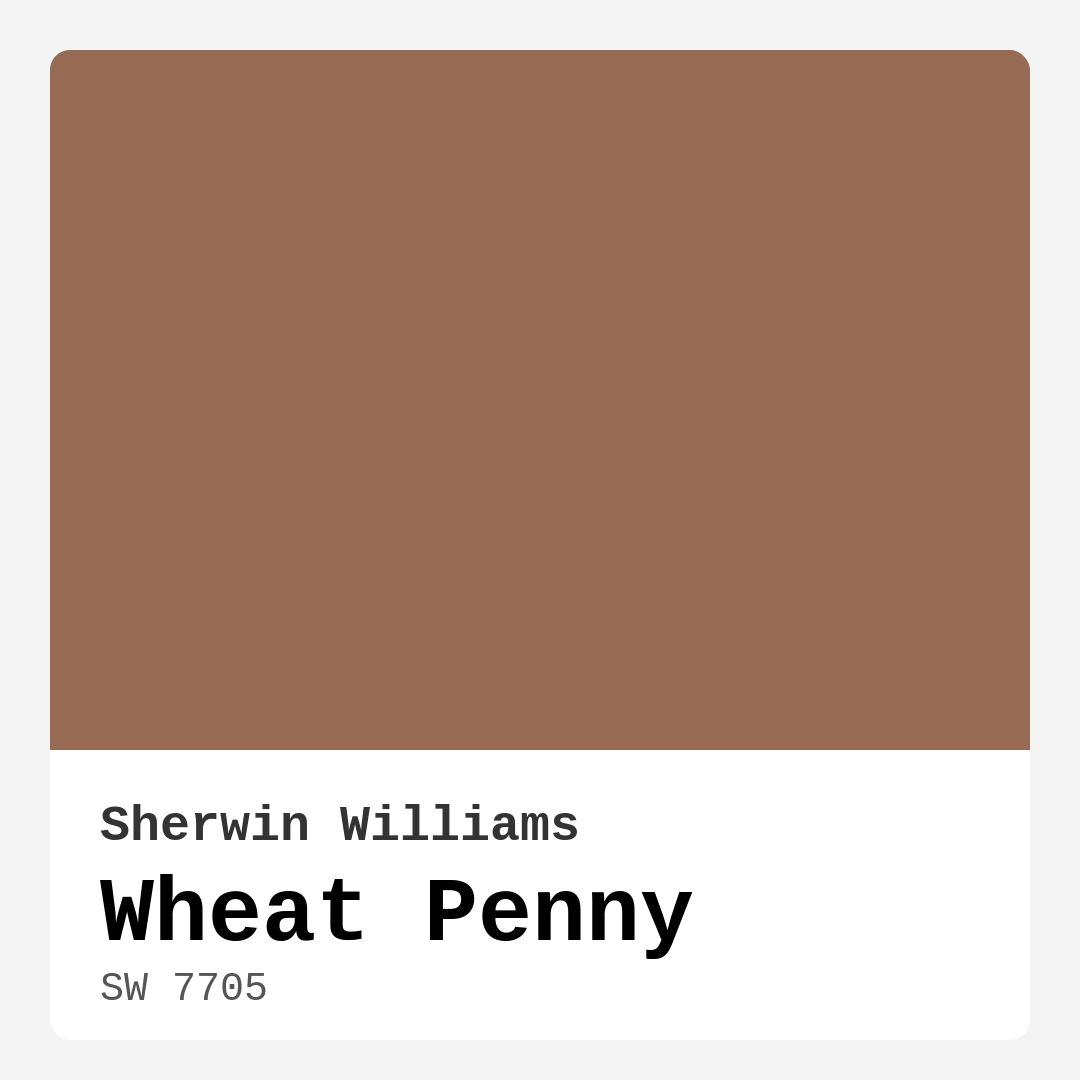
Color Preview & Key Details
| HEX Code | #976B53 |
| RGB | 151, 107, 83 |
| LRV | 45% |
| Undertone | Red |
| Finish Options | Eggshell, Satin, Semi-Gloss |
Imagine walking into a space that feels both warm and inviting, where the colors wrap around you like a cozy blanket. That’s the magic of Wheat Penny, a stunning paint color from Sherwin Williams that can transform your home into a haven of comfort and style. It’s that perfect blend of earthy tones that reminds you of autumn leaves and rich, sun-kissed soil. With its warm, red undertones, Wheat Penny is here to create an atmosphere that feels grounded yet sophisticated.
One of the standout features of Wheat Penny is its versatility. This paint color works beautifully in various styles, whether you’re leaning towards a modern farmhouse aesthetic, embracing rustic charm, or favoring a bohemian vibe. Its incredible adaptability makes it suitable for multiple rooms, including the living room, bedroom, dining room, and even a home office. Can you see it? Picture a serene study with Wheat Penny walls, where the warmth inspires creativity and calm.
When it comes to pairing colors and decor, Wheat Penny shines. Its earthy tone complements natural materials like wood and stone, enhancing the overall look of your space. Think about that rustic dining room table made of reclaimed wood against the backdrop of Wheat Penny walls. The contrast is beautiful, creating a visual feast for the eyes that feels both stylish and inviting.
Now, let’s talk about the practical aspects of using Wheat Penny. With a Light Reflectance Value (LRV) of 45%, it reflects a moderate amount of light. This means it strikes a balance between bright and cozy, making it a fantastic option for a variety of lighting conditions. In natural light, Wheat Penny comes alive, showcasing its warm undertones. When the day winds down and softer lights take over, the color takes on a muted quality, offering a tranquil vibe that’s perfect for winding down after a long day.
If you’re concerned about using Wheat Penny in smaller spaces, there’s no need to fret. While it has a rich, warm quality, it can work in compact areas if you use it thoughtfully. Consider pairing it with lighter furniture or accents to keep the space feeling open. Adequate lighting is essential, too. Large windows or well-placed lamps can help Wheat Penny create a cozy yet inviting atmosphere without overwhelming the room.
Wheat Penny offers various finish options, including eggshell, satin, and semi-gloss. For interior walls, eggshell or satin is often the best choice, giving you a slight sheen that enhances the color while being durable enough to withstand everyday wear and tear. If you’re thinking about trim, a semi-gloss finish can create a lovely contrast that highlights Wheat Penny’s warmth, especially when paired with a crisp white like White Dove.
One of the joys of working with Wheat Penny is how easy it is to apply. Designed with beginners in mind, it’s roller-ready and brush smooth, making your painting project a breeze. Plus, it dries quickly, so you won’t be waiting around for hours. And with its low VOC levels, you’ll be creating a healthier home environment while enjoying the aesthetic benefits of this beautiful color.
Now, let’s dive deeper into the color’s undertones. The subtle red undertones in Wheat Penny give it depth and complexity. This characteristic can change how the color looks depending on the other elements in your room. For instance, if you have gray furniture with blue undertones, you might find Wheat Penny feels warmer and more inviting against those cool tones. It’s essential to test the paint in your home and see how it interacts with your existing decor throughout the day. Light plays a huge role in revealing the color’s character, so don’t skip this step.
Wheat Penny’s mood is cozy, inviting, and grounding. It brings a sense of comfort that’s perfect for spaces meant for relaxation and gathering. Imagine hosting a dinner party in a Wheat Penny-painted dining room, where the warmth of the walls encourages conversation and connection. Or think about retreating to a Wheat Penny-hued bedroom at the end of the day, where you can unwind in a serene and nurturing environment.
If you’re looking to create an accent wall, Wheat Penny is a fantastic choice. It can draw the eye and serve as a focal point in a room, especially when combined with softer complementary shades. Consider pairing it with lighter colors like SW 9137 or SW 9633 to balance its depth. This combination can create a harmonious look that feels both modern and timeless.
In terms of maintenance, Wheat Penny is a wipeable and washable paint, making it practical for everyday living. Spills and scuffs can be easily managed, which is a must for busy households. Just grab a damp cloth, and you’re good to go.
Now that you see the beauty and functionality of Wheat Penny, it’s worth considering some of its potential downsides. While the warmth is inviting, it may darken smaller spaces if not used thoughtfully. A well-lit room can mitigate this effect, but smaller areas might benefit from lighter accents or decor. Additionally, achieving full coverage may require two coats, so be prepared for a little extra work in that department.
As you decide whether Wheat Penny is right for your project, think about how it will work with your furniture, flooring, and overall decor. It’s a color that feels timeless yet contemporary, making it a designer favorite for a reason. The ability to create a cozy, inviting atmosphere in various spaces is a testament to its charm.
Ultimately, Wheat Penny is more than just a paint color; it’s a way to create a feeling in your home. Whether you want to evoke warmth, intimacy, or a sophisticated yet casual vibe, this color can do it all. So grab a sample, test it on your walls, and see how it transforms your space into a retreat that feels just right for you. The beauty of Wheat Penny is waiting to be discovered in your home.
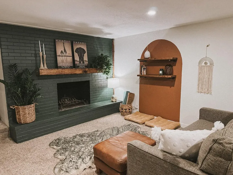
Real Room Photo of Wheat Penny SW 7705
Undertones of Wheat Penny ?
The undertones of Wheat Penny are a key aspect of its character, leaning towards Red. These subtle underlying hues are what give the color its depth and complexity. For example, a gray with a blue undertone will feel cooler and more modern, while one with a brown undertone will feel warmer and more traditional. It’s essential to test this paint in your home and observe it next to your existing furniture, flooring, and decor to see how these undertones interact and reveal themselves throughout the day.
HEX value: #976B53
RGB code: 151, 107, 83
Is Wheat Penny Cool or Warm?
Wheat Penny is considered a warm paint color. This characteristic plays a huge role in the overall feel of a room. Warm colors, like this one, tend to create a cozy, inviting, and energetic atmosphere, making them great for social spaces like living rooms and dining rooms. In contrast, cool colors often evoke a sense of calm and serenity, which is why they are popular in bedrooms and bathrooms. The warmth of Wheat Penny means it will pair beautifully with corresponding decor elements.
Understanding Color Properties and Interior Design Tips
Hue refers to a specific position on the color wheel, measured in degrees from 0 to 360. Each degree represents a different pure color:
- 0° represents red
- 120° represents green
- 240° represents blue
Saturation describes the intensity or purity of a color and is expressed as a percentage:
- At 0%, the color appears completely desaturated—essentially a shade of gray
- At 100%, the color is at its most vivid and vibrant
Lightness indicates how light or dark a color is, also expressed as a percentage:
- 0% lightness results in black
- 100% lightness results in white
Using Warm Colors in Interior Design
Warm hues—such as reds, oranges, yellows, warm beiges, and greiges—are excellent choices for creating inviting and energetic spaces. These colors are particularly well-suited for:
- Kitchens, living rooms, and bathrooms, where warmth enhances comfort and sociability
- Large rooms, where warm tones can help reduce the sense of emptiness and make the space feel more intimate
For example:
- Warm beige shades provide a cozy, inviting atmosphere, ideal for living rooms, bedrooms, and hallways.
- Warm greige (a mix of beige and gray) offers the warmth of beige with the modern appeal of gray, making it a versatile backdrop for dining areas, bedrooms, and living spaces.
However, be mindful when using warm light tones in rooms with limited natural light. These shades may appear muted or even take on an unpleasant yellowish tint. To avoid a dull or flat appearance:
- Add depth by incorporating richer tones like deep greens, charcoal, or chocolate brown
- Use textured elements such as curtains, rugs, or cushions to bring dimension to the space
Pro Tip: Achieving Harmony with Warm and Cool Color Balance
To create a well-balanced and visually interesting interior, mix warm and cool tones strategically. This contrast adds depth and harmony to your design.
- If your walls feature warm hues, introduce cool-colored accents such as blue or green furniture, artwork, or accessories to create contrast.
- For a polished look, consider using a complementary color scheme, which pairs colors opposite each other on the color wheel (e.g., red with green, orange with blue).
This thoughtful mix not only enhances visual appeal but also creates a space that feels both dynamic and cohesive.
Light Temperature Affects on Wheat Penny
Natural Light
Natural daylight changes in color temperature as the sun moves across the sky. At sunrise and sunset, the light tends to have a warm, golden tone with a color temperature around 2000 Kelvin (K). As the day progresses and the sun rises higher, the light becomes cooler and more neutral. Around midday, especially when the sky is clear, natural light typically reaches its peak brightness and shifts to a cooler tone, ranging from 5500 to 6500 Kelvin. This midday light is close to what we perceive as pure white or daylight-balanced light.
These shifts in natural light can significantly influence how colors appear in a space, which is why designers often consider both the time of day and the orientation of windows when planning interior color schemes.
Artificial Light
When choosing artificial lighting, pay close attention to the color temperature, measured in Kelvin (K). This determines how warm or cool the light will appear. Lower temperatures, around 2700K, give off a warm, yellow glow often used in living rooms or bedrooms. Higher temperatures, above 5000K, create a cool, bluish light similar to daylight, commonly used in kitchens, offices, or task areas.
Use the slider to see how lighting temperature can affect the appearance of a surface or color throughout a space.


4800K
LRV of Wheat Penny
The Light Reflectance Value (LRV) of Wheat Penny is 45%, which places it in the Medium category. This means it Reflects a moderate amount of light. Understanding a paint’s LRV is crucial for predicting how it will look in your space. A higher LRV indicates a lighter color that reflects more light, making rooms feel larger and brighter. A lower LRV signifies a darker color that absorbs more light, creating a cozier, more intimate atmosphere. Always consider the natural and artificial lighting in your room when selecting a paint color based on its LRV.
Detailed Review of Wheat Penny
Additional Paint Characteristics
Ideal Rooms
Bedroom, Dining Room, Hallway, Home Office, Living Room
Decor Styles
Bohemian, Modern Farmhouse, Rustic, Traditional
Coverage
Good (1–2 Coats)
Ease of Application
Beginner Friendly, Brush Smooth, Fast-Drying, Roller-Ready
Washability
Washable, Wipeable
VOC Level
Low VOC, Ultra Low VOC
Best Use
Accent Wall, Furniture, Interior Walls
Room Suitability
Bedroom, Dining Room, Home Office, Living Room
Tone Tag
Earthy, Muted, Warm
Finish Type
Eggshell, Satin
Paint Performance
High Coverage, Low Odor, Quick Drying
Use Cases
Best for Low Light Rooms, Best for Modern Farmhouse, Designer Favorite
Mood
Cozy, Grounding, Inviting
Trim Pairing
Complements Brass Fixtures, Pairs with White Dove, Works with Warm Trim
Wheat Penny stands out with its unique blend of warmth and sophistication. This color can transform a room, bringing a rustic charm that feels both timeless and contemporary. It pairs well with natural materials like wood and stone, enhancing the overall aesthetic of your space. Whether you’re painting your living room or a cozy nook, Wheat Penny provides a beautiful backdrop that complements a variety of decor styles. It’s versatile enough to work in both bright and dimly lit areas, making it a great option for different settings. If you’re looking for a paint that feels inviting yet modern, this is definitely worth considering.
Pros & Cons of SW 7705 Wheat Penny
Pros
Cons
Colors that go with Sherwin Williams Wheat Penny
FAQ on SW 7705 Wheat Penny
Can Wheat Penny be used in small spaces?
Absolutely! While Wheat Penny is a warm and deep color, it can work well in small spaces if used thoughtfully. To keep it from feeling too heavy, pair it with lighter furniture or accents and ensure there’s adequate lighting. This way, it can create a cozy yet inviting atmosphere without overwhelming the room.
What finishes are recommended for Wheat Penny?
Wheat Penny looks great in various finishes, but for interior walls, eggshell or satin are often the best choices. These finishes provide a slight sheen that enhances the color while being durable enough for everyday wear. For trim, you can use semi-gloss to create a nice contrast that highlights the warmth of Wheat Penny.
Comparisons Wheat Penny with other colors
Wheat Penny SW 7705 vs Cavern Clay SW 7701
| Attribute | Wheat Penny SW 7705 | Cavern Clay SW 7701 |
|---|---|---|
| Color Name | Wheat Penny SW 7705 | Cavern Clay SW 7701 |
| Color | ||
| Hue | Red | Red |
| Brightness | Dark | Dark |
| RGB | 151, 107, 83 | 172, 107, 83 |
| LRV | 45% | 30% |
| Finish Type | Eggshell, Satin | Eggshell, Matte, Satin |
| Finish Options | Eggshell, Satin, Semi-Gloss | Eggshell, Matte, Satin |
| Ideal Rooms | Bedroom, Dining Room, Hallway, Home Office, Living Room | Bedroom, Dining Room, Home Office, Kitchen, Living Room |
| Decor Styles | Bohemian, Modern Farmhouse, Rustic, Traditional | Bohemian, Contemporary, Modern Farmhouse, Rustic, Transitional |
| Coverage | Good (1–2 Coats) | Good (1–2 Coats), Touch-Up Friendly |
| Ease of Application | Beginner Friendly, Brush Smooth, Fast-Drying, Roller-Ready | Beginner Friendly, Brush Smooth, Roller-Ready |
| Washability | Washable, Wipeable | Washable, Wipeable |
| Room Suitability | Bedroom, Dining Room, Home Office, Living Room | Bedroom, Dining Room, Home Office, Kitchen, Living Room |
| Tone | Earthy, Muted, Warm | Earthy, Muted, Warm |
| Paint Performance | High Coverage, Low Odor, Quick Drying | Easy Touch-Up, Low Odor, Scuff Resistant |
Wheat Penny SW 7705 vs Burgundy SW 6300
| Attribute | Wheat Penny SW 7705 | Burgundy SW 6300 |
|---|---|---|
| Color Name | Wheat Penny SW 7705 | Burgundy SW 6300 |
| Color | ||
| Hue | Red | Red |
| Brightness | Dark | Dark |
| RGB | 151, 107, 83 | 99, 51, 62 |
| LRV | 45% | 6% |
| Finish Type | Eggshell, Satin | Eggshell, Matte, Satin |
| Finish Options | Eggshell, Satin, Semi-Gloss | Eggshell, Matte, Satin |
| Ideal Rooms | Bedroom, Dining Room, Hallway, Home Office, Living Room | Bedroom, Dining Room, Home Office, Living Room |
| Decor Styles | Bohemian, Modern Farmhouse, Rustic, Traditional | Contemporary, Rustic, Traditional, Vintage |
| Coverage | Good (1–2 Coats) | Good (1–2 Coats), Touch-Up Friendly |
| Ease of Application | Beginner Friendly, Brush Smooth, Fast-Drying, Roller-Ready | Beginner Friendly, Brush Smooth, Fast-Drying, Roller-Ready |
| Washability | Washable, Wipeable | Washable, Wipeable |
| Room Suitability | Bedroom, Dining Room, Home Office, Living Room | Bedroom, Dining Room, Home Office, Living Room |
| Tone | Earthy, Muted, Warm | Bold, Deep, Warm |
| Paint Performance | High Coverage, Low Odor, Quick Drying | High Coverage, Low Odor, Quick Drying |
Wheat Penny SW 7705 vs Rookwood Red SW 2802
| Attribute | Wheat Penny SW 7705 | Rookwood Red SW 2802 |
|---|---|---|
| Color Name | Wheat Penny SW 7705 | Rookwood Red SW 2802 |
| Color | ||
| Hue | Red | Red |
| Brightness | Dark | Dark |
| RGB | 151, 107, 83 | 98, 47, 45 |
| LRV | 45% | 6% |
| Finish Type | Eggshell, Satin | Eggshell, Matte, Satin |
| Finish Options | Eggshell, Satin, Semi-Gloss | Eggshell, Matte, Satin |
| Ideal Rooms | Bedroom, Dining Room, Hallway, Home Office, Living Room | Bedroom, Dining Room, Home Office, Living Room |
| Decor Styles | Bohemian, Modern Farmhouse, Rustic, Traditional | Arts and Crafts, Modern Farmhouse, Rustic, Traditional |
| Coverage | Good (1–2 Coats) | Good (1–2 Coats), Touch-Up Friendly |
| Ease of Application | Beginner Friendly, Brush Smooth, Fast-Drying, Roller-Ready | Beginner Friendly, Brush Smooth, Fast-Drying, Roller-Ready |
| Washability | Washable, Wipeable | Washable, Wipeable |
| Room Suitability | Bedroom, Dining Room, Home Office, Living Room | Bedroom, Dining Room, Living Room |
| Tone | Earthy, Muted, Warm | Deep, Earthy, Warm |
| Paint Performance | High Coverage, Low Odor, Quick Drying | Easy Touch-Up, High Coverage, Low Odor |
Wheat Penny SW 7705 vs Spiced Cider SW 7702
| Attribute | Wheat Penny SW 7705 | Spiced Cider SW 7702 |
|---|---|---|
| Color Name | Wheat Penny SW 7705 | Spiced Cider SW 7702 |
| Color | ||
| Hue | Red | Red |
| Brightness | Dark | Dark |
| RGB | 151, 107, 83 | 176, 120, 92 |
| LRV | 45% | 20% |
| Finish Type | Eggshell, Satin | Eggshell, Satin |
| Finish Options | Eggshell, Satin, Semi-Gloss | Eggshell, Satin, Semi-Gloss |
| Ideal Rooms | Bedroom, Dining Room, Hallway, Home Office, Living Room | Bedroom, Dining Room, Kitchen, Living Room |
| Decor Styles | Bohemian, Modern Farmhouse, Rustic, Traditional | Modern Farmhouse, Rustic, Traditional, Transitional |
| Coverage | Good (1–2 Coats) | Good (1–2 Coats), Touch-Up Friendly |
| Ease of Application | Beginner Friendly, Brush Smooth, Fast-Drying, Roller-Ready | Beginner Friendly, Brush Smooth, Roller-Ready |
| Washability | Washable, Wipeable | Scrubbable, Washable |
| Room Suitability | Bedroom, Dining Room, Home Office, Living Room | Bedroom, Dining Room, Kitchen, Living Room |
| Tone | Earthy, Muted, Warm | Earthy, Inviting, Warm |
| Paint Performance | High Coverage, Low Odor, Quick Drying | Easy Touch-Up, High Coverage, Low Odor |
Wheat Penny SW 7705 vs Carnelian SW 7580
| Attribute | Wheat Penny SW 7705 | Carnelian SW 7580 |
|---|---|---|
| Color Name | Wheat Penny SW 7705 | Carnelian SW 7580 |
| Color | ||
| Hue | Red | Red |
| Brightness | Dark | Dark |
| RGB | 151, 107, 83 | 87, 62, 62 |
| LRV | 45% | 20% |
| Finish Type | Eggshell, Satin | Eggshell, Satin |
| Finish Options | Eggshell, Satin, Semi-Gloss | Eggshell, Matte, Satin |
| Ideal Rooms | Bedroom, Dining Room, Hallway, Home Office, Living Room | Bedroom, Dining Room, Hallway, Home Office, Living Room |
| Decor Styles | Bohemian, Modern Farmhouse, Rustic, Traditional | Bohemian, Modern Farmhouse, Rustic, Traditional |
| Coverage | Good (1–2 Coats) | Good (1–2 Coats), Touch-Up Friendly |
| Ease of Application | Beginner Friendly, Brush Smooth, Fast-Drying, Roller-Ready | Beginner Friendly, Brush Smooth, Fast-Drying, Roller-Ready |
| Washability | Washable, Wipeable | Washable, Wipeable |
| Room Suitability | Bedroom, Dining Room, Home Office, Living Room | Bedroom, Dining Room, Home Office, Living Room |
| Tone | Earthy, Muted, Warm | Deep, Earthy, Warm |
| Paint Performance | High Coverage, Low Odor, Quick Drying | Easy Touch-Up, Low Odor, Quick Drying |
Wheat Penny SW 7705 vs Sommelier SW 7595
| Attribute | Wheat Penny SW 7705 | Sommelier SW 7595 |
|---|---|---|
| Color Name | Wheat Penny SW 7705 | Sommelier SW 7595 |
| Color | ||
| Hue | Red | Red |
| Brightness | Dark | Dark |
| RGB | 151, 107, 83 | 93, 55, 54 |
| LRV | 45% | 6% |
| Finish Type | Eggshell, Satin | Eggshell, Matte, Satin |
| Finish Options | Eggshell, Satin, Semi-Gloss | Eggshell, Matte, Satin |
| Ideal Rooms | Bedroom, Dining Room, Hallway, Home Office, Living Room | Bedroom, Dining Room, Home Office, Living Room |
| Decor Styles | Bohemian, Modern Farmhouse, Rustic, Traditional | Modern, Rustic, Traditional, Transitional |
| Coverage | Good (1–2 Coats) | Good (1–2 Coats), Touch-Up Friendly |
| Ease of Application | Beginner Friendly, Brush Smooth, Fast-Drying, Roller-Ready | Brush Smooth, Fast-Drying, Low Splatter, Roller-Ready |
| Washability | Washable, Wipeable | Washable, Wipeable |
| Room Suitability | Bedroom, Dining Room, Home Office, Living Room | Bedroom, Dining Room, Home Office, Living Room |
| Tone | Earthy, Muted, Warm | Deep, Earthy, Warm |
| Paint Performance | High Coverage, Low Odor, Quick Drying | Easy Touch-Up, High Coverage, Low Odor, Scuff Resistant |
Wheat Penny SW 7705 vs Sun Dried Tomato SW 7585
| Attribute | Wheat Penny SW 7705 | Sun Dried Tomato SW 7585 |
|---|---|---|
| Color Name | Wheat Penny SW 7705 | Sun Dried Tomato SW 7585 |
| Color | ||
| Hue | Red | Red |
| Brightness | Dark | Dark |
| RGB | 151, 107, 83 | 105, 43, 43 |
| LRV | 45% | 20% |
| Finish Type | Eggshell, Satin | Matte, Satin, Semi-Gloss |
| Finish Options | Eggshell, Satin, Semi-Gloss | Matte, Satin, Semi-Gloss |
| Ideal Rooms | Bedroom, Dining Room, Hallway, Home Office, Living Room | Dining Room, Home Office, Kitchen, Living Room |
| Decor Styles | Bohemian, Modern Farmhouse, Rustic, Traditional | Industrial, Mediterranean, Modern Farmhouse, Rustic |
| Coverage | Good (1–2 Coats) | Good (1–2 Coats), Touch-Up Friendly |
| Ease of Application | Beginner Friendly, Brush Smooth, Fast-Drying, Roller-Ready | Beginner Friendly, Brush Smooth, Roller-Ready |
| Washability | Washable, Wipeable | Washable, Wipeable |
| Room Suitability | Bedroom, Dining Room, Home Office, Living Room | Dining Room, Home Office, Kitchen, Living Room |
| Tone | Earthy, Muted, Warm | Bold, Earthy, Warm |
| Paint Performance | High Coverage, Low Odor, Quick Drying | Easy Touch-Up, High Coverage, Low Odor |
Wheat Penny SW 7705 vs Rustic Red SW 7593
| Attribute | Wheat Penny SW 7705 | Rustic Red SW 7593 |
|---|---|---|
| Color Name | Wheat Penny SW 7705 | Rustic Red SW 7593 |
| Color | ||
| Hue | Red | Red |
| Brightness | Dark | Dark |
| RGB | 151, 107, 83 | 112, 50, 41 |
| LRV | 45% | 12% |
| Finish Type | Eggshell, Satin | Matte, Satin |
| Finish Options | Eggshell, Satin, Semi-Gloss | Matte, Satin, Semi-Gloss |
| Ideal Rooms | Bedroom, Dining Room, Hallway, Home Office, Living Room | Bedroom, Dining Room, Hallway, Living Room |
| Decor Styles | Bohemian, Modern Farmhouse, Rustic, Traditional | Country, Farmhouse, Rustic, Traditional |
| Coverage | Good (1–2 Coats) | Good (1–2 Coats) |
| Ease of Application | Beginner Friendly, Brush Smooth, Fast-Drying, Roller-Ready | Beginner Friendly, Brush Smooth, Fast-Drying, Roller-Ready |
| Washability | Washable, Wipeable | Washable, Wipeable |
| Room Suitability | Bedroom, Dining Room, Home Office, Living Room | Bedroom, Dining Room, Living Room |
| Tone | Earthy, Muted, Warm | Deep, Earthy, Warm |
| Paint Performance | High Coverage, Low Odor, Quick Drying | Easy Touch-Up, Low Odor, Quick Drying |
Wheat Penny SW 7705 vs Roycroft Copper Red SW 2839
| Attribute | Wheat Penny SW 7705 | Roycroft Copper Red SW 2839 |
|---|---|---|
| Color Name | Wheat Penny SW 7705 | Roycroft Copper Red SW 2839 |
| Color | ||
| Hue | Red | Red |
| Brightness | Dark | Dark |
| RGB | 151, 107, 83 | 123, 55, 40 |
| LRV | 45% | 12% |
| Finish Type | Eggshell, Satin | Matte, Satin, Semi-Gloss |
| Finish Options | Eggshell, Satin, Semi-Gloss | Matte, Satin, Semi-Gloss |
| Ideal Rooms | Bedroom, Dining Room, Hallway, Home Office, Living Room | Bedroom, Dining Room, Entryway, Home Office, Living Room |
| Decor Styles | Bohemian, Modern Farmhouse, Rustic, Traditional | Arts and Crafts, Eclectic, Farmhouse, Rustic, Traditional |
| Coverage | Good (1–2 Coats) | Good (1–2 Coats), Touch-Up Friendly |
| Ease of Application | Beginner Friendly, Brush Smooth, Fast-Drying, Roller-Ready | Beginner Friendly, Brush Smooth, Roller-Ready |
| Washability | Washable, Wipeable | Stain Resistant, Washable |
| Room Suitability | Bedroom, Dining Room, Home Office, Living Room | Bedroom, Dining Room, Entryway, Home Office, Living Room |
| Tone | Earthy, Muted, Warm | Deep, Earthy, Warm |
| Paint Performance | High Coverage, Low Odor, Quick Drying | Easy Touch-Up, High Coverage, Low Odor |
Wheat Penny SW 7705 vs Rookwood Dark Red SW 2801
| Attribute | Wheat Penny SW 7705 | Rookwood Dark Red SW 2801 |
|---|---|---|
| Color Name | Wheat Penny SW 7705 | Rookwood Dark Red SW 2801 |
| Color | ||
| Hue | Red | Red |
| Brightness | Dark | Dark |
| RGB | 151, 107, 83 | 75, 41, 41 |
| LRV | 45% | 6% |
| Finish Type | Eggshell, Satin | Matte, Satin, Semi-Gloss |
| Finish Options | Eggshell, Satin, Semi-Gloss | Matte, Satin, Semi-Gloss |
| Ideal Rooms | Bedroom, Dining Room, Hallway, Home Office, Living Room | Bedroom, Dining Room, Home Office, Living Room |
| Decor Styles | Bohemian, Modern Farmhouse, Rustic, Traditional | Farmhouse, Modern, Rustic, Traditional |
| Coverage | Good (1–2 Coats) | Good (1–2 Coats) |
| Ease of Application | Beginner Friendly, Brush Smooth, Fast-Drying, Roller-Ready | Beginner Friendly, Brush Smooth, Roller-Ready |
| Washability | Washable, Wipeable | Highly Washable, Washable |
| Room Suitability | Bedroom, Dining Room, Home Office, Living Room | Bedroom, Dining Room, Home Office, Living Room |
| Tone | Earthy, Muted, Warm | Deep, Earthy, Warm |
| Paint Performance | High Coverage, Low Odor, Quick Drying | Easy Touch-Up, High Coverage, Low Odor |
Official Page of Sherwin Williams Wheat Penny SW 7705