
Color Preview & Key Details
| HEX Code | #C8BD98 |
| RGB | 200, 189, 152 |
| LRV | 48% |
| Undertone | Yellow |
| Finish Options | Eggshell, Matte, Satin |
Have you ever stepped into a room and instantly felt more at ease? That’s the magic of color in interior design. One color that embodies this serene ambiance is Sherwin Williams’ Lemongrass (SW 7732). This soft, muted hue is like a breath of fresh air, bringing the warmth of nature indoors while providing a versatile backdrop for any space. If you’re considering a paint project, let’s dive deeper into why Lemongrass might just be your perfect choice.
Imagine walking into your living room, where soft sunshine spills over the walls, illuminating a gentle shade that feels both welcoming and calming. Lemongrass captures that essence beautifully. This color reflects a moderate amount of light, thanks to its Light Reflectance Value (LRV) of 48%. It strikes a balance, making your space feel cozy without closing it in. Whether it’s natural light pouring in through the windows or soft artificial lighting in the evening, Lemongrass adapts, subtly shifting its tone throughout the day.
Its earthy undertones lean towards yellow, lending a warmth that feels inviting. This isn’t an overwhelming brightness; rather, it’s a muted charm that whispers comfort. The color has a way of harmonizing with its surroundings, making it an excellent choice for various decor styles. Whether your home leans towards modern farmhouse, Scandinavian simplicity, or a vibrant Bohemian flair, Lemongrass can work seamlessly within those frameworks.
When you’re selecting a paint color, you’ll want to think about how it interacts with other elements in your home. Lemongrass pairs beautifully with white and light gray, creating a calming palette that allows the space to breathe. For those looking to add a bit of pop, consider rich jewel tones like deep teal or burgundy. This contrast can create a stunning visual interest while maintaining the warmth of the room.
One of the best features of Lemongrass is its versatility across different rooms. It’s a fantastic choice for the living room, offering a serene backdrop for gatherings. In the bedroom, it creates a peaceful retreat, promoting relaxation and tranquility. In the kitchen, the gentle hue can inspire creativity and warmth, making it a welcoming space for family meals. Even in a home office, Lemongrass fosters a calm atmosphere, perfect for productivity.
If you have small spaces, don’t shy away from using Lemongrass. Its soft tone helps open up areas, giving the illusion of a larger environment. Pairing it with lighter furniture or accents can enhance this effect even more, creating a cozy yet expansive feel. It’s a color that invites you to stay a while, making even the smallest nooks feel inviting.
For those hesitant about color application, Lemongrass is beginner-friendly. It’s roller-ready and brush smooth, meaning you won’t need to be a professional to achieve a beautiful finish. The coverage is good, typically requiring 1–2 coats, and it’s highly washable, which is perfect for high-traffic areas. Plus, its low VOC formulation means healthier indoor air quality, allowing you to breathe easier as you transform your space.
As with any paint, consider a few factors before diving in. While Lemongrass is generally forgiving, you might find that it requires multiple coats for full coverage, especially if you’re transitioning from a darker color. It’s also important to note that in dim lighting, it can appear more muted, so keep that in mind when planning your palette.
When it comes to pairing with trim, you can’t go wrong with crisp whites like White Dove. This combination enhances the soft warmth of Lemongrass and makes spaces feel fresh and light. Brass fixtures can add a touch of elegance, complementing the warmth without competing for attention. If you have wood trim, Lemongrass can create a delightful contrast, making both elements stand out beautifully.
Now, let’s touch on the experience of living with Lemongrass. It’s more than just a color; it’s an atmosphere. The way it envelops a room makes everyday moments feel special. Imagine hosting a dinner party, where the gentle glow of Lemongrass sets the perfect tone for connection and conversation. It invites warmth and coziness, making everyone feel right at home.
A common question I receive is whether this color can be used in smaller areas. The answer is a resounding yes! Lemongrass is ideal for tight spaces. Its muted tones help create an open and airy vibe, making those areas feel less cramped. Add some light furniture or accents to amplify this effect, and you’ll have a cozy nook that feels expansive.
In terms of versatility, Lemongrass stands tall. It pairs well with various colors, making it easy to incorporate into your existing decor. For a calming palette, think whites and light grays. If you’re feeling more adventurous, consider contrasting it with deeper tones like navy or burgundy. The key is to balance the warmth of Lemongrass with the right accent colors to achieve your desired look.
When you’re envisioning your space, think about how Lemongrass interacts with different lighting scenarios. In bright conditions, it reveals its full vibrancy, while in dimmer settings, it softens and takes on a more muted quality. This adaptability allows you to enjoy the color throughout the day, no matter how the light shifts.
So, what’s the verdict? Is Lemongrass the right choice for your project? If you’re looking for a warm, inviting hue that feels both earthy and serene, it’s hard to beat. This color offers flexibility across various styles and settings, making it suitable for almost any room in your home. With its low VOC levels, ease of application, and enchanting ability to adapt to light, you’ll find that Lemongrass is not just a paint color, but a transformative experience.
In conclusion, whether you’re freshening up a single room or redesigning your entire home, Lemongrass is a color worth considering. It brings a touch of nature indoors, creating a serene and inviting atmosphere. So grab your paintbrush, and let Lemongrass work its magic in your space. You’ll love the way it transforms your home into a warm embrace, making every moment spent there feel just a little bit more special.
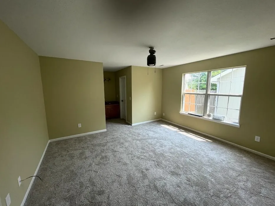
Real Room Photo of Lemongrass SW 7732
Undertones of Lemongrass ?
The undertones of Lemongrass are a key aspect of its character, leaning towards Yellow. These subtle underlying hues are what give the color its depth and complexity. For example, a gray with a blue undertone will feel cooler and more modern, while one with a brown undertone will feel warmer and more traditional. It’s essential to test this paint in your home and observe it next to your existing furniture, flooring, and decor to see how these undertones interact and reveal themselves throughout the day.
HEX value: #C8BD98
RGB code: 200, 189, 152
Is Lemongrass Cool or Warm?
This paint leans slightly warm, thanks to its subtle yellow undertones. While it’s not overly bright, it offers a cozy ambiance that makes spaces feel welcoming and alive. It’s perfect for creating a cheerful environment without being too bold.
Understanding Color Properties and Interior Design Tips
Hue refers to a specific position on the color wheel, measured in degrees from 0 to 360. Each degree represents a different pure color:
- 0° represents red
- 120° represents green
- 240° represents blue
Saturation describes the intensity or purity of a color and is expressed as a percentage:
- At 0%, the color appears completely desaturated—essentially a shade of gray
- At 100%, the color is at its most vivid and vibrant
Lightness indicates how light or dark a color is, also expressed as a percentage:
- 0% lightness results in black
- 100% lightness results in white
Using Warm Colors in Interior Design
Warm hues—such as reds, oranges, yellows, warm beiges, and greiges—are excellent choices for creating inviting and energetic spaces. These colors are particularly well-suited for:
- Kitchens, living rooms, and bathrooms, where warmth enhances comfort and sociability
- Large rooms, where warm tones can help reduce the sense of emptiness and make the space feel more intimate
For example:
- Warm beige shades provide a cozy, inviting atmosphere, ideal for living rooms, bedrooms, and hallways.
- Warm greige (a mix of beige and gray) offers the warmth of beige with the modern appeal of gray, making it a versatile backdrop for dining areas, bedrooms, and living spaces.
However, be mindful when using warm light tones in rooms with limited natural light. These shades may appear muted or even take on an unpleasant yellowish tint. To avoid a dull or flat appearance:
- Add depth by incorporating richer tones like deep greens, charcoal, or chocolate brown
- Use textured elements such as curtains, rugs, or cushions to bring dimension to the space
Pro Tip: Achieving Harmony with Warm and Cool Color Balance
To create a well-balanced and visually interesting interior, mix warm and cool tones strategically. This contrast adds depth and harmony to your design.
- If your walls feature warm hues, introduce cool-colored accents such as blue or green furniture, artwork, or accessories to create contrast.
- For a polished look, consider using a complementary color scheme, which pairs colors opposite each other on the color wheel (e.g., red with green, orange with blue).
This thoughtful mix not only enhances visual appeal but also creates a space that feels both dynamic and cohesive.
Light Temperature Affects on Lemongrass
Natural Light
Natural daylight changes in color temperature as the sun moves across the sky. At sunrise and sunset, the light tends to have a warm, golden tone with a color temperature around 2000 Kelvin (K). As the day progresses and the sun rises higher, the light becomes cooler and more neutral. Around midday, especially when the sky is clear, natural light typically reaches its peak brightness and shifts to a cooler tone, ranging from 5500 to 6500 Kelvin. This midday light is close to what we perceive as pure white or daylight-balanced light.
These shifts in natural light can significantly influence how colors appear in a space, which is why designers often consider both the time of day and the orientation of windows when planning interior color schemes.
Artificial Light
When choosing artificial lighting, pay close attention to the color temperature, measured in Kelvin (K). This determines how warm or cool the light will appear. Lower temperatures, around 2700K, give off a warm, yellow glow often used in living rooms or bedrooms. Higher temperatures, above 5000K, create a cool, bluish light similar to daylight, commonly used in kitchens, offices, or task areas.
Use the slider to see how lighting temperature can affect the appearance of a surface or color throughout a space.


4800K
LRV of Lemongrass
The Light Reflectance Value (LRV) of Lemongrass is 48%, which places it in the Medium category. This means it Reflects a moderate amount of light. Understanding a paint’s LRV is crucial for predicting how it will look in your space. A higher LRV indicates a lighter color that reflects more light, making rooms feel larger and brighter. A lower LRV signifies a darker color that absorbs more light, creating a cozier, more intimate atmosphere. Always consider the natural and artificial lighting in your room when selecting a paint color based on its LRV.
Detailed Review of Lemongrass
Additional Paint Characteristics
Ideal Rooms
Bathroom, Bedroom, Home Office, Kitchen, Living Room, Nursery
Decor Styles
Bohemian, Modern Farmhouse, Scandinavian, Transitional
Coverage
Good (1–2 Coats)
Ease of Application
Beginner Friendly, Brush Smooth, Roller-Ready
Washability
Highly Washable, Washable
VOC Level
Low VOC
Best Use
Accent Wall, Interior Walls, Trim
Room Suitability
Bedroom, Home Office, Kitchen, Living Room
Tone Tag
Earthy, Muted, Warm
Finish Type
Eggshell, Matte, Satin
Paint Performance
Easy Touch-Up, Low Odor, Scuff Resistant
Use Cases
Best for Modern Farmhouse, Best for Open Concept, Best for Rentals, Designer Favorite
Mood
Calm, Cozy, Inviting
Trim Pairing
Complements Brass Fixtures, Good with Wood Trim, Pairs with White Dove
Lemongrass is more than just a color; it’s an experience. When you apply it, you’ll notice how it transforms your space, bringing a sense of calm and warmth. This shade works beautifully in both natural and artificial light, adjusting subtly throughout the day. Whether you’re looking to create a tranquil bedroom retreat or a lively kitchen space, Lemongrass offers the flexibility to do just that. It pairs well with a variety of accent colors, allowing for creativity in decor. Plus, its muted tone makes it suitable for larger areas without overwhelming the senses. You’ll appreciate the way it harmonizes with nature, making it a favorite for those who love an organic aesthetic.
Pros & Cons of SW 7732 Lemongrass
Pros
Cons
Colors that go with Sherwin Williams Lemongrass
FAQ on SW 7732 Lemongrass
Can Lemongrass be used in small spaces?
Absolutely! Lemongrass is a fantastic choice for small spaces. Its soft, muted tone helps to open up areas, making them feel larger and more inviting. Pairing it with lighter furniture or accents can enhance this effect even more, creating a cozy yet expansive feel.
How does Lemongrass pair with other colors?
Lemongrass is incredibly versatile and pairs well with a variety of colors. For a calming palette, consider combining it with whites and light grays. If you want to add a pop, rich jewel tones like deep teal or burgundy can create stunning contrast. It’s all about balancing the warmth of Lemongrass with the right accents.
Comparisons Lemongrass with other colors
Lemongrass SW 7732 vs Hearts of Palm SW 6415
| Attribute | Lemongrass SW 7732 | Hearts of Palm SW 6415 |
|---|---|---|
| Color Name | Lemongrass SW 7732 | Hearts of Palm SW 6415 |
| Color | ||
| Hue | Yellow | Yellow |
| Brightness | Medium | Medium |
| RGB | 200, 189, 152 | 207, 194, 145 |
| LRV | 48% | 75% |
| Finish Type | Eggshell, Matte, Satin | Eggshell, Matte, Satin |
| Finish Options | Eggshell, Matte, Satin | Eggshell, Matte, Satin |
| Ideal Rooms | Bathroom, Bedroom, Home Office, Kitchen, Living Room, Nursery | Bathroom, Bedroom, Dining Room, Home Office, Kitchen, Living Room |
| Decor Styles | Bohemian, Modern Farmhouse, Scandinavian, Transitional | Bohemian, Coastal, Eclectic, Modern Farmhouse, Tropical |
| Coverage | Good (1–2 Coats) | Good (1–2 Coats), Touch-Up Friendly |
| Ease of Application | Beginner Friendly, Brush Smooth, Roller-Ready | Beginner Friendly, Brush Smooth, Roller-Ready |
| Washability | Highly Washable, Washable | Scrubbable, Washable |
| Room Suitability | Bedroom, Home Office, Kitchen, Living Room | Bathroom, Bedroom, Dining Room, Home Office, Kitchen, Living Room |
| Tone | Earthy, Muted, Warm | Earthy, Muted, Warm |
| Paint Performance | Easy Touch-Up, Low Odor, Scuff Resistant | Easy Touch-Up, Low Odor, Scuff Resistant |
Lemongrass SW 7732 vs Blonde SW 6128
| Attribute | Lemongrass SW 7732 | Blonde SW 6128 |
|---|---|---|
| Color Name | Lemongrass SW 7732 | Blonde SW 6128 |
| Color | ||
| Hue | Yellow | Yellow |
| Brightness | Medium | Medium |
| RGB | 200, 189, 152 | 220, 189, 146 |
| LRV | 48% | 64% |
| Finish Type | Eggshell, Matte, Satin | Eggshell, Satin |
| Finish Options | Eggshell, Matte, Satin | Eggshell, Matte, Satin |
| Ideal Rooms | Bathroom, Bedroom, Home Office, Kitchen, Living Room, Nursery | Bedroom, Dining Room, Home Office, Kitchen, Living Room |
| Decor Styles | Bohemian, Modern Farmhouse, Scandinavian, Transitional | Bohemian, Coastal, Modern Farmhouse, Scandinavian, Transitional |
| Coverage | Good (1–2 Coats) | Good (1–2 Coats), Touch-Up Friendly |
| Ease of Application | Beginner Friendly, Brush Smooth, Roller-Ready | Beginner Friendly, Fast-Drying, Roller-Ready |
| Washability | Highly Washable, Washable | Highly Washable, Washable |
| Room Suitability | Bedroom, Home Office, Kitchen, Living Room | Bedroom, Dining Room, Home Office, Kitchen, Living Room, Nursery |
| Tone | Earthy, Muted, Warm | Earthy, Neutral, Warm |
| Paint Performance | Easy Touch-Up, Low Odor, Scuff Resistant | Easy Touch-Up, Fade Resistant, Low Odor, Quick Drying |
Lemongrass SW 7732 vs Ruskin Room Green SW 0042
| Attribute | Lemongrass SW 7732 | Ruskin Room Green SW 0042 |
|---|---|---|
| Color Name | Lemongrass SW 7732 | Ruskin Room Green SW 0042 |
| Color | ||
| Hue | Yellow | Yellow |
| Brightness | Medium | Medium |
| RGB | 200, 189, 152 | 172, 161, 125 |
| LRV | 48% | 24% |
| Finish Type | Eggshell, Matte, Satin | Eggshell, Matte |
| Finish Options | Eggshell, Matte, Satin | Eggshell, Flat, Matte, Satin |
| Ideal Rooms | Bathroom, Bedroom, Home Office, Kitchen, Living Room, Nursery | Bedroom, Dining Room, Home Office, Living Room |
| Decor Styles | Bohemian, Modern Farmhouse, Scandinavian, Transitional | Farmhouse, Modern, Rustic, Traditional |
| Coverage | Good (1–2 Coats) | Good (1–2 Coats), Touch-Up Friendly |
| Ease of Application | Beginner Friendly, Brush Smooth, Roller-Ready | Beginner Friendly, Brush Smooth, Roller-Ready |
| Washability | Highly Washable, Washable | Scrubbable, Washable |
| Room Suitability | Bedroom, Home Office, Kitchen, Living Room | Bedroom, Dining Room, Home Office, Living Room |
| Tone | Earthy, Muted, Warm | Earthy, Muted, Warm |
| Paint Performance | Easy Touch-Up, Low Odor, Scuff Resistant | Easy Touch-Up, High Coverage, Low Odor |
Lemongrass SW 7732 vs Bosc Pear SW 6390
| Attribute | Lemongrass SW 7732 | Bosc Pear SW 6390 |
|---|---|---|
| Color Name | Lemongrass SW 7732 | Bosc Pear SW 6390 |
| Color | ||
| Hue | Yellow | Yellow |
| Brightness | Medium | Medium |
| RGB | 200, 189, 152 | 192, 144, 86 |
| LRV | 48% | 60% |
| Finish Type | Eggshell, Matte, Satin | Satin, Semi-Gloss |
| Finish Options | Eggshell, Matte, Satin | Flat, Satin, Semi-Gloss |
| Ideal Rooms | Bathroom, Bedroom, Home Office, Kitchen, Living Room, Nursery | Bedroom, Dining Room, Home Office, Kitchen, Living Room |
| Decor Styles | Bohemian, Modern Farmhouse, Scandinavian, Transitional | Modern Farmhouse, Rustic, Traditional, Transitional |
| Coverage | Good (1–2 Coats) | Good (1–2 Coats) |
| Ease of Application | Beginner Friendly, Brush Smooth, Roller-Ready | Beginner Friendly, Brush Smooth, Fast-Drying, Roller-Ready |
| Washability | Highly Washable, Washable | Highly Washable, Washable |
| Room Suitability | Bedroom, Home Office, Kitchen, Living Room | Bedroom, Dining Room, Home Office, Living Room |
| Tone | Earthy, Muted, Warm | Balanced, Earthy, Warm |
| Paint Performance | Easy Touch-Up, Low Odor, Scuff Resistant | Easy Touch-Up, High Coverage, Low Odor, Quick Drying |
Lemongrass SW 7732 vs Garden Sage SW 7736
| Attribute | Lemongrass SW 7732 | Garden Sage SW 7736 |
|---|---|---|
| Color Name | Lemongrass SW 7732 | Garden Sage SW 7736 |
| Color | ||
| Hue | Yellow | Yellow |
| Brightness | Medium | Medium |
| RGB | 200, 189, 152 | 177, 165, 132 |
| LRV | 48% | 24% |
| Finish Type | Eggshell, Matte, Satin | Eggshell, Matte, Satin |
| Finish Options | Eggshell, Matte, Satin | Eggshell, Matte, Satin |
| Ideal Rooms | Bathroom, Bedroom, Home Office, Kitchen, Living Room, Nursery | Bedroom, Dining Room, Home Office, Kitchen, Living Room, Nursery |
| Decor Styles | Bohemian, Modern Farmhouse, Scandinavian, Transitional | Bohemian, Cottage, Minimalist, Modern Farmhouse, Traditional |
| Coverage | Good (1–2 Coats) | Good (1–2 Coats), Touch-Up Friendly |
| Ease of Application | Beginner Friendly, Brush Smooth, Roller-Ready | Beginner Friendly, Brush Smooth, Roller-Ready |
| Washability | Highly Washable, Washable | Highly Washable, Washable |
| Room Suitability | Bedroom, Home Office, Kitchen, Living Room | Bedroom, Dining Room, Home Office, Kitchen, Living Room |
| Tone | Earthy, Muted, Warm | Balanced, Earthy, Muted, Warm |
| Paint Performance | Easy Touch-Up, Low Odor, Scuff Resistant | Easy Touch-Up, Fade Resistant, Low Odor |
Lemongrass SW 7732 vs Tassel SW 6369
| Attribute | Lemongrass SW 7732 | Tassel SW 6369 |
|---|---|---|
| Color Name | Lemongrass SW 7732 | Tassel SW 6369 |
| Color | ||
| Hue | Yellow | Yellow |
| Brightness | Medium | Medium |
| RGB | 200, 189, 152 | 198, 136, 74 |
| LRV | 48% | 45% |
| Finish Type | Eggshell, Matte, Satin | Matte, Satin |
| Finish Options | Eggshell, Matte, Satin | Matte, Satin, Semi-Gloss |
| Ideal Rooms | Bathroom, Bedroom, Home Office, Kitchen, Living Room, Nursery | Bedroom, Dining Room, Home Office, Living Room |
| Decor Styles | Bohemian, Modern Farmhouse, Scandinavian, Transitional | Bohemian, Modern Farmhouse, Rustic, Transitional |
| Coverage | Good (1–2 Coats) | Good (1–2 Coats) |
| Ease of Application | Beginner Friendly, Brush Smooth, Roller-Ready | Beginner Friendly, Brush Smooth, Fast-Drying, Roller-Ready |
| Washability | Highly Washable, Washable | Scrubbable, Washable |
| Room Suitability | Bedroom, Home Office, Kitchen, Living Room | Bedroom, Dining Room, Home Office, Living Room |
| Tone | Earthy, Muted, Warm | Earthy, Inviting, Warm |
| Paint Performance | Easy Touch-Up, Low Odor, Scuff Resistant | Easy Touch-Up, Low Odor, Quick Drying, Scuff Resistant |
Lemongrass SW 7732 vs Sunflower SW 6678
| Attribute | Lemongrass SW 7732 | Sunflower SW 6678 |
|---|---|---|
| Color Name | Lemongrass SW 7732 | Sunflower SW 6678 |
| Color | ||
| Hue | Yellow | Yellow |
| Brightness | Medium | Medium |
| RGB | 200, 189, 152 | 227, 154, 51 |
| LRV | 48% | 75% |
| Finish Type | Eggshell, Matte, Satin | Eggshell, Satin |
| Finish Options | Eggshell, Matte, Satin | Eggshell, Satin, Semi-Gloss |
| Ideal Rooms | Bathroom, Bedroom, Home Office, Kitchen, Living Room, Nursery | Dining Room, Entryway, Home Office, Kitchen, Living Room |
| Decor Styles | Bohemian, Modern Farmhouse, Scandinavian, Transitional | Bohemian, Eclectic, Modern Farmhouse, Traditional |
| Coverage | Good (1–2 Coats) | Good (1–2 Coats), Touch-Up Friendly |
| Ease of Application | Beginner Friendly, Brush Smooth, Roller-Ready | Beginner Friendly, Brush Smooth, Fast-Drying, Roller-Ready |
| Washability | Highly Washable, Washable | Highly Washable, Washable |
| Room Suitability | Bedroom, Home Office, Kitchen, Living Room | Dining Room, Entryway, Kitchen, Living Room |
| Tone | Earthy, Muted, Warm | Bold, Earthy, Warm |
| Paint Performance | Easy Touch-Up, Low Odor, Scuff Resistant | Fade Resistant, High Coverage, Quick Drying |
Lemongrass SW 7732 vs Bee's Wax SW 7682
| Attribute | Lemongrass SW 7732 | Bee's Wax SW 7682 |
|---|---|---|
| Color Name | Lemongrass SW 7732 | Bee's Wax SW 7682 |
| Color | ||
| Hue | Yellow | Yellow |
| Brightness | Medium | Medium |
| RGB | 200, 189, 152 | 234, 191, 134 |
| LRV | 48% | 50% |
| Finish Type | Eggshell, Matte, Satin | Eggshell, Matte, Satin |
| Finish Options | Eggshell, Matte, Satin | Eggshell, Matte, Satin |
| Ideal Rooms | Bathroom, Bedroom, Home Office, Kitchen, Living Room, Nursery | Bedroom, Dining Room, Entryway, Kitchen, Living Room |
| Decor Styles | Bohemian, Modern Farmhouse, Scandinavian, Transitional | Bohemian, Coastal, Modern Farmhouse, Traditional, Transitional |
| Coverage | Good (1–2 Coats) | Good (1–2 Coats), Touch-Up Friendly |
| Ease of Application | Beginner Friendly, Brush Smooth, Roller-Ready | Beginner Friendly, Brush Smooth, Roller-Ready |
| Washability | Highly Washable, Washable | Washable, Wipeable |
| Room Suitability | Bedroom, Home Office, Kitchen, Living Room | Bedroom, Dining Room, Entryway, Kitchen, Living Room |
| Tone | Earthy, Muted, Warm | Creamy, Earthy, Warm |
| Paint Performance | Easy Touch-Up, Low Odor, Scuff Resistant | Easy Touch-Up, High Coverage, Low Odor |
Lemongrass SW 7732 vs Downing Straw SW 2813
| Attribute | Lemongrass SW 7732 | Downing Straw SW 2813 |
|---|---|---|
| Color Name | Lemongrass SW 7732 | Downing Straw SW 2813 |
| Color | ||
| Hue | Yellow | Yellow |
| Brightness | Medium | Medium |
| RGB | 200, 189, 152 | 202, 171, 125 |
| LRV | 48% | 48% |
| Finish Type | Eggshell, Matte, Satin | Eggshell, Matte, Satin |
| Finish Options | Eggshell, Matte, Satin | Eggshell, Matte, Satin |
| Ideal Rooms | Bathroom, Bedroom, Home Office, Kitchen, Living Room, Nursery | Bedroom, Dining Room, Home Office, Kitchen, Living Room |
| Decor Styles | Bohemian, Modern Farmhouse, Scandinavian, Transitional | Contemporary, Eclectic, Modern Farmhouse, Rustic, Traditional |
| Coverage | Good (1–2 Coats) | Good (1–2 Coats), Touch-Up Friendly |
| Ease of Application | Beginner Friendly, Brush Smooth, Roller-Ready | Beginner Friendly, Brush Smooth, Roller-Ready |
| Washability | Highly Washable, Washable | Washable, Wipeable |
| Room Suitability | Bedroom, Home Office, Kitchen, Living Room | Bedroom, Dining Room, Home Office, Kitchen, Living Room |
| Tone | Earthy, Muted, Warm | Earthy, Muted, Warm |
| Paint Performance | Easy Touch-Up, Low Odor, Scuff Resistant | Easy Touch-Up, High Coverage, Low Odor |
Lemongrass SW 7732 vs Peristyle Brass SW 0043
| Attribute | Lemongrass SW 7732 | Peristyle Brass SW 0043 |
|---|---|---|
| Color Name | Lemongrass SW 7732 | Peristyle Brass SW 0043 |
| Color | ||
| Hue | Yellow | Yellow |
| Brightness | Medium | Medium |
| RGB | 200, 189, 152 | 174, 144, 94 |
| LRV | 48% | 50% |
| Finish Type | Eggshell, Matte, Satin | Matte, Satin, Semi-Gloss |
| Finish Options | Eggshell, Matte, Satin | Matte, Satin, Semi-Gloss |
| Ideal Rooms | Bathroom, Bedroom, Home Office, Kitchen, Living Room, Nursery | Bedroom, Dining Room, Entryway, Home Office, Living Room |
| Decor Styles | Bohemian, Modern Farmhouse, Scandinavian, Transitional | Modern Farmhouse, Rustic, Traditional, Transitional |
| Coverage | Good (1–2 Coats) | Good (1–2 Coats), Touch-Up Friendly |
| Ease of Application | Beginner Friendly, Brush Smooth, Roller-Ready | Beginner Friendly, Brush Smooth, Fast-Drying, Roller-Ready |
| Washability | Highly Washable, Washable | Washable, Wipeable |
| Room Suitability | Bedroom, Home Office, Kitchen, Living Room | Bedroom, Dining Room, Hallway, Living Room |
| Tone | Earthy, Muted, Warm | Earthy, Muted, Warm |
| Paint Performance | Easy Touch-Up, Low Odor, Scuff Resistant | Easy Touch-Up, High Coverage, Low Odor, Quick Drying |
Official Page of Sherwin Williams Lemongrass SW 7732