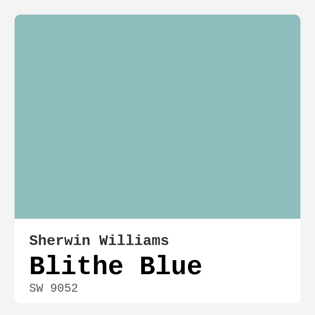
Color Preview & Key Details
| HEX Code | #90BDBD |
| RGB | 144, 189, 189 |
| LRV | 66% |
| Undertone | Blue |
| Finish Options | Eggshell, Matte, Satin |
Imagine stepping into a space that feels like a gentle breeze on a warm day, where the calming hues of the water and sky wrap around you like a soft embrace. That’s precisely the kind of atmosphere Blithe Blue (SW 9052) brings to your home. This serene color from Sherwin Williams is a delightful blend of blue and green, creating a tranquil ambiance that can effortlessly transform any room into a peaceful retreat.
When you first lay eyes on Blithe Blue, you might notice its refreshing quality. It’s reminiscent of calm waters, evoking a sense of serenity that makes you want to kick off your shoes and relax. With a Light Reflectance Value (LRV) of 66%, this color reflects a high amount of light, giving your space an airy feel. It’s perfect for those who want to brighten up their interiors without overwhelming them with brightness.
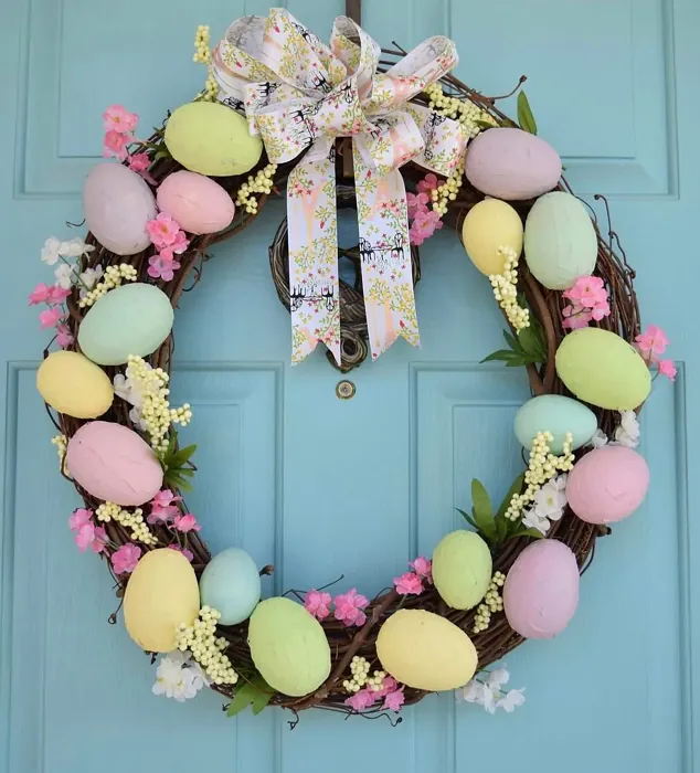
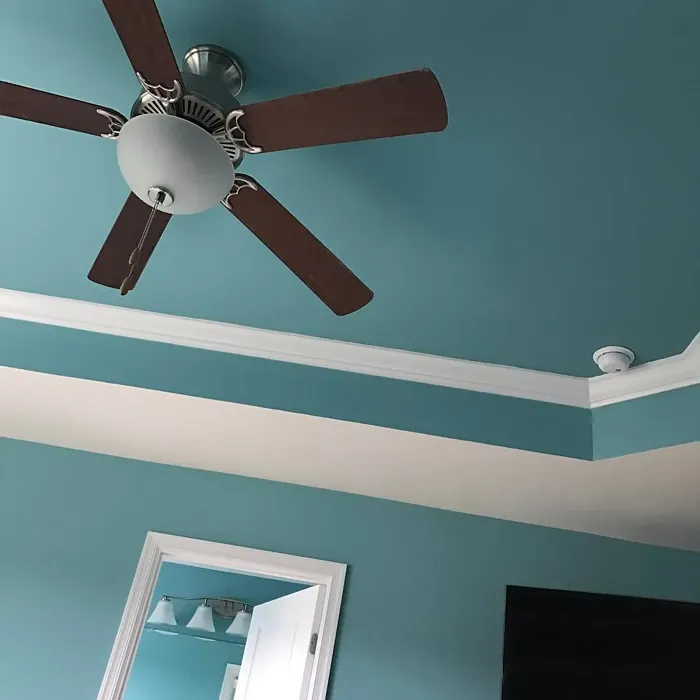
Blithe Blue shines in various rooms. Imagine waking up in a bedroom painted this soothing hue; it invites a sense of tranquility that can make even the busiest mornings feel more peaceful. In the living room, it can create an inviting atmosphere for family gatherings or quiet evenings with a book. This color also works wonders in kitchens and bathrooms, where a refreshing vibe is always welcome. Its versatility means it can adapt to different decor styles, whether you’re going for coastal chic, modern simplicity, Scandinavian minimalism, or a transitional look.
One of the standout features of Blithe Blue is its ease of application. Whether you’re a seasoned DIYer or a beginner picking up a paintbrush for the first time, this paint glides on smoothly. It’s roller-ready and brush-friendly, making your painting project more enjoyable. The coverage is dependable too; expect to achieve a flawless finish with just one or two coats. Plus, it’s touch-up friendly, so maintaining that perfect look is a breeze.
When choosing a finish for Blithe Blue, consider what atmosphere you want to create. An eggshell or satin finish offers a soft sheen that enhances the color’s beauty without being overpowering. If you’re leaning towards a more casual vibe, a matte finish might be just what you need, especially in cozy spaces like bedrooms. The finish you choose can subtly influence the mood of the room, so take a moment to think about this before diving in.
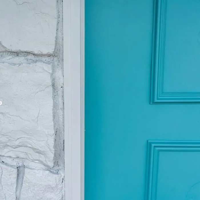
But let’s talk about the nature of the color itself. The undertones of Blithe Blue lean cool, which can create an inviting yet invigorating atmosphere. In bright light, it appears airy and vibrant, almost like a clear sky. However, it’s worth noting that this color may appear darker in dim lighting. If you’re working with a small or poorly lit space, consider pairing it with bright white trim or accents to help open up the area and bring in more light.
When it comes to pairing Blithe Blue with other colors, the options are abundant. It harmonizes beautifully with shades like SW 6280 and SW 6013, and it can be complemented by warm tones like brass fixtures that add a touch of elegance. The contrast between cool and warm can create a dynamic and inviting atmosphere, perfect for making a statement without feeling too bold.
Blithe Blue’s eco-friendly attributes are an added bonus. With a low VOC content, you can paint with peace of mind, knowing that you’re making a healthier choice for your home. It’s also highly washable, which is fantastic for busy households or homes with kids and pets. Life can get messy, but with Blithe Blue, clean-up is a simple wipe away.
This versatile shade also finds its way into trending styles for 2025, making it a designer favorite. Whether you’re preparing to sell your home or simply refreshing your space, Blithe Blue can enhance your property’s appeal. It’s not just a color; it’s an investment in creating a calm, inviting atmosphere that potential buyers will adore.
Now, let’s address a few common questions about using Blithe Blue. If you’re wondering about its suitability for small rooms, it’s essential to consider the lighting. While this color can work in smaller spaces, dim lighting can make it feel a touch more enclosed. If you’re in love with the hue, you might consider using it in larger rooms or as an accent wall to highlight its beauty effectively.
To ensure you’re happy with your color choice, always test Blithe Blue in your space. Paint a sample on the wall and observe how it interacts with your existing furniture and flooring throughout the day. The subtle shifts in light can dramatically influence the way the color appears, making it crucial to see it in different conditions.
In terms of mood, Blithe Blue brings a calm, inviting, and restful vibe to your home. It’s the kind of color that feels good to be around. If you want a space that feels rejuvenating and serene, this is definitely the color for you.
In closing, Blithe Blue is more than just a paint color; it’s a versatile shade that can transform your living environment into a peaceful haven. Its soothing qualities, easy application, and eco-friendly properties make it an excellent choice for any homeowner looking to create a personalized, beautiful interior. So, why not take the plunge and bring this tranquil hue into your home? You might just find that it’s the perfect touch to elevate your space into a serene retreat.
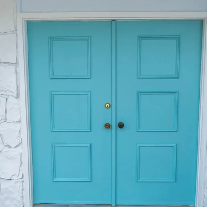
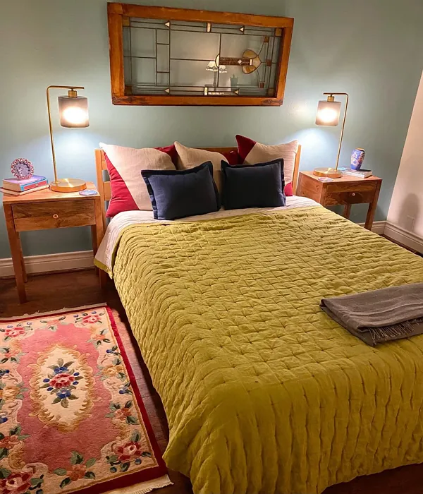
Real Room Photo of Blithe Blue SW 9052
Undertones of Blithe Blue ?
The undertones of Blithe Blue are a key aspect of its character, leaning towards Blue. These subtle underlying hues are what give the color its depth and complexity. For example, a gray with a blue undertone will feel cooler and more modern, while one with a brown undertone will feel warmer and more traditional. It’s essential to test this paint in your home and observe it next to your existing furniture, flooring, and decor to see how these undertones interact and reveal themselves throughout the day.
HEX value: #90BDBD
RGB code: 144, 189, 189
Is Blithe Blue Cool or Warm?
This paint leans cool, with its refreshing blue and green tones creating an inviting yet crisp atmosphere. It’s perfect for spaces where you want to feel relaxed and rejuvenated, offering a breezy vibe that complements both modern and traditional decor.
Understanding Color Properties and Interior Design Tips
Hue refers to a specific position on the color wheel, measured in degrees from 0 to 360. Each degree represents a different pure color:
- 0° represents red
- 120° represents green
- 240° represents blue
Saturation describes the intensity or purity of a color and is expressed as a percentage:
- At 0%, the color appears completely desaturated—essentially a shade of gray
- At 100%, the color is at its most vivid and vibrant
Lightness indicates how light or dark a color is, also expressed as a percentage:
- 0% lightness results in black
- 100% lightness results in white
Using Warm Colors in Interior Design
Warm hues—such as reds, oranges, yellows, warm beiges, and greiges—are excellent choices for creating inviting and energetic spaces. These colors are particularly well-suited for:
- Kitchens, living rooms, and bathrooms, where warmth enhances comfort and sociability
- Large rooms, where warm tones can help reduce the sense of emptiness and make the space feel more intimate
For example:
- Warm beige shades provide a cozy, inviting atmosphere, ideal for living rooms, bedrooms, and hallways.
- Warm greige (a mix of beige and gray) offers the warmth of beige with the modern appeal of gray, making it a versatile backdrop for dining areas, bedrooms, and living spaces.
However, be mindful when using warm light tones in rooms with limited natural light. These shades may appear muted or even take on an unpleasant yellowish tint. To avoid a dull or flat appearance:
- Add depth by incorporating richer tones like deep greens, charcoal, or chocolate brown
- Use textured elements such as curtains, rugs, or cushions to bring dimension to the space
Pro Tip: Achieving Harmony with Warm and Cool Color Balance
To create a well-balanced and visually interesting interior, mix warm and cool tones strategically. This contrast adds depth and harmony to your design.
- If your walls feature warm hues, introduce cool-colored accents such as blue or green furniture, artwork, or accessories to create contrast.
- For a polished look, consider using a complementary color scheme, which pairs colors opposite each other on the color wheel (e.g., red with green, orange with blue).
This thoughtful mix not only enhances visual appeal but also creates a space that feels both dynamic and cohesive.
Light Temperature Affects on Blithe Blue
Natural Light
Natural daylight changes in color temperature as the sun moves across the sky. At sunrise and sunset, the light tends to have a warm, golden tone with a color temperature around 2000 Kelvin (K). As the day progresses and the sun rises higher, the light becomes cooler and more neutral. Around midday, especially when the sky is clear, natural light typically reaches its peak brightness and shifts to a cooler tone, ranging from 5500 to 6500 Kelvin. This midday light is close to what we perceive as pure white or daylight-balanced light.
These shifts in natural light can significantly influence how colors appear in a space, which is why designers often consider both the time of day and the orientation of windows when planning interior color schemes.
Artificial Light
When choosing artificial lighting, pay close attention to the color temperature, measured in Kelvin (K). This determines how warm or cool the light will appear. Lower temperatures, around 2700K, give off a warm, yellow glow often used in living rooms or bedrooms. Higher temperatures, above 5000K, create a cool, bluish light similar to daylight, commonly used in kitchens, offices, or task areas.
Use the slider to see how lighting temperature can affect the appearance of a surface or color throughout a space.


4800K
LRV of Blithe Blue
The Light Reflectance Value (LRV) of Blithe Blue is 66%, which places it in the Light category. This means it Reflects a high amount of light. Understanding a paint’s LRV is crucial for predicting how it will look in your space. A higher LRV indicates a lighter color that reflects more light, making rooms feel larger and brighter. A lower LRV signifies a darker color that absorbs more light, creating a cozier, more intimate atmosphere. Always consider the natural and artificial lighting in your room when selecting a paint color based on its LRV.
Detailed Review of Blithe Blue
Additional Paint Characteristics
Ideal Rooms
Bedroom, Dining Room, Home Office, Kitchen, Living Room
Decor Styles
Coastal, Modern, Scandinavian, Transitional
Coverage
Good (1–2 Coats), Touch-Up Friendly
Ease of Application
Beginner Friendly, Brush Smooth, Fast-Drying, Roller-Ready
Washability
Highly Washable, Washable, Wipeable
VOC Level
Eco-Certified, Low VOC
Best Use
Accent Wall, Furniture, Interior Walls
Room Suitability
Bathroom, Bedroom, Kitchen, Living Room
Tone Tag
Airy, Cool, Muted
Finish Type
Eggshell, Matte, Satin
Paint Performance
Easy Touch-Up, Low Odor, Quick Drying, Scuff Resistant
Use Cases
Best for Modern Farmhouse, Best for Rentals, Best for Selling Your Home, Designer Favorite, Trending in 2025
Mood
Calm, Inviting, Restful
Trim Pairing
Complements Brass Fixtures, Matches Pure White, Pairs with White Dove
Blithe Blue is a refreshing choice for homeowners looking to create a peaceful environment. Its soft, muted tone reflects light beautifully, enhancing the overall feel of a room. When applied, it offers a smooth finish that glides on effortlessly, whether you’re using a roller or brush. Expect a coverage that’s dependable, typically requiring only one to two coats for a flawless appearance. Additionally, its versatility allows it to blend seamlessly with a variety of furnishings and decor, making it an excellent choice for open-concept spaces or cozy rooms alike. Overall, Blithe Blue stands out for its calming effect and timeless appeal, making it a go-to for anyone wanting to refresh their interiors.
Pros & Cons of SW 9052 Blithe Blue
Pros
Cons
Colors that go with Sherwin Williams Blithe Blue
FAQ on SW 9052 Blithe Blue
What type of finish is best for Blithe Blue?
Blithe Blue works beautifully in a variety of finishes, but for a soft and inviting look, consider using an eggshell or satin finish. These finishes provide a subtle sheen that enhances the color without overwhelming it. If you’re looking for a more casual vibe, a matte finish can also work well, especially in bedrooms or cozy spaces. Ultimately, the best finish depends on the room’s purpose and the look you want to achieve.
Can Blithe Blue be used in small rooms?
While Blithe Blue can be used in small rooms, it’s important to consider the lighting. In very small or dimly lit spaces, it may make the room feel a bit enclosed due to its cool undertones. If you love the color, consider pairing it with bright white trim or accents to help open up the space. Alternatively, using it in a larger room can create a refreshing and airy feel that’s both inviting and sophisticated.
Comparisons Blithe Blue with other colors
Blithe Blue SW 9052 vs Dutch Tile Blue SW 0031
| Attribute | Blithe Blue SW 9052 | Dutch Tile Blue SW 0031 |
|---|---|---|
| Color Name | Blithe Blue SW 9052 | Dutch Tile Blue SW 0031 |
| Color | ||
| Hue | Blue | Blue |
| Brightness | Medium | Medium |
| RGB | 144, 189, 189 | 154, 171, 171 |
| LRV | 66% | 24% |
| Finish Type | Eggshell, Matte, Satin | Eggshell, Matte, Satin |
| Finish Options | Eggshell, Matte, Satin | Eggshell, Flat, Matte, Satin |
| Ideal Rooms | Bedroom, Dining Room, Home Office, Kitchen, Living Room | Bathroom, Bedroom, Dining Room, Hallway, Home Office, Kitchen, Living Room |
| Decor Styles | Coastal, Modern, Scandinavian, Transitional | Coastal, Modern Farmhouse, Scandinavian, Traditional, Transitional |
| Coverage | Good (1–2 Coats), Touch-Up Friendly | Good (1–2 Coats) |
| Ease of Application | Beginner Friendly, Brush Smooth, Fast-Drying, Roller-Ready | Beginner Friendly, Brush Smooth, Fast-Drying, Roller-Ready |
| Washability | Highly Washable, Washable, Wipeable | Highly Washable, Washable |
| Room Suitability | Bathroom, Bedroom, Kitchen, Living Room | Bathroom, Bedroom, Dining Room, Kitchen, Living Room |
| Tone | Airy, Cool, Muted | Balanced, Cool, Muted |
| Paint Performance | Easy Touch-Up, Low Odor, Quick Drying, Scuff Resistant | Easy Touch-Up, High Coverage, Low Odor, Quick Drying |
Blithe Blue SW 9052 vs Debonair SW 9139
| Attribute | Blithe Blue SW 9052 | Debonair SW 9139 |
|---|---|---|
| Color Name | Blithe Blue SW 9052 | Debonair SW 9139 |
| Color | ||
| Hue | Blue | Blue |
| Brightness | Medium | Medium |
| RGB | 144, 189, 189 | 144, 160, 166 |
| LRV | 66% | 30% |
| Finish Type | Eggshell, Matte, Satin | Eggshell, Matte, Satin |
| Finish Options | Eggshell, Matte, Satin | Eggshell, Matte, Satin |
| Ideal Rooms | Bedroom, Dining Room, Home Office, Kitchen, Living Room | Bedroom, Dining Room, Home Office, Living Room |
| Decor Styles | Coastal, Modern, Scandinavian, Transitional | Coastal, Industrial, Modern, Transitional |
| Coverage | Good (1–2 Coats), Touch-Up Friendly | Good (1–2 Coats) |
| Ease of Application | Beginner Friendly, Brush Smooth, Fast-Drying, Roller-Ready | Beginner Friendly, Brush Smooth, Roller-Ready |
| Washability | Highly Washable, Washable, Wipeable | Washable, Wipeable |
| Room Suitability | Bathroom, Bedroom, Kitchen, Living Room | Bedroom, Dining Room, Home Office, Living Room |
| Tone | Airy, Cool, Muted | Balanced, Cool, Muted |
| Paint Performance | Easy Touch-Up, Low Odor, Quick Drying, Scuff Resistant | Easy Touch-Up, Low Odor, Quick Drying |
Blithe Blue SW 9052 vs Stardew SW 9138
| Attribute | Blithe Blue SW 9052 | Stardew SW 9138 |
|---|---|---|
| Color Name | Blithe Blue SW 9052 | Stardew SW 9138 |
| Color | ||
| Hue | Blue | Blue |
| Brightness | Medium | Medium |
| RGB | 144, 189, 189 | 166, 178, 181 |
| LRV | 66% | 30% |
| Finish Type | Eggshell, Matte, Satin | Eggshell, Satin |
| Finish Options | Eggshell, Matte, Satin | Eggshell, Matte, Satin |
| Ideal Rooms | Bedroom, Dining Room, Home Office, Kitchen, Living Room | Bathroom, Bedroom, Home Office, Living Room, Nursery |
| Decor Styles | Coastal, Modern, Scandinavian, Transitional | Coastal, Farmhouse, Modern, Scandinavian |
| Coverage | Good (1–2 Coats), Touch-Up Friendly | Good (1–2 Coats) |
| Ease of Application | Beginner Friendly, Brush Smooth, Fast-Drying, Roller-Ready | Beginner Friendly, Brush Smooth, Roller-Ready |
| Washability | Highly Washable, Washable, Wipeable | Highly Washable, Washable, Wipeable |
| Room Suitability | Bathroom, Bedroom, Kitchen, Living Room | Bathroom, Bedroom, Home Office, Living Room |
| Tone | Airy, Cool, Muted | Calm, Cool, Muted |
| Paint Performance | Easy Touch-Up, Low Odor, Quick Drying, Scuff Resistant | Easy Touch-Up, High Coverage, Low Odor |
Blithe Blue SW 9052 vs Niebla Azul SW 9137
| Attribute | Blithe Blue SW 9052 | Niebla Azul SW 9137 |
|---|---|---|
| Color Name | Blithe Blue SW 9052 | Niebla Azul SW 9137 |
| Color | ||
| Hue | Blue | Blue |
| Brightness | Medium | Medium |
| RGB | 144, 189, 189 | 182, 195, 196 |
| LRV | 66% | 48% |
| Finish Type | Eggshell, Matte, Satin | Eggshell, Matte, Satin |
| Finish Options | Eggshell, Matte, Satin | Eggshell, Matte, Satin |
| Ideal Rooms | Bedroom, Dining Room, Home Office, Kitchen, Living Room | Bedroom, Home Office, Living Room, Nursery |
| Decor Styles | Coastal, Modern, Scandinavian, Transitional | Coastal, Modern, Scandinavian, Transitional |
| Coverage | Good (1–2 Coats), Touch-Up Friendly | Good (1–2 Coats), Touch-Up Friendly |
| Ease of Application | Beginner Friendly, Brush Smooth, Fast-Drying, Roller-Ready | Beginner Friendly, Brush Smooth, Roller-Ready |
| Washability | Highly Washable, Washable, Wipeable | Highly Washable, Washable |
| Room Suitability | Bathroom, Bedroom, Kitchen, Living Room | Bedroom, Home Office, Living Room, Nursery |
| Tone | Airy, Cool, Muted | Airy, Cool, Muted |
| Paint Performance | Easy Touch-Up, Low Odor, Quick Drying, Scuff Resistant | Easy Touch-Up, Fade Resistant, Low Odor, Scuff Resistant |
Blithe Blue SW 9052 vs Rain SW 6219
| Attribute | Blithe Blue SW 9052 | Rain SW 6219 |
|---|---|---|
| Color Name | Blithe Blue SW 9052 | Rain SW 6219 |
| Color | ||
| Hue | Blue | Blue |
| Brightness | Medium | Medium |
| RGB | 144, 189, 189 | 171, 190, 191 |
| LRV | 66% | 50% |
| Finish Type | Eggshell, Matte, Satin | Eggshell, Matte, Satin |
| Finish Options | Eggshell, Matte, Satin | Eggshell, Matte, Satin |
| Ideal Rooms | Bedroom, Dining Room, Home Office, Kitchen, Living Room | Bathroom, Bedroom, Home Office, Living Room, Nursery |
| Decor Styles | Coastal, Modern, Scandinavian, Transitional | Coastal, Minimalist, Modern, Scandinavian, Transitional |
| Coverage | Good (1–2 Coats), Touch-Up Friendly | Good (1–2 Coats), Touch-Up Friendly |
| Ease of Application | Beginner Friendly, Brush Smooth, Fast-Drying, Roller-Ready | Beginner Friendly, Brush Smooth, Fast-Drying, Roller-Ready |
| Washability | Highly Washable, Washable, Wipeable | Scrubbable, Stain Resistant, Washable |
| Room Suitability | Bathroom, Bedroom, Kitchen, Living Room | Bathroom, Bedroom, Home Office, Living Room, Nursery |
| Tone | Airy, Cool, Muted | Balanced, Cool, Muted |
| Paint Performance | Easy Touch-Up, Low Odor, Quick Drying, Scuff Resistant | Easy Touch-Up, Low Odor, Quick Drying, Stain Resistant |
Blithe Blue SW 9052 vs Morning at Sea SW 9634
| Attribute | Blithe Blue SW 9052 | Morning at Sea SW 9634 |
|---|---|---|
| Color Name | Blithe Blue SW 9052 | Morning at Sea SW 9634 |
| Color | ||
| Hue | Blue | Blue |
| Brightness | Medium | Medium |
| RGB | 144, 189, 189 | 130, 151, 155 |
| LRV | 66% | 50% |
| Finish Type | Eggshell, Matte, Satin | Eggshell, Matte |
| Finish Options | Eggshell, Matte, Satin | Eggshell, Matte, Satin |
| Ideal Rooms | Bedroom, Dining Room, Home Office, Kitchen, Living Room | Bathroom, Bedroom, Home Office, Living Room |
| Decor Styles | Coastal, Modern, Scandinavian, Transitional | Coastal, Minimalist, Modern, Scandinavian |
| Coverage | Good (1–2 Coats), Touch-Up Friendly | Good (1–2 Coats), Touch-Up Friendly |
| Ease of Application | Beginner Friendly, Brush Smooth, Fast-Drying, Roller-Ready | Beginner Friendly, Brush Smooth, Roller-Ready |
| Washability | Highly Washable, Washable, Wipeable | Washable, Wipeable |
| Room Suitability | Bathroom, Bedroom, Kitchen, Living Room | Bathroom, Bedroom, Home Office, Living Room |
| Tone | Airy, Cool, Muted | Airy, Cool, Muted |
| Paint Performance | Easy Touch-Up, Low Odor, Quick Drying, Scuff Resistant | Easy Touch-Up, Fade Resistant, Low Odor |
Blithe Blue SW 9052 vs Sleepy Blue SW 6225
| Attribute | Blithe Blue SW 9052 | Sleepy Blue SW 6225 |
|---|---|---|
| Color Name | Blithe Blue SW 9052 | Sleepy Blue SW 6225 |
| Color | ||
| Hue | Blue | Blue |
| Brightness | Medium | Medium |
| RGB | 144, 189, 189 | 188, 203, 206 |
| LRV | 66% | 50% |
| Finish Type | Eggshell, Matte, Satin | Eggshell, Matte, Satin |
| Finish Options | Eggshell, Matte, Satin | Eggshell, Matte, Satin |
| Ideal Rooms | Bedroom, Dining Room, Home Office, Kitchen, Living Room | Bedroom, Home Office, Living Room, Nursery |
| Decor Styles | Coastal, Modern, Scandinavian, Transitional | Coastal, Minimalist, Modern Farmhouse, Scandinavian |
| Coverage | Good (1–2 Coats), Touch-Up Friendly | Good (1–2 Coats) |
| Ease of Application | Beginner Friendly, Brush Smooth, Fast-Drying, Roller-Ready | Beginner Friendly, Brush Smooth, Fast-Drying, Roller-Ready |
| Washability | Highly Washable, Washable, Wipeable | Highly Washable, Washable |
| Room Suitability | Bathroom, Bedroom, Kitchen, Living Room | Bedroom, Home Office, Living Room, Nursery |
| Tone | Airy, Cool, Muted | Airy, Cool, Muted |
| Paint Performance | Easy Touch-Up, Low Odor, Quick Drying, Scuff Resistant | Easy Touch-Up, Low Odor, Quick Drying, Scuff Resistant |
Blithe Blue SW 9052 vs Lakeside SW 9683
| Attribute | Blithe Blue SW 9052 | Lakeside SW 9683 |
|---|---|---|
| Color Name | Blithe Blue SW 9052 | Lakeside SW 9683 |
| Color | ||
| Hue | Blue | Blue |
| Brightness | Medium | Medium |
| RGB | 144, 189, 189 | 173, 184, 192 |
| LRV | 66% | 24% |
| Finish Type | Eggshell, Matte, Satin | Eggshell, Matte, Satin |
| Finish Options | Eggshell, Matte, Satin | Eggshell, Matte, Satin |
| Ideal Rooms | Bedroom, Dining Room, Home Office, Kitchen, Living Room | Bathroom, Bedroom, Home Office, Living Room |
| Decor Styles | Coastal, Modern, Scandinavian, Transitional | Coastal, Minimalist, Modern, Rustic |
| Coverage | Good (1–2 Coats), Touch-Up Friendly | Good (1–2 Coats) |
| Ease of Application | Beginner Friendly, Brush Smooth, Fast-Drying, Roller-Ready | Beginner Friendly, Brush Smooth, Roller-Ready |
| Washability | Highly Washable, Washable, Wipeable | Scrubbable, Washable |
| Room Suitability | Bathroom, Bedroom, Kitchen, Living Room | Bathroom, Bedroom, Home Office, Living Room |
| Tone | Airy, Cool, Muted | Balanced, Cool, Muted |
| Paint Performance | Easy Touch-Up, Low Odor, Quick Drying, Scuff Resistant | Easy Touch-Up, Fade Resistant, High Coverage, Low Odor |
Blithe Blue SW 9052 vs Upward SW 6239
| Attribute | Blithe Blue SW 9052 | Upward SW 6239 |
|---|---|---|
| Color Name | Blithe Blue SW 9052 | Upward SW 6239 |
| Color | ||
| Hue | Blue | Blue |
| Brightness | Medium | Medium |
| RGB | 144, 189, 189 | 191, 201, 208 |
| LRV | 66% | 75% |
| Finish Type | Eggshell, Matte, Satin | Eggshell, Satin |
| Finish Options | Eggshell, Matte, Satin | Eggshell, Flat, Satin |
| Ideal Rooms | Bedroom, Dining Room, Home Office, Kitchen, Living Room | Bedroom, Dining Room, Home Office, Living Room, Nursery |
| Decor Styles | Coastal, Modern, Scandinavian, Transitional | Coastal, Minimalist, Modern, Scandinavian |
| Coverage | Good (1–2 Coats), Touch-Up Friendly | Good (1–2 Coats), Touch-Up Friendly |
| Ease of Application | Beginner Friendly, Brush Smooth, Fast-Drying, Roller-Ready | Beginner Friendly, Brush Smooth, Fast-Drying, Roller-Ready |
| Washability | Highly Washable, Washable, Wipeable | Washable, Wipeable |
| Room Suitability | Bathroom, Bedroom, Kitchen, Living Room | Bedroom, Home Office, Living Room, Nursery |
| Tone | Airy, Cool, Muted | Cool, Crisp, Muted |
| Paint Performance | Easy Touch-Up, Low Odor, Quick Drying, Scuff Resistant | High Coverage, Low Odor, Quick Drying |
Blithe Blue SW 9052 vs Aleutian SW 6241
| Attribute | Blithe Blue SW 9052 | Aleutian SW 6241 |
|---|---|---|
| Color Name | Blithe Blue SW 9052 | Aleutian SW 6241 |
| Color | ||
| Hue | Blue | Blue |
| Brightness | Medium | Medium |
| RGB | 144, 189, 189 | 152, 169, 183 |
| LRV | 66% | 24% |
| Finish Type | Eggshell, Matte, Satin | Eggshell, Matte, Satin |
| Finish Options | Eggshell, Matte, Satin | Eggshell, Matte, Satin |
| Ideal Rooms | Bedroom, Dining Room, Home Office, Kitchen, Living Room | Bathroom, Bedroom, Home Office, Kitchen, Living Room, Nursery |
| Decor Styles | Coastal, Modern, Scandinavian, Transitional | Coastal, Minimalist, Modern, Scandinavian, Transitional |
| Coverage | Good (1–2 Coats), Touch-Up Friendly | Good (1–2 Coats), Touch-Up Friendly |
| Ease of Application | Beginner Friendly, Brush Smooth, Fast-Drying, Roller-Ready | Beginner Friendly, Brush Smooth, Fast-Drying, Roller-Ready |
| Washability | Highly Washable, Washable, Wipeable | Scrubbable, Stain Resistant, Washable |
| Room Suitability | Bathroom, Bedroom, Kitchen, Living Room | Bathroom, Bedroom, Home Office, Living Room, Nursery |
| Tone | Airy, Cool, Muted | Airy, Balanced, Cool, Muted |
| Paint Performance | Easy Touch-Up, Low Odor, Quick Drying, Scuff Resistant | Easy Touch-Up, Fade Resistant, Low Odor, Quick Drying |
Official Page of Sherwin Williams Blithe Blue SW 9052