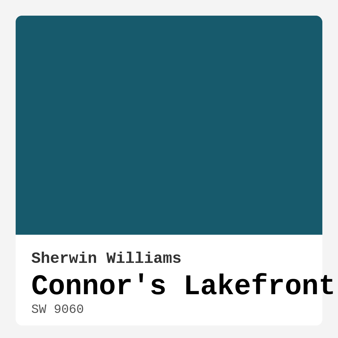
Color Preview & Key Details
| HEX Code | #175A6C |
| RGB | 23, 90, 108 |
| LRV | 12% |
| Undertone | Blue |
| Finish Options | Eggshell, Matte, Satin |
Imagine stepping into a room that instantly wraps you in a sense of tranquility, invoking the calmness of a serene lakeside retreat. That’s the magic of Connor’s Lakefront, a captivating paint color by Sherwin Williams that embodies deep teal tones reminiscent of tranquil waters. Let’s explore this beautiful hue and see why it might just be the perfect addition to your home.
Connor’s Lakefront, with its color code SW 9060, is a rich, dark blue that creates an inviting atmosphere in any space. This shade doesn’t just occupy a wall; it transforms a room into a peaceful haven. The LRV, or Light Reflectance Value, of 12% tells us this color doesn’t reflect much light, lending itself to creating cozy, intimate spaces. But don’t let this deter you; with the right lighting and decor, it can be the hero of your design.
When considering a color like Connor’s Lakefront, think about the emotions and moods you want to evoke in your home. This shade is cool, deep, and earthy, making it an ideal choice for spaces dedicated to relaxation and grounding. Whether you’re revamping a living room, a bedroom, or even a home office, Connor’s Lakefront brings with it a sense of calm that is hard to find in brighter colors.
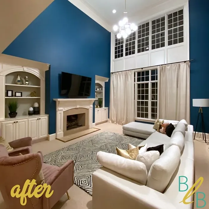
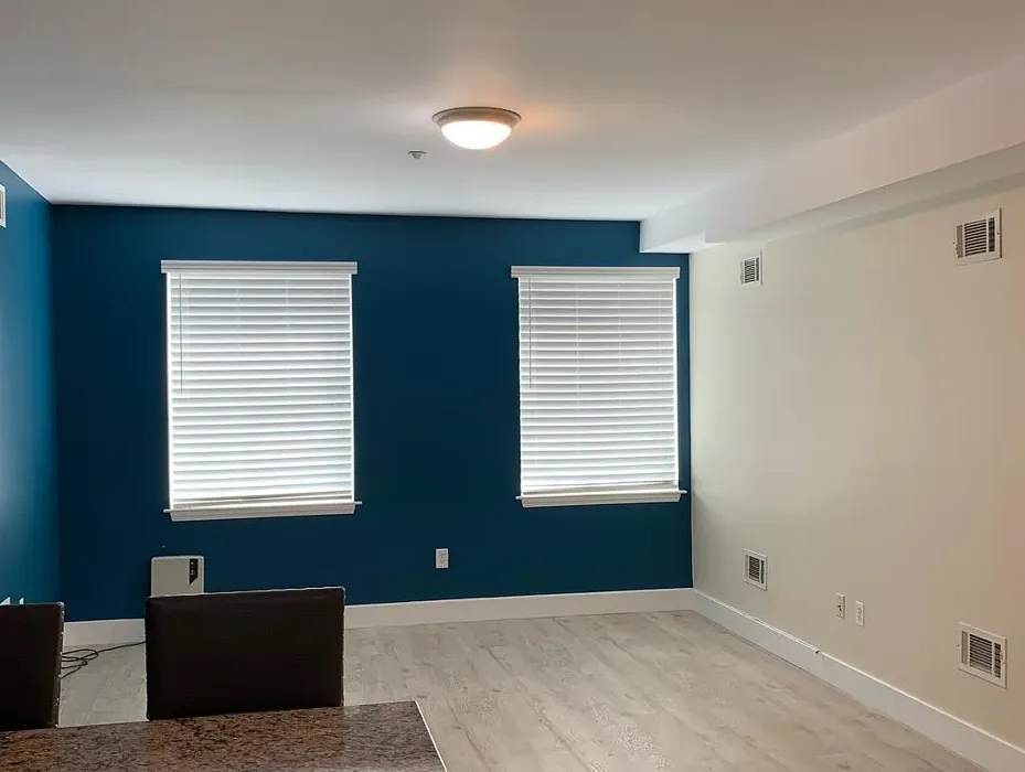
Think about your living room—a space where you gather with family and friends. Imagine those deep teal walls, paired with soft white trim that creates a stunning contrast. The richness of Connor’s Lakefront can serve as a beautiful backdrop for natural wood furniture, brass fixtures, and those cozy textiles that make a room feel homey. It’s a color that effortlessly complements various decor styles, from coastal and modern to rustic and Scandinavian.
Moving into the bedroom, this deep hue can create an oasis of comfort. Picture waking up every morning in a space enveloped by this serene color, where you feel a sense of peace and relaxation. Pair it with lighter bedding and soft textures to create a tranquil retreat. The blue undertones of Connor’s Lakefront lend a sophisticated vibe, enhancing the overall elegance of your space.
For those who work from home, the home office is vital for productivity. Connor’s Lakefront can bring focus and clarity, enhancing your creative flow. The color’s calming effect makes it easier to concentrate, allowing you to tackle tasks without distractions. Use this hue for an accent wall or to paint your desk and shelves for a cohesive look that inspires productivity.
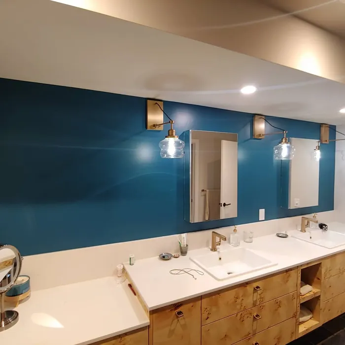
Now let’s talk about bathrooms. There’s something refreshing about a deep, cool color in a space where you seek relaxation. Connor’s Lakefront creates a spa-like atmosphere, especially when combined with white fixtures and natural textures. Think of wood accents or soft, woven baskets that bring warmth to this cool tone. It’s an ideal choice for creating an upscale feel without the need for a complete remodel.
But you might wonder about the challenges of using such a deep color, particularly in smaller spaces. While Connor’s Lakefront can darken a room, it can still shine in compact areas if you pay attention to lighting and decor. Make sure to incorporate plenty of natural light, and consider using mirrors to reflect light and make the space feel larger. Lighter accents and decor will also help mitigate any feelings of enclosure, allowing the color to envelop the room in a cozy embrace rather than overwhelming it.
When applying Connor’s Lakefront, you’ll find it beginner-friendly, rolling on smoothly with little fuss. The application process is straightforward, and you can easily achieve a professional-looking finish without needing advanced skills. Its washability and scrubbable nature mean that maintaining the beauty of this color is effortless—perfect for homes with kids or pets.
If you’re curious about the finishes, Connor’s Lakefront excels in eggshell or satin finishes. These options provide durability while enhancing the color’s depth with a gentle sheen. For lower-traffic areas, feel free to use a matte finish, which can create a more subdued look.
Now, let’s explore some complementary shades that can elevate your design. Colors like SW 6287 or SW 2927 can create a stunning palette alongside Connor’s Lakefront, allowing you to experiment with accents that add character and personality. You might consider using these shades for furniture, artwork, or decorative accessories that bring the whole room together.
As you think about how Connor’s Lakefront fits into your home, remember that it’s not just about the color itself; it’s about how it interacts with your existing decor. Testing the paint in your space is crucial. Observe how it looks in natural light during different times of the day. This will give you a true sense of its character and how it plays with your furnishings.
One of the significant advantages of Connor’s Lakefront is its versatility. It’s not just a color; it’s a mood. Whether you’re aiming for a modern farmhouse vibe or a classic coastal retreat, this paint can adapt. Its earthy quality grounds your decor while inviting a sense of nature into your home.
To maintain its inviting allure, remember to keep the space well-lit. Connor’s Lakefront can shift in appearance based on the light in the room—under natural light, it can appear vibrant and refreshing, while artificial lighting might highlight its deeper, moodier aspects.
In conclusion, Connor’s Lakefront is more than just a paint color; it’s a versatile tool for transforming your home into a serene sanctuary. With its calming depth, it invites peace and tranquility into any space, making it an excellent choice for a personal retreat.
So, as you embark on your next home project, consider how this stunning color can enhance your space, elevate your mood, and create a harmonious balance in your home. Whether you use it in a living room, bedroom, or bathroom, Connor’s Lakefront is sure to become a favorite hue that you’ll cherish for years to come. Let it wash over your walls and experience the transformation it brings to your home.
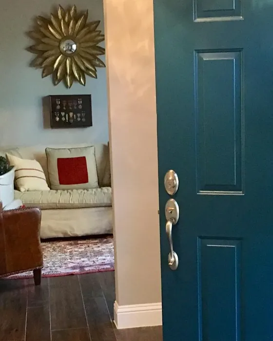
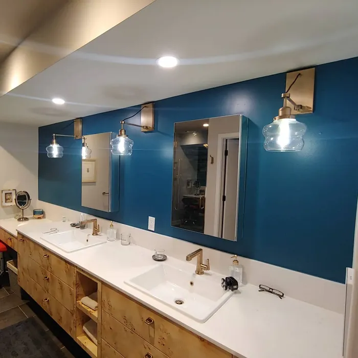
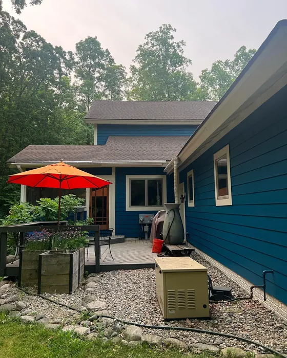
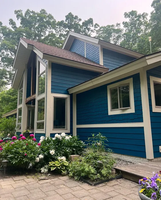
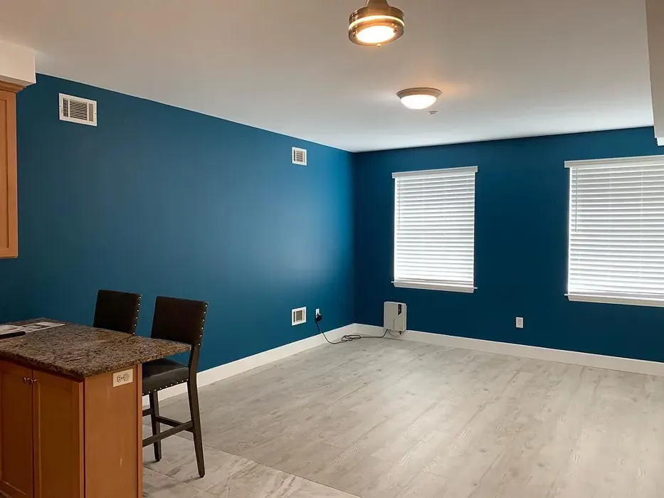
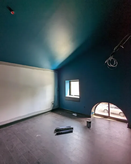
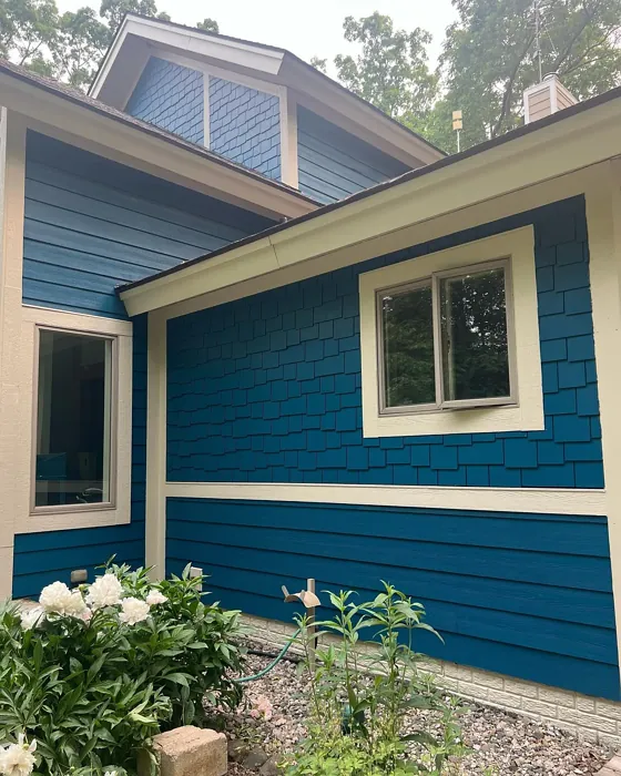
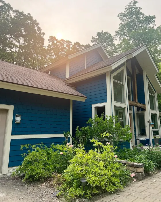
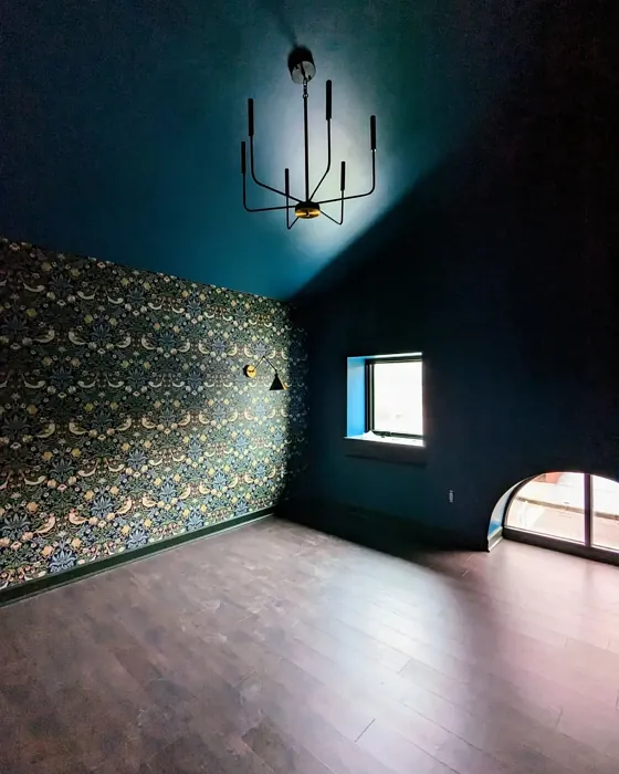
Real Room Photo of Connor’s Lakefront SW 9060


Undertones of Connor’s Lakefront ?
The undertones of Connor’s Lakefront are a key aspect of its character, leaning towards Blue. These subtle underlying hues are what give the color its depth and complexity. For example, a gray with a blue undertone will feel cooler and more modern, while one with a brown undertone will feel warmer and more traditional. It’s essential to test this paint in your home and observe it next to your existing furniture, flooring, and decor to see how these undertones interact and reveal themselves throughout the day.
HEX value: #175A6C
RGB code: 23, 90, 108
Is Connor’s Lakefront Cool or Warm?
Connor’s Lakefront is considered a cool paint color. This characteristic plays a huge role in the overall feel of a room. Cool colors, like this one, tend to create a cozy, inviting, and energetic atmosphere, making them great for social spaces like living rooms and dining rooms. In contrast, warm colors often evoke a sense of calm and serenity, which is why they are popular in bedrooms and bathrooms. The coolth of Connor’s Lakefront means it will pair beautifully with corresponding decor elements.
Understanding Color Properties and Interior Design Tips
Hue refers to a specific position on the color wheel, measured in degrees from 0 to 360. Each degree represents a different pure color:
- 0° represents red
- 120° represents green
- 240° represents blue
Saturation describes the intensity or purity of a color and is expressed as a percentage:
- At 0%, the color appears completely desaturated—essentially a shade of gray
- At 100%, the color is at its most vivid and vibrant
Lightness indicates how light or dark a color is, also expressed as a percentage:
- 0% lightness results in black
- 100% lightness results in white
Using Warm Colors in Interior Design
Warm hues—such as reds, oranges, yellows, warm beiges, and greiges—are excellent choices for creating inviting and energetic spaces. These colors are particularly well-suited for:
- Kitchens, living rooms, and bathrooms, where warmth enhances comfort and sociability
- Large rooms, where warm tones can help reduce the sense of emptiness and make the space feel more intimate
For example:
- Warm beige shades provide a cozy, inviting atmosphere, ideal for living rooms, bedrooms, and hallways.
- Warm greige (a mix of beige and gray) offers the warmth of beige with the modern appeal of gray, making it a versatile backdrop for dining areas, bedrooms, and living spaces.
However, be mindful when using warm light tones in rooms with limited natural light. These shades may appear muted or even take on an unpleasant yellowish tint. To avoid a dull or flat appearance:
- Add depth by incorporating richer tones like deep greens, charcoal, or chocolate brown
- Use textured elements such as curtains, rugs, or cushions to bring dimension to the space
Pro Tip: Achieving Harmony with Warm and Cool Color Balance
To create a well-balanced and visually interesting interior, mix warm and cool tones strategically. This contrast adds depth and harmony to your design.
- If your walls feature warm hues, introduce cool-colored accents such as blue or green furniture, artwork, or accessories to create contrast.
- For a polished look, consider using a complementary color scheme, which pairs colors opposite each other on the color wheel (e.g., red with green, orange with blue).
This thoughtful mix not only enhances visual appeal but also creates a space that feels both dynamic and cohesive.
Light Temperature Affects on Connor’s Lakefront
Natural Light
Natural daylight changes in color temperature as the sun moves across the sky. At sunrise and sunset, the light tends to have a warm, golden tone with a color temperature around 2000 Kelvin (K). As the day progresses and the sun rises higher, the light becomes cooler and more neutral. Around midday, especially when the sky is clear, natural light typically reaches its peak brightness and shifts to a cooler tone, ranging from 5500 to 6500 Kelvin. This midday light is close to what we perceive as pure white or daylight-balanced light.
These shifts in natural light can significantly influence how colors appear in a space, which is why designers often consider both the time of day and the orientation of windows when planning interior color schemes.
Artificial Light
When choosing artificial lighting, pay close attention to the color temperature, measured in Kelvin (K). This determines how warm or cool the light will appear. Lower temperatures, around 2700K, give off a warm, yellow glow often used in living rooms or bedrooms. Higher temperatures, above 5000K, create a cool, bluish light similar to daylight, commonly used in kitchens, offices, or task areas.
Use the slider to see how lighting temperature can affect the appearance of a surface or color throughout a space.


4800K
LRV of Connor’s Lakefront
The Light Reflectance Value (LRV) of Connor’s Lakefront is 12%, which places it in the Dark colors category. This means it does not reflect light. Understanding a paint’s LRV is crucial for predicting how it will look in your space. A higher LRV indicates a lighter color that reflects more light, making rooms feel larger and brighter. A lower LRV signifies a darker color that absorbs more light, creating a cozier, more intimate atmosphere. Always consider the natural and artificial lighting in your room when selecting a paint color based on its LRV.
Detailed Review of Connor’s Lakefront
Additional Paint Characteristics
Ideal Rooms
Bathroom, Bedroom, Hallway, Home Office, Living Room
Decor Styles
Coastal, Modern, Rustic, Scandinavian
Coverage
Good (1–2 Coats), Touch-Up Friendly
Ease of Application
Beginner Friendly, Brush Smooth, Roller-Ready
Washability
Scrubbable, Washable
VOC Level
Low VOC
Best Use
Accent Wall, Furniture, Interior Walls
Room Suitability
Bathroom, Bedroom, Home Office, Living Room
Tone Tag
Cool, Deep, Earthy
Finish Type
Eggshell, Matte, Satin
Paint Performance
Easy Touch-Up, High Coverage, Low Odor
Use Cases
Best for Modern Farmhouse, Best for Open Concept, Classic Favorite
Mood
Calm, Grounding, Inviting
Trim Pairing
Complements Brass Fixtures, Good with Wood Trim, Pairs with White Dove
Connor’s Lakefront is more than just a paint color; it’s a statement. The rich teal hue is both calming and sophisticated, making it an excellent choice for spaces where relaxation is key. It pairs beautifully with natural wood finishes and soft whites, creating a harmonious balance that feels both modern and timeless. Whether you’re updating a small bathroom or creating a cozy reading nook, this color invites tranquility into your home. Additionally, its versatility allows it to fit seamlessly into various decor styles, from coastal chic to rustic farmhouse. The application process is straightforward, and the finish is smooth and even, leaving you with a professional look without a professional’s touch.
Pros & Cons of SW 9060 Connor’s Lakefront
Pros
Cons
Colors that go with Sherwin Williams Connor’s Lakefront
FAQ on SW 9060 Connor’s Lakefront
Can Connor’s Lakefront be used in small spaces?
Absolutely! While Connor’s Lakefront has a deep hue, it can work beautifully in small spaces if paired with the right lighting and decor. To prevent the room from feeling too enclosed, consider using lighter accents and ensuring ample natural light. Mirrors can also help reflect light and make the space feel larger.
What finishes are best for Connor’s Lakefront?
Connor’s Lakefront works well in a variety of finishes, but for most interiors, an eggshell or satin finish is recommended. These finishes offer durability and washability while providing a soft sheen that enhances the color’s depth. Matte finishes can be used for ceilings or low-traffic areas where durability isn’t as crucial.
Comparisons Connor’s Lakefront with other colors
Connor's Lakefront SW 9060 vs Naval SW 6244
| Attribute | Connor's Lakefront SW 9060 | Naval SW 6244 |
|---|---|---|
| Color Name | Connor's Lakefront SW 9060 | Naval SW 6244 |
| Color | ||
| Hue | Blue | Blue |
| Brightness | Dark | Dark |
| RGB | 23, 90, 108 | 47, 61, 76 |
| LRV | 12% | 4% |
| Finish Type | Eggshell, Matte, Satin | Matte, Satin, Semi-Gloss |
| Finish Options | Eggshell, Matte, Satin | Matte, Satin, Semi-Gloss |
| Ideal Rooms | Bathroom, Bedroom, Hallway, Home Office, Living Room | Bedroom, Dining Room, Hallway, Home Office, Living Room |
| Decor Styles | Coastal, Modern, Rustic, Scandinavian | Coastal, Industrial, Minimalist, Modern, Traditional |
| Coverage | Good (1–2 Coats), Touch-Up Friendly | Good (1–2 Coats), Self-Priming |
| Ease of Application | Beginner Friendly, Brush Smooth, Roller-Ready | Beginner Friendly, Brush Smooth, Roller-Ready |
| Washability | Scrubbable, Washable | Highly Washable, Washable |
| Room Suitability | Bathroom, Bedroom, Home Office, Living Room | Bedroom, Dining Room, Entryway, Home Office, Living Room |
| Tone | Cool, Deep, Earthy | Cool, Deep, Moody |
| Paint Performance | Easy Touch-Up, High Coverage, Low Odor | Easy Touch-Up, High Coverage, Low Odor, Scuff Resistant |
Connor's Lakefront SW 9060 vs Sea Serpent SW 7615
| Attribute | Connor's Lakefront SW 9060 | Sea Serpent SW 7615 |
|---|---|---|
| Color Name | Connor's Lakefront SW 9060 | Sea Serpent SW 7615 |
| Color | ||
| Hue | Blue | Blue |
| Brightness | Dark | Dark |
| RGB | 23, 90, 108 | 62, 75, 84 |
| LRV | 12% | 12% |
| Finish Type | Eggshell, Matte, Satin | Eggshell, Matte, Satin |
| Finish Options | Eggshell, Matte, Satin | Eggshell, Matte, Satin |
| Ideal Rooms | Bathroom, Bedroom, Hallway, Home Office, Living Room | Bathroom, Bedroom, Home Office, Living Room |
| Decor Styles | Coastal, Modern, Rustic, Scandinavian | Coastal, Farmhouse, Industrial, Modern |
| Coverage | Good (1–2 Coats), Touch-Up Friendly | Good (1–2 Coats), Touch-Up Friendly |
| Ease of Application | Beginner Friendly, Brush Smooth, Roller-Ready | Beginner Friendly, Brush Smooth, Roller-Ready |
| Washability | Scrubbable, Washable | Highly Washable, Washable |
| Room Suitability | Bathroom, Bedroom, Home Office, Living Room | Bathroom, Bedroom, Home Office, Living Room |
| Tone | Cool, Deep, Earthy | Cool, Deep, Moody |
| Paint Performance | Easy Touch-Up, High Coverage, Low Odor | Easy Touch-Up, High Coverage, Low Odor |
Connor's Lakefront SW 9060 vs Rain Cloud SW 9639
| Attribute | Connor's Lakefront SW 9060 | Rain Cloud SW 9639 |
|---|---|---|
| Color Name | Connor's Lakefront SW 9060 | Rain Cloud SW 9639 |
| Color | ||
| Hue | Blue | Blue |
| Brightness | Dark | Dark |
| RGB | 23, 90, 108 | 83, 97, 104 |
| LRV | 12% | 30% |
| Finish Type | Eggshell, Matte, Satin | Eggshell, Matte, Satin |
| Finish Options | Eggshell, Matte, Satin | Eggshell, Matte, Satin |
| Ideal Rooms | Bathroom, Bedroom, Hallway, Home Office, Living Room | Bedroom, Dining Room, Home Office, Living Room |
| Decor Styles | Coastal, Modern, Rustic, Scandinavian | Coastal, Contemporary, Minimalist, Scandinavian |
| Coverage | Good (1–2 Coats), Touch-Up Friendly | Good (1–2 Coats), Touch-Up Friendly |
| Ease of Application | Beginner Friendly, Brush Smooth, Roller-Ready | Beginner Friendly, Brush Smooth, Roller-Ready |
| Washability | Scrubbable, Washable | Highly Washable, Washable |
| Room Suitability | Bathroom, Bedroom, Home Office, Living Room | Bedroom, Home Office, Living Room |
| Tone | Cool, Deep, Earthy | Balanced, Cool, Muted |
| Paint Performance | Easy Touch-Up, High Coverage, Low Odor | Easy Touch-Up, Fade Resistant, Low Odor |
Connor's Lakefront SW 9060 vs Indigo Batik SW 7602
| Attribute | Connor's Lakefront SW 9060 | Indigo Batik SW 7602 |
|---|---|---|
| Color Name | Connor's Lakefront SW 9060 | Indigo Batik SW 7602 |
| Color | ||
| Hue | Blue | Blue |
| Brightness | Dark | Dark |
| RGB | 23, 90, 108 | 62, 80, 99 |
| LRV | 12% | 10% |
| Finish Type | Eggshell, Matte, Satin | Matte, Satin |
| Finish Options | Eggshell, Matte, Satin | Eggshell, Flat, Matte, Satin |
| Ideal Rooms | Bathroom, Bedroom, Hallway, Home Office, Living Room | Bedroom, Dining Room, Home Office, Living Room |
| Decor Styles | Coastal, Modern, Rustic, Scandinavian | Bohemian, Coastal, Contemporary, Modern |
| Coverage | Good (1–2 Coats), Touch-Up Friendly | Good (1–2 Coats), Touch-Up Friendly |
| Ease of Application | Beginner Friendly, Brush Smooth, Roller-Ready | Brush Smooth, Fast-Drying, Roller-Ready |
| Washability | Scrubbable, Washable | Scrubbable, Washable, Wipeable |
| Room Suitability | Bathroom, Bedroom, Home Office, Living Room | Bedroom, Dining Room, Home Office, Living Room |
| Tone | Cool, Deep, Earthy | Cool, Deep, Moody |
| Paint Performance | Easy Touch-Up, High Coverage, Low Odor | Easy Touch-Up, High Coverage, Low Odor, Quick Drying |
Connor's Lakefront SW 9060 vs Sea Mariner SW 9640
| Attribute | Connor's Lakefront SW 9060 | Sea Mariner SW 9640 |
|---|---|---|
| Color Name | Connor's Lakefront SW 9060 | Sea Mariner SW 9640 |
| Color | ||
| Hue | Blue | Blue |
| Brightness | Dark | Dark |
| RGB | 23, 90, 108 | 67, 74, 84 |
| LRV | 12% | 6% |
| Finish Type | Eggshell, Matte, Satin | Eggshell, Matte, Satin |
| Finish Options | Eggshell, Matte, Satin | Eggshell, Matte, Satin |
| Ideal Rooms | Bathroom, Bedroom, Hallway, Home Office, Living Room | Bedroom, Dining Room, Hallway, Home Office, Living Room |
| Decor Styles | Coastal, Modern, Rustic, Scandinavian | Coastal, Industrial, Minimalist, Modern |
| Coverage | Good (1–2 Coats), Touch-Up Friendly | Good (1–2 Coats) |
| Ease of Application | Beginner Friendly, Brush Smooth, Roller-Ready | Beginner Friendly, Brush Smooth, Roller-Ready |
| Washability | Scrubbable, Washable | Scrubbable, Washable |
| Room Suitability | Bathroom, Bedroom, Home Office, Living Room | Bedroom, Dining Room, Home Office, Living Room |
| Tone | Cool, Deep, Earthy | Cool, Deep, Moody |
| Paint Performance | Easy Touch-Up, High Coverage, Low Odor | Easy Touch-Up, Low Odor, Quick Drying |
Connor's Lakefront SW 9060 vs Still Water SW 6223
| Attribute | Connor's Lakefront SW 9060 | Still Water SW 6223 |
|---|---|---|
| Color Name | Connor's Lakefront SW 9060 | Still Water SW 6223 |
| Color | ||
| Hue | Blue | Blue |
| Brightness | Dark | Dark |
| RGB | 23, 90, 108 | 74, 93, 95 |
| LRV | 12% | 48% |
| Finish Type | Eggshell, Matte, Satin | Eggshell, Matte, Satin |
| Finish Options | Eggshell, Matte, Satin | Eggshell, Matte, Satin |
| Ideal Rooms | Bathroom, Bedroom, Hallway, Home Office, Living Room | Bedroom, Dining Room, Home Office, Living Room, Nursery |
| Decor Styles | Coastal, Modern, Rustic, Scandinavian | Coastal, Contemporary, Farmhouse, Modern, Rustic |
| Coverage | Good (1–2 Coats), Touch-Up Friendly | Good (1–2 Coats), Touch-Up Friendly |
| Ease of Application | Beginner Friendly, Brush Smooth, Roller-Ready | Beginner Friendly, Brush Smooth, Roller-Ready |
| Washability | Scrubbable, Washable | Highly Washable, Washable |
| Room Suitability | Bathroom, Bedroom, Home Office, Living Room | Bedroom, Dining Room, Home Office, Living Room |
| Tone | Cool, Deep, Earthy | Cool, Earthy, Muted |
| Paint Performance | Easy Touch-Up, High Coverage, Low Odor | Easy Touch-Up, Fade Resistant, Low Odor |
Connor's Lakefront SW 9060 vs Waterloo SW 9141
| Attribute | Connor's Lakefront SW 9060 | Waterloo SW 9141 |
|---|---|---|
| Color Name | Connor's Lakefront SW 9060 | Waterloo SW 9141 |
| Color | ||
| Hue | Blue | Blue |
| Brightness | Dark | Dark |
| RGB | 23, 90, 108 | 83, 104, 114 |
| LRV | 12% | 12% |
| Finish Type | Eggshell, Matte, Satin | Matte, Satin |
| Finish Options | Eggshell, Matte, Satin | Matte, Satin, Semi-Gloss |
| Ideal Rooms | Bathroom, Bedroom, Hallway, Home Office, Living Room | Bedroom, Dining Room, Hallway, Home Office, Living Room |
| Decor Styles | Coastal, Modern, Rustic, Scandinavian | Coastal, Industrial, Modern, Rustic |
| Coverage | Good (1–2 Coats), Touch-Up Friendly | Good (1–2 Coats), Touch-Up Friendly |
| Ease of Application | Beginner Friendly, Brush Smooth, Roller-Ready | Brush Smooth, Fast-Drying, Roller-Ready |
| Washability | Scrubbable, Washable | Scrubbable, Washable |
| Room Suitability | Bathroom, Bedroom, Home Office, Living Room | Bedroom, Dining Room, Home Office, Living Room |
| Tone | Cool, Deep, Earthy | Balanced, Cool, Muted |
| Paint Performance | Easy Touch-Up, High Coverage, Low Odor | Easy Touch-Up, Fade Resistant, Low Odor, Quick Drying |
Connor's Lakefront SW 9060 vs Smoky Blue SW 7604
| Attribute | Connor's Lakefront SW 9060 | Smoky Blue SW 7604 |
|---|---|---|
| Color Name | Connor's Lakefront SW 9060 | Smoky Blue SW 7604 |
| Color | ||
| Hue | Blue | Blue |
| Brightness | Dark | Dark |
| RGB | 23, 90, 108 | 89, 110, 121 |
| LRV | 12% | 15% |
| Finish Type | Eggshell, Matte, Satin | Eggshell, Matte, Satin |
| Finish Options | Eggshell, Matte, Satin | Eggshell, Matte, Satin |
| Ideal Rooms | Bathroom, Bedroom, Hallway, Home Office, Living Room | Bathroom, Bedroom, Home Office, Kitchen, Living Room |
| Decor Styles | Coastal, Modern, Rustic, Scandinavian | Coastal, Modern, Scandinavian, Transitional |
| Coverage | Good (1–2 Coats), Touch-Up Friendly | Good (1–2 Coats), Touch-Up Friendly |
| Ease of Application | Beginner Friendly, Brush Smooth, Roller-Ready | Beginner Friendly, Brush Smooth, Roller-Ready |
| Washability | Scrubbable, Washable | Highly Washable, Washable |
| Room Suitability | Bathroom, Bedroom, Home Office, Living Room | Bathroom, Bedroom, Home Office, Living Room |
| Tone | Cool, Deep, Earthy | Cool, Dusty, Muted |
| Paint Performance | Easy Touch-Up, High Coverage, Low Odor | High Coverage, Low Odor, Quick Drying |
Connor's Lakefront SW 9060 vs Needlepoint Navy SW 0032
| Attribute | Connor's Lakefront SW 9060 | Needlepoint Navy SW 0032 |
|---|---|---|
| Color Name | Connor's Lakefront SW 9060 | Needlepoint Navy SW 0032 |
| Color | ||
| Hue | Blue | Blue |
| Brightness | Dark | Dark |
| RGB | 23, 90, 108 | 84, 102, 112 |
| LRV | 12% | 4% |
| Finish Type | Eggshell, Matte, Satin | Matte, Satin, Semi-Gloss |
| Finish Options | Eggshell, Matte, Satin | Matte, Satin, Semi-Gloss |
| Ideal Rooms | Bathroom, Bedroom, Hallway, Home Office, Living Room | Bedroom, Dining Room, Entryway, Home Office, Living Room |
| Decor Styles | Coastal, Modern, Rustic, Scandinavian | Coastal, Contemporary, Modern Farmhouse, Nautical, Traditional |
| Coverage | Good (1–2 Coats), Touch-Up Friendly | Good (1–2 Coats), Touch-Up Friendly |
| Ease of Application | Beginner Friendly, Brush Smooth, Roller-Ready | Beginner Friendly, Brush Smooth, Fast-Drying, Roller-Ready |
| Washability | Scrubbable, Washable | Scrubbable, Washable |
| Room Suitability | Bathroom, Bedroom, Home Office, Living Room | Bedroom, Dining Room, Home Office, Living Room |
| Tone | Cool, Deep, Earthy | Cool, Deep, Muted |
| Paint Performance | Easy Touch-Up, High Coverage, Low Odor | Easy Touch-Up, High Coverage, Low Odor, Quick Drying, Stain Resistant |
Connor's Lakefront SW 9060 vs Riverway SW 6222
| Attribute | Connor's Lakefront SW 9060 | Riverway SW 6222 |
|---|---|---|
| Color Name | Connor's Lakefront SW 9060 | Riverway SW 6222 |
| Color | ||
| Hue | Blue | Blue |
| Brightness | Dark | Dark |
| RGB | 23, 90, 108 | 93, 114, 116 |
| LRV | 12% | 24% |
| Finish Type | Eggshell, Matte, Satin | Eggshell, Satin |
| Finish Options | Eggshell, Matte, Satin | Eggshell, Matte, Satin |
| Ideal Rooms | Bathroom, Bedroom, Hallway, Home Office, Living Room | Bathroom, Bedroom, Dining Room, Home Office, Living Room |
| Decor Styles | Coastal, Modern, Rustic, Scandinavian | Coastal, Contemporary, Eclectic, Modern, Rustic |
| Coverage | Good (1–2 Coats), Touch-Up Friendly | Good (1–2 Coats), Touch-Up Friendly |
| Ease of Application | Beginner Friendly, Brush Smooth, Roller-Ready | Beginner Friendly, Brush Smooth, Fast-Drying, Low Splatter, Roller-Ready |
| Washability | Scrubbable, Washable | Highly Washable, Washable |
| Room Suitability | Bathroom, Bedroom, Home Office, Living Room | Bathroom, Bedroom, Home Office, Living Room |
| Tone | Cool, Deep, Earthy | Balanced, Cool, Muted |
| Paint Performance | Easy Touch-Up, High Coverage, Low Odor | Easy Touch-Up, High Coverage, Low Odor, Quick Drying |
Official Page of Sherwin Williams Connor’s Lakefront SW 9060