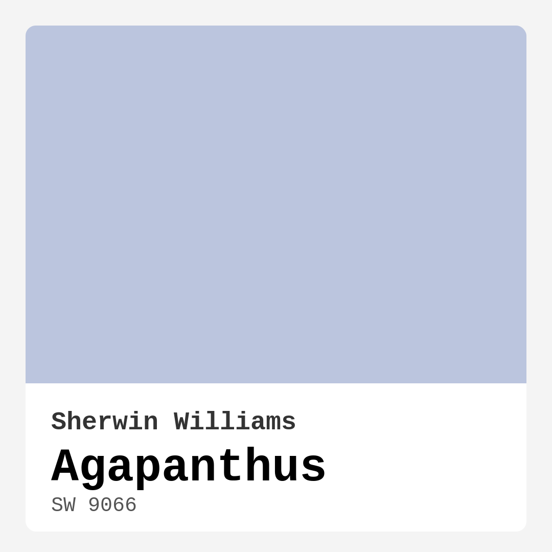
Color Preview & Key Details
| HEX Code | #BBC5DE |
| RGB | 187, 197, 222 |
| LRV | 15% |
| Undertone | Blue |
| Finish Options | Eggshell, Matte, Satin |
Imagine stepping into a room that envelops you in calmness, where the stress of the day seems to melt away as soon as you cross the threshold. That’s the magic of the color Agapanthus by Sherwin Williams. This soft, serene shade of blue, adorned with subtle gray undertones, has a way of transforming any space into a tranquil haven.
Picture a nursery filled with gentle light, where a sleepy baby is cradled in a peaceful atmosphere. Or envision your home office, painted Agapanthus, inviting creativity while still providing a serene backdrop for focus. This color is not just paint; it’s a mood, a feeling, a gentle embrace of tranquility.
Agapanthus, with its hex code #BBC5DE and RGB values of 187, 197, 222, is perfect for those who appreciate a color that whispers elegance rather than shouts for attention. It’s been carefully crafted to evoke feelings of calmness and sophistication, making it an ideal choice for bedrooms, living rooms, nurseries, and home offices alike.
One of the standout characteristics of Agapanthus is its versatility. Its medium brightness and low light reflectance value of 15% means it can create an intimate, cozy atmosphere, while still feeling airy and inviting. This makes it particularly well-suited for spaces where you want to create a sense of openness without overwhelming the senses.
When you apply Agapanthus, you’ll notice how it gently interacts with natural light. In bright rooms, it can appear soft and airy, while in dimmer spaces, it may lean a bit cooler. That’s something to keep in mind when selecting your paint. Always test it in your own lighting conditions to see how it evolves throughout the day.
One of the reasons I love Agapanthus is its incredible compatibility with various decor styles. Whether you’re drawn to modern, coastal, Scandinavian, or minimalist aesthetics, this color serves as a beautiful backdrop. It pairs wonderfully with crisp whites, such as Pure White or White Dove, for a fresh look. If you want to bring in a more organic feel, consider complementing it with natural wood trim. This adds warmth and character, creating a harmonious balance in your space.
Now, let’s talk about application. Agapanthus is beginner-friendly, meaning you don’t need to be a paint pro to get a great finish. It goes on smoothly with both rollers and brushes, and with good coverage in just one to two coats, you’ll find it touch-up friendly as well. Plus, it’s washable and wipeable, making it practical for everyday living, especially in spaces like nurseries or home offices where you might need to clean the walls from time to time.
While there’s so much to love about Agapanthus, it’s important to consider its nuances. The color can look cooler in dim lighting, so if you’re painting a small space, pay attention to how the light interacts with the hue. However, don’t let that deter you—Agapanthus can actually make smaller rooms feel more open and airy, creating a sense of spaciousness that invites you in.
When you’re choosing a color, think about how it resonates with your existing furniture and decor. The undertones in Agapanthus are subtle but significant; they lean toward blue, which can evoke a refreshing ambiance. This is particularly effective in spaces meant for relaxation or focus. Whether you’re looking to create a serene bedroom or a peaceful home office, Agapanthus offers a versatile, soothing backdrop that enhances your decor rather than competing with it.
As you plan your project, consider what complementary shades might work well with Agapanthus. Colors like SW 7077, SW 7635, and SW 7026 can harmonize beautifully, allowing you to create a cohesive look throughout your home. If you’re seeking a bit of contrast, think about incorporating soft oranges or coral accents to provide a warm pop against the coolness of Agapanthus.
One of the most fabulous things about this hue is its ability to set the mood. You’ll find that it imbues spaces with a calm, inviting, and restful vibe. It’s the kind of color that makes you want to curl up with a good book or have a cozy chat with a friend over coffee. That’s why it’s become a designer favorite for low-light rooms and small spaces—there’s something inherently comforting about it.
So, as you’re embarking on your home decor journey, consider the gentle elegance of Agapanthus. Its soft, muted tone, combined with the ease of application and versatility, makes it a fantastic choice for anyone looking to create a personalized, beautiful interior. Remember to take your time, test the colors in your space, and embrace the transformative power that paint can have. You might find that Agapanthus is just the color you’ve been waiting for to bring your vision to life.
In the end, your home should reflect who you are and how you want to feel in your space. Agapanthus offers an intimate, sophisticated backdrop that invites serenity and elegance, making it a perfect choice for various rooms and styles. So, grab that paintbrush and let Agapanthus help you create the tranquil haven you’ve always dreamed of.
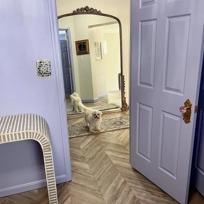
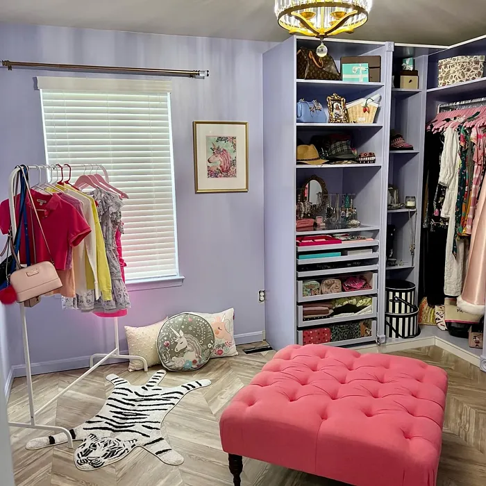
Real Room Photo of Agapanthus SW 9066
Undertones of Agapanthus ?
The undertones of Agapanthus are a key aspect of its character, leaning towards Blue. These subtle underlying hues are what give the color its depth and complexity. For example, a gray with a blue undertone will feel cooler and more modern, while one with a brown undertone will feel warmer and more traditional. It’s essential to test this paint in your home and observe it next to your existing furniture, flooring, and decor to see how these undertones interact and reveal themselves throughout the day.
HEX value: #BBC5DE
RGB code: 187, 197, 222
Is Agapanthus Cool or Warm?
Agapanthus leans cool, thanks to its blue and gray undertones. This makes it an excellent choice for spaces where you want to foster a tranquil, refreshing atmosphere.
Understanding Color Properties and Interior Design Tips
Hue refers to a specific position on the color wheel, measured in degrees from 0 to 360. Each degree represents a different pure color:
- 0° represents red
- 120° represents green
- 240° represents blue
Saturation describes the intensity or purity of a color and is expressed as a percentage:
- At 0%, the color appears completely desaturated—essentially a shade of gray
- At 100%, the color is at its most vivid and vibrant
Lightness indicates how light or dark a color is, also expressed as a percentage:
- 0% lightness results in black
- 100% lightness results in white
Using Warm Colors in Interior Design
Warm hues—such as reds, oranges, yellows, warm beiges, and greiges—are excellent choices for creating inviting and energetic spaces. These colors are particularly well-suited for:
- Kitchens, living rooms, and bathrooms, where warmth enhances comfort and sociability
- Large rooms, where warm tones can help reduce the sense of emptiness and make the space feel more intimate
For example:
- Warm beige shades provide a cozy, inviting atmosphere, ideal for living rooms, bedrooms, and hallways.
- Warm greige (a mix of beige and gray) offers the warmth of beige with the modern appeal of gray, making it a versatile backdrop for dining areas, bedrooms, and living spaces.
However, be mindful when using warm light tones in rooms with limited natural light. These shades may appear muted or even take on an unpleasant yellowish tint. To avoid a dull or flat appearance:
- Add depth by incorporating richer tones like deep greens, charcoal, or chocolate brown
- Use textured elements such as curtains, rugs, or cushions to bring dimension to the space
Pro Tip: Achieving Harmony with Warm and Cool Color Balance
To create a well-balanced and visually interesting interior, mix warm and cool tones strategically. This contrast adds depth and harmony to your design.
- If your walls feature warm hues, introduce cool-colored accents such as blue or green furniture, artwork, or accessories to create contrast.
- For a polished look, consider using a complementary color scheme, which pairs colors opposite each other on the color wheel (e.g., red with green, orange with blue).
This thoughtful mix not only enhances visual appeal but also creates a space that feels both dynamic and cohesive.
Light Temperature Affects on Agapanthus
Natural Light
Natural daylight changes in color temperature as the sun moves across the sky. At sunrise and sunset, the light tends to have a warm, golden tone with a color temperature around 2000 Kelvin (K). As the day progresses and the sun rises higher, the light becomes cooler and more neutral. Around midday, especially when the sky is clear, natural light typically reaches its peak brightness and shifts to a cooler tone, ranging from 5500 to 6500 Kelvin. This midday light is close to what we perceive as pure white or daylight-balanced light.
These shifts in natural light can significantly influence how colors appear in a space, which is why designers often consider both the time of day and the orientation of windows when planning interior color schemes.
Artificial Light
When choosing artificial lighting, pay close attention to the color temperature, measured in Kelvin (K). This determines how warm or cool the light will appear. Lower temperatures, around 2700K, give off a warm, yellow glow often used in living rooms or bedrooms. Higher temperatures, above 5000K, create a cool, bluish light similar to daylight, commonly used in kitchens, offices, or task areas.
Use the slider to see how lighting temperature can affect the appearance of a surface or color throughout a space.


4800K
LRV of Agapanthus
The Light Reflectance Value (LRV) of Agapanthus is 15%, which places it in the Medium Dark category. This means it reflects very little light. Understanding a paint’s LRV is crucial for predicting how it will look in your space. A higher LRV indicates a lighter color that reflects more light, making rooms feel larger and brighter. A lower LRV signifies a darker color that absorbs more light, creating a cozier, more intimate atmosphere. Always consider the natural and artificial lighting in your room when selecting a paint color based on its LRV.
Detailed Review of Agapanthus
Additional Paint Characteristics
Ideal Rooms
Bedroom, Hallway, Home Office, Living Room, Nursery
Decor Styles
Coastal, Minimalist, Modern, Scandinavian
Coverage
Good (1–2 Coats), Touch-Up Friendly
Ease of Application
Beginner Friendly, Brush Smooth, Roller-Ready
Washability
Washable, Wipeable
VOC Level
Low VOC
Best Use
Accent Wall, Interior Walls, Small Spaces
Room Suitability
Bedroom, Home Office, Living Room, Nursery
Tone Tag
Airy, Cool, Muted
Finish Type
Eggshell, Matte, Satin
Paint Performance
Easy Touch-Up, Fade Resistant, Low Odor, Quick Drying
Use Cases
Best for Low Light Rooms, Best for Small Spaces, Designer Favorite
Mood
Calm, Inviting, Restful
Trim Pairing
Good with Wood Trim, Matches Pure White, Pairs with White Dove
Agapanthus is a dream for anyone wanting to achieve a serene vibe in their home. This soft blue has just enough gray in it to keep it grounded, making it incredibly versatile. Whether you’re painting an entire room or just an accent wall, Agapanthus provides a peaceful backdrop that pairs beautifully with both warm and cool decor styles. It reflects light gently, creating a calming effect that’s perfect for spaces meant for relaxation, such as bedrooms and nurseries. When applied, the color maintains its integrity, and the finish options available allow for a customized look that fits your personal style. You’ll find that it works fabulously with natural light, enhancing the room’s overall ambiance. If you’re looking for a color that soothes and invites, Agapanthus is a top contender.
Pros & Cons of SW 9066 Agapanthus
Pros
Cons
Colors that go with Sherwin Williams Agapanthus
FAQ on SW 9066 Agapanthus
Can Agapanthus be used in small spaces?
Absolutely! Agapanthus is a fantastic choice for small spaces. Its soft blue hue can make a room feel more open and airy, creating a sense of spaciousness. Just be mindful of the lighting, as it might lean cooler in dimmer areas, but overall, it brightens up smaller rooms beautifully.
What trim colors pair well with Agapanthus?
Agapanthus pairs beautifully with a variety of trim colors. For a fresh, crisp look, consider pairing it with Pure White or Simply White. If you’re looking for a more organic feel, it also complements wood trim exceptionally well, adding warmth and character to your space.
Comparisons Agapanthus with other colors
Agapanthus SW 9066 vs Dusty Heather SW 9073
| Attribute | Agapanthus SW 9066 | Dusty Heather SW 9073 |
|---|---|---|
| Color Name | Agapanthus SW 9066 | Dusty Heather SW 9073 |
| Color | ||
| Hue | Purple | Purple |
| Brightness | Medium | Medium |
| RGB | 187, 197, 222 | 137, 144, 163 |
| LRV | 15% | 30% |
| Finish Type | Eggshell, Matte, Satin | Eggshell, Matte, Satin |
| Finish Options | Eggshell, Matte, Satin | Eggshell, Matte, Satin |
| Ideal Rooms | Bedroom, Hallway, Home Office, Living Room, Nursery | Bedroom, Home Office, Living Room, Nursery |
| Decor Styles | Coastal, Minimalist, Modern, Scandinavian | Modern, Rustic, Scandinavian, Transitional |
| Coverage | Good (1–2 Coats), Touch-Up Friendly | Good (1–2 Coats), Touch-Up Friendly |
| Ease of Application | Beginner Friendly, Brush Smooth, Roller-Ready | Beginner Friendly, Brush Smooth, Roller-Ready |
| Washability | Washable, Wipeable | Washable, Wipeable |
| Room Suitability | Bedroom, Home Office, Living Room, Nursery | Bedroom, Home Office, Living Room, Nursery |
| Tone | Airy, Cool, Muted | Cool, Dusty, Muted |
| Paint Performance | Easy Touch-Up, Fade Resistant, Low Odor, Quick Drying | Easy Touch-Up, High Coverage, Low Odor |
Agapanthus SW 9066 vs Chaise Mauve SW 6016
| Attribute | Agapanthus SW 9066 | Chaise Mauve SW 6016 |
|---|---|---|
| Color Name | Agapanthus SW 9066 | Chaise Mauve SW 6016 |
| Color | ||
| Hue | Purple | Purple |
| Brightness | Medium | Medium |
| RGB | 187, 197, 222 | 193, 178, 179 |
| LRV | 15% | 24% |
| Finish Type | Eggshell, Matte, Satin | Eggshell, Matte, Satin |
| Finish Options | Eggshell, Matte, Satin | Eggshell, Matte, Satin |
| Ideal Rooms | Bedroom, Hallway, Home Office, Living Room, Nursery | Bedroom, Dining Room, Home Office, Living Room, Nursery |
| Decor Styles | Coastal, Minimalist, Modern, Scandinavian | Eclectic, Minimalist, Modern, Transitional, Vintage |
| Coverage | Good (1–2 Coats), Touch-Up Friendly | Good (1–2 Coats) |
| Ease of Application | Beginner Friendly, Brush Smooth, Roller-Ready | Beginner Friendly, Brush Smooth, Fast-Drying, Roller-Ready |
| Washability | Washable, Wipeable | Highly Washable, Washable, Wipeable |
| Room Suitability | Bedroom, Home Office, Living Room, Nursery | Bedroom, Dining Room, Home Office, Living Room, Nursery |
| Tone | Airy, Cool, Muted | Balanced, Dusty, Muted, Warm |
| Paint Performance | Easy Touch-Up, Fade Resistant, Low Odor, Quick Drying | Easy Touch-Up, Fade Resistant, Low Odor, Quick Drying |
Agapanthus SW 9066 vs Vesper Violet SW 6542
| Attribute | Agapanthus SW 9066 | Vesper Violet SW 6542 |
|---|---|---|
| Color Name | Agapanthus SW 9066 | Vesper Violet SW 6542 |
| Color | ||
| Hue | Purple | Purple |
| Brightness | Medium | Medium |
| RGB | 187, 197, 222 | 153, 160, 178 |
| LRV | 15% | 24% |
| Finish Type | Eggshell, Matte, Satin | Eggshell, Satin |
| Finish Options | Eggshell, Matte, Satin | Eggshell, Flat, Satin |
| Ideal Rooms | Bedroom, Hallway, Home Office, Living Room, Nursery | Bedroom, Home Office, Living Room, Nursery |
| Decor Styles | Coastal, Minimalist, Modern, Scandinavian | Bohemian, Modern, Scandinavian, Transitional |
| Coverage | Good (1–2 Coats), Touch-Up Friendly | Good (1–2 Coats), Touch-Up Friendly |
| Ease of Application | Beginner Friendly, Brush Smooth, Roller-Ready | Beginner Friendly, Brush Smooth, Roller-Ready |
| Washability | Washable, Wipeable | Stain Resistant, Washable |
| Room Suitability | Bedroom, Home Office, Living Room, Nursery | Bedroom, Home Office, Living Room, Nursery |
| Tone | Airy, Cool, Muted | Cool, Dusty, Muted |
| Paint Performance | Easy Touch-Up, Fade Resistant, Low Odor, Quick Drying | Easy Touch-Up, Fade Resistant, Low Odor |
Agapanthus SW 9066 vs Moonlit Orchid SW 9153
| Attribute | Agapanthus SW 9066 | Moonlit Orchid SW 9153 |
|---|---|---|
| Color Name | Agapanthus SW 9066 | Moonlit Orchid SW 9153 |
| Color | ||
| Hue | Purple | Purple |
| Brightness | Medium | Medium |
| RGB | 187, 197, 222 | 148, 145, 148 |
| LRV | 15% | 15% |
| Finish Type | Eggshell, Matte, Satin | Eggshell, Matte |
| Finish Options | Eggshell, Matte, Satin | Eggshell, Matte, Satin |
| Ideal Rooms | Bedroom, Hallway, Home Office, Living Room, Nursery | Bedroom, Home Office, Living Room, Nursery |
| Decor Styles | Coastal, Minimalist, Modern, Scandinavian | Bohemian, Minimalist, Modern, Transitional |
| Coverage | Good (1–2 Coats), Touch-Up Friendly | Good (1–2 Coats), Touch-Up Friendly |
| Ease of Application | Beginner Friendly, Brush Smooth, Roller-Ready | Beginner Friendly, Brush Smooth, Roller-Ready |
| Washability | Washable, Wipeable | Spot Clean Only, Washable |
| Room Suitability | Bedroom, Home Office, Living Room, Nursery | Bedroom, Home Office, Living Room, Nursery |
| Tone | Airy, Cool, Muted | Balanced, Cool, Muted |
| Paint Performance | Easy Touch-Up, Fade Resistant, Low Odor, Quick Drying | Easy Touch-Up, High Coverage, Low Odor |
Agapanthus SW 9066 vs Thistle SW 6283
| Attribute | Agapanthus SW 9066 | Thistle SW 6283 |
|---|---|---|
| Color Name | Agapanthus SW 9066 | Thistle SW 6283 |
| Color | ||
| Hue | Purple | Purple |
| Brightness | Medium | Medium |
| RGB | 187, 197, 222 | 170, 142, 154 |
| LRV | 15% | 66% |
| Finish Type | Eggshell, Matte, Satin | Eggshell, Matte, Satin |
| Finish Options | Eggshell, Matte, Satin | Eggshell, Matte, Satin |
| Ideal Rooms | Bedroom, Hallway, Home Office, Living Room, Nursery | Bedroom, Dining Room, Home Office, Living Room, Nursery |
| Decor Styles | Coastal, Minimalist, Modern, Scandinavian | Bohemian, Modern, Scandinavian, Vintage |
| Coverage | Good (1–2 Coats), Touch-Up Friendly | Good (1–2 Coats), Touch-Up Friendly |
| Ease of Application | Beginner Friendly, Brush Smooth, Roller-Ready | Beginner Friendly, Brush Smooth, Fast-Drying, Roller-Ready |
| Washability | Washable, Wipeable | Spot Clean Only, Washable, Wipeable |
| Room Suitability | Bedroom, Home Office, Living Room, Nursery | Bedroom, Home Office, Living Room, Nursery |
| Tone | Airy, Cool, Muted | Dusty, Muted, Warm |
| Paint Performance | Easy Touch-Up, Fade Resistant, Low Odor, Quick Drying | Easy Touch-Up, Fade Resistant, Long Lasting, Low Odor |
Agapanthus SW 9066 vs Grape Mist SW 6548
| Attribute | Agapanthus SW 9066 | Grape Mist SW 6548 |
|---|---|---|
| Color Name | Agapanthus SW 9066 | Grape Mist SW 6548 |
| Color | ||
| Hue | Purple | Purple |
| Brightness | Medium | Medium |
| RGB | 187, 197, 222 | 197, 192, 201 |
| LRV | 15% | 24% |
| Finish Type | Eggshell, Matte, Satin | Eggshell, Matte |
| Finish Options | Eggshell, Matte, Satin | Eggshell, Matte, Satin |
| Ideal Rooms | Bedroom, Hallway, Home Office, Living Room, Nursery | Bedroom, Home Office, Living Room, Nursery |
| Decor Styles | Coastal, Minimalist, Modern, Scandinavian | Modern, Rustic, Scandinavian, Transitional |
| Coverage | Good (1–2 Coats), Touch-Up Friendly | Good (1–2 Coats), Touch-Up Friendly |
| Ease of Application | Beginner Friendly, Brush Smooth, Roller-Ready | Beginner Friendly, Brush Smooth, Roller-Ready |
| Washability | Washable, Wipeable | Washable, Wipeable |
| Room Suitability | Bedroom, Home Office, Living Room, Nursery | Bedroom, Home Office, Living Room, Nursery |
| Tone | Airy, Cool, Muted | Cool, Muted, Pastel |
| Paint Performance | Easy Touch-Up, Fade Resistant, Low Odor, Quick Drying | Easy Touch-Up, Fade Resistant, Low Odor |
Agapanthus SW 9066 vs Intuitive SW 6017
| Attribute | Agapanthus SW 9066 | Intuitive SW 6017 |
|---|---|---|
| Color Name | Agapanthus SW 9066 | Intuitive SW 6017 |
| Color | ||
| Hue | Purple | Purple |
| Brightness | Medium | Medium |
| RGB | 187, 197, 222 | 179, 163, 165 |
| LRV | 15% | 30% |
| Finish Type | Eggshell, Matte, Satin | Eggshell, Matte, Satin |
| Finish Options | Eggshell, Matte, Satin | Eggshell, Matte, Satin |
| Ideal Rooms | Bedroom, Hallway, Home Office, Living Room, Nursery | Bedroom, Dining Room, Home Office, Living Room, Nursery |
| Decor Styles | Coastal, Minimalist, Modern, Scandinavian | Minimalist, Modern, Scandinavian, Transitional |
| Coverage | Good (1–2 Coats), Touch-Up Friendly | Good (1–2 Coats) |
| Ease of Application | Beginner Friendly, Brush Smooth, Roller-Ready | Beginner Friendly, Brush Smooth, Roller-Ready |
| Washability | Washable, Wipeable | Washable, Wipeable |
| Room Suitability | Bedroom, Home Office, Living Room, Nursery | Bedroom, Dining Room, Home Office, Living Room |
| Tone | Airy, Cool, Muted | Balanced, Muted, Warm |
| Paint Performance | Easy Touch-Up, Fade Resistant, Low Odor, Quick Drying | Easy Touch-Up, Low Odor, Quick Drying |
Agapanthus SW 9066 vs Veiled Violet SW 6268
| Attribute | Agapanthus SW 9066 | Veiled Violet SW 6268 |
|---|---|---|
| Color Name | Agapanthus SW 9066 | Veiled Violet SW 6268 |
| Color | ||
| Hue | Purple | Purple |
| Brightness | Medium | Medium |
| RGB | 187, 197, 222 | 189, 181, 185 |
| LRV | 15% | 24% |
| Finish Type | Eggshell, Matte, Satin | Eggshell, Matte, Satin |
| Finish Options | Eggshell, Matte, Satin | Eggshell, Matte, Satin |
| Ideal Rooms | Bedroom, Hallway, Home Office, Living Room, Nursery | Bedroom, Home Office, Living Room, Nursery |
| Decor Styles | Coastal, Minimalist, Modern, Scandinavian | Bohemian, Minimalist, Modern, Transitional |
| Coverage | Good (1–2 Coats), Touch-Up Friendly | Good (1–2 Coats), Touch-Up Friendly |
| Ease of Application | Beginner Friendly, Brush Smooth, Roller-Ready | Beginner Friendly, Brush Smooth, Fast-Drying, Roller-Ready |
| Washability | Washable, Wipeable | Highly Washable, Washable |
| Room Suitability | Bedroom, Home Office, Living Room, Nursery | Bedroom, Home Office, Living Room, Nursery |
| Tone | Airy, Cool, Muted | Airy, Cool, Dusty, Muted |
| Paint Performance | Easy Touch-Up, Fade Resistant, Low Odor, Quick Drying | Easy Touch-Up, Fade Resistant, Low Odor, Quick Drying |
Agapanthus SW 9066 vs Gris Morado SW 9156
| Attribute | Agapanthus SW 9066 | Gris Morado SW 9156 |
|---|---|---|
| Color Name | Agapanthus SW 9066 | Gris Morado SW 9156 |
| Color | ||
| Hue | Purple | Purple |
| Brightness | Medium | Medium |
| RGB | 187, 197, 222 | 143, 138, 145 |
| LRV | 15% | 20% |
| Finish Type | Eggshell, Matte, Satin | Eggshell, Matte, Satin |
| Finish Options | Eggshell, Matte, Satin | Eggshell, Matte, Satin |
| Ideal Rooms | Bedroom, Hallway, Home Office, Living Room, Nursery | Bedroom, Dining Room, Home Office, Living Room |
| Decor Styles | Coastal, Minimalist, Modern, Scandinavian | Contemporary, Minimalist, Modern, Scandinavian |
| Coverage | Good (1–2 Coats), Touch-Up Friendly | Good (1–2 Coats), Touch-Up Friendly |
| Ease of Application | Beginner Friendly, Brush Smooth, Roller-Ready | Beginner Friendly, Brush Smooth, Fast-Drying, Roller-Ready |
| Washability | Washable, Wipeable | Washable, Wipeable |
| Room Suitability | Bedroom, Home Office, Living Room, Nursery | Bedroom, Dining Room, Home Office, Living Room |
| Tone | Airy, Cool, Muted | Cool, Muted, Sophisticated |
| Paint Performance | Easy Touch-Up, Fade Resistant, Low Odor, Quick Drying | Easy Touch-Up, Fade Resistant, Low Odor |
Agapanthus SW 9066 vs Mysterious Mauve SW 6262
| Attribute | Agapanthus SW 9066 | Mysterious Mauve SW 6262 |
|---|---|---|
| Color Name | Agapanthus SW 9066 | Mysterious Mauve SW 6262 |
| Color | ||
| Hue | Purple | Purple |
| Brightness | Medium | Medium |
| RGB | 187, 197, 222 | 166, 163, 169 |
| LRV | 15% | 15% |
| Finish Type | Eggshell, Matte, Satin | Eggshell, Matte, Satin |
| Finish Options | Eggshell, Matte, Satin | Eggshell, Matte, Satin |
| Ideal Rooms | Bedroom, Hallway, Home Office, Living Room, Nursery | Bedroom, Dining Room, Home Office, Living Room |
| Decor Styles | Coastal, Minimalist, Modern, Scandinavian | Bohemian, Eclectic, Modern, Transitional |
| Coverage | Good (1–2 Coats), Touch-Up Friendly | Good (1–2 Coats), Touch-Up Friendly |
| Ease of Application | Beginner Friendly, Brush Smooth, Roller-Ready | Beginner Friendly, Brush Smooth, Roller-Ready |
| Washability | Washable, Wipeable | Highly Washable, Washable |
| Room Suitability | Bedroom, Home Office, Living Room, Nursery | Bedroom, Dining Room, Home Office, Living Room |
| Tone | Airy, Cool, Muted | Dusty, Muted, Warm |
| Paint Performance | Easy Touch-Up, Fade Resistant, Low Odor, Quick Drying | Easy Touch-Up, Fade Resistant, Low Odor, Scuff Resistant |
Official Page of Sherwin Williams Agapanthus SW 9066