
Color Preview & Key Details
| HEX Code | #A38887 |
| RGB | 163, 136, 135 |
| LRV | 69% |
| Undertone | Red |
| Finish Options | Eggshell, Matte, Satin |
Imagine stepping into a cozy living room where the walls gently cradle you in a warm embrace. You’re greeted by a soft, muted hue that radiates both elegance and tranquility. This is what Rosaline Pearl from Sherwin Williams can do for your space. As an experienced home designer, I can confidently say that this color is more than just a paint; it’s a transformative experience waiting to happen in your home.
Rosaline Pearl (SW 9077) is a delightful blend of pink and beige undertones, creating a medium brightness that feels inviting without overwhelming the senses. With a Light Reflectance Value (LRV) of 69%, this paint reflects a significant amount of light, making any room feel airier and more spacious. Whether you’re looking to revamp your living room, bedroom, or even a home office, this color has the versatility to adapt beautifully to various decor styles, from modern to bohemian.
One of the standout features of Rosaline Pearl is its warmth. This is not just any pink; it’s a nuanced hue infused with a subtle red undertone that adds depth and sophistication. When the sunlight hits the walls, you’ll notice those lovely pink undertones coming to life, creating a serene atmosphere that invites relaxation. In dimmer settings, the color transforms, wrapping you in a comforting warmth that feels intimate and snug. It’s a color that works tirelessly throughout the day to uplift your mood.
Applying Rosaline Pearl is a breeze. It’s beginner-friendly, offering a smooth application whether you’re using a roller or a brush. Most DIYers will find that it covers well, often needing just one or two coats for a flawless finish. This is particularly beneficial for those new to painting, as you can achieve professional-looking results without feeling overwhelmed. Plus, it dries quickly, allowing you to move on to the next step of your project without unnecessary delays.
Let’s talk about its compatibility with different decor styles. Rosaline Pearl is incredibly adaptable. It pairs beautifully with various furnishings and accessories, making it a fantastic choice for those who enjoy mixing styles. Whether you’re aiming for a minimalist look with clean lines or an eclectic vibe filled with textures and colors, this hue serves as a perfect backdrop. Its muted, dusty quality allows it to blend seamlessly with a wide range of complementary shades, like soft grays and deeper reds.
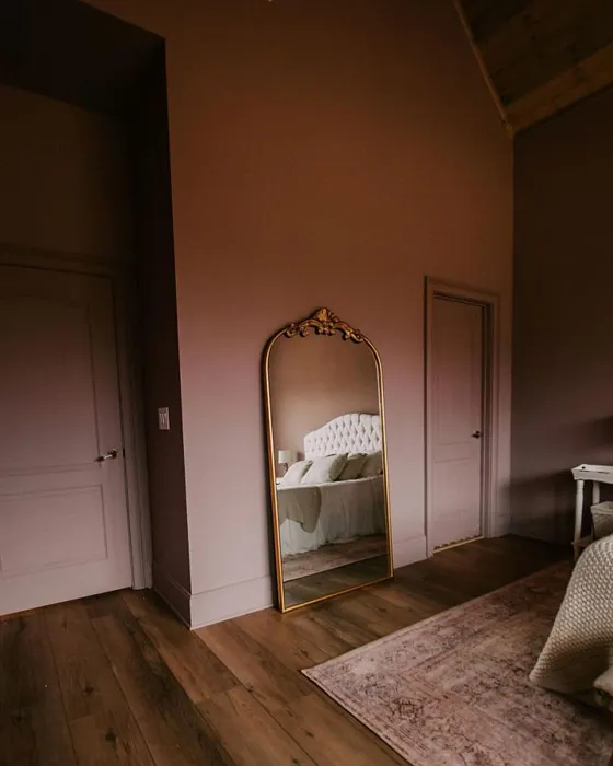
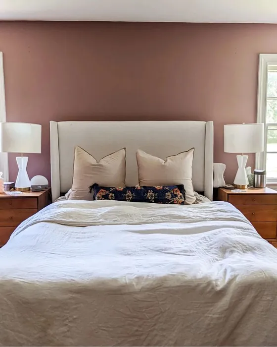
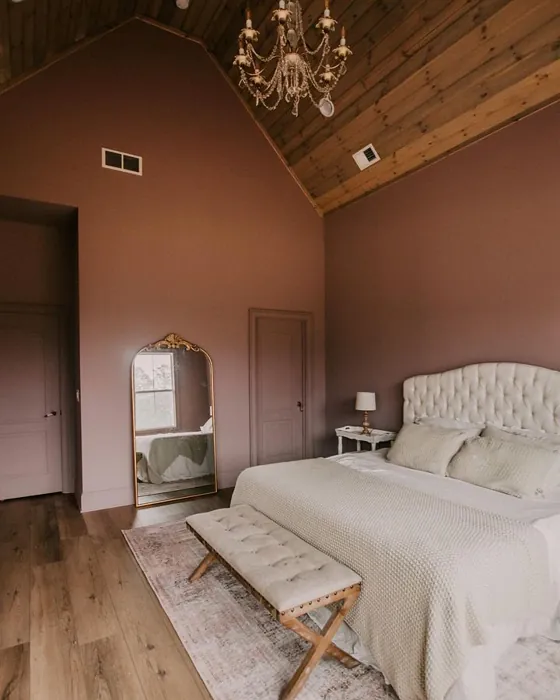
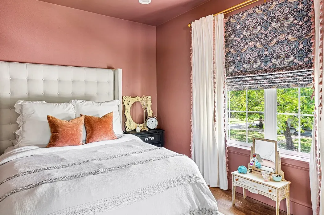
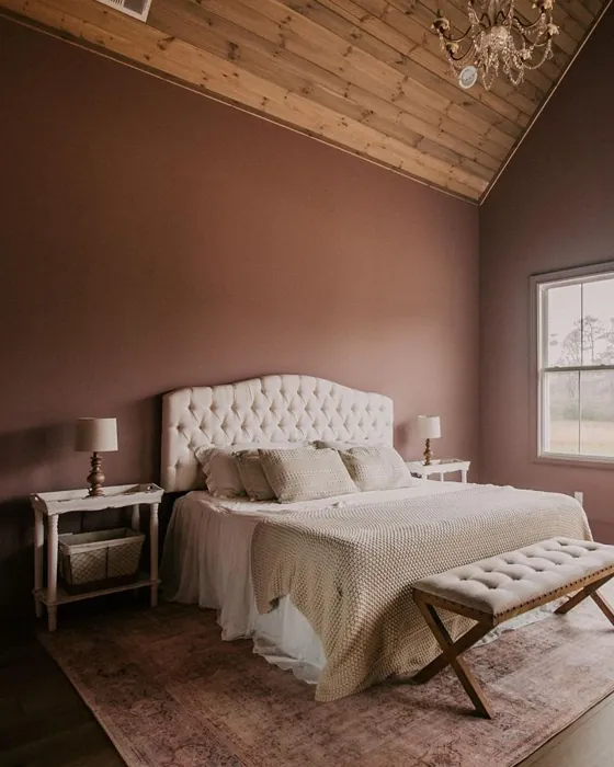
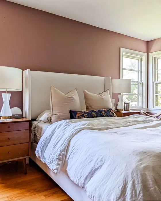
In terms of room suitability, Rosaline Pearl shines in spaces focused on relaxation and comfort. It’s an ideal choice for bedrooms where you want to create a restful sanctuary. Imagine waking up each morning surrounded by this gentle hue, the soft light of dawn reflecting off the walls. It’s also perfect for living rooms, where you gather with friends and family, or dining areas, setting the stage for cozy meals and conversations. Even a home office can benefit from this color, promoting a calm and focused atmosphere.
However, like any design choice, there are considerations to keep in mind. While Rosaline Pearl is lovely, it can show fingerprints and scuff marks in high-traffic areas, so it might require some touch-ups from time to time. This is particularly true in spaces where kids and pets play. Additionally, being a lighter color, it may need a bit of maintenance to keep it looking fresh. But don’t let that deter you; the beauty and warmth this color brings far outweigh these minor inconveniences.
When it comes to lighting, Rosaline Pearl performs remarkably well in various conditions. In natural light, its pink undertones shine bright, enhancing the room’s openness. Under artificial light, those warm tones deepen, inviting a sense of coziness that makes your space feel like home. It’s a versatile choice that adapts beautifully, ensuring your room feels inviting at any hour of the day.
If you’re considering this color for a smaller space, you’ll be pleased to know that Rosaline Pearl is an excellent choice. Its soft warmth can create an illusion of openness while maintaining a cozy atmosphere. Just remember to consider the natural light in the area; it plays a significant role in how the color appears.
To elevate your design further, think about how Rosaline Pearl can work with other colors. It pairs well with cooler whites like White Dove or Pure White, providing a clean contrast that highlights its warmth. If you’re feeling adventurous, you might even explore deeper, complementary shades like SW 6224 or SW 9137, which can add interest without overwhelming the senses.
Beyond its aesthetic appeal, consider the practical benefits as well. Rosaline Pearl has a low VOC (volatile organic compound) level, making it a healthier choice for your home. It’s also washable, so maintaining its beauty is as simple as a quick wipe down when needed. This quality can be especially useful in spaces like dining rooms or kitchens where spills may occur.
The mood this color evokes is another reason to consider it for your next project. Rosaline Pearl brings an inviting, restful energy that can transform a house into a home. It’s a hue that encourages relaxation and conversation, making it a fantastic choice for gathering spaces.
In conclusion, Rosaline Pearl from Sherwin Williams offers a unique blend of beauty, versatility, and functionality. Its soft, warm tones make it the perfect choice for creating inviting spaces that reflect your personal style. Whether you’re painting an entire room or just an accent wall, this color can add a touch of sophistication and coziness. So, as you embark on your next home decor project, keep Rosaline Pearl in mind. It’s not just a paint color; it’s a canvas for your beautiful life.
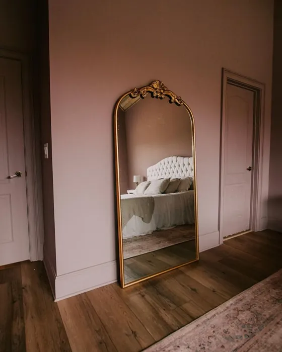
Real Room Photo of Rosaline Pearl SW 9077
Undertones of Rosaline Pearl ?
The undertones of Rosaline Pearl are a key aspect of its character, leaning towards Red. These subtle underlying hues are what give the color its depth and complexity. For example, a gray with a blue undertone will feel cooler and more modern, while one with a brown undertone will feel warmer and more traditional. It’s essential to test this paint in your home and observe it next to your existing furniture, flooring, and decor to see how these undertones interact and reveal themselves throughout the day.
HEX value: #A38887
RGB code: 163, 136, 135
Is Rosaline Pearl Cool or Warm?
Rosaline Pearl is predominantly warm, making it an excellent choice for creating inviting and cozy spaces.
Understanding Color Properties and Interior Design Tips
Hue refers to a specific position on the color wheel, measured in degrees from 0 to 360. Each degree represents a different pure color:
- 0° represents red
- 120° represents green
- 240° represents blue
Saturation describes the intensity or purity of a color and is expressed as a percentage:
- At 0%, the color appears completely desaturated—essentially a shade of gray
- At 100%, the color is at its most vivid and vibrant
Lightness indicates how light or dark a color is, also expressed as a percentage:
- 0% lightness results in black
- 100% lightness results in white
Using Warm Colors in Interior Design
Warm hues—such as reds, oranges, yellows, warm beiges, and greiges—are excellent choices for creating inviting and energetic spaces. These colors are particularly well-suited for:
- Kitchens, living rooms, and bathrooms, where warmth enhances comfort and sociability
- Large rooms, where warm tones can help reduce the sense of emptiness and make the space feel more intimate
For example:
- Warm beige shades provide a cozy, inviting atmosphere, ideal for living rooms, bedrooms, and hallways.
- Warm greige (a mix of beige and gray) offers the warmth of beige with the modern appeal of gray, making it a versatile backdrop for dining areas, bedrooms, and living spaces.
However, be mindful when using warm light tones in rooms with limited natural light. These shades may appear muted or even take on an unpleasant yellowish tint. To avoid a dull or flat appearance:
- Add depth by incorporating richer tones like deep greens, charcoal, or chocolate brown
- Use textured elements such as curtains, rugs, or cushions to bring dimension to the space
Pro Tip: Achieving Harmony with Warm and Cool Color Balance
To create a well-balanced and visually interesting interior, mix warm and cool tones strategically. This contrast adds depth and harmony to your design.
- If your walls feature warm hues, introduce cool-colored accents such as blue or green furniture, artwork, or accessories to create contrast.
- For a polished look, consider using a complementary color scheme, which pairs colors opposite each other on the color wheel (e.g., red with green, orange with blue).
This thoughtful mix not only enhances visual appeal but also creates a space that feels both dynamic and cohesive.
Light Temperature Affects on Rosaline Pearl
Natural Light
Natural daylight changes in color temperature as the sun moves across the sky. At sunrise and sunset, the light tends to have a warm, golden tone with a color temperature around 2000 Kelvin (K). As the day progresses and the sun rises higher, the light becomes cooler and more neutral. Around midday, especially when the sky is clear, natural light typically reaches its peak brightness and shifts to a cooler tone, ranging from 5500 to 6500 Kelvin. This midday light is close to what we perceive as pure white or daylight-balanced light.
These shifts in natural light can significantly influence how colors appear in a space, which is why designers often consider both the time of day and the orientation of windows when planning interior color schemes.
Artificial Light
When choosing artificial lighting, pay close attention to the color temperature, measured in Kelvin (K). This determines how warm or cool the light will appear. Lower temperatures, around 2700K, give off a warm, yellow glow often used in living rooms or bedrooms. Higher temperatures, above 5000K, create a cool, bluish light similar to daylight, commonly used in kitchens, offices, or task areas.
Use the slider to see how lighting temperature can affect the appearance of a surface or color throughout a space.


4800K
LRV of Rosaline Pearl
The Light Reflectance Value (LRV) of Rosaline Pearl is 69%, which places it in the Light category. This means it Reflects a high amount of light. Understanding a paint’s LRV is crucial for predicting how it will look in your space. A higher LRV indicates a lighter color that reflects more light, making rooms feel larger and brighter. A lower LRV signifies a darker color that absorbs more light, creating a cozier, more intimate atmosphere. Always consider the natural and artificial lighting in your room when selecting a paint color based on its LRV.
Detailed Review of Rosaline Pearl
Additional Paint Characteristics
Ideal Rooms
Bedroom, Dining Room, Home Office, Living Room
Decor Styles
Bohemian, Contemporary, Modern, Transitional
Coverage
Good (1–2 Coats)
Ease of Application
Beginner Friendly, Brush Smooth, Fast-Drying, Roller-Ready
Washability
Washable, Wipeable
VOC Level
Low VOC
Best Use
Accent Wall, Furniture, Interior Walls
Room Suitability
Bedroom, Dining Room, Home Office, Living Room
Tone Tag
Dusty, Muted, Warm
Finish Type
Eggshell, Matte
Paint Performance
Easy Touch-Up, Fade Resistant, Low Odor
Use Cases
Best for Low Light Rooms, Best for Small Spaces, Designer Favorite
Mood
Cozy, Inviting, Restful
Trim Pairing
Complements Cool Trim, Matches Pure White, Pairs with White Dove
Rosaline Pearl is truly a versatile paint choice that can transform any room into a cozy retreat. Its soft and inviting tone works beautifully in spaces where relaxation is key, like bedrooms and living rooms. When applied, the color maintains a subtle charm that doesn’t overwhelm the senses. It’s especially flattering in natural light, where it can reveal its nuanced undertones of pink and beige, enhancing the overall warmth of your space.
One of the standout features of Rosaline Pearl is its adaptability. It pairs well with a variety of decor styles, from modern to bohemian, allowing homeowners to experiment with different aesthetics. Whether you’re aiming for a minimalist look or a more eclectic vibe, this color can serve as a perfect backdrop. In terms of application, it’s user-friendly. Most DIYers will find it easy to work with, and the coverage is commendable, typically requiring just one or two coats for a flawless finish.
Pros & Cons of SW 9077 Rosaline Pearl
Pros
Cons
Colors that go with Sherwin Williams Rosaline Pearl
FAQ on SW 9077 Rosaline Pearl
Is Rosaline Pearl suitable for small spaces?
Absolutely! Rosaline Pearl is an excellent choice for small spaces. Its soft, warm hue can create an illusion of openness while maintaining a cozy atmosphere. The color reflects light beautifully, which helps to brighten up tighter areas without feeling overwhelming. Just be mindful of the natural light in the space, as this can influence how the color appears.
How does Rosaline Pearl perform in different lighting conditions?
Rosaline Pearl shines in various lighting conditions. In natural light, it reveals its lovely pink undertones, creating a bright and airy feel. In artificial light, it tends to warm up, making spaces feel inviting and snug. It’s a versatile choice that adapts well, ensuring that it can elevate the mood of any room throughout the day.
Comparisons Rosaline Pearl with other colors
Rosaline Pearl SW 9077 vs Realist Beige SW 6078
| Attribute | Rosaline Pearl SW 9077 | Realist Beige SW 6078 |
|---|---|---|
| Color Name | Rosaline Pearl SW 9077 | Realist Beige SW 6078 |
| Color | ||
| Hue | Pink | Pink |
| Brightness | Medium | Medium |
| RGB | 163, 136, 135 | 211, 200, 189 |
| LRV | 69% | 34% |
| Finish Type | Eggshell, Matte | Eggshell, Matte, Satin |
| Finish Options | Eggshell, Matte, Satin | Eggshell, Matte, Satin |
| Ideal Rooms | Bedroom, Dining Room, Home Office, Living Room | Bedroom, Dining Room, Entryway, Home Office, Kitchen, Living Room |
| Decor Styles | Bohemian, Contemporary, Modern, Transitional | Contemporary, Minimalist, Modern Farmhouse, Rustic, Traditional |
| Coverage | Good (1–2 Coats) | Good (1–2 Coats), Touch-Up Friendly |
| Ease of Application | Beginner Friendly, Brush Smooth, Fast-Drying, Roller-Ready | Beginner Friendly, Brush Smooth, Fast-Drying, Roller-Ready |
| Washability | Washable, Wipeable | Washable, Wipeable |
| Room Suitability | Bedroom, Dining Room, Home Office, Living Room | Bedroom, Dining Room, Home Office, Kitchen, Living Room |
| Tone | Dusty, Muted, Warm | Earthy, Neutral, Warm |
| Paint Performance | Easy Touch-Up, Fade Resistant, Low Odor | High Coverage, Low Odor, Quick Drying |
Rosaline Pearl SW 9077 vs Cabbage Rose SW 0003
| Attribute | Rosaline Pearl SW 9077 | Cabbage Rose SW 0003 |
|---|---|---|
| Color Name | Rosaline Pearl SW 9077 | Cabbage Rose SW 0003 |
| Color | ||
| Hue | Pink | Pink |
| Brightness | Medium | Medium |
| RGB | 163, 136, 135 | 197, 159, 145 |
| LRV | 69% | 15% |
| Finish Type | Eggshell, Matte | Eggshell, Matte, Satin |
| Finish Options | Eggshell, Matte, Satin | Eggshell, Matte, Satin |
| Ideal Rooms | Bedroom, Dining Room, Home Office, Living Room | Bedroom, Dining Room, Hallway, Living Room, Nursery |
| Decor Styles | Bohemian, Contemporary, Modern, Transitional | Cottage, Modern Farmhouse, Romantic, Shabby Chic, Vintage |
| Coverage | Good (1–2 Coats) | Good (1–2 Coats), Touch-Up Friendly |
| Ease of Application | Beginner Friendly, Brush Smooth, Fast-Drying, Roller-Ready | Beginner Friendly, Brush Smooth, Roller-Ready |
| Washability | Washable, Wipeable | Washable, Wipeable |
| Room Suitability | Bedroom, Dining Room, Home Office, Living Room | Bedroom, Dining Room, Hallway, Living Room, Nursery |
| Tone | Dusty, Muted, Warm | Earthy, Muted, Warm |
| Paint Performance | Easy Touch-Up, Fade Resistant, Low Odor | Easy Touch-Up, Low Odor |
Rosaline Pearl SW 9077 vs Sashay Sand SW 6051
| Attribute | Rosaline Pearl SW 9077 | Sashay Sand SW 6051 |
|---|---|---|
| Color Name | Rosaline Pearl SW 9077 | Sashay Sand SW 6051 |
| Color | ||
| Hue | Pink | Pink |
| Brightness | Medium | Medium |
| RGB | 163, 136, 135 | 207, 180, 168 |
| LRV | 69% | 64% |
| Finish Type | Eggshell, Matte | Eggshell, Matte, Satin |
| Finish Options | Eggshell, Matte, Satin | Eggshell, Matte, Satin |
| Ideal Rooms | Bedroom, Dining Room, Home Office, Living Room | Bedroom, Dining Room, Home Office, Kitchen, Living Room |
| Decor Styles | Bohemian, Contemporary, Modern, Transitional | Bohemian, Contemporary, Modern Farmhouse, Scandinavian, Transitional |
| Coverage | Good (1–2 Coats) | Good (1–2 Coats), Touch-Up Friendly |
| Ease of Application | Beginner Friendly, Brush Smooth, Fast-Drying, Roller-Ready | Beginner Friendly, Fast-Drying, Roller-Ready |
| Washability | Washable, Wipeable | Highly Washable, Washable |
| Room Suitability | Bedroom, Dining Room, Home Office, Living Room | Bedroom, Dining Room, Home Office, Kitchen, Living Room |
| Tone | Dusty, Muted, Warm | Earthy, Muted, Warm |
| Paint Performance | Easy Touch-Up, Fade Resistant, Low Odor | Easy Touch-Up, Low Odor, Quick Drying, Scuff Resistant |
Rosaline Pearl SW 9077 vs Touch of Sand SW 9085
| Attribute | Rosaline Pearl SW 9077 | Touch of Sand SW 9085 |
|---|---|---|
| Color Name | Rosaline Pearl SW 9077 | Touch of Sand SW 9085 |
| Color | ||
| Hue | Pink | Pink |
| Brightness | Medium | Medium |
| RGB | 163, 136, 135 | 213, 199, 186 |
| LRV | 69% | 66% |
| Finish Type | Eggshell, Matte | Eggshell, Matte, Satin |
| Finish Options | Eggshell, Matte, Satin | Eggshell, Matte, Satin |
| Ideal Rooms | Bedroom, Dining Room, Home Office, Living Room | Bathroom, Bedroom, Dining Room, Home Office, Kitchen, Living Room |
| Decor Styles | Bohemian, Contemporary, Modern, Transitional | Bohemian, Coastal, Contemporary, Modern Farmhouse, Rustic |
| Coverage | Good (1–2 Coats) | Good (1–2 Coats), Touch-Up Friendly |
| Ease of Application | Beginner Friendly, Brush Smooth, Fast-Drying, Roller-Ready | Beginner Friendly, Brush Smooth, Fast-Drying, Roller-Ready |
| Washability | Washable, Wipeable | Washable, Wipeable |
| Room Suitability | Bedroom, Dining Room, Home Office, Living Room | Bathroom, Bedroom, Dining Room, Home Office, Kitchen, Living Room |
| Tone | Dusty, Muted, Warm | Earthy, Muted, Neutral, Warm |
| Paint Performance | Easy Touch-Up, Fade Resistant, Low Odor | Easy Touch-Up, Low Odor, Quick Drying, Scuff Resistant |
Rosaline Pearl SW 9077 vs Pink Shadow SW 0070
| Attribute | Rosaline Pearl SW 9077 | Pink Shadow SW 0070 |
|---|---|---|
| Color Name | Rosaline Pearl SW 9077 | Pink Shadow SW 0070 |
| Color | ||
| Hue | Pink | Pink |
| Brightness | Medium | Medium |
| RGB | 163, 136, 135 | 222, 195, 185 |
| LRV | 69% | 45% |
| Finish Type | Eggshell, Matte | Eggshell, Matte, Satin |
| Finish Options | Eggshell, Matte, Satin | Eggshell, Matte, Satin |
| Ideal Rooms | Bedroom, Dining Room, Home Office, Living Room | Bedroom, Dining Room, Home Office, Living Room, Nursery |
| Decor Styles | Bohemian, Contemporary, Modern, Transitional | Bohemian, Minimalist, Modern Farmhouse, Scandinavian, Traditional |
| Coverage | Good (1–2 Coats) | Good (1–2 Coats) |
| Ease of Application | Beginner Friendly, Brush Smooth, Fast-Drying, Roller-Ready | Beginner Friendly, Brush Smooth, Fast-Drying, Roller-Ready |
| Washability | Washable, Wipeable | Washable, Wipeable |
| Room Suitability | Bedroom, Dining Room, Home Office, Living Room | Bedroom, Dining Room, Living Room, Nursery |
| Tone | Dusty, Muted, Warm | Muted, Pastel, Warm |
| Paint Performance | Easy Touch-Up, Fade Resistant, Low Odor | Easy Touch-Up, High Coverage, Low Odor |
Rosaline Pearl SW 9077 vs Hushed Auburn SW 9080
| Attribute | Rosaline Pearl SW 9077 | Hushed Auburn SW 9080 |
|---|---|---|
| Color Name | Rosaline Pearl SW 9077 | Hushed Auburn SW 9080 |
| Color | ||
| Hue | Pink | Pink |
| Brightness | Medium | Medium |
| RGB | 163, 136, 135 | 168, 133, 122 |
| LRV | 69% | 12% |
| Finish Type | Eggshell, Matte | Eggshell, Matte, Satin |
| Finish Options | Eggshell, Matte, Satin | Eggshell, Matte, Satin |
| Ideal Rooms | Bedroom, Dining Room, Home Office, Living Room | Bedroom, Dining Room, Home Office, Living Room |
| Decor Styles | Bohemian, Contemporary, Modern, Transitional | Contemporary, Modern Farmhouse, Rustic, Transitional |
| Coverage | Good (1–2 Coats) | Good (1–2 Coats), Touch-Up Friendly |
| Ease of Application | Beginner Friendly, Brush Smooth, Fast-Drying, Roller-Ready | Beginner Friendly, Brush Smooth, Fast-Drying, Roller-Ready |
| Washability | Washable, Wipeable | Washable, Wipeable |
| Room Suitability | Bedroom, Dining Room, Home Office, Living Room | Bedroom, Dining Room, Home Office, Living Room |
| Tone | Dusty, Muted, Warm | Earthy, Muted, Warm |
| Paint Performance | Easy Touch-Up, Fade Resistant, Low Odor | Easy Touch-Up, High Coverage, Low Odor |
Rosaline Pearl SW 9077 vs Likeable Sand SW 6058
| Attribute | Rosaline Pearl SW 9077 | Likeable Sand SW 6058 |
|---|---|---|
| Color Name | Rosaline Pearl SW 9077 | Likeable Sand SW 6058 |
| Color | ||
| Hue | Pink | Pink |
| Brightness | Medium | Medium |
| RGB | 163, 136, 135 | 209, 183, 168 |
| LRV | 69% | 61% |
| Finish Type | Eggshell, Matte | Eggshell, Matte, Satin |
| Finish Options | Eggshell, Matte, Satin | Eggshell, Matte, Satin |
| Ideal Rooms | Bedroom, Dining Room, Home Office, Living Room | Bedroom, Dining Room, Home Office, Kitchen, Living Room |
| Decor Styles | Bohemian, Contemporary, Modern, Transitional | Bohemian, Coastal, Contemporary, Modern Farmhouse, Rustic |
| Coverage | Good (1–2 Coats) | Good (1–2 Coats), Touch-Up Friendly |
| Ease of Application | Beginner Friendly, Brush Smooth, Fast-Drying, Roller-Ready | Beginner Friendly, Brush Smooth, Fast-Drying, Roller-Ready |
| Washability | Washable, Wipeable | Washable, Wipeable |
| Room Suitability | Bedroom, Dining Room, Home Office, Living Room | Bedroom, Dining Room, Home Office, Kitchen, Living Room |
| Tone | Dusty, Muted, Warm | Earthy, Muted, Warm |
| Paint Performance | Easy Touch-Up, Fade Resistant, Low Odor | Easy Touch-Up, Low Odor, Quick Drying |
Rosaline Pearl SW 9077 vs Glamour SW 6031
| Attribute | Rosaline Pearl SW 9077 | Glamour SW 6031 |
|---|---|---|
| Color Name | Rosaline Pearl SW 9077 | Glamour SW 6031 |
| Color | ||
| Hue | Pink | Pink |
| Brightness | Medium | Medium |
| RGB | 163, 136, 135 | 182, 160, 154 |
| LRV | 69% | 30% |
| Finish Type | Eggshell, Matte | Eggshell, Matte, Satin |
| Finish Options | Eggshell, Matte, Satin | Eggshell, Matte, Satin |
| Ideal Rooms | Bedroom, Dining Room, Home Office, Living Room | Bedroom, Dining Room, Home Office, Living Room |
| Decor Styles | Bohemian, Contemporary, Modern, Transitional | Bohemian, Classic, Modern, Transitional |
| Coverage | Good (1–2 Coats) | Good (1–2 Coats) |
| Ease of Application | Beginner Friendly, Brush Smooth, Fast-Drying, Roller-Ready | Beginner Friendly, Brush Smooth, Fast-Drying, Roller-Ready |
| Washability | Washable, Wipeable | Scrubbable, Washable |
| Room Suitability | Bedroom, Dining Room, Home Office, Living Room | Bedroom, Dining Room, Home Office, Living Room |
| Tone | Dusty, Muted, Warm | Balanced, Neutral, Warm |
| Paint Performance | Easy Touch-Up, Fade Resistant, Low Odor | Easy Touch-Up, Low Odor, Quick Drying |
Rosaline Pearl SW 9077 vs Temperate Taupe SW 6037
| Attribute | Rosaline Pearl SW 9077 | Temperate Taupe SW 6037 |
|---|---|---|
| Color Name | Rosaline Pearl SW 9077 | Temperate Taupe SW 6037 |
| Color | ||
| Hue | Pink | Pink |
| Brightness | Medium | Medium |
| RGB | 163, 136, 135 | 191, 177, 170 |
| LRV | 69% | 34% |
| Finish Type | Eggshell, Matte | Eggshell, Matte, Satin |
| Finish Options | Eggshell, Matte, Satin | Eggshell, Matte, Satin |
| Ideal Rooms | Bedroom, Dining Room, Home Office, Living Room | Bedroom, Dining Room, Home Office, Kitchen, Living Room |
| Decor Styles | Bohemian, Contemporary, Modern, Transitional | Bohemian, Modern Farmhouse, Rustic, Transitional |
| Coverage | Good (1–2 Coats) | Good (1–2 Coats), Touch-Up Friendly |
| Ease of Application | Beginner Friendly, Brush Smooth, Fast-Drying, Roller-Ready | Beginner Friendly, Brush Smooth, Fast-Drying, Roller-Ready |
| Washability | Washable, Wipeable | Highly Washable, Washable |
| Room Suitability | Bedroom, Dining Room, Home Office, Living Room | Bedroom, Dining Room, Home Office, Living Room |
| Tone | Dusty, Muted, Warm | Earthy, Neutral, Warm |
| Paint Performance | Easy Touch-Up, Fade Resistant, Low Odor | Long Lasting, Low Odor, Quick Drying, Scuff Resistant |
Rosaline Pearl SW 9077 vs Redend Point SW 9081
| Attribute | Rosaline Pearl SW 9077 | Redend Point SW 9081 |
|---|---|---|
| Color Name | Rosaline Pearl SW 9077 | Redend Point SW 9081 |
| Color | ||
| Hue | Pink | Pink |
| Brightness | Medium | Medium |
| RGB | 163, 136, 135 | 174, 142, 126 |
| LRV | 69% | 22% |
| Finish Type | Eggshell, Matte | Eggshell, Matte, Satin |
| Finish Options | Eggshell, Matte, Satin | Eggshell, Matte, Satin |
| Ideal Rooms | Bedroom, Dining Room, Home Office, Living Room | Bedroom, Dining Room, Home Office, Living Room, Nursery |
| Decor Styles | Bohemian, Contemporary, Modern, Transitional | Bohemian, Contemporary, Modern Farmhouse, Rustic, Transitional |
| Coverage | Good (1–2 Coats) | Good (1–2 Coats), Touch-Up Friendly |
| Ease of Application | Beginner Friendly, Brush Smooth, Fast-Drying, Roller-Ready | Beginner Friendly, Brush Smooth, Roller-Ready |
| Washability | Washable, Wipeable | Washable, Wipeable |
| Room Suitability | Bedroom, Dining Room, Home Office, Living Room | Bedroom, Dining Room, Home Office, Living Room, Nursery |
| Tone | Dusty, Muted, Warm | Earthy, Muted, Warm |
| Paint Performance | Easy Touch-Up, Fade Resistant, Low Odor | High Coverage, Low Odor, Quick Drying |
Official Page of Sherwin Williams Rosaline Pearl SW 9077