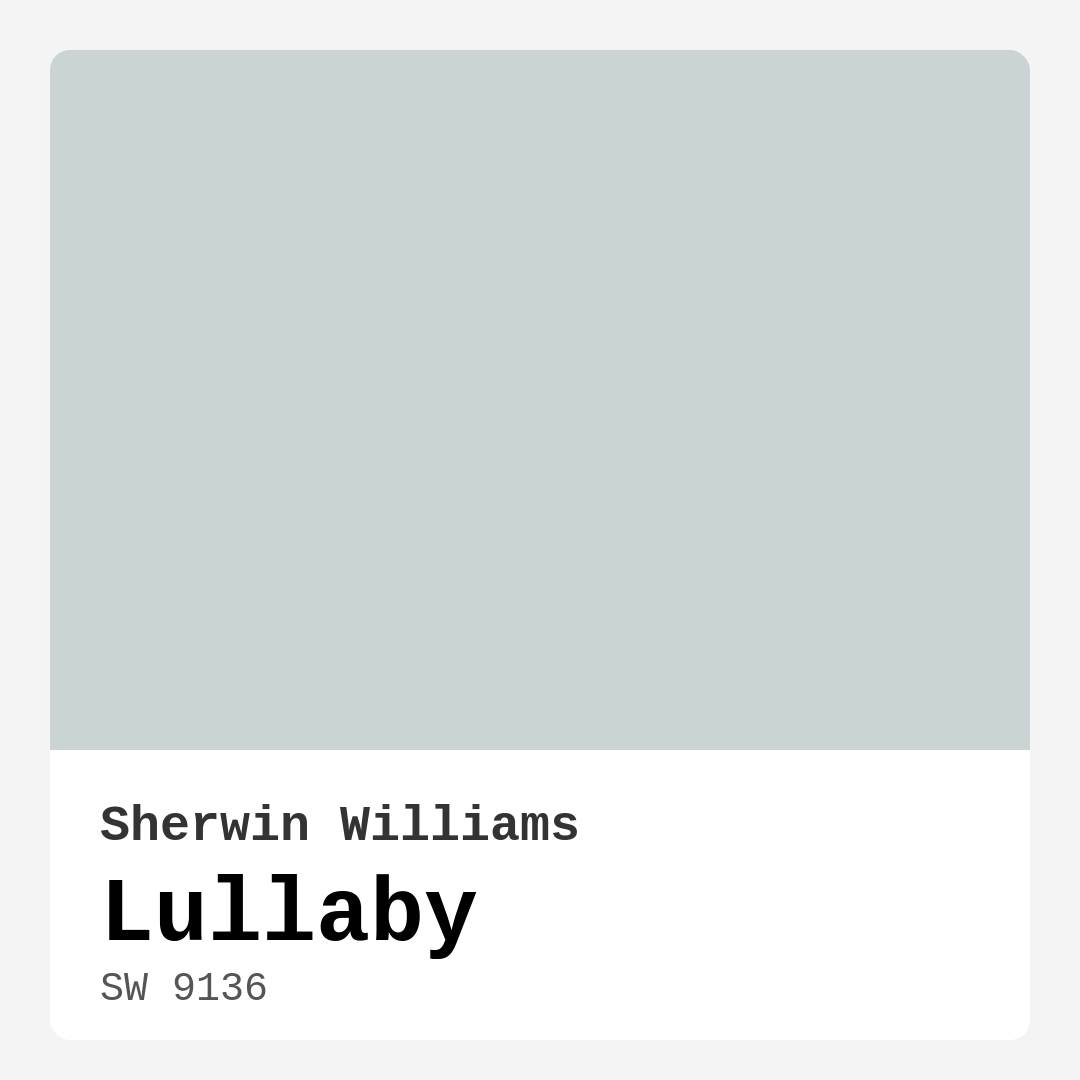
Color Preview & Key Details
| HEX Code | #CBD4D4 |
| RGB | 203, 212, 212 |
| LRV | 66% |
| Undertone | Blue |
| Finish Options | Eggshell, Flat, Matte, Satin |
Imagine stepping into a room that instantly wraps you in a gentle embrace, where the atmosphere feels serene and inviting. This is the magic of Sherwin Williams’ Lullaby (SW 9136). As an expert home designer, I’ve seen how a well-chosen paint color can transform a space, and Lullaby is a perfect example of this. With its calming blue undertones and soft, airy essence, it’s a color that can breathe new life into your home.
Lullaby is a light, soothing shade that reflects an impressive 66% of light, making it ideal for a variety of settings. This color is not just visually appealing; it also creates a tranquil environment that promotes relaxation. Whether you’re painting a nursery, a bedroom, or even a home office, Lullaby has the versatility to shine in different decor styles, from modern and coastal to Scandinavian and bohemian.
What I love about Lullaby is its ability to adapt. It harmonizes beautifully with a range of shades, particularly whites and cool grays. Pairing it with something like White Dove creates a crisp contrast that feels fresh and clean. If you’re considering a warm wood trim, you’ll find that Lullaby balances that warmth perfectly, enhancing the natural beauty of your trim while keeping the overall vibe cool and inviting.
When it comes to application, you’ll find that Lullaby is beginner-friendly. Whether you’re using a roller or a brush, it glides on smoothly, offering good coverage in one to two coats. For the best results, I recommend applying that second coat, especially if you’re painting over a darker color. This will enrich the finish and give you that lovely, consistent hue. Just remember to let the first coat dry completely before moving on.
One of the standout features of Lullaby is its washability. You can easily spot clean it, which is a big plus for areas that may see a bit more wear and tear, like living rooms or home offices. While I wouldn’t recommend it for high-traffic areas, it’s perfect for spaces where you want to maintain a calm and peaceful atmosphere.
Now, let’s talk about light. The way Lullaby interacts with both natural and artificial light is a key consideration. In bright daylight, the color transforms, exuding a vibrant, airy quality that can make smaller rooms feel larger and more open. In softer, dimmer lighting, it retains its gentle charm, creating a cozy atmosphere without feeling heavy or oppressive. This adaptability means that Lullaby can suit various moods and settings throughout the day.
As you explore this lovely shade, keep in mind its undertones. Lullaby leans towards the blue side of the spectrum, which gives it a cool, refreshing feel. This quality can help enhance the tranquility of your space, making it feel like a personal sanctuary. I often encourage my clients to test this color in their homes, observing it alongside their existing furniture and decor. You’ll want to see how it interacts with other colors throughout the day.
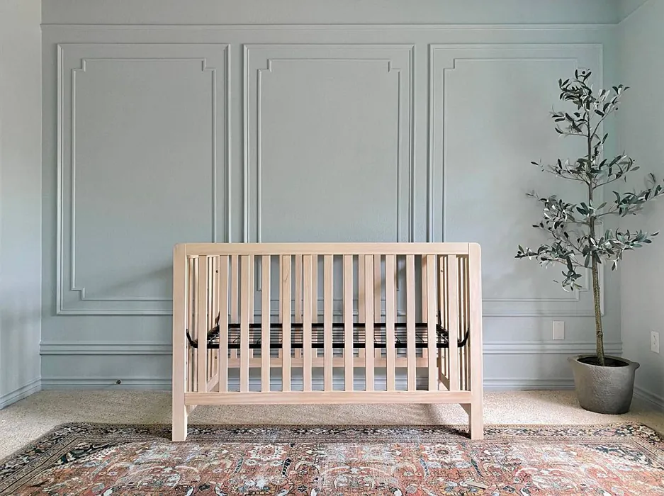
While Lullaby is a fantastic choice for many rooms, it’s particularly suited for bedrooms and nurseries where a tranquil vibe is essential. The calming tones invite relaxation and restfulness, making it easier to unwind at the end of a long day. It’s also a popular choice for home offices, where a serene environment can enhance focus and productivity.
However, every color has its pros and cons. While Lullaby’s gentle beauty is hard to resist, it can sometimes appear cooler in low light, which might not suit every preference. It may also require multiple coats for full coverage, particularly if you’re transitioning from a darker shade. If you’re up for the challenge, though, the results are well worth the effort.
For those looking to complement Lullaby, there are several shades that work beautifully alongside it. Lighter shades like SW 6525 or SW 9641 can create a serene gradient, while darker options can add depth and interest without overwhelming the space. Remember to consider the overall mood you want to achieve when selecting your color palette.
If you’re worried about the environmental impact of your paint, Lullaby scores points for its low VOC formula and eco-certification. You can feel good about using it in your home, knowing it contributes to a healthier indoor environment.
In conclusion, Lullaby by Sherwin Williams is more than just a color; it’s an experience. It brings a sense of calm and tranquility that can transform any space. Whether you’re painting an accent wall or refreshing an entire room, Lullaby has the power to create an inviting atmosphere that feels both airy and comforting. So, if you’re on the hunt for a color that promotes peace and serenity in your home, Lullaby might just be your perfect match. Test it out, see how it interacts with your space, and let it wrap you in its gentle embrace. Happy painting!
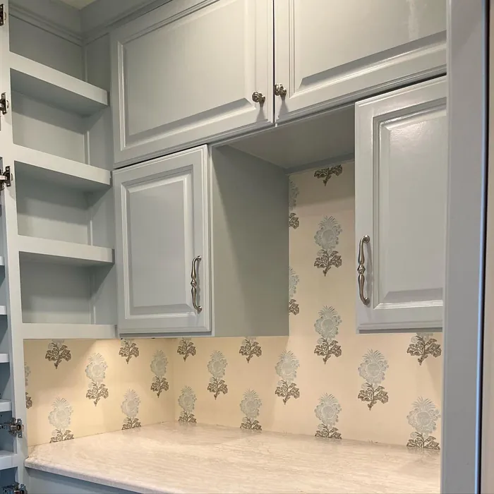
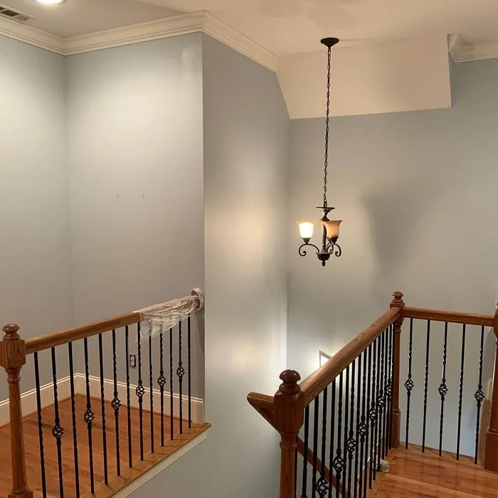
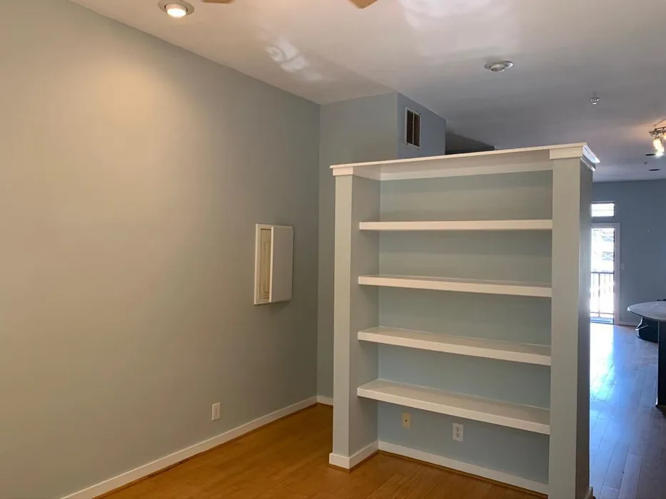
Real Room Photo of Lullaby SW 9136


Undertones of Lullaby ?
The undertones of Lullaby are a key aspect of its character, leaning towards Blue. These subtle underlying hues are what give the color its depth and complexity. For example, a gray with a blue undertone will feel cooler and more modern, while one with a brown undertone will feel warmer and more traditional. It’s essential to test this paint in your home and observe it next to your existing furniture, flooring, and decor to see how these undertones interact and reveal themselves throughout the day.
HEX value: #CBD4D4
RGB code: 203, 212, 212
Is Lullaby Cool or Warm?
Lullaby leans towards the cool side of the spectrum, making it an ideal choice for creating a calm, serene space. Its cooler tones can help make smaller rooms feel larger and more open.
Understanding Color Properties and Interior Design Tips
Hue refers to a specific position on the color wheel, measured in degrees from 0 to 360. Each degree represents a different pure color:
- 0° represents red
- 120° represents green
- 240° represents blue
Saturation describes the intensity or purity of a color and is expressed as a percentage:
- At 0%, the color appears completely desaturated—essentially a shade of gray
- At 100%, the color is at its most vivid and vibrant
Lightness indicates how light or dark a color is, also expressed as a percentage:
- 0% lightness results in black
- 100% lightness results in white
Using Warm Colors in Interior Design
Warm hues—such as reds, oranges, yellows, warm beiges, and greiges—are excellent choices for creating inviting and energetic spaces. These colors are particularly well-suited for:
- Kitchens, living rooms, and bathrooms, where warmth enhances comfort and sociability
- Large rooms, where warm tones can help reduce the sense of emptiness and make the space feel more intimate
For example:
- Warm beige shades provide a cozy, inviting atmosphere, ideal for living rooms, bedrooms, and hallways.
- Warm greige (a mix of beige and gray) offers the warmth of beige with the modern appeal of gray, making it a versatile backdrop for dining areas, bedrooms, and living spaces.
However, be mindful when using warm light tones in rooms with limited natural light. These shades may appear muted or even take on an unpleasant yellowish tint. To avoid a dull or flat appearance:
- Add depth by incorporating richer tones like deep greens, charcoal, or chocolate brown
- Use textured elements such as curtains, rugs, or cushions to bring dimension to the space
Pro Tip: Achieving Harmony with Warm and Cool Color Balance
To create a well-balanced and visually interesting interior, mix warm and cool tones strategically. This contrast adds depth and harmony to your design.
- If your walls feature warm hues, introduce cool-colored accents such as blue or green furniture, artwork, or accessories to create contrast.
- For a polished look, consider using a complementary color scheme, which pairs colors opposite each other on the color wheel (e.g., red with green, orange with blue).
This thoughtful mix not only enhances visual appeal but also creates a space that feels both dynamic and cohesive.
Light Temperature Affects on Lullaby
Natural Light
Natural daylight changes in color temperature as the sun moves across the sky. At sunrise and sunset, the light tends to have a warm, golden tone with a color temperature around 2000 Kelvin (K). As the day progresses and the sun rises higher, the light becomes cooler and more neutral. Around midday, especially when the sky is clear, natural light typically reaches its peak brightness and shifts to a cooler tone, ranging from 5500 to 6500 Kelvin. This midday light is close to what we perceive as pure white or daylight-balanced light.
These shifts in natural light can significantly influence how colors appear in a space, which is why designers often consider both the time of day and the orientation of windows when planning interior color schemes.
Artificial Light
When choosing artificial lighting, pay close attention to the color temperature, measured in Kelvin (K). This determines how warm or cool the light will appear. Lower temperatures, around 2700K, give off a warm, yellow glow often used in living rooms or bedrooms. Higher temperatures, above 5000K, create a cool, bluish light similar to daylight, commonly used in kitchens, offices, or task areas.
Use the slider to see how lighting temperature can affect the appearance of a surface or color throughout a space.


4800K
LRV of Lullaby
The Light Reflectance Value (LRV) of Lullaby is 66%, which places it in the Light category. This means it Reflects a high amount of light. Understanding a paint’s LRV is crucial for predicting how it will look in your space. A higher LRV indicates a lighter color that reflects more light, making rooms feel larger and brighter. A lower LRV signifies a darker color that absorbs more light, creating a cozier, more intimate atmosphere. Always consider the natural and artificial lighting in your room when selecting a paint color based on its LRV.
Detailed Review of Lullaby
Additional Paint Characteristics
Ideal Rooms
Bedroom, Home Office, Living Room, Nursery
Decor Styles
Bohemian, Coastal, Modern, Scandinavian
Coverage
Good (1–2 Coats), Touch-Up Friendly
Ease of Application
Beginner Friendly, Brush Smooth, Roller-Ready
Washability
Spot Clean Only, Washable
VOC Level
Eco-Certified, Low VOC
Best Use
Accent Wall, Bedroom, Interior Walls, Nursery
Room Suitability
Bedroom, Home Office, Living Room, Nursery
Tone Tag
Airy, Cool, Muted
Finish Type
Eggshell, Satin
Paint Performance
Easy Touch-Up, High Coverage, Low Odor
Use Cases
Best for Small Spaces, Classic Favorite, Designer Favorite
Mood
Calm, Inviting, Restful
Trim Pairing
Complements Cool Trim, Good with Wood Trim, Pairs with White Dove
Lullaby is a delightfully gentle color that can transform any room into a peaceful sanctuary. It’s perfect for bedrooms and nurseries, where you want to encourage relaxation and restfulness. The color applies smoothly, providing a soft finish that enhances the light in your space without overwhelming it. It’s also easy to touch up, which is a significant advantage for those who appreciate a flawless look without too much effort. Overall, Lullaby is an excellent choice for those who value tranquility in their home environment. Whether you’re painting an accent wall or refreshing a whole room, you’ll find that Lullaby wraps your space in a warm embrace, making it feel both inviting and airy.
Pros & Cons of SW 9136 Lullaby
Pros
Cons
Colors that go with Sherwin Williams Lullaby
FAQ on SW 9136 Lullaby
How many coats of Lullaby should I apply?
For best results, it’s recommended to apply at least two coats of Lullaby. While it offers good coverage, a second coat will help achieve a richer, more uniform finish, especially on walls that have not been previously painted or are a darker color. Always allow the first coat to dry completely before applying the second for optimal results.
Is Lullaby suitable for exterior use?
Lullaby is primarily designed for interior use, where its soft tones can shine. If you’re looking for an exterior option, consider a similar shade that’s specifically formulated to withstand outdoor conditions. Keeping Lullaby inside will help preserve its beautiful finish and color integrity.
Comparisons Lullaby with other colors
Lullaby SW 9136 vs Moonmist SW 9144
| Attribute | Lullaby SW 9136 | Moonmist SW 9144 |
|---|---|---|
| Color Name | Lullaby SW 9136 | Moonmist SW 9144 |
| Color | ||
| Hue | Blue | Blue |
| Brightness | Light | Light |
| RGB | 203, 212, 212 | 201, 217, 224 |
| LRV | 66% | 65% |
| Finish Type | Eggshell, Satin | Eggshell, Satin |
| Finish Options | Eggshell, Flat, Matte, Satin | Eggshell, Flat, Matte, Satin |
| Ideal Rooms | Bedroom, Home Office, Living Room, Nursery | Bathroom, Bedroom, Home Office, Living Room, Nursery |
| Decor Styles | Bohemian, Coastal, Modern, Scandinavian | Coastal, Minimalist, Modern, Scandinavian |
| Coverage | Good (1–2 Coats), Touch-Up Friendly | Good (1–2 Coats) |
| Ease of Application | Beginner Friendly, Brush Smooth, Roller-Ready | Beginner Friendly, Brush Smooth, Fast-Drying, Roller-Ready |
| Washability | Spot Clean Only, Washable | Washable, Wipeable |
| Room Suitability | Bedroom, Home Office, Living Room, Nursery | Bathroom, Bedroom, Home Office, Living Room |
| Tone | Airy, Cool, Muted | Airy, Cool, Muted |
| Paint Performance | Easy Touch-Up, High Coverage, Low Odor | High Coverage, Low Odor, Quick Drying |
Lullaby SW 9136 vs North Star SW 6246
| Attribute | Lullaby SW 9136 | North Star SW 6246 |
|---|---|---|
| Color Name | Lullaby SW 9136 | North Star SW 6246 |
| Color | ||
| Hue | Blue | Blue |
| Brightness | Light | Light |
| RGB | 203, 212, 212 | 202, 208, 210 |
| LRV | 66% | 75% |
| Finish Type | Eggshell, Satin | Eggshell, Satin |
| Finish Options | Eggshell, Flat, Matte, Satin | Eggshell, Satin, Semi-Gloss |
| Ideal Rooms | Bedroom, Home Office, Living Room, Nursery | Bedroom, Hallway, Home Office, Living Room, Nursery |
| Decor Styles | Bohemian, Coastal, Modern, Scandinavian | Coastal, Minimalist, Modern, Scandinavian |
| Coverage | Good (1–2 Coats), Touch-Up Friendly | Good (1–2 Coats) |
| Ease of Application | Beginner Friendly, Brush Smooth, Roller-Ready | Beginner Friendly, Brush Smooth, Roller-Ready |
| Washability | Spot Clean Only, Washable | Highly Washable, Washable |
| Room Suitability | Bedroom, Home Office, Living Room, Nursery | Bedroom, Home Office, Living Room, Nursery |
| Tone | Airy, Cool, Muted | Airy, Balanced, Cool, Muted |
| Paint Performance | Easy Touch-Up, High Coverage, Low Odor | Easy Touch-Up, Fade Resistant, Low Odor, Quick Drying |
Lullaby SW 9136 vs Hinting Blue SW 6519
| Attribute | Lullaby SW 9136 | Hinting Blue SW 6519 |
|---|---|---|
| Color Name | Lullaby SW 9136 | Hinting Blue SW 6519 |
| Color | ||
| Hue | Blue | Blue |
| Brightness | Light | Light |
| RGB | 203, 212, 212 | 206, 217, 221 |
| LRV | 66% | 48% |
| Finish Type | Eggshell, Satin | Eggshell, Matte, Satin |
| Finish Options | Eggshell, Flat, Matte, Satin | Eggshell, Matte, Satin |
| Ideal Rooms | Bedroom, Home Office, Living Room, Nursery | Bedroom, Home Office, Kids Room, Living Room, Nursery |
| Decor Styles | Bohemian, Coastal, Modern, Scandinavian | Coastal, Farmhouse, Minimalist, Modern, Scandinavian |
| Coverage | Good (1–2 Coats), Touch-Up Friendly | Good (1–2 Coats), Touch-Up Friendly |
| Ease of Application | Beginner Friendly, Brush Smooth, Roller-Ready | Beginner Friendly, Brush Smooth, Fast-Drying, Roller-Ready |
| Washability | Spot Clean Only, Washable | Washable, Wipeable |
| Room Suitability | Bedroom, Home Office, Living Room, Nursery | Bedroom, Home Office, Kids Room, Living Room, Nursery |
| Tone | Airy, Cool, Muted | Airy, Balanced, Cool, Muted |
| Paint Performance | Easy Touch-Up, High Coverage, Low Odor | Easy Touch-Up, Low Odor, Quick Drying |
Lullaby SW 9136 vs Lauren's Surprise SW 6791
| Attribute | Lullaby SW 9136 | Lauren's Surprise SW 6791 |
|---|---|---|
| Color Name | Lullaby SW 9136 | Lauren's Surprise SW 6791 |
| Color | ||
| Hue | Blue | Blue |
| Brightness | Light | Light |
| RGB | 203, 212, 212 | 213, 229, 231 |
| LRV | 66% | 66% |
| Finish Type | Eggshell, Satin | Eggshell, Satin |
| Finish Options | Eggshell, Flat, Matte, Satin | Eggshell, Satin, Semi-Gloss |
| Ideal Rooms | Bedroom, Home Office, Living Room, Nursery | Bedroom, Home Office, Living Room, Nursery |
| Decor Styles | Bohemian, Coastal, Modern, Scandinavian | Coastal, Farmhouse, Modern, Scandinavian |
| Coverage | Good (1–2 Coats), Touch-Up Friendly | Good (1–2 Coats), Touch-Up Friendly |
| Ease of Application | Beginner Friendly, Brush Smooth, Roller-Ready | Beginner Friendly, Brush Smooth, Roller-Ready |
| Washability | Spot Clean Only, Washable | Highly Washable, Washable |
| Room Suitability | Bedroom, Home Office, Living Room, Nursery | Bedroom, Home Office, Living Room, Nursery |
| Tone | Airy, Cool, Muted | Balanced, Cool, Pastel |
| Paint Performance | Easy Touch-Up, High Coverage, Low Odor | Easy Touch-Up, High Coverage, Low Odor |
Lullaby SW 9136 vs Sky High SW 6504
| Attribute | Lullaby SW 9136 | Sky High SW 6504 |
|---|---|---|
| Color Name | Lullaby SW 9136 | Sky High SW 6504 |
| Color | ||
| Hue | Blue | Blue |
| Brightness | Light | Light |
| RGB | 203, 212, 212 | 220, 231, 232 |
| LRV | 66% | 66% |
| Finish Type | Eggshell, Satin | Eggshell, Matte, Satin |
| Finish Options | Eggshell, Flat, Matte, Satin | Eggshell, Matte, Satin |
| Ideal Rooms | Bedroom, Home Office, Living Room, Nursery | Bathroom, Bedroom, Home Office, Kitchen, Living Room |
| Decor Styles | Bohemian, Coastal, Modern, Scandinavian | Coastal, Minimalist, Modern, Scandinavian |
| Coverage | Good (1–2 Coats), Touch-Up Friendly | Good (1–2 Coats), Touch-Up Friendly |
| Ease of Application | Beginner Friendly, Brush Smooth, Roller-Ready | Beginner Friendly, Brush Smooth, Fast-Drying, Roller-Ready |
| Washability | Spot Clean Only, Washable | Washable, Wipeable |
| Room Suitability | Bedroom, Home Office, Living Room, Nursery | Bathroom, Bedroom, Home Office, Kitchen, Living Room |
| Tone | Airy, Cool, Muted | Airy, Cool, Muted |
| Paint Performance | Easy Touch-Up, High Coverage, Low Odor | High Coverage, Low Odor, Quick Drying |
Lullaby SW 9136 vs Tradewind SW 6218
| Attribute | Lullaby SW 9136 | Tradewind SW 6218 |
|---|---|---|
| Color Name | Lullaby SW 9136 | Tradewind SW 6218 |
| Color | ||
| Hue | Blue | Blue |
| Brightness | Light | Light |
| RGB | 203, 212, 212 | 194, 207, 207 |
| LRV | 66% | 66% |
| Finish Type | Eggshell, Satin | Eggshell, Satin |
| Finish Options | Eggshell, Flat, Matte, Satin | Eggshell, Matte, Satin |
| Ideal Rooms | Bedroom, Home Office, Living Room, Nursery | Bedroom, Dining Room, Home Office, Living Room, Nursery |
| Decor Styles | Bohemian, Coastal, Modern, Scandinavian | Coastal, Minimalist, Modern, Scandinavian |
| Coverage | Good (1–2 Coats), Touch-Up Friendly | Good (1–2 Coats), Touch-Up Friendly |
| Ease of Application | Beginner Friendly, Brush Smooth, Roller-Ready | Beginner Friendly, Brush Smooth, Fast-Drying, Roller-Ready |
| Washability | Spot Clean Only, Washable | Washable, Wipeable |
| Room Suitability | Bedroom, Home Office, Living Room, Nursery | Bedroom, Home Office, Living Room, Nursery |
| Tone | Airy, Cool, Muted | Airy, Cool, Muted, Soft |
| Paint Performance | Easy Touch-Up, High Coverage, Low Odor | Easy Touch-Up, Low Odor, Quick Drying |
Lullaby SW 9136 vs Glimmer SW 6476
| Attribute | Lullaby SW 9136 | Glimmer SW 6476 |
|---|---|---|
| Color Name | Lullaby SW 9136 | Glimmer SW 6476 |
| Color | ||
| Hue | Blue | Blue |
| Brightness | Light | Light |
| RGB | 203, 212, 212 | 224, 231, 226 |
| LRV | 66% | 69% |
| Finish Type | Eggshell, Satin | Eggshell, Matte, Satin |
| Finish Options | Eggshell, Flat, Matte, Satin | Eggshell, Matte, Satin |
| Ideal Rooms | Bedroom, Home Office, Living Room, Nursery | Bathroom, Bedroom, Home Office, Kitchen, Living Room, Nursery |
| Decor Styles | Bohemian, Coastal, Modern, Scandinavian | Coastal, Farmhouse, Minimalist, Modern, Scandinavian |
| Coverage | Good (1–2 Coats), Touch-Up Friendly | Good (1–2 Coats), Touch-Up Friendly |
| Ease of Application | Beginner Friendly, Brush Smooth, Roller-Ready | Beginner Friendly, Brush Smooth, Fast-Drying, Roller-Ready |
| Washability | Spot Clean Only, Washable | Washable, Wipeable |
| Room Suitability | Bedroom, Home Office, Living Room, Nursery | Bathroom, Bedroom, Home Office, Living Room, Nursery |
| Tone | Airy, Cool, Muted | Airy, Balanced, Cool |
| Paint Performance | Easy Touch-Up, High Coverage, Low Odor | Easy Touch-Up, Fade Resistant, Low Odor, Quick Drying |
Lullaby SW 9136 vs Misty SW 6232
| Attribute | Lullaby SW 9136 | Misty SW 6232 |
|---|---|---|
| Color Name | Lullaby SW 9136 | Misty SW 6232 |
| Color | ||
| Hue | Blue | Blue |
| Brightness | Light | Light |
| RGB | 203, 212, 212 | 205, 210, 210 |
| LRV | 66% | 64% |
| Finish Type | Eggshell, Satin | Eggshell, Matte |
| Finish Options | Eggshell, Flat, Matte, Satin | Eggshell, Matte, Satin |
| Ideal Rooms | Bedroom, Home Office, Living Room, Nursery | Bedroom, Home Office, Kitchen, Living Room, Nursery |
| Decor Styles | Bohemian, Coastal, Modern, Scandinavian | Minimalist, Modern, Scandinavian, Transitional |
| Coverage | Good (1–2 Coats), Touch-Up Friendly | Good (1–2 Coats), Touch-Up Friendly |
| Ease of Application | Beginner Friendly, Brush Smooth, Roller-Ready | Beginner Friendly, Fast-Drying, Low Splatter |
| Washability | Spot Clean Only, Washable | Washable, Wipeable |
| Room Suitability | Bedroom, Home Office, Living Room, Nursery | Bedroom, Home Office, Kitchen, Living Room, Nursery |
| Tone | Airy, Cool, Muted | Airy, Balanced, Cool |
| Paint Performance | Easy Touch-Up, High Coverage, Low Odor | High Coverage, Low Odor, Quick Drying |
Lullaby SW 9136 vs Mild Blue SW 6533
| Attribute | Lullaby SW 9136 | Mild Blue SW 6533 |
|---|---|---|
| Color Name | Lullaby SW 9136 | Mild Blue SW 6533 |
| Color | ||
| Hue | Blue | Blue |
| Brightness | Light | Light |
| RGB | 203, 212, 212 | 203, 213, 219 |
| LRV | 66% | 48% |
| Finish Type | Eggshell, Satin | Eggshell, Matte, Satin |
| Finish Options | Eggshell, Flat, Matte, Satin | Eggshell, Matte, Satin |
| Ideal Rooms | Bedroom, Home Office, Living Room, Nursery | Bedroom, Dining Room, Home Office, Living Room, Nursery |
| Decor Styles | Bohemian, Coastal, Modern, Scandinavian | Coastal, Minimalist, Modern, Scandinavian |
| Coverage | Good (1–2 Coats), Touch-Up Friendly | Good (1–2 Coats), Touch-Up Friendly |
| Ease of Application | Beginner Friendly, Brush Smooth, Roller-Ready | Beginner Friendly, Brush Smooth, Fast-Drying, Roller-Ready |
| Washability | Spot Clean Only, Washable | Washable, Wipeable |
| Room Suitability | Bedroom, Home Office, Living Room, Nursery | Bedroom, Home Office, Living Room, Nursery |
| Tone | Airy, Cool, Muted | Airy, Cool, Muted |
| Paint Performance | Easy Touch-Up, High Coverage, Low Odor | Easy Touch-Up, Low Odor, Quick Drying |
Lullaby SW 9136 vs Tidewater SW 6477
| Attribute | Lullaby SW 9136 | Tidewater SW 6477 |
|---|---|---|
| Color Name | Lullaby SW 9136 | Tidewater SW 6477 |
| Color | ||
| Hue | Blue | Blue |
| Brightness | Light | Light |
| RGB | 203, 212, 212 | 195, 215, 211 |
| LRV | 66% | 50% |
| Finish Type | Eggshell, Satin | Eggshell, Matte, Satin |
| Finish Options | Eggshell, Flat, Matte, Satin | Eggshell, Flat, Matte, Satin, Semi-Gloss |
| Ideal Rooms | Bedroom, Home Office, Living Room, Nursery | Bathroom, Bedroom, Home Office, Kitchen, Living Room |
| Decor Styles | Bohemian, Coastal, Modern, Scandinavian | Coastal, Contemporary, Farmhouse, Minimalist, Modern |
| Coverage | Good (1–2 Coats), Touch-Up Friendly | Good (1–2 Coats), Touch-Up Friendly |
| Ease of Application | Beginner Friendly, Brush Smooth, Roller-Ready | Beginner Friendly, Brush Smooth, Fast-Drying, Roller-Ready |
| Washability | Spot Clean Only, Washable | Highly Washable, Washable |
| Room Suitability | Bedroom, Home Office, Living Room, Nursery | Bathroom, Bedroom, Home Office, Kitchen, Living Room |
| Tone | Airy, Cool, Muted | Airy, Cool, Muted |
| Paint Performance | Easy Touch-Up, High Coverage, Low Odor | Easy Touch-Up, High Coverage, Low Odor, Quick Drying |
Official Page of Sherwin Williams Lullaby SW 9136