Color Preview & Key Details
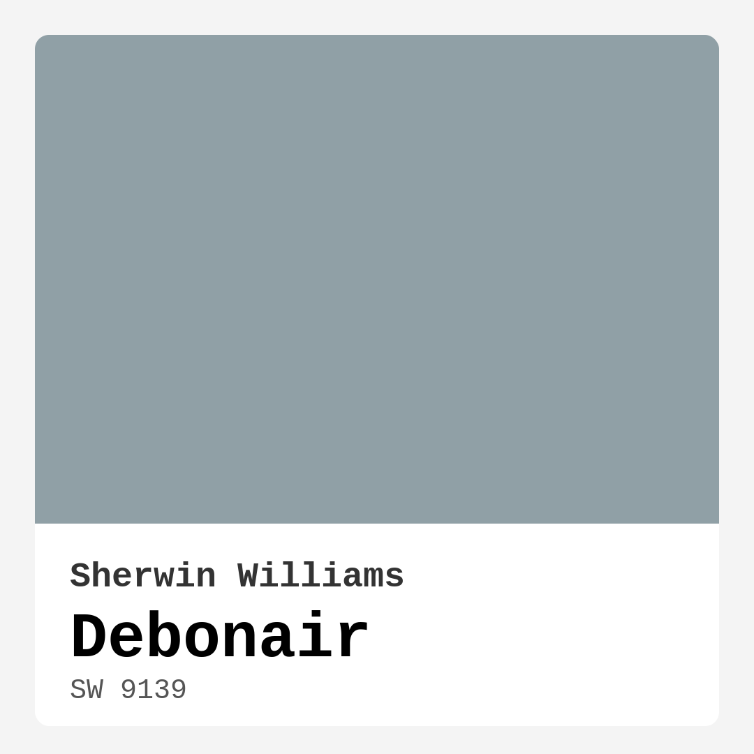
| HEX Code | #90A0A6 |
| RGB | 144, 160, 166 |
| LRV | 30% |
| Undertone | Blue |
| Finish Options | Eggshell, Matte, Satin |
Imagine stepping into a room where the atmosphere instantly feels calming and sophisticated, a place that invites you to unwind and breathe deeply. That’s the magic of paint color, and today, we’re diving into a particularly enchanting hue: Debonair by Sherwin Williams. This muted blue-gray tone is more than just a color on a wall; it’s a transformative element that can reshape your space, creating a serene environment that works beautifully across various decor styles.
Debonair, with its color code SW 9139, is characterized by a soft, sophisticated elegance. Its hex code, #90A0A6, reveals a blend of blue with subtle gray undertones. With a Light Reflectance Value (LRV) of 30%, Debonair reflects very little light, carving out a cozy and intimate vibe. This makes it perfect for spaces where you want to create an inviting atmosphere, such as bedrooms, living rooms, home offices, or dining areas.
When you’re contemplating a color for your walls, it’s essential to consider how it works in different lighting conditions. Debonair shines bright in well-lit spaces, appearing lighter and airier, while in dimmer environments, it takes on a contemplative depth that adds character and warmth. This versatility makes it a fantastic option for anyone looking to refresh their interiors without worrying about the mood swinging too harshly from one end to the other.
Now, let’s talk about the undertones of Debonair. The blue undertone gives it a calming effect, perfect for creating peaceful environments where you can relax or focus. It’s essential to test this paint in your home, next to your existing furnishings and decor, to see how these undertones interact. You might find that in different times of the day, the color reveals different aspects of its personality, especially when paired with natural light versus artificial sources.
One of the standout features of Debonair is its versatility. It complements a wide range of decor styles, from modern and transitional to industrial and coastal. If you’re a fan of a clean, contemporary look, Debonair pairs beautifully with crisp whites and soft neutrals. Imagine it on your walls paired with bright white trim or perhaps some brass fixtures that add a touch of glam. The coolness of the blue-gray tone harmonizes perfectly with warm wood accents, creating a balanced and inviting atmosphere.
For those of you wondering about its application, rest assured that Debonair has you covered. It’s beginner-friendly, meaning even if you’re new to painting, you’ll find it easy to roll on and brush smoothly. With good coverage in just one to two coats, you’ll be able to transform your space quickly. Plus, the washable and wipeable nature of the paint means it’s practical for high-traffic areas or homes with kids and pets.
You might be wondering if Debonair is suitable for smaller rooms. Absolutely! This hue can actually make small spaces feel larger and more inviting. The key is to balance it with lighter accents and ensure good lighting. Pair it with whites or light neutrals to keep the space airy and open.
In terms of decor, Debonair shines when it comes to accent walls or as a stunning backdrop for your favorite artwork. If you’re considering it for a home office, the calming nature of this color can boost your productivity, while in a dining room, it creates an atmosphere that encourages conversation and connection.
While Debonair is a strong contender for many projects, it’s worth noting a few considerations. In poorly lit spaces, it may appear darker, so strategic lighting becomes important. This is where testing the paint in your specific environment really pays off. It’s also crucial to match it carefully with your furnishings, as the wrong color pairing can detract from its beauty. Additionally, if you’re looking for this color, it might have limited availability in some stores, so a little planning ahead can save you some hassle.
For those of you who want to explore complementary colors, consider pairing Debonair with shades like SW 6280 or SW 0072 for a striking contrast. These can enhance the tranquil yet sophisticated vibe that Debonair brings. If you’re in the mood for a bolder look, deeper shades like SW 9135 or SW 9140 can create dramatic contrasts that are both eye-catching and elegant.
As an expert home designer, I can confidently say that Debonair is a fantastic choice for any homeowner looking to elevate their interior aesthetic. It strikes a perfect balance between subtlety and sophistication. Whether you’re refreshing a cozy bedroom or crafting a sophisticated dining room, this color adapts beautifully to various furnishings and styles, ensuring that your space feels cohesive and inviting.
Ultimately, the decision to use Debonair hinges on how it resonates with your taste and the atmosphere you wish to create. It’s more than just a color; it’s about how you want your spaces to feel. With its calm, inviting, and sophisticated mood, Debonair can help you achieve that perfect balance in your home. So grab a sample, take a good look in your space, and let this stunning hue guide you to your next beautiful interior project. Your walls are waiting for a little Debonair charm!

Real Room Photo of Debonair SW 9139


Undertones of Debonair ?
The undertones of Debonair are a key aspect of its character, leaning towards Blue. These subtle underlying hues are what give the color its depth and complexity. For example, a gray with a blue undertone will feel cooler and more modern, while one with a brown undertone will feel warmer and more traditional. It’s essential to test this paint in your home and observe it next to your existing furniture, flooring, and decor to see how these undertones interact and reveal themselves throughout the day.
HEX value: #90A0A6
RGB code: 144, 160, 166
Is Debonair Cool or Warm?
Debonair leans more towards the cool side of the color spectrum, thanks to its blue-gray tones. This coolness contributes to its calming effect, making it a perfect fit for serene spaces.
Understanding Color Properties and Interior Design Tips
Hue refers to a specific position on the color wheel, measured in degrees from 0 to 360. Each degree represents a different pure color:
- 0° represents red
- 120° represents green
- 240° represents blue
Saturation describes the intensity or purity of a color and is expressed as a percentage:
- At 0%, the color appears completely desaturated—essentially a shade of gray
- At 100%, the color is at its most vivid and vibrant
Lightness indicates how light or dark a color is, also expressed as a percentage:
- 0% lightness results in black
- 100% lightness results in white
Using Warm Colors in Interior Design
Warm hues—such as reds, oranges, yellows, warm beiges, and greiges—are excellent choices for creating inviting and energetic spaces. These colors are particularly well-suited for:
- Kitchens, living rooms, and bathrooms, where warmth enhances comfort and sociability
- Large rooms, where warm tones can help reduce the sense of emptiness and make the space feel more intimate
For example:
- Warm beige shades provide a cozy, inviting atmosphere, ideal for living rooms, bedrooms, and hallways.
- Warm greige (a mix of beige and gray) offers the warmth of beige with the modern appeal of gray, making it a versatile backdrop for dining areas, bedrooms, and living spaces.
However, be mindful when using warm light tones in rooms with limited natural light. These shades may appear muted or even take on an unpleasant yellowish tint. To avoid a dull or flat appearance:
- Add depth by incorporating richer tones like deep greens, charcoal, or chocolate brown
- Use textured elements such as curtains, rugs, or cushions to bring dimension to the space
Pro Tip: Achieving Harmony with Warm and Cool Color Balance
To create a well-balanced and visually interesting interior, mix warm and cool tones strategically. This contrast adds depth and harmony to your design.
- If your walls feature warm hues, introduce cool-colored accents such as blue or green furniture, artwork, or accessories to create contrast.
- For a polished look, consider using a complementary color scheme, which pairs colors opposite each other on the color wheel (e.g., red with green, orange with blue).
This thoughtful mix not only enhances visual appeal but also creates a space that feels both dynamic and cohesive.

Light Temperature Affects on Debonair
Natural Light
Natural daylight changes in color temperature as the sun moves across the sky. At sunrise and sunset, the light tends to have a warm, golden tone with a color temperature around 2000 Kelvin (K). As the day progresses and the sun rises higher, the light becomes cooler and more neutral. Around midday, especially when the sky is clear, natural light typically reaches its peak brightness and shifts to a cooler tone, ranging from 5500 to 6500 Kelvin. This midday light is close to what we perceive as pure white or daylight-balanced light.
These shifts in natural light can significantly influence how colors appear in a space, which is why designers often consider both the time of day and the orientation of windows when planning interior color schemes.
Artificial Light
When choosing artificial lighting, pay close attention to the color temperature, measured in Kelvin (K). This determines how warm or cool the light will appear. Lower temperatures, around 2700K, give off a warm, yellow glow often used in living rooms or bedrooms. Higher temperatures, above 5000K, create a cool, bluish light similar to daylight, commonly used in kitchens, offices, or task areas.
Use the slider to see how lighting temperature can affect the appearance of a surface or color throughout a space.


4800K
LRV of Debonair
The Light Reflectance Value (LRV) of Debonair is 30%, which places it in the Medium Dark category. This means it reflects very little light. Understanding a paint’s LRV is crucial for predicting how it will look in your space. A higher LRV indicates a lighter color that reflects more light, making rooms feel larger and brighter. A lower LRV signifies a darker color that absorbs more light, creating a cozier, more intimate atmosphere. Always consider the natural and artificial lighting in your room when selecting a paint color based on its LRV.
Detailed Review of Debonair
Additional Paint Characteristics
Ideal Rooms
Bedroom, Dining Room, Home Office, Living Room
Decor Styles
Coastal, Industrial, Modern, Transitional
Coverage
Good (1–2 Coats)
Ease of Application
Beginner Friendly, Brush Smooth, Roller-Ready
Washability
Washable, Wipeable
VOC Level
Low VOC
Best Use
Accent Wall, Furniture, Interior Walls
Room Suitability
Bedroom, Dining Room, Home Office, Living Room
Tone Tag
Balanced, Cool, Muted
Finish Type
Eggshell, Matte, Satin
Paint Performance
Easy Touch-Up, Low Odor, Quick Drying
Use Cases
Best for Modern Farmhouse, Best for Small Spaces, Classic Favorite
Mood
Calm, Inviting, Sophisticated
Trim Pairing
Complements Brass Fixtures, Good with Wood Trim, Pairs with White Dove
Debonair is a stunning choice for homeowners looking to strike a balance between subtle and striking. Its soft blue-gray hue evokes a sense of tranquility, making it ideal for spaces where relaxation is key. The color adapts beautifully to different lighting conditions, appearing lighter in natural light while maintaining its depth in shadowed areas. Whether you’re decorating a cozy bedroom or a sophisticated dining room, Debonair complements a wide range of furnishings and color palettes. The finish options available, including matte and satin, allow for customization based on your desired look and feel. Overall, this color is a fantastic way to elevate your interior aesthetic while keeping it inviting and elegant.
Pros & Cons of SW 9139 Debonair
Pros
Cons
Colors that go with Sherwin Williams Debonair
FAQ on SW 9139 Debonair
Can Debonair be used in a small room?
Absolutely! Debonair’s soft blue-gray tone can actually make small rooms feel larger and more inviting. The key is to balance it with lighter accents and good lighting. Pair it with whites or light neutrals to keep the space airy and open.
Is Debonair suitable for high-traffic areas?
Yes, Debonair can be used in high-traffic areas, especially if you opt for a satin finish for added durability. Just ensure you apply a good-quality primer and consider a washable formula to maintain its beauty over time.
Comparisons Debonair with other colors
Debonair SW 9139 vs Dutch Tile Blue SW 0031
| Attribute | Debonair SW 9139 | Dutch Tile Blue SW 0031 |
|---|---|---|
| Color Name | Debonair SW 9139 | Dutch Tile Blue SW 0031 |
| Color | ||
| Hue | Blue | Blue |
| Brightness | Medium | Medium |
| RGB | 144, 160, 166 | 154, 171, 171 |
| LRV | 30% | 24% |
| Finish Type | Eggshell, Matte, Satin | Eggshell, Matte, Satin |
| Finish Options | Eggshell, Matte, Satin | Eggshell, Flat, Matte, Satin |
| Ideal Rooms | Bedroom, Dining Room, Home Office, Living Room | Bathroom, Bedroom, Dining Room, Hallway, Home Office, Kitchen, Living Room |
| Decor Styles | Coastal, Industrial, Modern, Transitional | Coastal, Modern Farmhouse, Scandinavian, Traditional, Transitional |
| Coverage | Good (1–2 Coats) | Good (1–2 Coats) |
| Ease of Application | Beginner Friendly, Brush Smooth, Roller-Ready | Beginner Friendly, Brush Smooth, Fast-Drying, Roller-Ready |
| Washability | Washable, Wipeable | Highly Washable, Washable |
| Room Suitability | Bedroom, Dining Room, Home Office, Living Room | Bathroom, Bedroom, Dining Room, Kitchen, Living Room |
| Tone | Balanced, Cool, Muted | Balanced, Cool, Muted |
| Paint Performance | Easy Touch-Up, Low Odor, Quick Drying | Easy Touch-Up, High Coverage, Low Odor, Quick Drying |
Debonair SW 9139 vs Stardew SW 9138
| Attribute | Debonair SW 9139 | Stardew SW 9138 |
|---|---|---|
| Color Name | Debonair SW 9139 | Stardew SW 9138 |
| Color | ||
| Hue | Blue | Blue |
| Brightness | Medium | Medium |
| RGB | 144, 160, 166 | 166, 178, 181 |
| LRV | 30% | 30% |
| Finish Type | Eggshell, Matte, Satin | Eggshell, Satin |
| Finish Options | Eggshell, Matte, Satin | Eggshell, Matte, Satin |
| Ideal Rooms | Bedroom, Dining Room, Home Office, Living Room | Bathroom, Bedroom, Home Office, Living Room, Nursery |
| Decor Styles | Coastal, Industrial, Modern, Transitional | Coastal, Farmhouse, Modern, Scandinavian |
| Coverage | Good (1–2 Coats) | Good (1–2 Coats) |
| Ease of Application | Beginner Friendly, Brush Smooth, Roller-Ready | Beginner Friendly, Brush Smooth, Roller-Ready |
| Washability | Washable, Wipeable | Highly Washable, Washable, Wipeable |
| Room Suitability | Bedroom, Dining Room, Home Office, Living Room | Bathroom, Bedroom, Home Office, Living Room |
| Tone | Balanced, Cool, Muted | Calm, Cool, Muted |
| Paint Performance | Easy Touch-Up, Low Odor, Quick Drying | Easy Touch-Up, High Coverage, Low Odor |
Debonair SW 9139 vs Niebla Azul SW 9137
| Attribute | Debonair SW 9139 | Niebla Azul SW 9137 |
|---|---|---|
| Color Name | Debonair SW 9139 | Niebla Azul SW 9137 |
| Color | ||
| Hue | Blue | Blue |
| Brightness | Medium | Medium |
| RGB | 144, 160, 166 | 182, 195, 196 |
| LRV | 30% | 48% |
| Finish Type | Eggshell, Matte, Satin | Eggshell, Matte, Satin |
| Finish Options | Eggshell, Matte, Satin | Eggshell, Matte, Satin |
| Ideal Rooms | Bedroom, Dining Room, Home Office, Living Room | Bedroom, Home Office, Living Room, Nursery |
| Decor Styles | Coastal, Industrial, Modern, Transitional | Coastal, Modern, Scandinavian, Transitional |
| Coverage | Good (1–2 Coats) | Good (1–2 Coats), Touch-Up Friendly |
| Ease of Application | Beginner Friendly, Brush Smooth, Roller-Ready | Beginner Friendly, Brush Smooth, Roller-Ready |
| Washability | Washable, Wipeable | Highly Washable, Washable |
| Room Suitability | Bedroom, Dining Room, Home Office, Living Room | Bedroom, Home Office, Living Room, Nursery |
| Tone | Balanced, Cool, Muted | Airy, Cool, Muted |
| Paint Performance | Easy Touch-Up, Low Odor, Quick Drying | Easy Touch-Up, Fade Resistant, Low Odor, Scuff Resistant |
Debonair SW 9139 vs Rain SW 6219
| Attribute | Debonair SW 9139 | Rain SW 6219 |
|---|---|---|
| Color Name | Debonair SW 9139 | Rain SW 6219 |
| Color | ||
| Hue | Blue | Blue |
| Brightness | Medium | Medium |
| RGB | 144, 160, 166 | 171, 190, 191 |
| LRV | 30% | 50% |
| Finish Type | Eggshell, Matte, Satin | Eggshell, Matte, Satin |
| Finish Options | Eggshell, Matte, Satin | Eggshell, Matte, Satin |
| Ideal Rooms | Bedroom, Dining Room, Home Office, Living Room | Bathroom, Bedroom, Home Office, Living Room, Nursery |
| Decor Styles | Coastal, Industrial, Modern, Transitional | Coastal, Minimalist, Modern, Scandinavian, Transitional |
| Coverage | Good (1–2 Coats) | Good (1–2 Coats), Touch-Up Friendly |
| Ease of Application | Beginner Friendly, Brush Smooth, Roller-Ready | Beginner Friendly, Brush Smooth, Fast-Drying, Roller-Ready |
| Washability | Washable, Wipeable | Scrubbable, Stain Resistant, Washable |
| Room Suitability | Bedroom, Dining Room, Home Office, Living Room | Bathroom, Bedroom, Home Office, Living Room, Nursery |
| Tone | Balanced, Cool, Muted | Balanced, Cool, Muted |
| Paint Performance | Easy Touch-Up, Low Odor, Quick Drying | Easy Touch-Up, Low Odor, Quick Drying, Stain Resistant |
Debonair SW 9139 vs Morning at Sea SW 9634
| Attribute | Debonair SW 9139 | Morning at Sea SW 9634 |
|---|---|---|
| Color Name | Debonair SW 9139 | Morning at Sea SW 9634 |
| Color | ||
| Hue | Blue | Blue |
| Brightness | Medium | Medium |
| RGB | 144, 160, 166 | 130, 151, 155 |
| LRV | 30% | 50% |
| Finish Type | Eggshell, Matte, Satin | Eggshell, Matte |
| Finish Options | Eggshell, Matte, Satin | Eggshell, Matte, Satin |
| Ideal Rooms | Bedroom, Dining Room, Home Office, Living Room | Bathroom, Bedroom, Home Office, Living Room |
| Decor Styles | Coastal, Industrial, Modern, Transitional | Coastal, Minimalist, Modern, Scandinavian |
| Coverage | Good (1–2 Coats) | Good (1–2 Coats), Touch-Up Friendly |
| Ease of Application | Beginner Friendly, Brush Smooth, Roller-Ready | Beginner Friendly, Brush Smooth, Roller-Ready |
| Washability | Washable, Wipeable | Washable, Wipeable |
| Room Suitability | Bedroom, Dining Room, Home Office, Living Room | Bathroom, Bedroom, Home Office, Living Room |
| Tone | Balanced, Cool, Muted | Airy, Cool, Muted |
| Paint Performance | Easy Touch-Up, Low Odor, Quick Drying | Easy Touch-Up, Fade Resistant, Low Odor |
Debonair SW 9139 vs Sleepy Blue SW 6225
| Attribute | Debonair SW 9139 | Sleepy Blue SW 6225 |
|---|---|---|
| Color Name | Debonair SW 9139 | Sleepy Blue SW 6225 |
| Color | ||
| Hue | Blue | Blue |
| Brightness | Medium | Medium |
| RGB | 144, 160, 166 | 188, 203, 206 |
| LRV | 30% | 50% |
| Finish Type | Eggshell, Matte, Satin | Eggshell, Matte, Satin |
| Finish Options | Eggshell, Matte, Satin | Eggshell, Matte, Satin |
| Ideal Rooms | Bedroom, Dining Room, Home Office, Living Room | Bedroom, Home Office, Living Room, Nursery |
| Decor Styles | Coastal, Industrial, Modern, Transitional | Coastal, Minimalist, Modern Farmhouse, Scandinavian |
| Coverage | Good (1–2 Coats) | Good (1–2 Coats) |
| Ease of Application | Beginner Friendly, Brush Smooth, Roller-Ready | Beginner Friendly, Brush Smooth, Fast-Drying, Roller-Ready |
| Washability | Washable, Wipeable | Highly Washable, Washable |
| Room Suitability | Bedroom, Dining Room, Home Office, Living Room | Bedroom, Home Office, Living Room, Nursery |
| Tone | Balanced, Cool, Muted | Airy, Cool, Muted |
| Paint Performance | Easy Touch-Up, Low Odor, Quick Drying | Easy Touch-Up, Low Odor, Quick Drying, Scuff Resistant |
Debonair SW 9139 vs Lakeside SW 9683
| Attribute | Debonair SW 9139 | Lakeside SW 9683 |
|---|---|---|
| Color Name | Debonair SW 9139 | Lakeside SW 9683 |
| Color | ||
| Hue | Blue | Blue |
| Brightness | Medium | Medium |
| RGB | 144, 160, 166 | 173, 184, 192 |
| LRV | 30% | 24% |
| Finish Type | Eggshell, Matte, Satin | Eggshell, Matte, Satin |
| Finish Options | Eggshell, Matte, Satin | Eggshell, Matte, Satin |
| Ideal Rooms | Bedroom, Dining Room, Home Office, Living Room | Bathroom, Bedroom, Home Office, Living Room |
| Decor Styles | Coastal, Industrial, Modern, Transitional | Coastal, Minimalist, Modern, Rustic |
| Coverage | Good (1–2 Coats) | Good (1–2 Coats) |
| Ease of Application | Beginner Friendly, Brush Smooth, Roller-Ready | Beginner Friendly, Brush Smooth, Roller-Ready |
| Washability | Washable, Wipeable | Scrubbable, Washable |
| Room Suitability | Bedroom, Dining Room, Home Office, Living Room | Bathroom, Bedroom, Home Office, Living Room |
| Tone | Balanced, Cool, Muted | Balanced, Cool, Muted |
| Paint Performance | Easy Touch-Up, Low Odor, Quick Drying | Easy Touch-Up, Fade Resistant, High Coverage, Low Odor |
Debonair SW 9139 vs Upward SW 6239
| Attribute | Debonair SW 9139 | Upward SW 6239 |
|---|---|---|
| Color Name | Debonair SW 9139 | Upward SW 6239 |
| Color | ||
| Hue | Blue | Blue |
| Brightness | Medium | Medium |
| RGB | 144, 160, 166 | 191, 201, 208 |
| LRV | 30% | 75% |
| Finish Type | Eggshell, Matte, Satin | Eggshell, Satin |
| Finish Options | Eggshell, Matte, Satin | Eggshell, Flat, Satin |
| Ideal Rooms | Bedroom, Dining Room, Home Office, Living Room | Bedroom, Dining Room, Home Office, Living Room, Nursery |
| Decor Styles | Coastal, Industrial, Modern, Transitional | Coastal, Minimalist, Modern, Scandinavian |
| Coverage | Good (1–2 Coats) | Good (1–2 Coats), Touch-Up Friendly |
| Ease of Application | Beginner Friendly, Brush Smooth, Roller-Ready | Beginner Friendly, Brush Smooth, Fast-Drying, Roller-Ready |
| Washability | Washable, Wipeable | Washable, Wipeable |
| Room Suitability | Bedroom, Dining Room, Home Office, Living Room | Bedroom, Home Office, Living Room, Nursery |
| Tone | Balanced, Cool, Muted | Cool, Crisp, Muted |
| Paint Performance | Easy Touch-Up, Low Odor, Quick Drying | High Coverage, Low Odor, Quick Drying |
Debonair SW 9139 vs Aleutian SW 6241
| Attribute | Debonair SW 9139 | Aleutian SW 6241 |
|---|---|---|
| Color Name | Debonair SW 9139 | Aleutian SW 6241 |
| Color | ||
| Hue | Blue | Blue |
| Brightness | Medium | Medium |
| RGB | 144, 160, 166 | 152, 169, 183 |
| LRV | 30% | 24% |
| Finish Type | Eggshell, Matte, Satin | Eggshell, Matte, Satin |
| Finish Options | Eggshell, Matte, Satin | Eggshell, Matte, Satin |
| Ideal Rooms | Bedroom, Dining Room, Home Office, Living Room | Bathroom, Bedroom, Home Office, Kitchen, Living Room, Nursery |
| Decor Styles | Coastal, Industrial, Modern, Transitional | Coastal, Minimalist, Modern, Scandinavian, Transitional |
| Coverage | Good (1–2 Coats) | Good (1–2 Coats), Touch-Up Friendly |
| Ease of Application | Beginner Friendly, Brush Smooth, Roller-Ready | Beginner Friendly, Brush Smooth, Fast-Drying, Roller-Ready |
| Washability | Washable, Wipeable | Scrubbable, Stain Resistant, Washable |
| Room Suitability | Bedroom, Dining Room, Home Office, Living Room | Bathroom, Bedroom, Home Office, Living Room, Nursery |
| Tone | Balanced, Cool, Muted | Airy, Balanced, Cool, Muted |
| Paint Performance | Easy Touch-Up, Low Odor, Quick Drying | Easy Touch-Up, Fade Resistant, Low Odor, Quick Drying |
Debonair SW 9139 vs Moody Blue SW 6221
| Attribute | Debonair SW 9139 | Moody Blue SW 6221 |
|---|---|---|
| Color Name | Debonair SW 9139 | Moody Blue SW 6221 |
| Color | ||
| Hue | Blue | Blue |
| Brightness | Medium | Medium |
| RGB | 144, 160, 166 | 122, 145, 146 |
| LRV | 30% | 10% |
| Finish Type | Eggshell, Matte, Satin | Eggshell, Matte, Satin |
| Finish Options | Eggshell, Matte, Satin | Eggshell, Matte, Satin |
| Ideal Rooms | Bedroom, Dining Room, Home Office, Living Room | Bedroom, Dining Room, Hallway, Home Office, Living Room |
| Decor Styles | Coastal, Industrial, Modern, Transitional | Coastal, Contemporary, Modern Farmhouse, Transitional |
| Coverage | Good (1–2 Coats) | Good (1–2 Coats) |
| Ease of Application | Beginner Friendly, Brush Smooth, Roller-Ready | Beginner Friendly, Brush Smooth, Roller-Ready |
| Washability | Washable, Wipeable | Highly Washable, Washable |
| Room Suitability | Bedroom, Dining Room, Home Office, Living Room | Bedroom, Dining Room, Home Office, Living Room |
| Tone | Balanced, Cool, Muted | Cool, Deep, Moody, Muted |
| Paint Performance | Easy Touch-Up, Low Odor, Quick Drying | Easy Touch-Up, Fade Resistant, High Coverage, Low Odor |
Official Page of Sherwin Williams Debonair SW 9139