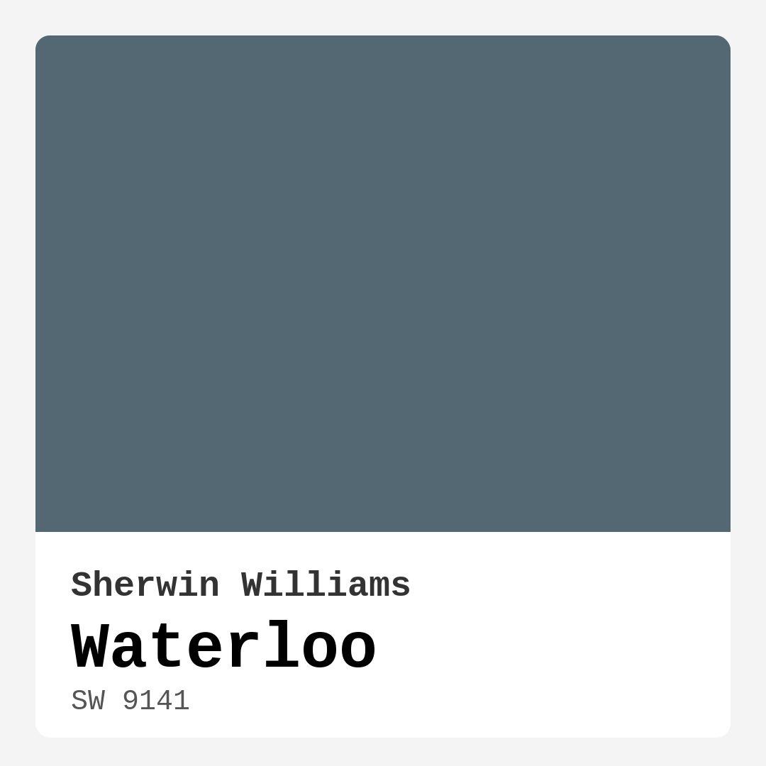
Color Preview & Key Details
| HEX Code | #536872 |
| RGB | 83, 104, 114 |
| LRV | 12% |
| Undertone | Blue |
| Finish Options | Matte, Satin, Semi-Gloss |
Imagine stepping into a serene retreat right in your own home, where the chaos of the outside world fades away, and all that surrounds you is calm and inviting. This is the magic that Sherwin Williams’ Waterloo (SW 9141) brings to your space. It’s a color that perfectly balances blue and gray, reminiscent of tranquil waters, and it can transform any room into a stylish sanctuary. As an experienced home designer, I can tell you that choosing the right paint color can make all the difference in how you feel in your home. Let’s dive into everything you need to know about Waterloo and see if it’s the right fit for your next project.
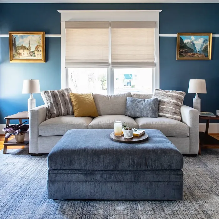
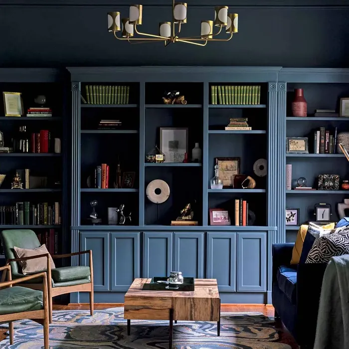
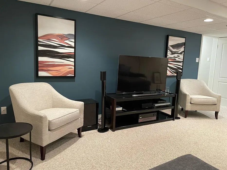
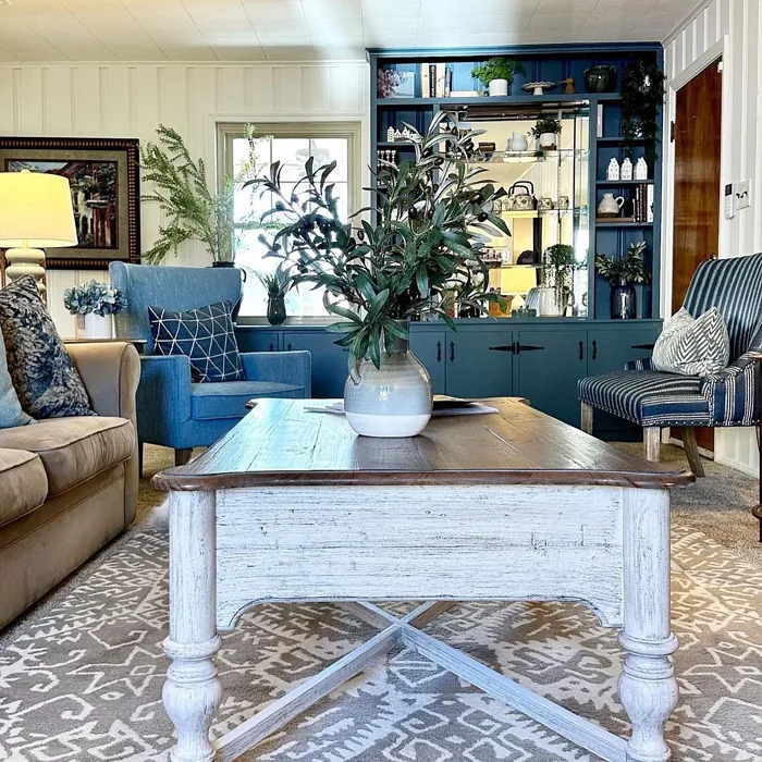
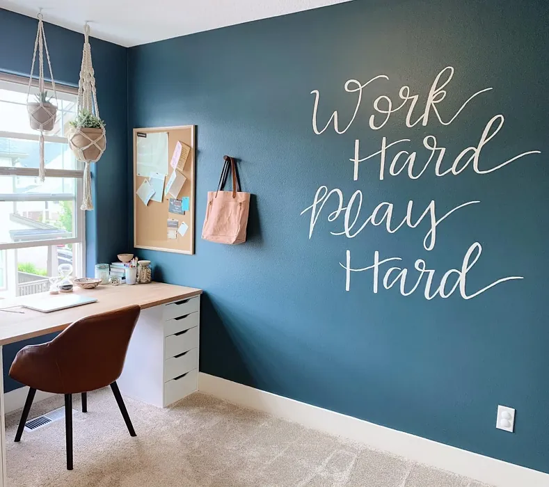
Waterloo is more than just a paint color; it’s a mood enhancer. Its unique blend offers a soothing atmosphere, making it ideal for spaces where relaxation is key—think bedrooms, living rooms, or even a cozy home office. The color is versatile and adapts beautifully to various decor styles, including modern, coastal, industrial, and rustic. Whether you’re going for a sleek, contemporary vibe or a warm, inviting look, Waterloo can be your perfect backdrop.
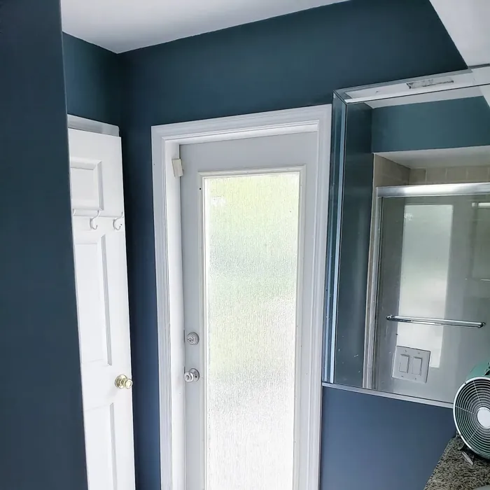
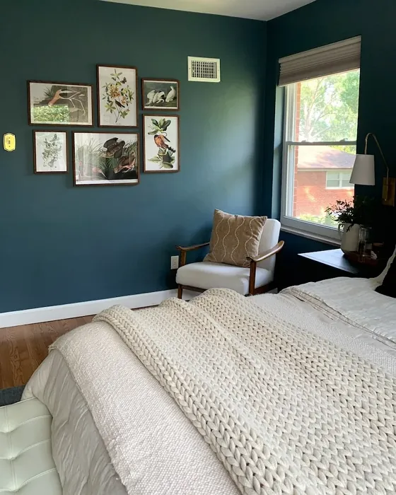
One of the standout features of Waterloo is its depth. With a Light Reflectance Value (LRV) of 12%, this color falls into the dark category. This means it doesn’t reflect much light, which can create a cozy and intimate atmosphere. However, this also means that in poorly lit spaces, it may appear darker than expected. If you’re considering it for a smaller room or a space without much natural light, you’ll want to think carefully about how it will interact with the lighting throughout the day.
The color’s undertones lean towards blue, giving it a cool, modern feel. This is crucial because the undertones can dramatically affect how the color comes across in your home. In bright light, Waterloo showcases its blue tones beautifully, while in softer lighting, it leans more into its gray aspects. This adaptability makes it a great choice for open-concept spaces, where you want to create a cohesive look without feeling monotonous.
When it comes to application, Waterloo is incredibly user-friendly. It’s roller-ready, brush smooth, and fast-drying, making the painting process efficient and hassle-free. Plus, it’s touch-up friendly, allowing you to easily maintain that flawless finish over time. It’s also washable and scrubbable, which is a significant advantage if you’re using it in high-traffic areas or spaces that may require frequent cleaning.
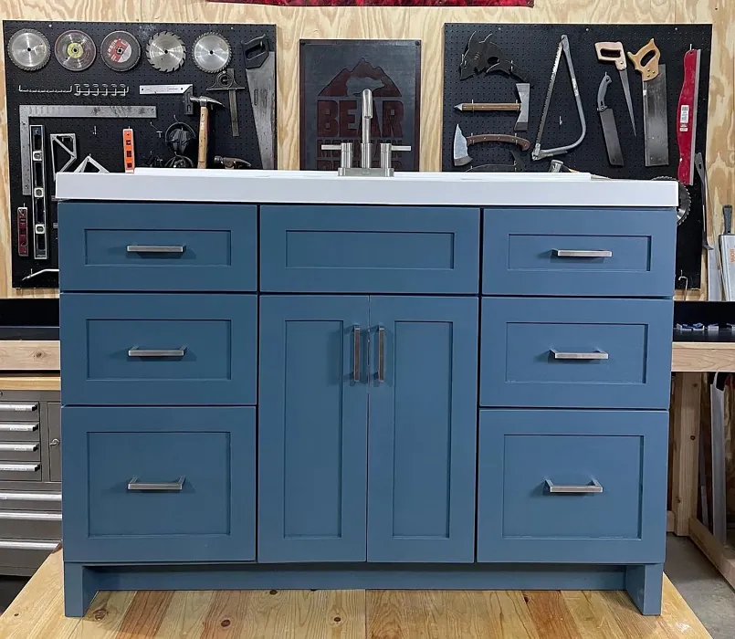
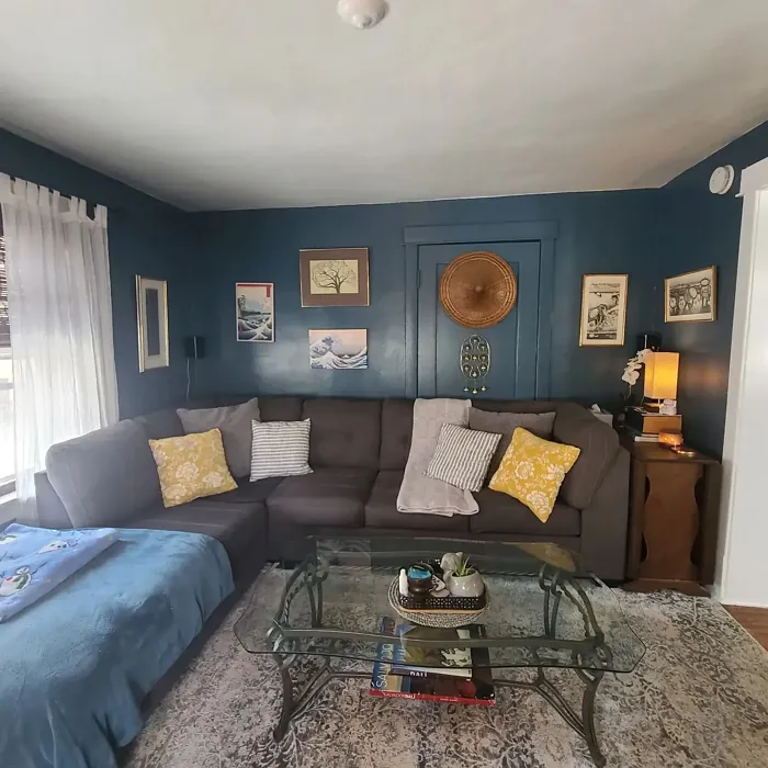
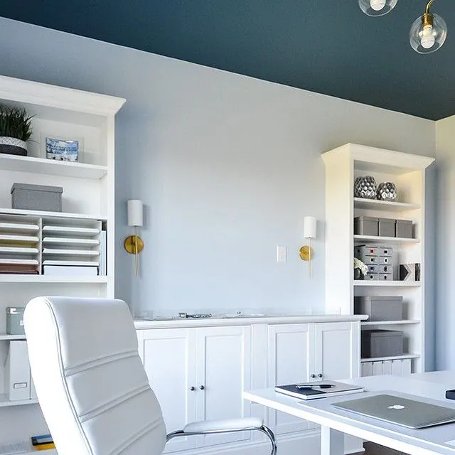
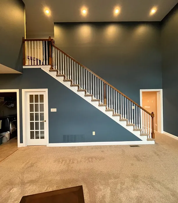
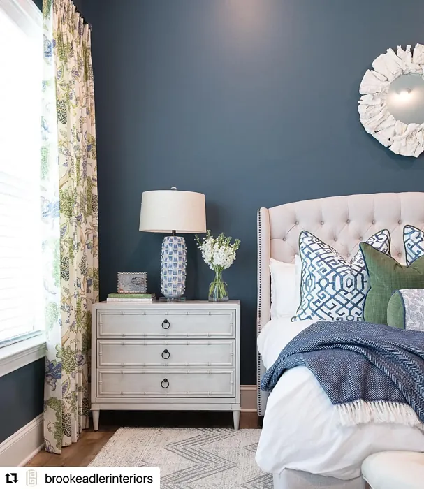
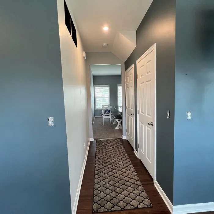
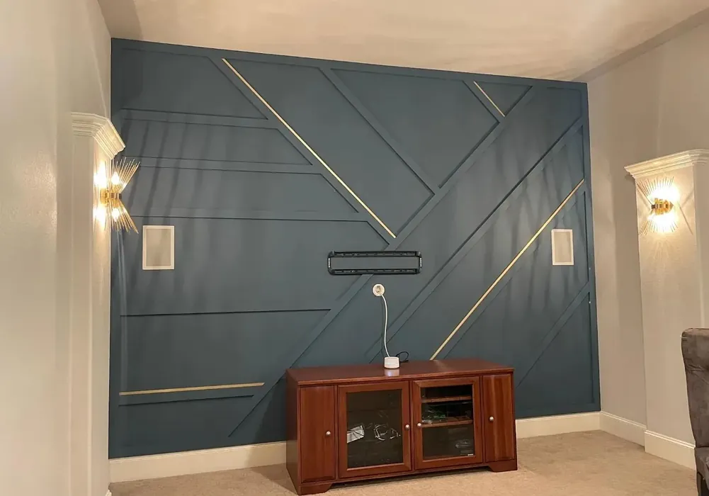
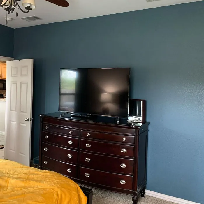
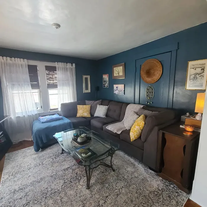
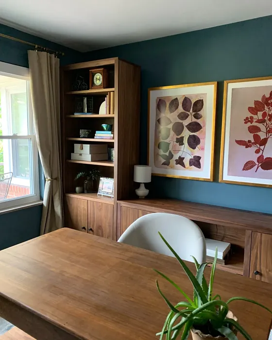
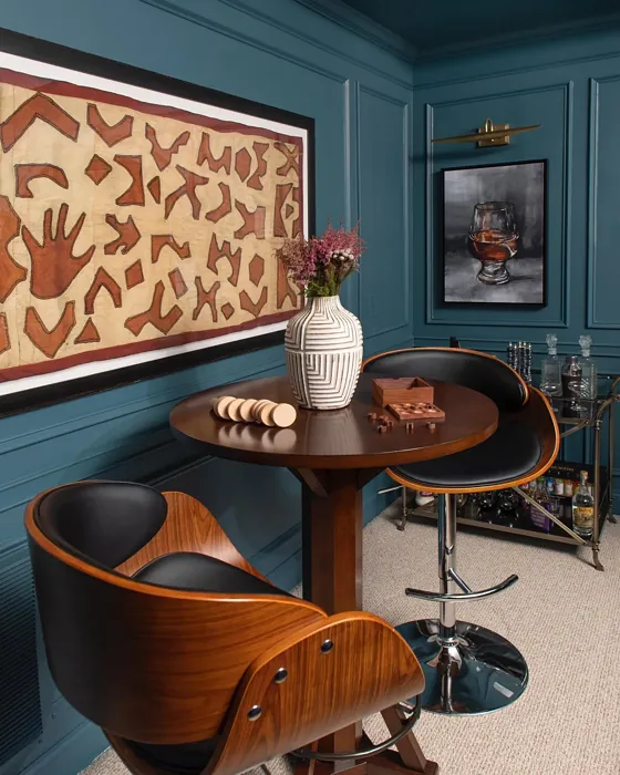
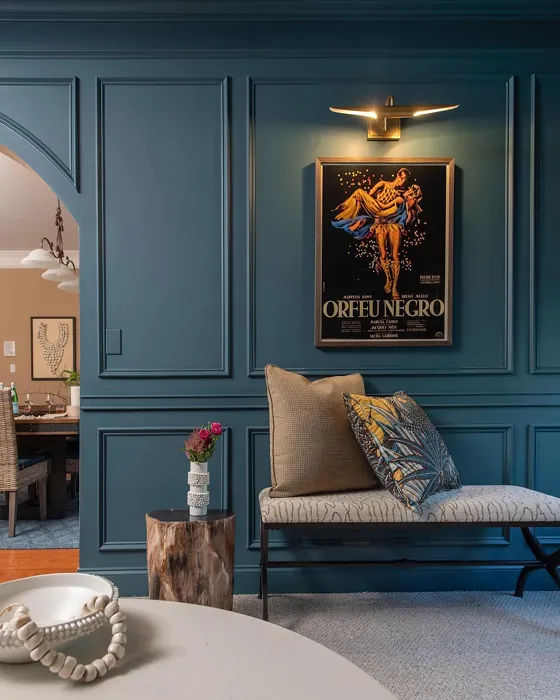
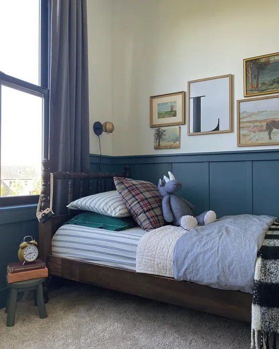
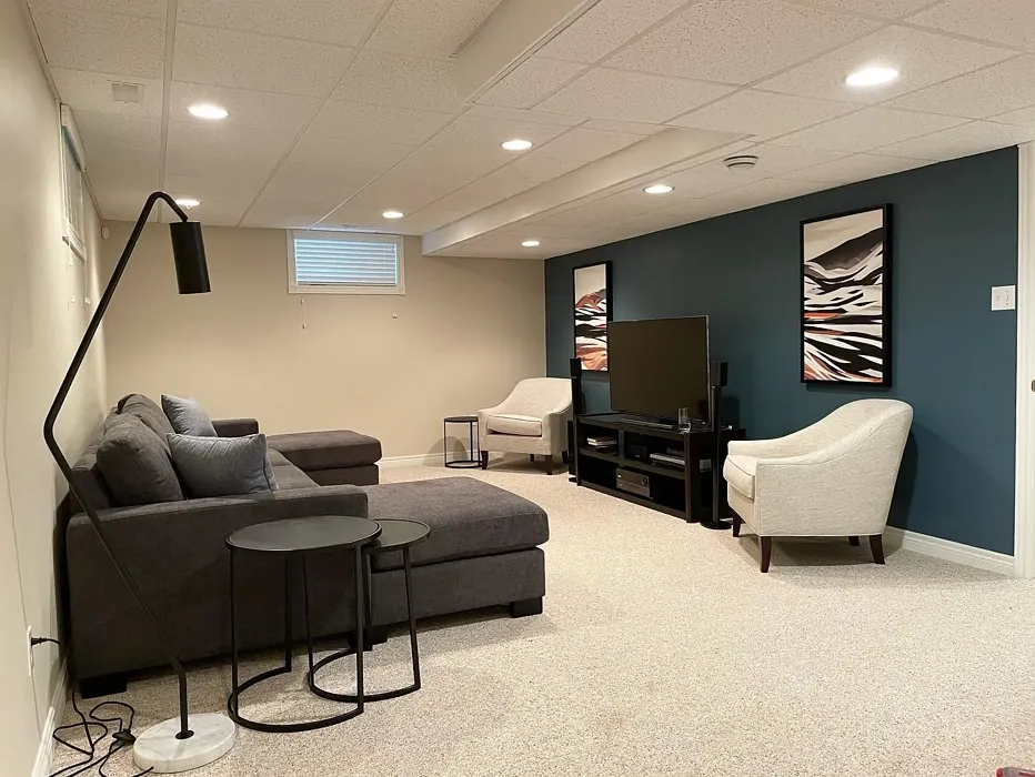
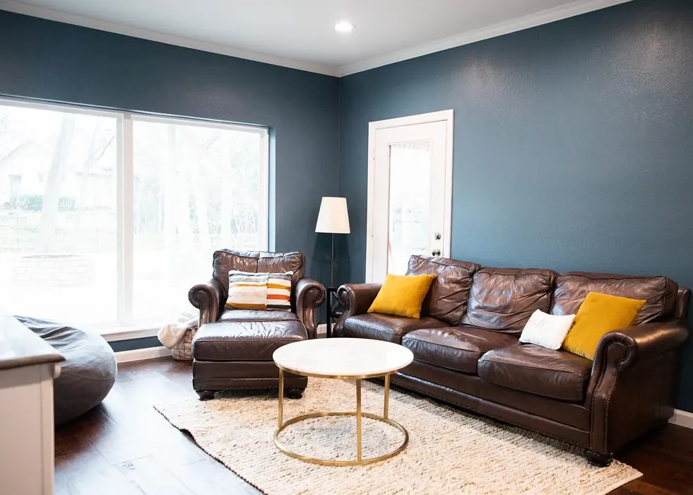
Now, let’s talk about where Waterloo shines. It’s perfect for living rooms, bedrooms, dining rooms, and even home offices. Imagine a soothing bedroom painted in Waterloo, where you can unwind after a long day. Or picture a dining room that feels elegant yet relaxed, setting the perfect stage for family gatherings and dinner parties. The color pairs beautifully with a variety of trim options, such as crisp whites like White Dove, enhancing its sophistication. It also complements brass fixtures beautifully, adding a touch of warmth that balances the coolness of the blue-gray hue.
For those of you considering how Waterloo interacts with other colors, it’s worth noting that it has some fantastic complementary shades. Pair it with greens or warm neutrals for a balanced palette that feels fresh and inviting. You might also find that it works wonderfully alongside darker shades like SW 7605 or SW 6229 for a more dramatic look.
One of the reasons I love recommending Waterloo is its excellent coverage. With just one or two coats, you can achieve a rich, full finish. That’s especially appealing if you’re on a timeline or working with a budget. Just keep in mind that for the best results, a well-prepped surface is essential. Make sure to clean and prime your walls if necessary; this will allow Waterloo to shine at its best.
Before making a final decision, it’s always wise to test paint colors in your space. Grab a sample of Waterloo and paint a small section on your wall. Observe how it changes throughout the day and how it interacts with your existing decor. You might find that it brings out the best in your furnishings or creates an unexpected harmony with your flooring.
If you’re still on the fence, consider how Waterloo compares to similar colors. It stands out for its unique blend of blue and gray, setting it apart from other blue-grays that might lean too cool or warm. Waterloo finds that sweet spot, making it versatile and adaptable to different lighting conditions. This quality can create a calm yet stylish ambiance, no matter where it’s used.
While Waterloo has many advantages, it’s essential to acknowledge its potential drawbacks. In dimly lit spaces, it may appear darker than you’d expect, which could be a concern if you’re trying to brighten up a room. However, this darker tone can also create an intimate feeling, making it ideal for spaces meant for relaxation and comfort.
As you consider Waterloo, think about how it can enhance the mood of your home. Its calm, inviting, and restful qualities foster a sense of peace, making it easier to unwind and recharge. Plus, with its low VOC levels and eco-certification, you can feel good about your choice for both your home and the environment.
In conclusion, if you’re looking for a sophisticated color that brings depth and tranquility to your space, Waterloo is an excellent option to consider. It’s versatile, easy to apply, and works beautifully across various styles and settings. So, go ahead and explore how this captivating shade can transform your home into the serene retreat you’ve always wanted. Trust me; once you see it on your walls, you’ll understand why it’s such a beloved choice among designers and homeowners alike.

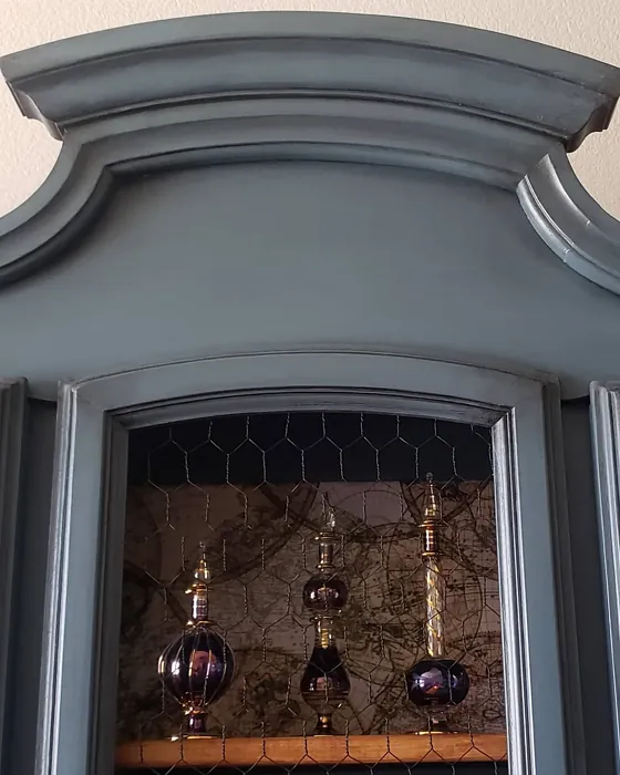
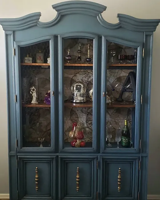
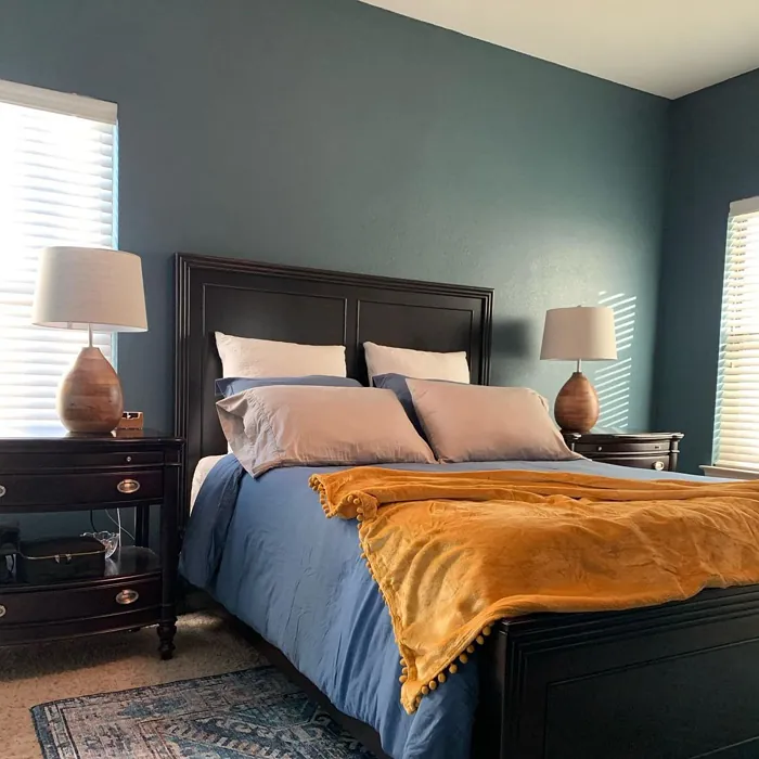
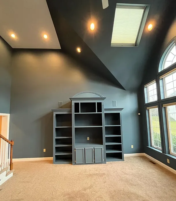
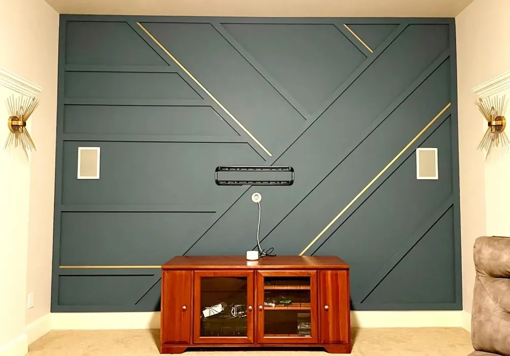
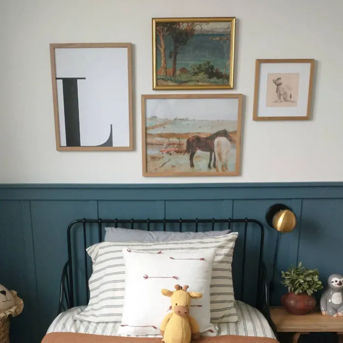
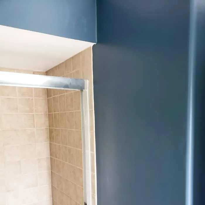
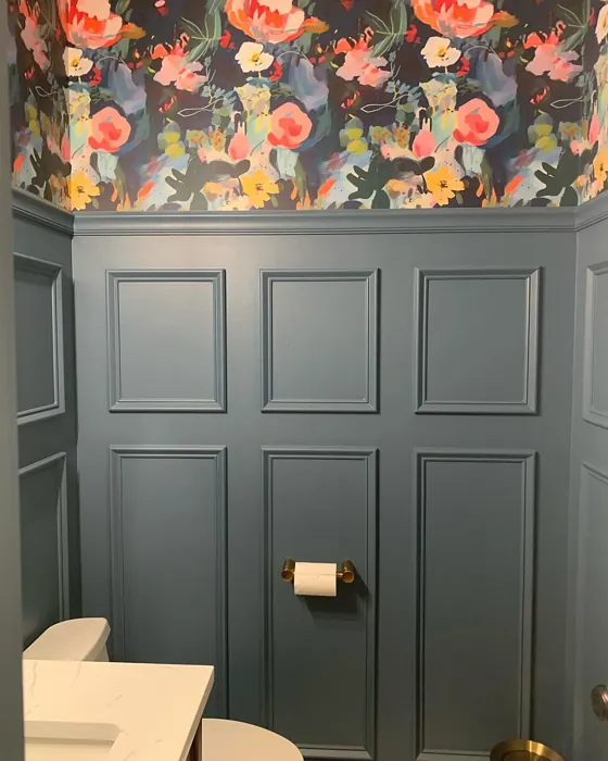
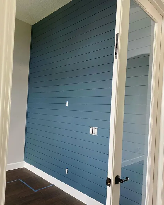
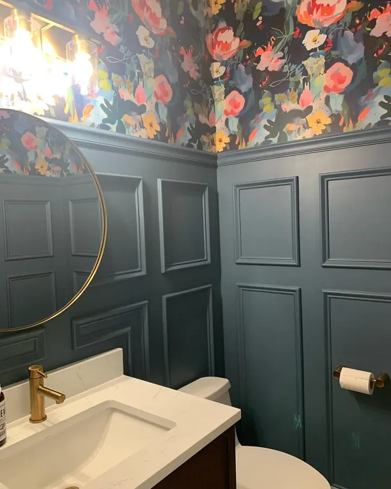
Real Room Photo of Waterloo SW 9141
Undertones of Waterloo ?
The undertones of Waterloo are a key aspect of its character, leaning towards Blue. These subtle underlying hues are what give the color its depth and complexity. For example, a gray with a blue undertone will feel cooler and more modern, while one with a brown undertone will feel warmer and more traditional. It’s essential to test this paint in your home and observe it next to your existing furniture, flooring, and decor to see how these undertones interact and reveal themselves throughout the day.
HEX value: #536872
RGB code: 83, 104, 114
Is Waterloo Cool or Warm?
Waterloo is predominantly a cool color, but its unique undertones can create a balanced ambiance, making it versatile enough to work in both warm and cool palettes. This quality allows it to interact well with different furnishings, creating a cohesive look.
Understanding Color Properties and Interior Design Tips
Hue refers to a specific position on the color wheel, measured in degrees from 0 to 360. Each degree represents a different pure color:
- 0° represents red
- 120° represents green
- 240° represents blue
Saturation describes the intensity or purity of a color and is expressed as a percentage:
- At 0%, the color appears completely desaturated—essentially a shade of gray
- At 100%, the color is at its most vivid and vibrant
Lightness indicates how light or dark a color is, also expressed as a percentage:
- 0% lightness results in black
- 100% lightness results in white
Using Warm Colors in Interior Design
Warm hues—such as reds, oranges, yellows, warm beiges, and greiges—are excellent choices for creating inviting and energetic spaces. These colors are particularly well-suited for:
- Kitchens, living rooms, and bathrooms, where warmth enhances comfort and sociability
- Large rooms, where warm tones can help reduce the sense of emptiness and make the space feel more intimate
For example:
- Warm beige shades provide a cozy, inviting atmosphere, ideal for living rooms, bedrooms, and hallways.
- Warm greige (a mix of beige and gray) offers the warmth of beige with the modern appeal of gray, making it a versatile backdrop for dining areas, bedrooms, and living spaces.
However, be mindful when using warm light tones in rooms with limited natural light. These shades may appear muted or even take on an unpleasant yellowish tint. To avoid a dull or flat appearance:
- Add depth by incorporating richer tones like deep greens, charcoal, or chocolate brown
- Use textured elements such as curtains, rugs, or cushions to bring dimension to the space
Pro Tip: Achieving Harmony with Warm and Cool Color Balance
To create a well-balanced and visually interesting interior, mix warm and cool tones strategically. This contrast adds depth and harmony to your design.
- If your walls feature warm hues, introduce cool-colored accents such as blue or green furniture, artwork, or accessories to create contrast.
- For a polished look, consider using a complementary color scheme, which pairs colors opposite each other on the color wheel (e.g., red with green, orange with blue).
This thoughtful mix not only enhances visual appeal but also creates a space that feels both dynamic and cohesive.
Light Temperature Affects on Waterloo
Natural Light
Natural daylight changes in color temperature as the sun moves across the sky. At sunrise and sunset, the light tends to have a warm, golden tone with a color temperature around 2000 Kelvin (K). As the day progresses and the sun rises higher, the light becomes cooler and more neutral. Around midday, especially when the sky is clear, natural light typically reaches its peak brightness and shifts to a cooler tone, ranging from 5500 to 6500 Kelvin. This midday light is close to what we perceive as pure white or daylight-balanced light.
These shifts in natural light can significantly influence how colors appear in a space, which is why designers often consider both the time of day and the orientation of windows when planning interior color schemes.
Artificial Light
When choosing artificial lighting, pay close attention to the color temperature, measured in Kelvin (K). This determines how warm or cool the light will appear. Lower temperatures, around 2700K, give off a warm, yellow glow often used in living rooms or bedrooms. Higher temperatures, above 5000K, create a cool, bluish light similar to daylight, commonly used in kitchens, offices, or task areas.
Use the slider to see how lighting temperature can affect the appearance of a surface or color throughout a space.


4800K
LRV of Waterloo
The Light Reflectance Value (LRV) of Waterloo is 12%, which places it in the Dark colors category. This means it does not reflect light. Understanding a paint’s LRV is crucial for predicting how it will look in your space. A higher LRV indicates a lighter color that reflects more light, making rooms feel larger and brighter. A lower LRV signifies a darker color that absorbs more light, creating a cozier, more intimate atmosphere. Always consider the natural and artificial lighting in your room when selecting a paint color based on its LRV.
Detailed Review of Waterloo
Additional Paint Characteristics
Ideal Rooms
Bedroom, Dining Room, Hallway, Home Office, Living Room
Decor Styles
Coastal, Industrial, Modern, Rustic
Coverage
Good (1–2 Coats), Touch-Up Friendly
Ease of Application
Brush Smooth, Fast-Drying, Roller-Ready
Washability
Scrubbable, Washable
VOC Level
Eco-Certified, Low VOC
Best Use
Accent Wall, Furniture, Interior Walls
Room Suitability
Bedroom, Dining Room, Home Office, Living Room
Tone Tag
Balanced, Cool, Muted
Finish Type
Matte, Satin
Paint Performance
Easy Touch-Up, Fade Resistant, Low Odor, Quick Drying
Use Cases
Best for Low Light Rooms, Best for Modern Farmhouse, Best for Open Concept
Mood
Calm, Inviting, Restful
Trim Pairing
Complements Brass Fixtures, Pairs with White Dove, Works with Warm Trim
Waterloo is more than just a color; it’s a mood enhancer. Its unique blend of blue and gray creates a soothing atmosphere, making it ideal for areas where relaxation is key. When applied, it offers a smooth finish that enhances the room’s light without overwhelming it. The color performs well in both natural and artificial light, adapting its tone based on the time of day and lighting conditions. This adaptability makes it an excellent choice for open-concept spaces, where one color can unify different areas without feeling monotonous. Overall, Waterloo is a chic option that brings a touch of elegance and calm to any home.
Pros & Cons of SW 9141 Waterloo
Pros
Cons
Colors that go with Sherwin Williams Waterloo
FAQ on SW 9141 Waterloo
What surfaces can I use Waterloo on?
Waterloo is suitable for a variety of surfaces, including drywall, wood, and metal. It performs exceptionally well on interior walls, trim, and even furniture pieces, providing a cohesive look throughout your home. Just ensure the surface is clean and primed if necessary for the best results.
How does Waterloo compare to other similar colors?
Waterloo stands out among similar colors due to its unique blend of blue and gray with green undertones. Unlike other blue-grays that may lean too cool or too warm, Waterloo finds a sweet spot that makes it versatile for various decor styles. Its adaptability in different lighting conditions also sets it apart, allowing it to create a calm yet stylish ambiance wherever it’s used.
Comparisons Waterloo with other colors
Waterloo SW 9141 vs Naval SW 6244
| Attribute | Waterloo SW 9141 | Naval SW 6244 |
|---|---|---|
| Color Name | Waterloo SW 9141 | Naval SW 6244 |
| Color | ||
| Hue | Blue | Blue |
| Brightness | Dark | Dark |
| RGB | 83, 104, 114 | 47, 61, 76 |
| LRV | 12% | 4% |
| Finish Type | Matte, Satin | Matte, Satin, Semi-Gloss |
| Finish Options | Matte, Satin, Semi-Gloss | Matte, Satin, Semi-Gloss |
| Ideal Rooms | Bedroom, Dining Room, Hallway, Home Office, Living Room | Bedroom, Dining Room, Hallway, Home Office, Living Room |
| Decor Styles | Coastal, Industrial, Modern, Rustic | Coastal, Industrial, Minimalist, Modern, Traditional |
| Coverage | Good (1–2 Coats), Touch-Up Friendly | Good (1–2 Coats), Self-Priming |
| Ease of Application | Brush Smooth, Fast-Drying, Roller-Ready | Beginner Friendly, Brush Smooth, Roller-Ready |
| Washability | Scrubbable, Washable | Highly Washable, Washable |
| Room Suitability | Bedroom, Dining Room, Home Office, Living Room | Bedroom, Dining Room, Entryway, Home Office, Living Room |
| Tone | Balanced, Cool, Muted | Cool, Deep, Moody |
| Paint Performance | Easy Touch-Up, Fade Resistant, Low Odor, Quick Drying | Easy Touch-Up, High Coverage, Low Odor, Scuff Resistant |
Waterloo SW 9141 vs Sea Serpent SW 7615
| Attribute | Waterloo SW 9141 | Sea Serpent SW 7615 |
|---|---|---|
| Color Name | Waterloo SW 9141 | Sea Serpent SW 7615 |
| Color | ||
| Hue | Blue | Blue |
| Brightness | Dark | Dark |
| RGB | 83, 104, 114 | 62, 75, 84 |
| LRV | 12% | 12% |
| Finish Type | Matte, Satin | Eggshell, Matte, Satin |
| Finish Options | Matte, Satin, Semi-Gloss | Eggshell, Matte, Satin |
| Ideal Rooms | Bedroom, Dining Room, Hallway, Home Office, Living Room | Bathroom, Bedroom, Home Office, Living Room |
| Decor Styles | Coastal, Industrial, Modern, Rustic | Coastal, Farmhouse, Industrial, Modern |
| Coverage | Good (1–2 Coats), Touch-Up Friendly | Good (1–2 Coats), Touch-Up Friendly |
| Ease of Application | Brush Smooth, Fast-Drying, Roller-Ready | Beginner Friendly, Brush Smooth, Roller-Ready |
| Washability | Scrubbable, Washable | Highly Washable, Washable |
| Room Suitability | Bedroom, Dining Room, Home Office, Living Room | Bathroom, Bedroom, Home Office, Living Room |
| Tone | Balanced, Cool, Muted | Cool, Deep, Moody |
| Paint Performance | Easy Touch-Up, Fade Resistant, Low Odor, Quick Drying | Easy Touch-Up, High Coverage, Low Odor |
Waterloo SW 9141 vs Rain Cloud SW 9639
| Attribute | Waterloo SW 9141 | Rain Cloud SW 9639 |
|---|---|---|
| Color Name | Waterloo SW 9141 | Rain Cloud SW 9639 |
| Color | ||
| Hue | Blue | Blue |
| Brightness | Dark | Dark |
| RGB | 83, 104, 114 | 83, 97, 104 |
| LRV | 12% | 30% |
| Finish Type | Matte, Satin | Eggshell, Matte, Satin |
| Finish Options | Matte, Satin, Semi-Gloss | Eggshell, Matte, Satin |
| Ideal Rooms | Bedroom, Dining Room, Hallway, Home Office, Living Room | Bedroom, Dining Room, Home Office, Living Room |
| Decor Styles | Coastal, Industrial, Modern, Rustic | Coastal, Contemporary, Minimalist, Scandinavian |
| Coverage | Good (1–2 Coats), Touch-Up Friendly | Good (1–2 Coats), Touch-Up Friendly |
| Ease of Application | Brush Smooth, Fast-Drying, Roller-Ready | Beginner Friendly, Brush Smooth, Roller-Ready |
| Washability | Scrubbable, Washable | Highly Washable, Washable |
| Room Suitability | Bedroom, Dining Room, Home Office, Living Room | Bedroom, Home Office, Living Room |
| Tone | Balanced, Cool, Muted | Balanced, Cool, Muted |
| Paint Performance | Easy Touch-Up, Fade Resistant, Low Odor, Quick Drying | Easy Touch-Up, Fade Resistant, Low Odor |
Waterloo SW 9141 vs Indigo Batik SW 7602
| Attribute | Waterloo SW 9141 | Indigo Batik SW 7602 |
|---|---|---|
| Color Name | Waterloo SW 9141 | Indigo Batik SW 7602 |
| Color | ||
| Hue | Blue | Blue |
| Brightness | Dark | Dark |
| RGB | 83, 104, 114 | 62, 80, 99 |
| LRV | 12% | 10% |
| Finish Type | Matte, Satin | Matte, Satin |
| Finish Options | Matte, Satin, Semi-Gloss | Eggshell, Flat, Matte, Satin |
| Ideal Rooms | Bedroom, Dining Room, Hallway, Home Office, Living Room | Bedroom, Dining Room, Home Office, Living Room |
| Decor Styles | Coastal, Industrial, Modern, Rustic | Bohemian, Coastal, Contemporary, Modern |
| Coverage | Good (1–2 Coats), Touch-Up Friendly | Good (1–2 Coats), Touch-Up Friendly |
| Ease of Application | Brush Smooth, Fast-Drying, Roller-Ready | Brush Smooth, Fast-Drying, Roller-Ready |
| Washability | Scrubbable, Washable | Scrubbable, Washable, Wipeable |
| Room Suitability | Bedroom, Dining Room, Home Office, Living Room | Bedroom, Dining Room, Home Office, Living Room |
| Tone | Balanced, Cool, Muted | Cool, Deep, Moody |
| Paint Performance | Easy Touch-Up, Fade Resistant, Low Odor, Quick Drying | Easy Touch-Up, High Coverage, Low Odor, Quick Drying |
Waterloo SW 9141 vs Sea Mariner SW 9640
| Attribute | Waterloo SW 9141 | Sea Mariner SW 9640 |
|---|---|---|
| Color Name | Waterloo SW 9141 | Sea Mariner SW 9640 |
| Color | ||
| Hue | Blue | Blue |
| Brightness | Dark | Dark |
| RGB | 83, 104, 114 | 67, 74, 84 |
| LRV | 12% | 6% |
| Finish Type | Matte, Satin | Eggshell, Matte, Satin |
| Finish Options | Matte, Satin, Semi-Gloss | Eggshell, Matte, Satin |
| Ideal Rooms | Bedroom, Dining Room, Hallway, Home Office, Living Room | Bedroom, Dining Room, Hallway, Home Office, Living Room |
| Decor Styles | Coastal, Industrial, Modern, Rustic | Coastal, Industrial, Minimalist, Modern |
| Coverage | Good (1–2 Coats), Touch-Up Friendly | Good (1–2 Coats) |
| Ease of Application | Brush Smooth, Fast-Drying, Roller-Ready | Beginner Friendly, Brush Smooth, Roller-Ready |
| Washability | Scrubbable, Washable | Scrubbable, Washable |
| Room Suitability | Bedroom, Dining Room, Home Office, Living Room | Bedroom, Dining Room, Home Office, Living Room |
| Tone | Balanced, Cool, Muted | Cool, Deep, Moody |
| Paint Performance | Easy Touch-Up, Fade Resistant, Low Odor, Quick Drying | Easy Touch-Up, Low Odor, Quick Drying |
Waterloo SW 9141 vs Still Water SW 6223
| Attribute | Waterloo SW 9141 | Still Water SW 6223 |
|---|---|---|
| Color Name | Waterloo SW 9141 | Still Water SW 6223 |
| Color | ||
| Hue | Blue | Blue |
| Brightness | Dark | Dark |
| RGB | 83, 104, 114 | 74, 93, 95 |
| LRV | 12% | 48% |
| Finish Type | Matte, Satin | Eggshell, Matte, Satin |
| Finish Options | Matte, Satin, Semi-Gloss | Eggshell, Matte, Satin |
| Ideal Rooms | Bedroom, Dining Room, Hallway, Home Office, Living Room | Bedroom, Dining Room, Home Office, Living Room, Nursery |
| Decor Styles | Coastal, Industrial, Modern, Rustic | Coastal, Contemporary, Farmhouse, Modern, Rustic |
| Coverage | Good (1–2 Coats), Touch-Up Friendly | Good (1–2 Coats), Touch-Up Friendly |
| Ease of Application | Brush Smooth, Fast-Drying, Roller-Ready | Beginner Friendly, Brush Smooth, Roller-Ready |
| Washability | Scrubbable, Washable | Highly Washable, Washable |
| Room Suitability | Bedroom, Dining Room, Home Office, Living Room | Bedroom, Dining Room, Home Office, Living Room |
| Tone | Balanced, Cool, Muted | Cool, Earthy, Muted |
| Paint Performance | Easy Touch-Up, Fade Resistant, Low Odor, Quick Drying | Easy Touch-Up, Fade Resistant, Low Odor |
Waterloo SW 9141 vs Smoky Blue SW 7604
| Attribute | Waterloo SW 9141 | Smoky Blue SW 7604 |
|---|---|---|
| Color Name | Waterloo SW 9141 | Smoky Blue SW 7604 |
| Color | ||
| Hue | Blue | Blue |
| Brightness | Dark | Dark |
| RGB | 83, 104, 114 | 89, 110, 121 |
| LRV | 12% | 15% |
| Finish Type | Matte, Satin | Eggshell, Matte, Satin |
| Finish Options | Matte, Satin, Semi-Gloss | Eggshell, Matte, Satin |
| Ideal Rooms | Bedroom, Dining Room, Hallway, Home Office, Living Room | Bathroom, Bedroom, Home Office, Kitchen, Living Room |
| Decor Styles | Coastal, Industrial, Modern, Rustic | Coastal, Modern, Scandinavian, Transitional |
| Coverage | Good (1–2 Coats), Touch-Up Friendly | Good (1–2 Coats), Touch-Up Friendly |
| Ease of Application | Brush Smooth, Fast-Drying, Roller-Ready | Beginner Friendly, Brush Smooth, Roller-Ready |
| Washability | Scrubbable, Washable | Highly Washable, Washable |
| Room Suitability | Bedroom, Dining Room, Home Office, Living Room | Bathroom, Bedroom, Home Office, Living Room |
| Tone | Balanced, Cool, Muted | Cool, Dusty, Muted |
| Paint Performance | Easy Touch-Up, Fade Resistant, Low Odor, Quick Drying | High Coverage, Low Odor, Quick Drying |
Waterloo SW 9141 vs Needlepoint Navy SW 0032
| Attribute | Waterloo SW 9141 | Needlepoint Navy SW 0032 |
|---|---|---|
| Color Name | Waterloo SW 9141 | Needlepoint Navy SW 0032 |
| Color | ||
| Hue | Blue | Blue |
| Brightness | Dark | Dark |
| RGB | 83, 104, 114 | 84, 102, 112 |
| LRV | 12% | 4% |
| Finish Type | Matte, Satin | Matte, Satin, Semi-Gloss |
| Finish Options | Matte, Satin, Semi-Gloss | Matte, Satin, Semi-Gloss |
| Ideal Rooms | Bedroom, Dining Room, Hallway, Home Office, Living Room | Bedroom, Dining Room, Entryway, Home Office, Living Room |
| Decor Styles | Coastal, Industrial, Modern, Rustic | Coastal, Contemporary, Modern Farmhouse, Nautical, Traditional |
| Coverage | Good (1–2 Coats), Touch-Up Friendly | Good (1–2 Coats), Touch-Up Friendly |
| Ease of Application | Brush Smooth, Fast-Drying, Roller-Ready | Beginner Friendly, Brush Smooth, Fast-Drying, Roller-Ready |
| Washability | Scrubbable, Washable | Scrubbable, Washable |
| Room Suitability | Bedroom, Dining Room, Home Office, Living Room | Bedroom, Dining Room, Home Office, Living Room |
| Tone | Balanced, Cool, Muted | Cool, Deep, Muted |
| Paint Performance | Easy Touch-Up, Fade Resistant, Low Odor, Quick Drying | Easy Touch-Up, High Coverage, Low Odor, Quick Drying, Stain Resistant |
Waterloo SW 9141 vs Riverway SW 6222
| Attribute | Waterloo SW 9141 | Riverway SW 6222 |
|---|---|---|
| Color Name | Waterloo SW 9141 | Riverway SW 6222 |
| Color | ||
| Hue | Blue | Blue |
| Brightness | Dark | Dark |
| RGB | 83, 104, 114 | 93, 114, 116 |
| LRV | 12% | 24% |
| Finish Type | Matte, Satin | Eggshell, Satin |
| Finish Options | Matte, Satin, Semi-Gloss | Eggshell, Matte, Satin |
| Ideal Rooms | Bedroom, Dining Room, Hallway, Home Office, Living Room | Bathroom, Bedroom, Dining Room, Home Office, Living Room |
| Decor Styles | Coastal, Industrial, Modern, Rustic | Coastal, Contemporary, Eclectic, Modern, Rustic |
| Coverage | Good (1–2 Coats), Touch-Up Friendly | Good (1–2 Coats), Touch-Up Friendly |
| Ease of Application | Brush Smooth, Fast-Drying, Roller-Ready | Beginner Friendly, Brush Smooth, Fast-Drying, Low Splatter, Roller-Ready |
| Washability | Scrubbable, Washable | Highly Washable, Washable |
| Room Suitability | Bedroom, Dining Room, Home Office, Living Room | Bathroom, Bedroom, Home Office, Living Room |
| Tone | Balanced, Cool, Muted | Balanced, Cool, Muted |
| Paint Performance | Easy Touch-Up, Fade Resistant, Low Odor, Quick Drying | Easy Touch-Up, High Coverage, Low Odor, Quick Drying |
Waterloo SW 9141 vs Tarragon SW 9660
| Attribute | Waterloo SW 9141 | Tarragon SW 9660 |
|---|---|---|
| Color Name | Waterloo SW 9141 | Tarragon SW 9660 |
| Color | ||
| Hue | Blue | Blue |
| Brightness | Dark | Dark |
| RGB | 83, 104, 114 | 66, 78, 83 |
| LRV | 12% | 24% |
| Finish Type | Matte, Satin | Eggshell, Matte, Satin |
| Finish Options | Matte, Satin, Semi-Gloss | Eggshell, Matte, Satin |
| Ideal Rooms | Bedroom, Dining Room, Hallway, Home Office, Living Room | Bedroom, Dining Room, Entryway, Home Office, Living Room |
| Decor Styles | Coastal, Industrial, Modern, Rustic | Bohemian, Coastal, Modern, Rustic |
| Coverage | Good (1–2 Coats), Touch-Up Friendly | Good (1–2 Coats) |
| Ease of Application | Brush Smooth, Fast-Drying, Roller-Ready | Beginner Friendly, Brush Smooth, Roller-Ready |
| Washability | Scrubbable, Washable | Highly Washable, Washable |
| Room Suitability | Bedroom, Dining Room, Home Office, Living Room | Bedroom, Dining Room, Home Office, Living Room |
| Tone | Balanced, Cool, Muted | Deep, Earthy, Muted |
| Paint Performance | Easy Touch-Up, Fade Resistant, Low Odor, Quick Drying | Easy Touch-Up, High Coverage, Low Odor |
Official Page of Sherwin Williams Waterloo SW 9141