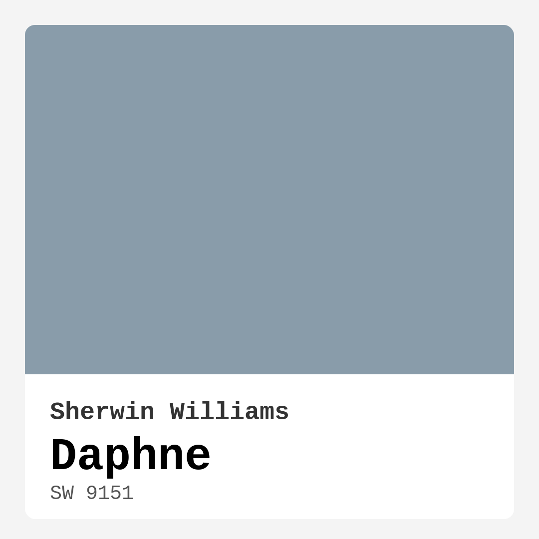
Color Preview & Key Details
| HEX Code | #899CAA |
| RGB | 137, 156, 170 |
| LRV | 50% |
| Undertone | Blue |
| Finish Options | Eggshell, Matte, Satin |
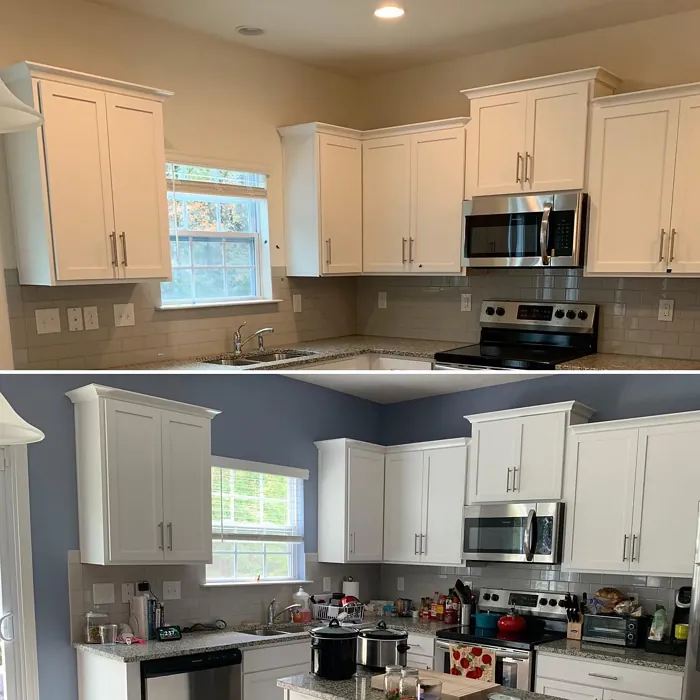
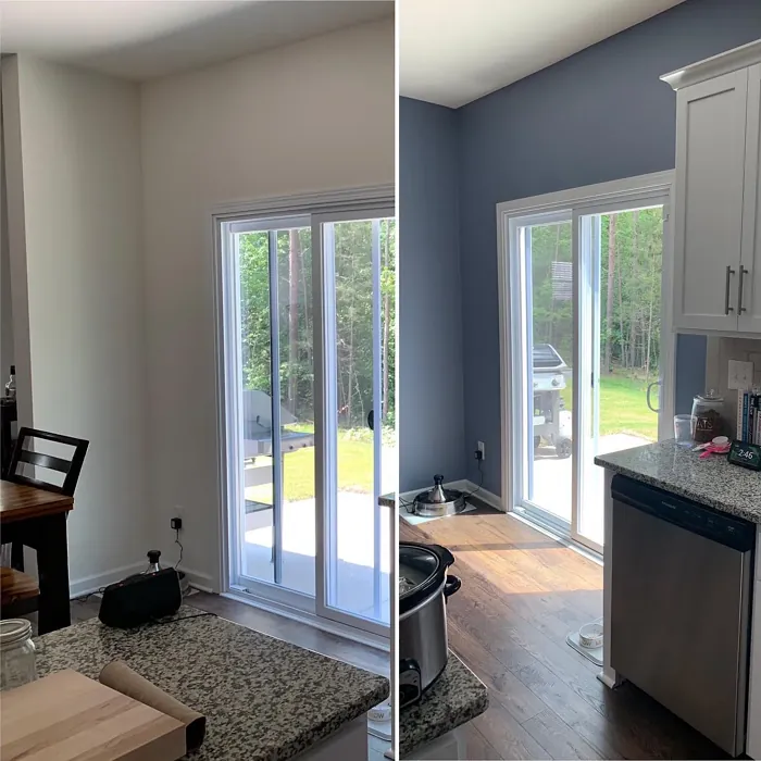
Imagine walking into a room that instantly calms your mind and lifts your spirits. The air feels lighter, and you can’t help but smile as you take in the soft, inviting hue enveloping the walls. This enchanting color is none other than Daphne, a blue-gray wonder from Sherwin Williams that has taken the world of home décor by storm. With its serene and sophisticated vibe, Daphne is a color that brings a refreshing yet cozy atmosphere to any space, making it a perfect choice for your next project.
Daphne is more than just a pretty shade; it’s a versatile option that can fit into various styles of décor. Whether you’re leaning toward modern, coastal, Scandinavian, farmhouse, or transitional aesthetics, Daphne can seamlessly integrate into your vision. The color’s adaptability allows it to shine in any room, be it a tranquil bedroom, a lively living room, a cozy bathroom, or a productive home office. If you’re seeking to create a soothing environment for a nursery, Daphne has your back there too.
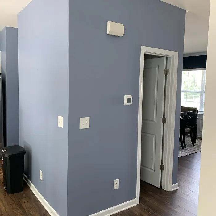
One of the standout features of Daphne is its unique blend of blue and gray. The undertones of this color lean predominantly toward blue, adding a coolness that feels fresh and modern. It’s essential to understand how undertones can dramatically change the character of a hue. In different lighting conditions, Daphne can appear lighter and airier during the day and take on a more muted, intimate feel as the evening sets in. This quality makes it exceptional for spaces meant to evoke calmness and serenity, a true sanctuary from the hustle and bustle of life.
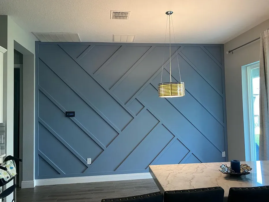
But what about the practical aspects? Daphne boasts a Light Reflectance Value (LRV) of 50%, classifying it as a medium color. This means it reflects a moderate amount of light, making it a great fit for various lighting situations. In bright daylight, Daphne emanates a soft, airy quality that makes spaces feel larger and more open, while in the evening, it transforms into a cozy retreat, perfect for winding down after a long day. This versatile duality is why Daphne truly shines as a go-to choice for interior walls or even accent walls, adding depth and dimension to your spaces.
Let’s talk application. You’re probably wondering how easy it is to work with this dreamy hue. The good news is that Daphne is incredibly beginner-friendly. Whether you’re using a brush or roller, its smooth application makes it a breeze to achieve that flawless finish. And if you’re concerned about upkeep, you’ll be pleased to know that it’s not only washable but also highly durable, making it suitable for high-traffic areas. Just keep in mind that for optimal coverage, a second coat is recommended. This will ensure that the beauty of Daphne remains intact, even in the busiest parts of your home.
Now, if you’re considering using Daphne in smaller rooms, you’re making a great choice. This color works wonders in creating an airy feeling, effectively opening up space and making it feel expansive. Pair it with adequate lighting and thoughtfully chosen furnishings, and you’ll amplify its lovely effect. However, be cautious in poorly lit areas, as Daphne might appear too cool and lose some of its charm without the right ambiance.
When it comes to pairing, Daphne is incredibly versatile. It complements a variety of shades beautifully, especially warmer tones that can prevent it from feeling overly cool. For trim, consider using classic White Dove or other cool trim colors to enhance its tranquil vibe. If you’re looking for a bolder contrast, incorporating deeper shades like SW 7601 or SW 6241 can create a striking combination that catches the eye and adds sophistication.
You might be wondering if this color is eco-friendly. With low VOC levels and eco-certification, Daphne is an excellent choice for those who care about their indoor air quality. Choosing a paint that is both beautiful and considerate of your health is always a win-win.
Now, let’s address a few FAQs you might have. Is Daphne suitable for high-traffic areas? Absolutely! Its durable finish and washability make it a great choice for spaces like hallways or living rooms. Just remember to apply that second coat for the best coverage.
Can you use Daphne in smaller rooms? Definitely! Its cool undertones can help open up spaces, creating an inviting atmosphere while making the room feel larger.
In terms of mood, Daphne evokes a calm and inviting feeling. You’ll find that it’s perfect for creating a restful environment, whether you’re looking to unwind in a serene bedroom or create a peaceful nursery. Its muted tones can also enhance the overall décor without overpowering the existing elements in your home.
As you consider Daphne for your next project, keep its versatility and adaptability in mind. Whether you’re sprucing up your living room or giving a cozy bedroom a fresh look, this color has the potential to transform your space into something special.
So, if you’re ready to embrace this enchanting blue-gray hue, grab a sample and see how it interacts with your lighting, furniture, and décor. You’ll soon realize that Daphne isn’t just a color; it’s a mood, a feeling, and a beautiful addition to your home. With its calming presence and sophisticated appearance, Daphne is sure to impress, making your home a sanctuary you’ll love coming back to. Let your walls tell a story of tranquility and elegance with this stunning hue, and watch as it transforms your space into something truly magical.
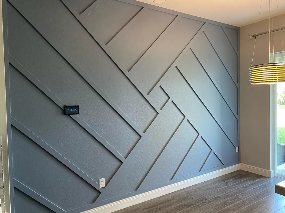
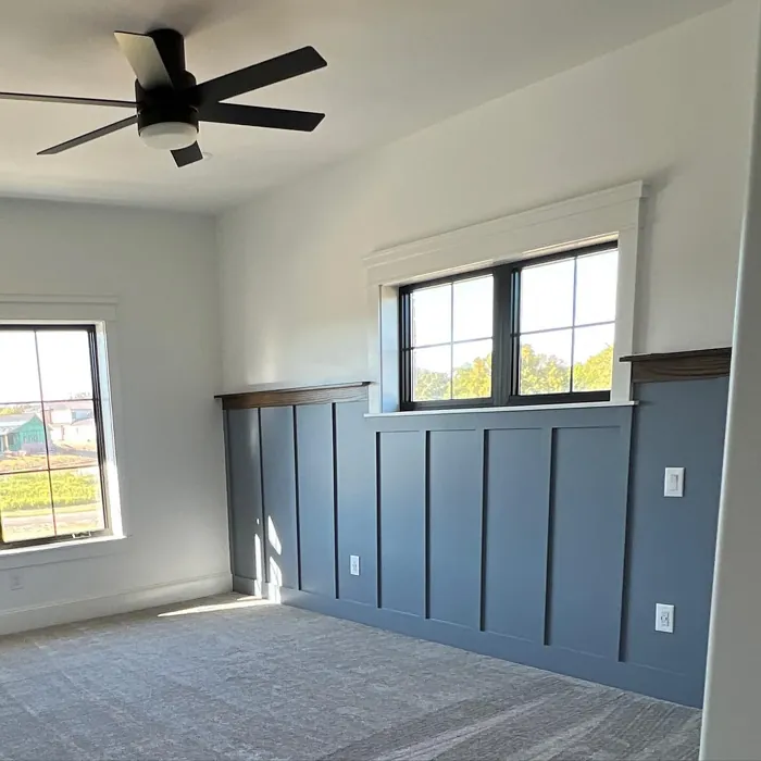
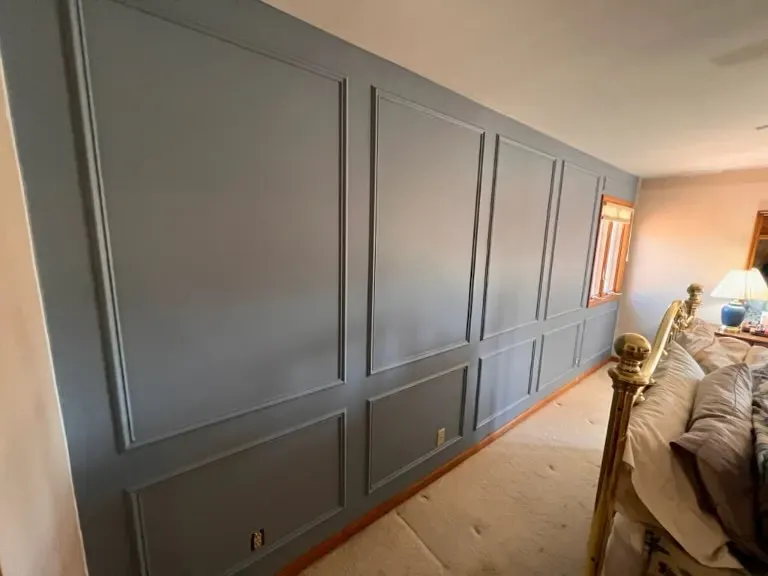
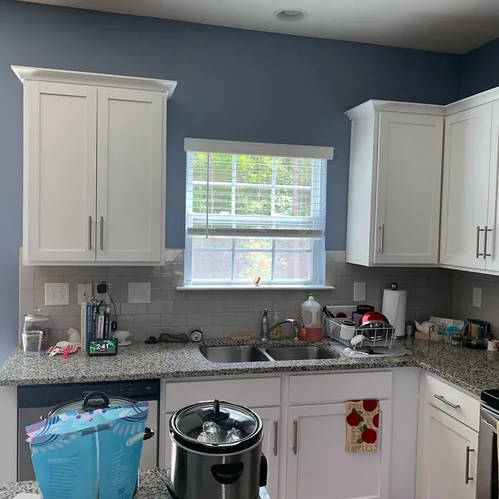
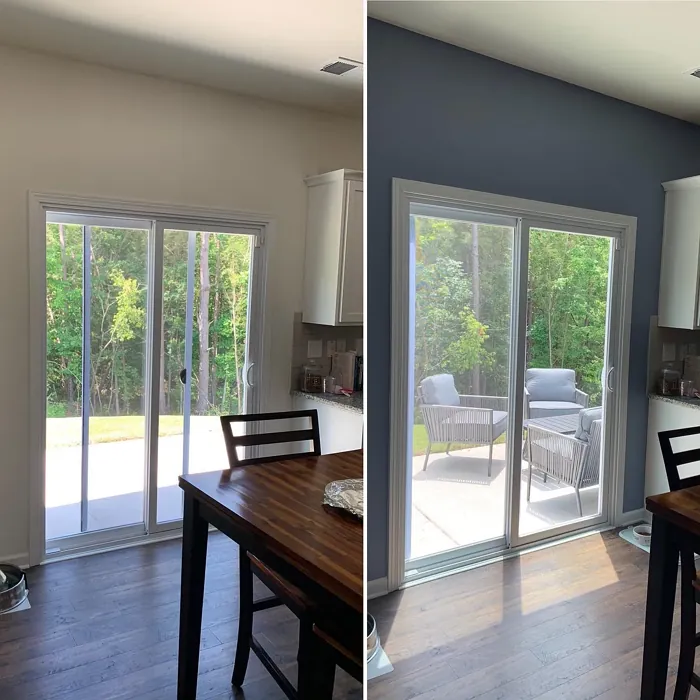
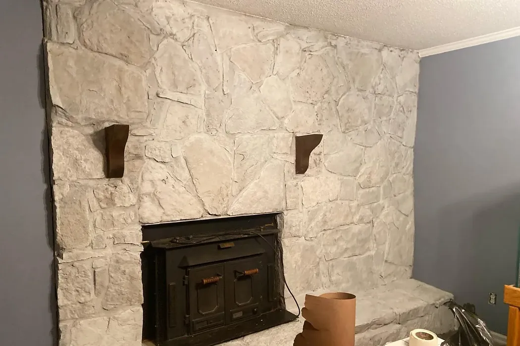
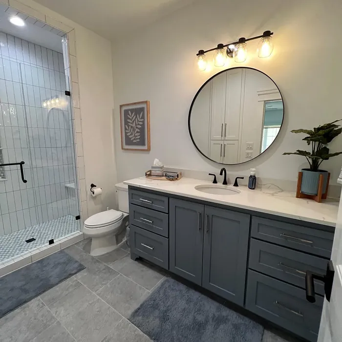
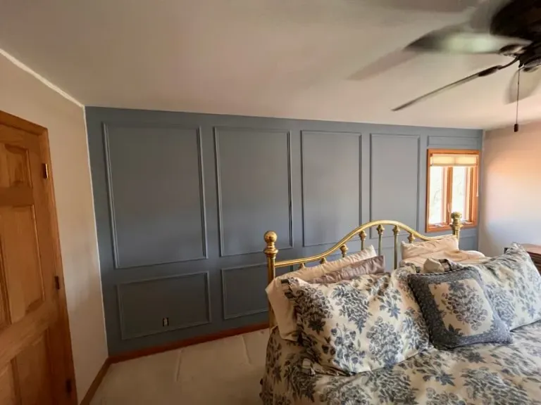
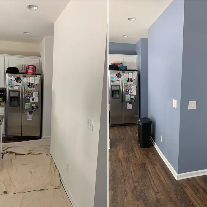
Real Room Photo of Daphne SW 9151

Undertones of Daphne ?
The undertones of Daphne are a key aspect of its character, leaning towards Blue. These subtle underlying hues are what give the color its depth and complexity. For example, a gray with a blue undertone will feel cooler and more modern, while one with a brown undertone will feel warmer and more traditional. It’s essential to test this paint in your home and observe it next to your existing furniture, flooring, and decor to see how these undertones interact and reveal themselves throughout the day.
HEX value: #899CAA
RGB code: 137, 156, 170
Is Daphne Cool or Warm?
Daphne leans towards the cool spectrum while maintaining a warm undertone balance. This quality makes it an excellent choice for spaces meant to evoke calmness and serenity. It can easily complement warmer furnishings without clashing, creating a harmonious environment.
Understanding Color Properties and Interior Design Tips
Hue refers to a specific position on the color wheel, measured in degrees from 0 to 360. Each degree represents a different pure color:
- 0° represents red
- 120° represents green
- 240° represents blue
Saturation describes the intensity or purity of a color and is expressed as a percentage:
- At 0%, the color appears completely desaturated—essentially a shade of gray
- At 100%, the color is at its most vivid and vibrant
Lightness indicates how light or dark a color is, also expressed as a percentage:
- 0% lightness results in black
- 100% lightness results in white
Using Warm Colors in Interior Design
Warm hues—such as reds, oranges, yellows, warm beiges, and greiges—are excellent choices for creating inviting and energetic spaces. These colors are particularly well-suited for:
- Kitchens, living rooms, and bathrooms, where warmth enhances comfort and sociability
- Large rooms, where warm tones can help reduce the sense of emptiness and make the space feel more intimate
For example:
- Warm beige shades provide a cozy, inviting atmosphere, ideal for living rooms, bedrooms, and hallways.
- Warm greige (a mix of beige and gray) offers the warmth of beige with the modern appeal of gray, making it a versatile backdrop for dining areas, bedrooms, and living spaces.
However, be mindful when using warm light tones in rooms with limited natural light. These shades may appear muted or even take on an unpleasant yellowish tint. To avoid a dull or flat appearance:
- Add depth by incorporating richer tones like deep greens, charcoal, or chocolate brown
- Use textured elements such as curtains, rugs, or cushions to bring dimension to the space
Pro Tip: Achieving Harmony with Warm and Cool Color Balance
To create a well-balanced and visually interesting interior, mix warm and cool tones strategically. This contrast adds depth and harmony to your design.
- If your walls feature warm hues, introduce cool-colored accents such as blue or green furniture, artwork, or accessories to create contrast.
- For a polished look, consider using a complementary color scheme, which pairs colors opposite each other on the color wheel (e.g., red with green, orange with blue).
This thoughtful mix not only enhances visual appeal but also creates a space that feels both dynamic and cohesive.
Light Temperature Affects on Daphne
Natural Light
Natural daylight changes in color temperature as the sun moves across the sky. At sunrise and sunset, the light tends to have a warm, golden tone with a color temperature around 2000 Kelvin (K). As the day progresses and the sun rises higher, the light becomes cooler and more neutral. Around midday, especially when the sky is clear, natural light typically reaches its peak brightness and shifts to a cooler tone, ranging from 5500 to 6500 Kelvin. This midday light is close to what we perceive as pure white or daylight-balanced light.
These shifts in natural light can significantly influence how colors appear in a space, which is why designers often consider both the time of day and the orientation of windows when planning interior color schemes.
Artificial Light
When choosing artificial lighting, pay close attention to the color temperature, measured in Kelvin (K). This determines how warm or cool the light will appear. Lower temperatures, around 2700K, give off a warm, yellow glow often used in living rooms or bedrooms. Higher temperatures, above 5000K, create a cool, bluish light similar to daylight, commonly used in kitchens, offices, or task areas.
Use the slider to see how lighting temperature can affect the appearance of a surface or color throughout a space.


4800K
LRV of Daphne
The Light Reflectance Value (LRV) of Daphne is 50%, which places it in the Medium category. This means it Reflects a moderate amount of light. Understanding a paint’s LRV is crucial for predicting how it will look in your space. A higher LRV indicates a lighter color that reflects more light, making rooms feel larger and brighter. A lower LRV signifies a darker color that absorbs more light, creating a cozier, more intimate atmosphere. Always consider the natural and artificial lighting in your room when selecting a paint color based on its LRV.
Detailed Review of Daphne
Additional Paint Characteristics
Ideal Rooms
Bathroom, Bedroom, Entryway, Home Office, Living Room, Nursery
Decor Styles
Coastal, Farmhouse, Modern, Scandinavian, Transitional
Coverage
Good (1–2 Coats), Touch-Up Friendly
Ease of Application
Beginner Friendly, Brush Smooth, Fast-Drying, Roller-Ready
Washability
Highly Washable, Washable
VOC Level
Eco-Certified, Low VOC
Best Use
Accent Wall, Furniture, Interior Walls
Room Suitability
Bathroom, Bedroom, Home Office, Living Room, Nursery
Tone Tag
Airy, Balanced, Cool, Muted
Finish Type
Eggshell, Matte, Satin
Paint Performance
Easy Touch-Up, Low Odor, Quick Drying, Scuff Resistant
Use Cases
Best for Low Light Rooms, Best for Small Spaces, Classic Favorite
Mood
Calm, Inviting, Restful
Trim Pairing
Complements Cool Trim, Pairs with White Dove, Works with Warm Trim
Daphne is a standout color that masterfully blends gray and blue, making it a versatile option for any room. When applied, it offers a soft, inviting presence that can transform both large and small spaces. The color’s adaptability shines in various lighting conditions, often appearing lighter in natural light and more muted in the evening. Its modern appeal fits seamlessly within a range of decor styles, from coastal to industrial. Additionally, Daphne pairs beautifully with both warm and cool accents, enhancing its versatility. Whether you’re looking to create a soothing bedroom retreat or a lively living area, Daphne is sure to impress.
Pros & Cons of SW 9151 Daphne
Pros
Cons
Colors that go with Sherwin Williams Daphne
FAQ on SW 9151 Daphne
Is Daphne suitable for high-traffic areas?
Absolutely! Daphne’s durable finish and washability make it a great choice for high-traffic areas like hallways or living rooms. Just be sure to apply a second coat for optimal coverage and durability. This way, you ensure the color maintains its beauty even with regular wear and tear.
Can I use Daphne in smaller rooms?
Yes, Daphne works well in smaller rooms due to its ability to create an airy feeling. The cool undertones can help open up space and make it feel more expansive. Just pair it with adequate lighting and the right furnishings to enhance its effect.
Comparisons Daphne with other colors
Daphne SW 9151 vs Dutch Tile Blue SW 0031
| Attribute | Daphne SW 9151 | Dutch Tile Blue SW 0031 |
|---|---|---|
| Color Name | Daphne SW 9151 | Dutch Tile Blue SW 0031 |
| Color | ||
| Hue | Blue | Blue |
| Brightness | Medium | Medium |
| RGB | 137, 156, 170 | 154, 171, 171 |
| LRV | 50% | 24% |
| Finish Type | Eggshell, Matte, Satin | Eggshell, Matte, Satin |
| Finish Options | Eggshell, Matte, Satin | Eggshell, Flat, Matte, Satin |
| Ideal Rooms | Bathroom, Bedroom, Entryway, Home Office, Living Room, Nursery | Bathroom, Bedroom, Dining Room, Hallway, Home Office, Kitchen, Living Room |
| Decor Styles | Coastal, Farmhouse, Modern, Scandinavian, Transitional | Coastal, Modern Farmhouse, Scandinavian, Traditional, Transitional |
| Coverage | Good (1–2 Coats), Touch-Up Friendly | Good (1–2 Coats) |
| Ease of Application | Beginner Friendly, Brush Smooth, Fast-Drying, Roller-Ready | Beginner Friendly, Brush Smooth, Fast-Drying, Roller-Ready |
| Washability | Highly Washable, Washable | Highly Washable, Washable |
| Room Suitability | Bathroom, Bedroom, Home Office, Living Room, Nursery | Bathroom, Bedroom, Dining Room, Kitchen, Living Room |
| Tone | Airy, Balanced, Cool, Muted | Balanced, Cool, Muted |
| Paint Performance | Easy Touch-Up, Low Odor, Quick Drying, Scuff Resistant | Easy Touch-Up, High Coverage, Low Odor, Quick Drying |
Daphne SW 9151 vs Debonair SW 9139
| Attribute | Daphne SW 9151 | Debonair SW 9139 |
|---|---|---|
| Color Name | Daphne SW 9151 | Debonair SW 9139 |
| Color | ||
| Hue | Blue | Blue |
| Brightness | Medium | Medium |
| RGB | 137, 156, 170 | 144, 160, 166 |
| LRV | 50% | 30% |
| Finish Type | Eggshell, Matte, Satin | Eggshell, Matte, Satin |
| Finish Options | Eggshell, Matte, Satin | Eggshell, Matte, Satin |
| Ideal Rooms | Bathroom, Bedroom, Entryway, Home Office, Living Room, Nursery | Bedroom, Dining Room, Home Office, Living Room |
| Decor Styles | Coastal, Farmhouse, Modern, Scandinavian, Transitional | Coastal, Industrial, Modern, Transitional |
| Coverage | Good (1–2 Coats), Touch-Up Friendly | Good (1–2 Coats) |
| Ease of Application | Beginner Friendly, Brush Smooth, Fast-Drying, Roller-Ready | Beginner Friendly, Brush Smooth, Roller-Ready |
| Washability | Highly Washable, Washable | Washable, Wipeable |
| Room Suitability | Bathroom, Bedroom, Home Office, Living Room, Nursery | Bedroom, Dining Room, Home Office, Living Room |
| Tone | Airy, Balanced, Cool, Muted | Balanced, Cool, Muted |
| Paint Performance | Easy Touch-Up, Low Odor, Quick Drying, Scuff Resistant | Easy Touch-Up, Low Odor, Quick Drying |
Daphne SW 9151 vs Stardew SW 9138
| Attribute | Daphne SW 9151 | Stardew SW 9138 |
|---|---|---|
| Color Name | Daphne SW 9151 | Stardew SW 9138 |
| Color | ||
| Hue | Blue | Blue |
| Brightness | Medium | Medium |
| RGB | 137, 156, 170 | 166, 178, 181 |
| LRV | 50% | 30% |
| Finish Type | Eggshell, Matte, Satin | Eggshell, Satin |
| Finish Options | Eggshell, Matte, Satin | Eggshell, Matte, Satin |
| Ideal Rooms | Bathroom, Bedroom, Entryway, Home Office, Living Room, Nursery | Bathroom, Bedroom, Home Office, Living Room, Nursery |
| Decor Styles | Coastal, Farmhouse, Modern, Scandinavian, Transitional | Coastal, Farmhouse, Modern, Scandinavian |
| Coverage | Good (1–2 Coats), Touch-Up Friendly | Good (1–2 Coats) |
| Ease of Application | Beginner Friendly, Brush Smooth, Fast-Drying, Roller-Ready | Beginner Friendly, Brush Smooth, Roller-Ready |
| Washability | Highly Washable, Washable | Highly Washable, Washable, Wipeable |
| Room Suitability | Bathroom, Bedroom, Home Office, Living Room, Nursery | Bathroom, Bedroom, Home Office, Living Room |
| Tone | Airy, Balanced, Cool, Muted | Calm, Cool, Muted |
| Paint Performance | Easy Touch-Up, Low Odor, Quick Drying, Scuff Resistant | Easy Touch-Up, High Coverage, Low Odor |
Daphne SW 9151 vs Niebla Azul SW 9137
| Attribute | Daphne SW 9151 | Niebla Azul SW 9137 |
|---|---|---|
| Color Name | Daphne SW 9151 | Niebla Azul SW 9137 |
| Color | ||
| Hue | Blue | Blue |
| Brightness | Medium | Medium |
| RGB | 137, 156, 170 | 182, 195, 196 |
| LRV | 50% | 48% |
| Finish Type | Eggshell, Matte, Satin | Eggshell, Matte, Satin |
| Finish Options | Eggshell, Matte, Satin | Eggshell, Matte, Satin |
| Ideal Rooms | Bathroom, Bedroom, Entryway, Home Office, Living Room, Nursery | Bedroom, Home Office, Living Room, Nursery |
| Decor Styles | Coastal, Farmhouse, Modern, Scandinavian, Transitional | Coastal, Modern, Scandinavian, Transitional |
| Coverage | Good (1–2 Coats), Touch-Up Friendly | Good (1–2 Coats), Touch-Up Friendly |
| Ease of Application | Beginner Friendly, Brush Smooth, Fast-Drying, Roller-Ready | Beginner Friendly, Brush Smooth, Roller-Ready |
| Washability | Highly Washable, Washable | Highly Washable, Washable |
| Room Suitability | Bathroom, Bedroom, Home Office, Living Room, Nursery | Bedroom, Home Office, Living Room, Nursery |
| Tone | Airy, Balanced, Cool, Muted | Airy, Cool, Muted |
| Paint Performance | Easy Touch-Up, Low Odor, Quick Drying, Scuff Resistant | Easy Touch-Up, Fade Resistant, Low Odor, Scuff Resistant |
Daphne SW 9151 vs Rain SW 6219
| Attribute | Daphne SW 9151 | Rain SW 6219 |
|---|---|---|
| Color Name | Daphne SW 9151 | Rain SW 6219 |
| Color | ||
| Hue | Blue | Blue |
| Brightness | Medium | Medium |
| RGB | 137, 156, 170 | 171, 190, 191 |
| LRV | 50% | 50% |
| Finish Type | Eggshell, Matte, Satin | Eggshell, Matte, Satin |
| Finish Options | Eggshell, Matte, Satin | Eggshell, Matte, Satin |
| Ideal Rooms | Bathroom, Bedroom, Entryway, Home Office, Living Room, Nursery | Bathroom, Bedroom, Home Office, Living Room, Nursery |
| Decor Styles | Coastal, Farmhouse, Modern, Scandinavian, Transitional | Coastal, Minimalist, Modern, Scandinavian, Transitional |
| Coverage | Good (1–2 Coats), Touch-Up Friendly | Good (1–2 Coats), Touch-Up Friendly |
| Ease of Application | Beginner Friendly, Brush Smooth, Fast-Drying, Roller-Ready | Beginner Friendly, Brush Smooth, Fast-Drying, Roller-Ready |
| Washability | Highly Washable, Washable | Scrubbable, Stain Resistant, Washable |
| Room Suitability | Bathroom, Bedroom, Home Office, Living Room, Nursery | Bathroom, Bedroom, Home Office, Living Room, Nursery |
| Tone | Airy, Balanced, Cool, Muted | Balanced, Cool, Muted |
| Paint Performance | Easy Touch-Up, Low Odor, Quick Drying, Scuff Resistant | Easy Touch-Up, Low Odor, Quick Drying, Stain Resistant |
Daphne SW 9151 vs Morning at Sea SW 9634
| Attribute | Daphne SW 9151 | Morning at Sea SW 9634 |
|---|---|---|
| Color Name | Daphne SW 9151 | Morning at Sea SW 9634 |
| Color | ||
| Hue | Blue | Blue |
| Brightness | Medium | Medium |
| RGB | 137, 156, 170 | 130, 151, 155 |
| LRV | 50% | 50% |
| Finish Type | Eggshell, Matte, Satin | Eggshell, Matte |
| Finish Options | Eggshell, Matte, Satin | Eggshell, Matte, Satin |
| Ideal Rooms | Bathroom, Bedroom, Entryway, Home Office, Living Room, Nursery | Bathroom, Bedroom, Home Office, Living Room |
| Decor Styles | Coastal, Farmhouse, Modern, Scandinavian, Transitional | Coastal, Minimalist, Modern, Scandinavian |
| Coverage | Good (1–2 Coats), Touch-Up Friendly | Good (1–2 Coats), Touch-Up Friendly |
| Ease of Application | Beginner Friendly, Brush Smooth, Fast-Drying, Roller-Ready | Beginner Friendly, Brush Smooth, Roller-Ready |
| Washability | Highly Washable, Washable | Washable, Wipeable |
| Room Suitability | Bathroom, Bedroom, Home Office, Living Room, Nursery | Bathroom, Bedroom, Home Office, Living Room |
| Tone | Airy, Balanced, Cool, Muted | Airy, Cool, Muted |
| Paint Performance | Easy Touch-Up, Low Odor, Quick Drying, Scuff Resistant | Easy Touch-Up, Fade Resistant, Low Odor |
Daphne SW 9151 vs Sleepy Blue SW 6225
| Attribute | Daphne SW 9151 | Sleepy Blue SW 6225 |
|---|---|---|
| Color Name | Daphne SW 9151 | Sleepy Blue SW 6225 |
| Color | ||
| Hue | Blue | Blue |
| Brightness | Medium | Medium |
| RGB | 137, 156, 170 | 188, 203, 206 |
| LRV | 50% | 50% |
| Finish Type | Eggshell, Matte, Satin | Eggshell, Matte, Satin |
| Finish Options | Eggshell, Matte, Satin | Eggshell, Matte, Satin |
| Ideal Rooms | Bathroom, Bedroom, Entryway, Home Office, Living Room, Nursery | Bedroom, Home Office, Living Room, Nursery |
| Decor Styles | Coastal, Farmhouse, Modern, Scandinavian, Transitional | Coastal, Minimalist, Modern Farmhouse, Scandinavian |
| Coverage | Good (1–2 Coats), Touch-Up Friendly | Good (1–2 Coats) |
| Ease of Application | Beginner Friendly, Brush Smooth, Fast-Drying, Roller-Ready | Beginner Friendly, Brush Smooth, Fast-Drying, Roller-Ready |
| Washability | Highly Washable, Washable | Highly Washable, Washable |
| Room Suitability | Bathroom, Bedroom, Home Office, Living Room, Nursery | Bedroom, Home Office, Living Room, Nursery |
| Tone | Airy, Balanced, Cool, Muted | Airy, Cool, Muted |
| Paint Performance | Easy Touch-Up, Low Odor, Quick Drying, Scuff Resistant | Easy Touch-Up, Low Odor, Quick Drying, Scuff Resistant |
Daphne SW 9151 vs Lakeside SW 9683
| Attribute | Daphne SW 9151 | Lakeside SW 9683 |
|---|---|---|
| Color Name | Daphne SW 9151 | Lakeside SW 9683 |
| Color | ||
| Hue | Blue | Blue |
| Brightness | Medium | Medium |
| RGB | 137, 156, 170 | 173, 184, 192 |
| LRV | 50% | 24% |
| Finish Type | Eggshell, Matte, Satin | Eggshell, Matte, Satin |
| Finish Options | Eggshell, Matte, Satin | Eggshell, Matte, Satin |
| Ideal Rooms | Bathroom, Bedroom, Entryway, Home Office, Living Room, Nursery | Bathroom, Bedroom, Home Office, Living Room |
| Decor Styles | Coastal, Farmhouse, Modern, Scandinavian, Transitional | Coastal, Minimalist, Modern, Rustic |
| Coverage | Good (1–2 Coats), Touch-Up Friendly | Good (1–2 Coats) |
| Ease of Application | Beginner Friendly, Brush Smooth, Fast-Drying, Roller-Ready | Beginner Friendly, Brush Smooth, Roller-Ready |
| Washability | Highly Washable, Washable | Scrubbable, Washable |
| Room Suitability | Bathroom, Bedroom, Home Office, Living Room, Nursery | Bathroom, Bedroom, Home Office, Living Room |
| Tone | Airy, Balanced, Cool, Muted | Balanced, Cool, Muted |
| Paint Performance | Easy Touch-Up, Low Odor, Quick Drying, Scuff Resistant | Easy Touch-Up, Fade Resistant, High Coverage, Low Odor |
Daphne SW 9151 vs Upward SW 6239
| Attribute | Daphne SW 9151 | Upward SW 6239 |
|---|---|---|
| Color Name | Daphne SW 9151 | Upward SW 6239 |
| Color | ||
| Hue | Blue | Blue |
| Brightness | Medium | Medium |
| RGB | 137, 156, 170 | 191, 201, 208 |
| LRV | 50% | 75% |
| Finish Type | Eggshell, Matte, Satin | Eggshell, Satin |
| Finish Options | Eggshell, Matte, Satin | Eggshell, Flat, Satin |
| Ideal Rooms | Bathroom, Bedroom, Entryway, Home Office, Living Room, Nursery | Bedroom, Dining Room, Home Office, Living Room, Nursery |
| Decor Styles | Coastal, Farmhouse, Modern, Scandinavian, Transitional | Coastal, Minimalist, Modern, Scandinavian |
| Coverage | Good (1–2 Coats), Touch-Up Friendly | Good (1–2 Coats), Touch-Up Friendly |
| Ease of Application | Beginner Friendly, Brush Smooth, Fast-Drying, Roller-Ready | Beginner Friendly, Brush Smooth, Fast-Drying, Roller-Ready |
| Washability | Highly Washable, Washable | Washable, Wipeable |
| Room Suitability | Bathroom, Bedroom, Home Office, Living Room, Nursery | Bedroom, Home Office, Living Room, Nursery |
| Tone | Airy, Balanced, Cool, Muted | Cool, Crisp, Muted |
| Paint Performance | Easy Touch-Up, Low Odor, Quick Drying, Scuff Resistant | High Coverage, Low Odor, Quick Drying |
Daphne SW 9151 vs Aleutian SW 6241
| Attribute | Daphne SW 9151 | Aleutian SW 6241 |
|---|---|---|
| Color Name | Daphne SW 9151 | Aleutian SW 6241 |
| Color | ||
| Hue | Blue | Blue |
| Brightness | Medium | Medium |
| RGB | 137, 156, 170 | 152, 169, 183 |
| LRV | 50% | 24% |
| Finish Type | Eggshell, Matte, Satin | Eggshell, Matte, Satin |
| Finish Options | Eggshell, Matte, Satin | Eggshell, Matte, Satin |
| Ideal Rooms | Bathroom, Bedroom, Entryway, Home Office, Living Room, Nursery | Bathroom, Bedroom, Home Office, Kitchen, Living Room, Nursery |
| Decor Styles | Coastal, Farmhouse, Modern, Scandinavian, Transitional | Coastal, Minimalist, Modern, Scandinavian, Transitional |
| Coverage | Good (1–2 Coats), Touch-Up Friendly | Good (1–2 Coats), Touch-Up Friendly |
| Ease of Application | Beginner Friendly, Brush Smooth, Fast-Drying, Roller-Ready | Beginner Friendly, Brush Smooth, Fast-Drying, Roller-Ready |
| Washability | Highly Washable, Washable | Scrubbable, Stain Resistant, Washable |
| Room Suitability | Bathroom, Bedroom, Home Office, Living Room, Nursery | Bathroom, Bedroom, Home Office, Living Room, Nursery |
| Tone | Airy, Balanced, Cool, Muted | Airy, Balanced, Cool, Muted |
| Paint Performance | Easy Touch-Up, Low Odor, Quick Drying, Scuff Resistant | Easy Touch-Up, Fade Resistant, Low Odor, Quick Drying |
Official Page of Sherwin Williams Daphne SW 9151