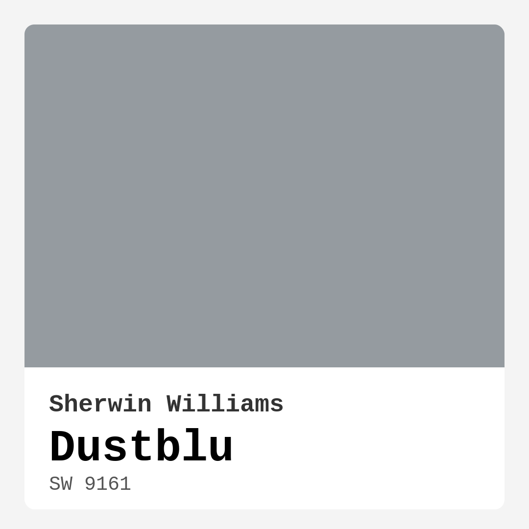
Color Preview & Key Details
| HEX Code | #959BA0 |
| RGB | 149, 155, 160 |
| LRV | 24% |
| Undertone | Blue |
| Finish Options | Eggshell, Matte, Satin |
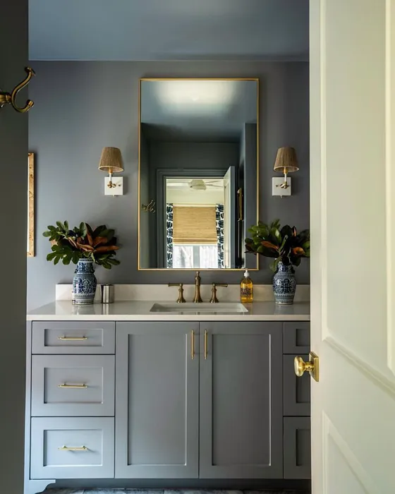
Imagine stepping into a space where the chaos of the outside world fades away. You’re greeted by a soothing hue that whispers tranquility and comfort—a color that feels like a gentle hug. This is the essence of Dustblu, Sherwin-Williams’ captivating soft blue-gray. With its serene undertones and versatile nature, this paint color can turn any room into a personal retreat, perfect for those moments when you want to unwind or focus.
Dustblu (SW 9161) is a medium dark shade, boasting a Light Reflectance Value (LRV) of 24%. This means it reflects very little light, creating an intimate atmosphere that can make a space feel cozy and inviting. The blue undertones of Dustblu give it a refreshing, modern edge while the gray base keeps it grounded and adaptable. This combination makes it a fantastic choice for a variety of decor styles, including modern, Scandinavian, coastal, and minimalist designs.
Imagine using Dustblu in your living room, where the soft, calming hue envelops you as you relax on your sofa with a book in hand. It’s an excellent choice for bedrooms too, promoting a peaceful ambiance perfect for restful sleep. If you’re working from home, consider painting your office in this shade; it inspires focus without overwhelming your senses. Even in a nursery, Dustblu creates a serene environment, perfect for your little one’s restful moments.
One of the many beautiful aspects of Dustblu is its adaptability to changing light conditions. Under natural light, it can appear lighter and more airy, creating an expansive feel. Conversely, in artificial light, it may lean more towards its gray tones, giving the room a cozy vibe. This flexibility is a game-changer when considering how your room’s atmosphere might change throughout the day.
Applying Dustblu is a breeze, thanks to its beginner-friendly formula. Whether you’re using a brush or a roller, you’ll find that it glides on smoothly, leaving minimal brush strokes behind. It’s fast-drying too, so you won’t be left waiting long to see the results of your hard work. Most users report good coverage with just one or two coats, making it touch-up friendly—an essential feature for high-traffic areas or homes with kids and pets.
Now, let’s talk about the practicalities. Dustblu is a low VOC paint, which means it’s eco-certified and emits fewer harmful chemicals. This eco-friendly aspect is something to consider, especially if you’re sensitive to odors or are painting a child’s room. The washability factor is another bonus. If you accidentally scuff the walls, a quick wipe can often restore it to its original beauty, especially if you’ve chosen a satin or eggshell finish for added durability.
Of course, no color is without its challenges. Dustblu may require a second coat for full opacity, and being a lighter shade, it can show scuffs more easily than darker colors. It’s also worth noting that while it works beautifully in many settings, it may not be the ideal choice for extremely dark rooms where you want a bold statement.
Pairing Dustblu with the right colors and furnishings can elevate its beauty even further. Consider complementary shades like SW 6038 (a vibrant green) or the earthy tones of SW 7026 (a charcoal gray) to create depth and interest. For trim, White Dove is a classic choice that brightens the overall look without competing with Dustblu. If you’re incorporating metallics, brass fixtures are stunning alongside this soft blue-gray, creating a sophisticated yet relaxed feel.
When it comes to its design versatility, Dustblu stands out as a true chameleon. It can seamlessly blend with light and dark furniture, making it an excellent backdrop for your favorite pieces. If you’re decorating with a minimalist style, Dustblu offers a serene canvas that allows your decor to shine without overwhelming the space. In a coastal theme, it evokes images of serene waters and misty mornings, making you feel as if you’ve just stepped into a seaside retreat.
It’s also important to consider how Dustblu interacts with your existing decor. Test the paint in your home, ideally on a small wall section, to see how the undertones play with your flooring, furniture, and lighting. The blue undertones might feel cooler, while the gray helps soften the overall look, making it a sophisticated yet approachable choice.
If you’re thinking about where to use Dustblu, here’s a tip: think about accent walls. A single wall painted in Dustblu can create a focal point that draws the eye without overpowering the room. It’s also a perfect choice for furniture. Imagine a dining table or a set of bookshelves dipped in Dustblu, adding a unique touch to your decor.
In summary, Dustblu is more than just a paint color; it’s an experience waiting to unfold in your home. Its calming presence can transform any space into a retreat, perfect for unwinding after a long day, fostering creativity in your home office, or creating a peaceful environment for your child. With its versatility, ease of application, and eco-friendly properties, it’s an option worth considering for your next project.
So, are you ready to bring the tranquility of Dustblu into your home? Whether you’re going for a complete overhaul or just a simple refresh, this soft blue-gray could be the perfect shade to elevate your space into a haven of calm and style.
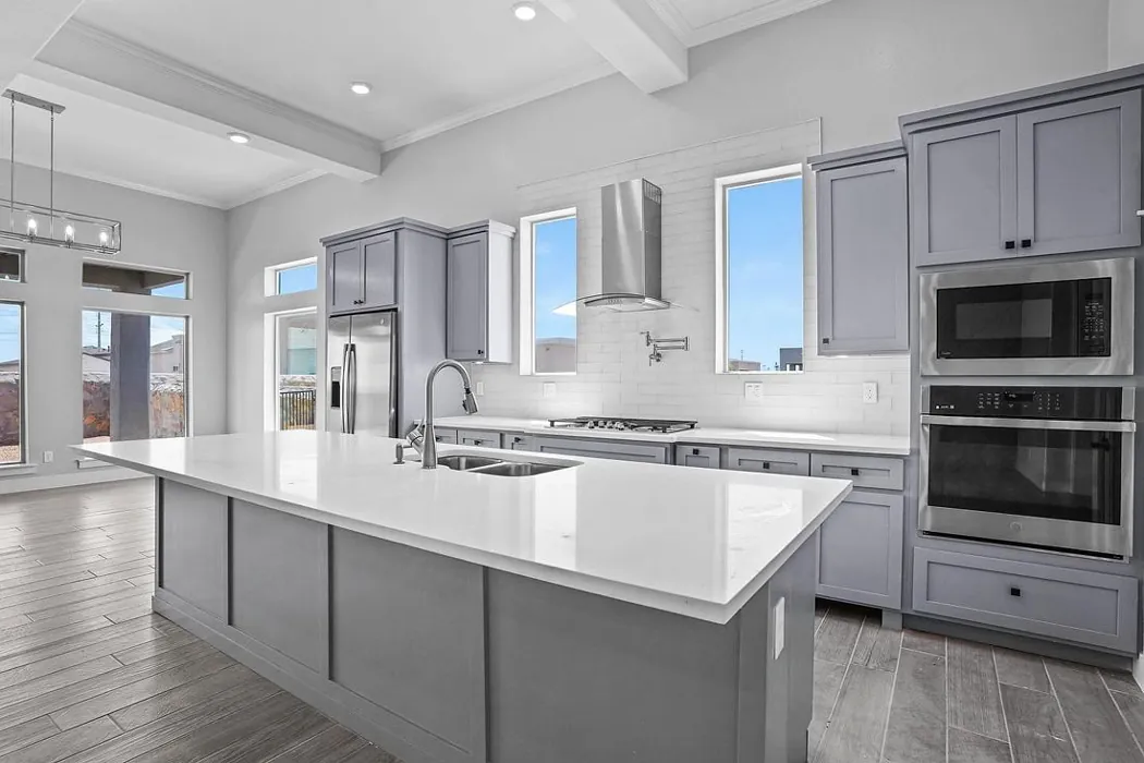
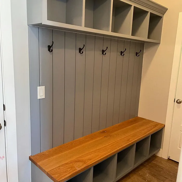
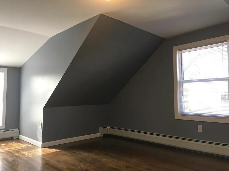
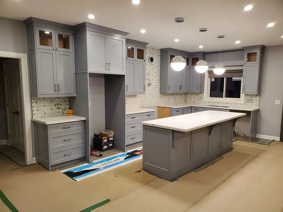
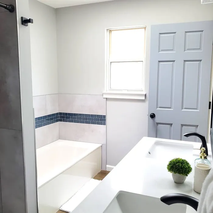
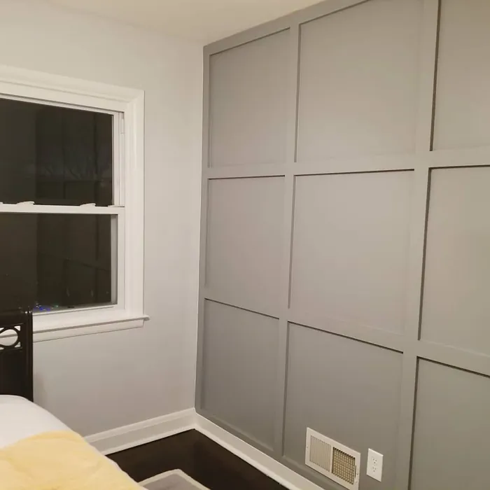
Real Room Photo of Dustblu SW 9161
Undertones of Dustblu ?
The undertones of Dustblu are a key aspect of its character, leaning towards Blue. These subtle underlying hues are what give the color its depth and complexity. For example, a gray with a blue undertone will feel cooler and more modern, while one with a brown undertone will feel warmer and more traditional. It’s essential to test this paint in your home and observe it next to your existing furniture, flooring, and decor to see how these undertones interact and reveal themselves throughout the day.
HEX value: #959BA0
RGB code: 149, 155, 160
Is Dustblu Cool or Warm?
Dustblu leans more towards the cool end of the spectrum, offering a refreshing feel reminiscent of serene waters. While it’s primarily cool, the balance of gray helps it feel cozy rather than stark.
Understanding Color Properties and Interior Design Tips
Hue refers to a specific position on the color wheel, measured in degrees from 0 to 360. Each degree represents a different pure color:
- 0° represents red
- 120° represents green
- 240° represents blue
Saturation describes the intensity or purity of a color and is expressed as a percentage:
- At 0%, the color appears completely desaturated—essentially a shade of gray
- At 100%, the color is at its most vivid and vibrant
Lightness indicates how light or dark a color is, also expressed as a percentage:
- 0% lightness results in black
- 100% lightness results in white
Using Warm Colors in Interior Design
Warm hues—such as reds, oranges, yellows, warm beiges, and greiges—are excellent choices for creating inviting and energetic spaces. These colors are particularly well-suited for:
- Kitchens, living rooms, and bathrooms, where warmth enhances comfort and sociability
- Large rooms, where warm tones can help reduce the sense of emptiness and make the space feel more intimate
For example:
- Warm beige shades provide a cozy, inviting atmosphere, ideal for living rooms, bedrooms, and hallways.
- Warm greige (a mix of beige and gray) offers the warmth of beige with the modern appeal of gray, making it a versatile backdrop for dining areas, bedrooms, and living spaces.
However, be mindful when using warm light tones in rooms with limited natural light. These shades may appear muted or even take on an unpleasant yellowish tint. To avoid a dull or flat appearance:
- Add depth by incorporating richer tones like deep greens, charcoal, or chocolate brown
- Use textured elements such as curtains, rugs, or cushions to bring dimension to the space
Pro Tip: Achieving Harmony with Warm and Cool Color Balance
To create a well-balanced and visually interesting interior, mix warm and cool tones strategically. This contrast adds depth and harmony to your design.
- If your walls feature warm hues, introduce cool-colored accents such as blue or green furniture, artwork, or accessories to create contrast.
- For a polished look, consider using a complementary color scheme, which pairs colors opposite each other on the color wheel (e.g., red with green, orange with blue).
This thoughtful mix not only enhances visual appeal but also creates a space that feels both dynamic and cohesive.
Light Temperature Affects on Dustblu
Natural Light
Natural daylight changes in color temperature as the sun moves across the sky. At sunrise and sunset, the light tends to have a warm, golden tone with a color temperature around 2000 Kelvin (K). As the day progresses and the sun rises higher, the light becomes cooler and more neutral. Around midday, especially when the sky is clear, natural light typically reaches its peak brightness and shifts to a cooler tone, ranging from 5500 to 6500 Kelvin. This midday light is close to what we perceive as pure white or daylight-balanced light.
These shifts in natural light can significantly influence how colors appear in a space, which is why designers often consider both the time of day and the orientation of windows when planning interior color schemes.
Artificial Light
When choosing artificial lighting, pay close attention to the color temperature, measured in Kelvin (K). This determines how warm or cool the light will appear. Lower temperatures, around 2700K, give off a warm, yellow glow often used in living rooms or bedrooms. Higher temperatures, above 5000K, create a cool, bluish light similar to daylight, commonly used in kitchens, offices, or task areas.
Use the slider to see how lighting temperature can affect the appearance of a surface or color throughout a space.


4800K
LRV of Dustblu
The Light Reflectance Value (LRV) of Dustblu is 24%, which places it in the Medium Dark category. This means it reflects very little light. Understanding a paint’s LRV is crucial for predicting how it will look in your space. A higher LRV indicates a lighter color that reflects more light, making rooms feel larger and brighter. A lower LRV signifies a darker color that absorbs more light, creating a cozier, more intimate atmosphere. Always consider the natural and artificial lighting in your room when selecting a paint color based on its LRV.
Detailed Review of Dustblu
Additional Paint Characteristics
Ideal Rooms
Bedroom, Home Office, Living Room, Nursery
Decor Styles
Coastal, Minimalist, Modern, Scandinavian
Coverage
Good (1–2 Coats), Touch-Up Friendly
Ease of Application
Beginner Friendly, Brush Smooth, Fast-Drying, Roller-Ready
Washability
Highly Washable, Washable
VOC Level
Eco-Certified, Low VOC
Best Use
Accent Wall, Furniture, Interior Walls
Room Suitability
Bedroom, Home Office, Living Room, Nursery
Tone Tag
Cool, Dusty, Muted
Finish Type
Eggshell, Matte, Satin
Paint Performance
Easy Touch-Up, Low Odor, Quick Drying
Use Cases
Best for Low Light Rooms, Classic Favorite, Designer Favorite
Mood
Calm, Inviting, Restful
Trim Pairing
Complements Brass Fixtures, Good with Wood Trim, Pairs with White Dove
Dustblu offers a unique blend of calmness and sophistication, making it an excellent choice for a variety of spaces. Its subtle undertones create a soothing ambiance, perfect for relaxation or focused work. The paint glides on smoothly, providing even coverage with minimal effort. Whether you’re painting an accent wall or an entire room, Dustblu maintains its charm without overpowering the decor. Many users have praised its ability to adapt to different lighting conditions, revealing varying shades throughout the day. This makes it a dynamic choice for any home setup, effortlessly complementing both light and dark furnishings.
Pros & Cons of SW 9161 Dustblu
Pros
Cons
Colors that go with Sherwin Williams Dustblu
FAQ on SW 9161 Dustblu
Can Dustblu be used in high-traffic areas?
Yes, Dustblu can be used in high-traffic areas, but it’s advisable to use a satin or eggshell finish for added durability. While it’s washable, maintaining it in areas with frequent wear may require touch-ups over time.
Is Dustblu suitable for exterior use?
Dustblu is primarily recommended for interior use. If you’re considering it for exterior applications, ensure it’s properly sealed and paired with a weatherproof topcoat to withstand outdoor conditions.
Comparisons Dustblu with other colors
Dustblu SW 9161 vs Repose Gray SW 7015
| Attribute | Dustblu SW 9161 | Repose Gray SW 7015 |
|---|---|---|
| Color Name | Dustblu SW 9161 | Repose Gray SW 7015 |
| Color | ||
| Hue | Grey | Grey |
| Brightness | Medium | Medium |
| RGB | 149, 155, 160 | 204, 201, 192 |
| LRV | 24% | 58% |
| Finish Type | Eggshell, Matte, Satin | Eggshell, Matte, Satin |
| Finish Options | Eggshell, Matte, Satin | Eggshell, Matte, Satin |
| Ideal Rooms | Bedroom, Home Office, Living Room, Nursery | Bedroom, Dining Room, Hallway, Home Office, Living Room |
| Decor Styles | Coastal, Minimalist, Modern, Scandinavian | Contemporary, Farmhouse, Minimalist, Modern, Transitional |
| Coverage | Good (1–2 Coats), Touch-Up Friendly | Good (1–2 Coats), Touch-Up Friendly |
| Ease of Application | Beginner Friendly, Brush Smooth, Fast-Drying, Roller-Ready | Beginner Friendly, Brush Smooth, Fast-Drying, Roller-Ready |
| Washability | Highly Washable, Washable | Highly Washable, Washable |
| Room Suitability | Bedroom, Home Office, Living Room, Nursery | Bedroom, Dining Room, Hallway, Home Office, Living Room |
| Tone | Cool, Dusty, Muted | Muted, Neutral, Warm |
| Paint Performance | Easy Touch-Up, Low Odor, Quick Drying | Low Odor, Quick Drying, Scuff Resistant |
Dustblu SW 9161 vs Light French Gray SW 0055
| Attribute | Dustblu SW 9161 | Light French Gray SW 0055 |
|---|---|---|
| Color Name | Dustblu SW 9161 | Light French Gray SW 0055 |
| Color | ||
| Hue | Grey | Grey |
| Brightness | Medium | Medium |
| RGB | 149, 155, 160 | 194, 192, 187 |
| LRV | 24% | 53% |
| Finish Type | Eggshell, Matte, Satin | Eggshell, Matte, Satin |
| Finish Options | Eggshell, Matte, Satin | Eggshell, Matte, Satin |
| Ideal Rooms | Bedroom, Home Office, Living Room, Nursery | Bedroom, Dining Room, Home Office, Kitchen, Living Room |
| Decor Styles | Coastal, Minimalist, Modern, Scandinavian | Contemporary, Farmhouse, Modern, Scandinavian, Transitional |
| Coverage | Good (1–2 Coats), Touch-Up Friendly | Good (1–2 Coats), Touch-Up Friendly |
| Ease of Application | Beginner Friendly, Brush Smooth, Fast-Drying, Roller-Ready | Beginner Friendly, Brush Smooth, Roller-Ready |
| Washability | Highly Washable, Washable | Highly Washable, Washable |
| Room Suitability | Bedroom, Home Office, Living Room, Nursery | Bedroom, Dining Room, Home Office, Kitchen, Living Room |
| Tone | Cool, Dusty, Muted | Balanced, Muted, Neutral, Warm |
| Paint Performance | Easy Touch-Up, Low Odor, Quick Drying | Easy Touch-Up, High Coverage, Low Odor |
Dustblu SW 9161 vs Wordly Gray SW 7043
| Attribute | Dustblu SW 9161 | Wordly Gray SW 7043 |
|---|---|---|
| Color Name | Dustblu SW 9161 | Wordly Gray SW 7043 |
| Color | ||
| Hue | Grey | Grey |
| Brightness | Medium | Medium |
| RGB | 149, 155, 160 | 206, 198, 187 |
| LRV | 24% | 58% |
| Finish Type | Eggshell, Matte, Satin | Eggshell, Satin |
| Finish Options | Eggshell, Matte, Satin | Eggshell, Flat, Satin |
| Ideal Rooms | Bedroom, Home Office, Living Room, Nursery | Bedroom, Home Office, Kitchen, Living Room |
| Decor Styles | Coastal, Minimalist, Modern, Scandinavian | Minimalist, Modern, Scandi, Transitional |
| Coverage | Good (1–2 Coats), Touch-Up Friendly | Good (1–2 Coats) |
| Ease of Application | Beginner Friendly, Brush Smooth, Fast-Drying, Roller-Ready | Beginner Friendly, Brush Smooth, Fast-Drying, Roller-Ready |
| Washability | Highly Washable, Washable | Highly Washable, Washable |
| Room Suitability | Bedroom, Home Office, Living Room, Nursery | Bedroom, Dining Room, Home Office, Living Room |
| Tone | Cool, Dusty, Muted | Muted, Neutral, Warm |
| Paint Performance | Easy Touch-Up, Low Odor, Quick Drying | Easy Touch-Up, Low Odor, Scuff Resistant |
Dustblu SW 9161 vs Illusive Green SW 9164
| Attribute | Dustblu SW 9161 | Illusive Green SW 9164 |
|---|---|---|
| Color Name | Dustblu SW 9161 | Illusive Green SW 9164 |
| Color | ||
| Hue | Grey | Grey |
| Brightness | Medium | Medium |
| RGB | 149, 155, 160 | 146, 148, 141 |
| LRV | 24% | 24% |
| Finish Type | Eggshell, Matte, Satin | Eggshell, Matte, Satin |
| Finish Options | Eggshell, Matte, Satin | Eggshell, Matte, Satin |
| Ideal Rooms | Bedroom, Home Office, Living Room, Nursery | Bedroom, Dining Room, Home Office, Living Room, Nursery |
| Decor Styles | Coastal, Minimalist, Modern, Scandinavian | Coastal, Minimalist, Modern, Rustic, Scandinavian |
| Coverage | Good (1–2 Coats), Touch-Up Friendly | Good (1–2 Coats), Touch-Up Friendly |
| Ease of Application | Beginner Friendly, Brush Smooth, Fast-Drying, Roller-Ready | Beginner Friendly, Brush Smooth, Fast-Drying, Roller-Ready |
| Washability | Highly Washable, Washable | Highly Washable, Washable, Wipeable |
| Room Suitability | Bedroom, Home Office, Living Room, Nursery | Bedroom, Dining Room, Home Office, Living Room, Nursery |
| Tone | Cool, Dusty, Muted | Balanced, Earthy, Muted |
| Paint Performance | Easy Touch-Up, Low Odor, Quick Drying | Easy Touch-Up, Low Odor, Quick Drying, Scuff Resistant |
Dustblu SW 9161 vs Fawn Brindle SW 7640
| Attribute | Dustblu SW 9161 | Fawn Brindle SW 7640 |
|---|---|---|
| Color Name | Dustblu SW 9161 | Fawn Brindle SW 7640 |
| Color | ||
| Hue | Grey | Grey |
| Brightness | Medium | Medium |
| RGB | 149, 155, 160 | 167, 160, 148 |
| LRV | 24% | 24% |
| Finish Type | Eggshell, Matte, Satin | Eggshell, Matte |
| Finish Options | Eggshell, Matte, Satin | Eggshell, Matte, Satin |
| Ideal Rooms | Bedroom, Home Office, Living Room, Nursery | Bedroom, Dining Room, Hallway, Home Office, Living Room |
| Decor Styles | Coastal, Minimalist, Modern, Scandinavian | Bohemian, Minimalist, Modern Farmhouse, Transitional |
| Coverage | Good (1–2 Coats), Touch-Up Friendly | Good (1–2 Coats) |
| Ease of Application | Beginner Friendly, Brush Smooth, Fast-Drying, Roller-Ready | Brush Smooth, Fast-Drying, Roller-Ready |
| Washability | Highly Washable, Washable | Stain Resistant, Washable |
| Room Suitability | Bedroom, Home Office, Living Room, Nursery | Bedroom, Dining Room, Home Office, Living Room |
| Tone | Cool, Dusty, Muted | Earthy, Neutral, Warm |
| Paint Performance | Easy Touch-Up, Low Odor, Quick Drying | Easy Touch-Up, Fade Resistant, Low Odor |
Dustblu SW 9161 vs Balanced Beige SW 7037
| Attribute | Dustblu SW 9161 | Balanced Beige SW 7037 |
|---|---|---|
| Color Name | Dustblu SW 9161 | Balanced Beige SW 7037 |
| Color | ||
| Hue | Grey | Grey |
| Brightness | Medium | Medium |
| RGB | 149, 155, 160 | 192, 178, 162 |
| LRV | 24% | 44% |
| Finish Type | Eggshell, Matte, Satin | Eggshell, Matte, Satin |
| Finish Options | Eggshell, Matte, Satin | Eggshell, Matte, Satin |
| Ideal Rooms | Bedroom, Home Office, Living Room, Nursery | Bedroom, Dining Room, Home Office, Kitchen, Living Room |
| Decor Styles | Coastal, Minimalist, Modern, Scandinavian | Contemporary, Minimalist, Modern Farmhouse, Rustic, Transitional |
| Coverage | Good (1–2 Coats), Touch-Up Friendly | Good (1–2 Coats), Touch-Up Friendly |
| Ease of Application | Beginner Friendly, Brush Smooth, Fast-Drying, Roller-Ready | Beginner Friendly, Brush Smooth, Roller-Ready |
| Washability | Highly Washable, Washable | Washable, Wipeable |
| Room Suitability | Bedroom, Home Office, Living Room, Nursery | Bedroom, Dining Room, Hallway, Kitchen, Living Room |
| Tone | Cool, Dusty, Muted | Balanced, Earthy, Warm |
| Paint Performance | Easy Touch-Up, Low Odor, Quick Drying | Easy Touch-Up, High Coverage, Low Odor |
Dustblu SW 9161 vs Mushroom SW 9587
| Attribute | Dustblu SW 9161 | Mushroom SW 9587 |
|---|---|---|
| Color Name | Dustblu SW 9161 | Mushroom SW 9587 |
| Color | ||
| Hue | Grey | Grey |
| Brightness | Medium | Medium |
| RGB | 149, 155, 160 | 208, 199, 183 |
| LRV | 24% | 24% |
| Finish Type | Eggshell, Matte, Satin | Eggshell, Satin |
| Finish Options | Eggshell, Matte, Satin | Eggshell, Flat, Matte, Satin |
| Ideal Rooms | Bedroom, Home Office, Living Room, Nursery | Bedroom, Dining Room, Hallway, Home Office, Living Room |
| Decor Styles | Coastal, Minimalist, Modern, Scandinavian | Bohemian, Contemporary, Modern Farmhouse, Traditional |
| Coverage | Good (1–2 Coats), Touch-Up Friendly | Good (1–2 Coats) |
| Ease of Application | Beginner Friendly, Brush Smooth, Fast-Drying, Roller-Ready | Beginner Friendly, Brush Smooth, Roller-Ready |
| Washability | Highly Washable, Washable | Highly Washable, Washable |
| Room Suitability | Bedroom, Home Office, Living Room, Nursery | Bedroom, Dining Room, Home Office, Living Room |
| Tone | Cool, Dusty, Muted | Earthy, Neutral, Warm |
| Paint Performance | Easy Touch-Up, Low Odor, Quick Drying | Easy Touch-Up, Long Lasting, Low Odor, Scuff Resistant |
Dustblu SW 9161 vs Silver Strand SW 7057
| Attribute | Dustblu SW 9161 | Silver Strand SW 7057 |
|---|---|---|
| Color Name | Dustblu SW 9161 | Silver Strand SW 7057 |
| Color | ||
| Hue | Grey | Grey |
| Brightness | Medium | Medium |
| RGB | 149, 155, 160 | 200, 203, 196 |
| LRV | 24% | 66% |
| Finish Type | Eggshell, Matte, Satin | Eggshell, Satin |
| Finish Options | Eggshell, Matte, Satin | Eggshell, Matte, Satin |
| Ideal Rooms | Bedroom, Home Office, Living Room, Nursery | Bedroom, Dining Room, Hallway, Home Office, Living Room |
| Decor Styles | Coastal, Minimalist, Modern, Scandinavian | Coastal, Minimalist, Modern, Traditional, Transitional |
| Coverage | Good (1–2 Coats), Touch-Up Friendly | Good (1–2 Coats), Touch-Up Friendly |
| Ease of Application | Beginner Friendly, Brush Smooth, Fast-Drying, Roller-Ready | Beginner Friendly, Brush Smooth, Roller-Ready |
| Washability | Highly Washable, Washable | Highly Washable, Washable |
| Room Suitability | Bedroom, Home Office, Living Room, Nursery | Bathroom, Bedroom, Home Office, Kitchen, Living Room |
| Tone | Cool, Dusty, Muted | Balanced, Neutral, Warm |
| Paint Performance | Easy Touch-Up, Low Odor, Quick Drying | Easy Touch-Up, High Coverage, Low Odor |
Dustblu SW 9161 vs Cadet SW 9143
| Attribute | Dustblu SW 9161 | Cadet SW 9143 |
|---|---|---|
| Color Name | Dustblu SW 9161 | Cadet SW 9143 |
| Color | ||
| Hue | Grey | Grey |
| Brightness | Medium | Medium |
| RGB | 149, 155, 160 | 145, 153, 156 |
| LRV | 24% | 12% |
| Finish Type | Eggshell, Matte, Satin | Eggshell, Matte, Satin |
| Finish Options | Eggshell, Matte, Satin | Eggshell, Matte, Satin |
| Ideal Rooms | Bedroom, Home Office, Living Room, Nursery | Bathroom, Bedroom, Hallway, Home Office, Kitchen, Living Room |
| Decor Styles | Coastal, Minimalist, Modern, Scandinavian | Coastal, Industrial, Minimalist, Modern, Scandinavian |
| Coverage | Good (1–2 Coats), Touch-Up Friendly | Good (1–2 Coats), Touch-Up Friendly |
| Ease of Application | Beginner Friendly, Brush Smooth, Fast-Drying, Roller-Ready | Beginner Friendly, Brush Smooth, Roller-Ready |
| Washability | Highly Washable, Washable | Washable, Wipeable |
| Room Suitability | Bedroom, Home Office, Living Room, Nursery | Bathroom, Bedroom, Hallway, Home Office, Living Room |
| Tone | Cool, Dusty, Muted | Balanced, Cool, Muted |
| Paint Performance | Easy Touch-Up, Low Odor, Quick Drying | Easy Touch-Up, High Coverage, Low Odor |
Dustblu SW 9161 vs Dovetail SW 7018
| Attribute | Dustblu SW 9161 | Dovetail SW 7018 |
|---|---|---|
| Color Name | Dustblu SW 9161 | Dovetail SW 7018 |
| Color | ||
| Hue | Grey | Grey |
| Brightness | Medium | Medium |
| RGB | 149, 155, 160 | 144, 138, 131 |
| LRV | 24% | 24% |
| Finish Type | Eggshell, Matte, Satin | Eggshell, Matte, Satin |
| Finish Options | Eggshell, Matte, Satin | Eggshell, Matte, Satin |
| Ideal Rooms | Bedroom, Home Office, Living Room, Nursery | Bedroom, Dining Room, Hallway, Home Office, Living Room |
| Decor Styles | Coastal, Minimalist, Modern, Scandinavian | Minimalist, Modern Farmhouse, Rustic, Transitional |
| Coverage | Good (1–2 Coats), Touch-Up Friendly | Good (1–2 Coats), Touch-Up Friendly |
| Ease of Application | Beginner Friendly, Brush Smooth, Fast-Drying, Roller-Ready | Beginner Friendly, Brush Smooth, Roller-Ready |
| Washability | Highly Washable, Washable | Washable, Wipeable |
| Room Suitability | Bedroom, Home Office, Living Room, Nursery | Bedroom, Dining Room, Home Office, Living Room |
| Tone | Cool, Dusty, Muted | Earthy, Neutral, Warm |
| Paint Performance | Easy Touch-Up, Low Odor, Quick Drying | Easy Touch-Up, Fade Resistant, Low Odor |
Official Page of Sherwin Williams Dustblu SW 9161