Color Preview & Key Details
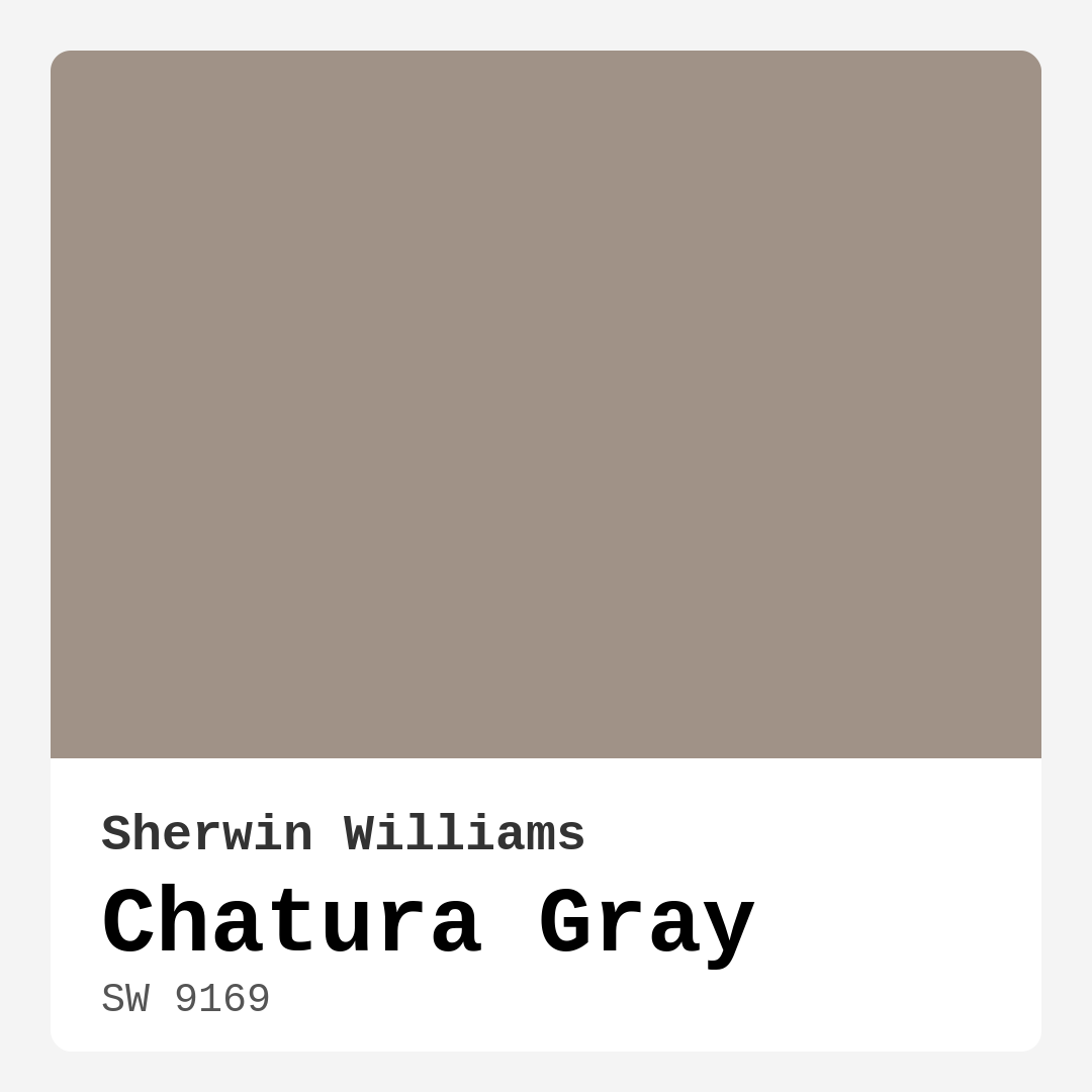
| HEX Code | #A09287 |
| RGB | 160, 146, 135 |
| LRV | 24% |
| Undertone | Red |
| Finish Options | Eggshell, Matte, Satin |
Imagine walking into a room that feels both sophisticated and inviting, a space where warmth wraps around you like a soft blanket. That’s the magic of Chatura Gray from Sherwin Williams. This captivating hue, with its subtle red undertones, isn’t just a paint color; it’s a transformative element that can breathe new life into any space in your home.
Chatura Gray, with the color code SW 9169, is a soft, muted gray that radiates a welcoming vibe without being overwhelming. Its medium darkness, reflected in its Light Reflectance Value (LRV) of 24%, means it absorbs more light than it reflects, creating a cozy atmosphere that feels just right for spaces where you want to unwind or gather. Whether you’re pondering a refresh for your living room, bedroom, or home office, this color could be the answer to your design dreams.
What makes Chatura Gray stand out in a sea of grays? Its warm undertones give it depth, setting it apart from cooler grays that can sometimes feel stark or unwelcoming. These subtle hints of red add a level of complexity that’s hard to replicate, making it a versatile choice for a variety of decor styles, including modern, transitional, rustic, and even industrial aesthetics. This adaptability is one of the primary reasons why Chatura Gray has earned a spot in many designers’ palettes.
When considering this color, it’s crucial to think about the spaces it will inhabit. Chatura Gray shines in living rooms and bedrooms, where a cozy ambiance is paramount. Imagine a serene bedroom painted in this hue, paired with crisp white bedding and natural wood accents. The result is a tranquil escape that invites relaxation. In a living room, it can serve as a stunning backdrop for artwork and furnishings, allowing your decor to pop while still feeling harmoniously tied together.
One of the great benefits of Chatura Gray is its coverage. You won’t find yourself wrestling with multiple coats of paint here. Typically, one to two coats will do the trick, making your painting project efficient and hassle-free. Plus, it’s beginner-friendly, so even if you’re a DIY novice, you can achieve a professional-looking finish. Whether you opt for a matte, eggshell, or satin finish, Chatura Gray will deliver a smooth application that enhances its soft texture.
Now, let’s talk about lighting, as it plays a pivotal role in how this color interacts within your space. In natural light, Chatura Gray appears lighter and more welcoming. However, in dim lighting, it reveals its richer character, deepening in tone and creating a snug, intimate environment. This quality makes it essential to test the color in your home’s specific lighting conditions before committing. Take a moment to observe how it looks at different times of the day; you might be surprised by its transformation.
As you consider pairing Chatura Gray with other colors, the possibilities are virtually endless. It complements a variety of shades beautifully, making your decor choices feel effortless. For a classic look, you might pair it with whites like White Dove, creating a timeless contrast. If you’re looking for something a bit bolder, consider pairing it with muted greens or deep blues for a striking yet harmonious palette.
However, be mindful when selecting trim colors. Chatura Gray’s warm undertones can sometimes clash with cool trims, so it’s wise to experiment a bit to find the perfect match. A warm white trim can beautifully enhance this color, while cool whites might create an unintended contrast.
If you’re concerned about using Chatura Gray in smaller spaces, worry not! This color can work wonders in smaller rooms, provided you balance it with lighter accents or furnishings. Its warmth can make even the tiniest space feel inviting and cozy. Just remember, if your room doesn’t get much natural light, integrating bright furnishings can help maintain an airy feel.
Chatura Gray is also a great choice for those looking for a low-VOC option. You can breathe easy knowing that this paint has a low VOC level, making it a healthier choice for your home environment. Its washable and wipeable nature adds to its functionality, allowing you to maintain its beauty with ease.
In terms of style versatility, Chatura Gray stands shoulder to shoulder with some of the most beloved gray paints on the market, such as Revere Pewter and Agreeable Gray. However, its unique warmth and depth help it carve out its niche. It’s perfect for those who love a cozy, inviting space without sacrificing sophistication.
Whether you’re revitalizing a single accent wall or transforming an entire room, Chatura Gray offers a calming atmosphere that beckons you to stay awhile. It’s a color that encourages connection, making it ideal for spaces meant for gathering and creating memories.
Let’s not forget the practicality of this color. Chatura Gray is incredibly touch-up friendly, which is a significant advantage for homeowners. Accidents happen, and having a paint that blends seamlessly with its previous coats means you can maintain the beauty of your walls without a fuss.
In conclusion, if you’re on the hunt for a paint color that strikes the perfect balance between warmth and sophistication, Chatura Gray deserves your attention. Its nuanced undertones, adaptability to various decor styles, and ability to create a calming atmosphere make it a top contender for any home project. Remember, the best way to appreciate this color is to see it in your own space. Grab a sample, test it against your furnishings, and observe how it dances with light throughout the day. You just might find that Chatura Gray is the warm embrace your home has been longing for.

Save this color to your Pinterest board to revisit when planning your room.
Real Room Photo of Chatura Gray SW 9169


Real rooms painted with Chatura Gray SW 9169 by Sherwin Williams. Lighting and photography can affect how colors appear — always test a sample swatch in your own space.
Undertones of Chatura Gray ?
The undertones of Chatura Gray are a key aspect of its character, leaning towards Red. These subtle underlying hues are what give the color its depth and complexity. For example, a gray with a blue undertone will feel cooler and more modern, while one with a brown undertone will feel warmer and more traditional. It’s essential to test this paint in your home and observe it next to your existing furniture, flooring, and decor to see how these undertones interact and reveal themselves throughout the day.
HEX value: #A09287
RGB code: 160, 146, 135
Is Chatura Gray Cool or Warm?
This color leans warm, making it perfect for creating cozy spaces that feel inviting. It can soften harsh lighting, making your rooms feel more relaxed and approachable.
Understanding Color Properties and Interior Design Tips
Hue refers to a specific position on the color wheel, measured in degrees from 0 to 360. Each degree represents a different pure color:
- 0° represents red
- 120° represents green
- 240° represents blue
Saturation describes the intensity or purity of a color and is expressed as a percentage:
- At 0%, the color appears completely desaturated—essentially a shade of gray
- At 100%, the color is at its most vivid and vibrant
Lightness indicates how light or dark a color is, also expressed as a percentage:
- 0% lightness results in black
- 100% lightness results in white
Using Warm Colors in Interior Design
Warm hues—such as reds, oranges, yellows, warm beiges, and greiges—are excellent choices for creating inviting and energetic spaces. These colors are particularly well-suited for:
- Kitchens, living rooms, and bathrooms, where warmth enhances comfort and sociability
- Large rooms, where warm tones can help reduce the sense of emptiness and make the space feel more intimate
For example:
- Warm beige shades provide a cozy, inviting atmosphere, ideal for living rooms, bedrooms, and hallways.
- Warm greige (a mix of beige and gray) offers the warmth of beige with the modern appeal of gray, making it a versatile backdrop for dining areas, bedrooms, and living spaces.
However, be mindful when using warm light tones in rooms with limited natural light. These shades may appear muted or even take on an unpleasant yellowish tint. To avoid a dull or flat appearance:
- Add depth by incorporating richer tones like deep greens, charcoal, or chocolate brown
- Use textured elements such as curtains, rugs, or cushions to bring dimension to the space
Pro Tip: Achieving Harmony with Warm and Cool Color Balance
To create a well-balanced and visually interesting interior, mix warm and cool tones strategically. This contrast adds depth and harmony to your design.
- If your walls feature warm hues, introduce cool-colored accents such as blue or green furniture, artwork, or accessories to create contrast.
- For a polished look, consider using a complementary color scheme, which pairs colors opposite each other on the color wheel (e.g., red with green, orange with blue).
This thoughtful mix not only enhances visual appeal but also creates a space that feels both dynamic and cohesive.

Save this color to your Pinterest board to revisit when planning your room.
Light Temperature Affects on Chatura Gray
Natural Light
Natural daylight changes in color temperature as the sun moves across the sky. At sunrise and sunset, the light tends to have a warm, golden tone with a color temperature around 2000 Kelvin (K). As the day progresses and the sun rises higher, the light becomes cooler and more neutral. Around midday, especially when the sky is clear, natural light typically reaches its peak brightness and shifts to a cooler tone, ranging from 5500 to 6500 Kelvin. This midday light is close to what we perceive as pure white or daylight-balanced light.
These shifts in natural light can significantly influence how colors appear in a space, which is why designers often consider both the time of day and the orientation of windows when planning interior color schemes.
Explore how this color transforms from sunrise through sunset as natural light changes throughout the day. Use the slider to simulate morning light, midday brightness, and warm afternoon tones.
North-facing rooms stay cooler throughout the day and benefit from warmer paint tones to compensate. South-facing rooms receive more direct sunlight, making even deeper shades more workable. East-facing rooms get bright morning light that fades by afternoon, while west-facing rooms glow warmly in the evening.
Artificial Light
When choosing artificial lighting, pay close attention to the color temperature, measured in Kelvin (K). This determines how warm or cool the light will appear. Lower temperatures, around 2700K, give off a warm, yellow glow often used in living rooms or bedrooms. Higher temperatures, above 5000K, create a cool, bluish light similar to daylight, commonly used in kitchens, offices, or task areas.
Use the slider to see how lighting temperature can affect the appearance of a surface or color throughout a space.
See how this color looks under different artificial light temperatures — from warm candlelight (2000K) to cool daylight (7000K). Move the slider to simulate your room's lighting conditions.


4800K
Keep in mind that natural light from windows, the warmth of lamps, and overhead lighting all affect how this color reads on your walls at different times of day. Always observe a sample swatch in your actual space before purchasing.
LRV of Chatura Gray
The Light Reflectance Value (LRV) of Chatura Gray is 24%, which places it in the Medium Dark category. This means it reflects very little light. Understanding a paint’s LRV is crucial for predicting how it will look in your space. A higher LRV indicates a lighter color that reflects more light, making rooms feel larger and brighter. A lower LRV signifies a darker color that absorbs more light, creating a cozier, more intimate atmosphere. Always consider the natural and artificial lighting in your room when selecting a paint color based on its LRV.
Detailed Review of Chatura Gray
Additional Paint Characteristics
Ideal Rooms
Bedroom, Dining Room, Home Office, Living Room
Decor Styles
Industrial, Modern, Rustic, Transitional
Coverage
Good (1–2 Coats), Touch-Up Friendly
Ease of Application
Beginner Friendly, Brush Smooth, Roller-Ready
Washability
Washable, Wipeable
VOC Level
Low VOC
Best Use
Accent Wall, Bedroom, Interior Walls, Living Room
Room Suitability
Bedroom, Dining Room, Home Office, Living Room
Tone Tag
Dusty, Neutral, Warm
Finish Type
Eggshell, Satin
Paint Performance
Easy Touch-Up, High Coverage, Low Odor
Use Cases
Best for Modern Farmhouse, Best for Rentals, Classic Favorite
Mood
Calm, Cozy, Inviting
Trim Pairing
Complements Cool Trim, Pairs with White Dove, Works with Warm Trim
Chatura Gray is a wonderful choice if you’re looking for a color that balances warmth and neutrality. Its nuanced undertones make it highly adaptable, allowing it to shine in both bright and dim lighting. Whether you’re painting a feature wall or refreshing an entire room, this shade offers excellent coverage with just one or two coats, saving you time and effort. The soft gray hue pairs beautifully with a variety of colors, making your decor choices effortless. Plus, it creates a cozy atmosphere that feels inviting without being overwhelming. If you’re seeking a versatile gray that doesn’t lean too cool or warm, Chatura Gray might just be your perfect match.
Pros & Cons of SW 9169 Chatura Gray
Pros
Cons
Colors that go with Sherwin Williams Chatura Gray
FAQ on SW 9169 Chatura Gray
Can I use Chatura Gray in a small room?
Absolutely! Chatura Gray can work beautifully in small rooms, provided you balance it with lighter trim or accents. Its warmth can make a small space feel more inviting. Just be mindful of lighting, as it may darken in dim conditions, so consider using bright furnishings to keep the overall feel airy.
How does Chatura Gray compare to other gray paints?
Chatura Gray stands out for its warm undertones, making it less stark than many cooler grays. Compared to colors like Revere Pewter, it offers a softer touch that can create a more inviting environment. It’s versatile and can blend seamlessly into various design styles, unlike some grays which may lean too blue or green.
Comparisons Chatura Gray with other colors
Chatura Gray SW 9169 vs Realist Beige SW 6078
| Attribute | Chatura Gray SW 9169 | Realist Beige SW 6078 |
|---|---|---|
| Color Name | Chatura Gray SW 9169 | Realist Beige SW 6078 |
| Color | ||
| Hue | Pink | Pink |
| Brightness | Medium | Medium |
| RGB | 160, 146, 135 | 211, 200, 189 |
| LRV | 24% | 34% |
| Finish Type | Eggshell, Satin | Eggshell, Matte, Satin |
| Finish Options | Eggshell, Matte, Satin | Eggshell, Matte, Satin |
| Ideal Rooms | Bedroom, Dining Room, Home Office, Living Room | Bedroom, Dining Room, Entryway, Home Office, Kitchen, Living Room |
| Decor Styles | Industrial, Modern, Rustic, Transitional | Contemporary, Minimalist, Modern Farmhouse, Rustic, Traditional |
| Coverage | Good (1–2 Coats), Touch-Up Friendly | Good (1–2 Coats), Touch-Up Friendly |
| Ease of Application | Beginner Friendly, Brush Smooth, Roller-Ready | Beginner Friendly, Brush Smooth, Fast-Drying, Roller-Ready |
| Washability | Washable, Wipeable | Washable, Wipeable |
| Room Suitability | Bedroom, Dining Room, Home Office, Living Room | Bedroom, Dining Room, Home Office, Kitchen, Living Room |
| Tone | Dusty, Neutral, Warm | Earthy, Neutral, Warm |
| Paint Performance | Easy Touch-Up, High Coverage, Low Odor | High Coverage, Low Odor, Quick Drying |
Lighting conditions, wall orientation, and surrounding decor can significantly affect how these colors appear in your space. Always test a sample swatch before committing to a full application.
Chatura Gray SW 9169 vs Rosaline Pearl SW 9077
| Attribute | Chatura Gray SW 9169 | Rosaline Pearl SW 9077 |
|---|---|---|
| Color Name | Chatura Gray SW 9169 | Rosaline Pearl SW 9077 |
| Color | ||
| Hue | Pink | Pink |
| Brightness | Medium | Medium |
| RGB | 160, 146, 135 | 163, 136, 135 |
| LRV | 24% | 69% |
| Finish Type | Eggshell, Satin | Eggshell, Matte |
| Finish Options | Eggshell, Matte, Satin | Eggshell, Matte, Satin |
| Ideal Rooms | Bedroom, Dining Room, Home Office, Living Room | Bedroom, Dining Room, Home Office, Living Room |
| Decor Styles | Industrial, Modern, Rustic, Transitional | Bohemian, Contemporary, Modern, Transitional |
| Coverage | Good (1–2 Coats), Touch-Up Friendly | Good (1–2 Coats) |
| Ease of Application | Beginner Friendly, Brush Smooth, Roller-Ready | Beginner Friendly, Brush Smooth, Fast-Drying, Roller-Ready |
| Washability | Washable, Wipeable | Washable, Wipeable |
| Room Suitability | Bedroom, Dining Room, Home Office, Living Room | Bedroom, Dining Room, Home Office, Living Room |
| Tone | Dusty, Neutral, Warm | Dusty, Muted, Warm |
| Paint Performance | Easy Touch-Up, High Coverage, Low Odor | Easy Touch-Up, Fade Resistant, Low Odor |
Lighting conditions, wall orientation, and surrounding decor can significantly affect how these colors appear in your space. Always test a sample swatch before committing to a full application.
Chatura Gray SW 9169 vs Cabbage Rose SW 0003
| Attribute | Chatura Gray SW 9169 | Cabbage Rose SW 0003 |
|---|---|---|
| Color Name | Chatura Gray SW 9169 | Cabbage Rose SW 0003 |
| Color | ||
| Hue | Pink | Pink |
| Brightness | Medium | Medium |
| RGB | 160, 146, 135 | 197, 159, 145 |
| LRV | 24% | 15% |
| Finish Type | Eggshell, Satin | Eggshell, Matte, Satin |
| Finish Options | Eggshell, Matte, Satin | Eggshell, Matte, Satin |
| Ideal Rooms | Bedroom, Dining Room, Home Office, Living Room | Bedroom, Dining Room, Hallway, Living Room, Nursery |
| Decor Styles | Industrial, Modern, Rustic, Transitional | Cottage, Modern Farmhouse, Romantic, Shabby Chic, Vintage |
| Coverage | Good (1–2 Coats), Touch-Up Friendly | Good (1–2 Coats), Touch-Up Friendly |
| Ease of Application | Beginner Friendly, Brush Smooth, Roller-Ready | Beginner Friendly, Brush Smooth, Roller-Ready |
| Washability | Washable, Wipeable | Washable, Wipeable |
| Room Suitability | Bedroom, Dining Room, Home Office, Living Room | Bedroom, Dining Room, Hallway, Living Room, Nursery |
| Tone | Dusty, Neutral, Warm | Earthy, Muted, Warm |
| Paint Performance | Easy Touch-Up, High Coverage, Low Odor | Easy Touch-Up, Low Odor |
Lighting conditions, wall orientation, and surrounding decor can significantly affect how these colors appear in your space. Always test a sample swatch before committing to a full application.
Chatura Gray SW 9169 vs Sashay Sand SW 6051
| Attribute | Chatura Gray SW 9169 | Sashay Sand SW 6051 |
|---|---|---|
| Color Name | Chatura Gray SW 9169 | Sashay Sand SW 6051 |
| Color | ||
| Hue | Pink | Pink |
| Brightness | Medium | Medium |
| RGB | 160, 146, 135 | 207, 180, 168 |
| LRV | 24% | 64% |
| Finish Type | Eggshell, Satin | Eggshell, Matte, Satin |
| Finish Options | Eggshell, Matte, Satin | Eggshell, Matte, Satin |
| Ideal Rooms | Bedroom, Dining Room, Home Office, Living Room | Bedroom, Dining Room, Home Office, Kitchen, Living Room |
| Decor Styles | Industrial, Modern, Rustic, Transitional | Bohemian, Contemporary, Modern Farmhouse, Scandinavian, Transitional |
| Coverage | Good (1–2 Coats), Touch-Up Friendly | Good (1–2 Coats), Touch-Up Friendly |
| Ease of Application | Beginner Friendly, Brush Smooth, Roller-Ready | Beginner Friendly, Fast-Drying, Roller-Ready |
| Washability | Washable, Wipeable | Highly Washable, Washable |
| Room Suitability | Bedroom, Dining Room, Home Office, Living Room | Bedroom, Dining Room, Home Office, Kitchen, Living Room |
| Tone | Dusty, Neutral, Warm | Earthy, Muted, Warm |
| Paint Performance | Easy Touch-Up, High Coverage, Low Odor | Easy Touch-Up, Low Odor, Quick Drying, Scuff Resistant |
Lighting conditions, wall orientation, and surrounding decor can significantly affect how these colors appear in your space. Always test a sample swatch before committing to a full application.
Chatura Gray SW 9169 vs Touch of Sand SW 9085
| Attribute | Chatura Gray SW 9169 | Touch of Sand SW 9085 |
|---|---|---|
| Color Name | Chatura Gray SW 9169 | Touch of Sand SW 9085 |
| Color | ||
| Hue | Pink | Pink |
| Brightness | Medium | Medium |
| RGB | 160, 146, 135 | 213, 199, 186 |
| LRV | 24% | 66% |
| Finish Type | Eggshell, Satin | Eggshell, Matte, Satin |
| Finish Options | Eggshell, Matte, Satin | Eggshell, Matte, Satin |
| Ideal Rooms | Bedroom, Dining Room, Home Office, Living Room | Bathroom, Bedroom, Dining Room, Home Office, Kitchen, Living Room |
| Decor Styles | Industrial, Modern, Rustic, Transitional | Bohemian, Coastal, Contemporary, Modern Farmhouse, Rustic |
| Coverage | Good (1–2 Coats), Touch-Up Friendly | Good (1–2 Coats), Touch-Up Friendly |
| Ease of Application | Beginner Friendly, Brush Smooth, Roller-Ready | Beginner Friendly, Brush Smooth, Fast-Drying, Roller-Ready |
| Washability | Washable, Wipeable | Washable, Wipeable |
| Room Suitability | Bedroom, Dining Room, Home Office, Living Room | Bathroom, Bedroom, Dining Room, Home Office, Kitchen, Living Room |
| Tone | Dusty, Neutral, Warm | Earthy, Muted, Neutral, Warm |
| Paint Performance | Easy Touch-Up, High Coverage, Low Odor | Easy Touch-Up, Low Odor, Quick Drying, Scuff Resistant |
Lighting conditions, wall orientation, and surrounding decor can significantly affect how these colors appear in your space. Always test a sample swatch before committing to a full application.
Chatura Gray SW 9169 vs Pink Shadow SW 0070
| Attribute | Chatura Gray SW 9169 | Pink Shadow SW 0070 |
|---|---|---|
| Color Name | Chatura Gray SW 9169 | Pink Shadow SW 0070 |
| Color | ||
| Hue | Pink | Pink |
| Brightness | Medium | Medium |
| RGB | 160, 146, 135 | 222, 195, 185 |
| LRV | 24% | 45% |
| Finish Type | Eggshell, Satin | Eggshell, Matte, Satin |
| Finish Options | Eggshell, Matte, Satin | Eggshell, Matte, Satin |
| Ideal Rooms | Bedroom, Dining Room, Home Office, Living Room | Bedroom, Dining Room, Home Office, Living Room, Nursery |
| Decor Styles | Industrial, Modern, Rustic, Transitional | Bohemian, Minimalist, Modern Farmhouse, Scandinavian, Traditional |
| Coverage | Good (1–2 Coats), Touch-Up Friendly | Good (1–2 Coats) |
| Ease of Application | Beginner Friendly, Brush Smooth, Roller-Ready | Beginner Friendly, Brush Smooth, Fast-Drying, Roller-Ready |
| Washability | Washable, Wipeable | Washable, Wipeable |
| Room Suitability | Bedroom, Dining Room, Home Office, Living Room | Bedroom, Dining Room, Living Room, Nursery |
| Tone | Dusty, Neutral, Warm | Muted, Pastel, Warm |
| Paint Performance | Easy Touch-Up, High Coverage, Low Odor | Easy Touch-Up, High Coverage, Low Odor |
Lighting conditions, wall orientation, and surrounding decor can significantly affect how these colors appear in your space. Always test a sample swatch before committing to a full application.
Chatura Gray SW 9169 vs Hushed Auburn SW 9080
| Attribute | Chatura Gray SW 9169 | Hushed Auburn SW 9080 |
|---|---|---|
| Color Name | Chatura Gray SW 9169 | Hushed Auburn SW 9080 |
| Color | ||
| Hue | Pink | Pink |
| Brightness | Medium | Medium |
| RGB | 160, 146, 135 | 168, 133, 122 |
| LRV | 24% | 12% |
| Finish Type | Eggshell, Satin | Eggshell, Matte, Satin |
| Finish Options | Eggshell, Matte, Satin | Eggshell, Matte, Satin |
| Ideal Rooms | Bedroom, Dining Room, Home Office, Living Room | Bedroom, Dining Room, Home Office, Living Room |
| Decor Styles | Industrial, Modern, Rustic, Transitional | Contemporary, Modern Farmhouse, Rustic, Transitional |
| Coverage | Good (1–2 Coats), Touch-Up Friendly | Good (1–2 Coats), Touch-Up Friendly |
| Ease of Application | Beginner Friendly, Brush Smooth, Roller-Ready | Beginner Friendly, Brush Smooth, Fast-Drying, Roller-Ready |
| Washability | Washable, Wipeable | Washable, Wipeable |
| Room Suitability | Bedroom, Dining Room, Home Office, Living Room | Bedroom, Dining Room, Home Office, Living Room |
| Tone | Dusty, Neutral, Warm | Earthy, Muted, Warm |
| Paint Performance | Easy Touch-Up, High Coverage, Low Odor | Easy Touch-Up, High Coverage, Low Odor |
Lighting conditions, wall orientation, and surrounding decor can significantly affect how these colors appear in your space. Always test a sample swatch before committing to a full application.
Chatura Gray SW 9169 vs Likeable Sand SW 6058
| Attribute | Chatura Gray SW 9169 | Likeable Sand SW 6058 |
|---|---|---|
| Color Name | Chatura Gray SW 9169 | Likeable Sand SW 6058 |
| Color | ||
| Hue | Pink | Pink |
| Brightness | Medium | Medium |
| RGB | 160, 146, 135 | 209, 183, 168 |
| LRV | 24% | 61% |
| Finish Type | Eggshell, Satin | Eggshell, Matte, Satin |
| Finish Options | Eggshell, Matte, Satin | Eggshell, Matte, Satin |
| Ideal Rooms | Bedroom, Dining Room, Home Office, Living Room | Bedroom, Dining Room, Home Office, Kitchen, Living Room |
| Decor Styles | Industrial, Modern, Rustic, Transitional | Bohemian, Coastal, Contemporary, Modern Farmhouse, Rustic |
| Coverage | Good (1–2 Coats), Touch-Up Friendly | Good (1–2 Coats), Touch-Up Friendly |
| Ease of Application | Beginner Friendly, Brush Smooth, Roller-Ready | Beginner Friendly, Brush Smooth, Fast-Drying, Roller-Ready |
| Washability | Washable, Wipeable | Washable, Wipeable |
| Room Suitability | Bedroom, Dining Room, Home Office, Living Room | Bedroom, Dining Room, Home Office, Kitchen, Living Room |
| Tone | Dusty, Neutral, Warm | Earthy, Muted, Warm |
| Paint Performance | Easy Touch-Up, High Coverage, Low Odor | Easy Touch-Up, Low Odor, Quick Drying |
Lighting conditions, wall orientation, and surrounding decor can significantly affect how these colors appear in your space. Always test a sample swatch before committing to a full application.
Chatura Gray SW 9169 vs Glamour SW 6031
| Attribute | Chatura Gray SW 9169 | Glamour SW 6031 |
|---|---|---|
| Color Name | Chatura Gray SW 9169 | Glamour SW 6031 |
| Color | ||
| Hue | Pink | Pink |
| Brightness | Medium | Medium |
| RGB | 160, 146, 135 | 182, 160, 154 |
| LRV | 24% | 30% |
| Finish Type | Eggshell, Satin | Eggshell, Matte, Satin |
| Finish Options | Eggshell, Matte, Satin | Eggshell, Matte, Satin |
| Ideal Rooms | Bedroom, Dining Room, Home Office, Living Room | Bedroom, Dining Room, Home Office, Living Room |
| Decor Styles | Industrial, Modern, Rustic, Transitional | Bohemian, Classic, Modern, Transitional |
| Coverage | Good (1–2 Coats), Touch-Up Friendly | Good (1–2 Coats) |
| Ease of Application | Beginner Friendly, Brush Smooth, Roller-Ready | Beginner Friendly, Brush Smooth, Fast-Drying, Roller-Ready |
| Washability | Washable, Wipeable | Scrubbable, Washable |
| Room Suitability | Bedroom, Dining Room, Home Office, Living Room | Bedroom, Dining Room, Home Office, Living Room |
| Tone | Dusty, Neutral, Warm | Balanced, Neutral, Warm |
| Paint Performance | Easy Touch-Up, High Coverage, Low Odor | Easy Touch-Up, Low Odor, Quick Drying |
Lighting conditions, wall orientation, and surrounding decor can significantly affect how these colors appear in your space. Always test a sample swatch before committing to a full application.
Chatura Gray SW 9169 vs Temperate Taupe SW 6037
| Attribute | Chatura Gray SW 9169 | Temperate Taupe SW 6037 |
|---|---|---|
| Color Name | Chatura Gray SW 9169 | Temperate Taupe SW 6037 |
| Color | ||
| Hue | Pink | Pink |
| Brightness | Medium | Medium |
| RGB | 160, 146, 135 | 191, 177, 170 |
| LRV | 24% | 34% |
| Finish Type | Eggshell, Satin | Eggshell, Matte, Satin |
| Finish Options | Eggshell, Matte, Satin | Eggshell, Matte, Satin |
| Ideal Rooms | Bedroom, Dining Room, Home Office, Living Room | Bedroom, Dining Room, Home Office, Kitchen, Living Room |
| Decor Styles | Industrial, Modern, Rustic, Transitional | Bohemian, Modern Farmhouse, Rustic, Transitional |
| Coverage | Good (1–2 Coats), Touch-Up Friendly | Good (1–2 Coats), Touch-Up Friendly |
| Ease of Application | Beginner Friendly, Brush Smooth, Roller-Ready | Beginner Friendly, Brush Smooth, Fast-Drying, Roller-Ready |
| Washability | Washable, Wipeable | Highly Washable, Washable |
| Room Suitability | Bedroom, Dining Room, Home Office, Living Room | Bedroom, Dining Room, Home Office, Living Room |
| Tone | Dusty, Neutral, Warm | Earthy, Neutral, Warm |
| Paint Performance | Easy Touch-Up, High Coverage, Low Odor | Long Lasting, Low Odor, Quick Drying, Scuff Resistant |
Lighting conditions, wall orientation, and surrounding decor can significantly affect how these colors appear in your space. Always test a sample swatch before committing to a full application.
Official Page of Sherwin Williams Chatura Gray SW 9169