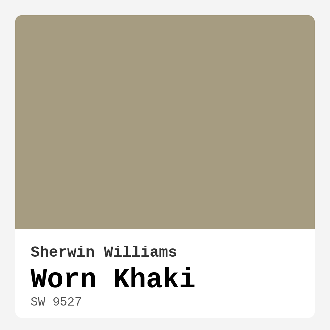
Color Preview & Key Details
| HEX Code | #A69C81 |
| RGB | 166, 156, 129 |
| LRV | 38% |
| Undertone | Yellow and Red |
| Finish Options | Eggshell, Matte, Satin |
Imagine stepping into a room that instantly wraps you in warmth and tranquility. The moment you walk through the door, you feel the gentle embrace of a soft, muted hue that makes everything else around it pop. This is the magic of Worn Khaki by Sherwin Williams, a color that has the remarkable ability to transform any space into a cozy sanctuary. As an expert home designer with a passion for color, I can’t help but share my enthusiasm for this versatile shade.
So, what exactly is Worn Khaki? With the color code SW 9527, this greige—an elegant blend of gray and beige—offers a beautiful balance of warmth and neutrality. It boasts a Light Reflectance Value (LRV) of 38%, meaning it reflects a moderate amount of light. This makes it a fantastic choice for spaces where you want to create an inviting atmosphere without overwhelming the senses. The color’s undertones lean toward yellow and red, giving it a grounded, earthy feel that can adapt to various decor styles, from modern farmhouse to eclectic bohemian.
One of the standout features of Worn Khaki is its ability to harmonize with natural light. Under sunlight, this shade reveals its true charm, accentuating its earthy hues and inviting ambiance. It can make a room feel larger and brighter, while still maintaining that cozy, intimate atmosphere we all crave in our homes. Yet, in spaces with limited natural light, it may appear a bit darker. If you’re working with a smaller room or one that doesn’t receive much sun, consider pairing Worn Khaki with brighter accents or furnishings to keep the space feeling open and airy.
This color is incredibly versatile, making it suitable for numerous areas in your home. Think about using it in the living room, bedroom, kitchen, dining room, or even a home office. It creates a warm backdrop that not only enhances the character of the room but also makes it more inviting for family and guests alike. Imagine a dining room painted in Worn Khaki, where friends gather around the table, surrounded by warmth and comfort. Or picture your home office, where the soft hue helps you focus while still feeling relaxed.
Worn Khaki’s adaptability extends to its compatibility with a variety of decor styles. It pairs beautifully with natural wood tones, crisp whites, and vibrant accent pieces. In a modern farmhouse setting, it complements rustic elements like reclaimed wood and vintage finds. For a more contemporary look, you can incorporate sleek metal accents and bold artwork against the warm backdrop of Worn Khaki.
When it comes to application, Worn Khaki shines. It’s a beginner-friendly color that rolls on smoothly and provides good coverage with just one to two coats. Plus, it’s touch-up friendly, which is a blessing for anyone who’s ever experienced the dreaded scuff marks and chips. The finishes available—matte, eggshell, and satin—allow you to choose the right sheen for your specific needs. For high-traffic areas like hallways or kitchens, consider a durable finish like eggshell or satin, which not only enhances the color but also provides a protective layer against scuffs and stains.
Worn Khaki is also an eco-conscious choice, featuring low VOC levels and being eco-certified. This means you can feel good about using it in your home, knowing that it’s a healthier option for both you and the environment. It’s easy to clean, too—whether you need to wipe down a wall after dinner or refresh the space for an unexpected guest, Worn Khaki makes maintenance a breeze.
Now, it’s crucial to think about how this color interacts with your existing decor. The subtle undertones of Worn Khaki play a major role in how it will look in your space. If you have furniture or decor with cool tones, you’ll want to ensure that Worn Khaki complements rather than clashes. Test it against your existing pieces to see how the yellow and red undertones reveal themselves throughout the day. You might find that it enhances your space in ways you hadn’t anticipated.
For those looking to make a statement, Worn Khaki can serve as an ideal canvas for vibrant accent pieces. Whether you choose bold throw pillows, colorful art, or even a striking piece of furniture, this color allows you to express your personality while still maintaining a harmonious overall look.
Of course, like any color, Worn Khaki does have its considerations. In lower light conditions, it may appear darker than anticipated. This is why it’s essential to observe the color in your specific lighting before making a final decision.
If you’re considering using Worn Khaki in a smaller room, rest assured it can work beautifully. Its warm, muted tone creates a cozy atmosphere without feeling overwhelming. Just remember to keep an eye on the lighting and perhaps incorporate brighter accents to maintain that open feel.
For high-traffic areas, Worn Khaki holds its ground well. With a durable finish and proper care, it can withstand the hustle and bustle of daily life. So, whether you’re painting a hallway or a family room, this color can handle the action while still looking chic.
When it comes to pairing, Worn Khaki works wonders with various trim colors. Crisp white trim can make the color pop, while warm brass fixtures can enhance its earthy tones, creating a cohesive and inviting look throughout your home.
If you find yourself drawn to Worn Khaki, it’s also worth exploring some lighter and darker shades in the Sherwin Williams palette. Lighter options like SW 9591 or SW 6164 can provide a soft, subtle contrast, while darker shades like SW 2861 can add depth and drama when used as an accent.
In conclusion, Worn Khaki is more than just a paint color; it’s an invitation to create a space that feels both beautiful and welcoming. Its versatility, warmth, and compatibility with various decor styles make it an ideal choice for any homeowner looking to refresh their space. With its calming presence and ability to enhance natural light, Worn Khaki might just be the perfect hue to bring your vision to life. So grab a sample, test it in your home, and prepare to fall in love with the cozy embrace of Worn Khaki. Your walls will thank you!
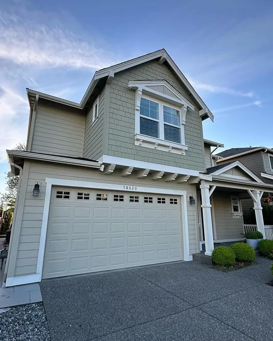
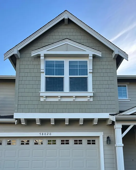
Real Room Photo of Worn Khaki SW 9527
Undertones of Worn Khaki ?
The undertones of Worn Khaki are a key aspect of its character, leaning towards Yellow and Red. These subtle underlying hues are what give the color its depth and complexity. For example, a gray with a blue undertone will feel cooler and more modern, while one with a brown undertone will feel warmer and more traditional. It’s essential to test this paint in your home and observe it next to your existing furniture, flooring, and decor to see how these undertones interact and reveal themselves throughout the day.
HEX value: #A69C81
RGB code: 166, 156, 129
Is Worn Khaki Cool or Warm?
This shade is warm, enveloping your space in a cozy embrace while still feeling light and airy.
Understanding Color Properties and Interior Design Tips
Hue refers to a specific position on the color wheel, measured in degrees from 0 to 360. Each degree represents a different pure color:
- 0° represents red
- 120° represents green
- 240° represents blue
Saturation describes the intensity or purity of a color and is expressed as a percentage:
- At 0%, the color appears completely desaturated—essentially a shade of gray
- At 100%, the color is at its most vivid and vibrant
Lightness indicates how light or dark a color is, also expressed as a percentage:
- 0% lightness results in black
- 100% lightness results in white
Using Warm Colors in Interior Design
Warm hues—such as reds, oranges, yellows, warm beiges, and greiges—are excellent choices for creating inviting and energetic spaces. These colors are particularly well-suited for:
- Kitchens, living rooms, and bathrooms, where warmth enhances comfort and sociability
- Large rooms, where warm tones can help reduce the sense of emptiness and make the space feel more intimate
For example:
- Warm beige shades provide a cozy, inviting atmosphere, ideal for living rooms, bedrooms, and hallways.
- Warm greige (a mix of beige and gray) offers the warmth of beige with the modern appeal of gray, making it a versatile backdrop for dining areas, bedrooms, and living spaces.
However, be mindful when using warm light tones in rooms with limited natural light. These shades may appear muted or even take on an unpleasant yellowish tint. To avoid a dull or flat appearance:
- Add depth by incorporating richer tones like deep greens, charcoal, or chocolate brown
- Use textured elements such as curtains, rugs, or cushions to bring dimension to the space
Pro Tip: Achieving Harmony with Warm and Cool Color Balance
To create a well-balanced and visually interesting interior, mix warm and cool tones strategically. This contrast adds depth and harmony to your design.
- If your walls feature warm hues, introduce cool-colored accents such as blue or green furniture, artwork, or accessories to create contrast.
- For a polished look, consider using a complementary color scheme, which pairs colors opposite each other on the color wheel (e.g., red with green, orange with blue).
This thoughtful mix not only enhances visual appeal but also creates a space that feels both dynamic and cohesive.
Light Temperature Affects on Worn Khaki
Natural Light
Natural daylight changes in color temperature as the sun moves across the sky. At sunrise and sunset, the light tends to have a warm, golden tone with a color temperature around 2000 Kelvin (K). As the day progresses and the sun rises higher, the light becomes cooler and more neutral. Around midday, especially when the sky is clear, natural light typically reaches its peak brightness and shifts to a cooler tone, ranging from 5500 to 6500 Kelvin. This midday light is close to what we perceive as pure white or daylight-balanced light.
These shifts in natural light can significantly influence how colors appear in a space, which is why designers often consider both the time of day and the orientation of windows when planning interior color schemes.
Artificial Light
When choosing artificial lighting, pay close attention to the color temperature, measured in Kelvin (K). This determines how warm or cool the light will appear. Lower temperatures, around 2700K, give off a warm, yellow glow often used in living rooms or bedrooms. Higher temperatures, above 5000K, create a cool, bluish light similar to daylight, commonly used in kitchens, offices, or task areas.
Use the slider to see how lighting temperature can affect the appearance of a surface or color throughout a space.


4800K
LRV of Worn Khaki
The Light Reflectance Value (LRV) of Worn Khaki is 38%, which places it in the Medium category. This means it Reflects a moderate amount of light. Understanding a paint’s LRV is crucial for predicting how it will look in your space. A higher LRV indicates a lighter color that reflects more light, making rooms feel larger and brighter. A lower LRV signifies a darker color that absorbs more light, creating a cozier, more intimate atmosphere. Always consider the natural and artificial lighting in your room when selecting a paint color based on its LRV.
Detailed Review of Worn Khaki
Additional Paint Characteristics
Ideal Rooms
Bedroom, Dining Room, Hallway, Home Office, Kitchen, Living Room
Decor Styles
Bohemian, Eclectic, Modern Farmhouse, Rustic, Transitional
Coverage
Good (1–2 Coats), Touch-Up Friendly
Ease of Application
Beginner Friendly, Brush Smooth, Roller-Ready
Washability
Washable, Wipeable
VOC Level
Eco-Certified, Low VOC
Best Use
Accent Wall, Cabinets, Interior Walls, Trim
Room Suitability
Bedroom, Dining Room, Home Office, Kitchen, Living Room
Tone Tag
Earthy, Neutral, Warm
Finish Type
Eggshell, Matte, Satin
Paint Performance
Easy Touch-Up, High Coverage, Low Odor, Quick Drying
Use Cases
Best for Modern Farmhouse, Best for Rentals, Best for Selling Your Home, Classic Favorite
Mood
Cozy, Grounding, Inviting
Trim Pairing
Complements Brass Fixtures, Pairs with White Dove, Works with Warm Trim
Worn Khaki is more than just a color; it’s an invitation to create a cozy sanctuary in your home. This paint shade strikes an ideal balance between light and dark, making it perfect for both small and large spaces. It pairs beautifully with natural wood tones and bright whites, offering a warm backdrop for your decor. When applied, it provides good coverage, typically needing only one to two coats, which saves time and effort. Its versatility allows it to adapt seamlessly to different styles, whether you’re going for a farmhouse aesthetic or a modern look. Plus, with its understated elegance, Worn Khaki can serve as an excellent canvas for vibrant accent pieces and artwork, making it a favorite among designers and homeowners alike.
Pros & Cons of SW 9527 Worn Khaki
Pros
Cons
Colors that go with Sherwin Williams Worn Khaki
FAQ on SW 9527 Worn Khaki
Can I use Worn Khaki in a small room?
Absolutely! Worn Khaki can be a great choice for small spaces. Its warm, muted tone helps create a cozy atmosphere without feeling overwhelming. Just be mindful of your lighting; in rooms with limited natural light, it might appear a bit darker, so consider pairing it with brighter accents or furnishings to keep the space feeling open.
Is Worn Khaki suitable for high-traffic areas?
Yes, Worn Khaki holds up well in high-traffic areas, especially when applied with a durable finish like eggshell or satin. These finishes not only enhance the color but also provide a layer of protection against scuffs and stains. For added durability, consider applying a topcoat for extra resilience in busy spaces like hallways or entryways.
Comparisons Worn Khaki with other colors
Worn Khaki SW 9527 vs Accessible Beige SW 7036
| Attribute | Worn Khaki SW 9527 | Accessible Beige SW 7036 |
|---|---|---|
| Color Name | Worn Khaki SW 9527 | Accessible Beige SW 7036 |
| Color | ||
| Hue | Greige | Greige |
| Brightness | Medium | Medium |
| RGB | 166, 156, 129 | 209, 199, 184 |
| LRV | 38% | 58% |
| Finish Type | Eggshell, Matte, Satin | Eggshell, Matte, Satin |
| Finish Options | Eggshell, Matte, Satin | Eggshell, Matte, Satin |
| Ideal Rooms | Bedroom, Dining Room, Hallway, Home Office, Kitchen, Living Room | Bedroom, Dining Room, Home Office, Kitchen, Living Room |
| Decor Styles | Bohemian, Eclectic, Modern Farmhouse, Rustic, Transitional | Bohemian, Contemporary, Modern Farmhouse, Traditional, Transitional |
| Coverage | Good (1–2 Coats), Touch-Up Friendly | Good (1–2 Coats), Touch-Up Friendly |
| Ease of Application | Beginner Friendly, Brush Smooth, Roller-Ready | Beginner Friendly, Brush Smooth, Roller-Ready |
| Washability | Washable, Wipeable | Highly Washable, Washable |
| Room Suitability | Bedroom, Dining Room, Home Office, Kitchen, Living Room | Bedroom, Dining Room, Home Office, Kitchen, Living Room |
| Tone | Earthy, Neutral, Warm | Earthy, Neutral, Warm |
| Paint Performance | Easy Touch-Up, High Coverage, Low Odor, Quick Drying | Easy Touch-Up, Fade Resistant, High Coverage, Low Odor |
Worn Khaki SW 9527 vs Jogging Path SW 7638
| Attribute | Worn Khaki SW 9527 | Jogging Path SW 7638 |
|---|---|---|
| Color Name | Worn Khaki SW 9527 | Jogging Path SW 7638 |
| Color | ||
| Hue | Greige | Greige |
| Brightness | Medium | Medium |
| RGB | 166, 156, 129 | 192, 185, 169 |
| LRV | 38% | 15% |
| Finish Type | Eggshell, Matte, Satin | Eggshell, Matte |
| Finish Options | Eggshell, Matte, Satin | Eggshell, Matte, Satin |
| Ideal Rooms | Bedroom, Dining Room, Hallway, Home Office, Kitchen, Living Room | Bedroom, Dining Room, Hallway, Home Office, Kitchen, Living Room |
| Decor Styles | Bohemian, Eclectic, Modern Farmhouse, Rustic, Transitional | Modern, Rustic, Scandinavian, Transitional |
| Coverage | Good (1–2 Coats), Touch-Up Friendly | Good (1–2 Coats), Touch-Up Friendly |
| Ease of Application | Beginner Friendly, Brush Smooth, Roller-Ready | Beginner Friendly, Brush Smooth, Fast-Drying, Roller-Ready |
| Washability | Washable, Wipeable | Washable, Wipeable |
| Room Suitability | Bedroom, Dining Room, Home Office, Kitchen, Living Room | Bedroom, Dining Room, Home Office, Living Room |
| Tone | Earthy, Neutral, Warm | Balanced, Earthy, Muted, Warm |
| Paint Performance | Easy Touch-Up, High Coverage, Low Odor, Quick Drying | Easy Touch-Up, Fade Resistant, Low Odor |
Worn Khaki SW 9527 vs Antler Velvet SW 9111
| Attribute | Worn Khaki SW 9527 | Antler Velvet SW 9111 |
|---|---|---|
| Color Name | Worn Khaki SW 9527 | Antler Velvet SW 9111 |
| Color | ||
| Hue | Greige | Greige |
| Brightness | Medium | Medium |
| RGB | 166, 156, 129 | 192, 173, 150 |
| LRV | 38% | 6% |
| Finish Type | Eggshell, Matte, Satin | Eggshell, Matte |
| Finish Options | Eggshell, Matte, Satin | Eggshell, Matte, Satin |
| Ideal Rooms | Bedroom, Dining Room, Hallway, Home Office, Kitchen, Living Room | Bedroom, Dining Room, Home Office, Living Room, Nursery |
| Decor Styles | Bohemian, Eclectic, Modern Farmhouse, Rustic, Transitional | Contemporary, Modern Farmhouse, Rustic, Transitional |
| Coverage | Good (1–2 Coats), Touch-Up Friendly | Good (1–2 Coats) |
| Ease of Application | Beginner Friendly, Brush Smooth, Roller-Ready | Beginner Friendly, Brush Smooth, Fast-Drying, Roller-Ready |
| Washability | Washable, Wipeable | Scrubbable, Washable, Wipeable |
| Room Suitability | Bedroom, Dining Room, Home Office, Kitchen, Living Room | Bedroom, Dining Room, Home Office, Living Room |
| Tone | Earthy, Neutral, Warm | Earthy, Muted, Warm |
| Paint Performance | Easy Touch-Up, High Coverage, Low Odor, Quick Drying | Easy Touch-Up, High Coverage, Low Odor, Quick Drying |
Worn Khaki SW 9527 vs Perfect Greige SW 6073
| Attribute | Worn Khaki SW 9527 | Perfect Greige SW 6073 |
|---|---|---|
| Color Name | Worn Khaki SW 9527 | Perfect Greige SW 6073 |
| Color | ||
| Hue | Greige | Greige |
| Brightness | Medium | Medium |
| RGB | 166, 156, 129 | 183, 171, 159 |
| LRV | 38% | 38% |
| Finish Type | Eggshell, Matte, Satin | Eggshell, Matte, Satin |
| Finish Options | Eggshell, Matte, Satin | Eggshell, Matte, Satin |
| Ideal Rooms | Bedroom, Dining Room, Hallway, Home Office, Kitchen, Living Room | Bathroom, Bedroom, Dining Room, Entryway, Home Office, Kitchen, Living Room |
| Decor Styles | Bohemian, Eclectic, Modern Farmhouse, Rustic, Transitional | Contemporary, Farmhouse, Modern, Traditional, Transitional |
| Coverage | Good (1–2 Coats), Touch-Up Friendly | Good (1–2 Coats), Touch-Up Friendly |
| Ease of Application | Beginner Friendly, Brush Smooth, Roller-Ready | Beginner Friendly, Brush Smooth, Roller-Ready |
| Washability | Washable, Wipeable | Highly Washable, Washable |
| Room Suitability | Bedroom, Dining Room, Home Office, Kitchen, Living Room | Bedroom, Dining Room, Home Office, Kitchen, Living Room |
| Tone | Earthy, Neutral, Warm | Muted, Neutral, Warm |
| Paint Performance | Easy Touch-Up, High Coverage, Low Odor, Quick Drying | Easy Touch-Up, Low Odor, Scuff Resistant |
Worn Khaki SW 9527 vs Analytical Gray SW 7051
| Attribute | Worn Khaki SW 9527 | Analytical Gray SW 7051 |
|---|---|---|
| Color Name | Worn Khaki SW 9527 | Analytical Gray SW 7051 |
| Color | ||
| Hue | Greige | Greige |
| Brightness | Medium | Medium |
| RGB | 166, 156, 129 | 191, 182, 167 |
| LRV | 38% | 60% |
| Finish Type | Eggshell, Matte, Satin | Eggshell, Matte, Satin |
| Finish Options | Eggshell, Matte, Satin | Eggshell, Matte, Satin |
| Ideal Rooms | Bedroom, Dining Room, Hallway, Home Office, Kitchen, Living Room | Bedroom, Dining Room, Hallway, Home Office, Living Room |
| Decor Styles | Bohemian, Eclectic, Modern Farmhouse, Rustic, Transitional | Farmhouse, Modern, Scandinavian, Transitional |
| Coverage | Good (1–2 Coats), Touch-Up Friendly | Good (1–2 Coats) |
| Ease of Application | Beginner Friendly, Brush Smooth, Roller-Ready | Beginner Friendly, Brush Smooth, Roller-Ready |
| Washability | Washable, Wipeable | Highly Washable, Washable |
| Room Suitability | Bedroom, Dining Room, Home Office, Kitchen, Living Room | Bedroom, Dining Room, Home Office, Living Room |
| Tone | Earthy, Neutral, Warm | Balanced, Neutral, Warm |
| Paint Performance | Easy Touch-Up, High Coverage, Low Odor, Quick Drying | Easy Touch-Up, High Coverage, Low Odor |
Worn Khaki SW 9527 vs Relaxed Khaki SW 6149
| Attribute | Worn Khaki SW 9527 | Relaxed Khaki SW 6149 |
|---|---|---|
| Color Name | Worn Khaki SW 9527 | Relaxed Khaki SW 6149 |
| Color | ||
| Hue | Greige | Greige |
| Brightness | Medium | Medium |
| RGB | 166, 156, 129 | 200, 187, 163 |
| LRV | 38% | 40% |
| Finish Type | Eggshell, Matte, Satin | Eggshell, Matte, Satin |
| Finish Options | Eggshell, Matte, Satin | Eggshell, Matte, Satin |
| Ideal Rooms | Bedroom, Dining Room, Hallway, Home Office, Kitchen, Living Room | Bedroom, Dining Room, Home Office, Kitchen, Living Room |
| Decor Styles | Bohemian, Eclectic, Modern Farmhouse, Rustic, Transitional | Contemporary, Modern Farmhouse, Rustic, Traditional |
| Coverage | Good (1–2 Coats), Touch-Up Friendly | Good (1–2 Coats), Touch-Up Friendly |
| Ease of Application | Beginner Friendly, Brush Smooth, Roller-Ready | Beginner Friendly, Brush Smooth, Roller-Ready |
| Washability | Washable, Wipeable | Washable, Wipeable |
| Room Suitability | Bedroom, Dining Room, Home Office, Kitchen, Living Room | Bedroom, Dining Room, Home Office, Living Room |
| Tone | Earthy, Neutral, Warm | Earthy, Muted, Warm |
| Paint Performance | Easy Touch-Up, High Coverage, Low Odor, Quick Drying | Easy Touch-Up, Low Odor, Scuff Resistant |
Worn Khaki SW 9527 vs Sage SW 2860
| Attribute | Worn Khaki SW 9527 | Sage SW 2860 |
|---|---|---|
| Color Name | Worn Khaki SW 9527 | Sage SW 2860 |
| Color | ||
| Hue | Greige | Greige |
| Brightness | Medium | Medium |
| RGB | 166, 156, 129 | 179, 174, 149 |
| LRV | 38% | 24% |
| Finish Type | Eggshell, Matte, Satin | Eggshell, Matte, Satin |
| Finish Options | Eggshell, Matte, Satin | Eggshell, Matte, Satin |
| Ideal Rooms | Bedroom, Dining Room, Hallway, Home Office, Kitchen, Living Room | Bathroom, Bedroom, Home Office, Kitchen, Living Room |
| Decor Styles | Bohemian, Eclectic, Modern Farmhouse, Rustic, Transitional | Bohemian, Farmhouse, Modern, Rustic, Traditional |
| Coverage | Good (1–2 Coats), Touch-Up Friendly | Good (1–2 Coats), Touch-Up Friendly |
| Ease of Application | Beginner Friendly, Brush Smooth, Roller-Ready | Beginner Friendly, Brush Smooth, Roller-Ready |
| Washability | Washable, Wipeable | Highly Washable, Washable |
| Room Suitability | Bedroom, Dining Room, Home Office, Kitchen, Living Room | Bathroom, Bedroom, Dining Room, Kitchen, Living Room |
| Tone | Earthy, Neutral, Warm | Earthy, Muted, Warm |
| Paint Performance | Easy Touch-Up, High Coverage, Low Odor, Quick Drying | Easy Touch-Up, Fade Resistant, Low Odor |
Worn Khaki SW 9527 vs Smokey Taupe 983
| Attribute | Worn Khaki SW 9527 | Smokey Taupe 983 |
|---|---|---|
| Color Name | Worn Khaki SW 9527 | Smokey Taupe 983 |
| Color | ||
| Hue | Greige | Greige |
| Brightness | Medium | Medium |
| RGB | 166, 156, 129 | 205, 196, 181 |
| LRV | 38% | 54.53% |
| Finish Type | Eggshell, Matte, Satin | Eggshell, Matte, Satin |
| Finish Options | Eggshell, Matte, Satin | Eggshell, Matte, Satin |
| Ideal Rooms | Bedroom, Dining Room, Hallway, Home Office, Kitchen, Living Room | Bedroom, Dining Room, Entryway, Home Office, Living Room |
| Decor Styles | Bohemian, Eclectic, Modern Farmhouse, Rustic, Transitional | Contemporary, Minimalist, Modern Farmhouse, Rustic, Transitional |
| Coverage | Good (1–2 Coats), Touch-Up Friendly | Good (1–2 Coats), High Hide, Touch-Up Friendly |
| Ease of Application | Beginner Friendly, Brush Smooth, Roller-Ready | Beginner Friendly, Brush Smooth, Fast-Drying, Roller-Ready |
| Washability | Washable, Wipeable | Highly Washable, Stain Resistant, Washable |
| Room Suitability | Bedroom, Dining Room, Home Office, Kitchen, Living Room | Bedroom, Dining Room, Entryway, Home Office, Living Room |
| Tone | Earthy, Neutral, Warm | Balanced, Earthy, Muted, Warm |
| Paint Performance | Easy Touch-Up, High Coverage, Low Odor, Quick Drying | Easy Touch-Up, High Coverage, Low Odor, Quick Drying, Scuff Resistant |
Worn Khaki SW 9527 vs Pashmina AF-100
| Attribute | Worn Khaki SW 9527 | Pashmina AF-100 |
|---|---|---|
| Color Name | Worn Khaki SW 9527 | Pashmina AF-100 |
| Color | ||
| Hue | Greige | Greige |
| Brightness | Medium | Medium |
| RGB | 166, 156, 129 | 187, 178, 161 |
| LRV | 38% | 44.20% |
| Finish Type | Eggshell, Matte, Satin | Eggshell, Matte, Satin |
| Finish Options | Eggshell, Matte, Satin | Eggshell, Matte, Satin |
| Ideal Rooms | Bedroom, Dining Room, Hallway, Home Office, Kitchen, Living Room | Bedroom, Hallway, Home Office, Living Room |
| Decor Styles | Bohemian, Eclectic, Modern Farmhouse, Rustic, Transitional | Bohemian, Modern, Rustic, Traditional |
| Coverage | Good (1–2 Coats), Touch-Up Friendly | Good (1–2 Coats), Touch-Up Friendly |
| Ease of Application | Beginner Friendly, Brush Smooth, Roller-Ready | Beginner Friendly, Brush Smooth, Roller-Ready |
| Washability | Washable, Wipeable | Scrubbable, Stain Resistant, Washable |
| Room Suitability | Bedroom, Dining Room, Home Office, Kitchen, Living Room | Bedroom, Dining Room, Home Office, Living Room |
| Tone | Earthy, Neutral, Warm | Earthy, Neutral, Warm |
| Paint Performance | Easy Touch-Up, High Coverage, Low Odor, Quick Drying | Easy Touch-Up, High Coverage, Low Odor, Scuff Resistant |
Worn Khaki SW 9527 vs Spanish Olive 1509
| Attribute | Worn Khaki SW 9527 | Spanish Olive 1509 |
|---|---|---|
| Color Name | Worn Khaki SW 9527 | Spanish Olive 1509 |
| Color | ||
| Hue | Greige | Greige |
| Brightness | Medium | Medium |
| RGB | 166, 156, 129 | 197, 195, 174 |
| LRV | 38% | 52.54% |
| Finish Type | Eggshell, Matte, Satin | Eggshell, Matte, Satin |
| Finish Options | Eggshell, Matte, Satin | Eggshell, Matte, Satin |
| Ideal Rooms | Bedroom, Dining Room, Hallway, Home Office, Kitchen, Living Room | Bedroom, Dining Room, Home Office, Kitchen, Living Room |
| Decor Styles | Bohemian, Eclectic, Modern Farmhouse, Rustic, Transitional | Bohemian, Contemporary, Modern Farmhouse, Rustic, Traditional |
| Coverage | Good (1–2 Coats), Touch-Up Friendly | Good (1–2 Coats), Touch-Up Friendly |
| Ease of Application | Beginner Friendly, Brush Smooth, Roller-Ready | Beginner Friendly, Brush Smooth, Roller-Ready |
| Washability | Washable, Wipeable | Highly Washable, Washable |
| Room Suitability | Bedroom, Dining Room, Home Office, Kitchen, Living Room | Bathroom, Bedroom, Dining Room, Kitchen, Living Room |
| Tone | Earthy, Neutral, Warm | Earthy, Muted, Warm |
| Paint Performance | Easy Touch-Up, High Coverage, Low Odor, Quick Drying | Easy Touch-Up, Fade Resistant, Low Odor, Stain Resistant |
Official Page of Sherwin Williams Worn Khaki SW 9527