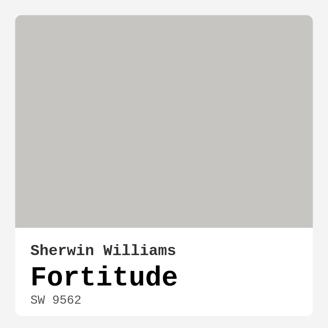
Color Preview & Key Details
| HEX Code | #C6C5C1 |
| RGB | 198, 197, 193 |
| LRV | 30% |
| Undertone | Yellow |
| Finish Options | Eggshell, Matte, Satin |
Imagine walking into a room that instantly wraps you in a warm embrace, a space where the chaos of the outside world melts away. This is the kind of atmosphere you can create with Fortitude by Sherwin Williams, a soft, muted gray that effortlessly radiates calmness. With its subtle warmth and adaptable character, Fortitude can transform any area into a serene haven.
Let’s dive deep into this beautiful shade and see if it’s the perfect fit for your next home decor project.
Fortitude, with the color code SW 9562, is not just another gray. It belongs to the gray hue family, but what sets it apart is its gentle, yellow undertone. This characteristic lends a unique softness that many cooler grays lack, making it feel inviting rather than stark. If you’ve been searching for a color that creates a tranquil backdrop without feeling cold, Fortitude could be your answer.
The HEX code #C6C5C1 captures its essence beautifully — a tranquil, muted hue that’s perfect for crafting spaces that feel both comforting and sophisticated. Its medium brightness allows it to blend seamlessly with numerous decor styles, from modern and Scandinavian to transitional and minimalist.
Now, you might be wondering where to use Fortitude in your home. This color shines in various settings, making it an excellent choice for living rooms, bedrooms, home offices, and even nurseries. Imagine a cozy reading nook in your living room, adorned with warm textures and natural light, all set against the calming backdrop of Fortitude. Or how about a serene bedroom that promotes relaxation after a long day? Fortitude’s soothing qualities can help create the perfect retreat.
One of the standout features of this color is its versatility. It adapts beautifully to different lighting conditions, shifting subtly throughout the day. In bright daylight, it reflects light, helping rooms feel airy and open. Come evening, it deepens slightly, creating an intimate ambiance that invites you to unwind. This responsiveness to light is key to ensuring your space remains dynamic and engaging.
When it comes to application, Fortitude is beginner-friendly. Whether you’re using a roller or a brush, this paint goes on smoothly, and its coverage is good, typically requiring only 1-2 coats. Plus, if you need to touch up areas later, you’ll find it’s quite accommodating. Its washable and scrubbable nature makes it a practical choice for high-traffic areas, which is a huge plus if you have kids or pets.
However, keep in mind that Fortitude may appear darker in poorly lit rooms. If you’re planning to use it in smaller or dimly lit spaces, consider supplementing with plenty of light sources to maintain its inviting charm. Testing the color in your home is essential; observe how it interacts with your existing furniture, flooring, and decor throughout the day.
Let’s talk undertones. Fortitude leans slightly towards the warmer side of the spectrum, making it perfect for fostering a sense of comfort. The yellow undertones add depth and complexity while ensuring that the color remains inviting. If you’ve ever painted with a gray that felt too cold, you’ll appreciate how Fortitude maintains warmth, preventing your space from feeling sterile.
Color pairing is another advantage of Fortitude. It works beautifully with both cool and warm accents, allowing you to play with various decor themes. Pair it with crisp whites like White Dove for a fresh, clean look, or complement it with wood trim for a more rustic feel. For those who love bolder colors, consider adding elements in deep blues or rich greens to create a striking contrast.
What about maintenance? Fortitude is designed to withstand the test of time. Its low VOC level means you won’t have to worry about harsh chemical odors while you’re painting, and its paint performance is nothing short of impressive. It offers easy touch-ups and is scuff-resistant, making it ideal for busy households.
Now, let’s explore how Fortitude fits into your overall design vision. If you’re going for a modern aesthetic, consider incorporating sleek lines and minimalist furniture alongside this soft gray. For a Scandinavian touch, layer in natural materials and textures to enhance the warmth of Fortitude. If transitional decor is more your style, mix contemporary pieces with traditional elements to create a timeless look that feels effortlessly chic.
And if you’re in love with the idea of creating a cozy atmosphere, Fortitude is your go-to color. Its calm, inviting nature sets the stage for restful evenings and peaceful mornings. Whether you’re decorating a nursery filled with soft toys and gentle colors or a home office that inspires creativity, this paint will serve as a fantastic backdrop.
For those still unsure about committing, I recommend using Fortitude as an accent wall. This way, you can experience its beauty without overwhelming the entire space. It pairs wonderfully with lighter shades like SW 7667 or darker options like SW 7650, offering you flexibility in your design choices.
In summary, Fortitude by Sherwin Williams is more than just a paint color; it’s a gateway to creating a warm, inviting home. Its ability to adapt to various styles and lighting conditions makes it a designer favorite. Remember to consider your space’s natural light and existing decor to ensure this hue enhances your home’s unique character.
So, what do you think? Are you ready to embrace the calm and sophistication of Fortitude? Whether you’re refreshing a single room or planning a larger project, this color is sure to inspire a sense of tranquility that transforms your home into a retreat. Happy decorating!
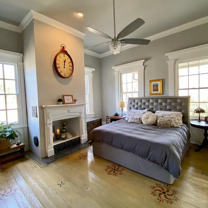
Real Room Photo of Fortitude SW 9562
Undertones of Fortitude ?
The undertones of Fortitude are a key aspect of its character, leaning towards Yellow. These subtle underlying hues are what give the color its depth and complexity. For example, a gray with a blue undertone will feel cooler and more modern, while one with a brown undertone will feel warmer and more traditional. It’s essential to test this paint in your home and observe it next to your existing furniture, flooring, and decor to see how these undertones interact and reveal themselves throughout the day.
HEX value: #C6C5C1
RGB code: 198, 197, 193
Is Fortitude Cool or Warm?
With its warm gray shade, Fortitude leans slightly toward the warmer side of the spectrum, making it an excellent choice for spaces where you want to foster comfort and relaxation.
Understanding Color Properties and Interior Design Tips
Hue refers to a specific position on the color wheel, measured in degrees from 0 to 360. Each degree represents a different pure color:
- 0° represents red
- 120° represents green
- 240° represents blue
Saturation describes the intensity or purity of a color and is expressed as a percentage:
- At 0%, the color appears completely desaturated—essentially a shade of gray
- At 100%, the color is at its most vivid and vibrant
Lightness indicates how light or dark a color is, also expressed as a percentage:
- 0% lightness results in black
- 100% lightness results in white
Using Warm Colors in Interior Design
Warm hues—such as reds, oranges, yellows, warm beiges, and greiges—are excellent choices for creating inviting and energetic spaces. These colors are particularly well-suited for:
- Kitchens, living rooms, and bathrooms, where warmth enhances comfort and sociability
- Large rooms, where warm tones can help reduce the sense of emptiness and make the space feel more intimate
For example:
- Warm beige shades provide a cozy, inviting atmosphere, ideal for living rooms, bedrooms, and hallways.
- Warm greige (a mix of beige and gray) offers the warmth of beige with the modern appeal of gray, making it a versatile backdrop for dining areas, bedrooms, and living spaces.
However, be mindful when using warm light tones in rooms with limited natural light. These shades may appear muted or even take on an unpleasant yellowish tint. To avoid a dull or flat appearance:
- Add depth by incorporating richer tones like deep greens, charcoal, or chocolate brown
- Use textured elements such as curtains, rugs, or cushions to bring dimension to the space
Pro Tip: Achieving Harmony with Warm and Cool Color Balance
To create a well-balanced and visually interesting interior, mix warm and cool tones strategically. This contrast adds depth and harmony to your design.
- If your walls feature warm hues, introduce cool-colored accents such as blue or green furniture, artwork, or accessories to create contrast.
- For a polished look, consider using a complementary color scheme, which pairs colors opposite each other on the color wheel (e.g., red with green, orange with blue).
This thoughtful mix not only enhances visual appeal but also creates a space that feels both dynamic and cohesive.
Light Temperature Affects on Fortitude
Natural Light
Natural daylight changes in color temperature as the sun moves across the sky. At sunrise and sunset, the light tends to have a warm, golden tone with a color temperature around 2000 Kelvin (K). As the day progresses and the sun rises higher, the light becomes cooler and more neutral. Around midday, especially when the sky is clear, natural light typically reaches its peak brightness and shifts to a cooler tone, ranging from 5500 to 6500 Kelvin. This midday light is close to what we perceive as pure white or daylight-balanced light.
These shifts in natural light can significantly influence how colors appear in a space, which is why designers often consider both the time of day and the orientation of windows when planning interior color schemes.
Artificial Light
When choosing artificial lighting, pay close attention to the color temperature, measured in Kelvin (K). This determines how warm or cool the light will appear. Lower temperatures, around 2700K, give off a warm, yellow glow often used in living rooms or bedrooms. Higher temperatures, above 5000K, create a cool, bluish light similar to daylight, commonly used in kitchens, offices, or task areas.
Use the slider to see how lighting temperature can affect the appearance of a surface or color throughout a space.


4800K
LRV of Fortitude
The Light Reflectance Value (LRV) of Fortitude is 30%, which places it in the Medium Dark category. This means it reflects very little light. Understanding a paint’s LRV is crucial for predicting how it will look in your space. A higher LRV indicates a lighter color that reflects more light, making rooms feel larger and brighter. A lower LRV signifies a darker color that absorbs more light, creating a cozier, more intimate atmosphere. Always consider the natural and artificial lighting in your room when selecting a paint color based on its LRV.
Detailed Review of Fortitude
Additional Paint Characteristics
Ideal Rooms
Bedroom, Hallway, Home Office, Living Room
Decor Styles
Minimalist, Modern, Scandinavian, Transitional
Coverage
Good (1–2 Coats), Touch-Up Friendly
Ease of Application
Beginner Friendly, Brush Smooth, Roller-Ready
Washability
Scrubbable, Washable
VOC Level
Eco-Certified, Low VOC
Best Use
Accent Wall, Interior Walls, Trim
Room Suitability
Bedroom, Home Office, Living Room, Nursery
Tone Tag
Muted, Neutral, Warm
Finish Type
Eggshell, Matte
Paint Performance
Easy Touch-Up, Low Odor, Scuff Resistant
Use Cases
Best for Low Light Rooms, Best for Small Spaces, Designer Favorite
Mood
Calm, Inviting, Restful
Trim Pairing
Complements Cool Trim, Good with Wood Trim, Pairs with White Dove
Fortitude stands out for its ability to adapt to its surroundings while maintaining a signature soft elegance. When applied, it offers a smooth finish that enhances the room’s natural light without overwhelming the senses. It performs well in various lighting conditions, shifting subtly throughout the day. For those who appreciate a color that feels both contemporary and timeless, Fortitude is a solid choice. Additionally, it pairs beautifully with both warm and cool accents, making it ideal for diverse decor themes. Whether you’re creating a cozy nook or a spacious lounge, this paint provides a calming backdrop that invites relaxation.
Pros & Cons of SW 9562 Fortitude
Pros
Cons
Colors that go with Sherwin Williams Fortitude
FAQ on SW 9562 Fortitude
Is Fortitude suitable for high-traffic areas?
Absolutely! Fortitude is designed to be durable and its washable nature makes it an excellent choice for high-traffic areas. Just be sure to apply it with a finish that’s appropriate for the wear and tear these areas may experience.
Can I use Fortitude in a small room?
Yes, Fortitude works wonderfully in small rooms. Its light reflectance helps make the space feel larger and more open while its warm undertones ensure it remains inviting and cozy. Just keep in mind that it may deepen in color in very dim lighting conditions.
Comparisons Fortitude with other colors
Fortitude SW 9562 vs Repose Gray SW 7015
| Attribute | Fortitude SW 9562 | Repose Gray SW 7015 |
|---|---|---|
| Color Name | Fortitude SW 9562 | Repose Gray SW 7015 |
| Color | ||
| Hue | Grey | Grey |
| Brightness | Medium | Medium |
| RGB | 198, 197, 193 | 204, 201, 192 |
| LRV | 30% | 58% |
| Finish Type | Eggshell, Matte | Eggshell, Matte, Satin |
| Finish Options | Eggshell, Matte, Satin | Eggshell, Matte, Satin |
| Ideal Rooms | Bedroom, Hallway, Home Office, Living Room | Bedroom, Dining Room, Hallway, Home Office, Living Room |
| Decor Styles | Minimalist, Modern, Scandinavian, Transitional | Contemporary, Farmhouse, Minimalist, Modern, Transitional |
| Coverage | Good (1–2 Coats), Touch-Up Friendly | Good (1–2 Coats), Touch-Up Friendly |
| Ease of Application | Beginner Friendly, Brush Smooth, Roller-Ready | Beginner Friendly, Brush Smooth, Fast-Drying, Roller-Ready |
| Washability | Scrubbable, Washable | Highly Washable, Washable |
| Room Suitability | Bedroom, Home Office, Living Room, Nursery | Bedroom, Dining Room, Hallway, Home Office, Living Room |
| Tone | Muted, Neutral, Warm | Muted, Neutral, Warm |
| Paint Performance | Easy Touch-Up, Low Odor, Scuff Resistant | Low Odor, Quick Drying, Scuff Resistant |
Fortitude SW 9562 vs Light French Gray SW 0055
| Attribute | Fortitude SW 9562 | Light French Gray SW 0055 |
|---|---|---|
| Color Name | Fortitude SW 9562 | Light French Gray SW 0055 |
| Color | ||
| Hue | Grey | Grey |
| Brightness | Medium | Medium |
| RGB | 198, 197, 193 | 194, 192, 187 |
| LRV | 30% | 53% |
| Finish Type | Eggshell, Matte | Eggshell, Matte, Satin |
| Finish Options | Eggshell, Matte, Satin | Eggshell, Matte, Satin |
| Ideal Rooms | Bedroom, Hallway, Home Office, Living Room | Bedroom, Dining Room, Home Office, Kitchen, Living Room |
| Decor Styles | Minimalist, Modern, Scandinavian, Transitional | Contemporary, Farmhouse, Modern, Scandinavian, Transitional |
| Coverage | Good (1–2 Coats), Touch-Up Friendly | Good (1–2 Coats), Touch-Up Friendly |
| Ease of Application | Beginner Friendly, Brush Smooth, Roller-Ready | Beginner Friendly, Brush Smooth, Roller-Ready |
| Washability | Scrubbable, Washable | Highly Washable, Washable |
| Room Suitability | Bedroom, Home Office, Living Room, Nursery | Bedroom, Dining Room, Home Office, Kitchen, Living Room |
| Tone | Muted, Neutral, Warm | Balanced, Muted, Neutral, Warm |
| Paint Performance | Easy Touch-Up, Low Odor, Scuff Resistant | Easy Touch-Up, High Coverage, Low Odor |
Fortitude SW 9562 vs Wordly Gray SW 7043
| Attribute | Fortitude SW 9562 | Wordly Gray SW 7043 |
|---|---|---|
| Color Name | Fortitude SW 9562 | Wordly Gray SW 7043 |
| Color | ||
| Hue | Grey | Grey |
| Brightness | Medium | Medium |
| RGB | 198, 197, 193 | 206, 198, 187 |
| LRV | 30% | 58% |
| Finish Type | Eggshell, Matte | Eggshell, Satin |
| Finish Options | Eggshell, Matte, Satin | Eggshell, Flat, Satin |
| Ideal Rooms | Bedroom, Hallway, Home Office, Living Room | Bedroom, Home Office, Kitchen, Living Room |
| Decor Styles | Minimalist, Modern, Scandinavian, Transitional | Minimalist, Modern, Scandi, Transitional |
| Coverage | Good (1–2 Coats), Touch-Up Friendly | Good (1–2 Coats) |
| Ease of Application | Beginner Friendly, Brush Smooth, Roller-Ready | Beginner Friendly, Brush Smooth, Fast-Drying, Roller-Ready |
| Washability | Scrubbable, Washable | Highly Washable, Washable |
| Room Suitability | Bedroom, Home Office, Living Room, Nursery | Bedroom, Dining Room, Home Office, Living Room |
| Tone | Muted, Neutral, Warm | Muted, Neutral, Warm |
| Paint Performance | Easy Touch-Up, Low Odor, Scuff Resistant | Easy Touch-Up, Low Odor, Scuff Resistant |
Fortitude SW 9562 vs Illusive Green SW 9164
| Attribute | Fortitude SW 9562 | Illusive Green SW 9164 |
|---|---|---|
| Color Name | Fortitude SW 9562 | Illusive Green SW 9164 |
| Color | ||
| Hue | Grey | Grey |
| Brightness | Medium | Medium |
| RGB | 198, 197, 193 | 146, 148, 141 |
| LRV | 30% | 24% |
| Finish Type | Eggshell, Matte | Eggshell, Matte, Satin |
| Finish Options | Eggshell, Matte, Satin | Eggshell, Matte, Satin |
| Ideal Rooms | Bedroom, Hallway, Home Office, Living Room | Bedroom, Dining Room, Home Office, Living Room, Nursery |
| Decor Styles | Minimalist, Modern, Scandinavian, Transitional | Coastal, Minimalist, Modern, Rustic, Scandinavian |
| Coverage | Good (1–2 Coats), Touch-Up Friendly | Good (1–2 Coats), Touch-Up Friendly |
| Ease of Application | Beginner Friendly, Brush Smooth, Roller-Ready | Beginner Friendly, Brush Smooth, Fast-Drying, Roller-Ready |
| Washability | Scrubbable, Washable | Highly Washable, Washable, Wipeable |
| Room Suitability | Bedroom, Home Office, Living Room, Nursery | Bedroom, Dining Room, Home Office, Living Room, Nursery |
| Tone | Muted, Neutral, Warm | Balanced, Earthy, Muted |
| Paint Performance | Easy Touch-Up, Low Odor, Scuff Resistant | Easy Touch-Up, Low Odor, Quick Drying, Scuff Resistant |
Fortitude SW 9562 vs Fawn Brindle SW 7640
| Attribute | Fortitude SW 9562 | Fawn Brindle SW 7640 |
|---|---|---|
| Color Name | Fortitude SW 9562 | Fawn Brindle SW 7640 |
| Color | ||
| Hue | Grey | Grey |
| Brightness | Medium | Medium |
| RGB | 198, 197, 193 | 167, 160, 148 |
| LRV | 30% | 24% |
| Finish Type | Eggshell, Matte | Eggshell, Matte |
| Finish Options | Eggshell, Matte, Satin | Eggshell, Matte, Satin |
| Ideal Rooms | Bedroom, Hallway, Home Office, Living Room | Bedroom, Dining Room, Hallway, Home Office, Living Room |
| Decor Styles | Minimalist, Modern, Scandinavian, Transitional | Bohemian, Minimalist, Modern Farmhouse, Transitional |
| Coverage | Good (1–2 Coats), Touch-Up Friendly | Good (1–2 Coats) |
| Ease of Application | Beginner Friendly, Brush Smooth, Roller-Ready | Brush Smooth, Fast-Drying, Roller-Ready |
| Washability | Scrubbable, Washable | Stain Resistant, Washable |
| Room Suitability | Bedroom, Home Office, Living Room, Nursery | Bedroom, Dining Room, Home Office, Living Room |
| Tone | Muted, Neutral, Warm | Earthy, Neutral, Warm |
| Paint Performance | Easy Touch-Up, Low Odor, Scuff Resistant | Easy Touch-Up, Fade Resistant, Low Odor |
Fortitude SW 9562 vs Balanced Beige SW 7037
| Attribute | Fortitude SW 9562 | Balanced Beige SW 7037 |
|---|---|---|
| Color Name | Fortitude SW 9562 | Balanced Beige SW 7037 |
| Color | ||
| Hue | Grey | Grey |
| Brightness | Medium | Medium |
| RGB | 198, 197, 193 | 192, 178, 162 |
| LRV | 30% | 44% |
| Finish Type | Eggshell, Matte | Eggshell, Matte, Satin |
| Finish Options | Eggshell, Matte, Satin | Eggshell, Matte, Satin |
| Ideal Rooms | Bedroom, Hallway, Home Office, Living Room | Bedroom, Dining Room, Home Office, Kitchen, Living Room |
| Decor Styles | Minimalist, Modern, Scandinavian, Transitional | Contemporary, Minimalist, Modern Farmhouse, Rustic, Transitional |
| Coverage | Good (1–2 Coats), Touch-Up Friendly | Good (1–2 Coats), Touch-Up Friendly |
| Ease of Application | Beginner Friendly, Brush Smooth, Roller-Ready | Beginner Friendly, Brush Smooth, Roller-Ready |
| Washability | Scrubbable, Washable | Washable, Wipeable |
| Room Suitability | Bedroom, Home Office, Living Room, Nursery | Bedroom, Dining Room, Hallway, Kitchen, Living Room |
| Tone | Muted, Neutral, Warm | Balanced, Earthy, Warm |
| Paint Performance | Easy Touch-Up, Low Odor, Scuff Resistant | Easy Touch-Up, High Coverage, Low Odor |
Fortitude SW 9562 vs Mushroom SW 9587
| Attribute | Fortitude SW 9562 | Mushroom SW 9587 |
|---|---|---|
| Color Name | Fortitude SW 9562 | Mushroom SW 9587 |
| Color | ||
| Hue | Grey | Grey |
| Brightness | Medium | Medium |
| RGB | 198, 197, 193 | 208, 199, 183 |
| LRV | 30% | 24% |
| Finish Type | Eggshell, Matte | Eggshell, Satin |
| Finish Options | Eggshell, Matte, Satin | Eggshell, Flat, Matte, Satin |
| Ideal Rooms | Bedroom, Hallway, Home Office, Living Room | Bedroom, Dining Room, Hallway, Home Office, Living Room |
| Decor Styles | Minimalist, Modern, Scandinavian, Transitional | Bohemian, Contemporary, Modern Farmhouse, Traditional |
| Coverage | Good (1–2 Coats), Touch-Up Friendly | Good (1–2 Coats) |
| Ease of Application | Beginner Friendly, Brush Smooth, Roller-Ready | Beginner Friendly, Brush Smooth, Roller-Ready |
| Washability | Scrubbable, Washable | Highly Washable, Washable |
| Room Suitability | Bedroom, Home Office, Living Room, Nursery | Bedroom, Dining Room, Home Office, Living Room |
| Tone | Muted, Neutral, Warm | Earthy, Neutral, Warm |
| Paint Performance | Easy Touch-Up, Low Odor, Scuff Resistant | Easy Touch-Up, Long Lasting, Low Odor, Scuff Resistant |
Fortitude SW 9562 vs Silver Strand SW 7057
| Attribute | Fortitude SW 9562 | Silver Strand SW 7057 |
|---|---|---|
| Color Name | Fortitude SW 9562 | Silver Strand SW 7057 |
| Color | ||
| Hue | Grey | Grey |
| Brightness | Medium | Medium |
| RGB | 198, 197, 193 | 200, 203, 196 |
| LRV | 30% | 66% |
| Finish Type | Eggshell, Matte | Eggshell, Satin |
| Finish Options | Eggshell, Matte, Satin | Eggshell, Matte, Satin |
| Ideal Rooms | Bedroom, Hallway, Home Office, Living Room | Bedroom, Dining Room, Hallway, Home Office, Living Room |
| Decor Styles | Minimalist, Modern, Scandinavian, Transitional | Coastal, Minimalist, Modern, Traditional, Transitional |
| Coverage | Good (1–2 Coats), Touch-Up Friendly | Good (1–2 Coats), Touch-Up Friendly |
| Ease of Application | Beginner Friendly, Brush Smooth, Roller-Ready | Beginner Friendly, Brush Smooth, Roller-Ready |
| Washability | Scrubbable, Washable | Highly Washable, Washable |
| Room Suitability | Bedroom, Home Office, Living Room, Nursery | Bathroom, Bedroom, Home Office, Kitchen, Living Room |
| Tone | Muted, Neutral, Warm | Balanced, Neutral, Warm |
| Paint Performance | Easy Touch-Up, Low Odor, Scuff Resistant | Easy Touch-Up, High Coverage, Low Odor |
Fortitude SW 9562 vs Cadet SW 9143
| Attribute | Fortitude SW 9562 | Cadet SW 9143 |
|---|---|---|
| Color Name | Fortitude SW 9562 | Cadet SW 9143 |
| Color | ||
| Hue | Grey | Grey |
| Brightness | Medium | Medium |
| RGB | 198, 197, 193 | 145, 153, 156 |
| LRV | 30% | 12% |
| Finish Type | Eggshell, Matte | Eggshell, Matte, Satin |
| Finish Options | Eggshell, Matte, Satin | Eggshell, Matte, Satin |
| Ideal Rooms | Bedroom, Hallway, Home Office, Living Room | Bathroom, Bedroom, Hallway, Home Office, Kitchen, Living Room |
| Decor Styles | Minimalist, Modern, Scandinavian, Transitional | Coastal, Industrial, Minimalist, Modern, Scandinavian |
| Coverage | Good (1–2 Coats), Touch-Up Friendly | Good (1–2 Coats), Touch-Up Friendly |
| Ease of Application | Beginner Friendly, Brush Smooth, Roller-Ready | Beginner Friendly, Brush Smooth, Roller-Ready |
| Washability | Scrubbable, Washable | Washable, Wipeable |
| Room Suitability | Bedroom, Home Office, Living Room, Nursery | Bathroom, Bedroom, Hallway, Home Office, Living Room |
| Tone | Muted, Neutral, Warm | Balanced, Cool, Muted |
| Paint Performance | Easy Touch-Up, Low Odor, Scuff Resistant | Easy Touch-Up, High Coverage, Low Odor |
Fortitude SW 9562 vs Dovetail SW 7018
| Attribute | Fortitude SW 9562 | Dovetail SW 7018 |
|---|---|---|
| Color Name | Fortitude SW 9562 | Dovetail SW 7018 |
| Color | ||
| Hue | Grey | Grey |
| Brightness | Medium | Medium |
| RGB | 198, 197, 193 | 144, 138, 131 |
| LRV | 30% | 24% |
| Finish Type | Eggshell, Matte | Eggshell, Matte, Satin |
| Finish Options | Eggshell, Matte, Satin | Eggshell, Matte, Satin |
| Ideal Rooms | Bedroom, Hallway, Home Office, Living Room | Bedroom, Dining Room, Hallway, Home Office, Living Room |
| Decor Styles | Minimalist, Modern, Scandinavian, Transitional | Minimalist, Modern Farmhouse, Rustic, Transitional |
| Coverage | Good (1–2 Coats), Touch-Up Friendly | Good (1–2 Coats), Touch-Up Friendly |
| Ease of Application | Beginner Friendly, Brush Smooth, Roller-Ready | Beginner Friendly, Brush Smooth, Roller-Ready |
| Washability | Scrubbable, Washable | Washable, Wipeable |
| Room Suitability | Bedroom, Home Office, Living Room, Nursery | Bedroom, Dining Room, Home Office, Living Room |
| Tone | Muted, Neutral, Warm | Earthy, Neutral, Warm |
| Paint Performance | Easy Touch-Up, Low Odor, Scuff Resistant | Easy Touch-Up, Fade Resistant, Low Odor |
Official Page of Sherwin Williams Fortitude SW 9562