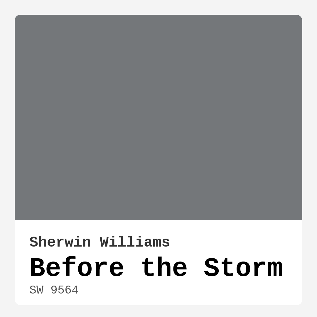
Color Preview & Key Details
| HEX Code | #74777A |
| RGB | 116, 119, 122 |
| LRV | 15% |
| Undertone | Blue |
| Finish Options | Eggshell, Matte, Satin |
Imagine stepping into a room that feels like a gentle embrace, where the chaos of the outside world fades away. This is the magic of color, and if you’re after a serene backdrop that brings both sophistication and calm, Sherwin Williams’ Before the Storm might just be your perfect choice.
Before the Storm, with its alluring gray hue (SW 9564), captures a unique essence that resonates with many homeowners. It’s not just a color; it’s an experience, a feeling, and a versatile option that can transform your space in ways you might not have imagined.
Let’s dive into what makes Before the Storm so special. This captivating gray elicits a sense of tranquility that’s hard to resist. It has a slightly muted tone, which feels like a cozy embrace, perfect for creating a serene atmosphere in any room. The color gracefully walks the line between warm and cool undertones, allowing it to meld beautifully with various decor styles, from modern and minimalist to industrial and Scandinavian.
Now, let’s talk about its color characteristics. Before the Storm is a dark gray with a blue undertone. This blue hue is a defining aspect of its personality, giving it a refreshing depth that keeps it from feeling flat or overwhelming. In bright, natural light, it shows its cooler side, appearing more like a soft, sophisticated gray. However, dim lighting reveals its moodier, deeper tones, creating a cozy, intimate ambiance. This adaptability makes it perfect for spaces with changing light throughout the day.
When you’re considering paint for your home, the Light Reflectance Value (LRV) is a crucial metric to keep in mind. With an LRV of 15%, Before the Storm reflects very little light. This means it’s ideal for creating a warm and inviting space, but it might require careful consideration in dimly lit areas. If you’re painting a room that doesn’t receive much natural light, expect that Before the Storm will appear even darker, which could be just what you want if you’re looking for that cozy, cocoon-like feel.
Before the Storm is incredibly versatile when it comes to decor styles. Whether you’re aiming for a sleek, modern aesthetic or a more rustic, industrial vibe, this color can adapt to your vision. It pairs beautifully with warm woods and cool metals, making it a fantastic backdrop for artwork and furnishings. Think about how it might look in your living room, wrapping around your favorite chair or sofa, or in your bedroom, creating a tranquil retreat at the end of a long day.
The finish you choose can significantly impact the overall feel of the space. Before the Storm is available in several finishes, including matte, eggshell, and satin. A matte finish lends a modern, understated look, while eggshell or satin can bring a subtle sheen that reflects light beautifully without being overpowering. Each finish tells its own story, allowing you to customize the ambiance based on your room’s lighting and decor.
Application is another crucial factor to consider, especially if you’re a DIY enthusiast or a beginner. Fortunately, Before the Storm is beginner-friendly, applying smoothly and evenly, and it’s roller-ready and brush-smooth. With good coverage typically requiring only one to two coats, it’s quite forgiving. And if you need to do touch-ups, you’ll find it easy to match, which is a huge plus.
If you’re concerned about indoor air quality, you’ll be pleased to know that Before the Storm has a low VOC level and is eco-certified. This means your home can be both beautiful and healthier for you and your loved ones.
While Before the Storm has many pros, it’s essential to consider a few potential challenges. In dim lighting, it may appear darker than expected. This means it’s crucial to test the color in your specific space and lighting conditions before committing. Additionally, pairing it with other colors can require some careful consideration. You want to ensure that the warm and cool undertones harmonize with your existing decor and furnishings.
When looking for complementary colors, Before the Storm plays well with others. Consider pairing it with soft whites like White Dove for trim or accents, creating a crisp contrast that feels fresh and modern. This gray also works beautifully with warmer tones, which can soften its coolness and create a balanced look. Think about how it might interact with your furniture, flooring, and decor—this is where testing truly comes into play.
If you’re considering what rooms would benefit most from Before the Storm, think about spaces where calm and connection are crucial. It’s perfect for living rooms, bedrooms, dining rooms, and even home offices. It creates an inviting environment that encourages relaxation and focus. Imagine sitting in your home office, surrounded by this muted gray, feeling grounded and inspired.
For those who love to curate a mood with color, Before the Storm can be a designer favorite. It’s especially effective in low-light rooms, as it creates a cozy, restful atmosphere. Plus, its washability and scrubbable properties make it practical for high-traffic areas.
As you contemplate Before the Storm for your next project, remember that it’s not just about choosing a paint color; it’s about crafting an experience within your home. Its calming and grounding qualities can transform your spaces into havens of tranquility. With its versatile nature, smooth application, and low VOC characteristics, it truly shines as an exceptional choice for a multitude of settings.
So, if you’re seeking a color that offers both depth and adaptability, Before the Storm could very well be your answer. Take the time to test it in your space, observe how it interacts with your furnishings and lighting, and see how it evolves throughout the day. You might just find that this beautiful gray is exactly what you need to create a home that feels both personal and beautifully curated.
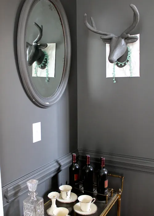
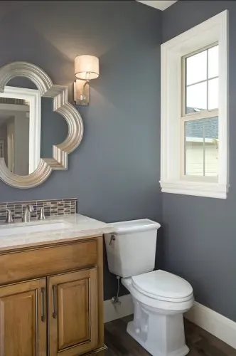
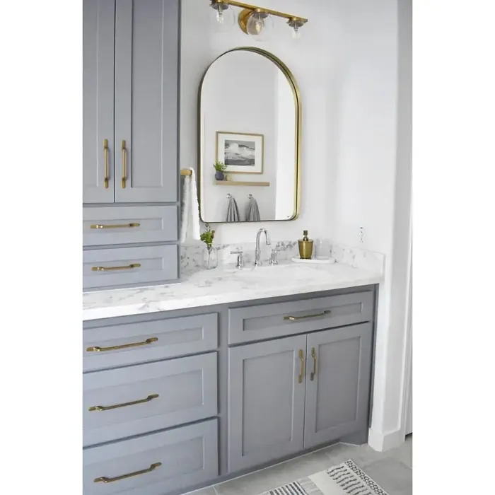
Real Room Photo of Before the Storm SW 9564
Undertones of Before the Storm ?
The undertones of Before the Storm are a key aspect of its character, leaning towards Blue. These subtle underlying hues are what give the color its depth and complexity. For example, a gray with a blue undertone will feel cooler and more modern, while one with a brown undertone will feel warmer and more traditional. It’s essential to test this paint in your home and observe it next to your existing furniture, flooring, and decor to see how these undertones interact and reveal themselves throughout the day.
HEX value: #74777A
RGB code: 116, 119, 122
Is Before the Storm Cool or Warm?
Before the Storm is predominantly cool, but its warm undertones add a layer of depth that keeps it from feeling too clinical. It strikes a fine balance that works well in various lighting conditions.
Understanding Color Properties and Interior Design Tips
Hue refers to a specific position on the color wheel, measured in degrees from 0 to 360. Each degree represents a different pure color:
- 0° represents red
- 120° represents green
- 240° represents blue
Saturation describes the intensity or purity of a color and is expressed as a percentage:
- At 0%, the color appears completely desaturated—essentially a shade of gray
- At 100%, the color is at its most vivid and vibrant
Lightness indicates how light or dark a color is, also expressed as a percentage:
- 0% lightness results in black
- 100% lightness results in white
Using Warm Colors in Interior Design
Warm hues—such as reds, oranges, yellows, warm beiges, and greiges—are excellent choices for creating inviting and energetic spaces. These colors are particularly well-suited for:
- Kitchens, living rooms, and bathrooms, where warmth enhances comfort and sociability
- Large rooms, where warm tones can help reduce the sense of emptiness and make the space feel more intimate
For example:
- Warm beige shades provide a cozy, inviting atmosphere, ideal for living rooms, bedrooms, and hallways.
- Warm greige (a mix of beige and gray) offers the warmth of beige with the modern appeal of gray, making it a versatile backdrop for dining areas, bedrooms, and living spaces.
However, be mindful when using warm light tones in rooms with limited natural light. These shades may appear muted or even take on an unpleasant yellowish tint. To avoid a dull or flat appearance:
- Add depth by incorporating richer tones like deep greens, charcoal, or chocolate brown
- Use textured elements such as curtains, rugs, or cushions to bring dimension to the space
Pro Tip: Achieving Harmony with Warm and Cool Color Balance
To create a well-balanced and visually interesting interior, mix warm and cool tones strategically. This contrast adds depth and harmony to your design.
- If your walls feature warm hues, introduce cool-colored accents such as blue or green furniture, artwork, or accessories to create contrast.
- For a polished look, consider using a complementary color scheme, which pairs colors opposite each other on the color wheel (e.g., red with green, orange with blue).
This thoughtful mix not only enhances visual appeal but also creates a space that feels both dynamic and cohesive.
Light Temperature Affects on Before the Storm
Natural Light
Natural daylight changes in color temperature as the sun moves across the sky. At sunrise and sunset, the light tends to have a warm, golden tone with a color temperature around 2000 Kelvin (K). As the day progresses and the sun rises higher, the light becomes cooler and more neutral. Around midday, especially when the sky is clear, natural light typically reaches its peak brightness and shifts to a cooler tone, ranging from 5500 to 6500 Kelvin. This midday light is close to what we perceive as pure white or daylight-balanced light.
These shifts in natural light can significantly influence how colors appear in a space, which is why designers often consider both the time of day and the orientation of windows when planning interior color schemes.
Artificial Light
When choosing artificial lighting, pay close attention to the color temperature, measured in Kelvin (K). This determines how warm or cool the light will appear. Lower temperatures, around 2700K, give off a warm, yellow glow often used in living rooms or bedrooms. Higher temperatures, above 5000K, create a cool, bluish light similar to daylight, commonly used in kitchens, offices, or task areas.
Use the slider to see how lighting temperature can affect the appearance of a surface or color throughout a space.


4800K
LRV of Before the Storm
The Light Reflectance Value (LRV) of Before the Storm is 15%, which places it in the Medium Dark category. This means it reflects very little light. Understanding a paint’s LRV is crucial for predicting how it will look in your space. A higher LRV indicates a lighter color that reflects more light, making rooms feel larger and brighter. A lower LRV signifies a darker color that absorbs more light, creating a cozier, more intimate atmosphere. Always consider the natural and artificial lighting in your room when selecting a paint color based on its LRV.
Detailed Review of Before the Storm
Additional Paint Characteristics
Ideal Rooms
Bedroom, Dining Room, Hallway, Home Office, Living Room
Decor Styles
Industrial, Minimalist, Modern, Scandinavian
Coverage
Good (1–2 Coats), Touch-Up Friendly
Ease of Application
Beginner Friendly, Brush Smooth, Roller-Ready
Washability
Scrubbable, Washable
VOC Level
Eco-Certified, Low VOC
Best Use
Accent Wall, Cabinets, Interior Walls, Trim
Room Suitability
Bedroom, Dining Room, Home Office, Living Room
Tone Tag
Balanced, Cool, Dusty, Muted
Finish Type
Eggshell, Matte
Paint Performance
Easy Touch-Up, Fade Resistant, High Coverage, Low Odor
Use Cases
Best for Low Light Rooms, Best for Rentals, Designer Favorite
Mood
Calm, Grounding, Restful
Trim Pairing
Complements Cool Trim, Pairs with White Dove, Works with Warm Trim
Before the Storm is an excellent choice for those looking to create a calming atmosphere in their home. Its versatile gray hue can seamlessly fit into various decor styles, from modern to industrial. The paint applies smoothly, drying to a beautiful matte or eggshell finish that subtly reflects light without being shiny. It pairs wonderfully with warm woods and cool metals, making it a perfect backdrop for art and furnishings. The color shifts slightly depending on natural light, offering a dynamic feel throughout the day while maintaining its tranquil essence. If you’re craving a color that can adapt and evolve with your space, Before the Storm is worth considering.
Pros & Cons of SW 9564 Before the Storm
Pros
Cons
Colors that go with Sherwin Williams Before the Storm
FAQ on SW 9564 Before the Storm
How does Before the Storm look in different lighting?
Before the Storm is a chameleon of sorts! In bright, natural light, it showcases its cooler undertones, appearing more like a soft gray. However, in dim lighting, it can take on a deeper, moodier tone, creating a cozy atmosphere. This adaptability makes it perfect for spaces with varying light sources, as it will continually offer a fresh perspective throughout the day.
What finishes are available for Before the Storm?
Before the Storm comes in a variety of finishes to suit your needs — from a matte finish for a modern, understated look to eggshell or satin for a touch of sheen. Each finish provides a different ambiance, allowing you to tailor the paint’s impact based on your room’s lighting and decor. Whether you’re aiming for a sleek, contemporary vibe or a more traditional feel, you’ll find a suitable option.
Comparisons Before the Storm with other colors
Before the Storm SW 9564 vs Night Owl SW 7061
| Attribute | Before the Storm SW 9564 | Night Owl SW 7061 |
|---|---|---|
| Color Name | Before the Storm SW 9564 | Night Owl SW 7061 |
| Color | ||
| Hue | Grey | Grey |
| Brightness | Dark | Dark |
| RGB | 116, 119, 122 | 99, 101, 95 |
| LRV | 15% | 24% |
| Finish Type | Eggshell, Matte | Eggshell, Matte, Satin |
| Finish Options | Eggshell, Matte, Satin | Eggshell, Matte, Satin |
| Ideal Rooms | Bedroom, Dining Room, Hallway, Home Office, Living Room | Bedroom, Dining Room, Hallway, Home Office, Living Room |
| Decor Styles | Industrial, Minimalist, Modern, Scandinavian | Industrial, Minimalist, Modern, Rustic, Scandinavian |
| Coverage | Good (1–2 Coats), Touch-Up Friendly | Good (1–2 Coats), Touch-Up Friendly |
| Ease of Application | Beginner Friendly, Brush Smooth, Roller-Ready | Beginner Friendly, Brush Smooth, Fast-Drying, Roller-Ready |
| Washability | Scrubbable, Washable | Scrubbable, Washable |
| Room Suitability | Bedroom, Dining Room, Home Office, Living Room | Bedroom, Dining Room, Home Office, Living Room |
| Tone | Balanced, Cool, Dusty, Muted | Balanced, Deep, Earthy, Muted |
| Paint Performance | Easy Touch-Up, Fade Resistant, High Coverage, Low Odor | Easy Touch-Up, Fade Resistant, High Coverage, Low Odor |
Before the Storm SW 9564 vs Urbane Bronze SW 7048
| Attribute | Before the Storm SW 9564 | Urbane Bronze SW 7048 |
|---|---|---|
| Color Name | Before the Storm SW 9564 | Urbane Bronze SW 7048 |
| Color | ||
| Hue | Grey | Grey |
| Brightness | Dark | Dark |
| RGB | 116, 119, 122 | 84, 80, 74 |
| LRV | 15% | 20% |
| Finish Type | Eggshell, Matte | Eggshell, Matte, Satin |
| Finish Options | Eggshell, Matte, Satin | Eggshell, Matte, Satin |
| Ideal Rooms | Bedroom, Dining Room, Hallway, Home Office, Living Room | Bedroom, Dining Room, Home Office, Living Room |
| Decor Styles | Industrial, Minimalist, Modern, Scandinavian | Contemporary, Industrial, Modern, Rustic, Transitional |
| Coverage | Good (1–2 Coats), Touch-Up Friendly | Good (1–2 Coats) |
| Ease of Application | Beginner Friendly, Brush Smooth, Roller-Ready | Beginner Friendly, Brush Smooth, Roller-Ready |
| Washability | Scrubbable, Washable | Highly Washable, Washable |
| Room Suitability | Bedroom, Dining Room, Home Office, Living Room | Bedroom, Dining Room, Home Office, Living Room |
| Tone | Balanced, Cool, Dusty, Muted | Deep, Earthy, Warm |
| Paint Performance | Easy Touch-Up, Fade Resistant, High Coverage, Low Odor | Easy Touch-Up, Fade Resistant, High Coverage, Low Odor |
Before the Storm SW 9564 vs Succulent SW 9650
| Attribute | Before the Storm SW 9564 | Succulent SW 9650 |
|---|---|---|
| Color Name | Before the Storm SW 9564 | Succulent SW 9650 |
| Color | ||
| Hue | Grey | Grey |
| Brightness | Dark | Dark |
| RGB | 116, 119, 122 | 97, 108, 100 |
| LRV | 15% | 30% |
| Finish Type | Eggshell, Matte | Eggshell, Matte, Satin |
| Finish Options | Eggshell, Matte, Satin | Eggshell, Matte, Satin |
| Ideal Rooms | Bedroom, Dining Room, Hallway, Home Office, Living Room | Bathroom, Bedroom, Dining Room, Entryway, Kitchen, Living Room |
| Decor Styles | Industrial, Minimalist, Modern, Scandinavian | Bohemian, Contemporary, Eclectic, Minimalist, Modern Farmhouse |
| Coverage | Good (1–2 Coats), Touch-Up Friendly | Good (1–2 Coats), Touch-Up Friendly |
| Ease of Application | Beginner Friendly, Brush Smooth, Roller-Ready | Beginner Friendly, Brush Smooth, Roller-Ready |
| Washability | Scrubbable, Washable | Highly Washable, Washable |
| Room Suitability | Bedroom, Dining Room, Home Office, Living Room | Bathroom, Bedroom, Dining Room, Kitchen, Living Room |
| Tone | Balanced, Cool, Dusty, Muted | Cool, Earthy, Muted |
| Paint Performance | Easy Touch-Up, Fade Resistant, High Coverage, Low Odor | Easy Touch-Up, Low Odor, Quick Drying, Scuff Resistant |
Before the Storm SW 9564 vs Grizzle Gray SW 7068
| Attribute | Before the Storm SW 9564 | Grizzle Gray SW 7068 |
|---|---|---|
| Color Name | Before the Storm SW 9564 | Grizzle Gray SW 7068 |
| Color | ||
| Hue | Grey | Grey |
| Brightness | Dark | Dark |
| RGB | 116, 119, 122 | 99, 101, 98 |
| LRV | 15% | 24% |
| Finish Type | Eggshell, Matte | Eggshell, Satin |
| Finish Options | Eggshell, Matte, Satin | Eggshell, Matte, Satin |
| Ideal Rooms | Bedroom, Dining Room, Hallway, Home Office, Living Room | Bedroom, Dining Room, Home Office, Living Room |
| Decor Styles | Industrial, Minimalist, Modern, Scandinavian | Industrial, Modern, Rustic, Scandinavian |
| Coverage | Good (1–2 Coats), Touch-Up Friendly | Good (1–2 Coats), Touch-Up Friendly |
| Ease of Application | Beginner Friendly, Brush Smooth, Roller-Ready | Beginner Friendly, Brush Smooth, Roller-Ready |
| Washability | Scrubbable, Washable | Washable, Wipeable |
| Room Suitability | Bedroom, Dining Room, Home Office, Living Room | Bedroom, Dining Room, Home Office, Living Room |
| Tone | Balanced, Cool, Dusty, Muted | Balanced, Cool, Muted |
| Paint Performance | Easy Touch-Up, Fade Resistant, High Coverage, Low Odor | Easy Touch-Up, High Coverage, Low Odor |
Before the Storm SW 9564 vs Iron Ore SW 7069
| Attribute | Before the Storm SW 9564 | Iron Ore SW 7069 |
|---|---|---|
| Color Name | Before the Storm SW 9564 | Iron Ore SW 7069 |
| Color | ||
| Hue | Grey | Grey |
| Brightness | Dark | Dark |
| RGB | 116, 119, 122 | 67, 67, 65 |
| LRV | 15% | 6% |
| Finish Type | Eggshell, Matte | Eggshell, Matte, Satin |
| Finish Options | Eggshell, Matte, Satin | Eggshell, Matte, Satin |
| Ideal Rooms | Bedroom, Dining Room, Hallway, Home Office, Living Room | Bedroom, Dining Room, Entryway, Home Office, Living Room |
| Decor Styles | Industrial, Minimalist, Modern, Scandinavian | Contemporary, Industrial, Minimalist, Modern, Rustic |
| Coverage | Good (1–2 Coats), Touch-Up Friendly | Good (1–2 Coats), High Hide |
| Ease of Application | Beginner Friendly, Brush Smooth, Roller-Ready | Brush Smooth, Fast-Drying, Roller-Ready |
| Washability | Scrubbable, Washable | Highly Washable, Washable |
| Room Suitability | Bedroom, Dining Room, Home Office, Living Room | Bedroom, Dining Room, Entryway, Home Office, Living Room |
| Tone | Balanced, Cool, Dusty, Muted | Balanced, Deep, Muted, Warm |
| Paint Performance | Easy Touch-Up, Fade Resistant, High Coverage, Low Odor | Easy Touch-Up, High Coverage, Low Odor |
Before the Storm SW 9564 vs Peppercorn SW 7674
| Attribute | Before the Storm SW 9564 | Peppercorn SW 7674 |
|---|---|---|
| Color Name | Before the Storm SW 9564 | Peppercorn SW 7674 |
| Color | ||
| Hue | Grey | Grey |
| Brightness | Dark | Dark |
| RGB | 116, 119, 122 | 88, 88, 88 |
| LRV | 15% | 10% |
| Finish Type | Eggshell, Matte | Eggshell, Matte, Satin |
| Finish Options | Eggshell, Matte, Satin | Eggshell, Matte, Satin |
| Ideal Rooms | Bedroom, Dining Room, Hallway, Home Office, Living Room | Bedroom, Dining Room, Home Office, Living Room |
| Decor Styles | Industrial, Minimalist, Modern, Scandinavian | Contemporary, Industrial, Minimalist, Modern |
| Coverage | Good (1–2 Coats), Touch-Up Friendly | Good (1–2 Coats), Touch-Up Friendly |
| Ease of Application | Beginner Friendly, Brush Smooth, Roller-Ready | Beginner Friendly, Brush Smooth, Roller-Ready |
| Washability | Scrubbable, Washable | Highly Washable, Washable |
| Room Suitability | Bedroom, Dining Room, Home Office, Living Room | Bedroom, Dining Room, Home Office, Living Room |
| Tone | Balanced, Cool, Dusty, Muted | Balanced, Deep, Moody, Neutral |
| Paint Performance | Easy Touch-Up, Fade Resistant, High Coverage, Low Odor | Easy Touch-Up, Low Odor, Quick Drying, Scuff Resistant |
Before the Storm SW 9564 vs Slate Tile SW 7624
| Attribute | Before the Storm SW 9564 | Slate Tile SW 7624 |
|---|---|---|
| Color Name | Before the Storm SW 9564 | Slate Tile SW 7624 |
| Color | ||
| Hue | Grey | Grey |
| Brightness | Dark | Dark |
| RGB | 116, 119, 122 | 96, 110, 116 |
| LRV | 15% | 15% |
| Finish Type | Eggshell, Matte | Eggshell, Matte, Satin |
| Finish Options | Eggshell, Matte, Satin | Eggshell, Matte, Satin |
| Ideal Rooms | Bedroom, Dining Room, Hallway, Home Office, Living Room | Bathroom, Bedroom, Home Office, Kitchen, Living Room |
| Decor Styles | Industrial, Minimalist, Modern, Scandinavian | Industrial, Minimalist, Modern, Rustic |
| Coverage | Good (1–2 Coats), Touch-Up Friendly | Good (1–2 Coats) |
| Ease of Application | Beginner Friendly, Brush Smooth, Roller-Ready | Beginner Friendly, Brush Smooth, Fast-Drying, Roller-Ready |
| Washability | Scrubbable, Washable | Scrubbable, Washable |
| Room Suitability | Bedroom, Dining Room, Home Office, Living Room | Bathroom, Bedroom, Kitchen, Living Room |
| Tone | Balanced, Cool, Dusty, Muted | Balanced, Cool, Muted |
| Paint Performance | Easy Touch-Up, Fade Resistant, High Coverage, Low Odor | Easy Touch-Up, High Coverage, Low Odor, Quick Drying |
Before the Storm SW 9564 vs Blustery Sky SW 9140
| Attribute | Before the Storm SW 9564 | Blustery Sky SW 9140 |
|---|---|---|
| Color Name | Before the Storm SW 9564 | Blustery Sky SW 9140 |
| Color | ||
| Hue | Grey | Grey |
| Brightness | Dark | Dark |
| RGB | 116, 119, 122 | 111, 132, 140 |
| LRV | 15% | 48% |
| Finish Type | Eggshell, Matte | Eggshell, Matte |
| Finish Options | Eggshell, Matte, Satin | Eggshell, Matte, Satin |
| Ideal Rooms | Bedroom, Dining Room, Hallway, Home Office, Living Room | Bedroom, Dining Room, Home Office, Living Room, Nursery |
| Decor Styles | Industrial, Minimalist, Modern, Scandinavian | Coastal, Modern Farmhouse, Scandinavian, Transitional |
| Coverage | Good (1–2 Coats), Touch-Up Friendly | Good (1–2 Coats), Touch-Up Friendly |
| Ease of Application | Beginner Friendly, Brush Smooth, Roller-Ready | Beginner Friendly, Fast-Drying, Low Splatter, Roller-Ready |
| Washability | Scrubbable, Washable | Washable, Wipeable |
| Room Suitability | Bedroom, Dining Room, Home Office, Living Room | Bedroom, Home Office, Living Room, Nursery |
| Tone | Balanced, Cool, Dusty, Muted | Balanced, Cool, Muted |
| Paint Performance | Easy Touch-Up, Fade Resistant, High Coverage, Low Odor | Easy Touch-Up, Fade Resistant, Low Odor, Quick Drying |
Before the Storm SW 9564 vs Gauntlet Gray SW 7019
| Attribute | Before the Storm SW 9564 | Gauntlet Gray SW 7019 |
|---|---|---|
| Color Name | Before the Storm SW 9564 | Gauntlet Gray SW 7019 |
| Color | ||
| Hue | Grey | Grey |
| Brightness | Dark | Dark |
| RGB | 116, 119, 122 | 120, 115, 110 |
| LRV | 15% | 24% |
| Finish Type | Eggshell, Matte | Eggshell, Matte, Satin |
| Finish Options | Eggshell, Matte, Satin | Eggshell, Matte, Satin |
| Ideal Rooms | Bedroom, Dining Room, Hallway, Home Office, Living Room | Bedroom, Dining Room, Hallway, Home Office, Living Room |
| Decor Styles | Industrial, Minimalist, Modern, Scandinavian | Industrial, Modern, Rustic, Transitional |
| Coverage | Good (1–2 Coats), Touch-Up Friendly | Good (1–2 Coats), Touch-Up Friendly |
| Ease of Application | Beginner Friendly, Brush Smooth, Roller-Ready | Beginner Friendly, Brush Smooth, Roller-Ready |
| Washability | Scrubbable, Washable | Scrubbable, Washable |
| Room Suitability | Bedroom, Dining Room, Home Office, Living Room | Bedroom, Dining Room, Home Office, Living Room |
| Tone | Balanced, Cool, Dusty, Muted | Dusty, Earthy, Muted, Warm |
| Paint Performance | Easy Touch-Up, Fade Resistant, High Coverage, Low Odor | Easy Touch-Up, High Coverage, Low Odor |
Before the Storm SW 9564 vs Cast Iron SW 6202
| Attribute | Before the Storm SW 9564 | Cast Iron SW 6202 |
|---|---|---|
| Color Name | Before the Storm SW 9564 | Cast Iron SW 6202 |
| Color | ||
| Hue | Grey | Grey |
| Brightness | Dark | Dark |
| RGB | 116, 119, 122 | 100, 100, 90 |
| LRV | 15% | 6% |
| Finish Type | Eggshell, Matte | Eggshell, Matte, Satin |
| Finish Options | Eggshell, Matte, Satin | Eggshell, Matte, Satin |
| Ideal Rooms | Bedroom, Dining Room, Hallway, Home Office, Living Room | Bedroom, Dining Room, Hallway, Home Office, Kitchen, Living Room |
| Decor Styles | Industrial, Minimalist, Modern, Scandinavian | Contemporary, Farmhouse, Industrial, Minimalist, Modern |
| Coverage | Good (1–2 Coats), Touch-Up Friendly | Good (1–2 Coats), High Hide, Touch-Up Friendly |
| Ease of Application | Beginner Friendly, Brush Smooth, Roller-Ready | Beginner Friendly, Brush Smooth, Fast-Drying, Roller-Ready |
| Washability | Scrubbable, Washable | Highly Washable, Washable, Wipeable |
| Room Suitability | Bedroom, Dining Room, Home Office, Living Room | Bedroom, Dining Room, Home Office, Kitchen, Living Room |
| Tone | Balanced, Cool, Dusty, Muted | Balanced, Deep, Dusty, Earthy, Warm |
| Paint Performance | Easy Touch-Up, Fade Resistant, High Coverage, Low Odor | Easy Touch-Up, High Coverage, Low Odor, Stain Resistant |
Official Page of Sherwin Williams Before the Storm SW 9564