Color Preview & Key Details
| HEX Code | #768482 |
| RGB | 118, 132, 130 |
| LRV | 12% |
| Undertone | Green and Blue |
| Finish Options | Eggshell, Flat, Matte, Satin |
Imagine stepping into your home after a long day, greeted by the soothing embrace of a color that feels like a gentle coastal breeze. That’s the magic of Portsmouth by Sherwin Williams. This isn’t just a paint color; it’s an experience, a feeling, and a beautiful backdrop for your life.
Portsmouth, with its serene blend of muted greens and blues, captures the essence of tranquility. It’s reminiscent of the calming waves lapping against the shore, making it an ideal choice for creating an inviting atmosphere. If you want your spaces to feel more relaxed and rejuvenating, Portsmouth might just be the perfect pick.
Let’s dive deeper into what makes this color a fantastic option for your home decor projects. With its hue tag classified as grey and a dark brightness tag, Portsmouth offers a unique charm that effortlessly blends with various decor styles, from Coastal to Modern Farmhouse, Scandinavian, and Bohemian. Its versatility is one of its strongest attributes, adapting beautifully to different settings and lighting conditions.
One of the standout features of Portsmouth is its warmth. Unlike many colors that lean cool, this paint exudes a gentle warmth that creates a cozy, inviting vibe. When you enter a room painted in Portsmouth, you’ll feel a sense of calm wash over you, making it a great choice for spaces where relaxation is key, like bedrooms and bathrooms.
Portsmouth has an LRV (Light Reflectance Value) of 12%. This places it firmly in the dark colors category, meaning it absorbs light rather than reflecting it. In practical terms, this means that Portsmouth can add depth and intimacy to a space. However, it’s essential to consider your room’s lighting. In bright environments, it showcases its beautiful coastal charm, appearing more vibrant and lively. Conversely, in dimmer settings, it will take on a softer, more muted tone, maintaining its inviting appeal.
When it comes to application, Portsmouth is beginner-friendly, making it a favorite among DIY enthusiasts. It rolls on smoothly and offers good coverage with just one or two coats, ensuring that even novice painters can achieve professional-looking results. Plus, its washability means it’s easy to maintain, perfect for homes with kids or pets.
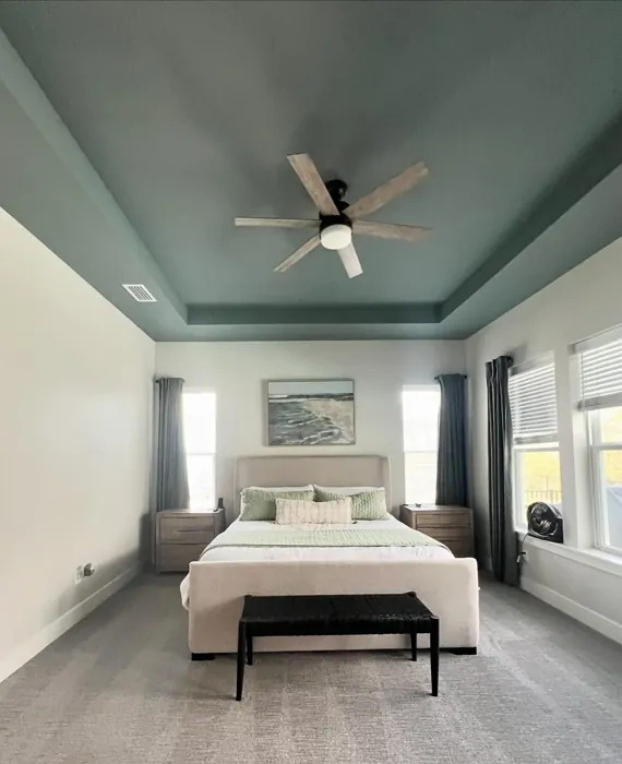
Now, you might wonder where Portsmouth fits best in your home. It’s incredibly versatile, making it an excellent choice for living rooms, bedrooms, bathrooms, and even kitchens. Picture a serene bedroom retreat featuring Portsmouth on the walls, paired with soft white linens and natural wood accents. Or imagine a cozy living room where Portsmouth serves as the perfect backdrop for a mix of textures, like plush throws and woven baskets.
However, while Portsmouth’s calming nature is undoubtedly appealing, it does come with a couple of considerations. In very dark rooms, it may appear more muted than expected, so it’s essential to test it in your space before committing. Additionally, careful color pairing is crucial to prevent it from feeling too subdued, especially if you’re aiming for a bolder look.
The undertones of Portsmouth add another layer of beauty to this color. Leaning towards green and blue, these subtle hues provide depth and complexity, allowing for interesting interactions with light and other colors in your decor. For instance, pairing Portsmouth with warm tones, like brass fixtures or a rich wood trim, creates a harmonious balance that feels both modern and timeless.
When it comes to finishes, Portsmouth shines in eggshell or satin. These finishes provide just the right sheen to enhance the color’s depth without overwhelming the senses. For a more matte look, consider a flat finish, which can highlight the serene qualities of Portsmouth beautifully in cozy spaces like bedrooms or intimate living areas.
If you’re looking to complement Portsmouth, it pairs beautifully with lighter shades like White Dove. This combination creates a clean, crisp contrast that allows Portsmouth to truly shine. Additionally, if you’re considering accent pieces or decor items, think about incorporating complementary shades that echo the calming nature of Portsmouth, such as soft creams, warm woods, or muted blues.
As with any paint color, testing it in your home is vital. Portsmouth can behave differently based on your existing furniture, flooring, and lighting. Before committing, apply a few samples on your walls and observe how it transforms throughout the day. You’ll find that the way it interacts with sunlight can change its character entirely, revealing new depths and undertones.
In small rooms, Portsmouth is a fantastic choice. Its calming nature can create an illusion of openness, making the space feel larger and more inviting. Just be sure to balance it with adequate lighting to enhance its refreshing qualities. Whether you’re painting an accent wall or the entire room, Portsmouth can work wonders in small spaces.
In conclusion, Portsmouth is more than just a paint color; it’s a gateway to creating a serene and inviting atmosphere in your home. With its beautiful blend of muted greens and blues, this color offers a versatile and calming backdrop for any room. Whether you choose to use it in a living room, bathroom, or bedroom, Portsmouth will undoubtedly breathe new life into your space. So, if you’re ready to embrace a color that embodies tranquility, consider adding Portsmouth to your palette. Your home deserves it, and so do you.
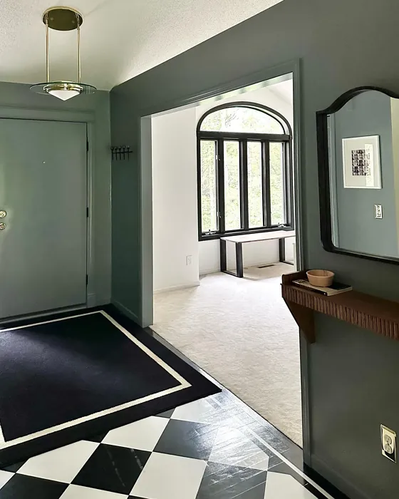
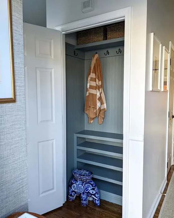
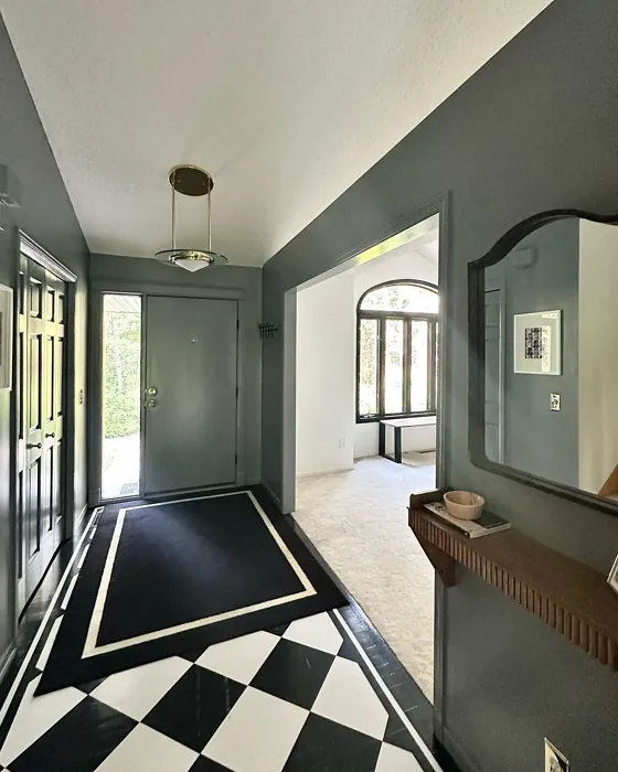
Real Room Photo of Portsmouth SW 9644

Undertones of Portsmouth ?
The undertones of Portsmouth are a key aspect of its character, leaning towards Green and Blue. These subtle underlying hues are what give the color its depth and complexity. For example, a gray with a blue undertone will feel cooler and more modern, while one with a brown undertone will feel warmer and more traditional. It’s essential to test this paint in your home and observe it next to your existing furniture, flooring, and decor to see how these undertones interact and reveal themselves throughout the day.
HEX value: #768482
RGB code: 118, 132, 130
Is Portsmouth Cool or Warm?
Portsmouth is considered a warm paint color. This characteristic plays a huge role in the overall feel of a room. Warm colors, like this one, tend to create a cozy, inviting, and energetic atmosphere, making them great for social spaces like living rooms and dining rooms. In contrast, cool colors often evoke a sense of calm and serenity, which is why they are popular in bedrooms and bathrooms. The warmth of Portsmouth means it will pair beautifully with corresponding decor elements.
Understanding Color Properties and Interior Design Tips
Hue refers to a specific position on the color wheel, measured in degrees from 0 to 360. Each degree represents a different pure color:
- 0° represents red
- 120° represents green
- 240° represents blue
Saturation describes the intensity or purity of a color and is expressed as a percentage:
- At 0%, the color appears completely desaturated—essentially a shade of gray
- At 100%, the color is at its most vivid and vibrant
Lightness indicates how light or dark a color is, also expressed as a percentage:
- 0% lightness results in black
- 100% lightness results in white
Using Warm Colors in Interior Design
Warm hues—such as reds, oranges, yellows, warm beiges, and greiges—are excellent choices for creating inviting and energetic spaces. These colors are particularly well-suited for:
- Kitchens, living rooms, and bathrooms, where warmth enhances comfort and sociability
- Large rooms, where warm tones can help reduce the sense of emptiness and make the space feel more intimate
For example:
- Warm beige shades provide a cozy, inviting atmosphere, ideal for living rooms, bedrooms, and hallways.
- Warm greige (a mix of beige and gray) offers the warmth of beige with the modern appeal of gray, making it a versatile backdrop for dining areas, bedrooms, and living spaces.
However, be mindful when using warm light tones in rooms with limited natural light. These shades may appear muted or even take on an unpleasant yellowish tint. To avoid a dull or flat appearance:
- Add depth by incorporating richer tones like deep greens, charcoal, or chocolate brown
- Use textured elements such as curtains, rugs, or cushions to bring dimension to the space
Pro Tip: Achieving Harmony with Warm and Cool Color Balance
To create a well-balanced and visually interesting interior, mix warm and cool tones strategically. This contrast adds depth and harmony to your design.
- If your walls feature warm hues, introduce cool-colored accents such as blue or green furniture, artwork, or accessories to create contrast.
- For a polished look, consider using a complementary color scheme, which pairs colors opposite each other on the color wheel (e.g., red with green, orange with blue).
This thoughtful mix not only enhances visual appeal but also creates a space that feels both dynamic and cohesive.
Light Temperature Affects on Portsmouth
Natural Light
Natural daylight changes in color temperature as the sun moves across the sky. At sunrise and sunset, the light tends to have a warm, golden tone with a color temperature around 2000 Kelvin (K). As the day progresses and the sun rises higher, the light becomes cooler and more neutral. Around midday, especially when the sky is clear, natural light typically reaches its peak brightness and shifts to a cooler tone, ranging from 5500 to 6500 Kelvin. This midday light is close to what we perceive as pure white or daylight-balanced light.
These shifts in natural light can significantly influence how colors appear in a space, which is why designers often consider both the time of day and the orientation of windows when planning interior color schemes.
Artificial Light
When choosing artificial lighting, pay close attention to the color temperature, measured in Kelvin (K). This determines how warm or cool the light will appear. Lower temperatures, around 2700K, give off a warm, yellow glow often used in living rooms or bedrooms. Higher temperatures, above 5000K, create a cool, bluish light similar to daylight, commonly used in kitchens, offices, or task areas.
Use the slider to see how lighting temperature can affect the appearance of a surface or color throughout a space.


4800K
LRV of Portsmouth
The Light Reflectance Value (LRV) of Portsmouth is 12%, which places it in the Dark colors category. This means it does not reflect light. Understanding a paint’s LRV is crucial for predicting how it will look in your space. A higher LRV indicates a lighter color that reflects more light, making rooms feel larger and brighter. A lower LRV signifies a darker color that absorbs more light, creating a cozier, more intimate atmosphere. Always consider the natural and artificial lighting in your room when selecting a paint color based on its LRV.
Detailed Review of Portsmouth
Additional Paint Characteristics
Ideal Rooms
Bathroom, Bedroom, Home Office, Kitchen, Living Room
Decor Styles
Bohemian, Coastal, Modern Farmhouse, Scandinavian
Coverage
Good (1–2 Coats)
Ease of Application
Beginner Friendly, Brush Smooth, Roller-Ready
Washability
Highly Washable, Washable
VOC Level
Low VOC
Best Use
Accent Wall, Interior Walls, Trim
Room Suitability
Bathroom, Bedroom, Kitchen, Living Room
Tone Tag
Cool, Earthy, Muted
Finish Type
Eggshell, Satin
Paint Performance
Easy Touch-Up, Low Odor, Scuff Resistant
Use Cases
Best for Low Light Rooms, Best for Small Spaces, Designer Favorite
Mood
Calm, Inviting, Restful
Trim Pairing
Complements Brass Fixtures, Good with Wood Trim, Pairs with White Dove
Portsmouth is a paint color that truly delivers on tranquility. The subtle mix of green and blue creates a serene backdrop that can breathe life into any space. Whether you’re looking to refresh a living room or create a spa-like atmosphere in a bathroom, Portsmouth stands out as a versatile option. It works beautifully in both natural light and artificial settings, adapting its tone to the environment. This color pairs particularly well with natural materials like wood and stone, enhancing the overall aesthetic of your home. Plus, it’s easy to apply and provides consistent coverage, making it a favorite among DIY enthusiasts and professionals alike.
Pros & Cons of SW 9644 Portsmouth
Pros
Cons
Colors that go with Sherwin Williams Portsmouth
FAQ on SW 9644 Portsmouth
Can Portsmouth be used in small rooms?
Absolutely! Portsmouth’s calming nature works wonders in small spaces, helping to create an illusion of openness. Its balanced tones can make a room feel larger and more inviting without overwhelming the senses. Just be sure to use adequate lighting to enhance its refreshing qualities.
What finishes work best for Portsmouth?
Portsmouth looks stunning in an eggshell or satin finish, as these options provide a subtle sheen that adds depth to the color without being too glossy. For a more matte look, a flat finish can highlight its serene qualities, making it perfect for bedrooms or cozy living areas.
Comparisons Portsmouth with other colors
Portsmouth SW 9644 vs Night Owl SW 7061
| Attribute | Portsmouth SW 9644 | Night Owl SW 7061 |
|---|---|---|
| Color Name | Portsmouth SW 9644 | Night Owl SW 7061 |
| Color | ||
| Hue | Grey | Grey |
| Brightness | Dark | Dark |
| RGB | 118, 132, 130 | 99, 101, 95 |
| LRV | 12% | 24% |
| Finish Type | Eggshell, Satin | Eggshell, Matte, Satin |
| Finish Options | Eggshell, Flat, Matte, Satin | Eggshell, Matte, Satin |
| Ideal Rooms | Bathroom, Bedroom, Home Office, Kitchen, Living Room | Bedroom, Dining Room, Hallway, Home Office, Living Room |
| Decor Styles | Bohemian, Coastal, Modern Farmhouse, Scandinavian | Industrial, Minimalist, Modern, Rustic, Scandinavian |
| Coverage | Good (1–2 Coats) | Good (1–2 Coats), Touch-Up Friendly |
| Ease of Application | Beginner Friendly, Brush Smooth, Roller-Ready | Beginner Friendly, Brush Smooth, Fast-Drying, Roller-Ready |
| Washability | Highly Washable, Washable | Scrubbable, Washable |
| Room Suitability | Bathroom, Bedroom, Kitchen, Living Room | Bedroom, Dining Room, Home Office, Living Room |
| Tone | Cool, Earthy, Muted | Balanced, Deep, Earthy, Muted |
| Paint Performance | Easy Touch-Up, Low Odor, Scuff Resistant | Easy Touch-Up, Fade Resistant, High Coverage, Low Odor |
Portsmouth SW 9644 vs Urbane Bronze SW 7048
| Attribute | Portsmouth SW 9644 | Urbane Bronze SW 7048 |
|---|---|---|
| Color Name | Portsmouth SW 9644 | Urbane Bronze SW 7048 |
| Color | ||
| Hue | Grey | Grey |
| Brightness | Dark | Dark |
| RGB | 118, 132, 130 | 84, 80, 74 |
| LRV | 12% | 20% |
| Finish Type | Eggshell, Satin | Eggshell, Matte, Satin |
| Finish Options | Eggshell, Flat, Matte, Satin | Eggshell, Matte, Satin |
| Ideal Rooms | Bathroom, Bedroom, Home Office, Kitchen, Living Room | Bedroom, Dining Room, Home Office, Living Room |
| Decor Styles | Bohemian, Coastal, Modern Farmhouse, Scandinavian | Contemporary, Industrial, Modern, Rustic, Transitional |
| Coverage | Good (1–2 Coats) | Good (1–2 Coats) |
| Ease of Application | Beginner Friendly, Brush Smooth, Roller-Ready | Beginner Friendly, Brush Smooth, Roller-Ready |
| Washability | Highly Washable, Washable | Highly Washable, Washable |
| Room Suitability | Bathroom, Bedroom, Kitchen, Living Room | Bedroom, Dining Room, Home Office, Living Room |
| Tone | Cool, Earthy, Muted | Deep, Earthy, Warm |
| Paint Performance | Easy Touch-Up, Low Odor, Scuff Resistant | Easy Touch-Up, Fade Resistant, High Coverage, Low Odor |
Portsmouth SW 9644 vs Succulent SW 9650
| Attribute | Portsmouth SW 9644 | Succulent SW 9650 |
|---|---|---|
| Color Name | Portsmouth SW 9644 | Succulent SW 9650 |
| Color | ||
| Hue | Grey | Grey |
| Brightness | Dark | Dark |
| RGB | 118, 132, 130 | 97, 108, 100 |
| LRV | 12% | 30% |
| Finish Type | Eggshell, Satin | Eggshell, Matte, Satin |
| Finish Options | Eggshell, Flat, Matte, Satin | Eggshell, Matte, Satin |
| Ideal Rooms | Bathroom, Bedroom, Home Office, Kitchen, Living Room | Bathroom, Bedroom, Dining Room, Entryway, Kitchen, Living Room |
| Decor Styles | Bohemian, Coastal, Modern Farmhouse, Scandinavian | Bohemian, Contemporary, Eclectic, Minimalist, Modern Farmhouse |
| Coverage | Good (1–2 Coats) | Good (1–2 Coats), Touch-Up Friendly |
| Ease of Application | Beginner Friendly, Brush Smooth, Roller-Ready | Beginner Friendly, Brush Smooth, Roller-Ready |
| Washability | Highly Washable, Washable | Highly Washable, Washable |
| Room Suitability | Bathroom, Bedroom, Kitchen, Living Room | Bathroom, Bedroom, Dining Room, Kitchen, Living Room |
| Tone | Cool, Earthy, Muted | Cool, Earthy, Muted |
| Paint Performance | Easy Touch-Up, Low Odor, Scuff Resistant | Easy Touch-Up, Low Odor, Quick Drying, Scuff Resistant |
Portsmouth SW 9644 vs Grizzle Gray SW 7068
| Attribute | Portsmouth SW 9644 | Grizzle Gray SW 7068 |
|---|---|---|
| Color Name | Portsmouth SW 9644 | Grizzle Gray SW 7068 |
| Color | ||
| Hue | Grey | Grey |
| Brightness | Dark | Dark |
| RGB | 118, 132, 130 | 99, 101, 98 |
| LRV | 12% | 24% |
| Finish Type | Eggshell, Satin | Eggshell, Satin |
| Finish Options | Eggshell, Flat, Matte, Satin | Eggshell, Matte, Satin |
| Ideal Rooms | Bathroom, Bedroom, Home Office, Kitchen, Living Room | Bedroom, Dining Room, Home Office, Living Room |
| Decor Styles | Bohemian, Coastal, Modern Farmhouse, Scandinavian | Industrial, Modern, Rustic, Scandinavian |
| Coverage | Good (1–2 Coats) | Good (1–2 Coats), Touch-Up Friendly |
| Ease of Application | Beginner Friendly, Brush Smooth, Roller-Ready | Beginner Friendly, Brush Smooth, Roller-Ready |
| Washability | Highly Washable, Washable | Washable, Wipeable |
| Room Suitability | Bathroom, Bedroom, Kitchen, Living Room | Bedroom, Dining Room, Home Office, Living Room |
| Tone | Cool, Earthy, Muted | Balanced, Cool, Muted |
| Paint Performance | Easy Touch-Up, Low Odor, Scuff Resistant | Easy Touch-Up, High Coverage, Low Odor |
Portsmouth SW 9644 vs Iron Ore SW 7069
| Attribute | Portsmouth SW 9644 | Iron Ore SW 7069 |
|---|---|---|
| Color Name | Portsmouth SW 9644 | Iron Ore SW 7069 |
| Color | ||
| Hue | Grey | Grey |
| Brightness | Dark | Dark |
| RGB | 118, 132, 130 | 67, 67, 65 |
| LRV | 12% | 6% |
| Finish Type | Eggshell, Satin | Eggshell, Matte, Satin |
| Finish Options | Eggshell, Flat, Matte, Satin | Eggshell, Matte, Satin |
| Ideal Rooms | Bathroom, Bedroom, Home Office, Kitchen, Living Room | Bedroom, Dining Room, Entryway, Home Office, Living Room |
| Decor Styles | Bohemian, Coastal, Modern Farmhouse, Scandinavian | Contemporary, Industrial, Minimalist, Modern, Rustic |
| Coverage | Good (1–2 Coats) | Good (1–2 Coats), High Hide |
| Ease of Application | Beginner Friendly, Brush Smooth, Roller-Ready | Brush Smooth, Fast-Drying, Roller-Ready |
| Washability | Highly Washable, Washable | Highly Washable, Washable |
| Room Suitability | Bathroom, Bedroom, Kitchen, Living Room | Bedroom, Dining Room, Entryway, Home Office, Living Room |
| Tone | Cool, Earthy, Muted | Balanced, Deep, Muted, Warm |
| Paint Performance | Easy Touch-Up, Low Odor, Scuff Resistant | Easy Touch-Up, High Coverage, Low Odor |
Portsmouth SW 9644 vs Peppercorn SW 7674
| Attribute | Portsmouth SW 9644 | Peppercorn SW 7674 |
|---|---|---|
| Color Name | Portsmouth SW 9644 | Peppercorn SW 7674 |
| Color | ||
| Hue | Grey | Grey |
| Brightness | Dark | Dark |
| RGB | 118, 132, 130 | 88, 88, 88 |
| LRV | 12% | 10% |
| Finish Type | Eggshell, Satin | Eggshell, Matte, Satin |
| Finish Options | Eggshell, Flat, Matte, Satin | Eggshell, Matte, Satin |
| Ideal Rooms | Bathroom, Bedroom, Home Office, Kitchen, Living Room | Bedroom, Dining Room, Home Office, Living Room |
| Decor Styles | Bohemian, Coastal, Modern Farmhouse, Scandinavian | Contemporary, Industrial, Minimalist, Modern |
| Coverage | Good (1–2 Coats) | Good (1–2 Coats), Touch-Up Friendly |
| Ease of Application | Beginner Friendly, Brush Smooth, Roller-Ready | Beginner Friendly, Brush Smooth, Roller-Ready |
| Washability | Highly Washable, Washable | Highly Washable, Washable |
| Room Suitability | Bathroom, Bedroom, Kitchen, Living Room | Bedroom, Dining Room, Home Office, Living Room |
| Tone | Cool, Earthy, Muted | Balanced, Deep, Moody, Neutral |
| Paint Performance | Easy Touch-Up, Low Odor, Scuff Resistant | Easy Touch-Up, Low Odor, Quick Drying, Scuff Resistant |
Portsmouth SW 9644 vs Slate Tile SW 7624
| Attribute | Portsmouth SW 9644 | Slate Tile SW 7624 |
|---|---|---|
| Color Name | Portsmouth SW 9644 | Slate Tile SW 7624 |
| Color | ||
| Hue | Grey | Grey |
| Brightness | Dark | Dark |
| RGB | 118, 132, 130 | 96, 110, 116 |
| LRV | 12% | 15% |
| Finish Type | Eggshell, Satin | Eggshell, Matte, Satin |
| Finish Options | Eggshell, Flat, Matte, Satin | Eggshell, Matte, Satin |
| Ideal Rooms | Bathroom, Bedroom, Home Office, Kitchen, Living Room | Bathroom, Bedroom, Home Office, Kitchen, Living Room |
| Decor Styles | Bohemian, Coastal, Modern Farmhouse, Scandinavian | Industrial, Minimalist, Modern, Rustic |
| Coverage | Good (1–2 Coats) | Good (1–2 Coats) |
| Ease of Application | Beginner Friendly, Brush Smooth, Roller-Ready | Beginner Friendly, Brush Smooth, Fast-Drying, Roller-Ready |
| Washability | Highly Washable, Washable | Scrubbable, Washable |
| Room Suitability | Bathroom, Bedroom, Kitchen, Living Room | Bathroom, Bedroom, Kitchen, Living Room |
| Tone | Cool, Earthy, Muted | Balanced, Cool, Muted |
| Paint Performance | Easy Touch-Up, Low Odor, Scuff Resistant | Easy Touch-Up, High Coverage, Low Odor, Quick Drying |
Portsmouth SW 9644 vs Blustery Sky SW 9140
| Attribute | Portsmouth SW 9644 | Blustery Sky SW 9140 |
|---|---|---|
| Color Name | Portsmouth SW 9644 | Blustery Sky SW 9140 |
| Color | ||
| Hue | Grey | Grey |
| Brightness | Dark | Dark |
| RGB | 118, 132, 130 | 111, 132, 140 |
| LRV | 12% | 48% |
| Finish Type | Eggshell, Satin | Eggshell, Matte |
| Finish Options | Eggshell, Flat, Matte, Satin | Eggshell, Matte, Satin |
| Ideal Rooms | Bathroom, Bedroom, Home Office, Kitchen, Living Room | Bedroom, Dining Room, Home Office, Living Room, Nursery |
| Decor Styles | Bohemian, Coastal, Modern Farmhouse, Scandinavian | Coastal, Modern Farmhouse, Scandinavian, Transitional |
| Coverage | Good (1–2 Coats) | Good (1–2 Coats), Touch-Up Friendly |
| Ease of Application | Beginner Friendly, Brush Smooth, Roller-Ready | Beginner Friendly, Fast-Drying, Low Splatter, Roller-Ready |
| Washability | Highly Washable, Washable | Washable, Wipeable |
| Room Suitability | Bathroom, Bedroom, Kitchen, Living Room | Bedroom, Home Office, Living Room, Nursery |
| Tone | Cool, Earthy, Muted | Balanced, Cool, Muted |
| Paint Performance | Easy Touch-Up, Low Odor, Scuff Resistant | Easy Touch-Up, Fade Resistant, Low Odor, Quick Drying |
Portsmouth SW 9644 vs Gauntlet Gray SW 7019
| Attribute | Portsmouth SW 9644 | Gauntlet Gray SW 7019 |
|---|---|---|
| Color Name | Portsmouth SW 9644 | Gauntlet Gray SW 7019 |
| Color | ||
| Hue | Grey | Grey |
| Brightness | Dark | Dark |
| RGB | 118, 132, 130 | 120, 115, 110 |
| LRV | 12% | 24% |
| Finish Type | Eggshell, Satin | Eggshell, Matte, Satin |
| Finish Options | Eggshell, Flat, Matte, Satin | Eggshell, Matte, Satin |
| Ideal Rooms | Bathroom, Bedroom, Home Office, Kitchen, Living Room | Bedroom, Dining Room, Hallway, Home Office, Living Room |
| Decor Styles | Bohemian, Coastal, Modern Farmhouse, Scandinavian | Industrial, Modern, Rustic, Transitional |
| Coverage | Good (1–2 Coats) | Good (1–2 Coats), Touch-Up Friendly |
| Ease of Application | Beginner Friendly, Brush Smooth, Roller-Ready | Beginner Friendly, Brush Smooth, Roller-Ready |
| Washability | Highly Washable, Washable | Scrubbable, Washable |
| Room Suitability | Bathroom, Bedroom, Kitchen, Living Room | Bedroom, Dining Room, Home Office, Living Room |
| Tone | Cool, Earthy, Muted | Dusty, Earthy, Muted, Warm |
| Paint Performance | Easy Touch-Up, Low Odor, Scuff Resistant | Easy Touch-Up, High Coverage, Low Odor |
Portsmouth SW 9644 vs Cast Iron SW 6202
| Attribute | Portsmouth SW 9644 | Cast Iron SW 6202 |
|---|---|---|
| Color Name | Portsmouth SW 9644 | Cast Iron SW 6202 |
| Color | ||
| Hue | Grey | Grey |
| Brightness | Dark | Dark |
| RGB | 118, 132, 130 | 100, 100, 90 |
| LRV | 12% | 6% |
| Finish Type | Eggshell, Satin | Eggshell, Matte, Satin |
| Finish Options | Eggshell, Flat, Matte, Satin | Eggshell, Matte, Satin |
| Ideal Rooms | Bathroom, Bedroom, Home Office, Kitchen, Living Room | Bedroom, Dining Room, Hallway, Home Office, Kitchen, Living Room |
| Decor Styles | Bohemian, Coastal, Modern Farmhouse, Scandinavian | Contemporary, Farmhouse, Industrial, Minimalist, Modern |
| Coverage | Good (1–2 Coats) | Good (1–2 Coats), High Hide, Touch-Up Friendly |
| Ease of Application | Beginner Friendly, Brush Smooth, Roller-Ready | Beginner Friendly, Brush Smooth, Fast-Drying, Roller-Ready |
| Washability | Highly Washable, Washable | Highly Washable, Washable, Wipeable |
| Room Suitability | Bathroom, Bedroom, Kitchen, Living Room | Bedroom, Dining Room, Home Office, Kitchen, Living Room |
| Tone | Cool, Earthy, Muted | Balanced, Deep, Dusty, Earthy, Warm |
| Paint Performance | Easy Touch-Up, Low Odor, Scuff Resistant | Easy Touch-Up, High Coverage, Low Odor, Stain Resistant |
Official Page of Sherwin Williams Portsmouth SW 9644