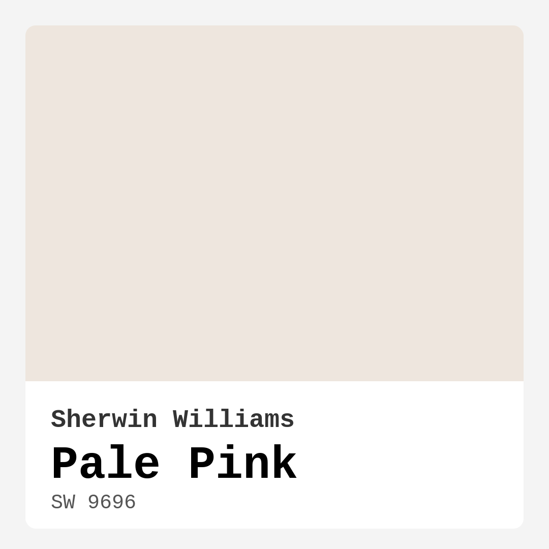
Color Preview & Key Details
| HEX Code | #EEE6DE |
| RGB | 238, 230, 222 |
| LRV | 75% |
| Undertone | Red |
| Finish Options | Eggshell, Matte, Satin |
Imagine stepping into a room that feels as soft and inviting as a hug. You know the kind of space where you can breathe easily, unwind after a long day, and feel instantly at peace. This is the magic of using Pale Pink (SW 9696) from Sherwin Williams. This delicate hue isn’t just a paint color; it’s a transformative experience for your home.
Pale Pink is like a gentle whisper of warmth, radiating comfort and serenity. With its light brightness and high light reflectance value of 75%, it effortlessly brightens your space, making even the smallest rooms feel larger and more open. The subtle charm of this color can breathe life into a nursery or add a touch of softness to your living room. Its inviting nature makes it an ideal choice for various settings, from a cozy bedroom to an elegant dining room.
The versatility of Pale Pink is one of its strongest attributes. It seamlessly integrates into a wide range of decor styles. Whether your home leans toward modern sophistication, farmhouse charm, Scandinavian minimalism, vintage elegance, or even a bohemian flair, Pale Pink fits right in. Picture it against rustic wooden beams in a farmhouse or paired with sleek furniture in a modern apartment. It allows your personality to shine through while still creating a cohesive aesthetic.
One of the beauties of this paint color is its muted quality, stemming from its red undertones. When you apply it to your walls, you might notice how the undertones shift depending on the light. In natural light, it glows softly, inviting a serene ambiance that feels calming. Under artificial light, those warm undertones can emerge more prominently, creating a romantic atmosphere. It’s essential to consider the lighting in your space when choosing this color, as it can significantly impact how it looks throughout the day.
When you’re thinking about applying Pale Pink, you’ll find that it’s beginner-friendly. This paint goes on smoothly, whether you’re using a brush or a roller, and dries quickly, which is perfect if you’re eager to see the transformation. With good coverage, typically needing just one to two coats, it’s practical for those looking to refresh their space without spending too much time or effort. Plus, it’s touch-up friendly and washable, so you don’t have to worry about everyday wear and tear.
Now, let’s talk about where to use this lovely hue. Pale Pink shines in bedrooms, creating a cozy retreat that feels inviting and serene. It’s also perfect for nurseries, where its soft charm can soothe your little one. In living rooms, it can serve as a delightful backdrop for gatherings, making the space feel warm and welcoming. Dining rooms benefit from its lightness, enhancing the dining experience with a gentle glow. And don’t overlook the home office — its calming presence can help foster creativity and focus.
You might be wondering how to pair Pale Pink with other colors. The good news is that it plays well with a variety of shades. For trim, consider using crisp whites like White Dove or Pure White for a fresh contrast. If you’re looking for something a little more bold, brass fixtures can add a touch of elegance that complements the warmth of Pale Pink beautifully.
While Pale Pink is a fabulous choice, it’s essential to consider a few factors. It may not suit very dark spaces or overly bold decor styles, as its soft nature can get lost in those settings. Careful application is necessary to avoid streaks, particularly in high-traffic areas. However, with the right finish — think eggshell or satin for added durability — you can ensure it withstands daily life while maintaining its lovely appearance.
For those who love exploring color palettes, you’ll be pleased to know that Pale Pink pairs wonderfully with other shades. Consider blending it with deeper tones for a beautiful contrast. For instance, pairing it with darker shades like SW 7000 or SW 6099 can create a stunning focal point. If you’re looking for complementary colors, think about integrating hues like SW 7625 or SW 9139. These combinations can elevate the overall design of your space.
For smaller rooms, Pale Pink can be a game-changer. Its light and airy quality helps open up tight spaces, creating an inviting atmosphere that feels expansive. Just balance it with adequate lighting and complementary decor to enhance its charm. This color is also an excellent choice for rentals, providing a classic yet modern look that doesn’t overwhelm the senses.
The mood that Pale Pink sets is undeniably cozy and calm. It invites you in and wraps you in a sense of comfort. Whether you’re curling up with a book or hosting friends, this color creates a backdrop that feels both inviting and sophisticated.
In summary, Pale Pink (SW 9696) is more than just a paint color; it’s a way to cultivate warmth and serenity in your home. Its versatility allows it to adapt to various decor styles and settings, making it a fantastic choice for any project. Whether you’re a seasoned DIY enthusiast or a beginner, the ease of application and good coverage make it a practical option. So, if you’re ready to embrace a hue that radiates charm and tranquility, consider Pale Pink as your next go-to color. Your home will thank you for it.

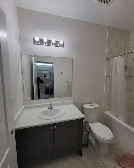
Real Room Photo of Pale Pink SW 9696

Undertones of Pale Pink ?
The undertones of Pale Pink are a key aspect of its character, leaning towards Red. These subtle underlying hues are what give the color its depth and complexity. For example, a gray with a blue undertone will feel cooler and more modern, while one with a brown undertone will feel warmer and more traditional. It’s essential to test this paint in your home and observe it next to your existing furniture, flooring, and decor to see how these undertones interact and reveal themselves throughout the day.
HEX value: #EEE6DE
RGB code: 238, 230, 222
Is Pale Pink Cool or Warm?
This color leans warm with its gentle pink tones, creating a cozy atmosphere that feels welcoming and soft.
Understanding Color Properties and Interior Design Tips
Hue refers to a specific position on the color wheel, measured in degrees from 0 to 360. Each degree represents a different pure color:
- 0° represents red
- 120° represents green
- 240° represents blue
Saturation describes the intensity or purity of a color and is expressed as a percentage:
- At 0%, the color appears completely desaturated—essentially a shade of gray
- At 100%, the color is at its most vivid and vibrant
Lightness indicates how light or dark a color is, also expressed as a percentage:
- 0% lightness results in black
- 100% lightness results in white
Using Warm Colors in Interior Design
Warm hues—such as reds, oranges, yellows, warm beiges, and greiges—are excellent choices for creating inviting and energetic spaces. These colors are particularly well-suited for:
- Kitchens, living rooms, and bathrooms, where warmth enhances comfort and sociability
- Large rooms, where warm tones can help reduce the sense of emptiness and make the space feel more intimate
For example:
- Warm beige shades provide a cozy, inviting atmosphere, ideal for living rooms, bedrooms, and hallways.
- Warm greige (a mix of beige and gray) offers the warmth of beige with the modern appeal of gray, making it a versatile backdrop for dining areas, bedrooms, and living spaces.
However, be mindful when using warm light tones in rooms with limited natural light. These shades may appear muted or even take on an unpleasant yellowish tint. To avoid a dull or flat appearance:
- Add depth by incorporating richer tones like deep greens, charcoal, or chocolate brown
- Use textured elements such as curtains, rugs, or cushions to bring dimension to the space
Pro Tip: Achieving Harmony with Warm and Cool Color Balance
To create a well-balanced and visually interesting interior, mix warm and cool tones strategically. This contrast adds depth and harmony to your design.
- If your walls feature warm hues, introduce cool-colored accents such as blue or green furniture, artwork, or accessories to create contrast.
- For a polished look, consider using a complementary color scheme, which pairs colors opposite each other on the color wheel (e.g., red with green, orange with blue).
This thoughtful mix not only enhances visual appeal but also creates a space that feels both dynamic and cohesive.
Light Temperature Affects on Pale Pink
Natural Light
Natural daylight changes in color temperature as the sun moves across the sky. At sunrise and sunset, the light tends to have a warm, golden tone with a color temperature around 2000 Kelvin (K). As the day progresses and the sun rises higher, the light becomes cooler and more neutral. Around midday, especially when the sky is clear, natural light typically reaches its peak brightness and shifts to a cooler tone, ranging from 5500 to 6500 Kelvin. This midday light is close to what we perceive as pure white or daylight-balanced light.
These shifts in natural light can significantly influence how colors appear in a space, which is why designers often consider both the time of day and the orientation of windows when planning interior color schemes.
Artificial Light
When choosing artificial lighting, pay close attention to the color temperature, measured in Kelvin (K). This determines how warm or cool the light will appear. Lower temperatures, around 2700K, give off a warm, yellow glow often used in living rooms or bedrooms. Higher temperatures, above 5000K, create a cool, bluish light similar to daylight, commonly used in kitchens, offices, or task areas.
Use the slider to see how lighting temperature can affect the appearance of a surface or color throughout a space.


4800K
LRV of Pale Pink
The Light Reflectance Value (LRV) of Pale Pink is 75%, which places it in the Light category. This means it Reflects a high amount of light. Understanding a paint’s LRV is crucial for predicting how it will look in your space. A higher LRV indicates a lighter color that reflects more light, making rooms feel larger and brighter. A lower LRV signifies a darker color that absorbs more light, creating a cozier, more intimate atmosphere. Always consider the natural and artificial lighting in your room when selecting a paint color based on its LRV.
Detailed Review of Pale Pink
Additional Paint Characteristics
Ideal Rooms
Bedroom, Dining Room, Home Office, Living Room, Nursery
Decor Styles
Bohemian, Farmhouse, Modern, Scandinavian, Vintage
Coverage
Good (1–2 Coats), Touch-Up Friendly
Ease of Application
Beginner Friendly, Brush Smooth, Fast-Drying, Roller-Ready
Washability
Washable, Wipeable
VOC Level
Low VOC, Ultra Low VOC
Best Use
Accent Wall, Bedroom, Home Office, Interior Walls, Nursery
Room Suitability
Bedroom, Dining Room, Home Office, Living Room, Nursery
Tone Tag
Muted, Pastel, Warm
Finish Type
Eggshell, Matte, Satin
Paint Performance
Easy Touch-Up, Fade Resistant, Low Odor, Stain Resistant
Use Cases
Best for Rentals, Best for Small Spaces, Classic Favorite
Mood
Calm, Cozy, Inviting, Romantic
Trim Pairing
Complements Brass Fixtures, Matches Pure White, Pairs with White Dove
Pale Pink is a wonderfully versatile paint that can completely transform a room. Its soft tone works beautifully in various settings, from a cozy bedroom to a sophisticated dining area. The color’s muted quality means it can blend seamlessly with both light and dark furniture, allowing for creative decor options. It performs well with good coverage, typically requiring just one to two coats for full opacity, which makes it a practical choice for your next project. The finish options available, including matte and eggshell, enhance its adaptability in different spaces. Overall, Pale Pink stands out for its elegant appearance and ease of use, making it a go-to choice for anyone looking to refresh their home.
Pros & Cons of SW 9696 Pale Pink
Pros
Cons
Colors that go with Sherwin Williams Pale Pink
FAQ on SW 9696 Pale Pink
Can I use Pale Pink in a small room?
Absolutely! Pale Pink is a fantastic choice for small spaces. Its light and airy quality helps to open up the room and create an inviting atmosphere. Just ensure you balance it with sufficient lighting and complementary decor to enhance its beauty.
How does Pale Pink perform in terms of durability?
Pale Pink is designed to be quite durable, especially with the right finish. For high-traffic areas, consider using an eggshell or satin finish, which offers better washability and scuff resistance. Overall, it withstands daily wear while keeping its lovely appearance.
Comparisons Pale Pink with other colors
Pale Pink SW 9696 vs Malted Milk SW 6057
| Attribute | Pale Pink SW 9696 | Malted Milk SW 6057 |
|---|---|---|
| Color Name | Pale Pink SW 9696 | Malted Milk SW 6057 |
| Color | ||
| Hue | Pink | Pink |
| Brightness | Light | Light |
| RGB | 238, 230, 222 | 222, 202, 189 |
| LRV | 75% | 74% |
| Finish Type | Eggshell, Matte, Satin | Eggshell, Satin |
| Finish Options | Eggshell, Matte, Satin | Eggshell, Matte, Satin |
| Ideal Rooms | Bedroom, Dining Room, Home Office, Living Room, Nursery | Bedroom, Dining Room, Kitchen, Living Room, Nursery |
| Decor Styles | Bohemian, Farmhouse, Modern, Scandinavian, Vintage | Coastal, Farmhouse, Modern, Scandinavian, Transitional |
| Coverage | Good (1–2 Coats), Touch-Up Friendly | Good (1–2 Coats), Touch-Up Friendly |
| Ease of Application | Beginner Friendly, Brush Smooth, Fast-Drying, Roller-Ready | Beginner Friendly, Brush Smooth, Fast-Drying, Roller-Ready |
| Washability | Washable, Wipeable | Washable, Wipeable |
| Room Suitability | Bedroom, Dining Room, Home Office, Living Room, Nursery | Bedroom, Dining Room, Kitchen, Living Room, Nursery |
| Tone | Muted, Pastel, Warm | Creamy, Neutral, Warm |
| Paint Performance | Easy Touch-Up, Fade Resistant, Low Odor, Stain Resistant | High Coverage, Low Odor, Quick Drying |
Pale Pink SW 9696 vs Intimate White SW 6322
| Attribute | Pale Pink SW 9696 | Intimate White SW 6322 |
|---|---|---|
| Color Name | Pale Pink SW 9696 | Intimate White SW 6322 |
| Color | ||
| Hue | Pink | Pink |
| Brightness | Light | Light |
| RGB | 238, 230, 222 | 240, 225, 216 |
| LRV | 75% | 75% |
| Finish Type | Eggshell, Matte, Satin | Eggshell, Matte, Satin |
| Finish Options | Eggshell, Matte, Satin | Eggshell, Matte, Satin |
| Ideal Rooms | Bedroom, Dining Room, Home Office, Living Room, Nursery | Bedroom, Hallway, Home Office, Living Room, Nursery |
| Decor Styles | Bohemian, Farmhouse, Modern, Scandinavian, Vintage | Farmhouse, Minimalist, Modern, Traditional |
| Coverage | Good (1–2 Coats), Touch-Up Friendly | Good (1–2 Coats) |
| Ease of Application | Beginner Friendly, Brush Smooth, Fast-Drying, Roller-Ready | Beginner Friendly, Brush Smooth, Roller-Ready |
| Washability | Washable, Wipeable | Highly Washable, Washable |
| Room Suitability | Bedroom, Dining Room, Home Office, Living Room, Nursery | Bedroom, Hallway, Living Room, Nursery |
| Tone | Muted, Pastel, Warm | Creamy, Muted, Warm |
| Paint Performance | Easy Touch-Up, Fade Resistant, Low Odor, Stain Resistant | Easy Touch-Up, Fade Resistant, Low Odor |
Pale Pink SW 9696 vs Abalone Shell SW 6050
| Attribute | Pale Pink SW 9696 | Abalone Shell SW 6050 |
|---|---|---|
| Color Name | Pale Pink SW 9696 | Abalone Shell SW 6050 |
| Color | ||
| Hue | Pink | Pink |
| Brightness | Light | Light |
| RGB | 238, 230, 222 | 219, 199, 189 |
| LRV | 75% | 30% |
| Finish Type | Eggshell, Matte, Satin | Eggshell, Matte, Satin |
| Finish Options | Eggshell, Matte, Satin | Eggshell, Matte, Satin |
| Ideal Rooms | Bedroom, Dining Room, Home Office, Living Room, Nursery | Bedroom, Dining Room, Home Office, Living Room |
| Decor Styles | Bohemian, Farmhouse, Modern, Scandinavian, Vintage | Coastal, Farmhouse, Minimalist, Modern, Traditional |
| Coverage | Good (1–2 Coats), Touch-Up Friendly | Good (1–2 Coats), Touch-Up Friendly |
| Ease of Application | Beginner Friendly, Brush Smooth, Fast-Drying, Roller-Ready | Beginner Friendly, Brush Smooth, Fast-Drying, Roller-Ready |
| Washability | Washable, Wipeable | Washable, Wipeable |
| Room Suitability | Bedroom, Dining Room, Home Office, Living Room, Nursery | Bedroom, Dining Room, Home Office, Living Room |
| Tone | Muted, Pastel, Warm | Balanced, Muted, Warm |
| Paint Performance | Easy Touch-Up, Fade Resistant, Low Odor, Stain Resistant | Easy Touch-Up, Fade Resistant, Low Odor, Quick Drying |
Pale Pink SW 9696 vs White Truffle SW 6029
| Attribute | Pale Pink SW 9696 | White Truffle SW 6029 |
|---|---|---|
| Color Name | Pale Pink SW 9696 | White Truffle SW 6029 |
| Color | ||
| Hue | Pink | Pink |
| Brightness | Light | Light |
| RGB | 238, 230, 222 | 215, 200, 194 |
| LRV | 75% | 48% |
| Finish Type | Eggshell, Matte, Satin | Eggshell, Satin |
| Finish Options | Eggshell, Matte, Satin | Eggshell, Flat, Matte, Satin |
| Ideal Rooms | Bedroom, Dining Room, Home Office, Living Room, Nursery | Bedroom, Dining Room, Hallway, Kitchen, Living Room |
| Decor Styles | Bohemian, Farmhouse, Modern, Scandinavian, Vintage | Eclectic, Farmhouse, Modern, Traditional |
| Coverage | Good (1–2 Coats), Touch-Up Friendly | Good (1–2 Coats), Touch-Up Friendly |
| Ease of Application | Beginner Friendly, Brush Smooth, Fast-Drying, Roller-Ready | Beginner Friendly, Brush Smooth, Roller-Ready |
| Washability | Washable, Wipeable | Washable, Wipeable |
| Room Suitability | Bedroom, Dining Room, Home Office, Living Room, Nursery | Bedroom, Dining Room, Hallway, Living Room |
| Tone | Muted, Pastel, Warm | Earthy, Neutral, Warm |
| Paint Performance | Easy Touch-Up, Fade Resistant, Low Odor, Stain Resistant | Easy Touch-Up, Low Odor, Scuff Resistant |
Pale Pink SW 9696 vs Faint Coral SW 6329
| Attribute | Pale Pink SW 9696 | Faint Coral SW 6329 |
|---|---|---|
| Color Name | Pale Pink SW 9696 | Faint Coral SW 6329 |
| Color | ||
| Hue | Pink | Pink |
| Brightness | Light | Light |
| RGB | 238, 230, 222 | 238, 222, 213 |
| LRV | 75% | 66% |
| Finish Type | Eggshell, Matte, Satin | Eggshell, Matte, Satin |
| Finish Options | Eggshell, Matte, Satin | Eggshell, Matte, Satin |
| Ideal Rooms | Bedroom, Dining Room, Home Office, Living Room, Nursery | Bedroom, Dining Room, Hallway, Living Room, Nursery |
| Decor Styles | Bohemian, Farmhouse, Modern, Scandinavian, Vintage | Bohemian, Coastal, Modern Farmhouse, Scandinavian, Vintage |
| Coverage | Good (1–2 Coats), Touch-Up Friendly | Good (1–2 Coats), Touch-Up Friendly |
| Ease of Application | Beginner Friendly, Brush Smooth, Fast-Drying, Roller-Ready | Beginner Friendly, Brush Smooth, Fast-Drying, Roller-Ready |
| Washability | Washable, Wipeable | Washable, Wipeable |
| Room Suitability | Bedroom, Dining Room, Home Office, Living Room, Nursery | Bedroom, Dining Room, Hallway, Living Room, Nursery |
| Tone | Muted, Pastel, Warm | Airy, Muted, Pastel, Warm |
| Paint Performance | Easy Touch-Up, Fade Resistant, Low Odor, Stain Resistant | Easy Touch-Up, Low Odor, Quick Drying |
Pale Pink SW 9696 vs Romance SW 6323
| Attribute | Pale Pink SW 9696 | Romance SW 6323 |
|---|---|---|
| Color Name | Pale Pink SW 9696 | Romance SW 6323 |
| Color | ||
| Hue | Pink | Pink |
| Brightness | Light | Light |
| RGB | 238, 230, 222 | 235, 207, 195 |
| LRV | 75% | 69% |
| Finish Type | Eggshell, Matte, Satin | Eggshell, Matte |
| Finish Options | Eggshell, Matte, Satin | Eggshell, Flat, Matte, Satin |
| Ideal Rooms | Bedroom, Dining Room, Home Office, Living Room, Nursery | Bedroom, Dining Room, Living Room, Nursery |
| Decor Styles | Bohemian, Farmhouse, Modern, Scandinavian, Vintage | Bohemian, Modern, Shabby Chic, Vintage |
| Coverage | Good (1–2 Coats), Touch-Up Friendly | Good (1–2 Coats), Touch-Up Friendly |
| Ease of Application | Beginner Friendly, Brush Smooth, Fast-Drying, Roller-Ready | Beginner Friendly, Brush Smooth, Fast-Drying, Roller-Ready |
| Washability | Washable, Wipeable | Washable, Wipeable |
| Room Suitability | Bedroom, Dining Room, Home Office, Living Room, Nursery | Bedroom, Dining Room, Living Room, Nursery |
| Tone | Muted, Pastel, Warm | Pastel, Soft, Warm |
| Paint Performance | Easy Touch-Up, Fade Resistant, Low Odor, Stain Resistant | Easy Touch-Up, Low Odor, Quick Drying |
Pale Pink SW 9696 vs Innocence SW 6302
| Attribute | Pale Pink SW 9696 | Innocence SW 6302 |
|---|---|---|
| Color Name | Pale Pink SW 9696 | Innocence SW 6302 |
| Color | ||
| Hue | Pink | Pink |
| Brightness | Light | Light |
| RGB | 238, 230, 222 | 235, 209, 207 |
| LRV | 75% | 75% |
| Finish Type | Eggshell, Matte, Satin | Eggshell, Matte |
| Finish Options | Eggshell, Matte, Satin | Eggshell, Matte, Satin |
| Ideal Rooms | Bedroom, Dining Room, Home Office, Living Room, Nursery | Bedroom, Dining Room, Living Room, Nursery |
| Decor Styles | Bohemian, Farmhouse, Modern, Scandinavian, Vintage | Bohemian, Modern Farmhouse, Scandinavian, Shabby Chic |
| Coverage | Good (1–2 Coats), Touch-Up Friendly | Good (1–2 Coats), Touch-Up Friendly |
| Ease of Application | Beginner Friendly, Brush Smooth, Fast-Drying, Roller-Ready | Beginner Friendly, Brush Smooth, Roller-Ready |
| Washability | Washable, Wipeable | Washable, Wipeable |
| Room Suitability | Bedroom, Dining Room, Home Office, Living Room, Nursery | Bedroom, Dining Room, Living Room, Nursery |
| Tone | Muted, Pastel, Warm | Pastel, Soft, Warm |
| Paint Performance | Easy Touch-Up, Fade Resistant, Low Odor, Stain Resistant | Easy Touch-Up, Fade Resistant, Low Odor |
Pale Pink SW 9696 vs Angelic SW 6602
| Attribute | Pale Pink SW 9696 | Angelic SW 6602 |
|---|---|---|
| Color Name | Pale Pink SW 9696 | Angelic SW 6602 |
| Color | ||
| Hue | Pink | Pink |
| Brightness | Light | Light |
| RGB | 238, 230, 222 | 242, 220, 215 |
| LRV | 75% | 75% |
| Finish Type | Eggshell, Matte, Satin | Eggshell, Satin |
| Finish Options | Eggshell, Matte, Satin | Eggshell, Flat, Matte, Satin |
| Ideal Rooms | Bedroom, Dining Room, Home Office, Living Room, Nursery | Bedroom, Dining Room, Home Office, Living Room, Nursery |
| Decor Styles | Bohemian, Farmhouse, Modern, Scandinavian, Vintage | Bohemian, Farmhouse, Modern, Transitional |
| Coverage | Good (1–2 Coats), Touch-Up Friendly | Good (1–2 Coats), Touch-Up Friendly |
| Ease of Application | Beginner Friendly, Brush Smooth, Fast-Drying, Roller-Ready | Beginner Friendly, Brush Smooth, Roller-Ready |
| Washability | Washable, Wipeable | Washable, Wipeable |
| Room Suitability | Bedroom, Dining Room, Home Office, Living Room, Nursery | Bedroom, Home Office, Living Room, Nursery |
| Tone | Muted, Pastel, Warm | Airy, Pastel, Warm |
| Paint Performance | Easy Touch-Up, Fade Resistant, Low Odor, Stain Resistant | Easy Touch-Up, Fade Resistant, Low Odor |
Pale Pink SW 9696 vs Rosy Outlook SW 6316
| Attribute | Pale Pink SW 9696 | Rosy Outlook SW 6316 |
|---|---|---|
| Color Name | Pale Pink SW 9696 | Rosy Outlook SW 6316 |
| Color | ||
| Hue | Pink | Pink |
| Brightness | Light | Light |
| RGB | 238, 230, 222 | 235, 206, 203 |
| LRV | 75% | 45% |
| Finish Type | Eggshell, Matte, Satin | Eggshell, Matte, Satin |
| Finish Options | Eggshell, Matte, Satin | Eggshell, Matte, Satin |
| Ideal Rooms | Bedroom, Dining Room, Home Office, Living Room, Nursery | Bedroom, Home Office, Living Room, Nursery |
| Decor Styles | Bohemian, Farmhouse, Modern, Scandinavian, Vintage | Bohemian, Cottage, Modern, Traditional |
| Coverage | Good (1–2 Coats), Touch-Up Friendly | Good (1–2 Coats), Touch-Up Friendly |
| Ease of Application | Beginner Friendly, Brush Smooth, Fast-Drying, Roller-Ready | Beginner Friendly, Brush Smooth, Roller-Ready |
| Washability | Washable, Wipeable | Scuff Resistant, Washable, Wipeable |
| Room Suitability | Bedroom, Dining Room, Home Office, Living Room, Nursery | Bedroom, Home Office, Living Room, Nursery |
| Tone | Muted, Pastel, Warm | Muted, Pastel, Warm |
| Paint Performance | Easy Touch-Up, Fade Resistant, Low Odor, Stain Resistant | High Coverage, Low Odor, Quick Drying |
Pale Pink SW 9696 vs Demure SW 6295
| Attribute | Pale Pink SW 9696 | Demure SW 6295 |
|---|---|---|
| Color Name | Pale Pink SW 9696 | Demure SW 6295 |
| Color | ||
| Hue | Pink | Pink |
| Brightness | Light | Light |
| RGB | 238, 230, 222 | 232, 212, 213 |
| LRV | 75% | 50% |
| Finish Type | Eggshell, Matte, Satin | Eggshell, Matte |
| Finish Options | Eggshell, Matte, Satin | Eggshell, Matte, Satin |
| Ideal Rooms | Bedroom, Dining Room, Home Office, Living Room, Nursery | Bedroom, Home Office, Living Room, Nursery |
| Decor Styles | Bohemian, Farmhouse, Modern, Scandinavian, Vintage | Minimalist, Modern, Shabby Chic, Transitional |
| Coverage | Good (1–2 Coats), Touch-Up Friendly | Good (1–2 Coats), Touch-Up Friendly |
| Ease of Application | Beginner Friendly, Brush Smooth, Fast-Drying, Roller-Ready | Beginner Friendly, Brush Smooth, Roller-Ready |
| Washability | Washable, Wipeable | Washable, Wipeable |
| Room Suitability | Bedroom, Dining Room, Home Office, Living Room, Nursery | Bedroom, Home Office, Living Room, Nursery |
| Tone | Muted, Pastel, Warm | Muted, Pastel, Warm |
| Paint Performance | Easy Touch-Up, Fade Resistant, Low Odor, Stain Resistant | Easy Touch-Up, Low Odor, Quick Drying |
Official Page of Sherwin Williams Pale Pink SW 9696