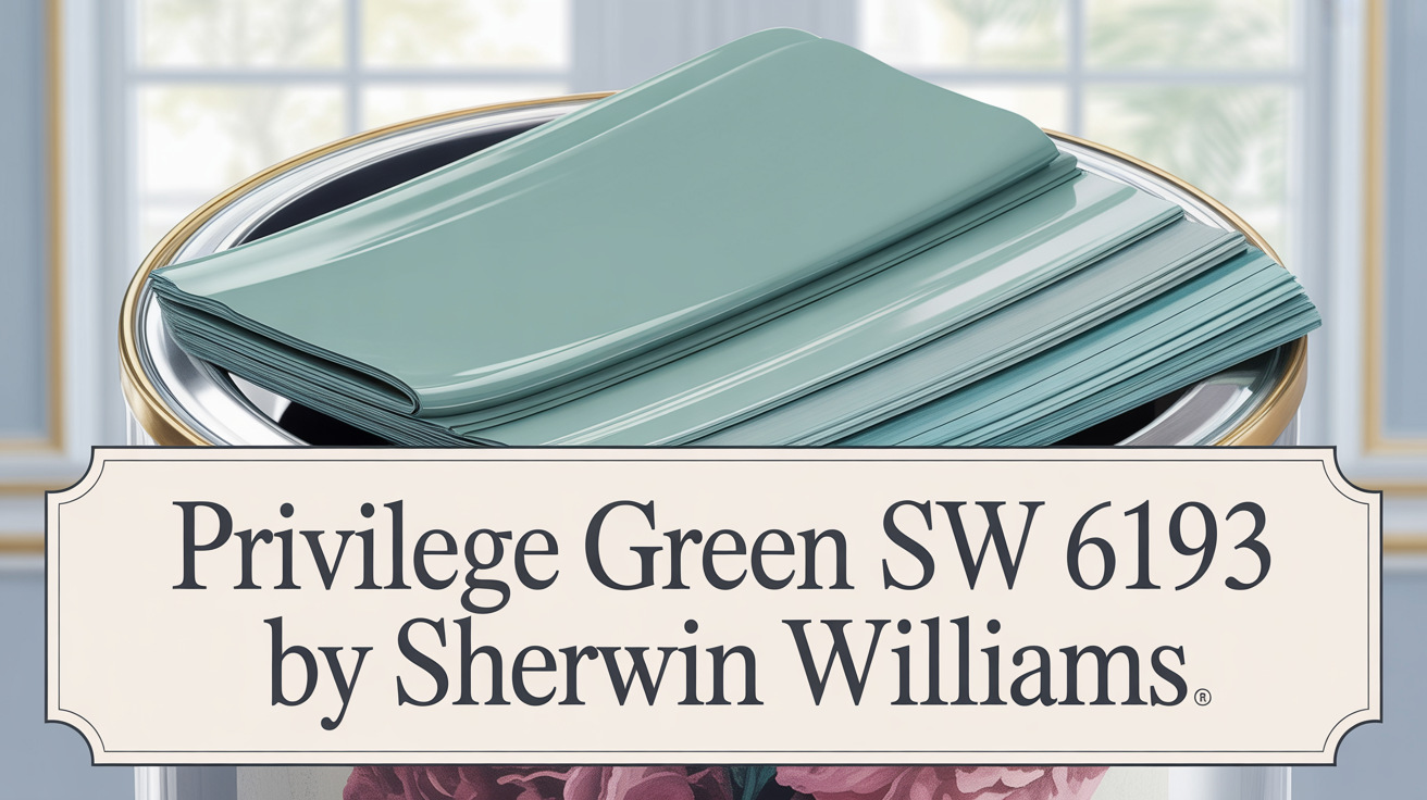
Hey there! Let’s dive into a color that can really transform your space: Privilege Green SW 6193 by Sherwin Williams.
Imagine giving your home a fresh update with a shade that feels just like bringing the outdoors inside. Privilege Green SW 6193 is that color. It’s a gentle, natural green that instantly inspires calmness and renewal. Think of it as an inviting hue ready to create a serene vibe in any room.
When you want to introduce a touch of nature, this color truly stands out with its subtle charm and organic feel. It’s a fantastic choice for places where you love to relax or hang out with friends and family. Whether you’re thinking about your living room, bedroom, or even the kitchen, this shade provides a peaceful backdrop.
You can easily pair it with neutral tones for a clean, modern look or combine it with warm wood accents for something cozier and rustic. If you’re aiming for a boost in creativity, try it in a workspace or study area. Its soft yet lively hue encourages focus without feeling overwhelming. Plus, it works beautifully with natural light, really enhancing its gentle vibrancy. As you use it, you’ll feel how it creates a nurturing environment, wrapping you in a sense of balance, freshness, and subtlety. It’s the kind of color that makes people want to linger.
What Kind of Green is Privilege Green SW 6193?
This color is a soft, muted green that carries a touch of warmth. It brings a serene and welcoming atmosphere wherever it’s used. With its subtle earthiness, it’s incredibly versatile for all sorts of interior design styles.
- Modern Farmhouse? It softens natural wood tones beautifully without overpowering the space.
- Rustic? It harmonizes perfectly with exposed wooden beams, stone, and vintage pieces.
- Coastal or Cottage? It captures nature’s essence and blends seamlessly with light furniture and airy fabrics.
- Scandinavian? It pairs nicely with light woods like birch or pine, maintaining a clean, minimalist feel while adding depth and warmth.
- Traditional? It acts as a refined backdrop that highlights antique furniture and intricate details.
Perfect materials to pair with this green include natural linen, rattan, wicker, and jute or wool rugs. Adding brass or copper fixtures gives a hint of elegance and warmth. Overall, it’s a flexible color that suits many styles and materials, helping to create a truly cozy environment.
Is Privilege Green SW 6193 a Warm or Cool Color?
Privilege Green is described as a soft, muted green that can bring a sense of calm to interiors. It has an understated elegance and a gentle, soothing appearance that works well in various spaces. The color blends hints of gray with its green tones, resulting in a balanced look that doesn’t feel too intense.
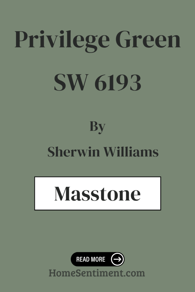
What is the Masstone of Privilege Green SW 6193?
The masstone of Privilege Green (SW 6193) is a neutral gray, specifically #808080. This gray undercurrent is key to its behavior. It provides stability and neutrality, making the green incredibly adaptable to different styles and settings. This means it can easily complement everything from wood furniture to metal fixtures.
In living rooms, it helps cultivate a cozy atmosphere without overpowering other colors. Kitchens using Privilege Green feel fresh and inviting, working well with natural materials like stone and wood. And in bedrooms, this shade encourages a peaceful environment, promoting relaxation. The gray undertone truly ensures its versatility, pairing beautifully with colors like whites or darker accents. Ultimately, it adds a subtle elegance, enhancing comfort and style.
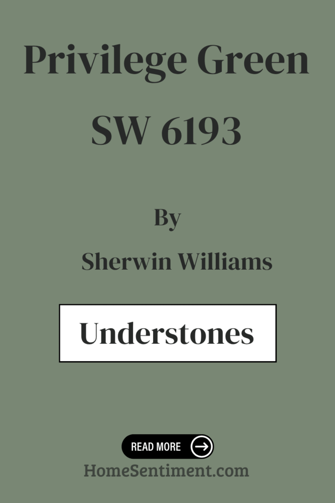
Undertones of Privilege Green SW 6193
This green is rich in complex undertones, which give it its depth and versatility. Undertones like olive, mint, and dark turquoise mean the color can subtly shift its hue depending on the light, making it dynamic.
- Olive and dark green undertones bring warmth and earthiness, creating a cozy, grounded, nature-connected feeling.
- Mint and light turquoise hints add a fresh, airy quality, brightening smaller rooms and creating a lively atmosphere.
- Pale pink and lilac undertones introduce softness and calm, perfect for creating relaxing spaces like bedrooms.
- Purple, violet, and navy undertones add depth and sophistication, suitable for creating a more formal or elegant ambiance.
- Touches of yellow and pale yellow infuse energy and optimism, making common areas feel welcoming and cheerful.
These mixed undertones make Privilege Green adaptable for various moods and settings in design.
Coordinating Colors for Privilege Green SW 6193
Choosing coordinating colors is all about creating a visually pleasing and harmonious look. They should complement each other to enhance the overall effect. Privilege Green, being a vibrant yet calming green, sets a serene stage. Coordinating colors can either enhance or balance its tones, adding depth and interest.
Consider these recommended options:
- SW 6236 Grays Harbor: This is a deep, rich gray with blue undertones. It offers a strong contrast to Privilege Green, providing a sophisticated and grounding element.
- SW 6189 Opaline: A subdued, soft green with a hint of gray. It captures nature’s calmness and creates a gentle transition when paired with Privilege Green.
- SW 7015 Repose Gray: A versatile, light gray with warm undertones. It serves as a neutral backdrop, letting Privilege Green shine while adding a touch of warmth.
These colors together offer balance, contrast, and harmony, allowing for diverse styling opportunities.
How Does Lighting Affect Privilege Green SW 6193?
Lighting plays a huge role in how any color looks. Privilege Green is a color that can look quite different depending on the light it receives.
- In natural light, colors tend to appear brighter and more vivid. This green has a fresh, soft, and vibrant appearance in sunlight, feeling calm and airy.
- Under artificial light, its vibe can change. Warmer lights might give it a slightly more muted or yellowish tint, making it feel earthier. Cool artificial lights can enhance its green tones, making it appear crisper and more modern.
- In a north-facing room (less direct sunlight), colors can seem cooler and more subdued. Privilege Green might feel a bit muted or grayish here, giving a calm and understated look. You might want to use warmer artificial lights in these rooms to bring out its warmth.
- South-facing rooms get consistent natural light, making colors look bright. Privilege Green will appear bright and lively, feeling warm and welcoming.
- East-facing rooms have soft, warm morning light, but cooler afternoons. Privilege Green feels warm and inviting in the morning, then cooler and more subdued later.
- West-facing rooms receive warm afternoon and evening light. Privilege Green can look especially cozy and inviting during these hours, with its tones enhanced by the warm light.
What is the LRV of Privilege Green SW 6193?
LRV stands for Light Reflectance Value. It measures how much light a color reflects, ranging from 0 (absolute black) to 100 (pure white). It helps you understand how light or dark a color will appear. Colors with lower LRV absorb more light, making rooms feel cozier. Higher LRV colors reflect more light, brightening spaces.
Privilege Green SW 6193 has an LRV of 22.639, which puts it on the darker side of the spectrum. This means it will absorb a significant amount of light, giving a room a rich and enveloping feel. It’s great for creating a cozy, comfortable atmosphere in places like a den or bedroom. However, in smaller or poorly lit rooms, it might make the space feel smaller. To balance this, you can pair it with lighter accents or use it on just one feature wall.
What are the Trim Colors for Privilege Green SW 6193?
Trim colors are super important for enhancing the look and defining architectural features like windows, doors, and baseboards. The right trim creates a balanced, cohesive look, adding depth and character.
Here are some recommended trim colors:
- SW 7013 Ivory Lace: This provides a soft, creamy contrast to Privilege Green. Its understated elegance offers a warm touch that pairs beautifully with the green’s calming vibe. It’s great for a lighter, airy feel.
- SW 7043 Worldly Gray: A more sophisticated, neutral counterpart. It’s a subtle warm gray tone, slightly deeper than Ivory Lace. It adds dimension and provides a grounding effect without overshadowing the green’s natural feel. This is perfect for a more grounded, mature ambiance.
Both options are crucial for enhancing Privilege Green’s features while offering different stylistic approaches, suiting both modern and traditional interiors.
Colors Similar to Privilege Green SW 6193
Similar colors are key for creating a cohesive design. They harmonize and tie elements together without clashing. Privilege Green, a soothing and versatile green, finds harmony with several shades, each adding a unique touch.
Here are some colors similar to Privilege Green:
- SW 9679 Juniper: A slightly darker shade with rich depth, adding warmth and comfort.
- SW 0015 Gallery Green: Offers a classic, timeless feel and an elegant backdrop.
- SW 6207 Retreat: A calm and restful hue, perfect for serene spaces.
- SW 6186 Dried Thyme: Introduces a subtle earthy tone, adding a cozy and grounded feeling.
- SW 6179 Artichoke: A muted green that feels soft yet sophisticated.
- SW 2811 Rookwood Blue Green: Adds a touch of blue with a vintage undertone.
- SW 6214 Underseas: Carries a deep, moody vibe that’s dramatic yet relaxing.
- SW 9654 Taiga & SW 9649 Willowleaf: Echo the tranquility of nature with rich, forest-inspired tones.
- SW 0047 Studio Blue Green: Another option with a touch of blue, offering a playful burst of color.
Using these colors together can create a harmonious and inviting environment.
Colors that Go With Privilege Green SW 6193
Choosing colors that pair well with Privilege Green is important for creating harmony and balance. These colors can really enhance the mood of a room.
Check out these recommended colors that work wonderfully:
- SW 6191 Contented: A soft, muted green that feels calming and relaxed, making it a great companion.
- SW 6190 Filmy Green: A fresh and airy shade that brings lightness and openness, helping a room feel more spacious.
- SW 9129 Jade Dragon: Delivers richness with its deeper green tone, adding depth and sophistication.
- SW 6192 Coastal Plain: Evokes a sense of the outdoors with a slightly earthy feel, enhancing the natural vibe.
- SW 6195 Rock Garden: For a touch of boldness, this darker green adds a striking contrast and can create a focal point.
- SW 6194 Basil: A warm, earthy green that balances well, adding warmth and comfort.
Together, these colors create a well-rounded palette that makes any space feel beautifully put together and cohesive.
How to Use Privilege Green SW 6193 In Your Home
Privilege Green offers a soft, inviting shade that brings a fresh, soothing vibe to any space. Its gentle hue is versatile, creating a calm and balanced atmosphere throughout your home.
- Living rooms: It can be a perfect backdrop for neutral furniture, adding a touch of nature and serenity.
- Kitchens: It complements wood tones, enhancing warmth and charm.
- Bedrooms: It promotes relaxation and restfulness, making it an ideal wall color for a good night’s sleep.
- Bathrooms: It adds a refreshing feel and evokes cleanliness, especially when paired with white tiles or fixtures.
- Home offices: It fits right in, encouraging focus with its subtle, natural energy.
You can accent it with earth tones or soft pastels for a cohesive look. This color blends effortlessly into various styles, from modern to traditional, making it a truly versatile choice for any home setting.
Privilege Green SW 6193 vs. Other Sherwin Williams Greens
It’s helpful to see how Privilege Green stacks up against other popular green shades!
- vs. Taiga SW 9654: Privilege Green is a soft, muted sage bringing calmness and sophistication, great for serene spaces and natural materials. Taiga is a richer, darker green with blue undertones, creating a more dramatic, moody feel perfect for bold statements. It pairs well with crisp whites or deep charcoals for high contrast. Choose Privilege Green for peace and subtle elegance; choose Taiga for intensity and a modern edge.
- vs. Dried Thyme SW 6186: Privilege Green is a light, airy green with a fresh vibe, uplifting and creating a lively, bright environment. Dried Thyme is more subdued, darker, and muted with a hint of gray, creating a calm, grounded effect ideal for cozy spaces. Privilege Green refreshes with lightness; Dried Thyme comforts with depth and warmth.
- vs. Studio Blue Green SW 0047: Privilege Green is a soft, muted shade with subtle hints, giving a natural, organic feel and creating calm. It’s earthy and gentle. Studio Blue Green is more vibrant and dynamic with its blue and green mix, feeling lively and refreshing. Privilege Green is more subdued and soothing; Studio Blue Green is brighter and more invigorating.
- vs. Juniper SW 9679: Privilege Green has a muted, earthy tone, bringing a natural, calming feel for subtle spaces where relaxation is key. Juniper is deeper and more vibrant, carrying bolder energy and standing out more, great for lively atmospheres or focal points.
- vs. Gallery Green SW 0015: Privilege Green is a soft, muted green with subtle undertones creating a calming, versatile, serene atmosphere, great for living rooms or bedrooms. Gallery Green is a deeper, more traditional green with a rich tone that brings warmth and character, ideal for libraries or dining rooms where a cozy ambiance is desired. Privilege Green is subtle; Gallery Green has boldness and rich character.
- vs. Rookwood Blue Green SW 2811: Privilege Green is a soft, muted green suggesting calm and relaxation for peaceful ambiances. Rookwood Blue Green leans more towards blue, feeling cooler and more dramatic with a historical quality, working well in spaces with lots of natural light like sunrooms.
- vs. Retreat SW 6207: Privilege Green is a lighter, fresher shade with yellow hints, creating renewal and energy, suitable for bright, airy spaces. Retreat is deeper and more muted with blue undertones, feeling slightly cool and cozy, calming and grounding for a relaxing environment. Privilege Green is for light and vibrancy; Retreat is for a peaceful, intimate atmosphere.
- vs. Artichoke SW 6179: Privilege Green is a fresh, muted shade bringing a lively, calming feel, vibrant yet subtle. Artichoke is deeper, more earthy, evoking grounding and stability, leaning towards a warm, nurturing environment for comfort and coziness. Privilege Green is brighter for modern designs; Artichoke’s warmth is for traditional or rustic settings.
- vs. Underseas SW 6214: Privilege Green is a gentle, muted green with warm undertones, bringing calm and comfort, ideal for living rooms or bedrooms. Underseas leans towards a deeper, blue-green, providing a cooler, more tranquil feel perfect for relaxation spaces like bathrooms or studies. Privilege Green feels earthy and soft; Underseas offers a cooler, more intense look.
- vs. Willowleaf SW 9649: Privilege Green offers a soft, muted tone that feels calming and gentle, leaning towards sage for a subtle backdrop. Willowleaf is a richer, more vibrant green, capturing fresh foliage essence for a lively, energetic feel that can be a focal point. Privilege Green is more subdued; Willowleaf adds a burst of vibrancy.
Bringing it All Together
Privilege Green SW 6193 by Sherwin Williams really does offer a beautiful blend of sophistication and calmness. It’s a color that effortlessly brings a sense of nature into your interiors, creating an inviting space that feels both lively and soothing.
This shade is incredibly versatile, working well in all sorts of settings, whether you prefer modern or traditional styles. You can use it with neutrals for a serene look or pair it with bolder colors if you’re feeling vibrant. Using this green can truly alter the mood of a room. It adds warmth without overwhelming and connects your indoor space with the feeling of being grounded in nature. This connection often leads to a more relaxed and comfortable atmosphere.
Its ability to adapt to different furnishings and decor styles makes it a practical and confident choice. Privilege Green adds depth and harmony to any room, inviting not just great aesthetics but a sense of balance and relaxation into your living spaces.