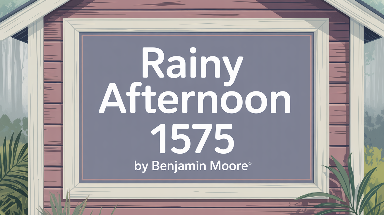
Let’s dive into the world of color and explore a shade that brings a sense of calm sophistication to any room: Benjamin Moore’s Rainy Afternoon 1575.
Imagine a cozy afternoon indoors, the gentle sound of rain outside, and a feeling of peace washing over you. That’s the kind of atmosphere this paint color creates. It wraps your space in tranquility, making it feel both calming and incredibly welcoming.
It’s a shade that truly complements a variety of styles and accents. Whether you’re going for a rustic feel with natural wood or a modern, clean aesthetic with crisp white, Rainy Afternoon adapts beautifully. It’s a fantastic choice whether you’re giving a single room a refresh or updating your whole house.
With the right touch of color, your home can become your sanctuary, no matter what’s happening outside. Rainy Afternoon brings a subtle, serene energy that can make any space feel like your own special retreat.
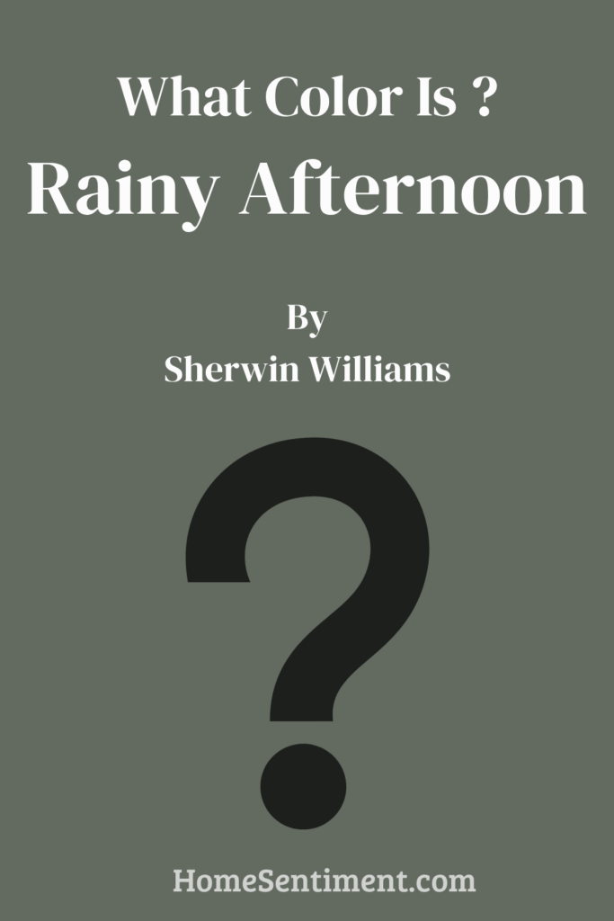
What Color Is Rainy Afternoon 1575?
Rainy Afternoon 1575 is a unique blend of cool green and gray. This muted hue mirrors the gentle mood of a rainy day, bringing a soothing vibe into any space. Its soft undertones make it incredibly versatile, blending seamlessly with various design styles.
In modern interiors, its neutral palette provides a serene backdrop, letting your furniture and artwork really shine. It also pairs wonderfully with contemporary elements, balancing out sleek lines and minimalist decor. For traditional settings, this color can add a fresh update to classic wood furniture and patterned fabrics.
Thinking about materials? Rainy Afternoon complements natural textures beautifully. Try pairing it with light woods like oak or ash to highlight its subtle depth. Linen and cotton fabrics will enhance its calm and comforting vibe. Metals like brushed nickel or matte black can add a modern contrast, while stone surfaces such as slate or marble offer an elegant touch.
Whether you use it on all your walls or just as an accent, Rainy Afternoon has a timeless quality, making spaces feel inviting and composed. It’s an excellent choice for bedrooms, living rooms, or any area where relaxation is your goal.
Is Rainy Afternoon 1575 Warm or Cool?
Rainy Afternoon 1575 is generally considered a soothing shade of gray with subtle green undertones. These undertones often make rooms painted with this color feel calm and cozy. It’s a versatile hue that works well in both modern and traditional homes.
When you use it in living rooms or bedrooms, it provides a serene backdrop that doesn’t take over the room’s decor. It pairs nicely with whites, blacks, and even soft blues or blush tones. Its muted nature means it doesn’t demand attention, allowing other elements in the room, like artwork or decor, to be the star.
This comforting vibe can also enhance natural light, creating a welcoming atmosphere that isn’t too dark or too bright. Its adaptability helps it fit seamlessly into various design styles.
What is the Masstone of Rainy Afternoon 1575?
The masstone of Rainy Afternoon is a soft, inviting shade of gray. This neutral tone is incredibly versatile for interior spaces, allowing it to blend seamlessly with a wide range of colors and styles. This gentle gray can make a room feel cozy and welcoming, encouraging relaxation.
In living rooms, it’s a perfect backdrop for colorful furniture or artwork, letting them stand out. In bedrooms, it creates a restful environment, promoting peace.
The subtlety of this color can even make small rooms appear more open and airy without feeling cold or sterile. It reflects natural and artificial light gently, ensuring a balanced ambiance throughout the day. For home offices, this shade supports focus and concentration, offering a calm environment for work.
Undertones of Rainy Afternoon 1575
Rainy Afternoon 1575 is a versatile color with a complex range of undertones. These undertones subtly influence how the color appears in different lighting and settings.
It possesses a blend of hues including olive, dark turquoise, and purple. These undertones significantly impact how the color is perceived, sometimes making it warmer or cooler.
- Olive and dark green undertones add a touch of earthiness.
- Dark turquoise and dark blue provide a sense of depth.
- Purple and violet undertones introduce a hint of luxury.
- Brown and navy tones bring in a sense of coziness.
- Pale pink and lilac undertones can evoke warmth and comfort.
- Light green and light turquoise elements add freshness.
- Colors like pink, violet, and fuchsia add gentle energy and elegance.
Overall, this mix of undertones helps create a balanced environment. Rainy Afternoon can adapt to various room styles, whether you’re seeking tranquility or a more dynamic atmosphere. This makes it suitable for many kinds of spaces, enhancing the room’s character.
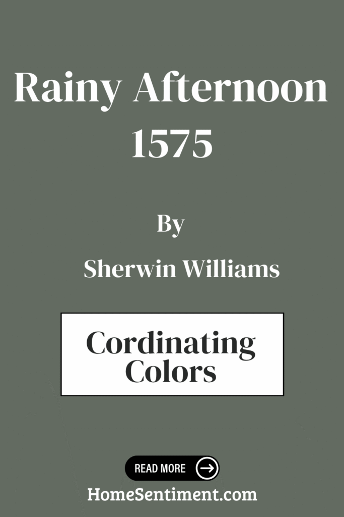
Coordinating Colors of Rainy Afternoon 1575
Choosing coordinating colors is key to creating a harmonious look in your space. These are hues that complement each other, blending seamlessly while enhancing the room’s overall appearance. The goal is balance – they shouldn’t overpower or clash, but work together to create a cohesive environment.
When pairing colors with Rainy Afternoon, these are some excellent choices:
- Horizon Gray (2141-50): Offers a soft yet sophisticated touch with its muted green undertone. It’s perfect for adding understated elegance.
- Dove Wing (OC-18): A classic, creamy off-white that brings calm and cleanliness. It’s an ideal backdrop for other colors.
- Coral Rock (032): With its warm, earthy coral hue, it adds a lively and inviting feel that can brighten any room.
- Moonshine (OC-56): A light gray with subtle hints of blue, offering a cool, refreshing vibe that enhances the tranquility of a space.
Together, these shades create a balanced palette, contributing to a space that feels welcoming and well-coordinated.
How Does Lighting Affect Rainy Afternoon 1575?
Lighting plays a huge role in how any color looks in a room. Both natural and artificial light can really change how Rainy Afternoon 1575 appears.
- Natural Light:
- North-facing rooms: Get cool, steady light. This might make Rainy Afternoon appear more bluish. The green undertone might show more, making it look more muted or subdued.
- South-facing rooms: Get warm, bright light. This can make Rainy Afternoon appear warmer and slightly lighter, enhancing the subtle green hint and making it more inviting.
- East-facing rooms: Get bright morning light and dimmer light later. In the morning, it might look brighter and more vibrant. As the day goes on, it can shift to a cooler tone.
- West-facing rooms: Receive softer morning light but intense warm light in the afternoon. It might look softer in the morning, but warmer and more vivid in the afternoon sun. The green tone might be more pronounced in the evening.
- Artificial Light:
- Incandescent bulbs: Give off warm light, potentially making the color look more yellow or creamy.
- Fluorescent or LED bulbs: Can have cooler tones, possibly bringing out bluer and greener shades.
Always test paint with different lights to see its true effect in your specific space.
What is the LRV of Rainy Afternoon 1575?
Light Reflectance Value (LRV) tells you how much light a color reflects. It’s a percentage from 0% (total black) to 100% (total white). A color’s LRV helps determine how bright or dark it will appear on a wall. Higher LRVs make rooms feel brighter and potentially larger, while lower LRVs absorb more light, making spaces feel cozier and more intimate.
The LRV of Rainy Afternoon 1575 is 15.2. This is quite low, indicating it’s a darker color that reflects only a small amount of light.
This low LRV makes Rainy Afternoon a great choice for creating a cozy and warm atmosphere. It will absorb a lot of light, making a room feel more enclosed and intimate. It can also complement well-lit areas where you want a strong, bold wall without overwhelming brightness. In darker rooms, you might need careful lighting choices to prevent the space from feeling too dim or closed in.
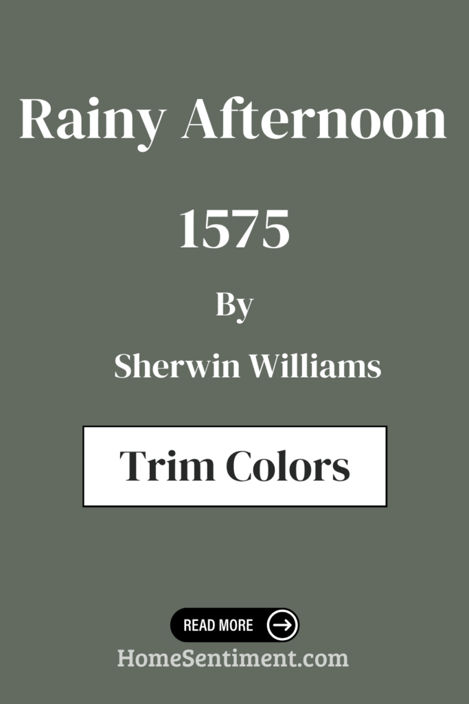
What are the Trim colors of Rainy Afternoon 1575?
Trim colors are the hues used on moldings, baseboards, door frames, and window casings. They frame the walls and can significantly influence the room’s atmosphere by either complementing or contrasting the main wall color. Choosing the right trim color helps define the space and enhance the main color, adding a polished look.
For Rainy Afternoon, which is described here as a soft, muted green (though elsewhere as a gray with green/blue hints), using trim colors like White Dove and Atrium White creates a harmonious and subtle contrast that maintains the room’s soothing feel.
Here are some recommended trim colors:
- White Dove (OC-17): A versatile white with soft, warm undertones. It’s a popular choice because it blends seamlessly with many colors.
- Atrium White (OC-145): A slightly warmer white with a hint of pink. It adds warmth without being overwhelming.
These trim colors provide a crisp outline that boosts the aesthetics of Rainy Afternoon and keeps the overall look balanced and fresh. The trim acts as a visual separator, giving definition and depth. By selecting the right trim color, you can accentuate the tones of Rainy Afternoon, making the space feel more refined and inviting. This ensures everything complements each other, creating an inviting atmosphere without clashing.
Colors Similar to Rainy Afternoon 1575
Similar colors are important in design for creating harmony and balance. They share underlying tones, yet each adds its unique character.
Colors like Caldwell Green, Millstone Gray, Quarry Rock, and Kitty Gray work well together because they share common threads with Rainy Afternoon, ensuring they work seamlessly. This harmonious blend is key to creating spaces that are pleasing and soothing.
Here are some colors considered similar:
- Caldwell Green (HC-124): Exudes an elegant, earthy freshness, feeling both grounded and revitalizing. Its subtle hints of nature are perfect for creating a serene environment.
- Millstone Gray (1581): Offers a soft, muted warmth that gently complements other colors. It’s versatile and adds depth without overpowering.
- Quarry Rock (1568): Has a rich, deep quality that makes spaces feel intimate and cozy. It echoes natural earth tones, providing a solid presence.
- Kitty Gray (1589): Brings a lighter touch, offering a soft, airy feel that brightens and balances deeper shades.
Colors that Go With Rainy Afternoon 1575
Colors that complement Rainy Afternoon play a key role in creating a peaceful and cohesive space. When paired correctly, they enhance the soothing quality of Rainy Afternoon.
Here are some colors that go well with Rainy Afternoon:
- Raindance (1572): A soft and soothing blue that gives Rainy Afternoon a fresh, airy feel.
- Rushing River (1574): A muted green with warm undertones that balances the coolness of Rainy Afternoon, adding warmth and depth.
- Imperial Gray (1571): A rich and sophisticated gray that enhances the elegance of Rainy Afternoon, creating a refined look.
- Castle Walls (1573): A deep and bold charcoal that offsets the calming nature of Rainy Afternoon with drama and contrast. This is perfect for a statement wall or accent pieces.
- Night Mist (1569): Adds a touch of mystery and intrigue with its deep, misty hue. It plays well with Rainy Afternoon’s soothing quality, resulting in an inviting space that feels comfortable and familiar.
- Gray Wisp (1570): A light and muted green that offers balance and an organic touch, promoting a relaxed and natural atmosphere.
These combinations ensure that Rainy Afternoon remains versatile, easily transitioning from restful bedrooms to dynamic living areas. Each pairing helps to create an environment that feels balanced and harmonious.
How to Use Rainy Afternoon 1575 In Your Home
Rainy Afternoon 1575 is a soothing shade that draws inspiration from serene, muted landscapes after a gentle rain. It features a soft blend of gray and blue, evoking calmness and relaxation. When used in your home, it can create a peaceful atmosphere perfect for unwinding.
Here’s how you might use it in different rooms:
- Living Rooms: It works well with neutral furniture and adds subtle depth without overwhelming the space. Pair it with light-colored curtains and natural wood accents to enhance its gentle effect.
- Bedrooms: Provides a restful backdrop that encourages relaxation and sleep. White or pastel bedding complements this color beautifully.
- Kitchens: Benefit from its fresh and clean look. It pairs beautifully with white cabinets or stainless-steel appliances.
- Bathrooms: Suits bathrooms perfectly, giving them a spa-like feel.
Overall, Rainy Afternoon 1575 is an excellent choice for creating a calm and inviting home environment.
Rainy Afternoon 1575 vs Kitty Gray 1589
Let’s compare Rainy Afternoon 1575 with Kitty Gray 1589.
- Rainy Afternoon 1575: This is a medium gray with cool undertones. It creates a calm, soothing environment, much like a peaceful day with overcast skies. It’s versatile and fits well in both modern and traditional spaces. It adds a subtle yet elegant touch.
- Kitty Gray 1589: This color is lighter. It’s a soft, warm gray that feels more inviting and cozy. The warmth makes it suitable for spaces needing a gentle touch, like bedrooms or nurseries. It brightens rooms nicely without overwhelming them.
Both are grays but offer different atmospheres. Rainy Afternoon feels moodier and more sophisticated, while Kitty Gray is warmer and more welcoming. The choice depends on the mood you want to set.
Rainy Afternoon 1575 vs Caldwell Green HC-124
Now, how does Rainy Afternoon 1575 stack up against Caldwell Green HC-124?
- Rainy Afternoon 1575: A soothing, muted gray with hints of green and blue. It brings a sense of peace to any room, reminiscent of a calm, overcast day. It’s versatile for both modern and traditional settings and pairs well with whites, soft blues, or darker grays.
- Caldwell Green HC-124: This is a deeper, richer green with a hint of teal. It feels more vibrant and has a touch of drama, making it a bolder choice. It works beautifully in spaces where you want to make a statement, like an accent wall. Caldwell Green pairs nicely with warm woods, creamy whites, and metallic accents.
Both offer unique atmospheres: Rainy Afternoon is calming and gentle, while Caldwell Green is dynamic and vibrant.
Rainy Afternoon 1575 vs Millstone Gray 1581
Let’s look at Rainy Afternoon 1575 compared to Millstone Gray 1581.
- Rainy Afternoon 1575: A muted, deep gray with undertones of green. It evokes a calm and cozy feeling, reminiscent of overcast skies. Its depth works well in creating intimate spaces, adding sophistication without being overpowering.
- Millstone Gray 1581: This is a lighter, soft gray with a hint of warmth. It carries a subtle, welcoming tone, making rooms feel open and airy. This shade adapts well, adding brightness without being stark.
These two colors create contrasting moods: Rainy Afternoon is intimate and subdued, while Millstone Gray is inviting and light-filled. Both can bring harmony, depending on the desired atmosphere.
Rainy Afternoon 1575 vs Quarry Rock 1568
Finally, comparing Rainy Afternoon 1575 with Quarry Rock 1568.
- Rainy Afternoon 1575: A soft, muted gray with a hint of green. It captures the calmness of a drizzly day. It’s versatile, works well in various spaces, and adds subtle elegance without overwhelming. It creates a soothing atmosphere, ideal for bedrooms or cozy living rooms.
- Quarry Rock 1568: This color is a darker, more grounded gray with a deeper, richer tone. This shade feels more dramatic and bold, perfect for accent walls or spaces needing intensity. It can add depth and character without feeling too heavy.
Both are gray tones but serve different purposes. Rainy Afternoon lends a gentle, relaxed feel, while Quarry Rock adds boldness and depth. Choosing between them depends on whether you want a calm, understated backdrop or a more pronounced, striking presence.
Conclusion
Rainy Afternoon 1575 is a shade that evokes warmth and comfort. It feels like wrapping yourself in a soft, familiar blanket, adding coziness to any space it touches. It has a gentle strength, fitting perfectly in both modern and traditional settings, bringing a unique charm.
This shade complements various decor styles, offering flexibility in design and an understated elegance. It beautifully balances being noticeable yet subtle, never overwhelming a room. It’s both sophisticated and welcoming, making it a perfect choice for any room in the home.
Whether it’s used in a living room or bedroom, it enhances the space, fostering an environment of calmness and relaxation.
It’s a reliable and appealing choice. It’s not just about painting walls; it’s about painting an atmosphere of comfort and peace that’s truly special.