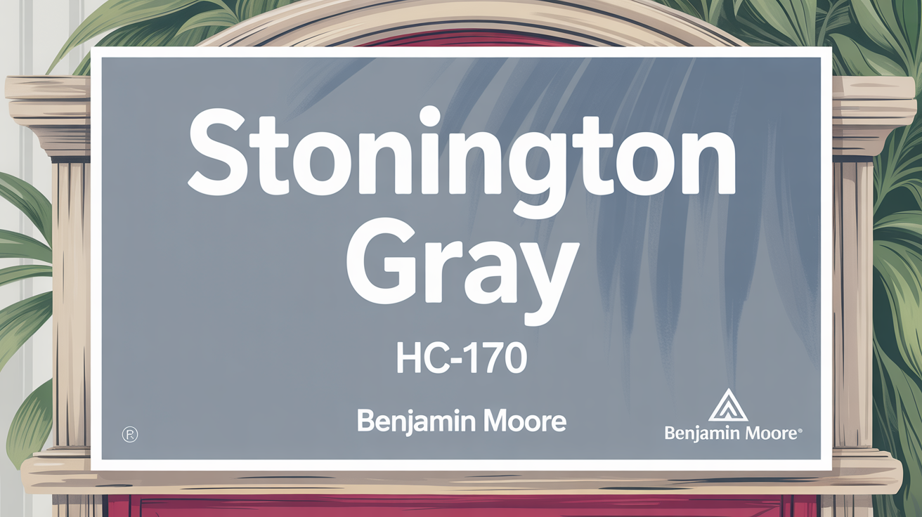
Alright, let’s talk about a paint color that’s a real favorite for good reason: Benjamin Moore’s Stonington Gray HC-170. It’s a versatile shade that pops up everywhere, and for good reason.
Classic Beauty in a Cool, Calm Shade
This color is a top pick when you’re looking for something that feels both classic and totally current. It’s a soft, neutral gray that has this lovely quality of feeling warm without losing its clean edge. You’ll see it used in all sorts of places and in different lighting, and it just works.
It’s really popular because it pairs so well with lots of other colors. Whether your furniture is bold and bright or soft and muted, Stonington Gray just blends right in, adding a touch of sophistication. It adapts easily to different styles, making it great for living rooms, bedrooms, or even kitchens.
Lighting makes a difference, though! It can look a little different throughout the day, giving your room a dynamic feel. In bright sunlight, you’ll notice it looks lighter and more cheerful, sometimes showing a bit of blue. When the light is dimmer or artificial, it feels cozier and more muted, creating a serene backdrop.
Think of it not just as a neutral, but as a foundation color that can tie your whole home’s look together. It’s easy to see why people love its understated elegance. If you’re thinking about repainting, Stonington Gray is definitely worth considering.
What Color Is Stonington Gray HC-170 by Benjamin Moore?
So, exactly what kind of gray is Stonington Gray HC-170? It’s a timeless neutral gray that hits just the right balance. It’s not too warm and not too cool, fitting harmoniously in many settings. This versatility is a big part of its appeal.
It has a subtle undertone that gives it depth, so it never feels flat or dull.
You’ll find Stonington Gray right at home in modern, minimalist, and even traditional design styles. It brings a calm and sophisticated vibe, making it perfect for spaces where you want a peaceful atmosphere, like living rooms, bedrooms, and kitchens. It fits coastal styles, reflecting the softness of sea breezes, but also looks elegant in city apartments.
Pairing it with certain materials can really bring out its best features. Try it with white marble or quartz to enhance its refined nature. Wood textures, from light oak to dark walnut, contrast beautifully, adding warmth and character. Metallic accents like brushed nickel or aged brass can highlight its understated elegance.
Using soft textiles like linen or cotton in neutral or pastel shades layers nicely, making the space feel cozy and inviting. Stonington Gray is a versatile backdrop, letting your furniture and decor stand out without competing for attention.
Is Stonington Gray HC-170 by Benjamin Moore Warm or Cool color?
Stonington Gray HC-170 is often described as a subtle gray with blue undertones. These undertones help give rooms a calm and welcoming feel.
It creates a neutral backdrop that lets other design elements, like your furniture and artwork, take center stage. While it has blue undertones, it’s often characterized as a balanced gray, not leaning too heavily warm or cool.
What is the Masstone of the Stonington Gray HC-170 by Benjamin Moore?
The masstone, which is the main color you see, of Stonington Gray HC-170 is a soft light gray. It’s represented by the color code #D5D5D5. This light tone provides a neutral backdrop that feels both fresh and modern in your home.
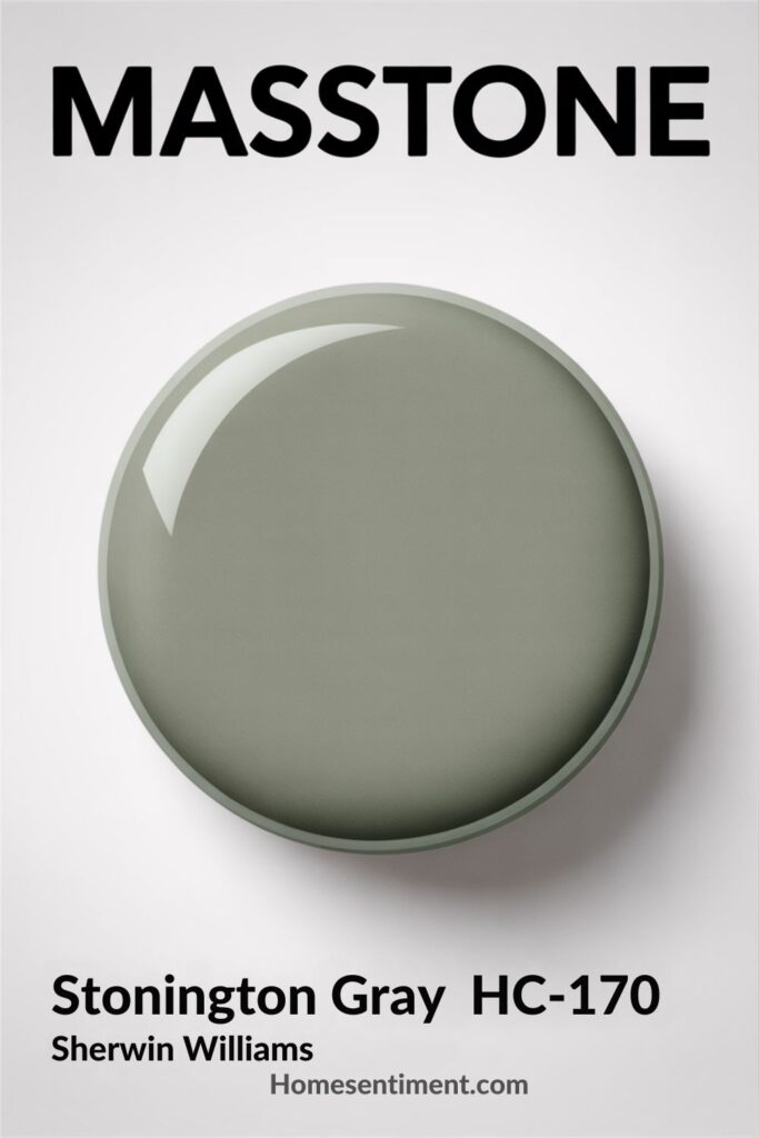
Because it’s a light shade, it’s great in various spaces. It helps reflect natural light, creating a sense of openness. Interestingly, this shade can appear cooler in areas with less light and warmer when hit by sunshine. This quality helps you create different environments, from cozy to airy, depending on how it’s used. It’s highly adaptable, pairing beautifully with many other colors.
Undertones of Stonington Gray HC-170 by Benjamin Moore
Stonington Gray is known for its versatility, partly thanks to its subtle undertones. These undertones can subtly shift how the color looks based on the lighting and surrounding colors. The source notes it contains a mix of undertones:
- pale yellow
- light blue
- light purple
- mint
- pale pink
- lilac
- and a touch of neutral gray
These different undertones influence how we see the color. For example, under warm light, the pale yellow might become more noticeable, giving it a warmer feel. In cooler light, the blue or lilac undertones can stand out, making it seem cooler and calmer. The neutral gray undertone is what keeps it balanced, helping it fit seamlessly into different color schemes.
These undertones interact with natural and artificial light throughout the day, creating subtle shifts. Pale pink and mint undertones can make it feel fresh and inviting in well-lit rooms. In shaded areas, the blue and purple hints might provide a more muted, serene backdrop. This makes it a great choice for creating a neutral yet dynamic atmosphere in main living areas or bedrooms.
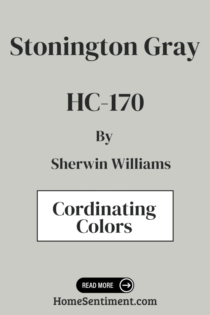
Coordinating Colors of Stonington Gray HC-170 by Benjamin Moore
Choosing colors that coordinate well is key to creating a pleasing space. Coordinating colors can either enhance Stonington Gray’s subtle tones or provide interesting contrast. Stonington Gray is a versatile gray with a subtle warmth, making it an excellent base.
Here are some coordinating colors that work beautifully with Stonington Gray HC-170:
- HC-164 Puritan Gray: A slightly deeper gray offering a rich, balanced look.
- AF-40 Lychee: Adds a soft, muted warmth for a gentle, welcoming feel.
- OC-149 Decorator’s White: Provides a crisp, clean contrast, perfect for trim or accents.
- OC-65 Chantilly Lace: A classic, crisp white that offers an airy, pure quality, letting Stonington Gray truly stand out.
Using these together helps create a harmonious and inviting environment.
How Does Lighting Affect Stonington Gray HC-170 by Benjamin Moore?
Lighting has a huge impact on how paint colors appear. Natural light changes throughout the day, and artificial light sources (like incandescent or LED bulbs) also have their own effects. Stonington Gray is particularly interesting because of how it responds to light.
In natural light, its tone can shift subtly. Artificial light’s effect depends on the bulb. Warmer incandescent bulbs might make Stonington Gray appear a bit warmer. Cooler LED bulbs, on the other hand, could emphasize its cooler, more steely undertones.
The direction of natural light matters too:
- North-facing rooms: The light is indirect and cooler here, so Stonington Gray might look more blue or stark. Adding warm lighting or accents can help balance this.
- South-facing rooms: Lots of warm, direct sunlight softens and lightens the color. This brings out warmer undertones, making it feel more balanced and inviting.
- East-facing rooms: Morning light gives it a fresh, crisp look. As the day goes on, it might take on a slightly cooler tone.
- West-facing rooms: They catch the warm, golden light of the setting sun. This makes Stonington Gray appear warmer and cozier in the late afternoon and evening.
So, while it’s versatile, Stonington Gray will look distinct in each room based on its orientation and lighting.
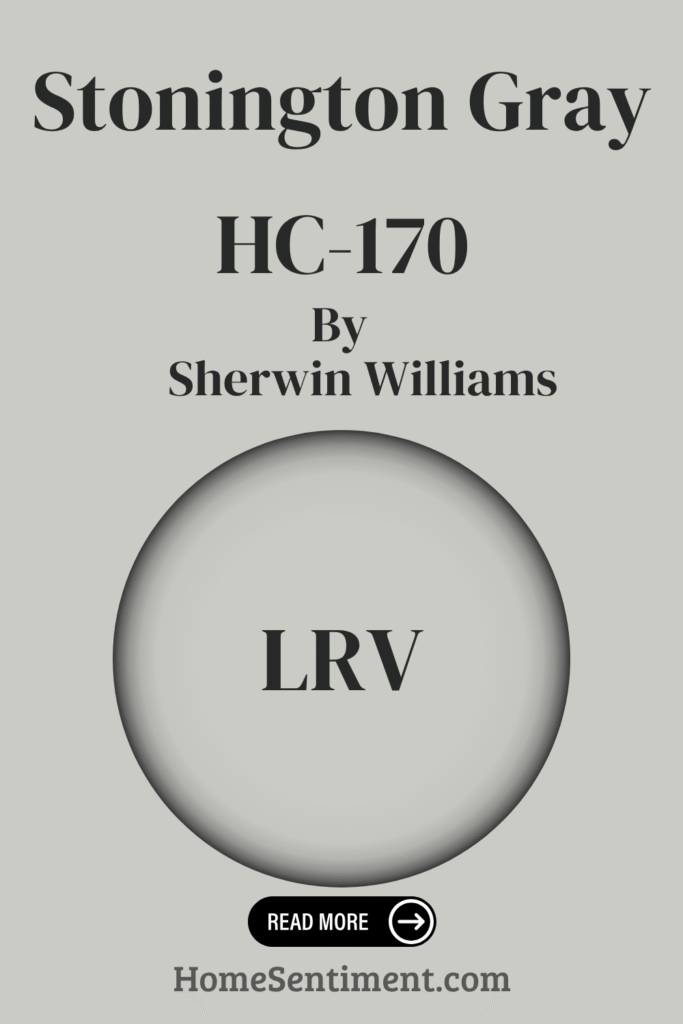
What is the LRV of Stonington Gray HC-170 by Benjamin Moore?
Light Reflectance Value (LRV) is a useful number when picking paint. It measures how much light a color reflects, from 0 (absorbs all light, totally black) to 100 (reflects all light, totally white). Lighter colors generally make rooms feel bigger and brighter by bouncing light around. Darker colors absorb light, creating a cozier feel.
Stonington Gray HC-170 has an LRV of 59.36. This puts it slightly on the lighter side of the scale. What this means is that it reflects a good amount of light, helping spaces feel more open and airy without being overly bright.
It’s a versatile shade partly because of this LRV. It works well in both well-lit and dimmer rooms, holding its gray tone without drastically changing color under different conditions.
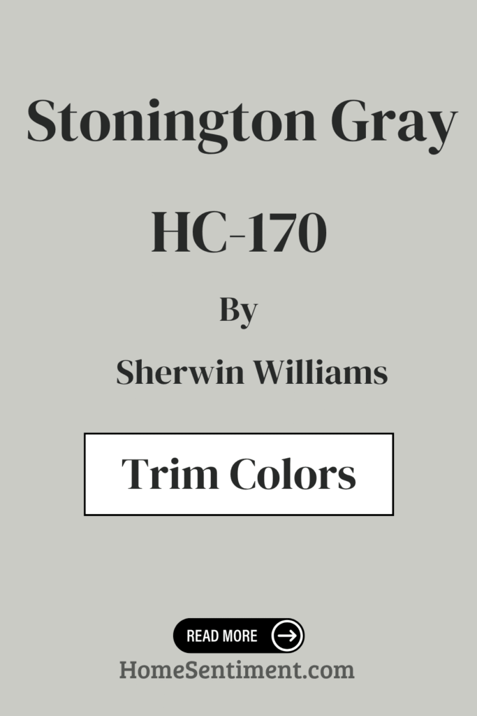
What are the Trim colors of Stonington Gray HC-170 by Benjamin Moore?
Trim colors are used for details like baseboards, window frames, and molding, and they really help highlight the main wall color. With Stonington Gray, choosing the right trim is key to emphasizing its elegance.
Using a contrasting or complementary trim can define architectural features and create crisp, clean lines for a polished look.
Here are some recommended trim colors for Stonington Gray HC-170:
- OC-68 Distant Gray: A subtle contrast. It’s a soft white with a hint of gray, adding warmth without overpowering the main color.
- OC-152 Super White: A sharp, clean option. This bright white enhances the clarity of Stonington Gray, providing a crisp, modern finish.
These trim colors frame Stonington Gray beautifully, letting the wall color be the star while adding their own touch of style.
Colors Similar to Stonington Gray HC-170 by Benjamin Moore
If you love the vibe of Stonington Gray but want to explore slightly different options that still work harmoniously, these similar colors are great. Using them can create unity and smooth transitions between spaces without feeling monotonous. They work well together because they share similar underlying tones.
Check out these colors that are similar to Stonington Gray:
- 1465 Nimbus: A soft gray with warm undertones, making spaces feel welcoming and elegant.
- 1577 Arctic Gray: Leans cooler, with a fresh, airy touch that keeps things clean.
- 1472 Silver Chain: A medium gray with subtle depth that pairs well with light and dark accents.
- 1480 Sleigh Bells: A muted gray that offers subtle sophistication.
Combining these with Stonington Gray helps achieve a seamless and stylish blend.
Colors that Go With Stonington Gray HC-170 by Benjamin Moore
Pairing Stonington Gray with the right accent colors brings balance and harmony to your space. It’s a versatile neutral that plays nicely with various shades.
Here are some colors that complement Stonington Gray HC-170:
- 1489 Devonshire Green: A soft, muted green that creates a calm and inviting atmosphere.
- 1559 Arctic Shadows: A deep gray with blue undertones that adds depth and sophistication.
- 2137-50 Sea Haze: A gentle, misty gray that blends seamlessly for a peaceful backdrop.
- 1483 Cos Cob Stonewall: A cozy olive-toned gray adding earthiness and warmth.
- 2140-30 Dark Olive: A rich, bold green for a striking contrast, great for focal points.
- 2112-70 American White: A soft off-white providing a crisp, clean look that brightens the space.
These colors, used alongside Stonington Gray, create cohesive, stylish, and comfortable environments.
How to Use Stonington Gray HC-170 by Benjamin Moore In Your Home?
You can use Stonington Gray HC-170 just about anywhere in your home! It strikes that great balance between warm and cool.
Here are some ideas for using it:
- Living Rooms: It’s a fantastic neutral backdrop, letting your furniture and decor shine.
- Bedrooms: It creates a calming atmosphere, just right for relaxing.
- Kitchens: It gives a clean, modern look.
You can pair it with classic white trim for a crisp contrast, or go bolder with darker accents. It fits both traditional and contemporary styles easily. It also pairs well with colors like blues or soft pinks if you want a bit more color. It’s truly a dependable and elegant choice for interiors.
Stonington Gray HC-170 by Benjamin Moore vs Silver Chain 1472 by Benjamin Moore
Let’s look at Stonington Gray compared to another Benjamin Moore color, Silver Chain 1472. Stonington Gray is a soft, versatile gray with a neutral undertone that adapts well to lighting. It feels comfortable and classic, fitting both traditional and modern spaces.
Silver Chain 1472, however, leans a bit cooler, with a hint of blue. This gives it a more refreshing and crisp feel compared to Stonington Gray. Silver Chain can make a room feel more spacious, making it good for smaller areas that need extra light. Stonington Gray offers more of a neutral backdrop, while Silver Chain provides that cool, airy vibe.
Stonington Gray HC-170 by Benjamin Moore vs Arctic Gray 1577 by Benjamin Moore
Comparing Stonington Gray HC-170 to Arctic Gray 1577, Stonington Gray is a timeless, soft gray with a hint of blue, balancing well for almost any room or style. Its subtle depth is calming and pairs well with bold or neutral accents.
Arctic Gray 1577 also has cool undertones, but it leans more blue, making it crisper and lighter. It’s great for brightening spaces and giving them an airy feel. Arctic Gray matches beautifully with whites and complementary blues, enhancing its fresh look.
Stonington Gray is better if you want a balanced undertone that can feel warm in certain light, fitting cozy, serene environments. Arctic Gray excels at creating light, refreshing, and open spaces. Both are elegant and versatile, but they create different moods.
Stonington Gray HC-170 by Benjamin Moore vs Sleigh Bells 1480 by Benjamin Moore
Comparing Stonington Gray HC-170 and Sleigh Bells 1480, Stonington Gray is a cool, neutral gray with those familiar blue undertones, making it very versatile. It works well in different lighting and provides a subdued backdrop.
Sleigh Bells 1480, on the other hand, is a softer, warmer gray, featuring faint beige undertones. This gives it a cozy, inviting atmosphere. It complements rooms with warm lighting, which enhances its gentle character.
Your choice depends on the feel you want. Stonington Gray suits modern, crisp designs and cooler palettes. Sleigh Bells fits traditional or cozy settings with warmth. Both are subtle, but they offer different vibes.
Stonington Gray HC-170 by Benjamin Moore vs Nimbus 1465 by Benjamin Moore
Let’s look at Stonington Gray HC-170 versus Nimbus 1465. Stonington Gray is a classic gray with a subtle, cool undertone, giving that crisp, clean look it’s known for. It’s a popular neutral with subtle sophistication, fitting both modern and traditional spaces. It often pairs really well with bright white trim for a fresh, airy feel.
Nimbus 1465 is also a gray, but it tends to be a bit warmer than Stonington Gray. It offers a soft, soothing appearance that creates a welcoming atmosphere. Nimbus often complements natural materials like wood and stone, giving a balanced, harmonious vibe.
Both colors are versatile backdrops. Stonington Gray feels slightly more formal due to its coolness, while Nimbus has an inviting warmth. The choice comes down to whether you prefer a cooler or warmer gray for your space’s mood.
Conclusion
If you appreciate a neutral color palette, you’ll find Stonington Gray incredibly adaptable. It hits a perfect balance, not leaning too warm or too cool, making it suitable for so many rooms.
Based on experience, it performs beautifully in both traditional and modern settings. It creates a crisp backdrop that truly lets your furniture and decorative items stand out. Plus, it just complements other colors wonderfully, whether they’re bold or subtle.
Pairing it with whites or deeper grays creates a clean, cohesive look. It also harmonizes beautifully with blues and greens.
It really helps create a calming and soothing atmosphere, making spaces feel open and airy. It’s a solid choice for creating a serene environment without being overwhelming. Whether it’s for your living room, bedroom, or office, Stonington Gray is a reliable choice that suits varied styles and tastes. It enhances the overall feel of a space while keeping a refined simplicity.