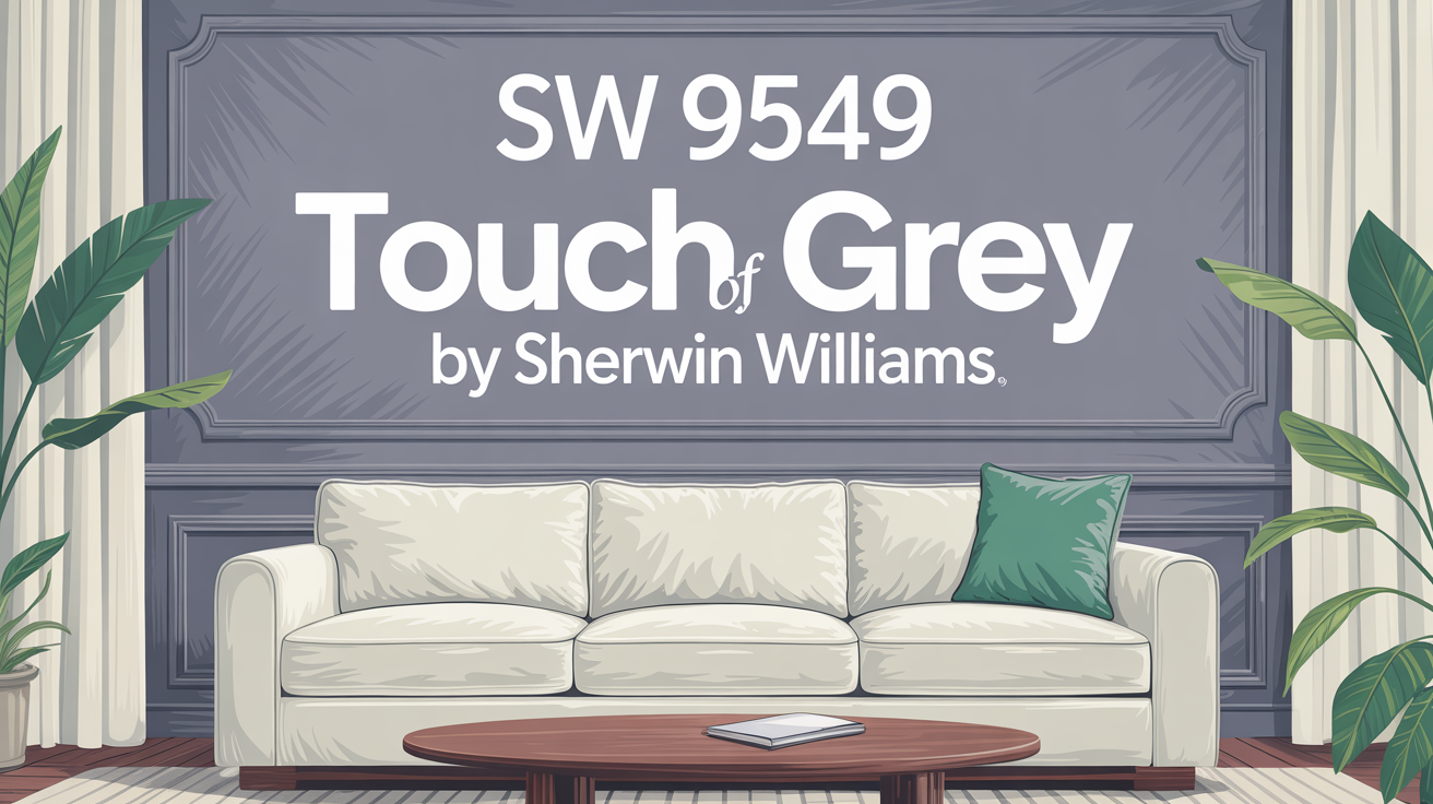
Let’s talk about finding that perfect shade to really set the mood in your space. Finding the right paint color can make a huge difference in how your home feels. If you’re on the hunt for a versatile, sophisticated grey, you might want to consider SW 9549 Touch of Grey by Sherwin Williams.
This unique grey color does more than just cover your walls. It brings a sense of calm and clarity, adding sophistication to any environment.
The Quiet Sophistication of Grey
Touch of Grey has a wonderfully balanced tone. It works seamlessly with many different decorating styles, whether you love a modern, minimalist look or something much more traditional. It’s especially effective in spaces where you want to encourage focus and tranquility, like a study or your bedroom.
It also complements a wide variety of decor elements and materials. Think about how it looks next to natural wood, metal accents like stainless steel or copper, or even simple textile fabrics like linen or cotton.
If you’re thinking about changing up the vibe in your home or just one room, Touch of Grey is an excellent candidate. It’s subtle enough that it won’t overpower your space, but it’s distinct enough to make a statement. Imagine how this shade could really enhance your living space, giving it a fresh yet timeless appeal you’ll appreciate daily.
What Color Is Touch of Grey SW 9549 by Sherwin Williams?
Touch of Grey SW 9549 is a versatile and subtle grey hue. It offers a gentle depth to any space it’s used in. Its lightness creates a soft backdrop, perfect for setting a serene and inviting atmosphere.
This particular shade really stands out because it can blend easily with various decor styles. All while keeping a clean, understated elegance.
Touch of Grey is exceptionally well-suited for modern and minimalist interior designs. Its clean and unobtrusive nature makes it an excellent foundation. This allows any more vibrant elements in the room to really pop. Plus, it’s a great fit for Scandinavian-inspired interiors. Those styles often favor light, muted tones to promote a feeling of calm and simplicity.
When you pair it with materials and textures, it complements natural wood finishes beautifully. This enhances the organic feel of a space. It also looks great with metallic accents like stainless steel or copper, which can add a touch of sophistication and modernity.
Textiles such as linen or cotton with simple patterns also pair well with this color. They add to the room’s overall soft and relaxed vibe. By choosing Touch of Grey for your walls, you can create a graceful and cohesive space. A space that feels both contemporary and timeless.
Is Touch of Grey SW 9549 by Sherwin Williams Warm or Cool color?
Sherwin Williams’ Touch of Grey SW 9549 is a versatile paint color. It balances gray with hints of blue and green. This gives it that soft and soothing appearance.
Its lightness makes it an ideal choice for enhancing the feel of space in smaller rooms. It also works well in areas that don’t get a lot of natural light. This color’s subtlety means it can blend seamlessly with various decor styles. From modern minimalism to cozy traditional looks.
It can effectively act as a neutral backdrop. So, it pairs wonderfully with a wide range of furniture and accent colors. This gives you lots of flexibility in your decorating choices. It’s particularly effective in bedrooms and living spaces. Places where you really want a calm, peaceful atmosphere.
In homes with an open floor plan, Touch of Grey can help connect different areas. It does this without creating any harsh or abrupt transitions. Its durability and ease of application also make it a very practical choice, especially for busy households. Overall, Touch of Grey offers a timeless appeal. It can help you create a home environment that feels more inviting and comfortable.
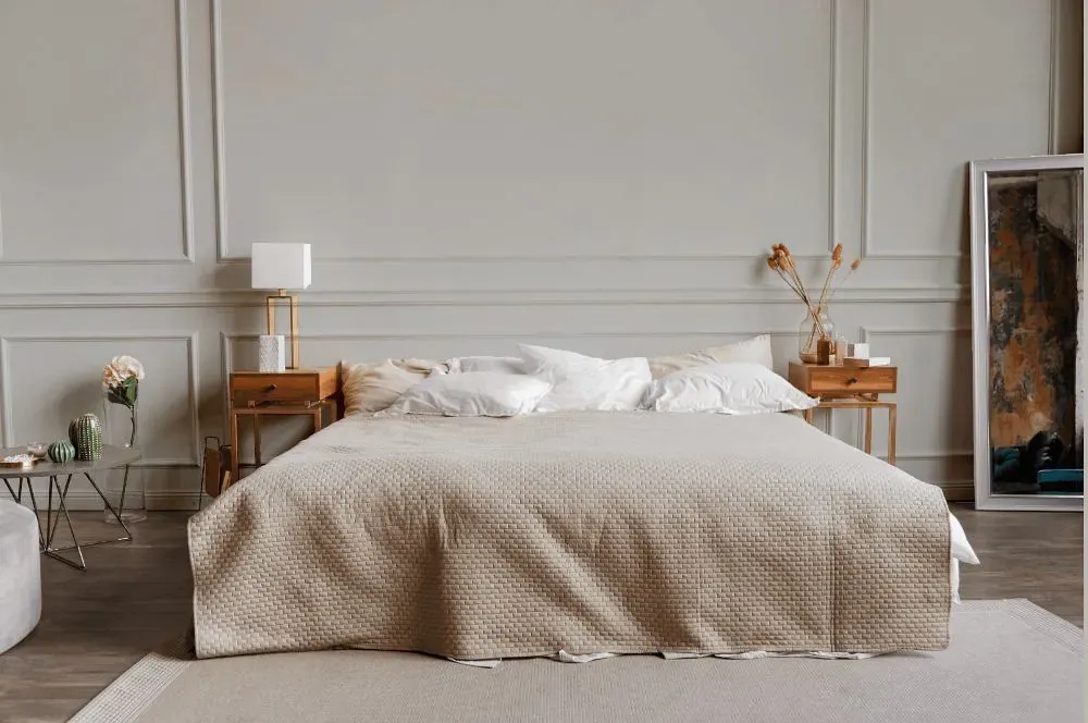
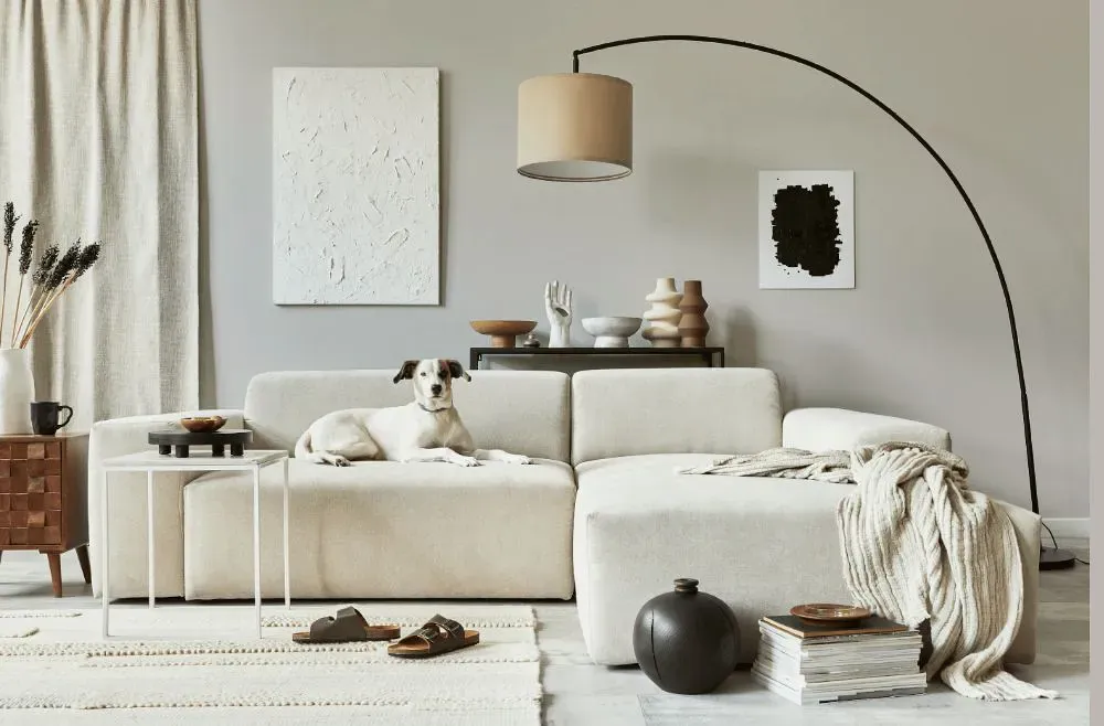
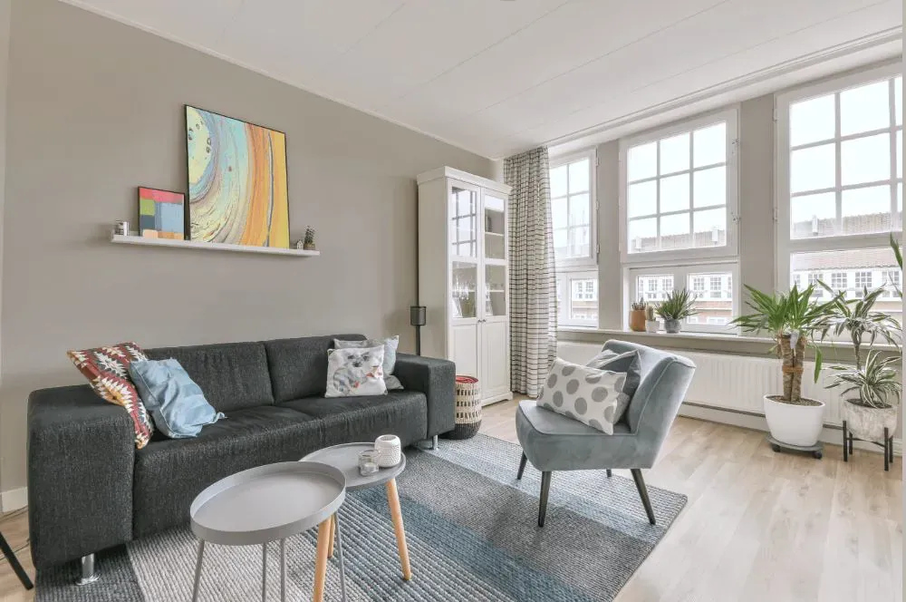
Touch of Grey for bedroom
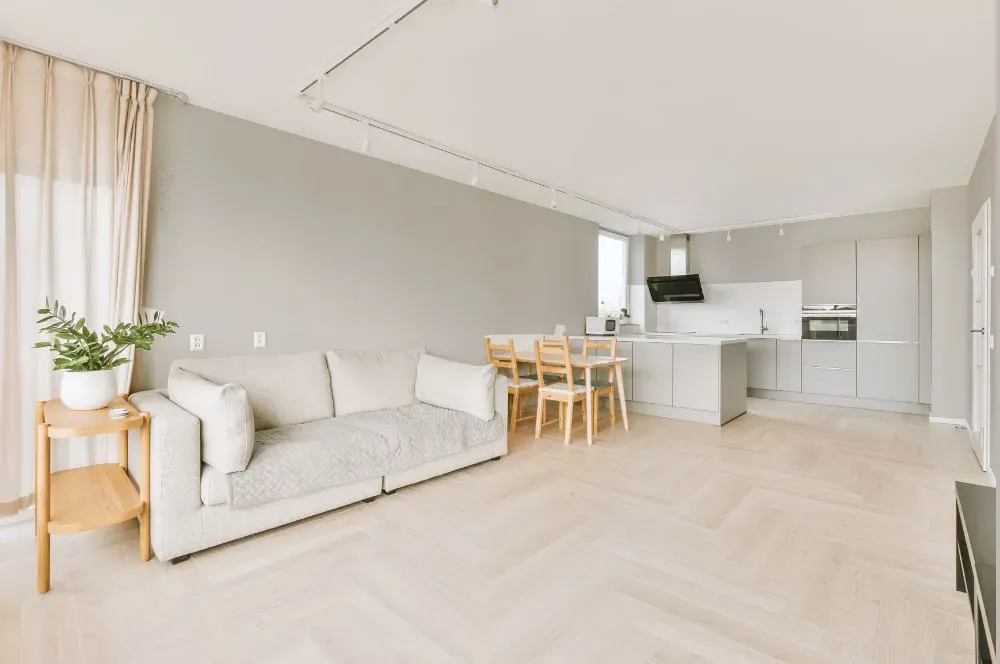
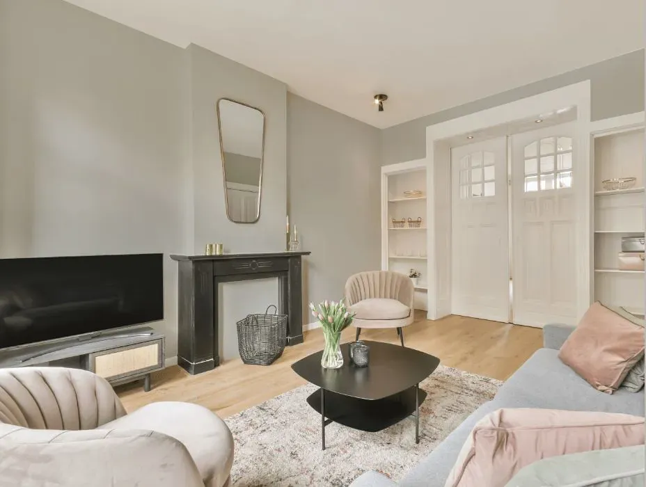
Touch of Grey for living room

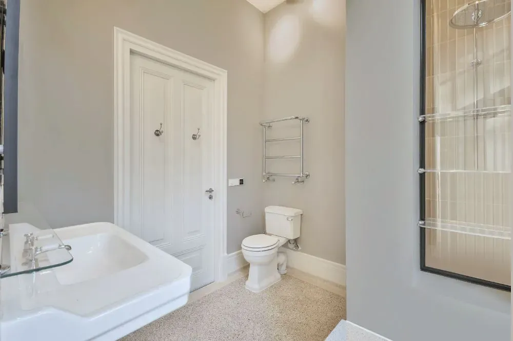
Touch of Grey for bathroom
What is the Masstone of the Touch of Grey SW 9549 by Sherwin Williams?
Touch of Grey SW 9549 is considered a light gray color. Its masstone, or true color, is identified as #D5D5D5. This specific shade of gray is soft and neutral. That makes it incredibly versatile for use throughout your home.
Its lightness means it reflects more light. This can really help make rooms appear larger and feel more open.
Because it’s such a neutral tone, Touch of Grey pairs well with a wide range of other colors. You can use it with bright and bold hues or softer pastels. This makes it an excellent choice for walls. It can easily complement various decor styles and color schemes.
Furthermore, this shade of gray provides a calm, soothing background. It’s not overwhelming at all. This makes it perfect for bedrooms and living areas where comfort is key. It’s subtle enough to be used as a base color. Then, you can easily accent it with different textures and colors in your furniture and decorations. Touch of Grey gives you a clean, modern look. And it does it without feeling too stark or cold.
Undertones of Touch of Grey SW 9549 by Sherwin Williams
Sherwin Williams’ Touch of Grey SW 9549 is a complex paint color. It has a mix of subtle undertones. These undertones significantly influence how the color appears in different lighting and settings.
You’ll find hints of pale yellow, light purple, light blue, pale pink, mint, lilac, and grey within this color. Each of these adds a unique dimension when the paint is applied to interior walls.
Understanding undertones is really crucial when you’re choosing the right paint color. The undertones in a paint can either enhance or soften the overall look of a room. It depends on the lighting and the surrounding colors. For example, those pale yellow undertones can brighten a space and make it feel warm and inviting. While light blue might make it feel cooler and more relaxed.
In the case of Touch of Grey SW 9549, having such a variety of undertones means the color can look different depending on its environment. On interior walls, these undertones interact with light sources and room furnishings. This creates subtle shifts in how the color looks.
In natural light, the grey might seem more dominant. It gives you that soft, neutral backdrop that works so well with various decor styles. Under artificial light, you might notice the pinks or purples becoming more evident. This can provide a gentle warmth. This adaptability makes Touch of Grey SW 9549 a fantastic choice for many rooms, from living spaces to bedrooms. It allows the walls to subtly complement different textures and colors in your furnishings and decor. This helps create a cohesive look that feels intentional and harmonious.
How Does Lighting Affect Touch of Grey SW 9549 by Sherwin Williams?
Lighting plays a huge role in how we see colors. The type of light and its intensity can significantly alter how a color appears. Take Touch of Grey SW 9549 by Sherwin Williams, for example. The way it presents itself can vary quite a bit under different lighting conditions.
Under artificial light, like the light emitted by bulbs, Touch of Grey SW 9549 might look slightly warmer. This depends on the type of bulb you use. Incandescent bulbs, which emit a warmer, yellowish light, can soften the color. This might make it seem more inviting and cozy. LED or fluorescent lighting, which can be cooler, might make the color appear a bit sharper and more neutral.
Natural light, however, has a different effect. Natural light changes throughout the day. Also, whether your room faces north, south, east, or west affects how you perceive Touch of Grey. In north-facing rooms, natural light is typically cooler and more consistent. This tends to give Touch of Grey a more true-to-swatch appearance; it looks more genuinely grey. In south-facing rooms, where the light is warmer and more abundant, this color could look lighter. It might even pick up some subtle warm undertones.
East-facing rooms get bright morning light. This makes Touch of Grey look brighter and more vibrant in the mornings. But it will turn softer and more shadowy in the afternoon and evening. Conversely, in west-facing rooms, the color might seem muted in the morning. But it can gain warmth and depth in the late afternoon and evening when the light is warmest.
Understanding how lighting impacts colors like Touch of Grey SW 9549 is so helpful. It can guide your decisions about paint colors based on the orientation and light sources in any room.
What is the LRV of Touch of Grey SW 9549 by Sherwin Williams?
LRV stands for Light Reflectance Value. It measures the percentage of light a paint color reflects back into a room. The scale goes from 0 to 100. 0 means the color absorbs all light, and 100 means it reflects all light. Knowing the LRV helps you select the right paint color for your space because it affects how light or dark a color appears on the walls.
A higher LRV means the color will appear lighter. This can make a small room feel more spacious and brighter. On the other hand, a lower LRV can make a color look darker. This can be used to make a large room feel cozier.
Touch of Grey SW 9549 by Sherwin Williams has an LRV of 62.35. This puts it on the lighter side of the scale. It means it will reflect a fair amount of light. This can certainly help in brightening up a space.
This moderate LRV makes it a versatile choice for various rooms. It works well whether the room has low or abundant natural light. In a well-lit room, this color will look vibrant and airy. In a room with less natural light, it will still help the space feel open. Much lighter than a color with a lower LRV would.
What are the Trim colors of Touch of Grey SW 9549 by Sherwin Williams?
Trim colors are the contrasting or complementing shades you use on things like baseboards, moldings, door frames, and window sills. They’re incredibly important for creating a cohesive look in a room. And they really help highlight those architectural details.
For a nuanced gray like Touch of Grey SW 9549, choosing the right trim colors can really enhance the overall aesthetic. It can subtly define the space. SW 7014 – Eider White and SW 7531 – Canvas Tan are excellent choices for this purpose. They provide a soft contrast that highlights the distinctive features of Touch of Grey. They do this without overwhelming it.
Eider White SW 7014 is a soft and sophisticated off-white. It offers a gentle contrast to colors like Touch of Grey. Its subtle gray undertones make it a perfect companion. It creates a refined boundary that softly transitions from the wall color to the trim. This makes it ideal for a space aiming for a light and airy feel.
On the other hand, Canvas Tan SW 7531 is a warmer, mid-toned neutral. It brings warmth into rooms. Its earthy base helps enhance a cozy atmosphere. It offers a smooth transition that complements the cooler tones you might see in Touch of Grey. This is perfect for creating a welcoming and balanced environment.
Colors Similar to Touch of Grey SW 9549 by Sherwin Williams
Using colors that are similar to Touch of Grey SW 9549 is key for creating a cohesive and harmonious interior design. When you use shades like On the Rocks SW 7671 or Big Chill SW 7648, their slight variations in hue help gently differentiate spaces. All while keeping a unified look.
These subtleties can help define different zones in an open floor plan. Or they can make smaller spaces feel larger. Colors such as Zircon SW 7667 and Crushed Ice SW 7647, while distinct, share a common undertone. This provides a smooth visual flow from room to room. You avoid those jarring transitions that could disrupt your home’s aesthetic continuity.
Moving to the softer side, Front Porch SW 7651 adds a breath of fresh air. It has a slightly cooler tone. This provides a serene backdrop, which is perfect for relaxation areas. Skipping Rocks SW 9551 and Guild Grey SW 9561 blend beautifully with Touch of Grey. They offer a slightly earthier touch. This warms up spaces without making them feel too dark.
Grey Heron SW 9566 and Sweater Weather SW 9548 are both deeper shades. They are perfect for accent walls or even furniture pieces. They provide just the right amount of contrast.
Finally, Mercurial SW 9550 is on the lighter end. It’s great for creating a sense of spaciousness. Use it in smaller or less-lit areas. It contributes to a modern and chic atmosphere throughout your home.
How to Use Touch of Grey SW 9549 by Sherwin Williams In Your Home?
Touch of Grey SW 9549 is a really versatile paint color. It works well in many areas of a home. Its balanced grey shade offers a soothing backdrop. This pairs nicely with both bold and muted decor styles.
You can use Touch of Grey in your living room. It helps create a calm, inviting atmosphere that complements your furnishings. It’s also ideal for bedrooms. Especially where you want a neutral, peaceful environment that’s perfect for relaxing and sleeping.
If you’re planning to refresh your kitchen or bathroom, Touch of Grey is a smart choice. It matches well with various fixtures and finishes. From stainless steel to wood accents.
This color can also help make small spaces appear more open and airy. For a look that flows throughout your house, consider using Touch of Grey in hallways and entryways. It seamlessly connects different rooms. Whether you’re updating just one room or repainting your entire home, Touch of Grey is a practical and stylish decision.
Touch of Grey SW 9549 by Sherwin Williams vs Sweater Weather SW 9548 by Sherwin Williams
Touch of Grey SW 9549 is a light grey shade. It has a warm undertone. It’s versatile and subtle. This makes it great for spaces where you want a calm atmosphere. It avoids the starkness that some greys can have. This color works well in both modern and traditional settings. It provides a soft background that can enhance other colors or stand alone for a minimalist look.

Sweater Weather SW 9548 is also from Sherwin Williams. It’s slightly darker than Touch of Grey. It carries a cooler tone. This can make rooms feel a bit more enclosed, yet still cozy. Sweater Weather is perfect for creating a snug and inviting environment. Like in a bedroom or living room where warmth and comfort are top priorities.
Both colors share an understated elegance. But they differ in their warmth and depth. This provides options depending on the needs of your space and the mood you want to create.
Touch of Grey SW 9549 by Sherwin Williams vs Mercurial SW 9550 by Sherwin Williams
Touch of Grey SW 9549 is a light, soft grey. It provides a peaceful and subtle backdrop for any space. It’s versatile and works well in various rooms. Whether you’re painting a bedroom, living room, or kitchen. This color gives off a clean, airy feel. Making it a popular choice for those who want a bright, open space.
Mercurial SW 9550 is also a grey from Sherwin Williams. However, it has a slightly darker tone compared to Touch of Grey. It adds more depth and sophistication to an area. This makes it suitable for spaces that need a bit more visual weight or formality. Think dining rooms or home offices. Mercurial can also create great contrast when paired with lighter hues. This really enhances the visual interest in a room.
Both colors capture the calm and neutral essence of grey. But they serve different purposes. It really depends on the mood and functionality you want to achieve in a room.
Touch of Grey SW 9549 by Sherwin Williams vs Crushed Ice SW 7647 by Sherwin Williams
Touch of Grey SW 9549 and Crushed Ice SW 7647 are both neutral paints from Sherwin Williams. Touch of Grey is a soft, warm gray. It adds a cozy feel to any space. Its warm undertones make it perfect for rooms that need a soothing, yet inviting atmosphere. It pairs nicely with brighter colors. It offers a subtle contrast without taking over the room’s vibe.
Crushed Ice SW 7647, in contrast, is lighter and cooler. This color has a clean, icy look. It brings a fresh and airy quality to spaces. Its cool undertones mean it’s especially effective in areas with plenty of natural light. It helps small spaces look larger and more open.
Both colors are versatile. They can effectively complement various decor styles. Touch of Grey might be better if you’re aiming for a comfortable, warm setting. While Crushed Ice excels at creating a crisp, modern feel.
Touch of Grey SW 9549 by Sherwin Williams vs Grey Heron SW 9566 by Sherwin Williams
Sherwin Williams’ Touch of Grey SW 9549 is a light grey. It gives off a soft and subtle feel. Making it perfect for creating a calm and gentle atmosphere in any room. This color works well in spaces where you want to keep a bright and airy feeling. While still adding just a hint of color to maintain a neutral setting.
On the flip side, Grey Heron SW 9566 is a deeper shade of grey than Touch of Grey. This color has a more pronounced and strong presence. It’s ideally suited for areas where you want to make a bolder statement. Grey Heron offers a slightly more elegant and sophisticated backdrop. Especially when compared to its lighter counterpart.
Both of these grey shades from Sherwin Williams offer distinct benefits. It really depends on the vibe and functionality you’re going for in a space. Touch of Grey excels in serene and minimalist designs. While Grey Heron fits better in more dramatic and defined decors.
Touch of Grey SW 9549 by Sherwin Williams vs Big Chill SW 7648 by Sherwin Williams
Sherwin Williams’ Touch of Grey SW 9549 is a subtle, light grey. It offers a hint of warmth. This makes it versatile for various spaces. It’s soft enough to work well in areas where you want a light, airy feel. Without being as stark as plain white can sometimes be. This color can easily fit into most decor schemes. It supports other colors without overwhelming them.
In contrast, Big Chill SW 7648 is also a light grey. But it leans a bit cooler compared to Touch of Grey. This shade brings a slightly more modern and fresh feeling to spaces. It’s particularly effective in settings that are aiming for a clean, contemporary look.
While both colors have a grey base, Big Chill provides a crisp backdrop. This can make it ideal for rooms with lots of natural light or minimalist styles. Both options are great for creating a calm environment. With Big Chill giving a cooler tone, and Touch of Grey offering a warmer, cozier touch.
Touch of Grey SW 9549 by Sherwin Williams vs Zircon SW 7667 by Sherwin Williams
Sherwin Williams’ Touch of Grey SW 9549 is a soft, light grey. It carries a subtle and airy feel. This makes it a versatile choice for various spaces. It’s especially suitable for creating a calm and neutral atmosphere. Perfect for both modern and traditional interiors. This color acts as a gentle backdrop. It can pair easily with brighter colors or stand alone for a minimalist look.
Zircon SW 7667, also by Sherwin Williams, is a slightly cooler grey. It has hints of blue undertones. This color leans towards a more modern vibe. It gives rooms a crisp and fresh appearance. It works well in spaces that are going for a more contemporary feel. And it’s excellent for bathrooms and kitchens. Those blue undertones can complement the typical whites and metals found there.
These two greys are similar, but they offer distinct vibes. This is due to their underlying tones. Touch of Grey is warmer and softer, making it more flexible. While Zircon provides a sharper, cleaner look because of its cooler undertones.
Touch of Grey SW 9549 by Sherwin Williams vs On the Rocks SW 7671 by Sherwin Williams
Touch of Grey SW 9549 and On the Rocks SW 7671 are both considered cool neutrals. But they have subtle differences. Touch of Grey leans slightly towards being a light grey with a soft, warm undertone. This makes it versatile for spaces that want a gentle touch of coziness. While still staying modern.
It pairs well with various decor styles. Offering a comforting backdrop whether your color scheme is vibrant or soft.
On the Rocks SW 7671, meanwhile, is a cooler, more muted grey. This color has hints of blue. Giving it a crisper feel. This can help make small spaces appear more expansive and airy. It’s excellent if you’re aiming for a sleek, contemporary look. Perfect for a minimalist or modern aesthetic.
While both colors provide a beautiful neutral base. Touch of Grey offers warmth and versatility. On the Rocks delivers a sharper, more defined presence. Creating distinctly different moods in a space.
Touch of Grey SW 9549 by Sherwin Williams vs Guild Grey SW 9561 by Sherwin Williams
Sherwin Williams’ Touch of Grey SW 9549 is a gentle, light grey. It carries a soft and subtle vibe. Making it ideal for creating a relaxed atmosphere in any space. This color is great for rooms where you want to enhance natural light. While keeping a neutral backdrop. It complements various decor styles, from modern to traditional. Adding a clean and serene feel.
Guild Grey SW 9561, another option from Sherwin Williams, is a darker grey. It offers a more pronounced shade. This can make a strong statement in a room. Guild Grey is perfect for adding depth and sophistication to spaces. It works particularly well in areas that would benefit from a more dramatic and cozy appearance. Like living rooms or bedrooms.
Both colors are versatile. They can be paired with a range of accent colors. But Touch of Grey is lighter and softer. While Guild Grey leans towards a bolder, more striking look. Their usability spans multiple room types and themes. It all depends on the mood you’re trying to set.
Touch of Grey SW 9549 by Sherwin Williams vs Front Porch SW 7651 by Sherwin Williams
Touch of Grey SW 9549 by Sherwin Williams is a subtle grey hue. It has hints of blue. Giving it a cool and soothing appearance. Its gentle tone works well in spaces that are aiming for a peaceful and serene atmosphere. This color’s versatility allows it to blend easily with various decor styles. From modern to traditional. Making it ideal for living rooms or bedrooms.
Front Porch SW 7651, also by Sherwin Williams, is a lighter grey. It tends to have a slightly airy, almost ethereal quality. This is due to its paler shade. This color is perfect for creating a feeling of spaciousness and calm in any room. Its lightness makes it especially effective in smaller spaces. Or areas with limited natural light. It can help the room appear brighter and more open.
Both shades are neutral. They can easily match a wide range of furniture and accent colors. But Touch of Grey offers a hint of depth with its cooler undertones. Whereas Front Porch provides a cleaner, crisper look because of its lighter tone. Each brings its own unique mood to an environment. Making them suitable for different purposes in home decor.
Touch of Grey SW 9549 by Sherwin Williams vs Skipping Rocks SW 9551 by Sherwin Williams
Sherwin Williams’ Touch of Grey SW 9549 is a light grey shade. It gives any space a clean and airy feel. It’s subtle enough to be used as a neutral backdrop in various rooms. This allows other colors or decor elements to take the spotlight. This color is versatile. It works well in both modern and traditional settings.
Skipping Rocks SW 9551 by Sherwin Williams, however, is a darker grey. It offers a stronger visual impact. It creates a more pronounced, cozy atmosphere. Making it perfect for intimate spaces. Or you could use it as an accent wall. It adds depth and focus to a room. Despite being darker, it’s still neutral. And it pairs well with a wide range of other colors.
Both colors offer a modern and timeless appeal. Touch of Grey is lighter and more understated. While Skipping Rocks provides a deeper, more enveloping feel. Each can be used effectively to create different moods and styles in your home decor.
Conclusion
Wrapping up our thoughts on SW 9549 Touch of Grey by Sherwin Williams, it’s clear this paint color is a balanced and versatile option. Especially for anyone looking to refresh their space. Its subtle, warm undertones make it ideal for creating a cozy yet sophisticated atmosphere in any room.
Whether you use it in a busy kitchen or a peaceful bedroom, Touch of Grey works harmoniously. It pairs well with both modern and traditional decor. Proving it’s a flexible choice for various interior styles.
This shade consistently provides a calm and collected vibe. Making it a reliable pick if you’re hesitant about committing to darker or more vibrant colors. Plus, the paint’s quality is noted for its durability and coverage. This assures a smooth application process and a long-lasting finish. Which is crucial for maintaining the look of your home.
Honestly, for anyone considering a makeover or just a simple update, Touch of Grey is a solid investment. It adapts well while keeping its unique sense of style. This helps create a space that feels both inviting and stylish. It truly stands out as a smart and poised choice in Sherwin Williams’ large collection of colors.