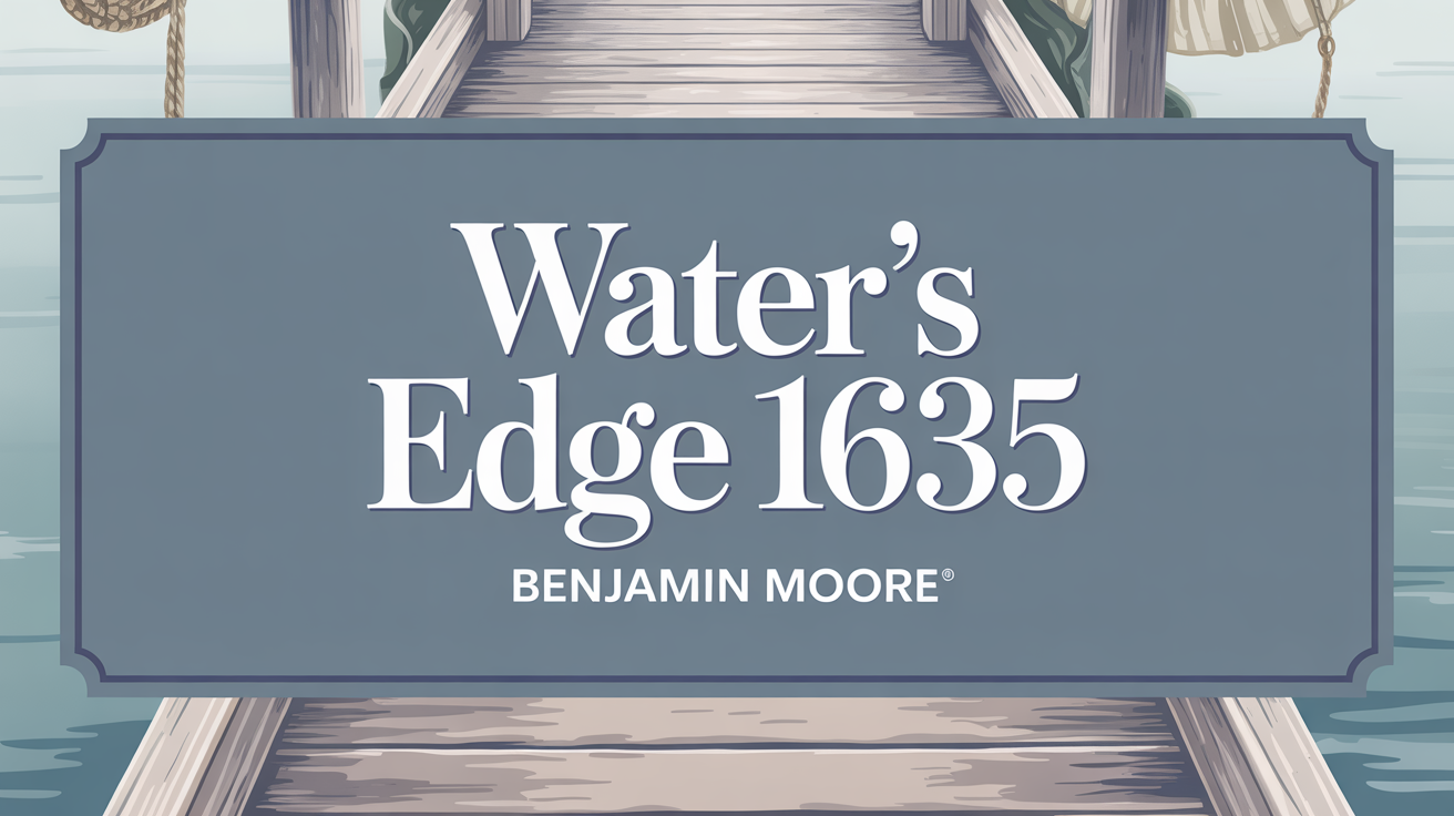
Looking for a paint color that brings tranquility? Water’s Edge 1635 might be just what you need. This beautiful shade offers a cool, calming blue that instantly introduces a sense of peace. Imagine your space whispering of gentle breezes and calm seascapes. It’s a shade that works beautifully in areas where you spend a lot of time relaxing, like a living room or bedroom.
What Color Is Water’s Edge 1635?
So, what exactly is Water’s Edge 1635? It’s a soft, calming shade. This color beautifully blends blue with subtle gray undertones. It calls to mind gentle waves and misty mornings, making it ideal for creating a peaceful atmosphere. You’ll find it feels right at home in coastal, nautical, modern, and Scandinavian designs, where its understated elegance enhances minimalist looks. It pairs wonderfully with natural wood tones, whether light or dark, and crisp white trim for a fresh, clean feel. Don’t forget to layer in textures like linen or jute, and metallic accents like brushed nickel can add a refined touch.
Is Water’s Edge 1635 Warm or Cool color?
Is this color warm or cool? Water’s Edge 1635 definitely falls on the cool side. Its soothing blue-gray tone makes rooms feel more open and airy. This is fantastic for smaller spaces or areas where relaxation is key, like bedrooms and bathrooms. It pairs effortlessly with natural materials like wood or stone, creating a timeless look. In living rooms, it acts as a soft backdrop that lets other colors shine without being overpowering. Its cool nature fits perfectly with coastal or modern styles. The color also changes with light, appearing lighter in natural light and cozier under indoor lighting.
What is the Masstone of Water’s Edge 1635?
Every paint color has a masstone, which is its main underlying color. For Water’s Edge 1635, the masstone is gray. This base helps define its appearance and gives it a neutral quality. The gray masstone contributes to the peaceful and balanced atmosphere the color creates. It’s this neutral base that allows it to complement such a wide range of styles and décor elements. This also makes it great for enhancing the sense of openness in smaller rooms.
Undertones of Water’s Edge 1635?
What makes Water’s Edge 1635 so intriguing are its subtle undertones. While primarily a light blue, you’ll find hints of lilac and light purple, adding a soothing touch. There are also whispers of mint and light green, bringing a feeling of freshness and nature. A touch of light gray keeps it grounded and neutral. This blend makes the color a bit of a chameleon, especially with lighting. In bright natural light, you might even catch glimpses of pale yellow and pale pink, giving it a gentle warmth. In lower light, darker undertones like navy or dark blue can emerge, adding depth and coolness. This interplay of undertones helps it adapt and feel right in many different spaces.
Coordinating Colors of Water’s Edge 1635?
Choosing the right coordinating colors helps a primary color shine and brings harmony to a space. For Water’s Edge 1635, several shades work beautifully to create a cohesive and inviting feel. Consider pairing it with:
- Antique Jade 465: This subtle green adds a touch of nature that complements the blue-gray.
- Simply White OC-117: A crisp white provides a clean, fresh contrast that makes Water’s Edge pop.
- Dove Wing OC-18: This soft, warm gray adds depth while remaining understated.
- Natural Wicker OC-1: A comfortable, warm beige that helps tie the whole palette together.
These colors together create a balanced palette that enhances the best qualities of Water’s Edge.
How Does Lighting Affect Water’s Edge 1635?
Lighting is a huge factor in how any paint color looks, and Water’s Edge 1635 is particularly sensitive. Natural light changes throughout the day. In cooler, north-facing rooms, Water’s Edge can look more muted and cool. Warm, south-facing light might make it appear brighter and warmer. East-facing rooms get soft morning light that can bring out warmth initially, while west-facing rooms see warmer, more intense color in the afternoon. Artificial light also plays a role. Incandescent bulbs lean warm and yellow, potentially making the color warmer or slightly green. Fluorescent lights, often cooler, can make it look more muted or bluish. LED lights vary, so it’s crucial to test the color in your specific space with the actual lighting you’ll be using.
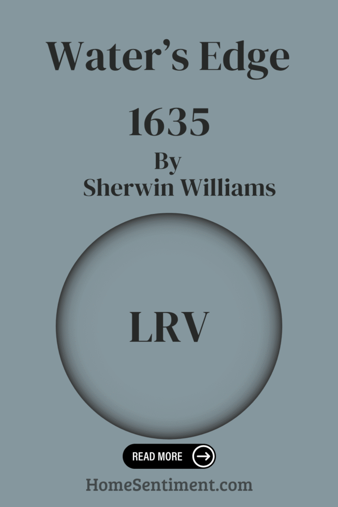
What is the LRV of Water’s Edge 1635?
Ever heard of LRV? It stands for Light Reflectance Value, and it’s a measure of how much light a color reflects. The scale runs from 0 (pure black) to 100 (pure white). A higher LRV means more light reflection and a brighter, lighter room. Water’s Edge 1635 has an LRV of 31.48, placing it firmly in the mid-tone range. This means it reflects a moderate amount of light. While it won’t make a room feel as large or bright as a color with a higher LRV, it adds a rich, calming mood perfect for creating a sense of serenity. It’s deep enough to feel substantial but not so dark that it makes a room feel closed in. It performs well even in naturally bright rooms, holding its beautiful hue without looking washed out.
What are the Trim colors of Water’s Edge 1635?
Trim colors are key to a finished look, defining architectural details like baseboards and window frames. For Water’s Edge 1635, choosing the right trim color creates balance. Two excellent options are OC-68 Distant Gray and OC-51 Intense White. Distant Gray is a soft shade that offers a subtle hint of warmth and blends easily, making rooms feel brighter without competing with the main color. Intense White is a warm, barely-there white that adds a touch of elegance and helps make the space feel cohesive. Both options beautifully complement the serene blue-gray walls.
Colors Similar to Water’s Edge 1635?
If you love the feel of Water’s Edge but want to explore similar options, there are some wonderful colors that share its calming vibe. Consider these shades that are closely aligned:
- Brewster Gray (HC-162): A soft, muted gray offering subtle elegance and a cozy feel.
- Cloudy Sky (2122-30): Deeper and moodier with blue undertones, adding richness.
- Province Blue (2135-40): A mellow blue with a hint of green, truly soothing like tranquil water.
- Amsterdam (AF-550): A deep, robust shade with teal hints for a touch of drama.
These similar colors allow you to achieve a peaceful palette with slightly different nuances.
Colors that Go With Water’s Edge 1635?
Beyond similar colors, there’s a palette of shades that simply pair beautifully with Water’s Edge 1635 to create a cohesive and serene space. Here are some lovely options from a similar family:
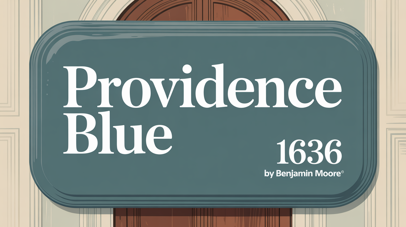
- Providence Blue 1636: A richer blue for added depth and sophistication.
- Blue Spruce 1637: A touch of greenish-blue that brings a natural, forest-like element.
- Brittany Blue 1633: A softer, more muted blue for a gentle, calming effect.
- Santorini Blue 1634: A brighter, more vibrant blue to energize the space.
- Midnight Blue 1638: A darker, intense blue ideal for creating a cozy, intimate feel.
- Glass Slipper 1632: A pale, ethereal blue that offers subtle contrast and enhances airiness.
Using these colors alongside Water’s Edge helps build a harmonious palette that can shape different moods within your home.
How to Use Water’s Edge 1635 In Your Home?
So, where should you use Water’s Edge 1635 in your home? This soothing color, reminiscent of calm waters, brings a fresh and relaxed feeling anywhere it’s applied. It’s perfect for areas where relaxation is a priority. Use it in a bedroom to help promote restful sleep. In living rooms, it can promote a sense of calm without becoming dull. In a bathroom, it can evoke the feeling of a serene day by the water, enhancing relaxation. It pairs wonderfully with whites and soft grays for a clean, modern aesthetic. Adding natural wood or warm metal accents provides beautiful contrast. Its versatility means it fits seamlessly with both traditional and modern styles, making it a great choice for serene spaces throughout your home.
Water’s Edge 1635 vs Cloudy Sky 2122-30
How does Water’s Edge 1635 stack up against Cloudy Sky 2122-30? Water’s Edge is a light, cool blue-gray. Think of a misty horizon – it’s subtle, airy, and incredibly soothing, making it ideal for truly relaxed spaces like bedrooms. Cloudy Sky, on the other hand, is a deeper, medium gray-blue. It feels more grounded and has a moodier, more intense presence. This shade brings sophistication and depth, creating a cozy, inviting atmosphere perfect for spaces wanting more character. While both have blue-gray elements, Water’s Edge is softer, and Cloudy Sky is richer and more dramatic.
Water’s Edge 1635 vs Brewster Gray HC-162
Let’s compare Water’s Edge 1635 and Brewster Gray HC-162. Both are soft, muted colors great for a calming atmosphere. Water’s Edge is a light blue with gray hints, like a peaceful sea. It leans cooler and lighter. It’s wonderful for bedrooms or spaces focused purely on tranquility. Brewster Gray is a muted gray with subtle blue undertones, but it leans warmer and feels cozier. It offers more depth and works well in versatile spaces like living or dining rooms where you want warmth and sophistication. Both pair well with whites, but Water’s Edge is the cooler, lighter option.
Water’s Edge 1635 vs Amsterdam AF-550
How about Water’s Edge 1635 compared to Amsterdam AF-550? Water’s Edge is a soft, muted blue-gray. It’s airy and fresh, perfect for creating a calm, restful vibe in places like bedrooms or bathrooms. Its gentle tone is beautiful with whites and creams. Amsterdam, in contrast, is a much darker, more intense blue. It has a deep, rich quality that adds significant depth and can bring a cozy, dramatic feel, perhaps in a study or as a feature wall. Water’s Edge is the peaceful backdrop; Amsterdam provides the intensity. They offer very different moods.
Water’s Edge 1635 vs Province Blue 2135-40
Comparing Water’s Edge 1635 and Province Blue 2135-40 shows how blues can vary. Water’s Edge is a soft, muted blue with gray undertones. It’s calm, subtle, and versatile, adapting to light and creating a peaceful backdrop wherever you use it. Province Blue is a richer, deeper blue. It has more vibrancy and a stronger presence, drawing attention and adding a bolder touch to a room. Water’s Edge is for spaces needing a gentle, neutral feel, while Province Blue is a more assertive hue that injects energy and character.
Conclusion
To wrap things up, Water’s Edge 1635 is truly a standout color. Its calming elegance makes it an excellent choice for any area where you want to relax, like bedrooms or living rooms. It beautifully mirrors the gentle colors of the sea, bringing a sense of serenity right into your home. This versatile shade works wonderfully with both neutral palettes and brighter accents, giving you plenty of decorating freedom. It can be a quiet backdrop or a feature wall – it’s up to you! Ultimately, this hue does more than just look good; it encourages peace, comfort, and makes your spaces feel more inviting and restful. It’s like capturing a little bit of the coastline’s calm for your everyday life.