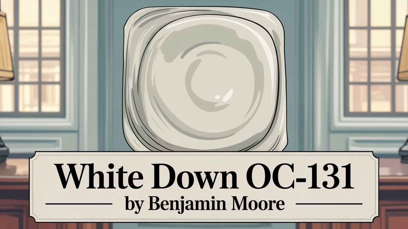
Choosing the right paint color for your home can feel overwhelming, right? There are so many options out there! But if you’re aiming for a color that feels like a warm hug, not too bright and not too cool, you’ve come to the right place. Let’s talk about a fantastic option: White Down OC-131 by Benjamin Moore.
Gentle Elegance in Every Color
This shade is a beautiful, creamy off-white that really knows how to create a cozy atmosphere. It’s definitely not stark, bringing just a touch of warmth that works perfectly in spaces like living areas or bedrooms.
You might find it’s exactly what you’re looking for if you love a soft, muted look without ending up with a color that feels too yellow or too gray. One of the best things about this color is how flexible it is. Whether your style leans modern or vintage, White Down blends right in. It complements so many different looks, you won’t have to worry about it clashing with what you already have. Plus, it’s a reliable backdrop for artwork, which is great if you like to change up your decor often. And guess what? It maintains its charm in different lighting conditions, looking lovely whether it’s soaking in natural sunlight or lit by indoor bulbs.
Think about how a subtle color shift can transform your home’s vibe. A warm white like this might be just the refresh your space needs.
What Color Is White Down OC-131 by Benjamin Moore?
Let’s get specific. White Down OC-131 is a warm, creamy off-white shade. It offers a sense of subtle sophistication. It’s designed to provide a gentle, inviting atmosphere, making it ideal for rooms where you want a cozy and welcoming feel. This soft color has slight undertones that find a balance between beige and gray, giving it that lovely versatility across different design styles.
In traditional homes, it blends beautifully with classic wood and rich textures. It really lets moldings, built-ins, and vintage pieces stand out. For contemporary spaces, it gives you a clean backdrop for sleek furniture and metal accents, but without feeling cold or sterile. It even works wonderfully in rustic or farmhouse settings, complementing natural materials like wood beams, stone, and textiles. The warmth of the shade also coordinates well with warm metals like brass or copper, adding an elegant touch.
It’s quite adaptable, working well with organic materials and muted palettes. It stays true no matter the lighting, making it a dependable choice for homes seeking warmth and understated elegance.
Is White Down OC-131 by Benjamin Moore Warm or Cool color?
This one’s simple: White Down OC-131 is a warm, soft off-white color. It really brings a cozy vibe into any room without feeling too stark. The subtle undertones of beige are what give it that creamy appearance. When you paint your walls with it, it creates a gentle, inviting atmosphere that helps spaces feel comfortable and relaxed.
It can actually help enhance natural light, making your rooms seem brighter and more welcoming. It’s great with both traditional and modern furniture, providing a versatile base for many styles. When used with darker colors, it offers a nice contrast. With lighter tones, it maintains a soft, harmonious look. It’s a fantastic choice for places like living rooms, bedrooms, and kitchens, offering a timeless appeal. Its warmth truly helps make a house feel more like a home.
What is the Masstone of the White Down OC-131 by Benjamin Moore?
Okay, let’s talk about the masstone. That’s basically the color you see immediately, at first glance. For White Down OC-131, the masstone is a light gray. It’s a very soft and gentle pale gray shade. This subtle primary tone makes it easy to use in all sorts of home settings. Using a light gray masstone can actually make a room feel more open and airy, which is awesome for smaller spaces.
It’s incredibly versatile and pairs well with lots of other colors, whether you’re decorating with bold furniture or more relaxed pieces. It provides a neutral backdrop that’s easy on the eyes. It doesn’t scream for attention; instead, it helps create a peaceful atmosphere. This makes it an excellent pick for living rooms, bedrooms, and offices where you want a calm environment. Plus, because it’s a soft tone, it helps natural light reflect beautifully, boosting the overall brightness without feeling harsh.
Undertones of White Down OC-131 by Benjamin Moore
Undertones are those subtle hues hiding beneath the main color that give it its unique personality. In White Down OC-131, you’ll find a fascinating mix: pale yellow, light purple, light blue, pale pink, mint, lilac, and grey. These undertones are key to its depth and complexity.
They also influence how the color appears depending on the lighting. For example, pale yellow and light blue can bring a sense of warmth and balance. Mint and lilac offer a subtle fresh feeling. Pale pink and light purple add gentle, cozy touches, while grey provides neutrality and softness. Under warm lighting, you might notice those pale yellow and mint undertones pop, making the room feel warmer. In cooler light, the light blue and grey can stand out, creating a calmer, more balanced space.
The delicate undertones, like pale pink and light purple, really contribute to that inviting and welcoming feel. It’s a versatile color that works with various decor styles. Understanding these undertones helps you pick the perfect paint for your space and enhance its mood.
Coordinating Colors of White Down OC-131 by Benjamin Moore
Choosing colors that work well together is crucial for a balanced, appealing space. For White Down OC-131, you want colors that complement its soft, subtle warmth. Getting the right coordinating colors can really enhance White Down’s look.
Here are a few coordinating colors that work wonderfully:
- AF-15 Steam: This is a light, airy neutral with a hint of warmth. It creates a gentle contrast without stealing the show from White Down.
- 1571 Imperial Gray: This one adds a touch of sophistication. It’s a bit darker with cool, muted hues, giving you depth and elegance.
- OC-117 Simply White: A crisp, clean choice that helps brighten spaces. It’s a fresh complement to the softness of White Down.
- HC-172 Revere Pewter: This color brings everything together with its warm gray undertones. It’s a fantastic neutral backdrop that enhances both classic and contemporary styles.
These colors harmonize beautifully, creating a versatile palette that’s easy to use in any space.
How Does Lighting Affect White Down OC-131 by Benjamin Moore?
Lighting is a big deal when it comes to paint color; it totally changes how you see a shade. White Down OC-131, being a soft, warm off-white, is definitely influenced by different lighting.
Think about natural light first. Where your windows face and the time of day can make a difference.
- North-facing rooms have cooler, consistent light, which might make White Down look a bit more muted or even grayish. The cooler light balances its warmth.
- South-facing rooms get lots of warm light, especially in the afternoon. This boosts White Down’s warm side, making it look cozier and creamier and feel really welcoming.
- East-facing rooms get bright, warm light in the morning. So, White Down might seem more golden and warm early on, then appear softer as the sun moves.
- West-facing rooms get intense warm light later in the day. This can make White Down look more vibrant and warm. In the morning, it might seem cooler.
Artificial light matters too. The type of light bulb can impact how it looks. Warm incandescent bulbs will enhance its cozy, yellow undertones, making the space feel super inviting. Cooler LED lights, on the other hand, might make the color appear more neutral. While it’s a versatile color, it can take on distinctly different looks depending on the lighting, giving each room a unique feel.
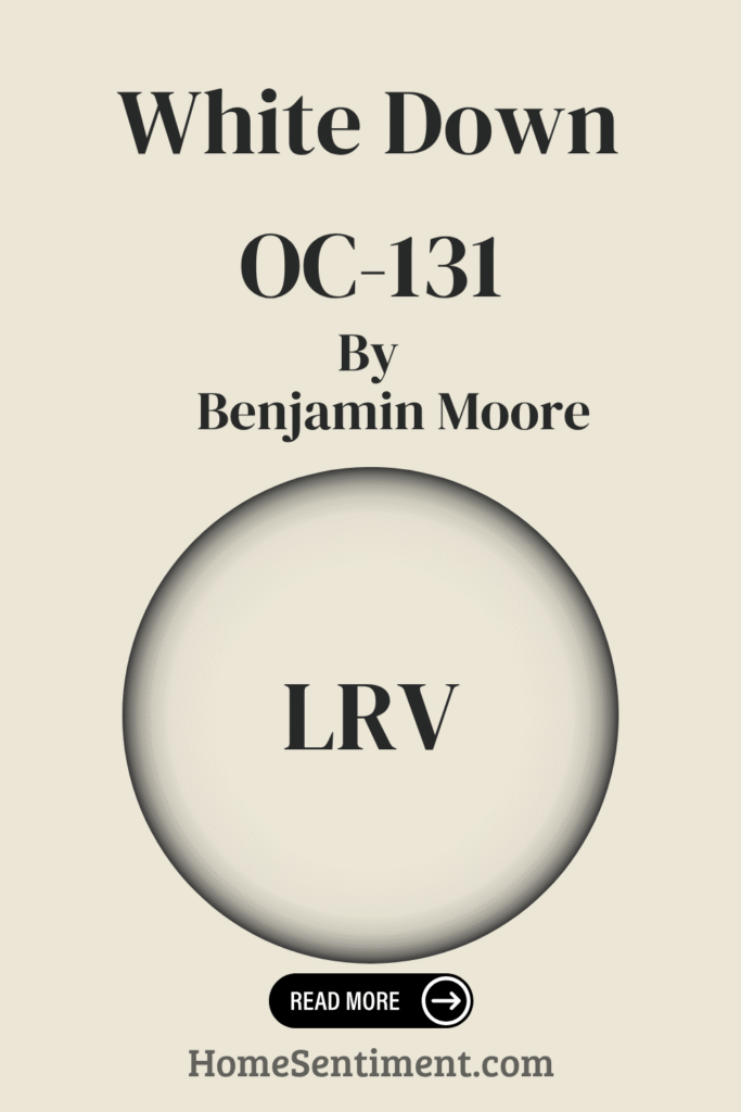
What is the LRV of White Down OC-131 by Benjamin Moore?
Let’s talk LRV. That stands for Light Reflectance Value. It’s a way to measure how much light a color reflects. The scale goes from 0 (absorbs all light) to 100 (reflects all light). White Down OC-131 has an LRV of 76.69.
This LRV means it’s quite a light color and reflects a lot of light back into the room. Colors with high LRVs can make spaces feel brighter and larger because they bounce more light around. This is super helpful if you have a smaller or darker room. With an LRV of 76.69, White Down definitely helps a room feel light and airy. It reflects a good amount of both natural and artificial light, illuminating spaces even when there isn’t much light. Painting with White Down can give a room a welcoming and open feel, preventing it from feeling cramped or shadowy. It can even subtly influence the mood, making the room feel calm and open. It’s a versatile choice for almost any area in your home or office.
What are the Trim colors of White Down OC-131 by Benjamin Moore?
Trim colors are those paints used on things like baseboards, moldings, and window and door frames. They’re really important because they complement or highlight your main wall color. With White Down OC-131 on the walls, choosing the right trim color can enhance its soft, neutral creaminess and add depth or contrast. Since White Down has subtle warmth, you want trim colors that harmonize well. Good trim colors provide a finished look and can make your walls pop or create a soothing, cohesive look by blending in.
Here are some recommended trim colors:
- Simply White OC-117: This is a super versatile, clean white with just a touch of warmth. It’s perfect for complementing White Down because it highlights the color’s delicate nature without clashing or looking too stark.
- Cloud White OC-130: This option has a gentle, warm undertone. It offers a bit more depth than a true white. Cloud White pairs beautifully with White Down, giving you just enough contrast to define the space elegantly while keeping things soothing.
Each of these options offers a subtle shift from the main wall color, enhancing the overall look and structure of your interior.
Colors Similar to White Down OC-131 by Benjamin Moore
Sometimes, you might want to use colors that are similar to your main shade to create a really harmonious, cohesive design. It helps rooms flow beautifully.
One color that fits the bill as being similar to White Down OC-131 is 974 – Muskoka Trail. This color adds a gentle warmth, kind of like nature or earthy paths. It has a soft, muted quality that pairs wonderfully with the softness of White Down. It offers a cozy touch without overwhelming the space. Using similar colors like this creates a smooth transition, which is pleasing to the eye. They allow for subtle depth and interest without the jarring contrast that very different colors can bring. Keeping a consistent undertone helps ensure that rooms connect seamlessly, creating a relaxing and consistent feel throughout your home. Muskoka Trail, with its calm tone, works alongside the brightness of White Down to create a balanced space that feels unified.
How to Use White Down OC-131 by Benjamin Moore In Your Home?
White Down OC-131 is a lovely soft, neutral color that’s great for just about any home. It’s super versatile and helps create a warm, inviting feeling. With its gentle off-white tone and subtle beige undertones, it’s a fantastic choice for living rooms, bedrooms, or even hallways.
Painting your walls with White Down makes it really easy to coordinate with all sorts of furniture and accent pieces. It looks great with wood trims or bright white ceilings. The color gives your space an airy feel, looking fresh without being too cool or stark. It keeps a balanced look, making rooms feel cozy yet spacious. It complements other colors easily, whether you have bold artwork or colorful furniture. If you’re looking for a subtle but impactful change, White Down gives you a beautiful, timeless look that works with basically any interior design preference.
White Down OC-131 by Benjamin Moore vs Muskoka Trail 974 by Benjamin Moore
Let’s take a closer look at White Down and that similar color, Muskoka Trail, side-by-side.
White Down OC-131 is a soft, warm white. It feels light and is incredibly versatile. It has subtle undertones that create a calm, inviting atmosphere. This shade blends effortlessly with various styles because it’s so neutral. It’s best for rooms where you want brightness and an open feel. It’s perfect for minimalistic or modern designs, offering a serene canvas.
Muskoka Trail 974, on the other hand, leans towards earthy, greenish hues. It has a natural vibe, reminding you of outdoor landscapes. This color can give your home a cozy, grounding effect, making spaces feel more connected to nature. Compared to White Down, Muskoka Trail is deeper and more rooted in nature. It works brilliantly if you’re aiming for a warm, earthy feel. While White Down offers that serene backdrop, Muskoka Trail provides depth and richness. They both help you achieve different aesthetic goals, allowing for creative expression in your room design.
Conclusion
White Down OC-131 by Benjamin Moore is truly a wonderful way to bring warmth and comfort into any space. It’s more than just a basic white; it’s got this soft undertone that adds depth and coziness.
You’ll find it looks beautiful in different lighting conditions, always keeping its inviting nature. It pairs well with all sorts of palettes, from bold to neutral, giving you tons of creative freedom. It works great as a main wall color or even an accent. It’s particularly effective in living rooms, bedrooms, and kitchens – basically anywhere you want a welcoming vibe. It’s a reliable choice for a timeless look; it really doesn’t go out of style and works effortlessly with different decor, from modern to classic. Personally, I think it brings a sense of calm and balance.
Overall, White Down is a thoughtful color choice that can genuinely enrich the look and feel of your home.