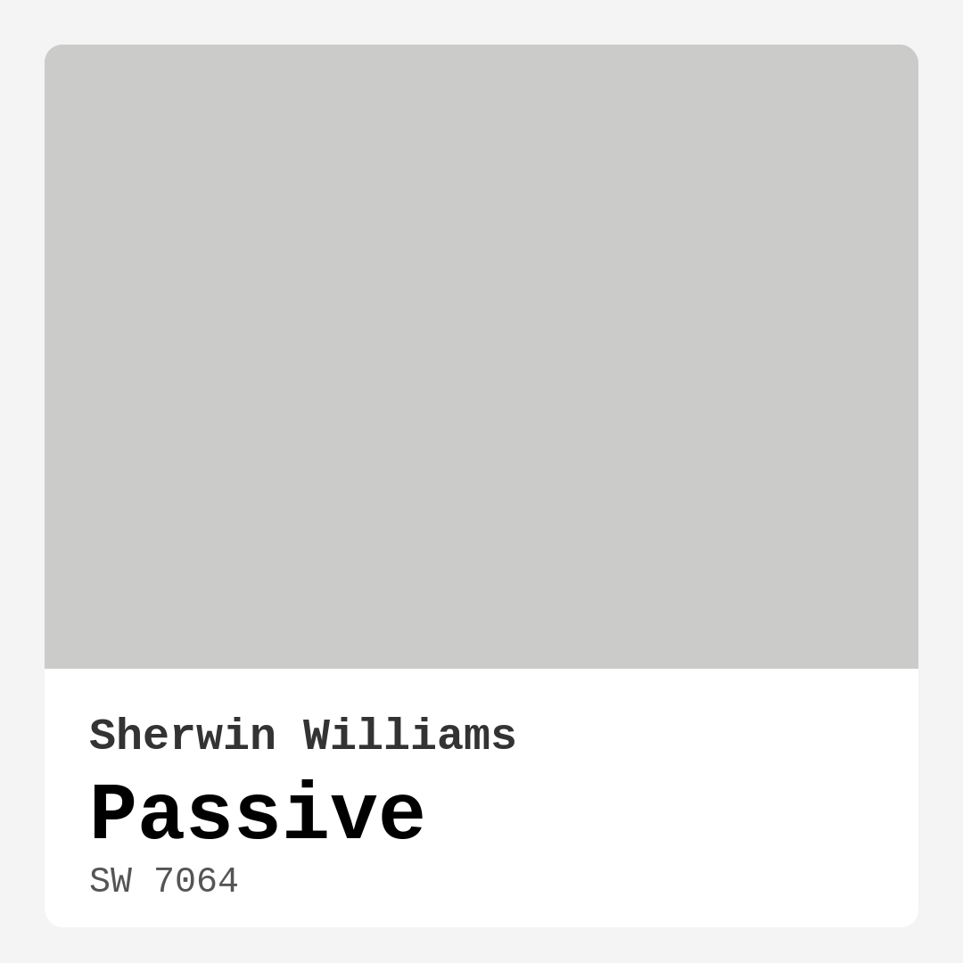
Color Preview & Key Details
| HEX Code | #CBCCC9 |
| RGB | 203, 204, 201 |
| LRV | 58% |
| Undertone | Green |
| Finish Options | Eggshell, Matte, Satin |
Imagine stepping into a room that instantly calms your senses. The walls are painted in a soft, serene gray that wraps you in a gentle embrace. This is the magic of Sherwin Williams’ Passive (SW 7064), a color that transforms spaces and elevates moods without even trying. As an expert home designer, I can tell you that color isn’t just about aesthetics; it’s about creating an atmosphere that resonates with your personal style and comfort.
Passive is a light gray that whispers elegance. With its subtle green undertone, this color offers a refreshing twist on traditional grays. It’s not stark or cold, which is crucial when you want a space to feel inviting rather than clinical. This soft hue is perfect for spaces where you unwind, like your living room or bedroom, but it also works beautifully in a home office or dining area where you want to foster focus and conversation.
One of the standout features of Passive is its versatility. It can seamlessly blend into a variety of decor styles — whether you’re into modern minimalism, Scandinavian calm, or transitional warmth. Its understated charm makes it an ideal backdrop, allowing your furniture and decor choices to shine. Imagine a crisp white sofa or warm wooden accents against the gentle gray; it’s a combination that feels balanced and thoughtfully curated.
When considering any paint color, it’s essential to think about how it interacts with light. Passive has a Light Reflectance Value (LRV) of 58%, placing it squarely in the medium range. This means it reflects a moderate amount of light, brightening your space without overwhelming it. Under natural light, Passive appears airy and fresh, perfect for brightening up a room. As the sun sets, it takes on a softer, muted tone, creating a cozy atmosphere ideal for evenings spent with loved ones.
Testing the paint in your own home is key. Light can drastically change how a color appears, so it’s wise to sample Passive on your walls and observe it at different times of day. You’ll notice how it interacts with your existing furniture and decor, revealing its green undertones that add depth and character.
For those who may feel hesitant about using gray, Passive offers a gentle introduction. It’s a soft, calming hue that can make small rooms feel larger and more open. Whether you’re painting a compact bedroom or a cozy bathroom, this color breathes life into spaces without feeling confining. Just remember to pair it with lighter furniture or accents to enhance that spacious feel.
While Passive is a fantastic choice on its own, it also plays well with others. It can serve as a beautiful backdrop for bolder colors or vibrant accents. Think of pairing it with warm woods, soft whites, or even striking pops of color. For a stunning contrast, try it alongside complementary shades like SW 6557 or SW 9075. This flexibility makes Passive not just a color, but a foundation for your entire decor scheme.
Now, let’s talk about application. Whether you’re a seasoned DIYer or a beginner, Passive is user-friendly. It applies smoothly, whether you’re using a brush or a roller, and typically offers excellent coverage with just one or two coats. This means less time on the ladder and more time enjoying your newly transformed space. Plus, its low VOC formula ensures that you’re making a safer choice for your indoor air quality while painting.
One of the advantages of Passive is its washability. Life happens, and walls can get scuffed or marked. But with this paint, you can easily wipe away messes without worrying about ruining the finish. This quality is especially beneficial in high-traffic areas or homes with kids and pets.
As you consider Passive for your project, remember that it might not be the boldest choice on the color wheel. It’s all about creating a space that feels right for you. If you’re someone who loves vibrant, dramatic hues, you may want to incorporate those as accents while allowing Passive to be the calm backdrop that anchors the overall design.
And let’s not forget about the finish options. Passive is available in matte, eggshell, and satin, giving you flexibility depending on the look you’re going for. A matte finish offers a soft, velvety look, while eggshell provides a bit more sheen, reflecting light beautifully. Satin takes it a step further, adding durability that can be especially useful in kitchens or dining areas.
With its broad applicability, Passive is perfect for various rooms in your home. Think about the living room, where you gather with family and friends, or the bedroom, where you retreat after a long day. It can even serve as a chic choice for an entryway, setting a serene tone for anyone who walks through your door.
As an expert in home design, I can’t stress enough the importance of color in setting the mood. With Passive, you’re choosing a hue that embodies calm, inviting, and restful vibes. It’s a color that nurtures a sense of tranquility, making it perfect for spaces meant for relaxation or gathering.
Ultimately, Passive is more than just a paint color; it’s an experience. It invites you to pause and breathe, to appreciate the beauty of your surroundings. If you’re ready to elevate your home with a sophisticated yet approachable palette, consider Passive. It’s a decision you won’t regret, and it just might become the foundation of your home’s story.
So, grab that paint swatch, find a cozy corner in your home, and envision the transformation. With Passive, you’re not just painting walls; you’re creating a sanctuary that reflects your unique style and warmth. Whether you’re updating a single room or embarking on a full home makeover, Passive is here to lend its serene charm to your journey.
Save this color to your Pinterest board to revisit when planning your room.
Real Room Photo of Passive SW 7064
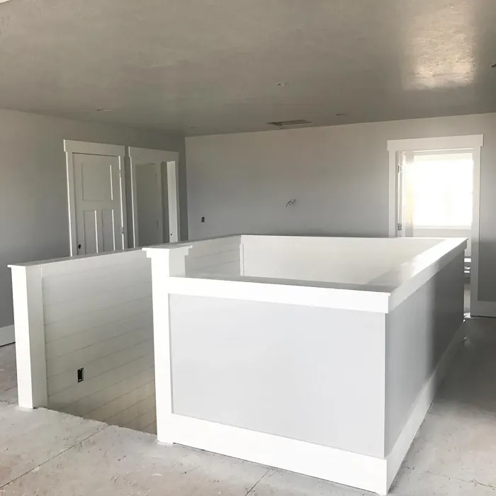
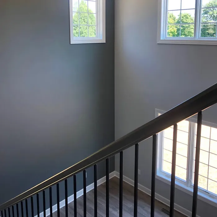
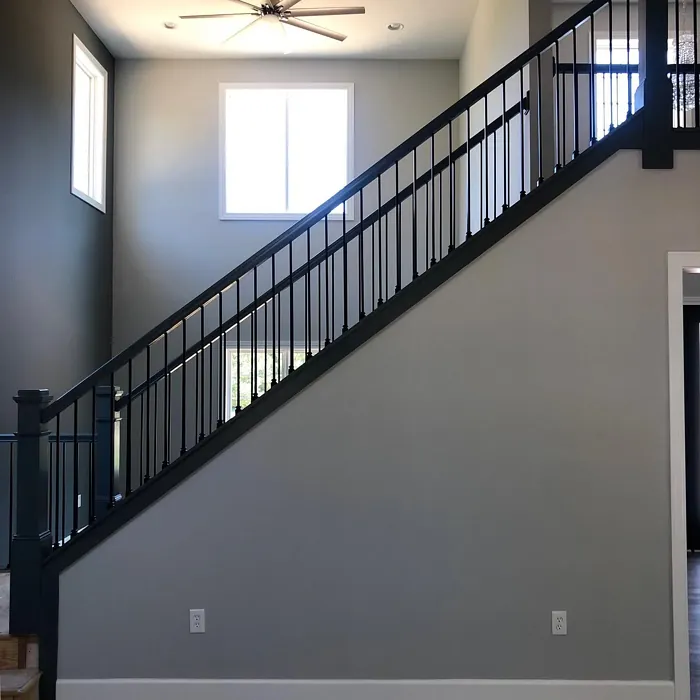

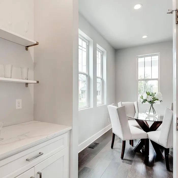
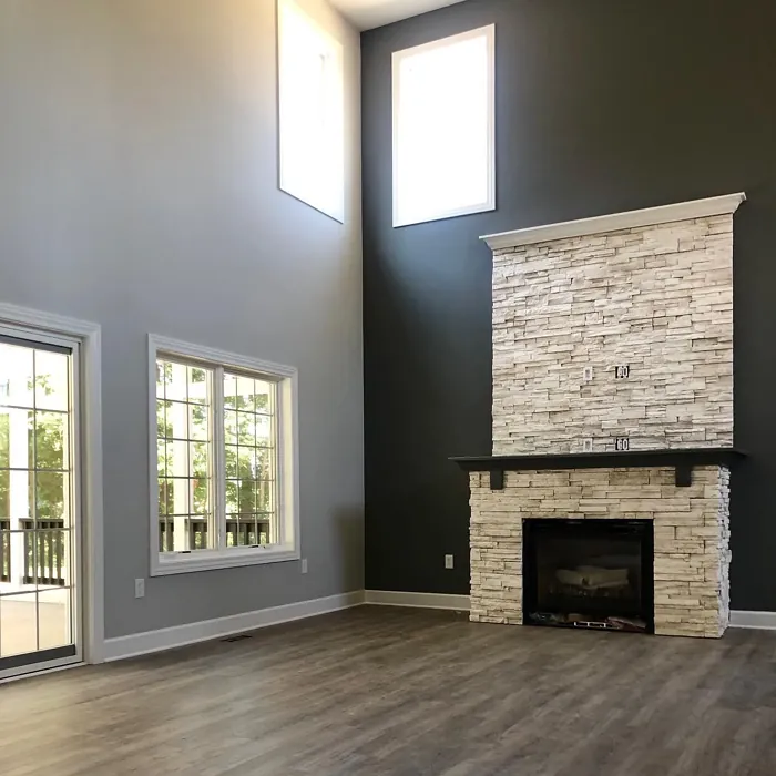
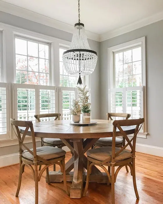
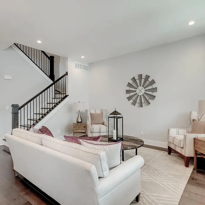
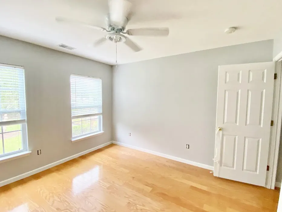
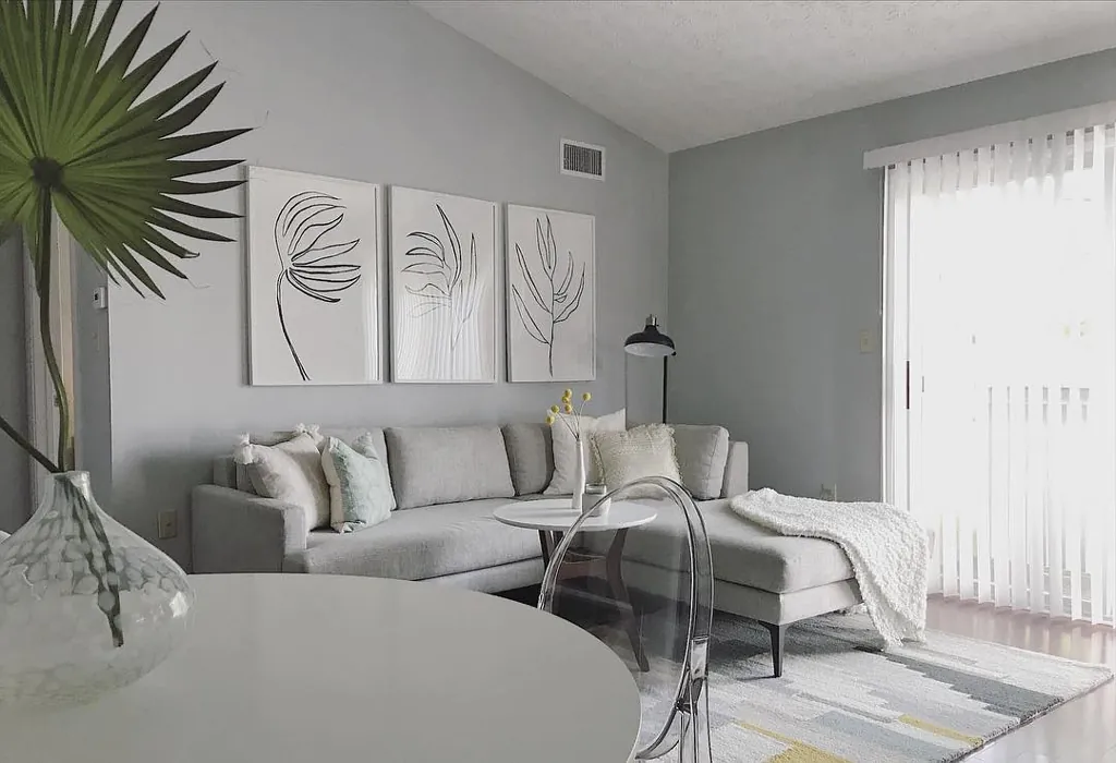
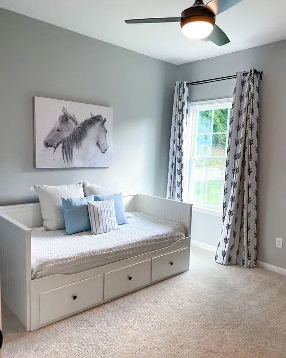
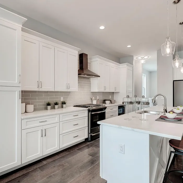
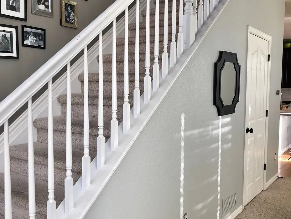
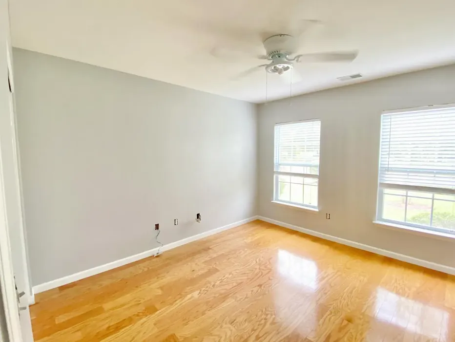
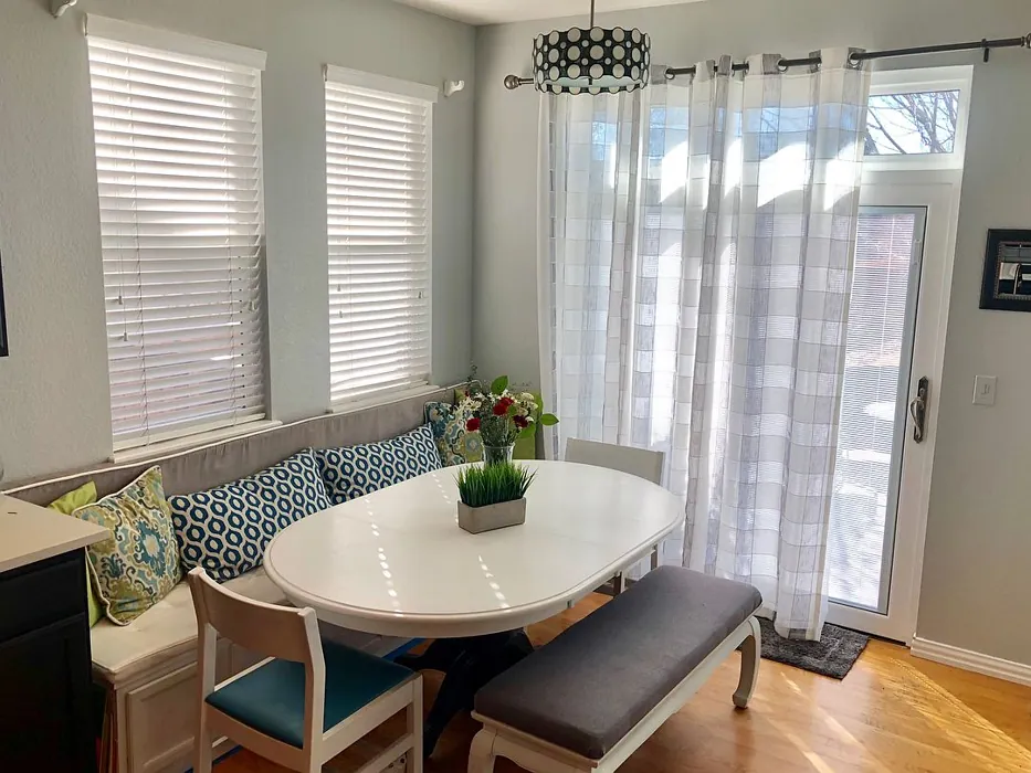
Real rooms painted with Passive SW 7064 by Sherwin Williams. Lighting and photography can affect how colors appear — always test a sample swatch in your own space.
Undertones of Passive ?
The undertones of Passive are a key aspect of its character, leaning towards Green. These subtle underlying hues are what give the color its depth and complexity. For example, a gray with a blue undertone will feel cooler and more modern, while one with a brown undertone will feel warmer and more traditional. It’s essential to test this paint in your home and observe it next to your existing furniture, flooring, and decor to see how these undertones interact and reveal themselves throughout the day.
HEX value: #CBCCC9
RGB code: 203, 204, 201
Is Passive Cool or Warm?
Passive leans slightly warm, which helps create an inviting atmosphere. It doesn’t feel stark like some cooler grays, making it perfect for spaces meant for relaxation or gathering.
Understanding Color Properties and Interior Design Tips
Hue refers to a specific position on the color wheel, measured in degrees from 0 to 360. Each degree represents a different pure color:
- 0° represents red
- 120° represents green
- 240° represents blue
Saturation describes the intensity or purity of a color and is expressed as a percentage:
- At 0%, the color appears completely desaturated—essentially a shade of gray
- At 100%, the color is at its most vivid and vibrant
Lightness indicates how light or dark a color is, also expressed as a percentage:
- 0% lightness results in black
- 100% lightness results in white
Using Warm Colors in Interior Design
Warm hues—such as reds, oranges, yellows, warm beiges, and greiges—are excellent choices for creating inviting and energetic spaces. These colors are particularly well-suited for:
- Kitchens, living rooms, and bathrooms, where warmth enhances comfort and sociability
- Large rooms, where warm tones can help reduce the sense of emptiness and make the space feel more intimate
For example:
- Warm beige shades provide a cozy, inviting atmosphere, ideal for living rooms, bedrooms, and hallways.
- Warm greige (a mix of beige and gray) offers the warmth of beige with the modern appeal of gray, making it a versatile backdrop for dining areas, bedrooms, and living spaces.
However, be mindful when using warm light tones in rooms with limited natural light. These shades may appear muted or even take on an unpleasant yellowish tint. To avoid a dull or flat appearance:
- Add depth by incorporating richer tones like deep greens, charcoal, or chocolate brown
- Use textured elements such as curtains, rugs, or cushions to bring dimension to the space
Pro Tip: Achieving Harmony with Warm and Cool Color Balance
To create a well-balanced and visually interesting interior, mix warm and cool tones strategically. This contrast adds depth and harmony to your design.
- If your walls feature warm hues, introduce cool-colored accents such as blue or green furniture, artwork, or accessories to create contrast.
- For a polished look, consider using a complementary color scheme, which pairs colors opposite each other on the color wheel (e.g., red with green, orange with blue).
This thoughtful mix not only enhances visual appeal but also creates a space that feels both dynamic and cohesive.
Save this color to your Pinterest board to revisit when planning your room.
Light Temperature Affects on Passive
Natural Light
Natural daylight changes in color temperature as the sun moves across the sky. At sunrise and sunset, the light tends to have a warm, golden tone with a color temperature around 2000 Kelvin (K). As the day progresses and the sun rises higher, the light becomes cooler and more neutral. Around midday, especially when the sky is clear, natural light typically reaches its peak brightness and shifts to a cooler tone, ranging from 5500 to 6500 Kelvin. This midday light is close to what we perceive as pure white or daylight-balanced light.
These shifts in natural light can significantly influence how colors appear in a space, which is why designers often consider both the time of day and the orientation of windows when planning interior color schemes.
Explore how this color transforms from sunrise through sunset as natural light changes throughout the day. Use the slider to simulate morning light, midday brightness, and warm afternoon tones.
North-facing rooms stay cooler throughout the day and benefit from warmer paint tones to compensate. South-facing rooms receive more direct sunlight, making even deeper shades more workable. East-facing rooms get bright morning light that fades by afternoon, while west-facing rooms glow warmly in the evening.
Artificial Light
When choosing artificial lighting, pay close attention to the color temperature, measured in Kelvin (K). This determines how warm or cool the light will appear. Lower temperatures, around 2700K, give off a warm, yellow glow often used in living rooms or bedrooms. Higher temperatures, above 5000K, create a cool, bluish light similar to daylight, commonly used in kitchens, offices, or task areas.
Use the slider to see how lighting temperature can affect the appearance of a surface or color throughout a space.
See how this color looks under different artificial light temperatures — from warm candlelight (2000K) to cool daylight (7000K). Move the slider to simulate your room's lighting conditions.


4800K
Keep in mind that natural light from windows, the warmth of lamps, and overhead lighting all affect how this color reads on your walls at different times of day. Always observe a sample swatch in your actual space before purchasing.
LRV of Passive
The Light Reflectance Value (LRV) of Passive is 58%, which places it in the Medium category. This means it Reflects a moderate amount of light. Understanding a paint’s LRV is crucial for predicting how it will look in your space. A higher LRV indicates a lighter color that reflects more light, making rooms feel larger and brighter. A lower LRV signifies a darker color that absorbs more light, creating a cozier, more intimate atmosphere. Always consider the natural and artificial lighting in your room when selecting a paint color based on its LRV.
Detailed Review of Passive
Additional Paint Characteristics
Ideal Rooms
Bedroom, Dining Room, Entryway, Home Office, Living Room
Decor Styles
Minimalist, Modern, Scandinavian, Transitional
Coverage
Good (1–2 Coats), Touch-Up Friendly
Ease of Application
Beginner Friendly, Brush Smooth, Roller-Ready
Washability
Washable, Wipeable
VOC Level
Low VOC
Best Use
Accent Wall, Furniture, Interior Walls
Room Suitability
Bedroom, Dining Room, Home Office, Living Room
Tone Tag
Balanced, Neutral, Warm
Finish Type
Eggshell, Matte, Satin
Paint Performance
Easy Touch-Up, High Coverage, Low Odor
Use Cases
Best for Open Concept, Best for Small Spaces, Classic Favorite
Mood
Calm, Inviting, Restful
Trim Pairing
Complements Cool Trim, Pairs with White Dove, Works with Warm Trim
Passive is a delightful choice for anyone looking to add a touch of sophistication to their home. The soft gray hue is incredibly versatile, making it suitable for various decor styles, from modern to transitional. When applied, Passive showcases a gentle warmth that can brighten a room without overwhelming it. Its finish options, particularly the matte and eggshell, enhance the color’s elegance, creating a smooth surface that feels inviting. One of the standout features of Passive is its excellent coverage; you can achieve a beautiful finish with just one or two coats, making it a practical option for DIYers and professionals alike. Overall, Passive is a fantastic paint that can elevate any space with its understated charm.
Pros & Cons of SW 7064 Passive
Pros
Cons
Colors that go with Sherwin Williams Passive
FAQ on SW 7064 Passive
Can I use Passive in a small room?
Absolutely! Passive’s soft gray hue can make small rooms feel larger and more open. Its light-reflecting properties help to brighten spaces, making it an ideal choice for areas like bathrooms or small bedrooms. Just pair it with lighter furniture or accents to enhance the effect.
How does Passive work with other colors?
Passive pairs beautifully with a variety of colors. Its neutral tone allows it to complement warmer and cooler shades alike, making it perfect for accent walls or as a backdrop for bolder colors. Try it with soft whites, warm woods, or even vibrant pops of color for a stunning contrast.
Comparisons Passive with other colors
Passive SW 7064 vs Agreeable Gray SW 7029
| Attribute | Passive SW 7064 | Agreeable Gray SW 7029 |
|---|---|---|
| Color Name | Passive SW 7064 | Agreeable Gray SW 7029 |
| Color | ||
| Hue | Grey | Grey |
| Brightness | Light | Light |
| RGB | 203, 204, 201 | 209, 203, 193 |
| LRV | 58% | 60% |
| Finish Type | Eggshell, Matte, Satin | Eggshell, Matte, Satin |
| Finish Options | Eggshell, Matte, Satin | Eggshell, Flat, Matte, Satin |
| Ideal Rooms | Bedroom, Dining Room, Entryway, Home Office, Living Room | Bathroom, Bedroom, Dining Room, Home Office, Kitchen, Living Room |
| Decor Styles | Minimalist, Modern, Scandinavian, Transitional | Contemporary, Farmhouse, Minimalist, Modern, Transitional |
| Coverage | Good (1–2 Coats), Touch-Up Friendly | Good (1–2 Coats), Touch-Up Friendly |
| Ease of Application | Beginner Friendly, Brush Smooth, Roller-Ready | Beginner Friendly, Brush Smooth, Roller-Ready |
| Washability | Washable, Wipeable | Washable, Wipeable |
| Room Suitability | Bedroom, Dining Room, Home Office, Living Room | Bathroom, Bedroom, Dining Room, Kitchen, Living Room |
| Tone | Balanced, Neutral, Warm | Muted, Neutral, Warm |
| Paint Performance | Easy Touch-Up, High Coverage, Low Odor | Easy Touch-Up, Fade Resistant, Low Odor |
Lighting conditions, wall orientation, and surrounding decor can significantly affect how these colors appear in your space. Always test a sample swatch before committing to a full application.
Passive SW 7064 vs Eider White SW 7014
| Attribute | Passive SW 7064 | Eider White SW 7014 |
|---|---|---|
| Color Name | Passive SW 7064 | Eider White SW 7014 |
| Color | ||
| Hue | Grey | Grey |
| Brightness | Light | Light |
| RGB | 203, 204, 201 | 226, 222, 216 |
| LRV | 58% | 73% |
| Finish Type | Eggshell, Matte, Satin | Eggshell, Matte, Satin |
| Finish Options | Eggshell, Matte, Satin | Eggshell, Matte, Satin |
| Ideal Rooms | Bedroom, Dining Room, Entryway, Home Office, Living Room | Bathroom, Bedroom, Dining Room, Home Office, Kitchen, Living Room |
| Decor Styles | Minimalist, Modern, Scandinavian, Transitional | Farmhouse, Minimalist, Modern, Scandinavian, Transitional |
| Coverage | Good (1–2 Coats), Touch-Up Friendly | Good (1–2 Coats), Touch-Up Friendly |
| Ease of Application | Beginner Friendly, Brush Smooth, Roller-Ready | Beginner Friendly, Brush Smooth, Roller-Ready |
| Washability | Washable, Wipeable | Highly Washable, Washable |
| Room Suitability | Bedroom, Dining Room, Home Office, Living Room | Bathroom, Bedroom, Dining Room, Kitchen, Living Room |
| Tone | Balanced, Neutral, Warm | Creamy, Muted, Neutral, Warm |
| Paint Performance | Easy Touch-Up, High Coverage, Low Odor | Easy Touch-Up, High Coverage, Low Odor, Scuff Resistant |
Lighting conditions, wall orientation, and surrounding decor can significantly affect how these colors appear in your space. Always test a sample swatch before committing to a full application.
Passive SW 7064 vs Drift of Mist SW 9166
| Attribute | Passive SW 7064 | Drift of Mist SW 9166 |
|---|---|---|
| Color Name | Passive SW 7064 | Drift of Mist SW 9166 |
| Color | ||
| Hue | Grey | Grey |
| Brightness | Light | Light |
| RGB | 203, 204, 201 | 220, 216, 208 |
| LRV | 58% | 65% |
| Finish Type | Eggshell, Matte, Satin | Eggshell, Matte, Satin |
| Finish Options | Eggshell, Matte, Satin | Eggshell, Matte, Satin |
| Ideal Rooms | Bedroom, Dining Room, Entryway, Home Office, Living Room | Bathroom, Bedroom, Home Office, Kitchen, Living Room |
| Decor Styles | Minimalist, Modern, Scandinavian, Transitional | Coastal, Minimalist, Modern, Scandinavian |
| Coverage | Good (1–2 Coats), Touch-Up Friendly | Good (1–2 Coats), Touch-Up Friendly |
| Ease of Application | Beginner Friendly, Brush Smooth, Roller-Ready | Beginner Friendly, Brush Smooth, Fast-Drying, Roller-Ready |
| Washability | Washable, Wipeable | Washable, Wipeable |
| Room Suitability | Bedroom, Dining Room, Home Office, Living Room | Bathroom, Bedroom, Home Office, Living Room |
| Tone | Balanced, Neutral, Warm | Airy, Cool, Neutral |
| Paint Performance | Easy Touch-Up, High Coverage, Low Odor | Easy Touch-Up, Low Odor, Quick Drying, Scuff Resistant |
Lighting conditions, wall orientation, and surrounding decor can significantly affect how these colors appear in your space. Always test a sample swatch before committing to a full application.
Passive SW 7064 vs Sanctuary SW 9583
| Attribute | Passive SW 7064 | Sanctuary SW 9583 |
|---|---|---|
| Color Name | Passive SW 7064 | Sanctuary SW 9583 |
| Color | ||
| Hue | Grey | Grey |
| Brightness | Light | Light |
| RGB | 203, 204, 201 | 230, 226, 217 |
| LRV | 58% | 24% |
| Finish Type | Eggshell, Matte, Satin | Eggshell, Matte, Satin |
| Finish Options | Eggshell, Matte, Satin | Eggshell, Matte, Satin |
| Ideal Rooms | Bedroom, Dining Room, Entryway, Home Office, Living Room | Bedroom, Dining Room, Home Office, Living Room, Nursery |
| Decor Styles | Minimalist, Modern, Scandinavian, Transitional | Bohemian, Coastal, Modern Farmhouse, Scandinavian |
| Coverage | Good (1–2 Coats), Touch-Up Friendly | Good (1–2 Coats), Touch-Up Friendly |
| Ease of Application | Beginner Friendly, Brush Smooth, Roller-Ready | Beginner Friendly, Brush Smooth, Fast-Drying, Roller-Ready |
| Washability | Washable, Wipeable | Highly Washable, Washable, Wipeable |
| Room Suitability | Bedroom, Dining Room, Home Office, Living Room | Bedroom, Home Office, Living Room, Nursery |
| Tone | Balanced, Neutral, Warm | Earthy, Neutral, Soft, Warm |
| Paint Performance | Easy Touch-Up, High Coverage, Low Odor | Easy Touch-Up, Low Odor, Quick Drying, Scuff Resistant |
Lighting conditions, wall orientation, and surrounding decor can significantly affect how these colors appear in your space. Always test a sample swatch before committing to a full application.
Passive SW 7064 vs Snowbound SW 7004
| Attribute | Passive SW 7064 | Snowbound SW 7004 |
|---|---|---|
| Color Name | Passive SW 7064 | Snowbound SW 7004 |
| Color | ||
| Hue | Grey | Grey |
| Brightness | Light | Light |
| RGB | 203, 204, 201 | 237, 234, 229 |
| LRV | 58% | 83% |
| Finish Type | Eggshell, Matte, Satin | Eggshell, Matte, Satin |
| Finish Options | Eggshell, Matte, Satin | Eggshell, Matte, Satin |
| Ideal Rooms | Bedroom, Dining Room, Entryway, Home Office, Living Room | Bathroom, Bedroom, Dining Room, Hallway, Home Office, Kitchen, Living Room, Nursery |
| Decor Styles | Minimalist, Modern, Scandinavian, Transitional | Farmhouse, Minimalist, Modern, Scandinavian, Transitional |
| Coverage | Good (1–2 Coats), Touch-Up Friendly | Good (1–2 Coats), Touch-Up Friendly |
| Ease of Application | Beginner Friendly, Brush Smooth, Roller-Ready | Beginner Friendly, Brush Smooth, Fast-Drying, Roller-Ready |
| Washability | Washable, Wipeable | Washable, Wipeable |
| Room Suitability | Bedroom, Dining Room, Home Office, Living Room | Bathroom, Bedroom, Dining Room, Hallway, Home Office, Kitchen, Living Room |
| Tone | Balanced, Neutral, Warm | Airy, Crisp, Neutral, Warm |
| Paint Performance | Easy Touch-Up, High Coverage, Low Odor | High Coverage, Low Odor, Quick Drying |
Lighting conditions, wall orientation, and surrounding decor can significantly affect how these colors appear in your space. Always test a sample swatch before committing to a full application.
Passive SW 7064 vs Pure White SW 7005
| Attribute | Passive SW 7064 | Pure White SW 7005 |
|---|---|---|
| Color Name | Passive SW 7064 | Pure White SW 7005 |
| Color | ||
| Hue | Grey | Grey |
| Brightness | Light | Light |
| RGB | 203, 204, 201 | 237, 236, 230 |
| LRV | 58% | 84% |
| Finish Type | Eggshell, Matte, Satin | Eggshell, Satin, Semi-Gloss |
| Finish Options | Eggshell, Matte, Satin | Eggshell, Flat, Matte, Satin, Semi-Gloss |
| Ideal Rooms | Bedroom, Dining Room, Entryway, Home Office, Living Room | Bathroom, Bedroom, Dining Room, Entryway, Hallway, Home Office, Kitchen, Living Room, Nursery |
| Decor Styles | Minimalist, Modern, Scandinavian, Transitional | Bohemian, Eclectic, Farmhouse, Minimalist, Modern, Traditional |
| Coverage | Good (1–2 Coats), Touch-Up Friendly | Good (1–2 Coats), Touch-Up Friendly |
| Ease of Application | Beginner Friendly, Brush Smooth, Roller-Ready | Beginner Friendly, Brush Smooth, Fast-Drying, Roller-Ready |
| Washability | Washable, Wipeable | Highly Washable, Washable |
| Room Suitability | Bedroom, Dining Room, Home Office, Living Room | Bathroom, Bedroom, Dining Room, Entryway, Hallway, Home Office, Kitchen, Living Room, Nursery |
| Tone | Balanced, Neutral, Warm | Crisp, Neutral, Warm |
| Paint Performance | Easy Touch-Up, High Coverage, Low Odor | Easy Touch-Up, High Coverage, Low Odor, Quick Drying |
Lighting conditions, wall orientation, and surrounding decor can significantly affect how these colors appear in your space. Always test a sample swatch before committing to a full application.
Passive SW 7064 vs Crushed Ice SW 7647
| Attribute | Passive SW 7064 | Crushed Ice SW 7647 |
|---|---|---|
| Color Name | Passive SW 7064 | Crushed Ice SW 7647 |
| Color | ||
| Hue | Grey | Grey |
| Brightness | Light | Light |
| RGB | 203, 204, 201 | 214, 211, 204 |
| LRV | 58% | 66% |
| Finish Type | Eggshell, Matte, Satin | Eggshell, Matte, Satin |
| Finish Options | Eggshell, Matte, Satin | Eggshell, Matte, Satin |
| Ideal Rooms | Bedroom, Dining Room, Entryway, Home Office, Living Room | Bathroom, Bedroom, Dining Room, Home Office, Living Room |
| Decor Styles | Minimalist, Modern, Scandinavian, Transitional | Farmhouse, Minimalist, Modern, Scandinavian, Transitional |
| Coverage | Good (1–2 Coats), Touch-Up Friendly | Good (1–2 Coats), Touch-Up Friendly |
| Ease of Application | Beginner Friendly, Brush Smooth, Roller-Ready | Beginner Friendly, Brush Smooth, Roller-Ready |
| Washability | Washable, Wipeable | Stain Resistant, Washable |
| Room Suitability | Bedroom, Dining Room, Home Office, Living Room | Bathroom, Bedroom, Dining Room, Hallway, Home Office, Living Room |
| Tone | Balanced, Neutral, Warm | Muted, Neutral, Warm |
| Paint Performance | Easy Touch-Up, High Coverage, Low Odor | High Coverage, Low Odor, Quick Drying |
Lighting conditions, wall orientation, and surrounding decor can significantly affect how these colors appear in your space. Always test a sample swatch before committing to a full application.
Passive SW 7064 vs Origami White SW 7636
| Attribute | Passive SW 7064 | Origami White SW 7636 |
|---|---|---|
| Color Name | Passive SW 7064 | Origami White SW 7636 |
| Color | ||
| Hue | Grey | Grey |
| Brightness | Light | Light |
| RGB | 203, 204, 201 | 229, 226, 218 |
| LRV | 58% | 83% |
| Finish Type | Eggshell, Matte, Satin | Eggshell, Matte |
| Finish Options | Eggshell, Matte, Satin | Eggshell, Matte, Satin |
| Ideal Rooms | Bedroom, Dining Room, Entryway, Home Office, Living Room | Bedroom, Dining Room, Entryway, Hallway, Home Office, Kitchen, Living Room |
| Decor Styles | Minimalist, Modern, Scandinavian, Transitional | Minimalist, Modern, Scandinavian, Traditional, Transitional |
| Coverage | Good (1–2 Coats), Touch-Up Friendly | Good (1–2 Coats), Touch-Up Friendly |
| Ease of Application | Beginner Friendly, Brush Smooth, Roller-Ready | Beginner Friendly, Brush Smooth, Roller-Ready |
| Washability | Washable, Wipeable | Washable, Wipeable |
| Room Suitability | Bedroom, Dining Room, Home Office, Living Room | Bedroom, Dining Room, Home Office, Kitchen, Living Room |
| Tone | Balanced, Neutral, Warm | Airy, Neutral, Warm |
| Paint Performance | Easy Touch-Up, High Coverage, Low Odor | Easy Touch-Up, Low Odor, Quick Drying |
Lighting conditions, wall orientation, and surrounding decor can significantly affect how these colors appear in your space. Always test a sample swatch before committing to a full application.
Passive SW 7064 vs Spare White SW 6203
| Attribute | Passive SW 7064 | Spare White SW 6203 |
|---|---|---|
| Color Name | Passive SW 7064 | Spare White SW 6203 |
| Color | ||
| Hue | Grey | Grey |
| Brightness | Light | Light |
| RGB | 203, 204, 201 | 228, 228, 221 |
| LRV | 58% | 75% |
| Finish Type | Eggshell, Matte, Satin | Eggshell, Matte |
| Finish Options | Eggshell, Matte, Satin | Eggshell, Matte, Satin |
| Ideal Rooms | Bedroom, Dining Room, Entryway, Home Office, Living Room | Bedroom, Dining Room, Home Office, Kitchen, Living Room, Nursery |
| Decor Styles | Minimalist, Modern, Scandinavian, Transitional | Farmhouse, Minimalist, Modern, Scandinavian, Transitional |
| Coverage | Good (1–2 Coats), Touch-Up Friendly | Good (1–2 Coats), Primer Recommended, Touch-Up Friendly |
| Ease of Application | Beginner Friendly, Brush Smooth, Roller-Ready | Beginner Friendly, Brush Smooth, Fast-Drying, Roller-Ready |
| Washability | Washable, Wipeable | Washable, Wipeable |
| Room Suitability | Bedroom, Dining Room, Home Office, Living Room | Bedroom, Dining Room, Home Office, Kitchen, Living Room |
| Tone | Balanced, Neutral, Warm | Creamy, Neutral, Warm |
| Paint Performance | Easy Touch-Up, High Coverage, Low Odor | Easy Touch-Up, Low Odor, Quick Drying |
Lighting conditions, wall orientation, and surrounding decor can significantly affect how these colors appear in your space. Always test a sample swatch before committing to a full application.
Passive SW 7064 vs Mountain Air SW 6224
| Attribute | Passive SW 7064 | Mountain Air SW 6224 |
|---|---|---|
| Color Name | Passive SW 7064 | Mountain Air SW 6224 |
| Color | ||
| Hue | Grey | Grey |
| Brightness | Light | Light |
| RGB | 203, 204, 201 | 216, 224, 223 |
| LRV | 58% | 66% |
| Finish Type | Eggshell, Matte, Satin | Eggshell, Satin |
| Finish Options | Eggshell, Matte, Satin | Eggshell, Matte, Satin |
| Ideal Rooms | Bedroom, Dining Room, Entryway, Home Office, Living Room | Bedroom, Hallway, Home Office, Living Room, Nursery |
| Decor Styles | Minimalist, Modern, Scandinavian, Transitional | Coastal, Minimalist, Modern, Scandinavian |
| Coverage | Good (1–2 Coats), Touch-Up Friendly | Good (1–2 Coats), Touch-Up Friendly |
| Ease of Application | Beginner Friendly, Brush Smooth, Roller-Ready | Beginner Friendly, Brush Smooth, Fast-Drying, Roller-Ready |
| Washability | Washable, Wipeable | Highly Washable, Washable |
| Room Suitability | Bedroom, Dining Room, Home Office, Living Room | Bedroom, Home Office, Living Room, Nursery |
| Tone | Balanced, Neutral, Warm | Airy, Cool, Muted |
| Paint Performance | Easy Touch-Up, High Coverage, Low Odor | Easy Touch-Up, Low Odor, Quick Drying, Scuff Resistant |
Lighting conditions, wall orientation, and surrounding decor can significantly affect how these colors appear in your space. Always test a sample swatch before committing to a full application.
Official Page of Sherwin Williams Passive SW 7064