Sophisticated Hues for Every Space
Ever walked into a room and just felt an instant sense of calm? That’s the incredible power of color at work. And when it comes to creating a sophisticated, soothing atmosphere, HC-160 Knoxville Gray by Benjamin Moore is a standout choice.
Imagine wrapping yourself in a soft, cozy blanket – that’s the feeling this shade brings. It captures the depth of charcoal but with subtle hints of blue and green woven in. It’s like those peaceful moments just before dusk or a quiet, foggy morning.
This color isn’t loud, but it’s definitely not dull. It brings subtle style and comfort to any space. Homeowners and designers alike rely on it for its inviting feel.
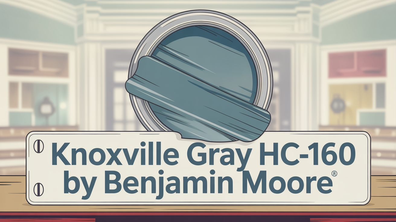
What Color Is Knoxville Gray HC-160 by Benjamin Moore?
Let’s break it down. Knoxville Gray HC-160 is a sophisticated blend of gray. It’s got those distinctive blue-green undertones that make it unique.
Think of it as a mid-toned color that simply oozes warmth and subtle elegance. It’s incredibly versatile and works beautifully whether your style is modern, classic, rustic, farmhouse, or even coastal.
Is Knoxville Gray HC-160 by Benjamin Moore Warm or Cool?
This is where Knoxville Gray really shows its adaptable nature. It’s often described as a versatile color offering depth and warmth. It’s a rich mix of blue, gray, and green hints.
Depending on the light, it can lean warmer or cooler. In bright light, you might see more blue. In dimmer or warmer light, the green and gray undertones can come forward, giving it a cozier feel. This adaptability helps it create a cozy, inviting atmosphere, perfect for spots like living rooms and bedrooms.
What is the Masstone of Knoxville Gray HC-160 by Benjamin Moore?
At its core, Knoxville Gray has a deep, rich gray tone. This primary gray gives it that instantly sophisticated look. The source information notes its gray masstone could be represented by the hex code #808080.
This deep gray masstone is key to its versatility. It pairs easily with various accent colors like whites, blues, or even bold yellows.
Undertones of Knoxville Gray HC-160 by Benjamin Moore
Now, let’s talk about what makes this color truly complex and fascinating: its undertones. These are the hidden colors mixed into the main shade that influence how it looks depending on lighting and surrounding colors.
Knoxville Gray features undertones of blue, green, and gray. This is where its versatile and adaptable quality comes from. The blue and green hints can give a room a calm, soothing, and refreshing vibe. The gray undertones add sophistication and balance.
As we mentioned, lighting is crucial. In brighter light, the blue undertones might be more noticeable, making it feel cooler. In dimmer light, the green or gray undertones can be more visible, creating that cozy feel. These undertones also help it pair well with things like warm wood furniture or modern metallic accents.
Coordinating Colors for Knoxville Gray HC-160 by Benjamin Moore
Choosing the right companions for Knoxville Gray can really enhance its elegance and create a harmonious space. You want colors that can add warmth, brightness, or softness.
Some great coordinating colors include:
- Rosy Peach 2089-20: This adds a lively, warm, and cheerful contrast that feels balanced.
- Greenmount Silk HC-3: A gentle, calming green that works beautifully with the deeper gray for a serene feel.
- Simply White OC-117: A crisp white that adds lightness and a clean, fresh look, great for highlighting architectural details.
- Cloud White OC-130: This creamy off-white provides warmth and depth without losing brightness, adding a cozy feel.
These colors come together to create inviting, balanced, and harmonious spaces.
How Does Lighting Affect Knoxville Gray HC-160 by Benjamin Moore?
Lighting dramatically influences how any color looks, and Knoxville Gray is a prime example. It’s a deep, muted shade with green and blue undertones that shift.
Here’s how different lighting might affect it:
- Natural Light: Its appearance changes based on the direction the light comes from.
- Artificial Light: Incandescent bulbs might highlight the green undertones, making it feel warmer. Fluorescent lighting can make the blue tones stand out more, giving it a cooler look.
Consider the room’s orientation:
- North-facing rooms: These get soft, cool indirect light. Knoxville Gray might look more blue and slightly darker here, providing a cozy feel despite the cooler light.
- South-facing rooms: With warm, bright light most of the day, it will likely appear lighter and slightly more green, as the sunlight enhances those green undertones, making the room feel welcoming.
- East-facing rooms: Morning light is bright; afternoon is softer. It might look brighter and livelier in the morning, shifting to a calmer tone in the afternoon.
- West-facing rooms: These get strong light late afternoon/evening. Knoxville Gray will likely look richer and darker as the sun sets, highlighting its depth.
Remember, you can always adjust artificial lighting to fine-tune the look.
What is the LRV of Knoxville Gray HC-160 by Benjamin Moore?
LRV, or Light Reflectance Value, tells us how much light a color reflects on a scale from 0 (black) to 100 (white). A low LRV means a color absorbs more light, appearing darker, while a high LRV means it reflects more, appearing lighter.
Knoxville Gray HC-160 has an LRV of 15.68. This puts it in the darker color category. It absorbs most light, giving walls depth and richness.
In rooms with lots of natural light, it might look a bit lighter and show more undertones. In dimly lit rooms, it feels quite cozy and intimate. This makes it great for adding personality without being overwhelmingly dark. Just be aware that in rooms with limited light, low LRV colors can sometimes make the space feel smaller.
What are the Trim Colors for Knoxville Gray HC-160 by Benjamin Moore?
Trim colors – the paint on moldings, door frames, and window frames – are essential for highlighting architectural features and creating contrast. With a rich color like Knoxville Gray, the right trim can either subtly complement or create a striking contrast.
Knoxville Gray is a versatile shade combining blue, green, and gray, perfect for a sophisticated background. Choosing trim helps bring out its character.
Here are some recommended trim colors:
- OC-110 Milkyway: A warm, creamy off-white that softens the boldness of Knoxville Gray for a classic, inviting feel.
- OC-149 Decorator’s White: A clean, crisp white that offers a pronounced contrast, creating a fresh, modern look where the gray walls really stand out.
Both options enhance Knoxville Gray but bring different moods to the space.
Colors Similar to Knoxville Gray HC-160 by Benjamin Moore
Sometimes it’s helpful to look at colors with similar characteristics to create a harmonious palette. These colors blend seamlessly and contribute to a unified space.
Knoxville Gray pairs well with several complementary colors, and there are also shades that share its vibe. Similar colors mentioned include:
- HC-124 Caldwell Green: Brings a subtle, serene forest green hint, balancing well with Knoxville Gray’s earthiness.
- 1637 Blue Spruce: Combines depth of blue and green, similar to winter trees, offering a cool, refreshing feel.
- 1568 Quarry Rock: A darker, more substantial gray with depth and solidity, like rugged stone.
- 1589 Kitty Gray: A lighter, softer gray with a gentle, elegant appeal, adding brightness.
This collection enhances the beauty of Knoxville Gray and helps create balanced, inviting spaces.
Colors that Go With Knoxville Gray HC-160 by Benjamin Moore
Beyond similar shades, other colors simply go well with Knoxville Gray’s sophisticated deep gray and blue undertones. Selecting complementary colors boosts its elegance and creates harmony.
Here are some recommended companions:
- HC-162 Brewster Gray: A soft gray with gentle undertones that provides a serene, subtle contrast.
- 2123-10 Mediterranean Teal: A vibrant blue-green that offers a pop of energy and depth, great for accents.
- 1588 Gray Pinstripe: An understated companion with clean, cool tones, useful for softening bolder colors.
- 1593 Adagio: A gentle blue-gray offering a delicate, calming aura for tranquil spaces.
- 1604 Silvery Moon: Injects luminosity and blends gracefully without stealing the show.
- 1605 Winter Solstice: A light, airy pale gray that provides crisp lightness, balancing heavier tones.
Each of these adds unique depth and variety to a design featuring Knoxville Gray.
How to Use Knoxville Gray HC-160 by Benjamin Moore In Your Home?
Knoxville Gray is a beautiful color that adds elegance, depth, and character to almost any room. Its rich gray with hints of green makes it incredibly versatile.
- Living Rooms: Creates a cozy and inviting space. Its warmth works well with both modern and traditional decor.
- Bedrooms: A soothing choice for walls, providing a restful backdrop perfect for relaxation.
- Kitchens: Looks sophisticated on cabinets, especially against light countertops.
- Offices: Provides a calm yet professional environment.
Pair it with white trim for a clean, fresh look, or natural wood tones to highlight their beauty. It’s a flexible option that adds interest suitable for many styles.
Knoxville Gray HC-160 vs. Kitty Gray 1589 by Benjamin Moore
Let’s compare Knoxville Gray to Kitty Gray. Knoxville Gray HC-160 is a bold, deep hue with a rich blend of blue and green undertones. It’s intense and adds a dramatic, timeless elegance, great for accent walls or cabinets.
Kitty Gray 1589 is softer and cooler with subtle blue undertones. It’s more subdued, offering a gentle, calming presence for a peaceful ambiance.
While both are grays, their character differs. Knoxville Gray is darker and more saturated, creating sophistication. Kitty Gray is lighter, making smaller spaces feel airy and open. Your choice depends on the mood you want: the boldness of Knoxville Gray or the calm of Kitty Gray.
Knoxville Gray HC-160 vs. Caldwell Green HC-124 by Benjamin Moore
Comparing these two shows how different shades create different vibes. Knoxville Gray is a muted, sophisticated gray with blue undertones. It gives rooms a calm, classic feel, ideal for living rooms or studies wanting a refined, relaxed atmosphere. It offers more personality than traditional grays.
Caldwell Green HC-124 is a rich, deep green. It feels earthy and vibrant, bringing nature indoors. It’s perfect for cozy, welcoming spaces like kitchens or dining rooms. Knoxville Gray offers cool elegance, while Caldwell Green brings warmth and energy.
Both work well in various settings. Knoxville Gray leans contemporary and understated, while Caldwell Green adds life. They can even complement each other in different areas of a home.
Knoxville Gray HC-160 vs. Quarry Rock 1568 by Benjamin Moore
Here’s another interesting comparison. Knoxville Gray HC-160 is a deep, rich tone blending blue and green with gray undertones. It feels classic, sophisticated, and cozy, perfect for living rooms or studies.
Quarry Rock 1568 is slightly warmer and earthier. While also gray, it leans towards a natural stone look, bringing warmth and an inviting atmosphere. It’s a great neutral yet welcoming option.
Both provide calm elegance. Knoxville Gray leans cooler with its blue hints, while Quarry Rock leans into earthy warmth. They offer flexibility based on your preferred style.
Knoxville Gray HC-160 vs. Blue Spruce 1637 by Benjamin Moore
Finally, let’s look at Blue Spruce. Knoxville Gray is that rich, muted gray with green and blue hints, creating a calm, sophisticated atmosphere for traditional and modern settings. Its understated elegance works for living rooms, bedrooms, or even exteriors.
Blue Spruce 1637 has a deeper, more pronounced blue-green tone. It feels bold yet cozy, often chosen for more intimate spaces like bedrooms or studies.
Knoxville Gray offers subtle sophistication and feels versatile and timeless. Blue Spruce is a stronger statement with its distinct, darker shade. Each brings unique warmth and character.
Conclusion
Knoxville Gray HC-160 is a fantastic choice for anyone seeking a stylish yet understated look. This deep, muted gray offers warmth and depth, making any space feel more complete and harmonious.
Whether you use it on walls, cabinets, or accent pieces, it’s incredibly easy to coordinate with different design elements and styles. It works well in various settings, from urban lofts to rustic cabins.
Its neutral tone is a wonderful backdrop, allowing your art, furniture, and decor to shine. It balances boldness with comfort and pairs beautifully with both warm and cool tones. Choosing Knoxville Gray is choosing a color that’s both visually appealing and practical.