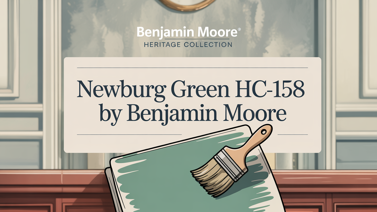
Choosing the right paint color can completely transform your space. It sets the mood, defines the style, and makes a house feel like a home. If you’re looking for a color that offers depth, sophistication, and incredible versatility, let’s talk about Benjamin Moore’s Newburg Green HC-158.
It’s not just a color; it’s an experience.
What Color Is Newburg Green HC-158 by Benjamin Moore?
This shade is a deep, rich green with significant blue undertones. Think of it as a sophisticated blend that brings a sense of depth and elegance to any area.
It’s more intense than a typical teal but definitely not as dark as navy, hitting a sweet spot that’s perfect for creating spaces that feel both cozy and inviting.
Newburg Green works beautifully across many interior styles. Whether your home leans traditional, transitional, or firmly modern, this color can adapt. In classic settings, it’s stunning alongside dark woods and elegant furnishings, while for a contemporary vibe, pair it with crisp whites and sleek pieces for a sharp contrast.
It also plays well with different materials. Brushed metals like brass or gold add warmth and a touch of luxury against it. Natural elements like wood and leather see their rich tones enhanced by this color. Even textiles like velvet, linen, and wool become richer when Newburg Green serves as their backdrop.
Consider using this color on walls in spaces like home offices, libraries, or dining areas. It really helps set a focused, intimate mood. It can act as your bold statement color or as a harmonious backdrop for other accent hues.
Is Newburg Green HC-158 by Benjamin Moore Warm or Cool color?
Newburg Green is a complex shade because it combines elements of both blue and green. While it has depth and can create a cozy, inviting feel, it often leans towards the cooler side due to its strong blue and green components, especially the prominent dark turquoise masstone.
However, its richness and the way it absorbs light can give a sense of warmth or intimacy. It has a unique ability to feel both sophisticated and warm depending on the context and lighting.
In a living room, it makes the space feel welcoming and adds depth. In a dining area, it brings elegance, and in a bedroom, it provides a soothing environment ideal for relaxation.
You can enhance its richness by pairing it with lighter colors like whites, creams, or soft grays. Adding metallic accents like gold or bronze also introduces a touch of luxury. Overall, its adaptability and depth make it a truly dynamic choice for interiors.
What is the Masstone of the Newburg Green HC-158 by Benjamin Moore?
Every color has a primary appearance, known as its masstone. For Newburg Green HC-158, the masstone is a dark turquoise, specifically identified by the hex code #2B8080.
This dark turquoise quality is what gives the color its calming and serene feel. It might remind you of deep ocean waters or the lush depths of a forest. This cool quality offers a refreshing atmosphere within your home.
Used in spaces like a living room or bedroom, it cultivates a cozy and inviting feel. Its depth and richness are beautifully highlighted when paired with neutral tones like whites and grays.
It also harmonizes wonderfully with natural materials such as wood and stone, bringing warmth and texture to your overall design. In a home office or study, this deep, tranquil nature can actually help promote focus and concentration, fostering a peaceful setting conducive to productivity.
Undertones of Newburg Green HC-158 by Benjamin Moore
Newburg Green isn’t just a simple mix of blue and green; it’s quite complex! It boasts a rich array of subtle undertones that truly influence how you perceive the color in your space.
These hidden colors include hints of navy, dark green, grey, lilac, mint, violet, purple, olive, and brown. They are vital to how the color looks under different conditions.
When light hits the walls, these undertones become more or less apparent. Natural sunlight, for instance, might bring out the blue or turquoise hints. Artificial lighting could emphasize the green or grey. This constant interplay with light and shadow significantly impacts the mood and feel of the room.
The strong navy and dark green elements lend depth and sophistication, making spaces feel wonderfully cozy and elegant. Grey and dark grey bits enhance a sense of classic, timeless quality. You might even catch a hint of mystique from the violet and purple notes, adding unexpected richness. Meanwhile, the olive and brown provide warmth, helping to balance out the cooler aspects.
Depending on the lighting, you might see refreshing mint or turquoise undertones come forward, offering a lively vibe. This complexity means Newburg Green is incredibly versatile, fitting everything from traditional to contemporary styles. Its array of undertones allows it to adapt and create environments that feel both calm and inviting.
Coordinating Colors of Newburg Green HC-158 by Benjamin Moore
Selecting colors that pair well with Newburg Green is key to creating a harmonious space. Coordinating colors balance tones and add depth without overwhelming the main shade. Newburg Green, serving as a rich backdrop, pairs beautifully with several complementary hues.
Here are some recommendations:
- AF-15 Steam: This is a soft, warm off-white. It brings a clean, fresh feel and offers a lovely contrast to Newburg Green’s depth. It helps add brightness and makes the space feel more open.
- 1562 Healing Aloe: A gentle, muted green with a touch of blue. It has a fresh, relaxing essence and adds a soothing element, enhancing the calming aspect of Newburg Green.
- OC-86 White Blush: A delicate white with a subtle pink undertone. This adds a touch of warmth and elegance to the palette, creating a refined feel.
- HC-57 Sheraton Beige: A timeless, versatile beige. It provides an understated earthy tone that complements the richness of Newburg Green without competing with it.
Using these colors together helps create a balanced and cohesive look in any room, allowing Newburg Green to stand out beautifully while integrating smoothly with other elements.
How Does Lighting Affect Newburg Green HC-158 by Benjamin Moore?
Lighting is a critical factor in how paint colors appear. The same color can look quite different depending on whether it’s under natural light, artificial light, or even based on which direction the room faces. Newburg Green HC-158 is particularly sensitive to lighting variations.
In natural light, the color often shows its most authentic self, but even natural light changes throughout the day. Morning light tends to be crisp and cool, while afternoon light can be much warmer.
Artificial light sources also matter. An incandescent bulb, which emits a warm, yellowish glow, can make Newburg Green appear warmer and slightly more muted. Fluorescent lighting, on the other hand, has a cooler tone that might make the color lean more blue.
The direction a room faces significantly impacts the natural light it receives:
- North-facing rooms get cooler, steadier light. Here, Newburg Green might take on a muted, cooler tone and appear slightly more blue than green.
- South-facing rooms receive brighter, warmer light. In these spaces, Newburg Green often looks richer and more vibrant, revealing its full depth.
- East-facing rooms benefit from soft morning light. The color could appear crisp and fresh in the morning before becoming a bit more muted as the sun moves away.
- West-facing rooms get warm afternoon and evening light. Newburg Green might start the day looking cooler and become noticeably richer as the day progresses into evening.
Understanding how lighting will interact with Newburg Green in your specific space is really important. It’s highly recommended to test paint swatches on your walls and observe them at different times of the day and under various lighting conditions to ensure you’ll love the final result.
What is the LRV of Newburg Green HC-158 by Benjamin Moore?
LRV stands for Light Reflectance Value. It’s a measurement, given as a percentage from 0% to 100%, that tells you how much light a color reflects versus absorbs. 0% means no light is reflected (true black), and 100% means all light is reflected (true white).
Colors with a low LRV are darker because they absorb more light. Colors with a high LRV are lighter and reflect more light. Knowing a color’s LRV helps you predict how it will perform in a room based on the amount of light available.
A color’s LRV greatly affects the atmosphere and mood of a space, influencing whether a room feels more spacious or cozy.
Newburg Green HC-158 has an LRV of 10.58. This is quite low on the scale. It means Newburg Green is indeed a dark, rich color that absorbs most of the light that hits its surface, reflecting very little back into the room.
This low LRV means Newburg Green can make a room feel wonderfully intimate and cozy. However, especially in spaces with limited natural light, it might also make the room feel smaller. In rooms that are well-lit, this low LRV adds significant depth and a sense of richness to the walls.
When using a color this dark, it’s often a good idea to balance it with lighter furnishings, trim, or accents. This prevents the space from potentially feeling too closed in while still allowing the richness of Newburg Green to shine.
What are the Trim colors of Newburg Green HC-158 by Benjamin Moore?
Trim colors are like the frame around your wall color. They add definition, emphasis, and help to tie the design of a room together. When you’re using a deep, sophisticated color like Newburg Green, choosing the right trim color is crucial.
Trim colors help balance the richness and elegance of Newburg Green, preventing the room from feeling too dark or heavy. The right choice can brighten the space, highlight architectural details, and enhance the overall look.
Here are some recommended trim colors that work beautifully with Newburg Green:
- OC-117 Simply White: This is a classic choice offering a clean look with warm, soft undertones. It’s excellent for adding warmth and light, providing a subtle contrast that really makes Newburg Green pop while feeling inviting.
- OC-61 White Diamond: A cooler, crisper white option. This brings a fresh and modern edge. It offers a refined, sleek contrast against the deep green, perfect if you’re going for a more contemporary feel.
Both Simply White and White Diamond beautifully frame Newburg Green, each adding their own unique flair and offering versatility in achieving your desired atmosphere.
Colors Similar to Newburg Green HC-158 by Benjamin Moore
Sometimes you’re looking for a color that has a similar feel or shares undertones with a favorite, but isn’t quite the same. Choosing similar colors can help create an inviting and cohesive atmosphere in your home because they often harmonize effortlessly. This helps establish a sense of unity and makes design flow smoothly.
When colors are closely related, they transition subtly across walls, furniture, and decor, avoiding harsh contrasts and maintaining a consistent mood.
One color that shares similarities with Newburg Green HC-158 is Vanderberg Blue 721.
- Vanderberg Blue 721 is described as a deep, muted blue with hints of green, evoking the feeling of a peaceful twilight sky just before darkness.
- Newburg Green HC-158 is a rich mix of blue and green, delivering a robust and cozy feel, like a plush forest canopy offering shelter.
Both colors share a certain depth that creates a sense of comfort and security. While they are distinct, their complementary undertones allow them to merge beautifully, smoothing any potential visual clashes when used in the same space, leading to a seamlessly blended interior.
How to Use Newburg Green HC-158 In Your Home?
Newburg Green HC-158 is a versatile and sophisticated color, perfect for adding warmth and depth throughout your home. Its deep green with blue undertones makes it adaptable for various applications and styles.
Here are some ideas for using this beautiful shade:
- Living Rooms: It creates a wonderfully cozy and inviting atmosphere. Pair it with white trim like Simply White or White Diamond to make the color stand out and add brightness.
- Dining Rooms: Use it for a bold statement. It enhances the ambiance, making meals feel more intimate and special.
- Bedrooms: It provides a calming backdrop, ideal for relaxing and unwinding after a busy day.
- Pairing: It complements other colors like cream or beige, adding depth and visual interest.
- Accents: If painting whole walls feels too bold, use Newburg Green in accent pieces like pillows, curtains, or decor items. This can help tie a room together and introduce the color in a less permanent way.
This shade works well with both modern and traditional design styles, making it a fantastic choice for many different homes and aesthetics.
Newburg Green HC-158 by Benjamin Moore vs Vanderberg Blue 721 by Benjamin Moore
When considering deep, atmospheric colors from Benjamin Moore, Newburg Green HC-158 and Vanderberg Blue 721 might come up. While they share a certain depth, they offer distinct feels.
- Newburg Green HC-158 is a rich, deep green with blue undertones. It has a sophisticated and calming appeal, known for creating cozy atmospheres. It feels elegant and can add a touch of boldness while remaining versatile with various colors and materials. It brings drama and intensity.
- Vanderberg Blue 721 is a softer, more muted blue with green hints. It offers a gentler, more relaxed feel compared to Newburg Green’s intensity. It works well in spaces where you want a lighter touch, such as bedrooms or bathrooms, bringing a sense of openness and serenity. It offers a serene and light-hearted ambiance.
Choosing between them depends entirely on the atmosphere you want to create. Newburg Green is for depth, sophistication, and a touch of drama, while Vanderberg Blue is for softness, serenity, and a lighter feel.
Conclusion
This rich color truly has a special quality. Its deep, muted tones work wonders in creating an atmosphere that feels both calm and incredibly inviting. There’s a sense of being grounded and comfortable when you’re in a space painted with this shade.
The elegance of this deep green fits seamlessly into various design styles, from classic traditional homes to sleek modern spaces. It’s a color that provides a perfect backdrop, highlighting your furniture and decor without ever stealing the show. Plus, its ability to adapt and complement a wide range of other colors gives you fantastic flexibility when it comes to accessorizing and styling your room.
What’s great is that Newburg Green maintains its depth and allure regardless of the lighting conditions. It performs beautifully whether bathed in natural sunlight or under artificial light sources at night. It’s a choice that offers a balance of sophistication and comfort, suitable for both residential and commercial settings.
If you’re looking for a paint color that brings subtle charm, enhances your environment, and makes a space feel truly complete and enjoyable, Newburg Green is an excellent contender. It’s a color that adds character and depth in a quietly confident way.