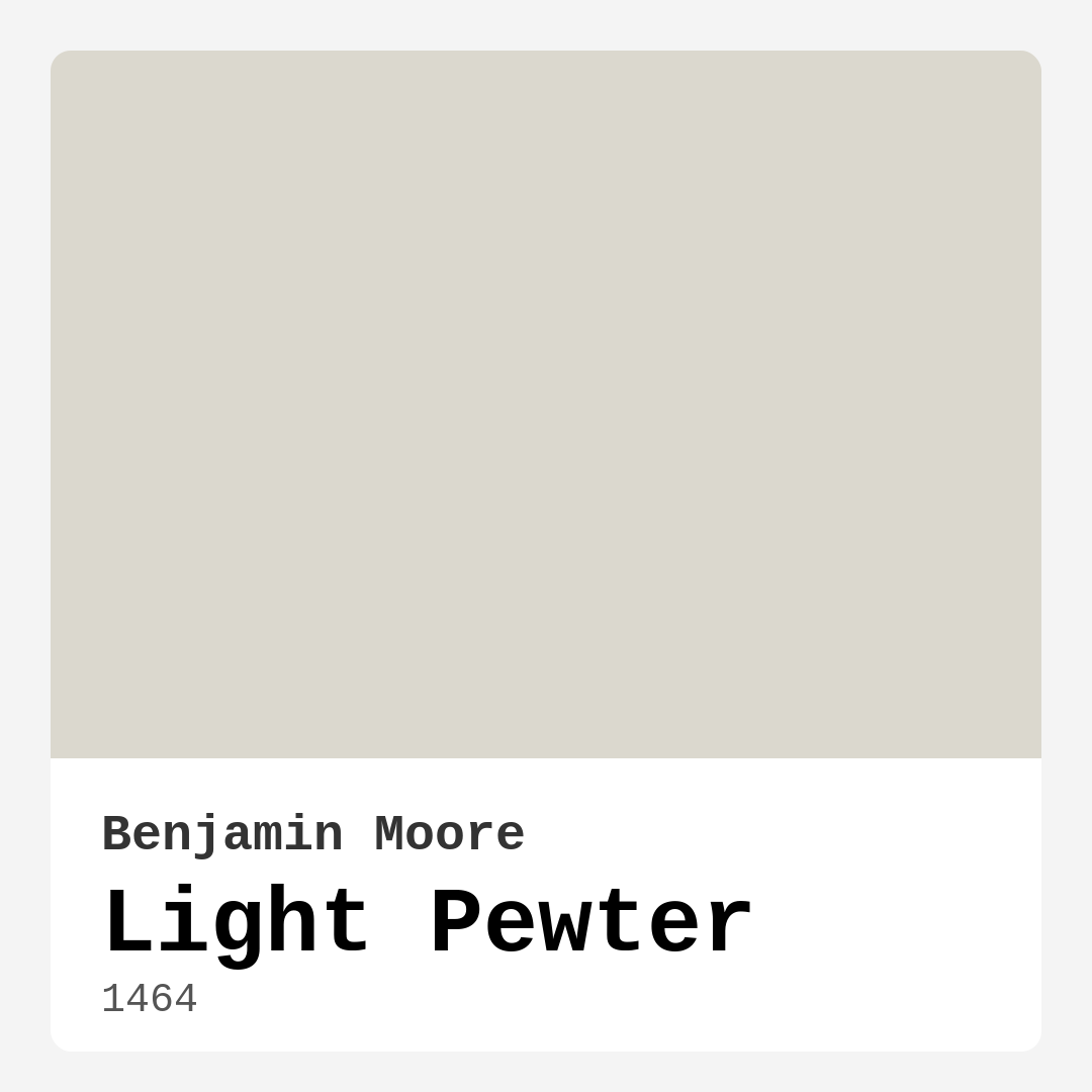
Color Preview & Key Details
| HEX Code | #DBD8CE |
| RGB | 219, 216, 206 |
| LRV | 67.52% |
| Undertone | Yellow |
| Finish Options | Eggshell, Matte, Satin |
Imagine walking into a room that instantly makes you exhale—soft, soothing, and effortlessly elegant. That’s the magic of Benjamin Moore’s Light Pewter (1464). It’s not just another gray; it’s a whisper of warmth, a backdrop that makes your space feel both polished and personal. Whether you’re refreshing a tired living room or designing a serene bedroom retreat, this color might just be the secret weapon you’ve been searching for.
Light Pewter is a chameleon in the best way. At first glance, it’s a gentle gray, but look closer, and you’ll notice its subtle yellow undertones adding depth and warmth. This isn’t a cold, stark gray—it’s inviting, almost like a cashmere throw for your walls. With an LRV of 67.52%, it reflects plenty of light, making rooms feel airy and open. But here’s the catch: in dimly lit spaces, it can lean a bit moodier, so if your room lacks natural light, test a swatch first to see how it behaves.
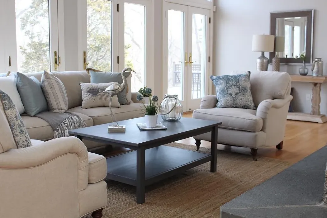
One of the biggest wins with Light Pewter is its versatility. It plays well with almost every decor style. Modern minimalist? Check. Cozy farmhouse? Absolutely. Coastal vibes? It’s got that breezy, relaxed feel down pat. Pair it with crisp white trim like Benjamin Moore’s White Dove for a classic look, or let it mingle with brass fixtures and warm wood tones to amplify its cozy side. If you’re feeling bold, try it alongside a deep navy or forest green—the contrast is stunning without feeling jarring.
Application is a breeze, even if you’re a DIY newbie. It’s roller-ready, covers well in one to two coats, and touch-ups blend seamlessly. Opt for an eggshell finish for a soft sheen that’s easy to clean, or go matte for a velvety, modern look. And because it’s low-VOC, you won’t have to worry about harsh fumes, making it a great choice for bedrooms or homes with kids and pets.
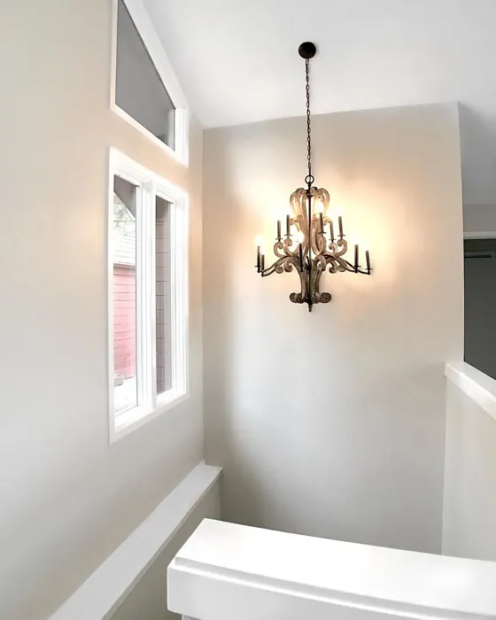
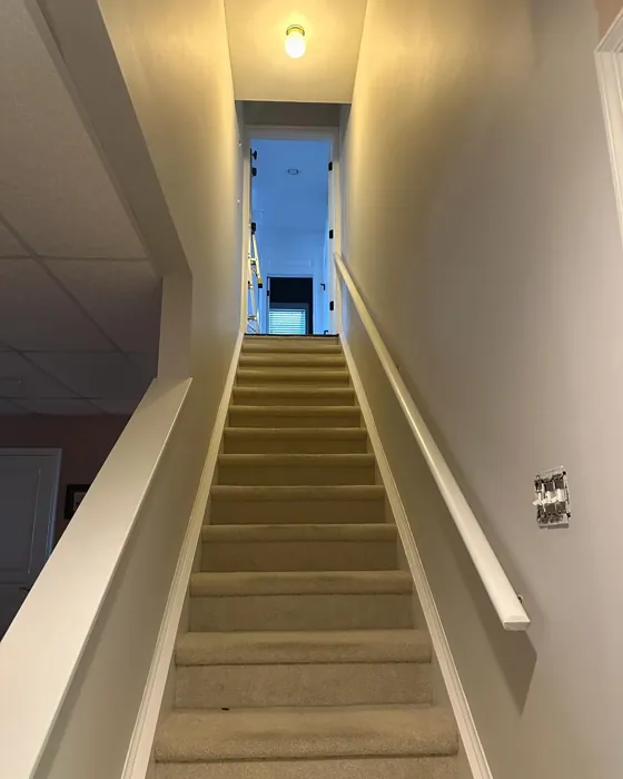
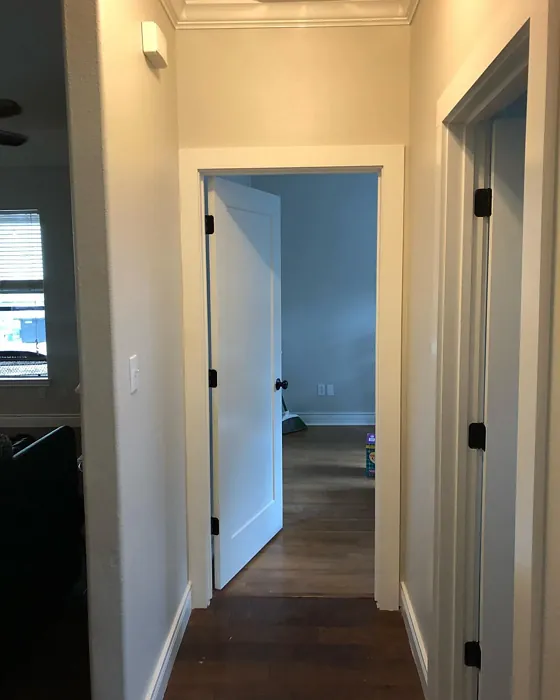
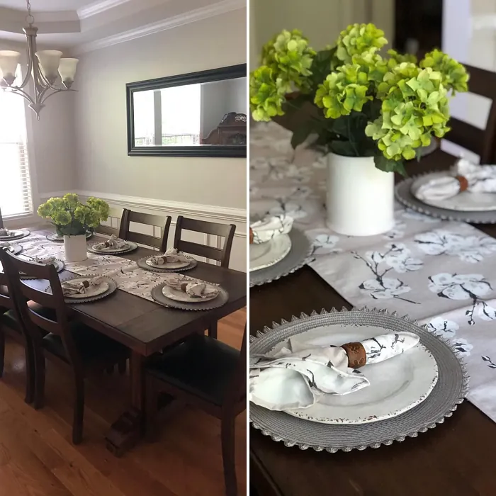
Now, let’s talk rooms. Light Pewter shines in living spaces where you want calm without sacrificing sophistication. In a bedroom, it creates a restful retreat—pair it with linen bedding and muted textiles for a hotel-worthy vibe. Home offices benefit from its unobtrusive elegance, keeping distractions at bay while feeling anything but sterile. Even hallways, often overlooked, feel intentional and inviting when wrapped in this hue.
Of course, no color is perfect for everyone. If you love bold, high-contrast spaces, Light Pewter might feel too subtle. And while its warmth is a pro for many, if your room gets tons of cool northern light, those yellow undertones might clash. Always sample it on your walls and observe it at different times of day. Paint is the cheapest way to transform a space, but it’s also the hardest to undo if you rush the decision.
So, is Light Pewter right for you? If you’re after a color that’s timeless but not boring, warm but not beige, and flexible enough to grow with your style, it’s a contender. It’s the kind of gray that doesn’t just sit on your walls—it works with them, adapting to your light, your furniture, your life. And isn’t that what great design should do?
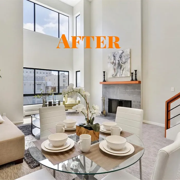
Real Room Photo of Light Pewter 1464
Undertones of Light Pewter ?
The undertones of Light Pewter are a key aspect of its character, leaning towards Yellow. These subtle underlying hues are what give the color its depth and complexity. For example, a gray with a blue undertone will feel cooler and more modern, while one with a brown undertone will feel warmer and more traditional. It’s essential to test this paint in your home and observe it next to your existing furniture, flooring, and decor to see how these undertones interact and reveal themselves throughout the day.
HEX value: #DBD8CE
RGB code: 219, 216, 206
Is Light Pewter Cool or Warm?
This color leans slightly warm, giving it a welcoming vibe that can enhance the overall ambiance of your home. While it’s predominantly gray, its warmth helps create a cozy atmosphere, especially in naturally lit spaces.
Understanding Color Properties and Interior Design Tips
Hue refers to a specific position on the color wheel, measured in degrees from 0 to 360. Each degree represents a different pure color:
- 0° represents red
- 120° represents green
- 240° represents blue
Saturation describes the intensity or purity of a color and is expressed as a percentage:
- At 0%, the color appears completely desaturated—essentially a shade of gray
- At 100%, the color is at its most vivid and vibrant
Lightness indicates how light or dark a color is, also expressed as a percentage:
- 0% lightness results in black
- 100% lightness results in white
Using Warm Colors in Interior Design
Warm hues—such as reds, oranges, yellows, warm beiges, and greiges—are excellent choices for creating inviting and energetic spaces. These colors are particularly well-suited for:
- Kitchens, living rooms, and bathrooms, where warmth enhances comfort and sociability
- Large rooms, where warm tones can help reduce the sense of emptiness and make the space feel more intimate
For example:
- Warm beige shades provide a cozy, inviting atmosphere, ideal for living rooms, bedrooms, and hallways.
- Warm greige (a mix of beige and gray) offers the warmth of beige with the modern appeal of gray, making it a versatile backdrop for dining areas, bedrooms, and living spaces.
However, be mindful when using warm light tones in rooms with limited natural light. These shades may appear muted or even take on an unpleasant yellowish tint. To avoid a dull or flat appearance:
- Add depth by incorporating richer tones like deep greens, charcoal, or chocolate brown
- Use textured elements such as curtains, rugs, or cushions to bring dimension to the space
Pro Tip: Achieving Harmony with Warm and Cool Color Balance
To create a well-balanced and visually interesting interior, mix warm and cool tones strategically. This contrast adds depth and harmony to your design.
- If your walls feature warm hues, introduce cool-colored accents such as blue or green furniture, artwork, or accessories to create contrast.
- For a polished look, consider using a complementary color scheme, which pairs colors opposite each other on the color wheel (e.g., red with green, orange with blue).
This thoughtful mix not only enhances visual appeal but also creates a space that feels both dynamic and cohesive.
Light Temperature Affects on Light Pewter
Natural Light
Natural daylight changes in color temperature as the sun moves across the sky. At sunrise and sunset, the light tends to have a warm, golden tone with a color temperature around 2000 Kelvin (K). As the day progresses and the sun rises higher, the light becomes cooler and more neutral. Around midday, especially when the sky is clear, natural light typically reaches its peak brightness and shifts to a cooler tone, ranging from 5500 to 6500 Kelvin. This midday light is close to what we perceive as pure white or daylight-balanced light.
These shifts in natural light can significantly influence how colors appear in a space, which is why designers often consider both the time of day and the orientation of windows when planning interior color schemes.
Artificial Light
When choosing artificial lighting, pay close attention to the color temperature, measured in Kelvin (K). This determines how warm or cool the light will appear. Lower temperatures, around 2700K, give off a warm, yellow glow often used in living rooms or bedrooms. Higher temperatures, above 5000K, create a cool, bluish light similar to daylight, commonly used in kitchens, offices, or task areas.
Use the slider to see how lighting temperature can affect the appearance of a surface or color throughout a space.


4800K
LRV of Light Pewter
The Light Reflectance Value (LRV) of Light Pewter is 67.52%, which places it in the Light colors category. This means it reflect most of the incident light. Understanding a paint’s LRV is crucial for predicting how it will look in your space. A higher LRV indicates a lighter color that reflects more light, making rooms feel larger and brighter. A lower LRV signifies a darker color that absorbs more light, creating a cozier, more intimate atmosphere. Always consider the natural and artificial lighting in your room when selecting a paint color based on its LRV.
Detailed Review of Light Pewter
Additional Paint Characteristics
Ideal Rooms
Bedroom, Dining Room, Hallway, Home Office, Living Room
Decor Styles
Coastal, Farmhouse, Minimalist, Modern, Transitional
Coverage
Good (1–2 Coats), Touch-Up Friendly
Ease of Application
Beginner Friendly, Brush Smooth, Roller-Ready
Washability
Washable, Wipeable
VOC Level
Eco-Certified, Low VOC
Best Use
Accent Wall, Interior Walls, Open Concept Spaces
Room Suitability
Bedroom, Dining Room, Hallway, Home Office, Living Room
Tone Tag
Dusty, Muted, Neutral, Warm
Finish Type
Eggshell, Matte, Satin
Paint Performance
Easy Touch-Up, High Coverage, Low Odor
Use Cases
Best for Low Light Rooms, Best for Open Concept, Best for Rentals, Classic Favorite
Mood
Calm, Cozy, Inviting, Restful
Trim Pairing
Complements Brass Fixtures, Matches Pure White, Pairs with White Dove
Light Pewter is a fantastic choice for anyone looking to create a serene and inviting atmosphere. Its soft gray tone pairs well with both warm and cool colors, making it incredibly versatile. Whether you’re updating a room or starting from scratch, this paint can be a backdrop for vibrant artwork or complement neutral furnishings. It’s particularly effective in spaces where you want to foster relaxation, like bedrooms or living areas. The application is smooth, and with its good coverage, you’ll find that it quickly transforms your space. Overall, Light Pewter is a solid option for anyone seeking a timeless, adaptable color.
Pros & Cons of 1464 Light Pewter
Pros
Cons
Colors that go with Benjamin Moore Light Pewter
FAQ on 1464 Light Pewter
Can Light Pewter be used in small spaces?
Absolutely! Light Pewter is a great choice for small rooms. Its light reflectance helps open up the space, making it feel larger and more airy. Just be mindful of the lighting; in dim areas, it might appear a bit darker, so consider using it in rooms with plenty of natural light to maximize its potential.
What colors pair well with Light Pewter?
Light Pewter is incredibly versatile and pairs beautifully with a variety of colors. For a soft, monochromatic look, consider whites and creams. If you’re after a more vibrant contrast, rich navy blues or deep greens can work wonders. Additionally, warm woods and earthy tones complement its warmth, enhancing the cozy feel.
Comparisons Light Pewter with other colors
Light Pewter 1464 vs Agreeable Gray SW 7029
| Attribute | Light Pewter 1464 | Agreeable Gray SW 7029 |
|---|---|---|
| Color Name | Light Pewter 1464 | Agreeable Gray SW 7029 |
| Color | ||
| Hue | Grey | Grey |
| Brightness | Light | Light |
| RGB | 219, 216, 206 | 209, 203, 193 |
| LRV | 67.52% | 60% |
| Finish Type | Eggshell, Matte, Satin | Eggshell, Matte, Satin |
| Finish Options | Eggshell, Matte, Satin | Eggshell, Flat, Matte, Satin |
| Ideal Rooms | Bedroom, Dining Room, Hallway, Home Office, Living Room | Bathroom, Bedroom, Dining Room, Home Office, Kitchen, Living Room |
| Decor Styles | Coastal, Farmhouse, Minimalist, Modern, Transitional | Contemporary, Farmhouse, Minimalist, Modern, Transitional |
| Coverage | Good (1–2 Coats), Touch-Up Friendly | Good (1–2 Coats), Touch-Up Friendly |
| Ease of Application | Beginner Friendly, Brush Smooth, Roller-Ready | Beginner Friendly, Brush Smooth, Roller-Ready |
| Washability | Washable, Wipeable | Washable, Wipeable |
| Room Suitability | Bedroom, Dining Room, Hallway, Home Office, Living Room | Bathroom, Bedroom, Dining Room, Kitchen, Living Room |
| Tone | Dusty, Muted, Neutral, Warm | Muted, Neutral, Warm |
| Paint Performance | Easy Touch-Up, High Coverage, Low Odor | Easy Touch-Up, Fade Resistant, Low Odor |
Light Pewter 1464 vs Eider White SW 7014
| Attribute | Light Pewter 1464 | Eider White SW 7014 |
|---|---|---|
| Color Name | Light Pewter 1464 | Eider White SW 7014 |
| Color | ||
| Hue | Grey | Grey |
| Brightness | Light | Light |
| RGB | 219, 216, 206 | 226, 222, 216 |
| LRV | 67.52% | 73% |
| Finish Type | Eggshell, Matte, Satin | Eggshell, Matte, Satin |
| Finish Options | Eggshell, Matte, Satin | Eggshell, Matte, Satin |
| Ideal Rooms | Bedroom, Dining Room, Hallway, Home Office, Living Room | Bathroom, Bedroom, Dining Room, Home Office, Kitchen, Living Room |
| Decor Styles | Coastal, Farmhouse, Minimalist, Modern, Transitional | Farmhouse, Minimalist, Modern, Scandinavian, Transitional |
| Coverage | Good (1–2 Coats), Touch-Up Friendly | Good (1–2 Coats), Touch-Up Friendly |
| Ease of Application | Beginner Friendly, Brush Smooth, Roller-Ready | Beginner Friendly, Brush Smooth, Roller-Ready |
| Washability | Washable, Wipeable | Highly Washable, Washable |
| Room Suitability | Bedroom, Dining Room, Hallway, Home Office, Living Room | Bathroom, Bedroom, Dining Room, Kitchen, Living Room |
| Tone | Dusty, Muted, Neutral, Warm | Creamy, Muted, Neutral, Warm |
| Paint Performance | Easy Touch-Up, High Coverage, Low Odor | Easy Touch-Up, High Coverage, Low Odor, Scuff Resistant |
Light Pewter 1464 vs Drift of Mist SW 9166
| Attribute | Light Pewter 1464 | Drift of Mist SW 9166 |
|---|---|---|
| Color Name | Light Pewter 1464 | Drift of Mist SW 9166 |
| Color | ||
| Hue | Grey | Grey |
| Brightness | Light | Light |
| RGB | 219, 216, 206 | 220, 216, 208 |
| LRV | 67.52% | 65% |
| Finish Type | Eggshell, Matte, Satin | Eggshell, Matte, Satin |
| Finish Options | Eggshell, Matte, Satin | Eggshell, Matte, Satin |
| Ideal Rooms | Bedroom, Dining Room, Hallway, Home Office, Living Room | Bathroom, Bedroom, Home Office, Kitchen, Living Room |
| Decor Styles | Coastal, Farmhouse, Minimalist, Modern, Transitional | Coastal, Minimalist, Modern, Scandinavian |
| Coverage | Good (1–2 Coats), Touch-Up Friendly | Good (1–2 Coats), Touch-Up Friendly |
| Ease of Application | Beginner Friendly, Brush Smooth, Roller-Ready | Beginner Friendly, Brush Smooth, Fast-Drying, Roller-Ready |
| Washability | Washable, Wipeable | Washable, Wipeable |
| Room Suitability | Bedroom, Dining Room, Hallway, Home Office, Living Room | Bathroom, Bedroom, Home Office, Living Room |
| Tone | Dusty, Muted, Neutral, Warm | Airy, Cool, Neutral |
| Paint Performance | Easy Touch-Up, High Coverage, Low Odor | Easy Touch-Up, Low Odor, Quick Drying, Scuff Resistant |
Light Pewter 1464 vs Sanctuary SW 9583
| Attribute | Light Pewter 1464 | Sanctuary SW 9583 |
|---|---|---|
| Color Name | Light Pewter 1464 | Sanctuary SW 9583 |
| Color | ||
| Hue | Grey | Grey |
| Brightness | Light | Light |
| RGB | 219, 216, 206 | 230, 226, 217 |
| LRV | 67.52% | 24% |
| Finish Type | Eggshell, Matte, Satin | Eggshell, Matte, Satin |
| Finish Options | Eggshell, Matte, Satin | Eggshell, Matte, Satin |
| Ideal Rooms | Bedroom, Dining Room, Hallway, Home Office, Living Room | Bedroom, Dining Room, Home Office, Living Room, Nursery |
| Decor Styles | Coastal, Farmhouse, Minimalist, Modern, Transitional | Bohemian, Coastal, Modern Farmhouse, Scandinavian |
| Coverage | Good (1–2 Coats), Touch-Up Friendly | Good (1–2 Coats), Touch-Up Friendly |
| Ease of Application | Beginner Friendly, Brush Smooth, Roller-Ready | Beginner Friendly, Brush Smooth, Fast-Drying, Roller-Ready |
| Washability | Washable, Wipeable | Highly Washable, Washable, Wipeable |
| Room Suitability | Bedroom, Dining Room, Hallway, Home Office, Living Room | Bedroom, Home Office, Living Room, Nursery |
| Tone | Dusty, Muted, Neutral, Warm | Earthy, Neutral, Soft, Warm |
| Paint Performance | Easy Touch-Up, High Coverage, Low Odor | Easy Touch-Up, Low Odor, Quick Drying, Scuff Resistant |
Light Pewter 1464 vs Snowbound SW 7004
| Attribute | Light Pewter 1464 | Snowbound SW 7004 |
|---|---|---|
| Color Name | Light Pewter 1464 | Snowbound SW 7004 |
| Color | ||
| Hue | Grey | Grey |
| Brightness | Light | Light |
| RGB | 219, 216, 206 | 237, 234, 229 |
| LRV | 67.52% | 83% |
| Finish Type | Eggshell, Matte, Satin | Eggshell, Matte, Satin |
| Finish Options | Eggshell, Matte, Satin | Eggshell, Matte, Satin |
| Ideal Rooms | Bedroom, Dining Room, Hallway, Home Office, Living Room | Bathroom, Bedroom, Dining Room, Hallway, Home Office, Kitchen, Living Room, Nursery |
| Decor Styles | Coastal, Farmhouse, Minimalist, Modern, Transitional | Farmhouse, Minimalist, Modern, Scandinavian, Transitional |
| Coverage | Good (1–2 Coats), Touch-Up Friendly | Good (1–2 Coats), Touch-Up Friendly |
| Ease of Application | Beginner Friendly, Brush Smooth, Roller-Ready | Beginner Friendly, Brush Smooth, Fast-Drying, Roller-Ready |
| Washability | Washable, Wipeable | Washable, Wipeable |
| Room Suitability | Bedroom, Dining Room, Hallway, Home Office, Living Room | Bathroom, Bedroom, Dining Room, Hallway, Home Office, Kitchen, Living Room |
| Tone | Dusty, Muted, Neutral, Warm | Airy, Crisp, Neutral, Warm |
| Paint Performance | Easy Touch-Up, High Coverage, Low Odor | High Coverage, Low Odor, Quick Drying |
Light Pewter 1464 vs Pure White SW 7005
| Attribute | Light Pewter 1464 | Pure White SW 7005 |
|---|---|---|
| Color Name | Light Pewter 1464 | Pure White SW 7005 |
| Color | ||
| Hue | Grey | Grey |
| Brightness | Light | Light |
| RGB | 219, 216, 206 | 237, 236, 230 |
| LRV | 67.52% | 84% |
| Finish Type | Eggshell, Matte, Satin | Eggshell, Satin, Semi-Gloss |
| Finish Options | Eggshell, Matte, Satin | Eggshell, Flat, Matte, Satin, Semi-Gloss |
| Ideal Rooms | Bedroom, Dining Room, Hallway, Home Office, Living Room | Bathroom, Bedroom, Dining Room, Entryway, Hallway, Home Office, Kitchen, Living Room, Nursery |
| Decor Styles | Coastal, Farmhouse, Minimalist, Modern, Transitional | Bohemian, Eclectic, Farmhouse, Minimalist, Modern, Traditional |
| Coverage | Good (1–2 Coats), Touch-Up Friendly | Good (1–2 Coats), Touch-Up Friendly |
| Ease of Application | Beginner Friendly, Brush Smooth, Roller-Ready | Beginner Friendly, Brush Smooth, Fast-Drying, Roller-Ready |
| Washability | Washable, Wipeable | Highly Washable, Washable |
| Room Suitability | Bedroom, Dining Room, Hallway, Home Office, Living Room | Bathroom, Bedroom, Dining Room, Entryway, Hallway, Home Office, Kitchen, Living Room, Nursery |
| Tone | Dusty, Muted, Neutral, Warm | Crisp, Neutral, Warm |
| Paint Performance | Easy Touch-Up, High Coverage, Low Odor | Easy Touch-Up, High Coverage, Low Odor, Quick Drying |
Light Pewter 1464 vs Crushed Ice SW 7647
| Attribute | Light Pewter 1464 | Crushed Ice SW 7647 |
|---|---|---|
| Color Name | Light Pewter 1464 | Crushed Ice SW 7647 |
| Color | ||
| Hue | Grey | Grey |
| Brightness | Light | Light |
| RGB | 219, 216, 206 | 214, 211, 204 |
| LRV | 67.52% | 66% |
| Finish Type | Eggshell, Matte, Satin | Eggshell, Matte, Satin |
| Finish Options | Eggshell, Matte, Satin | Eggshell, Matte, Satin |
| Ideal Rooms | Bedroom, Dining Room, Hallway, Home Office, Living Room | Bathroom, Bedroom, Dining Room, Home Office, Living Room |
| Decor Styles | Coastal, Farmhouse, Minimalist, Modern, Transitional | Farmhouse, Minimalist, Modern, Scandinavian, Transitional |
| Coverage | Good (1–2 Coats), Touch-Up Friendly | Good (1–2 Coats), Touch-Up Friendly |
| Ease of Application | Beginner Friendly, Brush Smooth, Roller-Ready | Beginner Friendly, Brush Smooth, Roller-Ready |
| Washability | Washable, Wipeable | Stain Resistant, Washable |
| Room Suitability | Bedroom, Dining Room, Hallway, Home Office, Living Room | Bathroom, Bedroom, Dining Room, Hallway, Home Office, Living Room |
| Tone | Dusty, Muted, Neutral, Warm | Muted, Neutral, Warm |
| Paint Performance | Easy Touch-Up, High Coverage, Low Odor | High Coverage, Low Odor, Quick Drying |
Light Pewter 1464 vs Origami White SW 7636
| Attribute | Light Pewter 1464 | Origami White SW 7636 |
|---|---|---|
| Color Name | Light Pewter 1464 | Origami White SW 7636 |
| Color | ||
| Hue | Grey | Grey |
| Brightness | Light | Light |
| RGB | 219, 216, 206 | 229, 226, 218 |
| LRV | 67.52% | 83% |
| Finish Type | Eggshell, Matte, Satin | Eggshell, Matte |
| Finish Options | Eggshell, Matte, Satin | Eggshell, Matte, Satin |
| Ideal Rooms | Bedroom, Dining Room, Hallway, Home Office, Living Room | Bedroom, Dining Room, Entryway, Hallway, Home Office, Kitchen, Living Room |
| Decor Styles | Coastal, Farmhouse, Minimalist, Modern, Transitional | Minimalist, Modern, Scandinavian, Traditional, Transitional |
| Coverage | Good (1–2 Coats), Touch-Up Friendly | Good (1–2 Coats), Touch-Up Friendly |
| Ease of Application | Beginner Friendly, Brush Smooth, Roller-Ready | Beginner Friendly, Brush Smooth, Roller-Ready |
| Washability | Washable, Wipeable | Washable, Wipeable |
| Room Suitability | Bedroom, Dining Room, Hallway, Home Office, Living Room | Bedroom, Dining Room, Home Office, Kitchen, Living Room |
| Tone | Dusty, Muted, Neutral, Warm | Airy, Neutral, Warm |
| Paint Performance | Easy Touch-Up, High Coverage, Low Odor | Easy Touch-Up, Low Odor, Quick Drying |
Light Pewter 1464 vs Spare White SW 6203
| Attribute | Light Pewter 1464 | Spare White SW 6203 |
|---|---|---|
| Color Name | Light Pewter 1464 | Spare White SW 6203 |
| Color | ||
| Hue | Grey | Grey |
| Brightness | Light | Light |
| RGB | 219, 216, 206 | 228, 228, 221 |
| LRV | 67.52% | 75% |
| Finish Type | Eggshell, Matte, Satin | Eggshell, Matte |
| Finish Options | Eggshell, Matte, Satin | Eggshell, Matte, Satin |
| Ideal Rooms | Bedroom, Dining Room, Hallway, Home Office, Living Room | Bedroom, Dining Room, Home Office, Kitchen, Living Room, Nursery |
| Decor Styles | Coastal, Farmhouse, Minimalist, Modern, Transitional | Farmhouse, Minimalist, Modern, Scandinavian, Transitional |
| Coverage | Good (1–2 Coats), Touch-Up Friendly | Good (1–2 Coats), Primer Recommended, Touch-Up Friendly |
| Ease of Application | Beginner Friendly, Brush Smooth, Roller-Ready | Beginner Friendly, Brush Smooth, Fast-Drying, Roller-Ready |
| Washability | Washable, Wipeable | Washable, Wipeable |
| Room Suitability | Bedroom, Dining Room, Hallway, Home Office, Living Room | Bedroom, Dining Room, Home Office, Kitchen, Living Room |
| Tone | Dusty, Muted, Neutral, Warm | Creamy, Neutral, Warm |
| Paint Performance | Easy Touch-Up, High Coverage, Low Odor | Easy Touch-Up, Low Odor, Quick Drying |
Light Pewter 1464 vs Mountain Air SW 6224
| Attribute | Light Pewter 1464 | Mountain Air SW 6224 |
|---|---|---|
| Color Name | Light Pewter 1464 | Mountain Air SW 6224 |
| Color | ||
| Hue | Grey | Grey |
| Brightness | Light | Light |
| RGB | 219, 216, 206 | 216, 224, 223 |
| LRV | 67.52% | 66% |
| Finish Type | Eggshell, Matte, Satin | Eggshell, Satin |
| Finish Options | Eggshell, Matte, Satin | Eggshell, Matte, Satin |
| Ideal Rooms | Bedroom, Dining Room, Hallway, Home Office, Living Room | Bedroom, Hallway, Home Office, Living Room, Nursery |
| Decor Styles | Coastal, Farmhouse, Minimalist, Modern, Transitional | Coastal, Minimalist, Modern, Scandinavian |
| Coverage | Good (1–2 Coats), Touch-Up Friendly | Good (1–2 Coats), Touch-Up Friendly |
| Ease of Application | Beginner Friendly, Brush Smooth, Roller-Ready | Beginner Friendly, Brush Smooth, Fast-Drying, Roller-Ready |
| Washability | Washable, Wipeable | Highly Washable, Washable |
| Room Suitability | Bedroom, Dining Room, Hallway, Home Office, Living Room | Bedroom, Home Office, Living Room, Nursery |
| Tone | Dusty, Muted, Neutral, Warm | Airy, Cool, Muted |
| Paint Performance | Easy Touch-Up, High Coverage, Low Odor | Easy Touch-Up, Low Odor, Quick Drying, Scuff Resistant |
Official Page of Benjamin Moore Light Pewter 1464