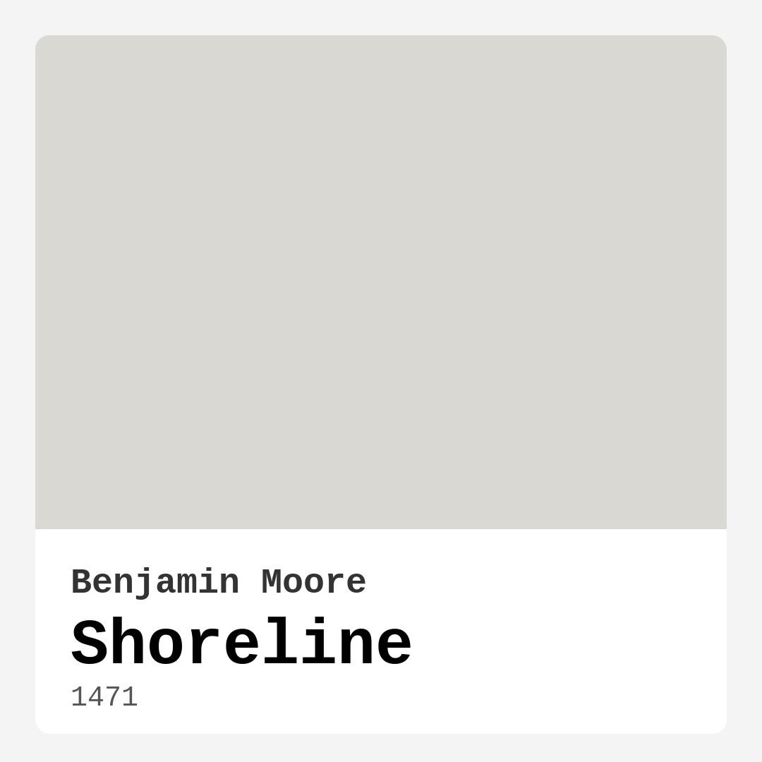
Color Preview & Key Details
| HEX Code | #D9D8D3 |
| RGB | 217, 216, 211 |
| LRV | 67.66% |
| Undertone | Yellow |
| Finish Options | Eggshell, Flat, Satin |
You know that feeling when you walk into a room and instantly feel at ease? Like the walls are giving you a quiet, comforting hug? That’s the magic of the right paint color—and if you’re searching for a shade that brings calm without sacrificing style, let me introduce you to Benjamin Moore’s Shoreline.
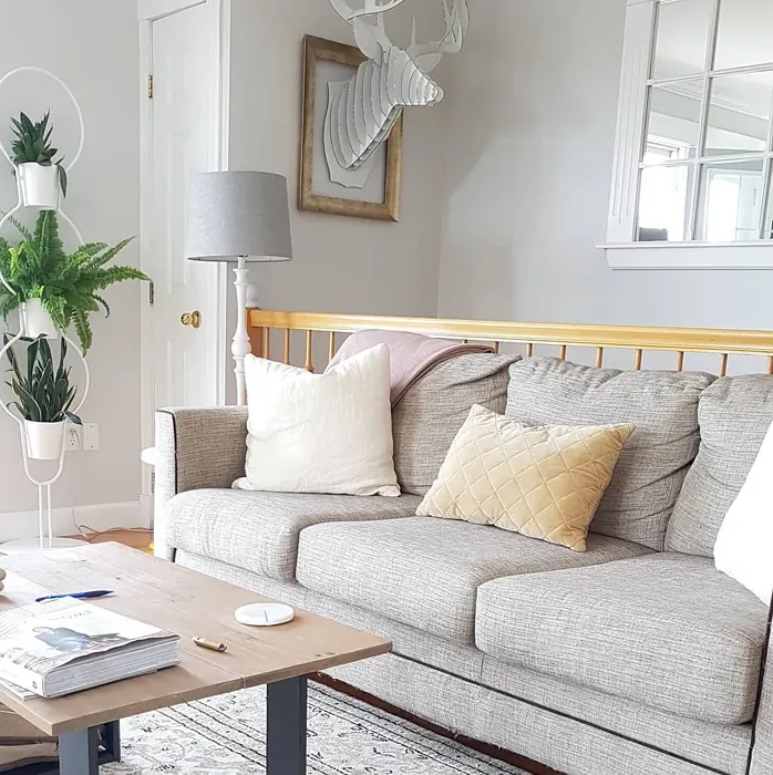
Shoreline (color code 1471) is one of those rare grays that doesn’t just sit on your walls—it transforms them. With its soft, muted tone and a whisper of yellow undertone, it’s like the quiet glow of morning light on a foggy beach. It’s not stark or cold, but it’s not overly warm either. It’s balanced, making it a chameleon in the best way. Whether your home leans coastal, modern farmhouse, or minimalist, this color slides right in like it was always meant to be there.
Let’s talk about light, because that’s where Shoreline really shines. With a Light Reflectance Value (LRV) of 67.66%, it reflects most of the light that hits it, which means it brightens up a room without feeling sterile. In a sun-drenched living room, it feels airy and fresh. In a north-facing bedroom with softer light, it holds its own, staying serene instead of gloomy. And if you’ve ever painted a room only to realize the color shifts dramatically at night, you’ll appreciate how Shoreline keeps its composure. It might lean slightly cooler in low light, but it never loses its inviting vibe.
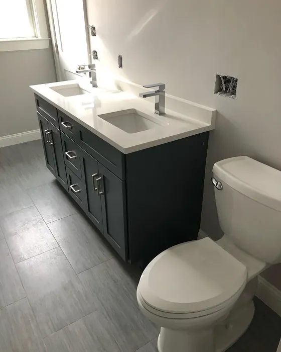
Now, the practical stuff. Shoreline is beginner-friendly—no weird splatters or frustrating streaks. It’s roller-ready, brush-smooth, and covers well in one to two coats. Touch-ups? Easy. Life happens, especially in high-traffic areas, and this paint handles it gracefully. Plus, it’s washable and scrubbable, so it’s a dream for busy households or rooms like bathrooms (yes, it works there too—just opt for a satin or eggshell finish to handle humidity). And because it’s low-VOC, you won’t be stuck airing out your home for days after painting.
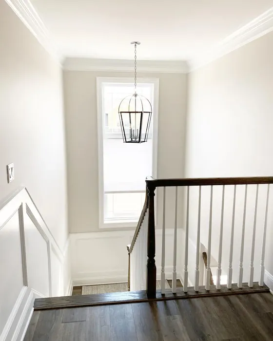
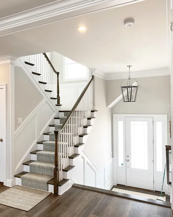
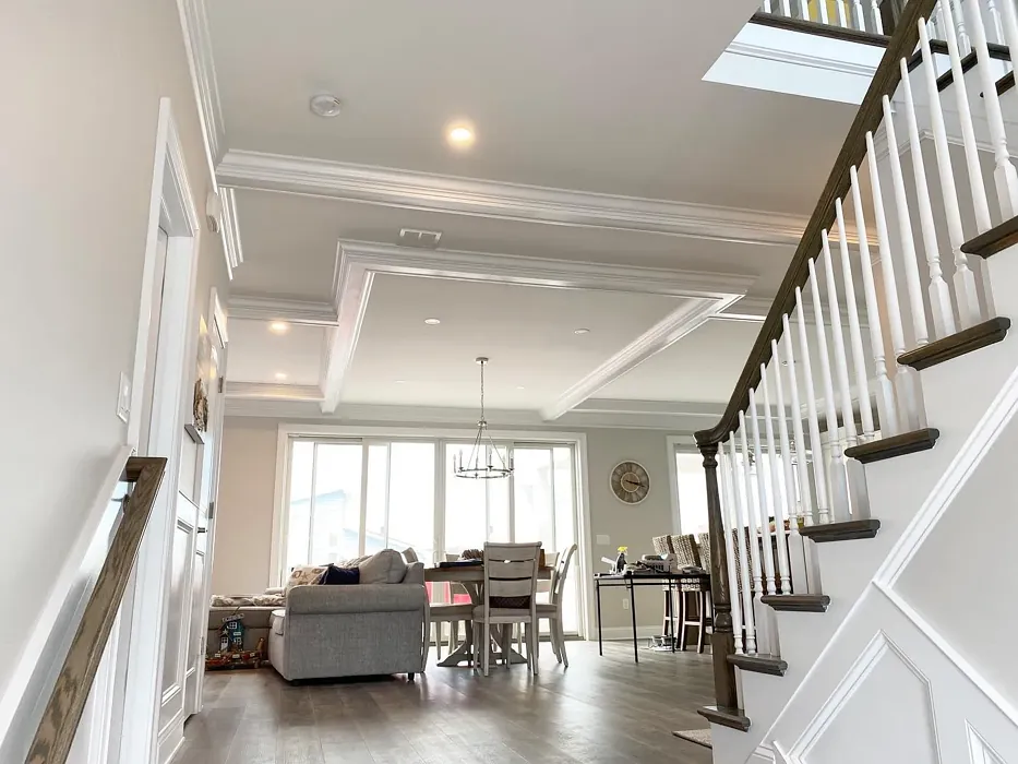
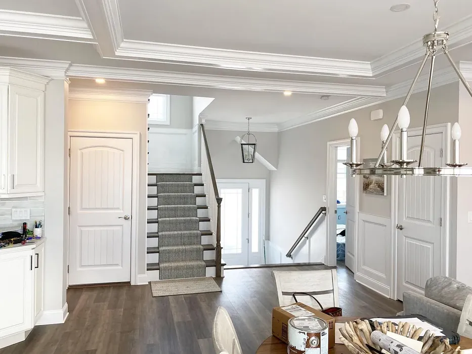
Wondering where to use it? Shoreline is a natural fit for living rooms and bedrooms, where its calming presence sets the tone for relaxation. But don’t overlook it for a home office—it’s soothing without being sleepy, so it helps you focus without feeling like you’re in a sterile cubicle. Hallways and small spaces benefit too, since its light-reflecting quality makes them feel more open. And if you’re tempted to go bold with an accent wall, pair it with crisp white trim (Benjamin Moore’s White Dove is a perfect match) to let that soft gray really pop.
A quick note on undertones: Shoreline’s hint of yellow gives it warmth, but it’s subtle. That means it plays well with both cool and warm decor. Pair it with creamy whites and natural wood for a cozy feel, or mix it with sleek blacks and blues for a more modern edge. Just be sure to test it in your space first. Paint a large swatch and watch how it changes throughout the day—you’ll see those undertones come alive in different lights, and that’s how you’ll know it’s right for you.
If you’re on the fence, think of Shoreline as the quiet hero of paint colors. It’s not shouting for attention, but it’s working hard to make your home feel harmonious. It’s the kind of color you won’t tire of, the one that makes your furniture look better and your space feel intentional. And isn’t that what we all want? A home that feels like home, without overthinking it.
So, grab a sample. Paint a corner. Live with it for a day or two. I have a feeling you’ll fall in love with the way Shoreline makes your rooms feel—like a deep breath in the middle of a hectic day. And really, isn’t that worth a little paint swatch on the wall?
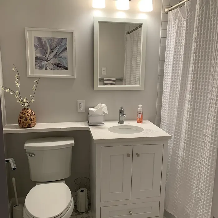
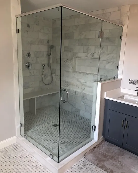
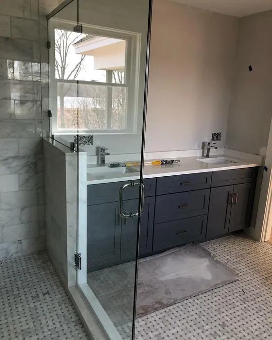
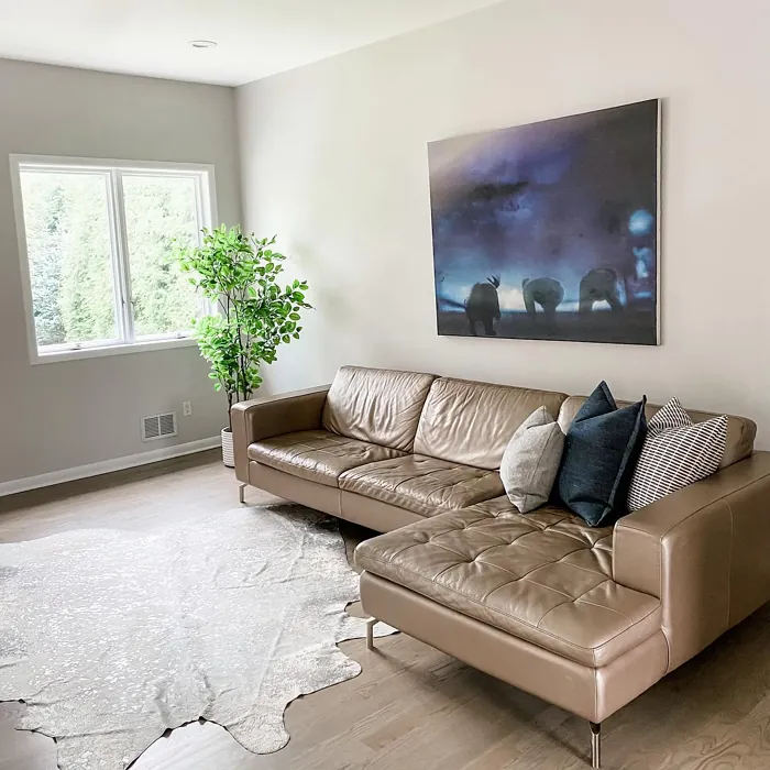
Real Room Photo of Shoreline 1471
Undertones of Shoreline ?
The undertones of Shoreline are a key aspect of its character, leaning towards Yellow. These subtle underlying hues are what give the color its depth and complexity. For example, a gray with a blue undertone will feel cooler and more modern, while one with a brown undertone will feel warmer and more traditional. It’s essential to test this paint in your home and observe it next to your existing furniture, flooring, and decor to see how these undertones interact and reveal themselves throughout the day.
HEX value: #D9D8D3
RGB code: 217, 216, 211
Is Shoreline Cool or Warm?
This color leans towards the cool side of the spectrum, making it perfect for spaces where you want to create a refreshing, tranquil vibe. However, its subtle warmth ensures it won’t feel cold or stark.
Understanding Color Properties and Interior Design Tips
Hue refers to a specific position on the color wheel, measured in degrees from 0 to 360. Each degree represents a different pure color:
- 0° represents red
- 120° represents green
- 240° represents blue
Saturation describes the intensity or purity of a color and is expressed as a percentage:
- At 0%, the color appears completely desaturated—essentially a shade of gray
- At 100%, the color is at its most vivid and vibrant
Lightness indicates how light or dark a color is, also expressed as a percentage:
- 0% lightness results in black
- 100% lightness results in white
Using Warm Colors in Interior Design
Warm hues—such as reds, oranges, yellows, warm beiges, and greiges—are excellent choices for creating inviting and energetic spaces. These colors are particularly well-suited for:
- Kitchens, living rooms, and bathrooms, where warmth enhances comfort and sociability
- Large rooms, where warm tones can help reduce the sense of emptiness and make the space feel more intimate
For example:
- Warm beige shades provide a cozy, inviting atmosphere, ideal for living rooms, bedrooms, and hallways.
- Warm greige (a mix of beige and gray) offers the warmth of beige with the modern appeal of gray, making it a versatile backdrop for dining areas, bedrooms, and living spaces.
However, be mindful when using warm light tones in rooms with limited natural light. These shades may appear muted or even take on an unpleasant yellowish tint. To avoid a dull or flat appearance:
- Add depth by incorporating richer tones like deep greens, charcoal, or chocolate brown
- Use textured elements such as curtains, rugs, or cushions to bring dimension to the space
Pro Tip: Achieving Harmony with Warm and Cool Color Balance
To create a well-balanced and visually interesting interior, mix warm and cool tones strategically. This contrast adds depth and harmony to your design.
- If your walls feature warm hues, introduce cool-colored accents such as blue or green furniture, artwork, or accessories to create contrast.
- For a polished look, consider using a complementary color scheme, which pairs colors opposite each other on the color wheel (e.g., red with green, orange with blue).
This thoughtful mix not only enhances visual appeal but also creates a space that feels both dynamic and cohesive.
Light Temperature Affects on Shoreline
Natural Light
Natural daylight changes in color temperature as the sun moves across the sky. At sunrise and sunset, the light tends to have a warm, golden tone with a color temperature around 2000 Kelvin (K). As the day progresses and the sun rises higher, the light becomes cooler and more neutral. Around midday, especially when the sky is clear, natural light typically reaches its peak brightness and shifts to a cooler tone, ranging from 5500 to 6500 Kelvin. This midday light is close to what we perceive as pure white or daylight-balanced light.
These shifts in natural light can significantly influence how colors appear in a space, which is why designers often consider both the time of day and the orientation of windows when planning interior color schemes.
Artificial Light
When choosing artificial lighting, pay close attention to the color temperature, measured in Kelvin (K). This determines how warm or cool the light will appear. Lower temperatures, around 2700K, give off a warm, yellow glow often used in living rooms or bedrooms. Higher temperatures, above 5000K, create a cool, bluish light similar to daylight, commonly used in kitchens, offices, or task areas.
Use the slider to see how lighting temperature can affect the appearance of a surface or color throughout a space.


4800K
LRV of Shoreline
The Light Reflectance Value (LRV) of Shoreline is 67.66%, which places it in the Light colors category. This means it reflect most of the incident light. Understanding a paint’s LRV is crucial for predicting how it will look in your space. A higher LRV indicates a lighter color that reflects more light, making rooms feel larger and brighter. A lower LRV signifies a darker color that absorbs more light, creating a cozier, more intimate atmosphere. Always consider the natural and artificial lighting in your room when selecting a paint color based on its LRV.
Detailed Review of Shoreline
Additional Paint Characteristics
Ideal Rooms
Bathroom, Bedroom, Hallway, Home Office, Living Room
Decor Styles
Coastal, Minimalist, Modern Farmhouse, Scandinavian
Coverage
Good (1–2 Coats), Touch-Up Friendly
Ease of Application
Beginner Friendly, Brush Smooth, Roller-Ready
Washability
Scrubbable, Washable
VOC Level
Low VOC
Best Use
Accent Wall, Ceiling, Interior Walls
Room Suitability
Bathroom, Bedroom, Home Office, Living Room
Tone Tag
Balanced, Cool, Muted
Finish Type
Eggshell, Satin
Paint Performance
Easy Touch-Up, High Coverage, Low Odor
Use Cases
Best for Low Light Rooms, Best for Rentals, Classic Favorite
Mood
Calm, Inviting, Restful
Trim Pairing
Complements Cool Trim, Pairs with White Dove
Shoreline is a versatile paint color that beautifully balances warmth and coolness, making it a fantastic choice for various settings. Its subtle gray tones can brighten up a room while maintaining a cozy ambiance. Whether you’re painting a serene bedroom or a lively living room, Shoreline adapts seamlessly to both environments. The color looks particularly stunning in natural light, enhancing its airy feel. Its performance also stands out; you’ll find it easy to apply, with good coverage that minimizes the need for multiple coats. This paint truly shines in creating a soothing backdrop for your home.
Pros & Cons of 1471 Shoreline
Pros
Cons
Colors that go with Benjamin Moore Shoreline
FAQ on 1471 Shoreline
Is Shoreline suitable for small spaces?
Absolutely! Shoreline is a fantastic choice for small spaces. Its light-reflective quality helps create an illusion of a larger area, while its muted tones maintain a cozy atmosphere. You’ll find that it opens up the room without making it feel cold.
Can I use Shoreline in a bathroom?
Yes, Shoreline works beautifully in bathrooms! Its washability ensures that you can easily clean any moisture or stains. The calming effect of the color also makes it a perfect choice for a relaxing retreat. Just make sure to use a finish that can handle humidity, like satin or eggshell.
Comparisons Shoreline with other colors
Shoreline 1471 vs Agreeable Gray SW 7029
| Attribute | Shoreline 1471 | Agreeable Gray SW 7029 |
|---|---|---|
| Color Name | Shoreline 1471 | Agreeable Gray SW 7029 |
| Color | ||
| Hue | Grey | Grey |
| Brightness | Light | Light |
| RGB | 217, 216, 211 | 209, 203, 193 |
| LRV | 67.66% | 60% |
| Finish Type | Eggshell, Satin | Eggshell, Matte, Satin |
| Finish Options | Eggshell, Flat, Satin | Eggshell, Flat, Matte, Satin |
| Ideal Rooms | Bathroom, Bedroom, Hallway, Home Office, Living Room | Bathroom, Bedroom, Dining Room, Home Office, Kitchen, Living Room |
| Decor Styles | Coastal, Minimalist, Modern Farmhouse, Scandinavian | Contemporary, Farmhouse, Minimalist, Modern, Transitional |
| Coverage | Good (1–2 Coats), Touch-Up Friendly | Good (1–2 Coats), Touch-Up Friendly |
| Ease of Application | Beginner Friendly, Brush Smooth, Roller-Ready | Beginner Friendly, Brush Smooth, Roller-Ready |
| Washability | Scrubbable, Washable | Washable, Wipeable |
| Room Suitability | Bathroom, Bedroom, Home Office, Living Room | Bathroom, Bedroom, Dining Room, Kitchen, Living Room |
| Tone | Balanced, Cool, Muted | Muted, Neutral, Warm |
| Paint Performance | Easy Touch-Up, High Coverage, Low Odor | Easy Touch-Up, Fade Resistant, Low Odor |
Shoreline 1471 vs Eider White SW 7014
| Attribute | Shoreline 1471 | Eider White SW 7014 |
|---|---|---|
| Color Name | Shoreline 1471 | Eider White SW 7014 |
| Color | ||
| Hue | Grey | Grey |
| Brightness | Light | Light |
| RGB | 217, 216, 211 | 226, 222, 216 |
| LRV | 67.66% | 73% |
| Finish Type | Eggshell, Satin | Eggshell, Matte, Satin |
| Finish Options | Eggshell, Flat, Satin | Eggshell, Matte, Satin |
| Ideal Rooms | Bathroom, Bedroom, Hallway, Home Office, Living Room | Bathroom, Bedroom, Dining Room, Home Office, Kitchen, Living Room |
| Decor Styles | Coastal, Minimalist, Modern Farmhouse, Scandinavian | Farmhouse, Minimalist, Modern, Scandinavian, Transitional |
| Coverage | Good (1–2 Coats), Touch-Up Friendly | Good (1–2 Coats), Touch-Up Friendly |
| Ease of Application | Beginner Friendly, Brush Smooth, Roller-Ready | Beginner Friendly, Brush Smooth, Roller-Ready |
| Washability | Scrubbable, Washable | Highly Washable, Washable |
| Room Suitability | Bathroom, Bedroom, Home Office, Living Room | Bathroom, Bedroom, Dining Room, Kitchen, Living Room |
| Tone | Balanced, Cool, Muted | Creamy, Muted, Neutral, Warm |
| Paint Performance | Easy Touch-Up, High Coverage, Low Odor | Easy Touch-Up, High Coverage, Low Odor, Scuff Resistant |
Shoreline 1471 vs Drift of Mist SW 9166
| Attribute | Shoreline 1471 | Drift of Mist SW 9166 |
|---|---|---|
| Color Name | Shoreline 1471 | Drift of Mist SW 9166 |
| Color | ||
| Hue | Grey | Grey |
| Brightness | Light | Light |
| RGB | 217, 216, 211 | 220, 216, 208 |
| LRV | 67.66% | 65% |
| Finish Type | Eggshell, Satin | Eggshell, Matte, Satin |
| Finish Options | Eggshell, Flat, Satin | Eggshell, Matte, Satin |
| Ideal Rooms | Bathroom, Bedroom, Hallway, Home Office, Living Room | Bathroom, Bedroom, Home Office, Kitchen, Living Room |
| Decor Styles | Coastal, Minimalist, Modern Farmhouse, Scandinavian | Coastal, Minimalist, Modern, Scandinavian |
| Coverage | Good (1–2 Coats), Touch-Up Friendly | Good (1–2 Coats), Touch-Up Friendly |
| Ease of Application | Beginner Friendly, Brush Smooth, Roller-Ready | Beginner Friendly, Brush Smooth, Fast-Drying, Roller-Ready |
| Washability | Scrubbable, Washable | Washable, Wipeable |
| Room Suitability | Bathroom, Bedroom, Home Office, Living Room | Bathroom, Bedroom, Home Office, Living Room |
| Tone | Balanced, Cool, Muted | Airy, Cool, Neutral |
| Paint Performance | Easy Touch-Up, High Coverage, Low Odor | Easy Touch-Up, Low Odor, Quick Drying, Scuff Resistant |
Shoreline 1471 vs Sanctuary SW 9583
| Attribute | Shoreline 1471 | Sanctuary SW 9583 |
|---|---|---|
| Color Name | Shoreline 1471 | Sanctuary SW 9583 |
| Color | ||
| Hue | Grey | Grey |
| Brightness | Light | Light |
| RGB | 217, 216, 211 | 230, 226, 217 |
| LRV | 67.66% | 24% |
| Finish Type | Eggshell, Satin | Eggshell, Matte, Satin |
| Finish Options | Eggshell, Flat, Satin | Eggshell, Matte, Satin |
| Ideal Rooms | Bathroom, Bedroom, Hallway, Home Office, Living Room | Bedroom, Dining Room, Home Office, Living Room, Nursery |
| Decor Styles | Coastal, Minimalist, Modern Farmhouse, Scandinavian | Bohemian, Coastal, Modern Farmhouse, Scandinavian |
| Coverage | Good (1–2 Coats), Touch-Up Friendly | Good (1–2 Coats), Touch-Up Friendly |
| Ease of Application | Beginner Friendly, Brush Smooth, Roller-Ready | Beginner Friendly, Brush Smooth, Fast-Drying, Roller-Ready |
| Washability | Scrubbable, Washable | Highly Washable, Washable, Wipeable |
| Room Suitability | Bathroom, Bedroom, Home Office, Living Room | Bedroom, Home Office, Living Room, Nursery |
| Tone | Balanced, Cool, Muted | Earthy, Neutral, Soft, Warm |
| Paint Performance | Easy Touch-Up, High Coverage, Low Odor | Easy Touch-Up, Low Odor, Quick Drying, Scuff Resistant |
Shoreline 1471 vs Snowbound SW 7004
| Attribute | Shoreline 1471 | Snowbound SW 7004 |
|---|---|---|
| Color Name | Shoreline 1471 | Snowbound SW 7004 |
| Color | ||
| Hue | Grey | Grey |
| Brightness | Light | Light |
| RGB | 217, 216, 211 | 237, 234, 229 |
| LRV | 67.66% | 83% |
| Finish Type | Eggshell, Satin | Eggshell, Matte, Satin |
| Finish Options | Eggshell, Flat, Satin | Eggshell, Matte, Satin |
| Ideal Rooms | Bathroom, Bedroom, Hallway, Home Office, Living Room | Bathroom, Bedroom, Dining Room, Hallway, Home Office, Kitchen, Living Room, Nursery |
| Decor Styles | Coastal, Minimalist, Modern Farmhouse, Scandinavian | Farmhouse, Minimalist, Modern, Scandinavian, Transitional |
| Coverage | Good (1–2 Coats), Touch-Up Friendly | Good (1–2 Coats), Touch-Up Friendly |
| Ease of Application | Beginner Friendly, Brush Smooth, Roller-Ready | Beginner Friendly, Brush Smooth, Fast-Drying, Roller-Ready |
| Washability | Scrubbable, Washable | Washable, Wipeable |
| Room Suitability | Bathroom, Bedroom, Home Office, Living Room | Bathroom, Bedroom, Dining Room, Hallway, Home Office, Kitchen, Living Room |
| Tone | Balanced, Cool, Muted | Airy, Crisp, Neutral, Warm |
| Paint Performance | Easy Touch-Up, High Coverage, Low Odor | High Coverage, Low Odor, Quick Drying |
Shoreline 1471 vs Pure White SW 7005
| Attribute | Shoreline 1471 | Pure White SW 7005 |
|---|---|---|
| Color Name | Shoreline 1471 | Pure White SW 7005 |
| Color | ||
| Hue | Grey | Grey |
| Brightness | Light | Light |
| RGB | 217, 216, 211 | 237, 236, 230 |
| LRV | 67.66% | 84% |
| Finish Type | Eggshell, Satin | Eggshell, Satin, Semi-Gloss |
| Finish Options | Eggshell, Flat, Satin | Eggshell, Flat, Matte, Satin, Semi-Gloss |
| Ideal Rooms | Bathroom, Bedroom, Hallway, Home Office, Living Room | Bathroom, Bedroom, Dining Room, Entryway, Hallway, Home Office, Kitchen, Living Room, Nursery |
| Decor Styles | Coastal, Minimalist, Modern Farmhouse, Scandinavian | Bohemian, Eclectic, Farmhouse, Minimalist, Modern, Traditional |
| Coverage | Good (1–2 Coats), Touch-Up Friendly | Good (1–2 Coats), Touch-Up Friendly |
| Ease of Application | Beginner Friendly, Brush Smooth, Roller-Ready | Beginner Friendly, Brush Smooth, Fast-Drying, Roller-Ready |
| Washability | Scrubbable, Washable | Highly Washable, Washable |
| Room Suitability | Bathroom, Bedroom, Home Office, Living Room | Bathroom, Bedroom, Dining Room, Entryway, Hallway, Home Office, Kitchen, Living Room, Nursery |
| Tone | Balanced, Cool, Muted | Crisp, Neutral, Warm |
| Paint Performance | Easy Touch-Up, High Coverage, Low Odor | Easy Touch-Up, High Coverage, Low Odor, Quick Drying |
Shoreline 1471 vs Crushed Ice SW 7647
| Attribute | Shoreline 1471 | Crushed Ice SW 7647 |
|---|---|---|
| Color Name | Shoreline 1471 | Crushed Ice SW 7647 |
| Color | ||
| Hue | Grey | Grey |
| Brightness | Light | Light |
| RGB | 217, 216, 211 | 214, 211, 204 |
| LRV | 67.66% | 66% |
| Finish Type | Eggshell, Satin | Eggshell, Matte, Satin |
| Finish Options | Eggshell, Flat, Satin | Eggshell, Matte, Satin |
| Ideal Rooms | Bathroom, Bedroom, Hallway, Home Office, Living Room | Bathroom, Bedroom, Dining Room, Home Office, Living Room |
| Decor Styles | Coastal, Minimalist, Modern Farmhouse, Scandinavian | Farmhouse, Minimalist, Modern, Scandinavian, Transitional |
| Coverage | Good (1–2 Coats), Touch-Up Friendly | Good (1–2 Coats), Touch-Up Friendly |
| Ease of Application | Beginner Friendly, Brush Smooth, Roller-Ready | Beginner Friendly, Brush Smooth, Roller-Ready |
| Washability | Scrubbable, Washable | Stain Resistant, Washable |
| Room Suitability | Bathroom, Bedroom, Home Office, Living Room | Bathroom, Bedroom, Dining Room, Hallway, Home Office, Living Room |
| Tone | Balanced, Cool, Muted | Muted, Neutral, Warm |
| Paint Performance | Easy Touch-Up, High Coverage, Low Odor | High Coverage, Low Odor, Quick Drying |
Shoreline 1471 vs Origami White SW 7636
| Attribute | Shoreline 1471 | Origami White SW 7636 |
|---|---|---|
| Color Name | Shoreline 1471 | Origami White SW 7636 |
| Color | ||
| Hue | Grey | Grey |
| Brightness | Light | Light |
| RGB | 217, 216, 211 | 229, 226, 218 |
| LRV | 67.66% | 83% |
| Finish Type | Eggshell, Satin | Eggshell, Matte |
| Finish Options | Eggshell, Flat, Satin | Eggshell, Matte, Satin |
| Ideal Rooms | Bathroom, Bedroom, Hallway, Home Office, Living Room | Bedroom, Dining Room, Entryway, Hallway, Home Office, Kitchen, Living Room |
| Decor Styles | Coastal, Minimalist, Modern Farmhouse, Scandinavian | Minimalist, Modern, Scandinavian, Traditional, Transitional |
| Coverage | Good (1–2 Coats), Touch-Up Friendly | Good (1–2 Coats), Touch-Up Friendly |
| Ease of Application | Beginner Friendly, Brush Smooth, Roller-Ready | Beginner Friendly, Brush Smooth, Roller-Ready |
| Washability | Scrubbable, Washable | Washable, Wipeable |
| Room Suitability | Bathroom, Bedroom, Home Office, Living Room | Bedroom, Dining Room, Home Office, Kitchen, Living Room |
| Tone | Balanced, Cool, Muted | Airy, Neutral, Warm |
| Paint Performance | Easy Touch-Up, High Coverage, Low Odor | Easy Touch-Up, Low Odor, Quick Drying |
Shoreline 1471 vs Spare White SW 6203
| Attribute | Shoreline 1471 | Spare White SW 6203 |
|---|---|---|
| Color Name | Shoreline 1471 | Spare White SW 6203 |
| Color | ||
| Hue | Grey | Grey |
| Brightness | Light | Light |
| RGB | 217, 216, 211 | 228, 228, 221 |
| LRV | 67.66% | 75% |
| Finish Type | Eggshell, Satin | Eggshell, Matte |
| Finish Options | Eggshell, Flat, Satin | Eggshell, Matte, Satin |
| Ideal Rooms | Bathroom, Bedroom, Hallway, Home Office, Living Room | Bedroom, Dining Room, Home Office, Kitchen, Living Room, Nursery |
| Decor Styles | Coastal, Minimalist, Modern Farmhouse, Scandinavian | Farmhouse, Minimalist, Modern, Scandinavian, Transitional |
| Coverage | Good (1–2 Coats), Touch-Up Friendly | Good (1–2 Coats), Primer Recommended, Touch-Up Friendly |
| Ease of Application | Beginner Friendly, Brush Smooth, Roller-Ready | Beginner Friendly, Brush Smooth, Fast-Drying, Roller-Ready |
| Washability | Scrubbable, Washable | Washable, Wipeable |
| Room Suitability | Bathroom, Bedroom, Home Office, Living Room | Bedroom, Dining Room, Home Office, Kitchen, Living Room |
| Tone | Balanced, Cool, Muted | Creamy, Neutral, Warm |
| Paint Performance | Easy Touch-Up, High Coverage, Low Odor | Easy Touch-Up, Low Odor, Quick Drying |
Shoreline 1471 vs Mountain Air SW 6224
| Attribute | Shoreline 1471 | Mountain Air SW 6224 |
|---|---|---|
| Color Name | Shoreline 1471 | Mountain Air SW 6224 |
| Color | ||
| Hue | Grey | Grey |
| Brightness | Light | Light |
| RGB | 217, 216, 211 | 216, 224, 223 |
| LRV | 67.66% | 66% |
| Finish Type | Eggshell, Satin | Eggshell, Satin |
| Finish Options | Eggshell, Flat, Satin | Eggshell, Matte, Satin |
| Ideal Rooms | Bathroom, Bedroom, Hallway, Home Office, Living Room | Bedroom, Hallway, Home Office, Living Room, Nursery |
| Decor Styles | Coastal, Minimalist, Modern Farmhouse, Scandinavian | Coastal, Minimalist, Modern, Scandinavian |
| Coverage | Good (1–2 Coats), Touch-Up Friendly | Good (1–2 Coats), Touch-Up Friendly |
| Ease of Application | Beginner Friendly, Brush Smooth, Roller-Ready | Beginner Friendly, Brush Smooth, Fast-Drying, Roller-Ready |
| Washability | Scrubbable, Washable | Highly Washable, Washable |
| Room Suitability | Bathroom, Bedroom, Home Office, Living Room | Bedroom, Home Office, Living Room, Nursery |
| Tone | Balanced, Cool, Muted | Airy, Cool, Muted |
| Paint Performance | Easy Touch-Up, High Coverage, Low Odor | Easy Touch-Up, Low Odor, Quick Drying, Scuff Resistant |
Official Page of Benjamin Moore Shoreline 1471