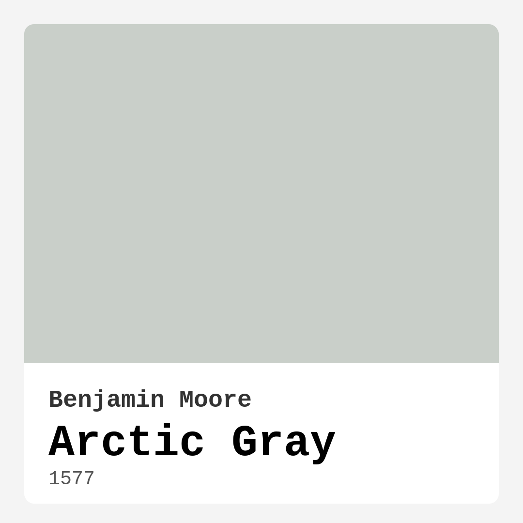
Color Preview & Key Details
| HEX Code | #C9CFC9 |
| RGB | 201, 207, 201 |
| LRV | 61.03% |
| Undertone | Green |
| Finish Options | Eggshell, Matte, Satin |
Ever walked into a room and immediately felt a sense of calm wash over you? That’s the magic of the right paint color—it doesn’t just cover walls; it sets the tone for how you experience a space. Today, let’s talk about one of those effortlessly sophisticated shades that’s been quietly winning over designers and homeowners alike: Benjamin Moore’s Arctic Gray (1577). If you’re on the fence about whether this soft, serene gray belongs in your home, let’s break it down together.
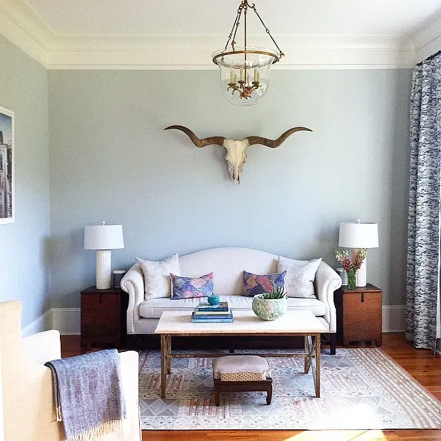
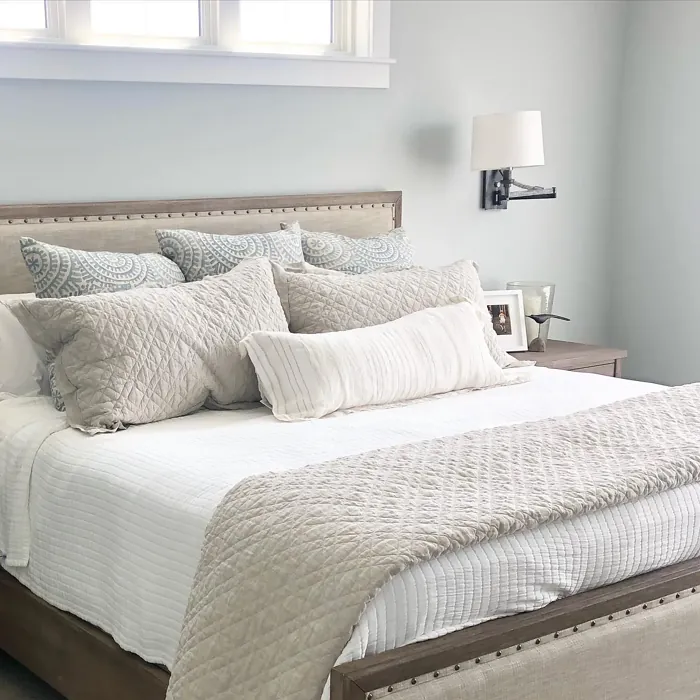
Arctic Gray is the kind of color that plays well with others. It’s not too cold, not too warm—just a perfectly balanced light gray with a whisper of green undertone that adds depth without overwhelming. Picture it in a sunlit living room, where it reflects just enough light to keep things airy, or in a bedroom where it creates a restful retreat. With an LRV of 61.03%, it’s firmly in the “light-reflecting” category, which means it’s fantastic for making smaller rooms feel more spacious. But here’s the thing: this isn’t a flat, one-note gray. Those subtle green undertones mean it can shift slightly depending on the light, giving your walls a quiet dynamism that keeps things interesting.
Now, let’s talk about where Arctic Gray shines. It’s a chameleon in the best way—equally at home in a modern minimalist loft as it is in a cozy traditional farmhouse. In a kitchen, it pairs beautifully with crisp white cabinetry or warm wood tones, striking a balance between clean and inviting. In a home office, it fosters focus without feeling sterile. And in a bedroom? It’s like a soft sigh at the end of a long day. One of my favorite ways to use it is on an accent wall in a dining room, where it adds just enough sophistication to let your artwork or furniture take center stage.
If you’re worried about commitment, don’t be. Arctic Gray is beginner-friendly, with excellent coverage (often just one or two coats) and easy touch-ups. It comes in matte, eggshell, and satin finishes, so you can choose the level of sheen that suits your space. Matte is perfect for hiding imperfections in older walls, while satin adds a subtle glow that’s great for high-traffic areas like hallways. And because it’s low-VOC and eco-certified, you can breathe easy knowing it’s a safe choice for your home.
But let’s address the elephant in the room: undertones. Yes, Arctic Gray has a green base, which means it can sometimes lean cooler in certain lights, especially at night under artificial lighting. That’s why it’s crucial to test it in your space before committing. Paint a large swatch and observe it at different times of day. You’ll notice how it harmonizes with your flooring, furniture, and even the color of your curtains. Pair it with warm woods or creamy whites to soften any potential coolness, or lean into its tranquility with cool blues and soft greens for a cohesive, calming palette.
Trim colors? Arctic Gray is a dream to pair. For a classic look, try it with Benjamin Moore’s White Dove—a soft white that keeps things warm and inviting. If you’re after something crisper, Pure White adds a modern edge. And for those who love contrast, a deep charcoal or even black trim (like Black Windows) can create a striking, contemporary vibe. The key is to let Arctic Gray do what it does best: provide a neutral, sophisticated backdrop that lets your personal style shine.
So, is Arctic Gray right for you? If you’re looking for a versatile, light-reflective gray that brings tranquility without sacrificing style, the answer is probably yes. It’s a color that adapts to you, not the other way around. Whether you’re refreshing a rental, designing an open-concept space, or just craving a change, Arctic Gray is one of those rare shades that feels both timeless and fresh. Grab a sample, see how it plays in your light, and get ready to fall in love with your walls all over again.
Real Room Photo of Arctic Gray 1577
Undertones of Arctic Gray ?
The undertones of Arctic Gray are a key aspect of its character, leaning towards Green. These subtle underlying hues are what give the color its depth and complexity. For example, a gray with a blue undertone will feel cooler and more modern, while one with a brown undertone will feel warmer and more traditional. It’s essential to test this paint in your home and observe it next to your existing furniture, flooring, and decor to see how these undertones interact and reveal themselves throughout the day.
HEX value: #C9CFC9
RGB code: 201, 207, 201
Is Arctic Gray Cool or Warm?
Arctic Gray is considered a cool color, making it an excellent choice for spaces that benefit from a refreshing and airy feel. It works well with cooler accents and can help to balance warmer tones in a room.
Understanding Color Properties and Interior Design Tips
Hue refers to a specific position on the color wheel, measured in degrees from 0 to 360. Each degree represents a different pure color:
- 0° represents red
- 120° represents green
- 240° represents blue
Saturation describes the intensity or purity of a color and is expressed as a percentage:
- At 0%, the color appears completely desaturated—essentially a shade of gray
- At 100%, the color is at its most vivid and vibrant
Lightness indicates how light or dark a color is, also expressed as a percentage:
- 0% lightness results in black
- 100% lightness results in white
Using Warm Colors in Interior Design
Warm hues—such as reds, oranges, yellows, warm beiges, and greiges—are excellent choices for creating inviting and energetic spaces. These colors are particularly well-suited for:
- Kitchens, living rooms, and bathrooms, where warmth enhances comfort and sociability
- Large rooms, where warm tones can help reduce the sense of emptiness and make the space feel more intimate
For example:
- Warm beige shades provide a cozy, inviting atmosphere, ideal for living rooms, bedrooms, and hallways.
- Warm greige (a mix of beige and gray) offers the warmth of beige with the modern appeal of gray, making it a versatile backdrop for dining areas, bedrooms, and living spaces.
However, be mindful when using warm light tones in rooms with limited natural light. These shades may appear muted or even take on an unpleasant yellowish tint. To avoid a dull or flat appearance:
- Add depth by incorporating richer tones like deep greens, charcoal, or chocolate brown
- Use textured elements such as curtains, rugs, or cushions to bring dimension to the space
Pro Tip: Achieving Harmony with Warm and Cool Color Balance
To create a well-balanced and visually interesting interior, mix warm and cool tones strategically. This contrast adds depth and harmony to your design.
- If your walls feature warm hues, introduce cool-colored accents such as blue or green furniture, artwork, or accessories to create contrast.
- For a polished look, consider using a complementary color scheme, which pairs colors opposite each other on the color wheel (e.g., red with green, orange with blue).
This thoughtful mix not only enhances visual appeal but also creates a space that feels both dynamic and cohesive.
Light Temperature Affects on Arctic Gray
Natural Light
Natural daylight changes in color temperature as the sun moves across the sky. At sunrise and sunset, the light tends to have a warm, golden tone with a color temperature around 2000 Kelvin (K). As the day progresses and the sun rises higher, the light becomes cooler and more neutral. Around midday, especially when the sky is clear, natural light typically reaches its peak brightness and shifts to a cooler tone, ranging from 5500 to 6500 Kelvin. This midday light is close to what we perceive as pure white or daylight-balanced light.
These shifts in natural light can significantly influence how colors appear in a space, which is why designers often consider both the time of day and the orientation of windows when planning interior color schemes.
Artificial Light
When choosing artificial lighting, pay close attention to the color temperature, measured in Kelvin (K). This determines how warm or cool the light will appear. Lower temperatures, around 2700K, give off a warm, yellow glow often used in living rooms or bedrooms. Higher temperatures, above 5000K, create a cool, bluish light similar to daylight, commonly used in kitchens, offices, or task areas.
Use the slider to see how lighting temperature can affect the appearance of a surface or color throughout a space.


4800K
LRV of Arctic Gray
The Light Reflectance Value (LRV) of Arctic Gray is 61.03%, which places it in the Light colors category. This means it reflect most of the incident light. Understanding a paint’s LRV is crucial for predicting how it will look in your space. A higher LRV indicates a lighter color that reflects more light, making rooms feel larger and brighter. A lower LRV signifies a darker color that absorbs more light, creating a cozier, more intimate atmosphere. Always consider the natural and artificial lighting in your room when selecting a paint color based on its LRV.
Detailed Review of Arctic Gray
Additional Paint Characteristics
Ideal Rooms
Bedroom, Dining Room, Hallway, Home Office, Kitchen, Living Room
Decor Styles
Minimalist, Modern, Scandinavian, Traditional, Transitional
Coverage
Good (1–2 Coats), Touch-Up Friendly
Ease of Application
Beginner Friendly, Brush Smooth, Roller-Ready
Washability
Highly Washable, Washable
VOC Level
Eco-Certified, Low VOC
Best Use
Accent Wall, Interior Walls, Trim
Room Suitability
Bedroom, Dining Room, Home Office, Kitchen, Living Room
Tone Tag
Balanced, Cool, Muted
Finish Type
Eggshell, Matte, Satin
Paint Performance
Easy Touch-Up, Low Odor, Quick Drying
Use Cases
Best for Modern Farmhouse, Best for Open Concept, Best for Rentals, Classic Favorite
Mood
Calm, Inviting, Restful
Trim Pairing
Complements Cool Trim, Matches Pure White, Pairs with White Dove
Arctic Gray is more than just a paint color; it’s a statement of elegance and calm. The soft gray hue is incredibly adaptable, fitting perfectly in various lighting conditions and decor styles. Whether you’re painting an accent wall or an entire room, Arctic Gray brings a refreshing touch without overpowering the space. Its subtlety allows it to pair beautifully with both bold and muted colors, making it a favorite among interior designers. The finish options available—matte, eggshell, and satin—add to its versatility while offering different levels of sheen to match your desired look. This color doesn’t just sit on your walls; it invites a serene atmosphere that encourages relaxation and creativity.
Pros & Cons of 1577 Arctic Gray
Pros
Cons
Colors that go with Benjamin Moore Arctic Gray
FAQ on 1577 Arctic Gray
Can I use Arctic Gray in a small room?
Absolutely! Arctic Gray can help make a small room feel larger and more open due to its light-reflective qualities. Just be mindful of your lighting; it’s best to use it in spaces with natural light to keep the atmosphere bright and airy.
What trim colors work best with Arctic Gray?
Arctic Gray pairs beautifully with white trims, especially options like White Dove or Simply White. If you prefer a bit of contrast, consider pairing it with darker trims like Black Windows for a modern touch. Its versatility allows it to complement a variety of trim colors seamlessly.
Comparisons Arctic Gray with other colors
Arctic Gray 1577 vs Agreeable Gray SW 7029
| Attribute | Arctic Gray 1577 | Agreeable Gray SW 7029 |
|---|---|---|
| Color Name | Arctic Gray 1577 | Agreeable Gray SW 7029 |
| Color | ||
| Hue | Grey | Grey |
| Brightness | Light | Light |
| RGB | 201, 207, 201 | 209, 203, 193 |
| LRV | 61.03% | 60% |
| Finish Type | Eggshell, Matte, Satin | Eggshell, Matte, Satin |
| Finish Options | Eggshell, Matte, Satin | Eggshell, Flat, Matte, Satin |
| Ideal Rooms | Bedroom, Dining Room, Hallway, Home Office, Kitchen, Living Room | Bathroom, Bedroom, Dining Room, Home Office, Kitchen, Living Room |
| Decor Styles | Minimalist, Modern, Scandinavian, Traditional, Transitional | Contemporary, Farmhouse, Minimalist, Modern, Transitional |
| Coverage | Good (1–2 Coats), Touch-Up Friendly | Good (1–2 Coats), Touch-Up Friendly |
| Ease of Application | Beginner Friendly, Brush Smooth, Roller-Ready | Beginner Friendly, Brush Smooth, Roller-Ready |
| Washability | Highly Washable, Washable | Washable, Wipeable |
| Room Suitability | Bedroom, Dining Room, Home Office, Kitchen, Living Room | Bathroom, Bedroom, Dining Room, Kitchen, Living Room |
| Tone | Balanced, Cool, Muted | Muted, Neutral, Warm |
| Paint Performance | Easy Touch-Up, Low Odor, Quick Drying | Easy Touch-Up, Fade Resistant, Low Odor |
Arctic Gray 1577 vs Eider White SW 7014
| Attribute | Arctic Gray 1577 | Eider White SW 7014 |
|---|---|---|
| Color Name | Arctic Gray 1577 | Eider White SW 7014 |
| Color | ||
| Hue | Grey | Grey |
| Brightness | Light | Light |
| RGB | 201, 207, 201 | 226, 222, 216 |
| LRV | 61.03% | 73% |
| Finish Type | Eggshell, Matte, Satin | Eggshell, Matte, Satin |
| Finish Options | Eggshell, Matte, Satin | Eggshell, Matte, Satin |
| Ideal Rooms | Bedroom, Dining Room, Hallway, Home Office, Kitchen, Living Room | Bathroom, Bedroom, Dining Room, Home Office, Kitchen, Living Room |
| Decor Styles | Minimalist, Modern, Scandinavian, Traditional, Transitional | Farmhouse, Minimalist, Modern, Scandinavian, Transitional |
| Coverage | Good (1–2 Coats), Touch-Up Friendly | Good (1–2 Coats), Touch-Up Friendly |
| Ease of Application | Beginner Friendly, Brush Smooth, Roller-Ready | Beginner Friendly, Brush Smooth, Roller-Ready |
| Washability | Highly Washable, Washable | Highly Washable, Washable |
| Room Suitability | Bedroom, Dining Room, Home Office, Kitchen, Living Room | Bathroom, Bedroom, Dining Room, Kitchen, Living Room |
| Tone | Balanced, Cool, Muted | Creamy, Muted, Neutral, Warm |
| Paint Performance | Easy Touch-Up, Low Odor, Quick Drying | Easy Touch-Up, High Coverage, Low Odor, Scuff Resistant |
Arctic Gray 1577 vs Drift of Mist SW 9166
| Attribute | Arctic Gray 1577 | Drift of Mist SW 9166 |
|---|---|---|
| Color Name | Arctic Gray 1577 | Drift of Mist SW 9166 |
| Color | ||
| Hue | Grey | Grey |
| Brightness | Light | Light |
| RGB | 201, 207, 201 | 220, 216, 208 |
| LRV | 61.03% | 65% |
| Finish Type | Eggshell, Matte, Satin | Eggshell, Matte, Satin |
| Finish Options | Eggshell, Matte, Satin | Eggshell, Matte, Satin |
| Ideal Rooms | Bedroom, Dining Room, Hallway, Home Office, Kitchen, Living Room | Bathroom, Bedroom, Home Office, Kitchen, Living Room |
| Decor Styles | Minimalist, Modern, Scandinavian, Traditional, Transitional | Coastal, Minimalist, Modern, Scandinavian |
| Coverage | Good (1–2 Coats), Touch-Up Friendly | Good (1–2 Coats), Touch-Up Friendly |
| Ease of Application | Beginner Friendly, Brush Smooth, Roller-Ready | Beginner Friendly, Brush Smooth, Fast-Drying, Roller-Ready |
| Washability | Highly Washable, Washable | Washable, Wipeable |
| Room Suitability | Bedroom, Dining Room, Home Office, Kitchen, Living Room | Bathroom, Bedroom, Home Office, Living Room |
| Tone | Balanced, Cool, Muted | Airy, Cool, Neutral |
| Paint Performance | Easy Touch-Up, Low Odor, Quick Drying | Easy Touch-Up, Low Odor, Quick Drying, Scuff Resistant |
Arctic Gray 1577 vs Sanctuary SW 9583
| Attribute | Arctic Gray 1577 | Sanctuary SW 9583 |
|---|---|---|
| Color Name | Arctic Gray 1577 | Sanctuary SW 9583 |
| Color | ||
| Hue | Grey | Grey |
| Brightness | Light | Light |
| RGB | 201, 207, 201 | 230, 226, 217 |
| LRV | 61.03% | 24% |
| Finish Type | Eggshell, Matte, Satin | Eggshell, Matte, Satin |
| Finish Options | Eggshell, Matte, Satin | Eggshell, Matte, Satin |
| Ideal Rooms | Bedroom, Dining Room, Hallway, Home Office, Kitchen, Living Room | Bedroom, Dining Room, Home Office, Living Room, Nursery |
| Decor Styles | Minimalist, Modern, Scandinavian, Traditional, Transitional | Bohemian, Coastal, Modern Farmhouse, Scandinavian |
| Coverage | Good (1–2 Coats), Touch-Up Friendly | Good (1–2 Coats), Touch-Up Friendly |
| Ease of Application | Beginner Friendly, Brush Smooth, Roller-Ready | Beginner Friendly, Brush Smooth, Fast-Drying, Roller-Ready |
| Washability | Highly Washable, Washable | Highly Washable, Washable, Wipeable |
| Room Suitability | Bedroom, Dining Room, Home Office, Kitchen, Living Room | Bedroom, Home Office, Living Room, Nursery |
| Tone | Balanced, Cool, Muted | Earthy, Neutral, Soft, Warm |
| Paint Performance | Easy Touch-Up, Low Odor, Quick Drying | Easy Touch-Up, Low Odor, Quick Drying, Scuff Resistant |
Arctic Gray 1577 vs Snowbound SW 7004
| Attribute | Arctic Gray 1577 | Snowbound SW 7004 |
|---|---|---|
| Color Name | Arctic Gray 1577 | Snowbound SW 7004 |
| Color | ||
| Hue | Grey | Grey |
| Brightness | Light | Light |
| RGB | 201, 207, 201 | 237, 234, 229 |
| LRV | 61.03% | 83% |
| Finish Type | Eggshell, Matte, Satin | Eggshell, Matte, Satin |
| Finish Options | Eggshell, Matte, Satin | Eggshell, Matte, Satin |
| Ideal Rooms | Bedroom, Dining Room, Hallway, Home Office, Kitchen, Living Room | Bathroom, Bedroom, Dining Room, Hallway, Home Office, Kitchen, Living Room, Nursery |
| Decor Styles | Minimalist, Modern, Scandinavian, Traditional, Transitional | Farmhouse, Minimalist, Modern, Scandinavian, Transitional |
| Coverage | Good (1–2 Coats), Touch-Up Friendly | Good (1–2 Coats), Touch-Up Friendly |
| Ease of Application | Beginner Friendly, Brush Smooth, Roller-Ready | Beginner Friendly, Brush Smooth, Fast-Drying, Roller-Ready |
| Washability | Highly Washable, Washable | Washable, Wipeable |
| Room Suitability | Bedroom, Dining Room, Home Office, Kitchen, Living Room | Bathroom, Bedroom, Dining Room, Hallway, Home Office, Kitchen, Living Room |
| Tone | Balanced, Cool, Muted | Airy, Crisp, Neutral, Warm |
| Paint Performance | Easy Touch-Up, Low Odor, Quick Drying | High Coverage, Low Odor, Quick Drying |
Arctic Gray 1577 vs Pure White SW 7005
| Attribute | Arctic Gray 1577 | Pure White SW 7005 |
|---|---|---|
| Color Name | Arctic Gray 1577 | Pure White SW 7005 |
| Color | ||
| Hue | Grey | Grey |
| Brightness | Light | Light |
| RGB | 201, 207, 201 | 237, 236, 230 |
| LRV | 61.03% | 84% |
| Finish Type | Eggshell, Matte, Satin | Eggshell, Satin, Semi-Gloss |
| Finish Options | Eggshell, Matte, Satin | Eggshell, Flat, Matte, Satin, Semi-Gloss |
| Ideal Rooms | Bedroom, Dining Room, Hallway, Home Office, Kitchen, Living Room | Bathroom, Bedroom, Dining Room, Entryway, Hallway, Home Office, Kitchen, Living Room, Nursery |
| Decor Styles | Minimalist, Modern, Scandinavian, Traditional, Transitional | Bohemian, Eclectic, Farmhouse, Minimalist, Modern, Traditional |
| Coverage | Good (1–2 Coats), Touch-Up Friendly | Good (1–2 Coats), Touch-Up Friendly |
| Ease of Application | Beginner Friendly, Brush Smooth, Roller-Ready | Beginner Friendly, Brush Smooth, Fast-Drying, Roller-Ready |
| Washability | Highly Washable, Washable | Highly Washable, Washable |
| Room Suitability | Bedroom, Dining Room, Home Office, Kitchen, Living Room | Bathroom, Bedroom, Dining Room, Entryway, Hallway, Home Office, Kitchen, Living Room, Nursery |
| Tone | Balanced, Cool, Muted | Crisp, Neutral, Warm |
| Paint Performance | Easy Touch-Up, Low Odor, Quick Drying | Easy Touch-Up, High Coverage, Low Odor, Quick Drying |
Arctic Gray 1577 vs Crushed Ice SW 7647
| Attribute | Arctic Gray 1577 | Crushed Ice SW 7647 |
|---|---|---|
| Color Name | Arctic Gray 1577 | Crushed Ice SW 7647 |
| Color | ||
| Hue | Grey | Grey |
| Brightness | Light | Light |
| RGB | 201, 207, 201 | 214, 211, 204 |
| LRV | 61.03% | 66% |
| Finish Type | Eggshell, Matte, Satin | Eggshell, Matte, Satin |
| Finish Options | Eggshell, Matte, Satin | Eggshell, Matte, Satin |
| Ideal Rooms | Bedroom, Dining Room, Hallway, Home Office, Kitchen, Living Room | Bathroom, Bedroom, Dining Room, Home Office, Living Room |
| Decor Styles | Minimalist, Modern, Scandinavian, Traditional, Transitional | Farmhouse, Minimalist, Modern, Scandinavian, Transitional |
| Coverage | Good (1–2 Coats), Touch-Up Friendly | Good (1–2 Coats), Touch-Up Friendly |
| Ease of Application | Beginner Friendly, Brush Smooth, Roller-Ready | Beginner Friendly, Brush Smooth, Roller-Ready |
| Washability | Highly Washable, Washable | Stain Resistant, Washable |
| Room Suitability | Bedroom, Dining Room, Home Office, Kitchen, Living Room | Bathroom, Bedroom, Dining Room, Hallway, Home Office, Living Room |
| Tone | Balanced, Cool, Muted | Muted, Neutral, Warm |
| Paint Performance | Easy Touch-Up, Low Odor, Quick Drying | High Coverage, Low Odor, Quick Drying |
Arctic Gray 1577 vs Origami White SW 7636
| Attribute | Arctic Gray 1577 | Origami White SW 7636 |
|---|---|---|
| Color Name | Arctic Gray 1577 | Origami White SW 7636 |
| Color | ||
| Hue | Grey | Grey |
| Brightness | Light | Light |
| RGB | 201, 207, 201 | 229, 226, 218 |
| LRV | 61.03% | 83% |
| Finish Type | Eggshell, Matte, Satin | Eggshell, Matte |
| Finish Options | Eggshell, Matte, Satin | Eggshell, Matte, Satin |
| Ideal Rooms | Bedroom, Dining Room, Hallway, Home Office, Kitchen, Living Room | Bedroom, Dining Room, Entryway, Hallway, Home Office, Kitchen, Living Room |
| Decor Styles | Minimalist, Modern, Scandinavian, Traditional, Transitional | Minimalist, Modern, Scandinavian, Traditional, Transitional |
| Coverage | Good (1–2 Coats), Touch-Up Friendly | Good (1–2 Coats), Touch-Up Friendly |
| Ease of Application | Beginner Friendly, Brush Smooth, Roller-Ready | Beginner Friendly, Brush Smooth, Roller-Ready |
| Washability | Highly Washable, Washable | Washable, Wipeable |
| Room Suitability | Bedroom, Dining Room, Home Office, Kitchen, Living Room | Bedroom, Dining Room, Home Office, Kitchen, Living Room |
| Tone | Balanced, Cool, Muted | Airy, Neutral, Warm |
| Paint Performance | Easy Touch-Up, Low Odor, Quick Drying | Easy Touch-Up, Low Odor, Quick Drying |
Arctic Gray 1577 vs Spare White SW 6203
| Attribute | Arctic Gray 1577 | Spare White SW 6203 |
|---|---|---|
| Color Name | Arctic Gray 1577 | Spare White SW 6203 |
| Color | ||
| Hue | Grey | Grey |
| Brightness | Light | Light |
| RGB | 201, 207, 201 | 228, 228, 221 |
| LRV | 61.03% | 75% |
| Finish Type | Eggshell, Matte, Satin | Eggshell, Matte |
| Finish Options | Eggshell, Matte, Satin | Eggshell, Matte, Satin |
| Ideal Rooms | Bedroom, Dining Room, Hallway, Home Office, Kitchen, Living Room | Bedroom, Dining Room, Home Office, Kitchen, Living Room, Nursery |
| Decor Styles | Minimalist, Modern, Scandinavian, Traditional, Transitional | Farmhouse, Minimalist, Modern, Scandinavian, Transitional |
| Coverage | Good (1–2 Coats), Touch-Up Friendly | Good (1–2 Coats), Primer Recommended, Touch-Up Friendly |
| Ease of Application | Beginner Friendly, Brush Smooth, Roller-Ready | Beginner Friendly, Brush Smooth, Fast-Drying, Roller-Ready |
| Washability | Highly Washable, Washable | Washable, Wipeable |
| Room Suitability | Bedroom, Dining Room, Home Office, Kitchen, Living Room | Bedroom, Dining Room, Home Office, Kitchen, Living Room |
| Tone | Balanced, Cool, Muted | Creamy, Neutral, Warm |
| Paint Performance | Easy Touch-Up, Low Odor, Quick Drying | Easy Touch-Up, Low Odor, Quick Drying |
Arctic Gray 1577 vs Mountain Air SW 6224
| Attribute | Arctic Gray 1577 | Mountain Air SW 6224 |
|---|---|---|
| Color Name | Arctic Gray 1577 | Mountain Air SW 6224 |
| Color | ||
| Hue | Grey | Grey |
| Brightness | Light | Light |
| RGB | 201, 207, 201 | 216, 224, 223 |
| LRV | 61.03% | 66% |
| Finish Type | Eggshell, Matte, Satin | Eggshell, Satin |
| Finish Options | Eggshell, Matte, Satin | Eggshell, Matte, Satin |
| Ideal Rooms | Bedroom, Dining Room, Hallway, Home Office, Kitchen, Living Room | Bedroom, Hallway, Home Office, Living Room, Nursery |
| Decor Styles | Minimalist, Modern, Scandinavian, Traditional, Transitional | Coastal, Minimalist, Modern, Scandinavian |
| Coverage | Good (1–2 Coats), Touch-Up Friendly | Good (1–2 Coats), Touch-Up Friendly |
| Ease of Application | Beginner Friendly, Brush Smooth, Roller-Ready | Beginner Friendly, Brush Smooth, Fast-Drying, Roller-Ready |
| Washability | Highly Washable, Washable | Highly Washable, Washable |
| Room Suitability | Bedroom, Dining Room, Home Office, Kitchen, Living Room | Bedroom, Home Office, Living Room, Nursery |
| Tone | Balanced, Cool, Muted | Airy, Cool, Muted |
| Paint Performance | Easy Touch-Up, Low Odor, Quick Drying | Easy Touch-Up, Low Odor, Quick Drying, Scuff Resistant |
Official Page of Benjamin Moore Arctic Gray 1577