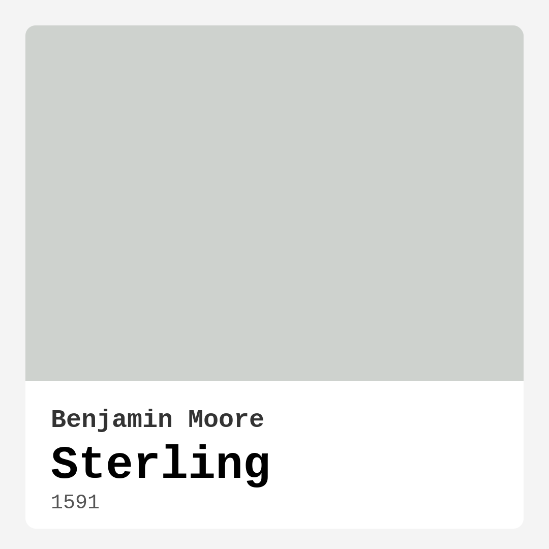
Color Preview & Key Details
| HEX Code | #CED2CE |
| RGB | 206, 210, 206 |
| LRV | 62.33% |
| Undertone | Green |
| Finish Options | Eggshell, Matte, Satin |
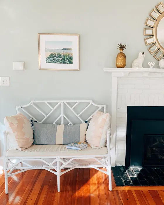
Ever walked into a room and immediately felt at ease? That’s the magic of the right paint color—it doesn’t just cover walls; it sets the tone for your entire space. Today, let’s talk about one of those effortlessly sophisticated shades that’s been quietly winning over designers and homeowners alike: Benjamin Moore’s Sterling.
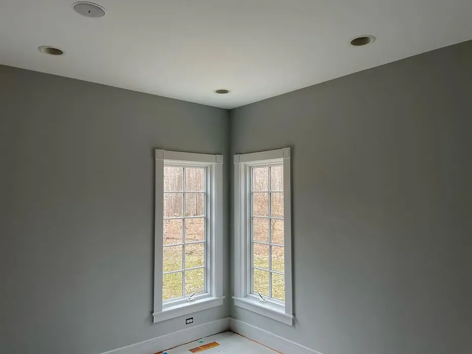
Sterling (color code 1591) is a soft, muted gray with a whisper of green undertone, giving it a fresh yet grounded feel. It’s the kind of color that doesn’t demand attention but effortlessly elevates whatever’s around it. With an LRV of 62.33%, it reflects plenty of light, making rooms feel airy and open without veering into starkness. Whether you’re painting a sun-drenched living room or a cozy bedroom, Sterling adapts beautifully, shifting subtly with the light to create a dynamic yet calming backdrop.
One of the things I love about Sterling is its versatility. It plays well with modern, minimalist, and even traditional decor, thanks to its neutral yet nuanced character. Pair it with crisp white trim like Benjamin Moore’s White Dove for a clean, timeless look, or let it anchor a moodier palette with deep jewel tones or warm woods. The green undertone adds just enough depth to keep it from feeling flat, so it never reads as cold or sterile.
Practicality matters, too, and Sterling delivers. It’s beginner-friendly—easy to apply, quick-drying, and touch-up friendly, so you won’t stress over imperfections. Opt for an eggshell or satin finish in high-traffic areas for added durability, or go matte for a velvety, contemporary vibe. And because it’s low-VOC and eco-certified, you can breathe easy knowing it’s as kind to your home as it is to the environment.
Lighting will influence how Sterling shows up, though. In a north-facing room, that green undertone might peek through more, lending a serene, almost earthy quality. In a south-facing space flooded with warm light, it’ll lean softer and more neutral. Always test a swatch on your walls and observe it at different times of day. Trust me, this step saves so much second-guessing later.
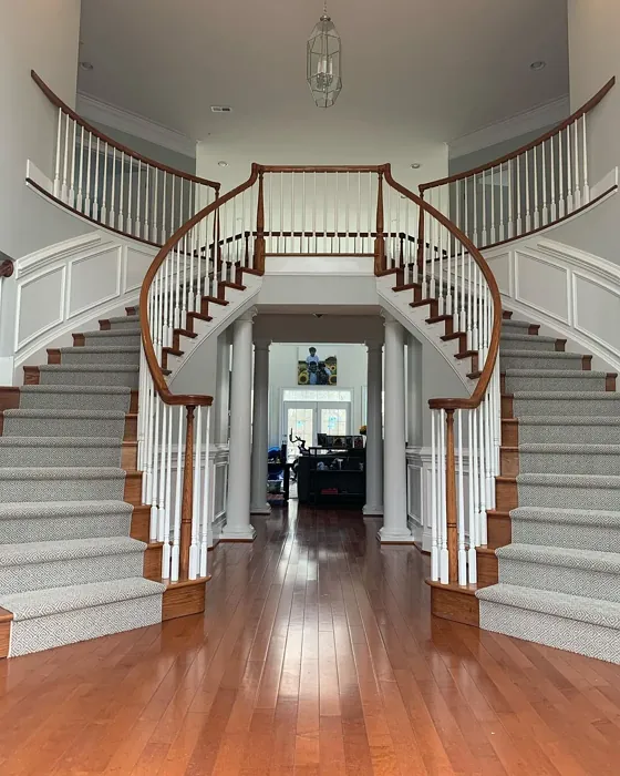
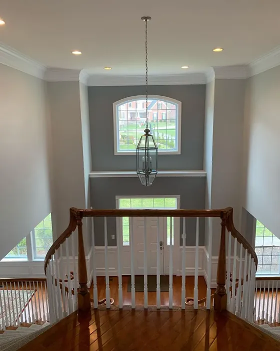
Wondering where Sterling shines brightest? It’s a natural fit for living rooms and bedrooms, where its calming vibe fosters relaxation. In a home office, it creates a focused but inviting atmosphere. Hallways and open-concept spaces benefit from its light-reflecting properties, making narrow areas feel more expansive. And if you’re working with a small room, Sterling’s ability to bounce light around can make it feel larger without sacrificing coziness.
Now, let’s talk pairings. For a fresh, modern look, try Sterling with pale blues or soft blush pinks. If you’re after contrast, deep charcoal or navy accents add sophistication. Earthy terracottas and warm taupes lean into its subtle warmth, while crisp whites keep things bright and balanced. And don’t forget texture—layering in linen, wood, or metallics will keep the space from feeling flat.
A few pro tips: If you’re using Sterling in a room with little natural light, amp up the warmth with creamy whites or golden-toned lighting to keep it from feeling too cool. And if you’re painting an accent wall, remember that Sterling’s muted quality makes it a great backdrop for bold art or statement furniture.
So, is Sterling the right gray for you? If you’re after a color that’s elegant but approachable, versatile but distinctive, and easy to live with, the answer is probably yes. It’s one of those rare shades that feels both current and timeless—a quiet hero in the world of neutrals. Grab a sample, see how it plays in your space, and get ready to fall in love with the walls all over again.
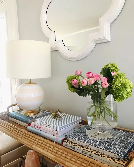
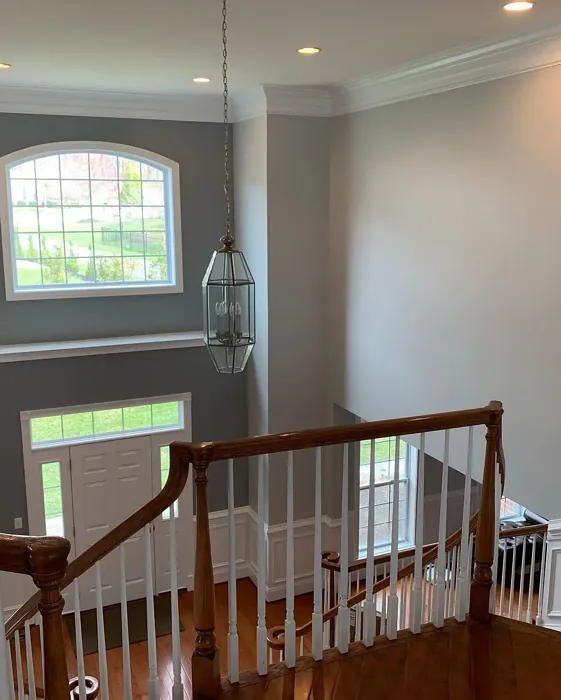
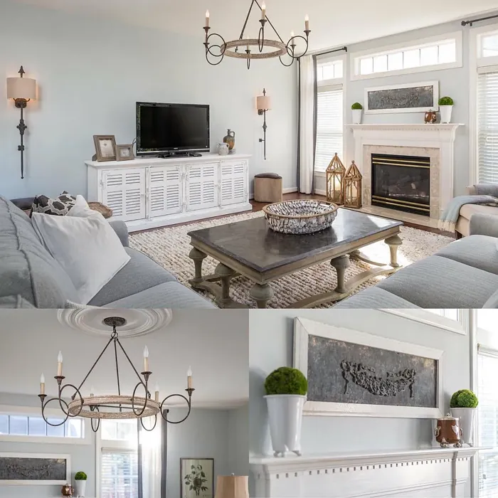
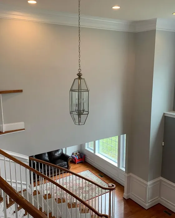
Real Room Photo of Sterling 1591
Undertones of Sterling ?
The undertones of Sterling are a key aspect of its character, leaning towards Green. These subtle underlying hues are what give the color its depth and complexity. For example, a gray with a blue undertone will feel cooler and more modern, while one with a brown undertone will feel warmer and more traditional. It’s essential to test this paint in your home and observe it next to your existing furniture, flooring, and decor to see how these undertones interact and reveal themselves throughout the day.
HEX value: #CED2CE
RGB code: 206, 210, 206
Is Sterling Cool or Warm?
While predominantly a cool gray, Sterling’s warmth can shine through in certain lights, creating an inviting atmosphere. This duality makes it adaptable to various furnishings, ensuring it harmonizes well with both warm and cool color palettes.
Understanding Color Properties and Interior Design Tips
Hue refers to a specific position on the color wheel, measured in degrees from 0 to 360. Each degree represents a different pure color:
- 0° represents red
- 120° represents green
- 240° represents blue
Saturation describes the intensity or purity of a color and is expressed as a percentage:
- At 0%, the color appears completely desaturated—essentially a shade of gray
- At 100%, the color is at its most vivid and vibrant
Lightness indicates how light or dark a color is, also expressed as a percentage:
- 0% lightness results in black
- 100% lightness results in white
Using Warm Colors in Interior Design
Warm hues—such as reds, oranges, yellows, warm beiges, and greiges—are excellent choices for creating inviting and energetic spaces. These colors are particularly well-suited for:
- Kitchens, living rooms, and bathrooms, where warmth enhances comfort and sociability
- Large rooms, where warm tones can help reduce the sense of emptiness and make the space feel more intimate
For example:
- Warm beige shades provide a cozy, inviting atmosphere, ideal for living rooms, bedrooms, and hallways.
- Warm greige (a mix of beige and gray) offers the warmth of beige with the modern appeal of gray, making it a versatile backdrop for dining areas, bedrooms, and living spaces.
However, be mindful when using warm light tones in rooms with limited natural light. These shades may appear muted or even take on an unpleasant yellowish tint. To avoid a dull or flat appearance:
- Add depth by incorporating richer tones like deep greens, charcoal, or chocolate brown
- Use textured elements such as curtains, rugs, or cushions to bring dimension to the space
Pro Tip: Achieving Harmony with Warm and Cool Color Balance
To create a well-balanced and visually interesting interior, mix warm and cool tones strategically. This contrast adds depth and harmony to your design.
- If your walls feature warm hues, introduce cool-colored accents such as blue or green furniture, artwork, or accessories to create contrast.
- For a polished look, consider using a complementary color scheme, which pairs colors opposite each other on the color wheel (e.g., red with green, orange with blue).
This thoughtful mix not only enhances visual appeal but also creates a space that feels both dynamic and cohesive.
Light Temperature Affects on Sterling
Natural Light
Natural daylight changes in color temperature as the sun moves across the sky. At sunrise and sunset, the light tends to have a warm, golden tone with a color temperature around 2000 Kelvin (K). As the day progresses and the sun rises higher, the light becomes cooler and more neutral. Around midday, especially when the sky is clear, natural light typically reaches its peak brightness and shifts to a cooler tone, ranging from 5500 to 6500 Kelvin. This midday light is close to what we perceive as pure white or daylight-balanced light.
These shifts in natural light can significantly influence how colors appear in a space, which is why designers often consider both the time of day and the orientation of windows when planning interior color schemes.
Artificial Light
When choosing artificial lighting, pay close attention to the color temperature, measured in Kelvin (K). This determines how warm or cool the light will appear. Lower temperatures, around 2700K, give off a warm, yellow glow often used in living rooms or bedrooms. Higher temperatures, above 5000K, create a cool, bluish light similar to daylight, commonly used in kitchens, offices, or task areas.
Use the slider to see how lighting temperature can affect the appearance of a surface or color throughout a space.


4800K
LRV of Sterling
The Light Reflectance Value (LRV) of Sterling is 62.33%, which places it in the Light colors category. This means it reflect most of the incident light. Understanding a paint’s LRV is crucial for predicting how it will look in your space. A higher LRV indicates a lighter color that reflects more light, making rooms feel larger and brighter. A lower LRV signifies a darker color that absorbs more light, creating a cozier, more intimate atmosphere. Always consider the natural and artificial lighting in your room when selecting a paint color based on its LRV.
Detailed Review of Sterling
Additional Paint Characteristics
Ideal Rooms
Bedroom, Dining Room, Hallway, Home Office, Living Room
Decor Styles
Minimalist, Modern, Scandinavian, Transitional
Coverage
Good (1–2 Coats), Touch-Up Friendly
Ease of Application
Beginner Friendly, Brush Smooth, Fast-Drying, Roller-Ready
Washability
Highly Washable, Washable
VOC Level
Eco-Certified, Low VOC
Best Use
Accent Wall, Interior Walls, Open Concept Spaces
Room Suitability
Bedroom, Hallway, Home Office, Living Room
Tone Tag
Cool, Muted, Neutral
Finish Type
Eggshell, Matte, Satin
Paint Performance
Easy Touch-Up, Low Odor, Quick Drying, Scuff Resistant
Use Cases
Best for Modern Farmhouse, Best for Open Concept, Best for Small Spaces
Mood
Calm, Grounding, Inviting
Trim Pairing
Complements Cool Trim, Pairs with White Dove, Works with Warm Trim
Sterling is an exceptional gray that balances warmth and coolness, making it a fantastic backdrop for a variety of decor styles. When applied, it offers a soft ambiance that enhances natural light, creating a welcoming environment. It’s particularly effective in spaces where you want to promote relaxation, like bedrooms or living rooms. The finish options of matte, eggshell, and satin allow for flexibility in application, whether you’re aiming for a flat look or a subtle sheen. Overall, Sterling is a reliable choice that delivers both aesthetics and functionality, ensuring your walls look great and stay stylish over time.
Pros & Cons of 1591 Sterling
Pros
Cons
Colors that go with Benjamin Moore Sterling
FAQ on 1591 Sterling
Is Sterling suitable for high-traffic areas?
Absolutely! Sterling’s durability and washability make it a great option for high-traffic areas. Just ensure you choose a finish that can withstand wear and tear, like eggshell or satin, to maintain its beauty over time.
How does Sterling pair with other colors?
Sterling pairs beautifully with a range of colors. For a fresh, modern look, try it with crisp whites or soft pastels. If you’re aiming for a cozier feel, combine it with warm earthy tones or deep jewel colors. Its versatility allows it to adapt to many palettes effortlessly.
Comparisons Sterling with other colors
Sterling 1591 vs Agreeable Gray SW 7029
| Attribute | Sterling 1591 | Agreeable Gray SW 7029 |
|---|---|---|
| Color Name | Sterling 1591 | Agreeable Gray SW 7029 |
| Color | ||
| Hue | Grey | Grey |
| Brightness | Light | Light |
| RGB | 206, 210, 206 | 209, 203, 193 |
| LRV | 62.33% | 60% |
| Finish Type | Eggshell, Matte, Satin | Eggshell, Matte, Satin |
| Finish Options | Eggshell, Matte, Satin | Eggshell, Flat, Matte, Satin |
| Ideal Rooms | Bedroom, Dining Room, Hallway, Home Office, Living Room | Bathroom, Bedroom, Dining Room, Home Office, Kitchen, Living Room |
| Decor Styles | Minimalist, Modern, Scandinavian, Transitional | Contemporary, Farmhouse, Minimalist, Modern, Transitional |
| Coverage | Good (1–2 Coats), Touch-Up Friendly | Good (1–2 Coats), Touch-Up Friendly |
| Ease of Application | Beginner Friendly, Brush Smooth, Fast-Drying, Roller-Ready | Beginner Friendly, Brush Smooth, Roller-Ready |
| Washability | Highly Washable, Washable | Washable, Wipeable |
| Room Suitability | Bedroom, Hallway, Home Office, Living Room | Bathroom, Bedroom, Dining Room, Kitchen, Living Room |
| Tone | Cool, Muted, Neutral | Muted, Neutral, Warm |
| Paint Performance | Easy Touch-Up, Low Odor, Quick Drying, Scuff Resistant | Easy Touch-Up, Fade Resistant, Low Odor |
Sterling 1591 vs Eider White SW 7014
| Attribute | Sterling 1591 | Eider White SW 7014 |
|---|---|---|
| Color Name | Sterling 1591 | Eider White SW 7014 |
| Color | ||
| Hue | Grey | Grey |
| Brightness | Light | Light |
| RGB | 206, 210, 206 | 226, 222, 216 |
| LRV | 62.33% | 73% |
| Finish Type | Eggshell, Matte, Satin | Eggshell, Matte, Satin |
| Finish Options | Eggshell, Matte, Satin | Eggshell, Matte, Satin |
| Ideal Rooms | Bedroom, Dining Room, Hallway, Home Office, Living Room | Bathroom, Bedroom, Dining Room, Home Office, Kitchen, Living Room |
| Decor Styles | Minimalist, Modern, Scandinavian, Transitional | Farmhouse, Minimalist, Modern, Scandinavian, Transitional |
| Coverage | Good (1–2 Coats), Touch-Up Friendly | Good (1–2 Coats), Touch-Up Friendly |
| Ease of Application | Beginner Friendly, Brush Smooth, Fast-Drying, Roller-Ready | Beginner Friendly, Brush Smooth, Roller-Ready |
| Washability | Highly Washable, Washable | Highly Washable, Washable |
| Room Suitability | Bedroom, Hallway, Home Office, Living Room | Bathroom, Bedroom, Dining Room, Kitchen, Living Room |
| Tone | Cool, Muted, Neutral | Creamy, Muted, Neutral, Warm |
| Paint Performance | Easy Touch-Up, Low Odor, Quick Drying, Scuff Resistant | Easy Touch-Up, High Coverage, Low Odor, Scuff Resistant |
Sterling 1591 vs Drift of Mist SW 9166
| Attribute | Sterling 1591 | Drift of Mist SW 9166 |
|---|---|---|
| Color Name | Sterling 1591 | Drift of Mist SW 9166 |
| Color | ||
| Hue | Grey | Grey |
| Brightness | Light | Light |
| RGB | 206, 210, 206 | 220, 216, 208 |
| LRV | 62.33% | 65% |
| Finish Type | Eggshell, Matte, Satin | Eggshell, Matte, Satin |
| Finish Options | Eggshell, Matte, Satin | Eggshell, Matte, Satin |
| Ideal Rooms | Bedroom, Dining Room, Hallway, Home Office, Living Room | Bathroom, Bedroom, Home Office, Kitchen, Living Room |
| Decor Styles | Minimalist, Modern, Scandinavian, Transitional | Coastal, Minimalist, Modern, Scandinavian |
| Coverage | Good (1–2 Coats), Touch-Up Friendly | Good (1–2 Coats), Touch-Up Friendly |
| Ease of Application | Beginner Friendly, Brush Smooth, Fast-Drying, Roller-Ready | Beginner Friendly, Brush Smooth, Fast-Drying, Roller-Ready |
| Washability | Highly Washable, Washable | Washable, Wipeable |
| Room Suitability | Bedroom, Hallway, Home Office, Living Room | Bathroom, Bedroom, Home Office, Living Room |
| Tone | Cool, Muted, Neutral | Airy, Cool, Neutral |
| Paint Performance | Easy Touch-Up, Low Odor, Quick Drying, Scuff Resistant | Easy Touch-Up, Low Odor, Quick Drying, Scuff Resistant |
Sterling 1591 vs Sanctuary SW 9583
| Attribute | Sterling 1591 | Sanctuary SW 9583 |
|---|---|---|
| Color Name | Sterling 1591 | Sanctuary SW 9583 |
| Color | ||
| Hue | Grey | Grey |
| Brightness | Light | Light |
| RGB | 206, 210, 206 | 230, 226, 217 |
| LRV | 62.33% | 24% |
| Finish Type | Eggshell, Matte, Satin | Eggshell, Matte, Satin |
| Finish Options | Eggshell, Matte, Satin | Eggshell, Matte, Satin |
| Ideal Rooms | Bedroom, Dining Room, Hallway, Home Office, Living Room | Bedroom, Dining Room, Home Office, Living Room, Nursery |
| Decor Styles | Minimalist, Modern, Scandinavian, Transitional | Bohemian, Coastal, Modern Farmhouse, Scandinavian |
| Coverage | Good (1–2 Coats), Touch-Up Friendly | Good (1–2 Coats), Touch-Up Friendly |
| Ease of Application | Beginner Friendly, Brush Smooth, Fast-Drying, Roller-Ready | Beginner Friendly, Brush Smooth, Fast-Drying, Roller-Ready |
| Washability | Highly Washable, Washable | Highly Washable, Washable, Wipeable |
| Room Suitability | Bedroom, Hallway, Home Office, Living Room | Bedroom, Home Office, Living Room, Nursery |
| Tone | Cool, Muted, Neutral | Earthy, Neutral, Soft, Warm |
| Paint Performance | Easy Touch-Up, Low Odor, Quick Drying, Scuff Resistant | Easy Touch-Up, Low Odor, Quick Drying, Scuff Resistant |
Sterling 1591 vs Snowbound SW 7004
| Attribute | Sterling 1591 | Snowbound SW 7004 |
|---|---|---|
| Color Name | Sterling 1591 | Snowbound SW 7004 |
| Color | ||
| Hue | Grey | Grey |
| Brightness | Light | Light |
| RGB | 206, 210, 206 | 237, 234, 229 |
| LRV | 62.33% | 83% |
| Finish Type | Eggshell, Matte, Satin | Eggshell, Matte, Satin |
| Finish Options | Eggshell, Matte, Satin | Eggshell, Matte, Satin |
| Ideal Rooms | Bedroom, Dining Room, Hallway, Home Office, Living Room | Bathroom, Bedroom, Dining Room, Hallway, Home Office, Kitchen, Living Room, Nursery |
| Decor Styles | Minimalist, Modern, Scandinavian, Transitional | Farmhouse, Minimalist, Modern, Scandinavian, Transitional |
| Coverage | Good (1–2 Coats), Touch-Up Friendly | Good (1–2 Coats), Touch-Up Friendly |
| Ease of Application | Beginner Friendly, Brush Smooth, Fast-Drying, Roller-Ready | Beginner Friendly, Brush Smooth, Fast-Drying, Roller-Ready |
| Washability | Highly Washable, Washable | Washable, Wipeable |
| Room Suitability | Bedroom, Hallway, Home Office, Living Room | Bathroom, Bedroom, Dining Room, Hallway, Home Office, Kitchen, Living Room |
| Tone | Cool, Muted, Neutral | Airy, Crisp, Neutral, Warm |
| Paint Performance | Easy Touch-Up, Low Odor, Quick Drying, Scuff Resistant | High Coverage, Low Odor, Quick Drying |
Sterling 1591 vs Pure White SW 7005
| Attribute | Sterling 1591 | Pure White SW 7005 |
|---|---|---|
| Color Name | Sterling 1591 | Pure White SW 7005 |
| Color | ||
| Hue | Grey | Grey |
| Brightness | Light | Light |
| RGB | 206, 210, 206 | 237, 236, 230 |
| LRV | 62.33% | 84% |
| Finish Type | Eggshell, Matte, Satin | Eggshell, Satin, Semi-Gloss |
| Finish Options | Eggshell, Matte, Satin | Eggshell, Flat, Matte, Satin, Semi-Gloss |
| Ideal Rooms | Bedroom, Dining Room, Hallway, Home Office, Living Room | Bathroom, Bedroom, Dining Room, Entryway, Hallway, Home Office, Kitchen, Living Room, Nursery |
| Decor Styles | Minimalist, Modern, Scandinavian, Transitional | Bohemian, Eclectic, Farmhouse, Minimalist, Modern, Traditional |
| Coverage | Good (1–2 Coats), Touch-Up Friendly | Good (1–2 Coats), Touch-Up Friendly |
| Ease of Application | Beginner Friendly, Brush Smooth, Fast-Drying, Roller-Ready | Beginner Friendly, Brush Smooth, Fast-Drying, Roller-Ready |
| Washability | Highly Washable, Washable | Highly Washable, Washable |
| Room Suitability | Bedroom, Hallway, Home Office, Living Room | Bathroom, Bedroom, Dining Room, Entryway, Hallway, Home Office, Kitchen, Living Room, Nursery |
| Tone | Cool, Muted, Neutral | Crisp, Neutral, Warm |
| Paint Performance | Easy Touch-Up, Low Odor, Quick Drying, Scuff Resistant | Easy Touch-Up, High Coverage, Low Odor, Quick Drying |
Sterling 1591 vs Crushed Ice SW 7647
| Attribute | Sterling 1591 | Crushed Ice SW 7647 |
|---|---|---|
| Color Name | Sterling 1591 | Crushed Ice SW 7647 |
| Color | ||
| Hue | Grey | Grey |
| Brightness | Light | Light |
| RGB | 206, 210, 206 | 214, 211, 204 |
| LRV | 62.33% | 66% |
| Finish Type | Eggshell, Matte, Satin | Eggshell, Matte, Satin |
| Finish Options | Eggshell, Matte, Satin | Eggshell, Matte, Satin |
| Ideal Rooms | Bedroom, Dining Room, Hallway, Home Office, Living Room | Bathroom, Bedroom, Dining Room, Home Office, Living Room |
| Decor Styles | Minimalist, Modern, Scandinavian, Transitional | Farmhouse, Minimalist, Modern, Scandinavian, Transitional |
| Coverage | Good (1–2 Coats), Touch-Up Friendly | Good (1–2 Coats), Touch-Up Friendly |
| Ease of Application | Beginner Friendly, Brush Smooth, Fast-Drying, Roller-Ready | Beginner Friendly, Brush Smooth, Roller-Ready |
| Washability | Highly Washable, Washable | Stain Resistant, Washable |
| Room Suitability | Bedroom, Hallway, Home Office, Living Room | Bathroom, Bedroom, Dining Room, Hallway, Home Office, Living Room |
| Tone | Cool, Muted, Neutral | Muted, Neutral, Warm |
| Paint Performance | Easy Touch-Up, Low Odor, Quick Drying, Scuff Resistant | High Coverage, Low Odor, Quick Drying |
Sterling 1591 vs Origami White SW 7636
| Attribute | Sterling 1591 | Origami White SW 7636 |
|---|---|---|
| Color Name | Sterling 1591 | Origami White SW 7636 |
| Color | ||
| Hue | Grey | Grey |
| Brightness | Light | Light |
| RGB | 206, 210, 206 | 229, 226, 218 |
| LRV | 62.33% | 83% |
| Finish Type | Eggshell, Matte, Satin | Eggshell, Matte |
| Finish Options | Eggshell, Matte, Satin | Eggshell, Matte, Satin |
| Ideal Rooms | Bedroom, Dining Room, Hallway, Home Office, Living Room | Bedroom, Dining Room, Entryway, Hallway, Home Office, Kitchen, Living Room |
| Decor Styles | Minimalist, Modern, Scandinavian, Transitional | Minimalist, Modern, Scandinavian, Traditional, Transitional |
| Coverage | Good (1–2 Coats), Touch-Up Friendly | Good (1–2 Coats), Touch-Up Friendly |
| Ease of Application | Beginner Friendly, Brush Smooth, Fast-Drying, Roller-Ready | Beginner Friendly, Brush Smooth, Roller-Ready |
| Washability | Highly Washable, Washable | Washable, Wipeable |
| Room Suitability | Bedroom, Hallway, Home Office, Living Room | Bedroom, Dining Room, Home Office, Kitchen, Living Room |
| Tone | Cool, Muted, Neutral | Airy, Neutral, Warm |
| Paint Performance | Easy Touch-Up, Low Odor, Quick Drying, Scuff Resistant | Easy Touch-Up, Low Odor, Quick Drying |
Sterling 1591 vs Spare White SW 6203
| Attribute | Sterling 1591 | Spare White SW 6203 |
|---|---|---|
| Color Name | Sterling 1591 | Spare White SW 6203 |
| Color | ||
| Hue | Grey | Grey |
| Brightness | Light | Light |
| RGB | 206, 210, 206 | 228, 228, 221 |
| LRV | 62.33% | 75% |
| Finish Type | Eggshell, Matte, Satin | Eggshell, Matte |
| Finish Options | Eggshell, Matte, Satin | Eggshell, Matte, Satin |
| Ideal Rooms | Bedroom, Dining Room, Hallway, Home Office, Living Room | Bedroom, Dining Room, Home Office, Kitchen, Living Room, Nursery |
| Decor Styles | Minimalist, Modern, Scandinavian, Transitional | Farmhouse, Minimalist, Modern, Scandinavian, Transitional |
| Coverage | Good (1–2 Coats), Touch-Up Friendly | Good (1–2 Coats), Primer Recommended, Touch-Up Friendly |
| Ease of Application | Beginner Friendly, Brush Smooth, Fast-Drying, Roller-Ready | Beginner Friendly, Brush Smooth, Fast-Drying, Roller-Ready |
| Washability | Highly Washable, Washable | Washable, Wipeable |
| Room Suitability | Bedroom, Hallway, Home Office, Living Room | Bedroom, Dining Room, Home Office, Kitchen, Living Room |
| Tone | Cool, Muted, Neutral | Creamy, Neutral, Warm |
| Paint Performance | Easy Touch-Up, Low Odor, Quick Drying, Scuff Resistant | Easy Touch-Up, Low Odor, Quick Drying |
Sterling 1591 vs Mountain Air SW 6224
| Attribute | Sterling 1591 | Mountain Air SW 6224 |
|---|---|---|
| Color Name | Sterling 1591 | Mountain Air SW 6224 |
| Color | ||
| Hue | Grey | Grey |
| Brightness | Light | Light |
| RGB | 206, 210, 206 | 216, 224, 223 |
| LRV | 62.33% | 66% |
| Finish Type | Eggshell, Matte, Satin | Eggshell, Satin |
| Finish Options | Eggshell, Matte, Satin | Eggshell, Matte, Satin |
| Ideal Rooms | Bedroom, Dining Room, Hallway, Home Office, Living Room | Bedroom, Hallway, Home Office, Living Room, Nursery |
| Decor Styles | Minimalist, Modern, Scandinavian, Transitional | Coastal, Minimalist, Modern, Scandinavian |
| Coverage | Good (1–2 Coats), Touch-Up Friendly | Good (1–2 Coats), Touch-Up Friendly |
| Ease of Application | Beginner Friendly, Brush Smooth, Fast-Drying, Roller-Ready | Beginner Friendly, Brush Smooth, Fast-Drying, Roller-Ready |
| Washability | Highly Washable, Washable | Highly Washable, Washable |
| Room Suitability | Bedroom, Hallway, Home Office, Living Room | Bedroom, Home Office, Living Room, Nursery |
| Tone | Cool, Muted, Neutral | Airy, Cool, Muted |
| Paint Performance | Easy Touch-Up, Low Odor, Quick Drying, Scuff Resistant | Easy Touch-Up, Low Odor, Quick Drying, Scuff Resistant |
Official Page of Benjamin Moore Sterling 1591