
Color Preview & Key Details
| HEX Code | #EEF1EB |
| RGB | 238, 241, 235 |
| LRV | 86.32% |
| Undertone | Green |
| Finish Options | Eggshell, Matte, Satin |
Imagine walking into a room that instantly makes you exhale—soft, serene, and effortlessly elegant. The walls wrap around you like a gentle whisper, cool and calming, yet warm enough to feel inviting. That’s the magic of Benjamin Moore’s Frostine (AF-5), a delicate gray with just the right touch of green undertone to keep it from feeling sterile. If you’ve been searching for a color that balances freshness with sophistication, this might be your answer.
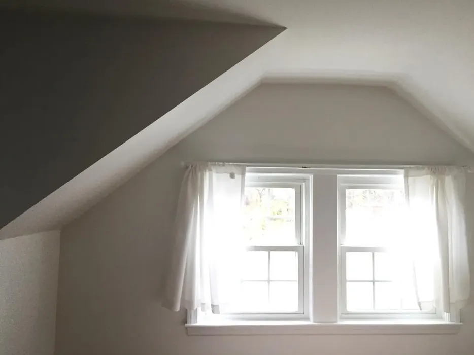
Frostine is one of those rare shades that works almost anywhere. Its light, airy quality makes it a natural fit for living rooms, bedrooms, and even nurseries, where you want a sense of tranquility. With an LRV of 86.32%, it reflects nearly all the light that hits it, which means it can make small spaces feel larger and dark rooms feel brighter. But don’t mistake its lightness for blandness—the subtle green undertone adds depth, giving it a chameleon-like quality that shifts slightly depending on the time of day and the lighting in your space.
One of the best things about Frostine is how beginner-friendly it is. Whether you’re a DIY enthusiast or a first-time painter, you’ll appreciate how smoothly it applies. It’s roller-ready, dries quickly, and typically only needs one or two coats for full coverage. The finish options—matte, eggshell, or satin—let you tailor the look to your room’s needs. Prefer a soft, velvety texture? Go with matte. Want a hint of sheen for easier cleaning? Satin’s your best bet. And because it’s low-VOC, you won’t have to worry about harsh fumes lingering in your home.
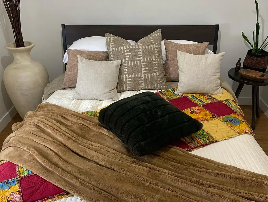
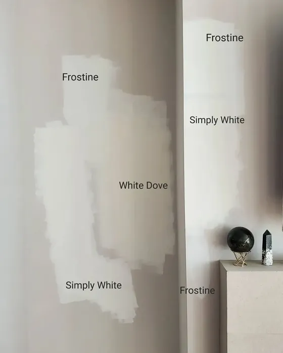
Now, let’s talk about pairing Frostine with your existing decor. This color plays well with others, especially crisp whites like White Dove for trim or brass fixtures that add a touch of warmth. If you’re feeling bold, try pairing it with deeper greens or muted purples (its complementary hue) for a sophisticated contrast. Scandinavian and minimalist styles love Frostine for its clean, uncluttered vibe, but it’s just as at home in a coastal or farmhouse setting where you want a relaxed, lived-in feel.
Of course, no color is perfect for every situation. Frostine’s lightness means it might not be the best choice for high-traffic areas like hallways or kids’ rooms unless you’re willing to commit to regular touch-ups. And while its green undertone is subtle, it can sometimes pull more noticeably in rooms with lots of natural light, so always test a swatch on your walls before committing.
But here’s the thing—Frostine’s versatility is its superpower. Use it on all four walls for a cohesive, airy look, or as an accent to highlight architectural details. Paint your ceiling for an unexpected touch of elegance, or let it set the stage for a gallery wall in your dining room. However you use it, this color brings a sense of calm and refinement that’s hard to beat.
So, is Frostine right for your home? If you’re drawn to colors that feel fresh without being cold, soft without being wishy-washy, and elegant without being fussy, then yes. It’s a shade that adapts to you, not the other way around. And in the world of paint colors, that’s a rare and beautiful thing.
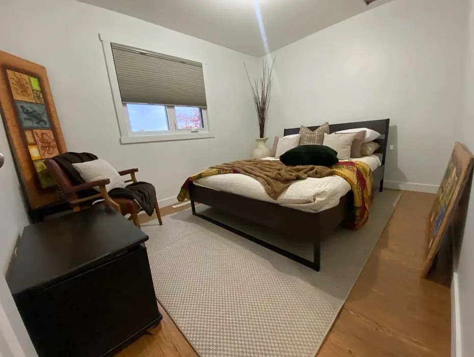
Real Room Photo of Frostine AF-5
Undertones of Frostine ?
The undertones of Frostine are a key aspect of its character, leaning towards Green. These subtle underlying hues are what give the color its depth and complexity. For example, a gray with a blue undertone will feel cooler and more modern, while one with a brown undertone will feel warmer and more traditional. It’s essential to test this paint in your home and observe it next to your existing furniture, flooring, and decor to see how these undertones interact and reveal themselves throughout the day.
HEX value: #EEF1EB
RGB code: 238, 241, 235
Is Frostine Cool or Warm?
Frostine leans more towards the cool side of the spectrum, which helps to create a refreshing and crisp atmosphere. This quality makes it ideal for spaces where you want to evoke a sense of calmness and serenity.
Understanding Color Properties and Interior Design Tips
Hue refers to a specific position on the color wheel, measured in degrees from 0 to 360. Each degree represents a different pure color:
- 0° represents red
- 120° represents green
- 240° represents blue
Saturation describes the intensity or purity of a color and is expressed as a percentage:
- At 0%, the color appears completely desaturated—essentially a shade of gray
- At 100%, the color is at its most vivid and vibrant
Lightness indicates how light or dark a color is, also expressed as a percentage:
- 0% lightness results in black
- 100% lightness results in white
Using Warm Colors in Interior Design
Warm hues—such as reds, oranges, yellows, warm beiges, and greiges—are excellent choices for creating inviting and energetic spaces. These colors are particularly well-suited for:
- Kitchens, living rooms, and bathrooms, where warmth enhances comfort and sociability
- Large rooms, where warm tones can help reduce the sense of emptiness and make the space feel more intimate
For example:
- Warm beige shades provide a cozy, inviting atmosphere, ideal for living rooms, bedrooms, and hallways.
- Warm greige (a mix of beige and gray) offers the warmth of beige with the modern appeal of gray, making it a versatile backdrop for dining areas, bedrooms, and living spaces.
However, be mindful when using warm light tones in rooms with limited natural light. These shades may appear muted or even take on an unpleasant yellowish tint. To avoid a dull or flat appearance:
- Add depth by incorporating richer tones like deep greens, charcoal, or chocolate brown
- Use textured elements such as curtains, rugs, or cushions to bring dimension to the space
Pro Tip: Achieving Harmony with Warm and Cool Color Balance
To create a well-balanced and visually interesting interior, mix warm and cool tones strategically. This contrast adds depth and harmony to your design.
- If your walls feature warm hues, introduce cool-colored accents such as blue or green furniture, artwork, or accessories to create contrast.
- For a polished look, consider using a complementary color scheme, which pairs colors opposite each other on the color wheel (e.g., red with green, orange with blue).
This thoughtful mix not only enhances visual appeal but also creates a space that feels both dynamic and cohesive.
Light Temperature Affects on Frostine
Natural Light
Natural daylight changes in color temperature as the sun moves across the sky. At sunrise and sunset, the light tends to have a warm, golden tone with a color temperature around 2000 Kelvin (K). As the day progresses and the sun rises higher, the light becomes cooler and more neutral. Around midday, especially when the sky is clear, natural light typically reaches its peak brightness and shifts to a cooler tone, ranging from 5500 to 6500 Kelvin. This midday light is close to what we perceive as pure white or daylight-balanced light.
These shifts in natural light can significantly influence how colors appear in a space, which is why designers often consider both the time of day and the orientation of windows when planning interior color schemes.
Artificial Light
When choosing artificial lighting, pay close attention to the color temperature, measured in Kelvin (K). This determines how warm or cool the light will appear. Lower temperatures, around 2700K, give off a warm, yellow glow often used in living rooms or bedrooms. Higher temperatures, above 5000K, create a cool, bluish light similar to daylight, commonly used in kitchens, offices, or task areas.
Use the slider to see how lighting temperature can affect the appearance of a surface or color throughout a space.


4800K
LRV of Frostine
The Light Reflectance Value (LRV) of Frostine is 86.32%, which places it in the White colors category. This means it reflect all light. Understanding a paint’s LRV is crucial for predicting how it will look in your space. A higher LRV indicates a lighter color that reflects more light, making rooms feel larger and brighter. A lower LRV signifies a darker color that absorbs more light, creating a cozier, more intimate atmosphere. Always consider the natural and artificial lighting in your room when selecting a paint color based on its LRV.
Detailed Review of Frostine
Additional Paint Characteristics
Ideal Rooms
Bathroom, Bedroom, Dining Room, Living Room, Nursery
Decor Styles
Coastal, Farmhouse, Minimalist, Modern, Scandinavian
Coverage
Good (1–2 Coats), Self-Priming
Ease of Application
Beginner Friendly, Brush Smooth, Fast-Drying, Roller-Ready
Washability
Washable, Wipeable
VOC Level
Low VOC
Best Use
Accent Wall, Ceiling, Interior Walls, Trim
Room Suitability
Bathroom, Bedroom, Dining Room, Living Room, Nursery
Tone Tag
Airy, Cool, Crisp
Finish Type
Eggshell, Matte, Satin
Paint Performance
Easy Touch-Up, Low Odor, Quick Drying
Use Cases
Best for Rentals, Best for Small Spaces, Designer Favorite
Mood
Calm, Inviting, Restful
Trim Pairing
Complements Brass Fixtures, Matches Pure White, Pairs with White Dove
Frostine is one of those colors that can effortlessly transform a space. Its light hue creates an open and airy feel, making it an excellent choice for smaller rooms or areas that lack natural light. When applied, it glides on smoothly, providing a consistent finish that looks polished and refined. The color works beautifully with various decor styles, from contemporary to rustic, and pairs well with both warm and cool tones. One of the standout features of Frostine is its versatility; it shines as a primary wall color and also works well as an accent. If you’re looking to create a tranquil environment, Frostine is a top contender. However, be mindful that it may require two coats for optimal coverage, especially on darker surfaces. Overall, it’s a lovely choice for anyone aiming for a calming aesthetic in their home.
Pros & Cons of AF-5 Frostine
Pros
Cons
Colors that go with Benjamin Moore Frostine
FAQ on AF-5 Frostine
Can Frostine be used in high-traffic areas?
While Frostine is beautiful, it’s best suited for low to moderate traffic areas. If you’re considering it for a high-traffic space, ensure to apply a protective topcoat for added durability. This will help maintain its fresh appearance even in busier rooms.
What finishes are available for Frostine?
Frostine is available in several finishes, including matte, eggshell, and satin. Each finish offers a different look and feel; for example, a matte finish provides a more understated elegance, while satin adds a slight sheen that can enhance its reflective qualities. Choose the finish that best suits the room and your personal style.
Comparisons Frostine with other colors
Frostine AF-5 vs Agreeable Gray SW 7029
| Attribute | Frostine AF-5 | Agreeable Gray SW 7029 |
|---|---|---|
| Color Name | Frostine AF-5 | Agreeable Gray SW 7029 |
| Color | ||
| Hue | Grey | Grey |
| Brightness | Light | Light |
| RGB | 238, 241, 235 | 209, 203, 193 |
| LRV | 86.32% | 60% |
| Finish Type | Eggshell, Matte, Satin | Eggshell, Matte, Satin |
| Finish Options | Eggshell, Matte, Satin | Eggshell, Flat, Matte, Satin |
| Ideal Rooms | Bathroom, Bedroom, Dining Room, Living Room, Nursery | Bathroom, Bedroom, Dining Room, Home Office, Kitchen, Living Room |
| Decor Styles | Coastal, Farmhouse, Minimalist, Modern, Scandinavian | Contemporary, Farmhouse, Minimalist, Modern, Transitional |
| Coverage | Good (1–2 Coats), Self-Priming | Good (1–2 Coats), Touch-Up Friendly |
| Ease of Application | Beginner Friendly, Brush Smooth, Fast-Drying, Roller-Ready | Beginner Friendly, Brush Smooth, Roller-Ready |
| Washability | Washable, Wipeable | Washable, Wipeable |
| Room Suitability | Bathroom, Bedroom, Dining Room, Living Room, Nursery | Bathroom, Bedroom, Dining Room, Kitchen, Living Room |
| Tone | Airy, Cool, Crisp | Muted, Neutral, Warm |
| Paint Performance | Easy Touch-Up, Low Odor, Quick Drying | Easy Touch-Up, Fade Resistant, Low Odor |
Frostine AF-5 vs Eider White SW 7014
| Attribute | Frostine AF-5 | Eider White SW 7014 |
|---|---|---|
| Color Name | Frostine AF-5 | Eider White SW 7014 |
| Color | ||
| Hue | Grey | Grey |
| Brightness | Light | Light |
| RGB | 238, 241, 235 | 226, 222, 216 |
| LRV | 86.32% | 73% |
| Finish Type | Eggshell, Matte, Satin | Eggshell, Matte, Satin |
| Finish Options | Eggshell, Matte, Satin | Eggshell, Matte, Satin |
| Ideal Rooms | Bathroom, Bedroom, Dining Room, Living Room, Nursery | Bathroom, Bedroom, Dining Room, Home Office, Kitchen, Living Room |
| Decor Styles | Coastal, Farmhouse, Minimalist, Modern, Scandinavian | Farmhouse, Minimalist, Modern, Scandinavian, Transitional |
| Coverage | Good (1–2 Coats), Self-Priming | Good (1–2 Coats), Touch-Up Friendly |
| Ease of Application | Beginner Friendly, Brush Smooth, Fast-Drying, Roller-Ready | Beginner Friendly, Brush Smooth, Roller-Ready |
| Washability | Washable, Wipeable | Highly Washable, Washable |
| Room Suitability | Bathroom, Bedroom, Dining Room, Living Room, Nursery | Bathroom, Bedroom, Dining Room, Kitchen, Living Room |
| Tone | Airy, Cool, Crisp | Creamy, Muted, Neutral, Warm |
| Paint Performance | Easy Touch-Up, Low Odor, Quick Drying | Easy Touch-Up, High Coverage, Low Odor, Scuff Resistant |
Frostine AF-5 vs Drift of Mist SW 9166
| Attribute | Frostine AF-5 | Drift of Mist SW 9166 |
|---|---|---|
| Color Name | Frostine AF-5 | Drift of Mist SW 9166 |
| Color | ||
| Hue | Grey | Grey |
| Brightness | Light | Light |
| RGB | 238, 241, 235 | 220, 216, 208 |
| LRV | 86.32% | 65% |
| Finish Type | Eggshell, Matte, Satin | Eggshell, Matte, Satin |
| Finish Options | Eggshell, Matte, Satin | Eggshell, Matte, Satin |
| Ideal Rooms | Bathroom, Bedroom, Dining Room, Living Room, Nursery | Bathroom, Bedroom, Home Office, Kitchen, Living Room |
| Decor Styles | Coastal, Farmhouse, Minimalist, Modern, Scandinavian | Coastal, Minimalist, Modern, Scandinavian |
| Coverage | Good (1–2 Coats), Self-Priming | Good (1–2 Coats), Touch-Up Friendly |
| Ease of Application | Beginner Friendly, Brush Smooth, Fast-Drying, Roller-Ready | Beginner Friendly, Brush Smooth, Fast-Drying, Roller-Ready |
| Washability | Washable, Wipeable | Washable, Wipeable |
| Room Suitability | Bathroom, Bedroom, Dining Room, Living Room, Nursery | Bathroom, Bedroom, Home Office, Living Room |
| Tone | Airy, Cool, Crisp | Airy, Cool, Neutral |
| Paint Performance | Easy Touch-Up, Low Odor, Quick Drying | Easy Touch-Up, Low Odor, Quick Drying, Scuff Resistant |
Frostine AF-5 vs Sanctuary SW 9583
| Attribute | Frostine AF-5 | Sanctuary SW 9583 |
|---|---|---|
| Color Name | Frostine AF-5 | Sanctuary SW 9583 |
| Color | ||
| Hue | Grey | Grey |
| Brightness | Light | Light |
| RGB | 238, 241, 235 | 230, 226, 217 |
| LRV | 86.32% | 24% |
| Finish Type | Eggshell, Matte, Satin | Eggshell, Matte, Satin |
| Finish Options | Eggshell, Matte, Satin | Eggshell, Matte, Satin |
| Ideal Rooms | Bathroom, Bedroom, Dining Room, Living Room, Nursery | Bedroom, Dining Room, Home Office, Living Room, Nursery |
| Decor Styles | Coastal, Farmhouse, Minimalist, Modern, Scandinavian | Bohemian, Coastal, Modern Farmhouse, Scandinavian |
| Coverage | Good (1–2 Coats), Self-Priming | Good (1–2 Coats), Touch-Up Friendly |
| Ease of Application | Beginner Friendly, Brush Smooth, Fast-Drying, Roller-Ready | Beginner Friendly, Brush Smooth, Fast-Drying, Roller-Ready |
| Washability | Washable, Wipeable | Highly Washable, Washable, Wipeable |
| Room Suitability | Bathroom, Bedroom, Dining Room, Living Room, Nursery | Bedroom, Home Office, Living Room, Nursery |
| Tone | Airy, Cool, Crisp | Earthy, Neutral, Soft, Warm |
| Paint Performance | Easy Touch-Up, Low Odor, Quick Drying | Easy Touch-Up, Low Odor, Quick Drying, Scuff Resistant |
Frostine AF-5 vs Snowbound SW 7004
| Attribute | Frostine AF-5 | Snowbound SW 7004 |
|---|---|---|
| Color Name | Frostine AF-5 | Snowbound SW 7004 |
| Color | ||
| Hue | Grey | Grey |
| Brightness | Light | Light |
| RGB | 238, 241, 235 | 237, 234, 229 |
| LRV | 86.32% | 83% |
| Finish Type | Eggshell, Matte, Satin | Eggshell, Matte, Satin |
| Finish Options | Eggshell, Matte, Satin | Eggshell, Matte, Satin |
| Ideal Rooms | Bathroom, Bedroom, Dining Room, Living Room, Nursery | Bathroom, Bedroom, Dining Room, Hallway, Home Office, Kitchen, Living Room, Nursery |
| Decor Styles | Coastal, Farmhouse, Minimalist, Modern, Scandinavian | Farmhouse, Minimalist, Modern, Scandinavian, Transitional |
| Coverage | Good (1–2 Coats), Self-Priming | Good (1–2 Coats), Touch-Up Friendly |
| Ease of Application | Beginner Friendly, Brush Smooth, Fast-Drying, Roller-Ready | Beginner Friendly, Brush Smooth, Fast-Drying, Roller-Ready |
| Washability | Washable, Wipeable | Washable, Wipeable |
| Room Suitability | Bathroom, Bedroom, Dining Room, Living Room, Nursery | Bathroom, Bedroom, Dining Room, Hallway, Home Office, Kitchen, Living Room |
| Tone | Airy, Cool, Crisp | Airy, Crisp, Neutral, Warm |
| Paint Performance | Easy Touch-Up, Low Odor, Quick Drying | High Coverage, Low Odor, Quick Drying |
Frostine AF-5 vs Pure White SW 7005
| Attribute | Frostine AF-5 | Pure White SW 7005 |
|---|---|---|
| Color Name | Frostine AF-5 | Pure White SW 7005 |
| Color | ||
| Hue | Grey | Grey |
| Brightness | Light | Light |
| RGB | 238, 241, 235 | 237, 236, 230 |
| LRV | 86.32% | 84% |
| Finish Type | Eggshell, Matte, Satin | Eggshell, Satin, Semi-Gloss |
| Finish Options | Eggshell, Matte, Satin | Eggshell, Flat, Matte, Satin, Semi-Gloss |
| Ideal Rooms | Bathroom, Bedroom, Dining Room, Living Room, Nursery | Bathroom, Bedroom, Dining Room, Entryway, Hallway, Home Office, Kitchen, Living Room, Nursery |
| Decor Styles | Coastal, Farmhouse, Minimalist, Modern, Scandinavian | Bohemian, Eclectic, Farmhouse, Minimalist, Modern, Traditional |
| Coverage | Good (1–2 Coats), Self-Priming | Good (1–2 Coats), Touch-Up Friendly |
| Ease of Application | Beginner Friendly, Brush Smooth, Fast-Drying, Roller-Ready | Beginner Friendly, Brush Smooth, Fast-Drying, Roller-Ready |
| Washability | Washable, Wipeable | Highly Washable, Washable |
| Room Suitability | Bathroom, Bedroom, Dining Room, Living Room, Nursery | Bathroom, Bedroom, Dining Room, Entryway, Hallway, Home Office, Kitchen, Living Room, Nursery |
| Tone | Airy, Cool, Crisp | Crisp, Neutral, Warm |
| Paint Performance | Easy Touch-Up, Low Odor, Quick Drying | Easy Touch-Up, High Coverage, Low Odor, Quick Drying |
Frostine AF-5 vs Crushed Ice SW 7647
| Attribute | Frostine AF-5 | Crushed Ice SW 7647 |
|---|---|---|
| Color Name | Frostine AF-5 | Crushed Ice SW 7647 |
| Color | ||
| Hue | Grey | Grey |
| Brightness | Light | Light |
| RGB | 238, 241, 235 | 214, 211, 204 |
| LRV | 86.32% | 66% |
| Finish Type | Eggshell, Matte, Satin | Eggshell, Matte, Satin |
| Finish Options | Eggshell, Matte, Satin | Eggshell, Matte, Satin |
| Ideal Rooms | Bathroom, Bedroom, Dining Room, Living Room, Nursery | Bathroom, Bedroom, Dining Room, Home Office, Living Room |
| Decor Styles | Coastal, Farmhouse, Minimalist, Modern, Scandinavian | Farmhouse, Minimalist, Modern, Scandinavian, Transitional |
| Coverage | Good (1–2 Coats), Self-Priming | Good (1–2 Coats), Touch-Up Friendly |
| Ease of Application | Beginner Friendly, Brush Smooth, Fast-Drying, Roller-Ready | Beginner Friendly, Brush Smooth, Roller-Ready |
| Washability | Washable, Wipeable | Stain Resistant, Washable |
| Room Suitability | Bathroom, Bedroom, Dining Room, Living Room, Nursery | Bathroom, Bedroom, Dining Room, Hallway, Home Office, Living Room |
| Tone | Airy, Cool, Crisp | Muted, Neutral, Warm |
| Paint Performance | Easy Touch-Up, Low Odor, Quick Drying | High Coverage, Low Odor, Quick Drying |
Frostine AF-5 vs Origami White SW 7636
| Attribute | Frostine AF-5 | Origami White SW 7636 |
|---|---|---|
| Color Name | Frostine AF-5 | Origami White SW 7636 |
| Color | ||
| Hue | Grey | Grey |
| Brightness | Light | Light |
| RGB | 238, 241, 235 | 229, 226, 218 |
| LRV | 86.32% | 83% |
| Finish Type | Eggshell, Matte, Satin | Eggshell, Matte |
| Finish Options | Eggshell, Matte, Satin | Eggshell, Matte, Satin |
| Ideal Rooms | Bathroom, Bedroom, Dining Room, Living Room, Nursery | Bedroom, Dining Room, Entryway, Hallway, Home Office, Kitchen, Living Room |
| Decor Styles | Coastal, Farmhouse, Minimalist, Modern, Scandinavian | Minimalist, Modern, Scandinavian, Traditional, Transitional |
| Coverage | Good (1–2 Coats), Self-Priming | Good (1–2 Coats), Touch-Up Friendly |
| Ease of Application | Beginner Friendly, Brush Smooth, Fast-Drying, Roller-Ready | Beginner Friendly, Brush Smooth, Roller-Ready |
| Washability | Washable, Wipeable | Washable, Wipeable |
| Room Suitability | Bathroom, Bedroom, Dining Room, Living Room, Nursery | Bedroom, Dining Room, Home Office, Kitchen, Living Room |
| Tone | Airy, Cool, Crisp | Airy, Neutral, Warm |
| Paint Performance | Easy Touch-Up, Low Odor, Quick Drying | Easy Touch-Up, Low Odor, Quick Drying |
Frostine AF-5 vs Spare White SW 6203
| Attribute | Frostine AF-5 | Spare White SW 6203 |
|---|---|---|
| Color Name | Frostine AF-5 | Spare White SW 6203 |
| Color | ||
| Hue | Grey | Grey |
| Brightness | Light | Light |
| RGB | 238, 241, 235 | 228, 228, 221 |
| LRV | 86.32% | 75% |
| Finish Type | Eggshell, Matte, Satin | Eggshell, Matte |
| Finish Options | Eggshell, Matte, Satin | Eggshell, Matte, Satin |
| Ideal Rooms | Bathroom, Bedroom, Dining Room, Living Room, Nursery | Bedroom, Dining Room, Home Office, Kitchen, Living Room, Nursery |
| Decor Styles | Coastal, Farmhouse, Minimalist, Modern, Scandinavian | Farmhouse, Minimalist, Modern, Scandinavian, Transitional |
| Coverage | Good (1–2 Coats), Self-Priming | Good (1–2 Coats), Primer Recommended, Touch-Up Friendly |
| Ease of Application | Beginner Friendly, Brush Smooth, Fast-Drying, Roller-Ready | Beginner Friendly, Brush Smooth, Fast-Drying, Roller-Ready |
| Washability | Washable, Wipeable | Washable, Wipeable |
| Room Suitability | Bathroom, Bedroom, Dining Room, Living Room, Nursery | Bedroom, Dining Room, Home Office, Kitchen, Living Room |
| Tone | Airy, Cool, Crisp | Creamy, Neutral, Warm |
| Paint Performance | Easy Touch-Up, Low Odor, Quick Drying | Easy Touch-Up, Low Odor, Quick Drying |
Frostine AF-5 vs Mountain Air SW 6224
| Attribute | Frostine AF-5 | Mountain Air SW 6224 |
|---|---|---|
| Color Name | Frostine AF-5 | Mountain Air SW 6224 |
| Color | ||
| Hue | Grey | Grey |
| Brightness | Light | Light |
| RGB | 238, 241, 235 | 216, 224, 223 |
| LRV | 86.32% | 66% |
| Finish Type | Eggshell, Matte, Satin | Eggshell, Satin |
| Finish Options | Eggshell, Matte, Satin | Eggshell, Matte, Satin |
| Ideal Rooms | Bathroom, Bedroom, Dining Room, Living Room, Nursery | Bedroom, Hallway, Home Office, Living Room, Nursery |
| Decor Styles | Coastal, Farmhouse, Minimalist, Modern, Scandinavian | Coastal, Minimalist, Modern, Scandinavian |
| Coverage | Good (1–2 Coats), Self-Priming | Good (1–2 Coats), Touch-Up Friendly |
| Ease of Application | Beginner Friendly, Brush Smooth, Fast-Drying, Roller-Ready | Beginner Friendly, Brush Smooth, Fast-Drying, Roller-Ready |
| Washability | Washable, Wipeable | Highly Washable, Washable |
| Room Suitability | Bathroom, Bedroom, Dining Room, Living Room, Nursery | Bedroom, Home Office, Living Room, Nursery |
| Tone | Airy, Cool, Crisp | Airy, Cool, Muted |
| Paint Performance | Easy Touch-Up, Low Odor, Quick Drying | Easy Touch-Up, Low Odor, Quick Drying, Scuff Resistant |
Official Page of Benjamin Moore Frostine AF-5