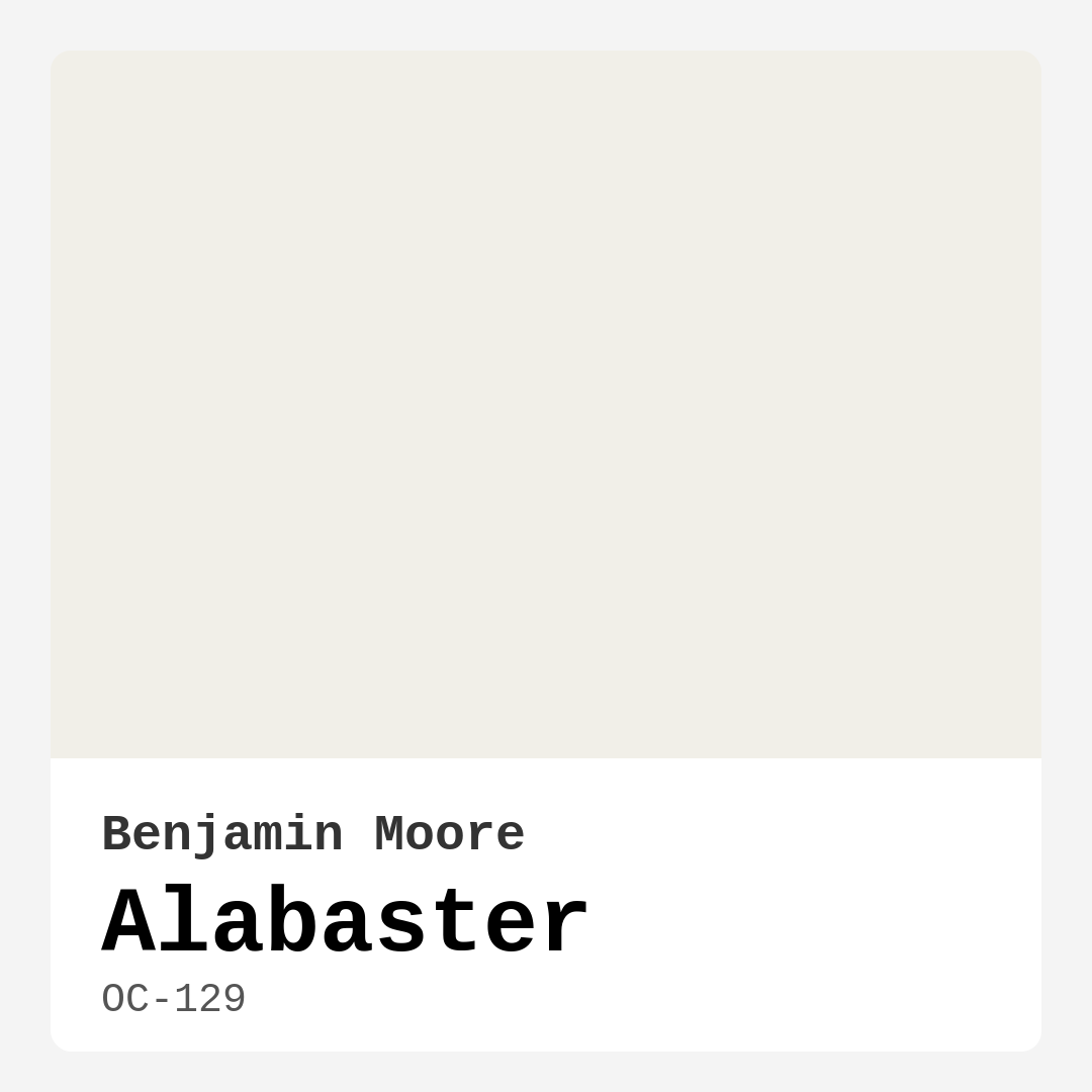
Color Preview & Key Details
| HEX Code | #F1EFE8 |
| RGB | 241, 239, 232 |
| LRV | 85.08% |
| Undertone | Yellow |
| Finish Options | Eggshell, Matte, Satin |
Imagine walking into a room that instantly feels like a warm embrace—soft, inviting, and effortlessly elegant. The walls seem to glow with a gentle light, and the space exudes a quiet sophistication that makes you want to stay awhile. That’s the magic of Benjamin Moore’s Alabaster (OC-129). This isn’t just another off-white paint; it’s a chameleon of warmth and versatility, capable of transforming any room into a sanctuary. Whether you’re refreshing a cozy bedroom, designing a modern farmhouse kitchen, or creating a serene living room, Alabaster might just be the perfect shade to bring your vision to life.
Alabaster sits in that sweet spot between white and cream, with a subtle yellow undertone that adds depth without overwhelming. It’s not stark or clinical—it’s warm, approachable, and incredibly forgiving. With a Light Reflectance Value (LRV) of 85.08%, it reflects nearly all the light that hits it, making even the smallest spaces feel airy and open. But here’s the thing: it doesn’t just bounce light around like a sterile hospital wall. Instead, it softens it, creating a glow that feels natural and inviting. In a north-facing room with cooler light, Alabaster keeps things cozy. In a sun-drenched south-facing space, it amplifies the brightness without veering into harshness.
One of the biggest strengths of Alabaster is its adaptability. It plays well with almost every decor style, from minimalist Scandinavian to rustic farmhouse. Pair it with crisp white trim like White Dove for a classic, timeless look, or let it contrast against matte black windows for a modern edge. If you love the warmth of wood tones, Alabaster enhances rich oak or walnut finishes, letting the natural grain take center stage. And if you’re a fan of brass or gold fixtures, this paint color will make them shine even brighter. It’s also a dream for renters or anyone who wants a neutral backdrop that won’t clash with bold furniture or artwork.
Now, let’s talk application. If you’re a DIYer, you’ll love how beginner-friendly Alabaster is. It’s roller-ready, brushes on smoothly, and dries quickly—no frustrating streaks or patchiness. Most walls will need just two coats for full coverage, and because it’s self-priming, you can skip that extra step if you’re painting over a similar color. Touch-ups are a breeze, too, thanks to its forgiving finish. For high-traffic areas like hallways or kids’ rooms, opt for a satin or eggshell finish—they’re more durable and easier to wipe clean than matte.
Of course, no paint color is perfect for every situation. Alabaster’s warmth means it can lean slightly darker in rooms with very little natural light, so if you’re working with a basement or a windowless bathroom, test a swatch first. And while it’s versatile, it might not be the best choice if you’re aiming for a cool, crisp modern vibe—colors with blue or gray undertones could be a better fit. But for most homes, Alabaster strikes a balance that’s hard to beat.
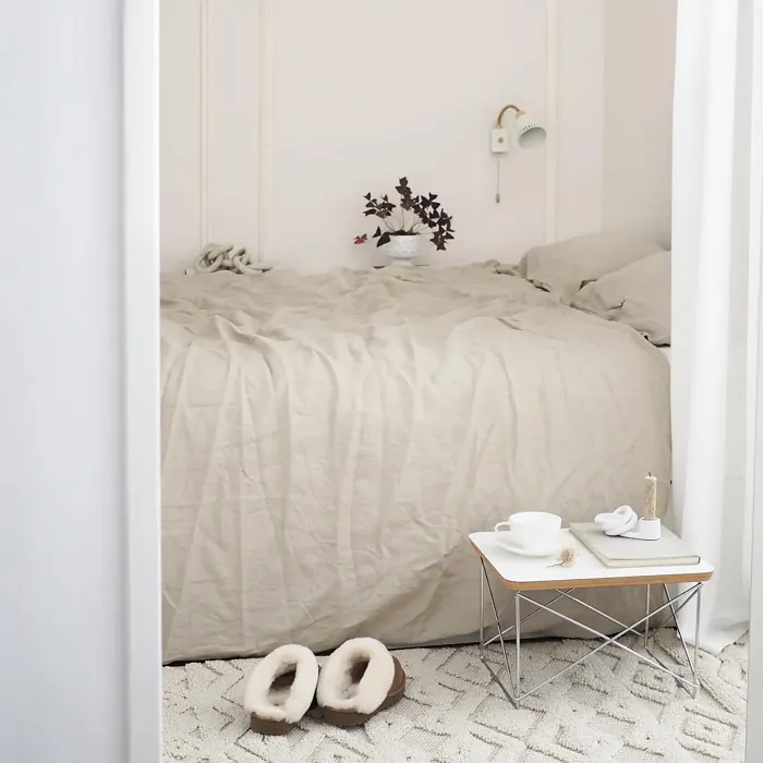
Wondering how to use it in your space? In a living room, Alabaster creates a serene backdrop for layered textures—think linen sofas, chunky knit throws, and a mix of wood and metal accents. In a kitchen, it pairs beautifully with marble countertops or warm oak cabinetry, especially when paired with brass hardware. Bedrooms painted in Alabaster feel like a retreat, especially when layered with soft bedding and muted earth tones. And in a bathroom, it brings spa-like tranquility, especially when paired with natural stone or matte black fixtures.
The undertones are what make Alabaster so special. That hint of yellow gives it a creamy richness, but it’s subtle enough that it won’t clash with other colors in your home. If you’re pairing it with complementary shades, lean into soft blues or greens—they’ll create a harmonious contrast that feels fresh and balanced. And if you’re worried about committing, grab a sample pot and paint a large swatch on your wall. Observe it at different times of day to see how it shifts with the light. You’ll quickly notice how it adapts, always feeling just right.
At the end of the day, Alabaster is more than just a paint color—it’s a design tool. It’s the kind of shade that makes everything around it look better, from your favorite artwork to that vintage rug you can’t part with. It’s low-VOC, easy to live with, and timeless enough that you won’t tire of it in a few years. Whether you’re painting one room or your entire home, Alabaster delivers a quiet elegance that’s hard to replicate. So go ahead—give it a try. Your walls (and your peace of mind) will thank you.
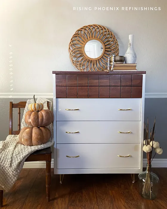
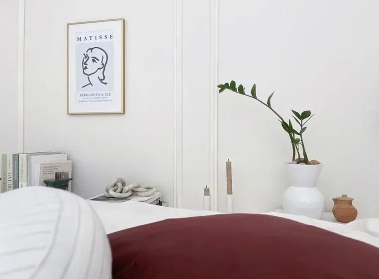
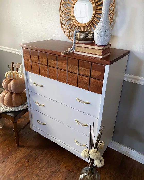
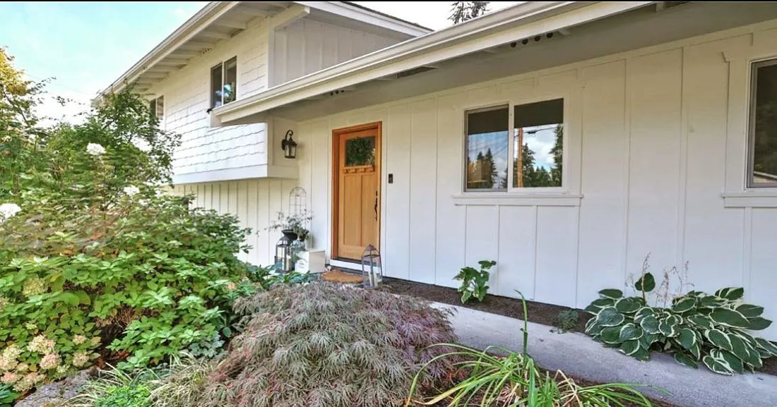
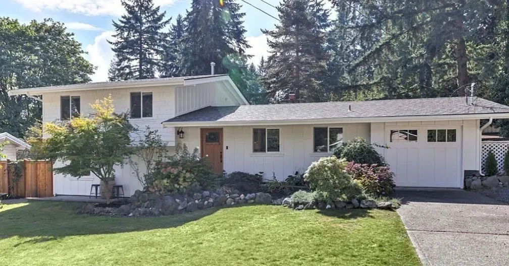
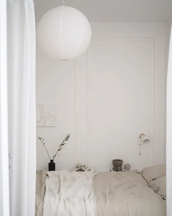
Real Room Photo of Alabaster OC-129
Undertones of Alabaster ?
The undertones of Alabaster are a key aspect of its character, leaning towards Yellow. These subtle underlying hues are what give the color its depth and complexity. For example, a gray with a blue undertone will feel cooler and more modern, while one with a brown undertone will feel warmer and more traditional. It’s essential to test this paint in your home and observe it next to your existing furniture, flooring, and decor to see how these undertones interact and reveal themselves throughout the day.
HEX value: #F1EFE8
RGB code: 241, 239, 232
Is Alabaster Cool or Warm?
Alabaster is primarily a warm color, but its balanced undertones allow it to harmonize well with cooler shades. This quality makes it adaptable and easy to incorporate into different decor styles, providing a sense of balance in any room.
Understanding Color Properties and Interior Design Tips
Hue refers to a specific position on the color wheel, measured in degrees from 0 to 360. Each degree represents a different pure color:
- 0° represents red
- 120° represents green
- 240° represents blue
Saturation describes the intensity or purity of a color and is expressed as a percentage:
- At 0%, the color appears completely desaturated—essentially a shade of gray
- At 100%, the color is at its most vivid and vibrant
Lightness indicates how light or dark a color is, also expressed as a percentage:
- 0% lightness results in black
- 100% lightness results in white
Using Warm Colors in Interior Design
Warm hues—such as reds, oranges, yellows, warm beiges, and greiges—are excellent choices for creating inviting and energetic spaces. These colors are particularly well-suited for:
- Kitchens, living rooms, and bathrooms, where warmth enhances comfort and sociability
- Large rooms, where warm tones can help reduce the sense of emptiness and make the space feel more intimate
For example:
- Warm beige shades provide a cozy, inviting atmosphere, ideal for living rooms, bedrooms, and hallways.
- Warm greige (a mix of beige and gray) offers the warmth of beige with the modern appeal of gray, making it a versatile backdrop for dining areas, bedrooms, and living spaces.
However, be mindful when using warm light tones in rooms with limited natural light. These shades may appear muted or even take on an unpleasant yellowish tint. To avoid a dull or flat appearance:
- Add depth by incorporating richer tones like deep greens, charcoal, or chocolate brown
- Use textured elements such as curtains, rugs, or cushions to bring dimension to the space
Pro Tip: Achieving Harmony with Warm and Cool Color Balance
To create a well-balanced and visually interesting interior, mix warm and cool tones strategically. This contrast adds depth and harmony to your design.
- If your walls feature warm hues, introduce cool-colored accents such as blue or green furniture, artwork, or accessories to create contrast.
- For a polished look, consider using a complementary color scheme, which pairs colors opposite each other on the color wheel (e.g., red with green, orange with blue).
This thoughtful mix not only enhances visual appeal but also creates a space that feels both dynamic and cohesive.
Light Temperature Affects on Alabaster
Natural Light
Natural daylight changes in color temperature as the sun moves across the sky. At sunrise and sunset, the light tends to have a warm, golden tone with a color temperature around 2000 Kelvin (K). As the day progresses and the sun rises higher, the light becomes cooler and more neutral. Around midday, especially when the sky is clear, natural light typically reaches its peak brightness and shifts to a cooler tone, ranging from 5500 to 6500 Kelvin. This midday light is close to what we perceive as pure white or daylight-balanced light.
These shifts in natural light can significantly influence how colors appear in a space, which is why designers often consider both the time of day and the orientation of windows when planning interior color schemes.
Artificial Light
When choosing artificial lighting, pay close attention to the color temperature, measured in Kelvin (K). This determines how warm or cool the light will appear. Lower temperatures, around 2700K, give off a warm, yellow glow often used in living rooms or bedrooms. Higher temperatures, above 5000K, create a cool, bluish light similar to daylight, commonly used in kitchens, offices, or task areas.
Use the slider to see how lighting temperature can affect the appearance of a surface or color throughout a space.


4800K
LRV of Alabaster
The Light Reflectance Value (LRV) of Alabaster is 85.08%, which places it in the White colors category. This means it reflect all light. Understanding a paint’s LRV is crucial for predicting how it will look in your space. A higher LRV indicates a lighter color that reflects more light, making rooms feel larger and brighter. A lower LRV signifies a darker color that absorbs more light, creating a cozier, more intimate atmosphere. Always consider the natural and artificial lighting in your room when selecting a paint color based on its LRV.
Detailed Review of Alabaster
Additional Paint Characteristics
Ideal Rooms
Bathroom, Bedroom, Dining Room, Hallway, Home Office, Kitchen, Living Room
Decor Styles
Farmhouse, Minimalist, Modern, Scandinavian, Transitional
Coverage
Good (1–2 Coats), Self-Priming, Touch-Up Friendly
Ease of Application
Beginner Friendly, Brush Smooth, Fast-Drying, Roller-Ready
Washability
Highly Washable, Washable, Wipeable
VOC Level
Low VOC, Ultra Low VOC
Best Use
Accent Wall, Interior Walls, Trim
Room Suitability
Bathroom, Bedroom, Dining Room, Kitchen, Living Room
Tone Tag
Creamy, Neutral, Warm
Finish Type
Eggshell, Matte, Satin
Paint Performance
Easy Touch-Up, Low Odor, Quick Drying, Scuff Resistant
Use Cases
Best for Modern Farmhouse, Best for Rentals, Classic Favorite, Designer Favorite
Mood
Calm, Cozy, Inviting, Warm
Trim Pairing
Complements Brass Fixtures, Good with Wood Trim, Matches Pure White, Pairs with White Dove
Alabaster is an excellent choice for homeowners looking to achieve a timeless and sophisticated look. This paint offers a soft, creamy hue that brings warmth to any room without feeling overwhelming. Its versatility shines as it can easily adapt to various decor styles, from modern to farmhouse. In terms of application, Alabaster goes on smoothly, allowing for a uniform finish that is both visually appealing and easy to maintain. When it comes to light, this color beautifully reflects natural brightness, making spaces feel larger and more inviting. With its ability to complement other colors and textures, Alabaster is a fantastic option for those wanting to create a cohesive design throughout their home.
Pros & Cons of OC-129 Alabaster
Pros
Cons
Colors that go with Benjamin Moore Alabaster
FAQ on OC-129 Alabaster
Is Alabaster suitable for small spaces?
Absolutely! Alabaster is a fantastic choice for small spaces as its light and airy quality makes them feel larger and more open. Its warm undertones also add a cozy touch, ensuring that small rooms feel inviting rather than cramped. Whether used on walls, ceilings, or trim, Alabaster can brighten up any nook in your home.
How does Alabaster work with different trim colors?
Alabaster pairs beautifully with a variety of trim colors. For a classic look, it complements white trims like White Dove or Chantilly Lace. If you’re leaning towards a more modern aesthetic, it works well with black windows or warm wood accents. The adaptability of Alabaster allows it to enhance the overall design while ensuring that your trim stands out in the best possible way.
Comparisons Alabaster with other colors
Alabaster OC-129 vs Agreeable Gray SW 7029
| Attribute | Alabaster OC-129 | Agreeable Gray SW 7029 |
|---|---|---|
| Color Name | Alabaster OC-129 | Agreeable Gray SW 7029 |
| Color | ||
| Hue | Grey | Grey |
| Brightness | Light | Light |
| RGB | 241, 239, 232 | 209, 203, 193 |
| LRV | 85.08% | 60% |
| Finish Type | Eggshell, Matte, Satin | Eggshell, Matte, Satin |
| Finish Options | Eggshell, Matte, Satin | Eggshell, Flat, Matte, Satin |
| Ideal Rooms | Bathroom, Bedroom, Dining Room, Hallway, Home Office, Kitchen, Living Room | Bathroom, Bedroom, Dining Room, Home Office, Kitchen, Living Room |
| Decor Styles | Farmhouse, Minimalist, Modern, Scandinavian, Transitional | Contemporary, Farmhouse, Minimalist, Modern, Transitional |
| Coverage | Good (1–2 Coats), Self-Priming, Touch-Up Friendly | Good (1–2 Coats), Touch-Up Friendly |
| Ease of Application | Beginner Friendly, Brush Smooth, Fast-Drying, Roller-Ready | Beginner Friendly, Brush Smooth, Roller-Ready |
| Washability | Highly Washable, Washable, Wipeable | Washable, Wipeable |
| Room Suitability | Bathroom, Bedroom, Dining Room, Kitchen, Living Room | Bathroom, Bedroom, Dining Room, Kitchen, Living Room |
| Tone | Creamy, Neutral, Warm | Muted, Neutral, Warm |
| Paint Performance | Easy Touch-Up, Low Odor, Quick Drying, Scuff Resistant | Easy Touch-Up, Fade Resistant, Low Odor |
Alabaster OC-129 vs Eider White SW 7014
| Attribute | Alabaster OC-129 | Eider White SW 7014 |
|---|---|---|
| Color Name | Alabaster OC-129 | Eider White SW 7014 |
| Color | ||
| Hue | Grey | Grey |
| Brightness | Light | Light |
| RGB | 241, 239, 232 | 226, 222, 216 |
| LRV | 85.08% | 73% |
| Finish Type | Eggshell, Matte, Satin | Eggshell, Matte, Satin |
| Finish Options | Eggshell, Matte, Satin | Eggshell, Matte, Satin |
| Ideal Rooms | Bathroom, Bedroom, Dining Room, Hallway, Home Office, Kitchen, Living Room | Bathroom, Bedroom, Dining Room, Home Office, Kitchen, Living Room |
| Decor Styles | Farmhouse, Minimalist, Modern, Scandinavian, Transitional | Farmhouse, Minimalist, Modern, Scandinavian, Transitional |
| Coverage | Good (1–2 Coats), Self-Priming, Touch-Up Friendly | Good (1–2 Coats), Touch-Up Friendly |
| Ease of Application | Beginner Friendly, Brush Smooth, Fast-Drying, Roller-Ready | Beginner Friendly, Brush Smooth, Roller-Ready |
| Washability | Highly Washable, Washable, Wipeable | Highly Washable, Washable |
| Room Suitability | Bathroom, Bedroom, Dining Room, Kitchen, Living Room | Bathroom, Bedroom, Dining Room, Kitchen, Living Room |
| Tone | Creamy, Neutral, Warm | Creamy, Muted, Neutral, Warm |
| Paint Performance | Easy Touch-Up, Low Odor, Quick Drying, Scuff Resistant | Easy Touch-Up, High Coverage, Low Odor, Scuff Resistant |
Alabaster OC-129 vs Drift of Mist SW 9166
| Attribute | Alabaster OC-129 | Drift of Mist SW 9166 |
|---|---|---|
| Color Name | Alabaster OC-129 | Drift of Mist SW 9166 |
| Color | ||
| Hue | Grey | Grey |
| Brightness | Light | Light |
| RGB | 241, 239, 232 | 220, 216, 208 |
| LRV | 85.08% | 65% |
| Finish Type | Eggshell, Matte, Satin | Eggshell, Matte, Satin |
| Finish Options | Eggshell, Matte, Satin | Eggshell, Matte, Satin |
| Ideal Rooms | Bathroom, Bedroom, Dining Room, Hallway, Home Office, Kitchen, Living Room | Bathroom, Bedroom, Home Office, Kitchen, Living Room |
| Decor Styles | Farmhouse, Minimalist, Modern, Scandinavian, Transitional | Coastal, Minimalist, Modern, Scandinavian |
| Coverage | Good (1–2 Coats), Self-Priming, Touch-Up Friendly | Good (1–2 Coats), Touch-Up Friendly |
| Ease of Application | Beginner Friendly, Brush Smooth, Fast-Drying, Roller-Ready | Beginner Friendly, Brush Smooth, Fast-Drying, Roller-Ready |
| Washability | Highly Washable, Washable, Wipeable | Washable, Wipeable |
| Room Suitability | Bathroom, Bedroom, Dining Room, Kitchen, Living Room | Bathroom, Bedroom, Home Office, Living Room |
| Tone | Creamy, Neutral, Warm | Airy, Cool, Neutral |
| Paint Performance | Easy Touch-Up, Low Odor, Quick Drying, Scuff Resistant | Easy Touch-Up, Low Odor, Quick Drying, Scuff Resistant |
Alabaster OC-129 vs Sanctuary SW 9583
| Attribute | Alabaster OC-129 | Sanctuary SW 9583 |
|---|---|---|
| Color Name | Alabaster OC-129 | Sanctuary SW 9583 |
| Color | ||
| Hue | Grey | Grey |
| Brightness | Light | Light |
| RGB | 241, 239, 232 | 230, 226, 217 |
| LRV | 85.08% | 24% |
| Finish Type | Eggshell, Matte, Satin | Eggshell, Matte, Satin |
| Finish Options | Eggshell, Matte, Satin | Eggshell, Matte, Satin |
| Ideal Rooms | Bathroom, Bedroom, Dining Room, Hallway, Home Office, Kitchen, Living Room | Bedroom, Dining Room, Home Office, Living Room, Nursery |
| Decor Styles | Farmhouse, Minimalist, Modern, Scandinavian, Transitional | Bohemian, Coastal, Modern Farmhouse, Scandinavian |
| Coverage | Good (1–2 Coats), Self-Priming, Touch-Up Friendly | Good (1–2 Coats), Touch-Up Friendly |
| Ease of Application | Beginner Friendly, Brush Smooth, Fast-Drying, Roller-Ready | Beginner Friendly, Brush Smooth, Fast-Drying, Roller-Ready |
| Washability | Highly Washable, Washable, Wipeable | Highly Washable, Washable, Wipeable |
| Room Suitability | Bathroom, Bedroom, Dining Room, Kitchen, Living Room | Bedroom, Home Office, Living Room, Nursery |
| Tone | Creamy, Neutral, Warm | Earthy, Neutral, Soft, Warm |
| Paint Performance | Easy Touch-Up, Low Odor, Quick Drying, Scuff Resistant | Easy Touch-Up, Low Odor, Quick Drying, Scuff Resistant |
Alabaster OC-129 vs Snowbound SW 7004
| Attribute | Alabaster OC-129 | Snowbound SW 7004 |
|---|---|---|
| Color Name | Alabaster OC-129 | Snowbound SW 7004 |
| Color | ||
| Hue | Grey | Grey |
| Brightness | Light | Light |
| RGB | 241, 239, 232 | 237, 234, 229 |
| LRV | 85.08% | 83% |
| Finish Type | Eggshell, Matte, Satin | Eggshell, Matte, Satin |
| Finish Options | Eggshell, Matte, Satin | Eggshell, Matte, Satin |
| Ideal Rooms | Bathroom, Bedroom, Dining Room, Hallway, Home Office, Kitchen, Living Room | Bathroom, Bedroom, Dining Room, Hallway, Home Office, Kitchen, Living Room, Nursery |
| Decor Styles | Farmhouse, Minimalist, Modern, Scandinavian, Transitional | Farmhouse, Minimalist, Modern, Scandinavian, Transitional |
| Coverage | Good (1–2 Coats), Self-Priming, Touch-Up Friendly | Good (1–2 Coats), Touch-Up Friendly |
| Ease of Application | Beginner Friendly, Brush Smooth, Fast-Drying, Roller-Ready | Beginner Friendly, Brush Smooth, Fast-Drying, Roller-Ready |
| Washability | Highly Washable, Washable, Wipeable | Washable, Wipeable |
| Room Suitability | Bathroom, Bedroom, Dining Room, Kitchen, Living Room | Bathroom, Bedroom, Dining Room, Hallway, Home Office, Kitchen, Living Room |
| Tone | Creamy, Neutral, Warm | Airy, Crisp, Neutral, Warm |
| Paint Performance | Easy Touch-Up, Low Odor, Quick Drying, Scuff Resistant | High Coverage, Low Odor, Quick Drying |
Alabaster OC-129 vs Pure White SW 7005
| Attribute | Alabaster OC-129 | Pure White SW 7005 |
|---|---|---|
| Color Name | Alabaster OC-129 | Pure White SW 7005 |
| Color | ||
| Hue | Grey | Grey |
| Brightness | Light | Light |
| RGB | 241, 239, 232 | 237, 236, 230 |
| LRV | 85.08% | 84% |
| Finish Type | Eggshell, Matte, Satin | Eggshell, Satin, Semi-Gloss |
| Finish Options | Eggshell, Matte, Satin | Eggshell, Flat, Matte, Satin, Semi-Gloss |
| Ideal Rooms | Bathroom, Bedroom, Dining Room, Hallway, Home Office, Kitchen, Living Room | Bathroom, Bedroom, Dining Room, Entryway, Hallway, Home Office, Kitchen, Living Room, Nursery |
| Decor Styles | Farmhouse, Minimalist, Modern, Scandinavian, Transitional | Bohemian, Eclectic, Farmhouse, Minimalist, Modern, Traditional |
| Coverage | Good (1–2 Coats), Self-Priming, Touch-Up Friendly | Good (1–2 Coats), Touch-Up Friendly |
| Ease of Application | Beginner Friendly, Brush Smooth, Fast-Drying, Roller-Ready | Beginner Friendly, Brush Smooth, Fast-Drying, Roller-Ready |
| Washability | Highly Washable, Washable, Wipeable | Highly Washable, Washable |
| Room Suitability | Bathroom, Bedroom, Dining Room, Kitchen, Living Room | Bathroom, Bedroom, Dining Room, Entryway, Hallway, Home Office, Kitchen, Living Room, Nursery |
| Tone | Creamy, Neutral, Warm | Crisp, Neutral, Warm |
| Paint Performance | Easy Touch-Up, Low Odor, Quick Drying, Scuff Resistant | Easy Touch-Up, High Coverage, Low Odor, Quick Drying |
Alabaster OC-129 vs Crushed Ice SW 7647
| Attribute | Alabaster OC-129 | Crushed Ice SW 7647 |
|---|---|---|
| Color Name | Alabaster OC-129 | Crushed Ice SW 7647 |
| Color | ||
| Hue | Grey | Grey |
| Brightness | Light | Light |
| RGB | 241, 239, 232 | 214, 211, 204 |
| LRV | 85.08% | 66% |
| Finish Type | Eggshell, Matte, Satin | Eggshell, Matte, Satin |
| Finish Options | Eggshell, Matte, Satin | Eggshell, Matte, Satin |
| Ideal Rooms | Bathroom, Bedroom, Dining Room, Hallway, Home Office, Kitchen, Living Room | Bathroom, Bedroom, Dining Room, Home Office, Living Room |
| Decor Styles | Farmhouse, Minimalist, Modern, Scandinavian, Transitional | Farmhouse, Minimalist, Modern, Scandinavian, Transitional |
| Coverage | Good (1–2 Coats), Self-Priming, Touch-Up Friendly | Good (1–2 Coats), Touch-Up Friendly |
| Ease of Application | Beginner Friendly, Brush Smooth, Fast-Drying, Roller-Ready | Beginner Friendly, Brush Smooth, Roller-Ready |
| Washability | Highly Washable, Washable, Wipeable | Stain Resistant, Washable |
| Room Suitability | Bathroom, Bedroom, Dining Room, Kitchen, Living Room | Bathroom, Bedroom, Dining Room, Hallway, Home Office, Living Room |
| Tone | Creamy, Neutral, Warm | Muted, Neutral, Warm |
| Paint Performance | Easy Touch-Up, Low Odor, Quick Drying, Scuff Resistant | High Coverage, Low Odor, Quick Drying |
Alabaster OC-129 vs Origami White SW 7636
| Attribute | Alabaster OC-129 | Origami White SW 7636 |
|---|---|---|
| Color Name | Alabaster OC-129 | Origami White SW 7636 |
| Color | ||
| Hue | Grey | Grey |
| Brightness | Light | Light |
| RGB | 241, 239, 232 | 229, 226, 218 |
| LRV | 85.08% | 83% |
| Finish Type | Eggshell, Matte, Satin | Eggshell, Matte |
| Finish Options | Eggshell, Matte, Satin | Eggshell, Matte, Satin |
| Ideal Rooms | Bathroom, Bedroom, Dining Room, Hallway, Home Office, Kitchen, Living Room | Bedroom, Dining Room, Entryway, Hallway, Home Office, Kitchen, Living Room |
| Decor Styles | Farmhouse, Minimalist, Modern, Scandinavian, Transitional | Minimalist, Modern, Scandinavian, Traditional, Transitional |
| Coverage | Good (1–2 Coats), Self-Priming, Touch-Up Friendly | Good (1–2 Coats), Touch-Up Friendly |
| Ease of Application | Beginner Friendly, Brush Smooth, Fast-Drying, Roller-Ready | Beginner Friendly, Brush Smooth, Roller-Ready |
| Washability | Highly Washable, Washable, Wipeable | Washable, Wipeable |
| Room Suitability | Bathroom, Bedroom, Dining Room, Kitchen, Living Room | Bedroom, Dining Room, Home Office, Kitchen, Living Room |
| Tone | Creamy, Neutral, Warm | Airy, Neutral, Warm |
| Paint Performance | Easy Touch-Up, Low Odor, Quick Drying, Scuff Resistant | Easy Touch-Up, Low Odor, Quick Drying |
Alabaster OC-129 vs Spare White SW 6203
| Attribute | Alabaster OC-129 | Spare White SW 6203 |
|---|---|---|
| Color Name | Alabaster OC-129 | Spare White SW 6203 |
| Color | ||
| Hue | Grey | Grey |
| Brightness | Light | Light |
| RGB | 241, 239, 232 | 228, 228, 221 |
| LRV | 85.08% | 75% |
| Finish Type | Eggshell, Matte, Satin | Eggshell, Matte |
| Finish Options | Eggshell, Matte, Satin | Eggshell, Matte, Satin |
| Ideal Rooms | Bathroom, Bedroom, Dining Room, Hallway, Home Office, Kitchen, Living Room | Bedroom, Dining Room, Home Office, Kitchen, Living Room, Nursery |
| Decor Styles | Farmhouse, Minimalist, Modern, Scandinavian, Transitional | Farmhouse, Minimalist, Modern, Scandinavian, Transitional |
| Coverage | Good (1–2 Coats), Self-Priming, Touch-Up Friendly | Good (1–2 Coats), Primer Recommended, Touch-Up Friendly |
| Ease of Application | Beginner Friendly, Brush Smooth, Fast-Drying, Roller-Ready | Beginner Friendly, Brush Smooth, Fast-Drying, Roller-Ready |
| Washability | Highly Washable, Washable, Wipeable | Washable, Wipeable |
| Room Suitability | Bathroom, Bedroom, Dining Room, Kitchen, Living Room | Bedroom, Dining Room, Home Office, Kitchen, Living Room |
| Tone | Creamy, Neutral, Warm | Creamy, Neutral, Warm |
| Paint Performance | Easy Touch-Up, Low Odor, Quick Drying, Scuff Resistant | Easy Touch-Up, Low Odor, Quick Drying |
Alabaster OC-129 vs Mountain Air SW 6224
| Attribute | Alabaster OC-129 | Mountain Air SW 6224 |
|---|---|---|
| Color Name | Alabaster OC-129 | Mountain Air SW 6224 |
| Color | ||
| Hue | Grey | Grey |
| Brightness | Light | Light |
| RGB | 241, 239, 232 | 216, 224, 223 |
| LRV | 85.08% | 66% |
| Finish Type | Eggshell, Matte, Satin | Eggshell, Satin |
| Finish Options | Eggshell, Matte, Satin | Eggshell, Matte, Satin |
| Ideal Rooms | Bathroom, Bedroom, Dining Room, Hallway, Home Office, Kitchen, Living Room | Bedroom, Hallway, Home Office, Living Room, Nursery |
| Decor Styles | Farmhouse, Minimalist, Modern, Scandinavian, Transitional | Coastal, Minimalist, Modern, Scandinavian |
| Coverage | Good (1–2 Coats), Self-Priming, Touch-Up Friendly | Good (1–2 Coats), Touch-Up Friendly |
| Ease of Application | Beginner Friendly, Brush Smooth, Fast-Drying, Roller-Ready | Beginner Friendly, Brush Smooth, Fast-Drying, Roller-Ready |
| Washability | Highly Washable, Washable, Wipeable | Highly Washable, Washable |
| Room Suitability | Bathroom, Bedroom, Dining Room, Kitchen, Living Room | Bedroom, Home Office, Living Room, Nursery |
| Tone | Creamy, Neutral, Warm | Airy, Cool, Muted |
| Paint Performance | Easy Touch-Up, Low Odor, Quick Drying, Scuff Resistant | Easy Touch-Up, Low Odor, Quick Drying, Scuff Resistant |
Official Page of Benjamin Moore Alabaster OC-129