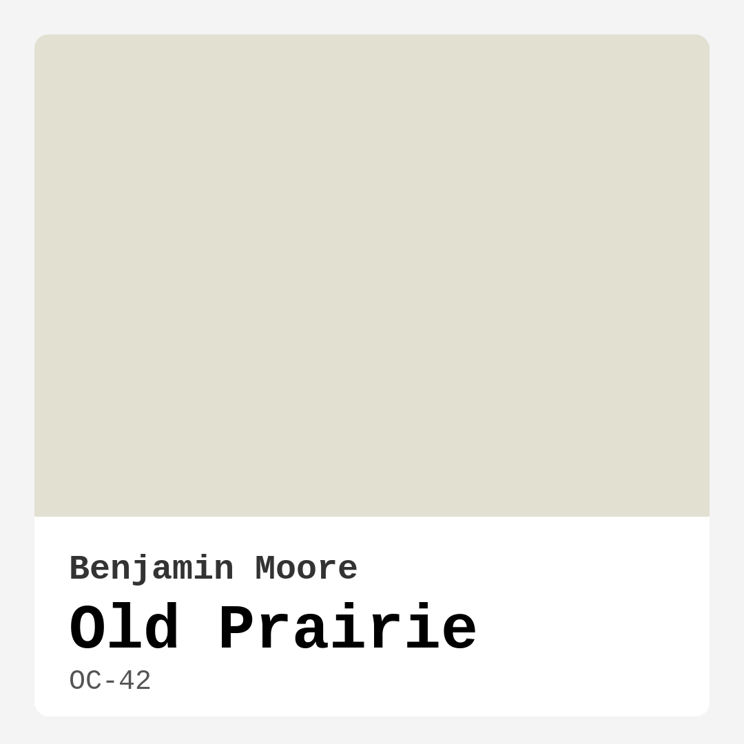
Color Preview & Key Details
| HEX Code | #E2E0D1 |
| RGB | 226, 224, 209 |
| LRV | 72.22% |
| Undertone | Yellow |
| Finish Options | Eggshell, Matte, Satin |
Have you ever walked into a room and immediately felt at ease? Like the walls were giving you a gentle hug? That’s the magic of the right paint color—it doesn’t just cover your walls; it sets the tone for your entire space. Today, let’s talk about one of those quietly transformative shades: Benjamin Moore’s Old Prairie (OC-42). If you’re searching for a color that’s warm but not overwhelming, timeless but not boring, and versatile enough to work in almost any room, this might just be your perfect match.
Old Prairie is a soft, muted beige with a whisper of yellow undertone, giving it that gentle warmth that feels like sunlight filtering through linen curtains. It’s the kind of color that plays well with others—whether you’re into modern farmhouse vibes, rustic charm, or a more contemporary look. With a Light Reflectance Value (LRV) of 72.22, it sits comfortably in the off-white category, meaning it reflects plenty of light without feeling stark or cold. That makes it a fantastic choice for rooms where you want brightness but also crave coziness.
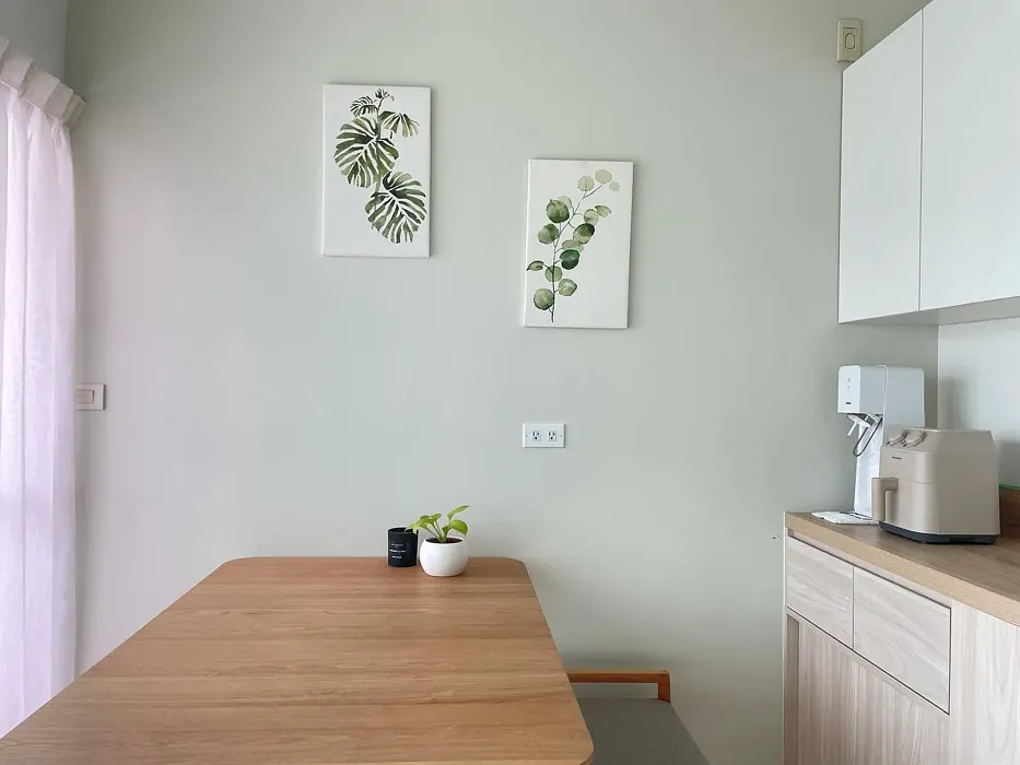
Let’s talk about where this color shines. Picture it in a living room with a plush neutral sofa, layered textures like a chunky knit throw and a weathered wood coffee table. Old Prairie acts as the calm backbone of the space, letting your decor take center stage. In a bedroom, it creates a serene retreat—pair it with crisp white linens and brass accents for a touch of elegance. It’s also a winner in home offices, where its warm undertones keep the space feeling inviting rather than sterile. And don’t overlook hallways—this shade can turn a forgettable pass-through into a moment of quiet beauty.
One of the best things about Old Prairie is how easy it is to work with. It’s beginner-friendly, covering well in one to two coats, and it’s touch-up friendly, so you won’t stress over every little scuff. The finish options—Matte, Eggshell, and Satin—give you flexibility depending on the room’s needs. Go Matte for a velvety, low-sheen look in bedrooms or ceilings. Eggshell is your go-to for living areas, offering just enough sheen to resist fingerprints. Satin steps it up for high-traffic spots like kitchens or hallways, where durability matters.
Now, let’s address the elephant in the room: undertones. Old Prairie’s yellow undertone is subtle but present, which means it can shift slightly depending on the light. In a north-facing room, it might lean a touch cooler, while in a south-facing space, that warmth will glow. Always test a swatch on your wall and observe it at different times of day. And here’s a pro tip: pair it with trim colors like Benjamin Moore’s White Dove or Pure White to keep things fresh and balanced. The contrast will highlight Old Prairie’s warmth without letting it feel muddy.
If you’re worried about small spaces, don’t be. Old Prairie can work beautifully, but lighting is key. In a cramped room, lean into its light-reflecting qualities with ample artificial light or mirrors to bounce natural light around. Avoid heavy, dark furniture that could weigh the space down—opt for lighter woods or airy pieces to keep the vibe open.
As for decor pairings, this color is a dream. It loves natural materials—think rattan baskets, linen curtains, or a reclaimed wood dining table. For a pop of contrast, bring in blues (its complementary hue) through throw pillows, artwork, or a statement rug. If you’re feeling bold, deep greens or muted terracottas can add richness without overwhelming the space. And if you’re a fan of metallics, brass or gold fixtures will sing against this backdrop.
Of course, no color is perfect for everyone. If you’re after something with more drama or a cooler, crisper vibe, Old Prairie might feel too subtle. And in rooms with very little natural light, it can read darker than you’d expect, so always test first. But for those who want a color that feels like a deep breath—calm, welcoming, and endlessly adaptable—it’s hard to beat.
So, is Old Prairie right for you? If you’re nodding along to words like “cozy,” “versatile,” and “easygoing,” then yes. Grab a sample, paint a big swatch, and live with it for a few days. Notice how it changes with the light, how it makes you feel when you walk into the room. The best paint colors don’t just look good—they feel like home. And Old Prairie? It’s got that magic in spades.
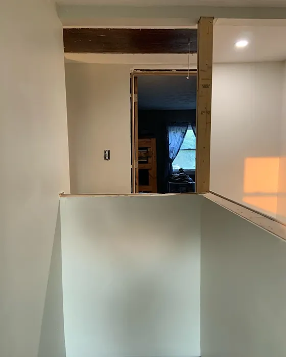
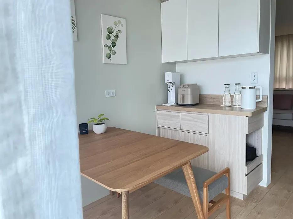
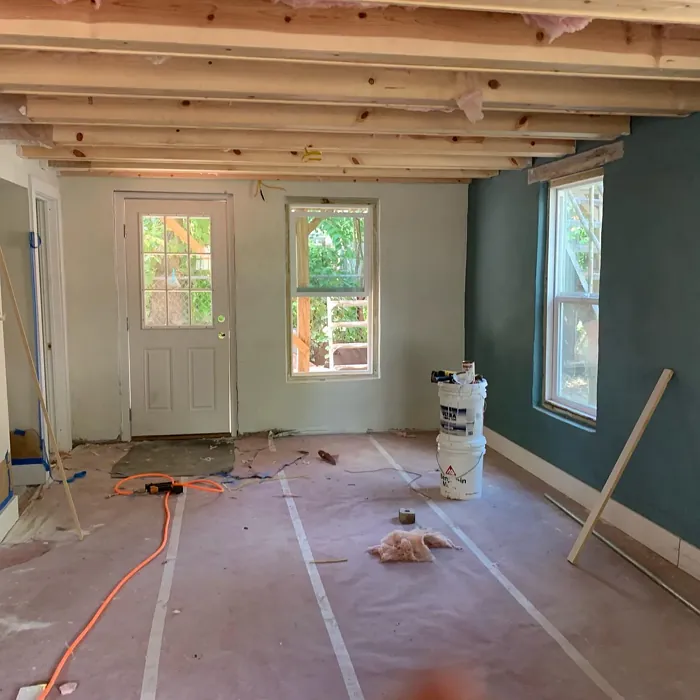
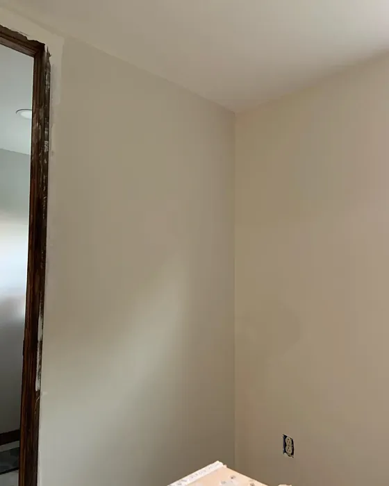
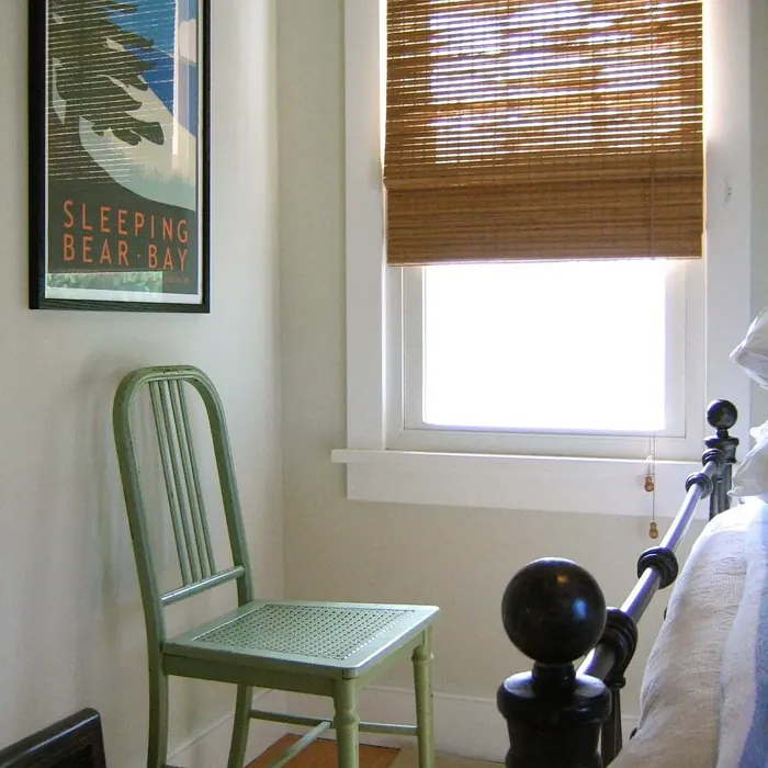
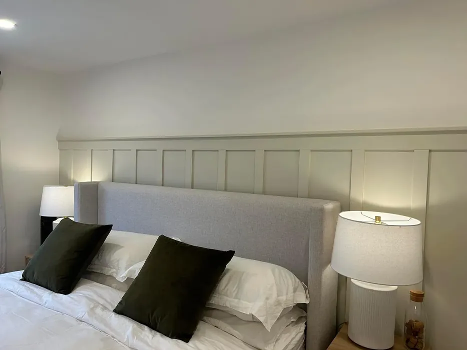
Real Room Photo of Old Prairie OC-42

Undertones of Old Prairie ?
The undertones of Old Prairie are a key aspect of its character, leaning towards Yellow. These subtle underlying hues are what give the color its depth and complexity. For example, a gray with a blue undertone will feel cooler and more modern, while one with a brown undertone will feel warmer and more traditional. It’s essential to test this paint in your home and observe it next to your existing furniture, flooring, and decor to see how these undertones interact and reveal themselves throughout the day.
HEX value: #E2E0D1
RGB code: 226, 224, 209
Is Old Prairie Cool or Warm?
This color is undoubtedly warm, which allows it to foster a sense of comfort and coziness. It’s perfect for spaces where you want to feel relaxed and at ease, like a bedroom or a reading nook.
Understanding Color Properties and Interior Design Tips
Hue refers to a specific position on the color wheel, measured in degrees from 0 to 360. Each degree represents a different pure color:
- 0° represents red
- 120° represents green
- 240° represents blue
Saturation describes the intensity or purity of a color and is expressed as a percentage:
- At 0%, the color appears completely desaturated—essentially a shade of gray
- At 100%, the color is at its most vivid and vibrant
Lightness indicates how light or dark a color is, also expressed as a percentage:
- 0% lightness results in black
- 100% lightness results in white
Using Warm Colors in Interior Design
Warm hues—such as reds, oranges, yellows, warm beiges, and greiges—are excellent choices for creating inviting and energetic spaces. These colors are particularly well-suited for:
- Kitchens, living rooms, and bathrooms, where warmth enhances comfort and sociability
- Large rooms, where warm tones can help reduce the sense of emptiness and make the space feel more intimate
For example:
- Warm beige shades provide a cozy, inviting atmosphere, ideal for living rooms, bedrooms, and hallways.
- Warm greige (a mix of beige and gray) offers the warmth of beige with the modern appeal of gray, making it a versatile backdrop for dining areas, bedrooms, and living spaces.
However, be mindful when using warm light tones in rooms with limited natural light. These shades may appear muted or even take on an unpleasant yellowish tint. To avoid a dull or flat appearance:
- Add depth by incorporating richer tones like deep greens, charcoal, or chocolate brown
- Use textured elements such as curtains, rugs, or cushions to bring dimension to the space
Pro Tip: Achieving Harmony with Warm and Cool Color Balance
To create a well-balanced and visually interesting interior, mix warm and cool tones strategically. This contrast adds depth and harmony to your design.
- If your walls feature warm hues, introduce cool-colored accents such as blue or green furniture, artwork, or accessories to create contrast.
- For a polished look, consider using a complementary color scheme, which pairs colors opposite each other on the color wheel (e.g., red with green, orange with blue).
This thoughtful mix not only enhances visual appeal but also creates a space that feels both dynamic and cohesive.
Light Temperature Affects on Old Prairie
Natural Light
Natural daylight changes in color temperature as the sun moves across the sky. At sunrise and sunset, the light tends to have a warm, golden tone with a color temperature around 2000 Kelvin (K). As the day progresses and the sun rises higher, the light becomes cooler and more neutral. Around midday, especially when the sky is clear, natural light typically reaches its peak brightness and shifts to a cooler tone, ranging from 5500 to 6500 Kelvin. This midday light is close to what we perceive as pure white or daylight-balanced light.
These shifts in natural light can significantly influence how colors appear in a space, which is why designers often consider both the time of day and the orientation of windows when planning interior color schemes.
Artificial Light
When choosing artificial lighting, pay close attention to the color temperature, measured in Kelvin (K). This determines how warm or cool the light will appear. Lower temperatures, around 2700K, give off a warm, yellow glow often used in living rooms or bedrooms. Higher temperatures, above 5000K, create a cool, bluish light similar to daylight, commonly used in kitchens, offices, or task areas.
Use the slider to see how lighting temperature can affect the appearance of a surface or color throughout a space.


4800K
LRV of Old Prairie
The Light Reflectance Value (LRV) of Old Prairie is 72.22%, which places it in the Off‑White colors category. This means it reflect a lot of light. Understanding a paint’s LRV is crucial for predicting how it will look in your space. A higher LRV indicates a lighter color that reflects more light, making rooms feel larger and brighter. A lower LRV signifies a darker color that absorbs more light, creating a cozier, more intimate atmosphere. Always consider the natural and artificial lighting in your room when selecting a paint color based on its LRV.
Detailed Review of Old Prairie
Additional Paint Characteristics
Ideal Rooms
Bedroom, Dining Room, Hallway, Home Office, Living Room
Decor Styles
Bohemian, Contemporary, Modern Farmhouse, Rustic, Transitional
Coverage
Good (1–2 Coats), Touch-Up Friendly
Ease of Application
Beginner Friendly, Brush Smooth, Roller-Ready
Washability
Scrubbable, Washable, Wipeable
VOC Level
Eco-Certified, Low VOC
Best Use
Accent Wall, Furniture, Interior Walls, Trim
Room Suitability
Bedroom, Dining Room, Hallway, Home Office, Living Room
Tone Tag
Earthy, Muted, Warm
Finish Type
Eggshell, Matte, Satin
Paint Performance
Easy Touch-Up, Low Odor, Quick Drying, Scuff Resistant
Use Cases
Best for Open Concept, Best for Small Spaces, Designer Favorite
Mood
Calm, Cozy, Inviting
Trim Pairing
Complements Brass Fixtures, Matches Pure White, Pairs with White Dove
Old Prairie is a delightful choice if you’re looking for a paint that effortlessly brings warmth and sophistication to your home. Its muted beige tone is versatile enough to pair with both bold and subtle decor, making it an excellent choice for open concept spaces. I particularly love how it complements natural materials like wood and stone, enhancing the overall aesthetic of your environment. The application is straightforward, and you can achieve great results with just one to two coats, depending on your surface. Its calming effect makes it an ideal choice for bedrooms or living areas where you want to unwind. Overall, Old Prairie is a fantastic option for anyone looking to create a cozy yet stylish atmosphere.
Pros & Cons of OC-42 Old Prairie
Pros
Cons
Colors that go with Benjamin Moore Old Prairie
FAQ on OC-42 Old Prairie
What types of finishes are available for Old Prairie?
Old Prairie is available in several finishes, including Matte, Eggshell, and Satin. Matte offers a classic, non-reflective look that’s perfect for ceilings and low-traffic areas. Eggshell provides a slight sheen, making it suitable for living spaces, while Satin adds a touch of elegance and durability, ideal for high-traffic areas and kitchens.
Can I use Old Prairie in smaller rooms?
Absolutely! Old Prairie can work well in smaller rooms, but be mindful that it may appear darker in low light. To keep the space feeling open and airy, consider pairing it with lighter trim colors and ample lighting. This will enhance its warm tones while preventing the room from feeling cramped.
Comparisons Old Prairie with other colors
Old Prairie OC-42 vs Agreeable Gray SW 7029
| Attribute | Old Prairie OC-42 | Agreeable Gray SW 7029 |
|---|---|---|
| Color Name | Old Prairie OC-42 | Agreeable Gray SW 7029 |
| Color | ||
| Hue | Grey | Grey |
| Brightness | Light | Light |
| RGB | 226, 224, 209 | 209, 203, 193 |
| LRV | 72.22% | 60% |
| Finish Type | Eggshell, Matte, Satin | Eggshell, Matte, Satin |
| Finish Options | Eggshell, Matte, Satin | Eggshell, Flat, Matte, Satin |
| Ideal Rooms | Bedroom, Dining Room, Hallway, Home Office, Living Room | Bathroom, Bedroom, Dining Room, Home Office, Kitchen, Living Room |
| Decor Styles | Bohemian, Contemporary, Modern Farmhouse, Rustic, Transitional | Contemporary, Farmhouse, Minimalist, Modern, Transitional |
| Coverage | Good (1–2 Coats), Touch-Up Friendly | Good (1–2 Coats), Touch-Up Friendly |
| Ease of Application | Beginner Friendly, Brush Smooth, Roller-Ready | Beginner Friendly, Brush Smooth, Roller-Ready |
| Washability | Scrubbable, Washable, Wipeable | Washable, Wipeable |
| Room Suitability | Bedroom, Dining Room, Hallway, Home Office, Living Room | Bathroom, Bedroom, Dining Room, Kitchen, Living Room |
| Tone | Earthy, Muted, Warm | Muted, Neutral, Warm |
| Paint Performance | Easy Touch-Up, Low Odor, Quick Drying, Scuff Resistant | Easy Touch-Up, Fade Resistant, Low Odor |
Old Prairie OC-42 vs Eider White SW 7014
| Attribute | Old Prairie OC-42 | Eider White SW 7014 |
|---|---|---|
| Color Name | Old Prairie OC-42 | Eider White SW 7014 |
| Color | ||
| Hue | Grey | Grey |
| Brightness | Light | Light |
| RGB | 226, 224, 209 | 226, 222, 216 |
| LRV | 72.22% | 73% |
| Finish Type | Eggshell, Matte, Satin | Eggshell, Matte, Satin |
| Finish Options | Eggshell, Matte, Satin | Eggshell, Matte, Satin |
| Ideal Rooms | Bedroom, Dining Room, Hallway, Home Office, Living Room | Bathroom, Bedroom, Dining Room, Home Office, Kitchen, Living Room |
| Decor Styles | Bohemian, Contemporary, Modern Farmhouse, Rustic, Transitional | Farmhouse, Minimalist, Modern, Scandinavian, Transitional |
| Coverage | Good (1–2 Coats), Touch-Up Friendly | Good (1–2 Coats), Touch-Up Friendly |
| Ease of Application | Beginner Friendly, Brush Smooth, Roller-Ready | Beginner Friendly, Brush Smooth, Roller-Ready |
| Washability | Scrubbable, Washable, Wipeable | Highly Washable, Washable |
| Room Suitability | Bedroom, Dining Room, Hallway, Home Office, Living Room | Bathroom, Bedroom, Dining Room, Kitchen, Living Room |
| Tone | Earthy, Muted, Warm | Creamy, Muted, Neutral, Warm |
| Paint Performance | Easy Touch-Up, Low Odor, Quick Drying, Scuff Resistant | Easy Touch-Up, High Coverage, Low Odor, Scuff Resistant |
Old Prairie OC-42 vs Drift of Mist SW 9166
| Attribute | Old Prairie OC-42 | Drift of Mist SW 9166 |
|---|---|---|
| Color Name | Old Prairie OC-42 | Drift of Mist SW 9166 |
| Color | ||
| Hue | Grey | Grey |
| Brightness | Light | Light |
| RGB | 226, 224, 209 | 220, 216, 208 |
| LRV | 72.22% | 65% |
| Finish Type | Eggshell, Matte, Satin | Eggshell, Matte, Satin |
| Finish Options | Eggshell, Matte, Satin | Eggshell, Matte, Satin |
| Ideal Rooms | Bedroom, Dining Room, Hallway, Home Office, Living Room | Bathroom, Bedroom, Home Office, Kitchen, Living Room |
| Decor Styles | Bohemian, Contemporary, Modern Farmhouse, Rustic, Transitional | Coastal, Minimalist, Modern, Scandinavian |
| Coverage | Good (1–2 Coats), Touch-Up Friendly | Good (1–2 Coats), Touch-Up Friendly |
| Ease of Application | Beginner Friendly, Brush Smooth, Roller-Ready | Beginner Friendly, Brush Smooth, Fast-Drying, Roller-Ready |
| Washability | Scrubbable, Washable, Wipeable | Washable, Wipeable |
| Room Suitability | Bedroom, Dining Room, Hallway, Home Office, Living Room | Bathroom, Bedroom, Home Office, Living Room |
| Tone | Earthy, Muted, Warm | Airy, Cool, Neutral |
| Paint Performance | Easy Touch-Up, Low Odor, Quick Drying, Scuff Resistant | Easy Touch-Up, Low Odor, Quick Drying, Scuff Resistant |
Old Prairie OC-42 vs Sanctuary SW 9583
| Attribute | Old Prairie OC-42 | Sanctuary SW 9583 |
|---|---|---|
| Color Name | Old Prairie OC-42 | Sanctuary SW 9583 |
| Color | ||
| Hue | Grey | Grey |
| Brightness | Light | Light |
| RGB | 226, 224, 209 | 230, 226, 217 |
| LRV | 72.22% | 24% |
| Finish Type | Eggshell, Matte, Satin | Eggshell, Matte, Satin |
| Finish Options | Eggshell, Matte, Satin | Eggshell, Matte, Satin |
| Ideal Rooms | Bedroom, Dining Room, Hallway, Home Office, Living Room | Bedroom, Dining Room, Home Office, Living Room, Nursery |
| Decor Styles | Bohemian, Contemporary, Modern Farmhouse, Rustic, Transitional | Bohemian, Coastal, Modern Farmhouse, Scandinavian |
| Coverage | Good (1–2 Coats), Touch-Up Friendly | Good (1–2 Coats), Touch-Up Friendly |
| Ease of Application | Beginner Friendly, Brush Smooth, Roller-Ready | Beginner Friendly, Brush Smooth, Fast-Drying, Roller-Ready |
| Washability | Scrubbable, Washable, Wipeable | Highly Washable, Washable, Wipeable |
| Room Suitability | Bedroom, Dining Room, Hallway, Home Office, Living Room | Bedroom, Home Office, Living Room, Nursery |
| Tone | Earthy, Muted, Warm | Earthy, Neutral, Soft, Warm |
| Paint Performance | Easy Touch-Up, Low Odor, Quick Drying, Scuff Resistant | Easy Touch-Up, Low Odor, Quick Drying, Scuff Resistant |
Old Prairie OC-42 vs Snowbound SW 7004
| Attribute | Old Prairie OC-42 | Snowbound SW 7004 |
|---|---|---|
| Color Name | Old Prairie OC-42 | Snowbound SW 7004 |
| Color | ||
| Hue | Grey | Grey |
| Brightness | Light | Light |
| RGB | 226, 224, 209 | 237, 234, 229 |
| LRV | 72.22% | 83% |
| Finish Type | Eggshell, Matte, Satin | Eggshell, Matte, Satin |
| Finish Options | Eggshell, Matte, Satin | Eggshell, Matte, Satin |
| Ideal Rooms | Bedroom, Dining Room, Hallway, Home Office, Living Room | Bathroom, Bedroom, Dining Room, Hallway, Home Office, Kitchen, Living Room, Nursery |
| Decor Styles | Bohemian, Contemporary, Modern Farmhouse, Rustic, Transitional | Farmhouse, Minimalist, Modern, Scandinavian, Transitional |
| Coverage | Good (1–2 Coats), Touch-Up Friendly | Good (1–2 Coats), Touch-Up Friendly |
| Ease of Application | Beginner Friendly, Brush Smooth, Roller-Ready | Beginner Friendly, Brush Smooth, Fast-Drying, Roller-Ready |
| Washability | Scrubbable, Washable, Wipeable | Washable, Wipeable |
| Room Suitability | Bedroom, Dining Room, Hallway, Home Office, Living Room | Bathroom, Bedroom, Dining Room, Hallway, Home Office, Kitchen, Living Room |
| Tone | Earthy, Muted, Warm | Airy, Crisp, Neutral, Warm |
| Paint Performance | Easy Touch-Up, Low Odor, Quick Drying, Scuff Resistant | High Coverage, Low Odor, Quick Drying |
Old Prairie OC-42 vs Pure White SW 7005
| Attribute | Old Prairie OC-42 | Pure White SW 7005 |
|---|---|---|
| Color Name | Old Prairie OC-42 | Pure White SW 7005 |
| Color | ||
| Hue | Grey | Grey |
| Brightness | Light | Light |
| RGB | 226, 224, 209 | 237, 236, 230 |
| LRV | 72.22% | 84% |
| Finish Type | Eggshell, Matte, Satin | Eggshell, Satin, Semi-Gloss |
| Finish Options | Eggshell, Matte, Satin | Eggshell, Flat, Matte, Satin, Semi-Gloss |
| Ideal Rooms | Bedroom, Dining Room, Hallway, Home Office, Living Room | Bathroom, Bedroom, Dining Room, Entryway, Hallway, Home Office, Kitchen, Living Room, Nursery |
| Decor Styles | Bohemian, Contemporary, Modern Farmhouse, Rustic, Transitional | Bohemian, Eclectic, Farmhouse, Minimalist, Modern, Traditional |
| Coverage | Good (1–2 Coats), Touch-Up Friendly | Good (1–2 Coats), Touch-Up Friendly |
| Ease of Application | Beginner Friendly, Brush Smooth, Roller-Ready | Beginner Friendly, Brush Smooth, Fast-Drying, Roller-Ready |
| Washability | Scrubbable, Washable, Wipeable | Highly Washable, Washable |
| Room Suitability | Bedroom, Dining Room, Hallway, Home Office, Living Room | Bathroom, Bedroom, Dining Room, Entryway, Hallway, Home Office, Kitchen, Living Room, Nursery |
| Tone | Earthy, Muted, Warm | Crisp, Neutral, Warm |
| Paint Performance | Easy Touch-Up, Low Odor, Quick Drying, Scuff Resistant | Easy Touch-Up, High Coverage, Low Odor, Quick Drying |
Old Prairie OC-42 vs Crushed Ice SW 7647
| Attribute | Old Prairie OC-42 | Crushed Ice SW 7647 |
|---|---|---|
| Color Name | Old Prairie OC-42 | Crushed Ice SW 7647 |
| Color | ||
| Hue | Grey | Grey |
| Brightness | Light | Light |
| RGB | 226, 224, 209 | 214, 211, 204 |
| LRV | 72.22% | 66% |
| Finish Type | Eggshell, Matte, Satin | Eggshell, Matte, Satin |
| Finish Options | Eggshell, Matte, Satin | Eggshell, Matte, Satin |
| Ideal Rooms | Bedroom, Dining Room, Hallway, Home Office, Living Room | Bathroom, Bedroom, Dining Room, Home Office, Living Room |
| Decor Styles | Bohemian, Contemporary, Modern Farmhouse, Rustic, Transitional | Farmhouse, Minimalist, Modern, Scandinavian, Transitional |
| Coverage | Good (1–2 Coats), Touch-Up Friendly | Good (1–2 Coats), Touch-Up Friendly |
| Ease of Application | Beginner Friendly, Brush Smooth, Roller-Ready | Beginner Friendly, Brush Smooth, Roller-Ready |
| Washability | Scrubbable, Washable, Wipeable | Stain Resistant, Washable |
| Room Suitability | Bedroom, Dining Room, Hallway, Home Office, Living Room | Bathroom, Bedroom, Dining Room, Hallway, Home Office, Living Room |
| Tone | Earthy, Muted, Warm | Muted, Neutral, Warm |
| Paint Performance | Easy Touch-Up, Low Odor, Quick Drying, Scuff Resistant | High Coverage, Low Odor, Quick Drying |
Old Prairie OC-42 vs Origami White SW 7636
| Attribute | Old Prairie OC-42 | Origami White SW 7636 |
|---|---|---|
| Color Name | Old Prairie OC-42 | Origami White SW 7636 |
| Color | ||
| Hue | Grey | Grey |
| Brightness | Light | Light |
| RGB | 226, 224, 209 | 229, 226, 218 |
| LRV | 72.22% | 83% |
| Finish Type | Eggshell, Matte, Satin | Eggshell, Matte |
| Finish Options | Eggshell, Matte, Satin | Eggshell, Matte, Satin |
| Ideal Rooms | Bedroom, Dining Room, Hallway, Home Office, Living Room | Bedroom, Dining Room, Entryway, Hallway, Home Office, Kitchen, Living Room |
| Decor Styles | Bohemian, Contemporary, Modern Farmhouse, Rustic, Transitional | Minimalist, Modern, Scandinavian, Traditional, Transitional |
| Coverage | Good (1–2 Coats), Touch-Up Friendly | Good (1–2 Coats), Touch-Up Friendly |
| Ease of Application | Beginner Friendly, Brush Smooth, Roller-Ready | Beginner Friendly, Brush Smooth, Roller-Ready |
| Washability | Scrubbable, Washable, Wipeable | Washable, Wipeable |
| Room Suitability | Bedroom, Dining Room, Hallway, Home Office, Living Room | Bedroom, Dining Room, Home Office, Kitchen, Living Room |
| Tone | Earthy, Muted, Warm | Airy, Neutral, Warm |
| Paint Performance | Easy Touch-Up, Low Odor, Quick Drying, Scuff Resistant | Easy Touch-Up, Low Odor, Quick Drying |
Old Prairie OC-42 vs Spare White SW 6203
| Attribute | Old Prairie OC-42 | Spare White SW 6203 |
|---|---|---|
| Color Name | Old Prairie OC-42 | Spare White SW 6203 |
| Color | ||
| Hue | Grey | Grey |
| Brightness | Light | Light |
| RGB | 226, 224, 209 | 228, 228, 221 |
| LRV | 72.22% | 75% |
| Finish Type | Eggshell, Matte, Satin | Eggshell, Matte |
| Finish Options | Eggshell, Matte, Satin | Eggshell, Matte, Satin |
| Ideal Rooms | Bedroom, Dining Room, Hallway, Home Office, Living Room | Bedroom, Dining Room, Home Office, Kitchen, Living Room, Nursery |
| Decor Styles | Bohemian, Contemporary, Modern Farmhouse, Rustic, Transitional | Farmhouse, Minimalist, Modern, Scandinavian, Transitional |
| Coverage | Good (1–2 Coats), Touch-Up Friendly | Good (1–2 Coats), Primer Recommended, Touch-Up Friendly |
| Ease of Application | Beginner Friendly, Brush Smooth, Roller-Ready | Beginner Friendly, Brush Smooth, Fast-Drying, Roller-Ready |
| Washability | Scrubbable, Washable, Wipeable | Washable, Wipeable |
| Room Suitability | Bedroom, Dining Room, Hallway, Home Office, Living Room | Bedroom, Dining Room, Home Office, Kitchen, Living Room |
| Tone | Earthy, Muted, Warm | Creamy, Neutral, Warm |
| Paint Performance | Easy Touch-Up, Low Odor, Quick Drying, Scuff Resistant | Easy Touch-Up, Low Odor, Quick Drying |
Old Prairie OC-42 vs Mountain Air SW 6224
| Attribute | Old Prairie OC-42 | Mountain Air SW 6224 |
|---|---|---|
| Color Name | Old Prairie OC-42 | Mountain Air SW 6224 |
| Color | ||
| Hue | Grey | Grey |
| Brightness | Light | Light |
| RGB | 226, 224, 209 | 216, 224, 223 |
| LRV | 72.22% | 66% |
| Finish Type | Eggshell, Matte, Satin | Eggshell, Satin |
| Finish Options | Eggshell, Matte, Satin | Eggshell, Matte, Satin |
| Ideal Rooms | Bedroom, Dining Room, Hallway, Home Office, Living Room | Bedroom, Hallway, Home Office, Living Room, Nursery |
| Decor Styles | Bohemian, Contemporary, Modern Farmhouse, Rustic, Transitional | Coastal, Minimalist, Modern, Scandinavian |
| Coverage | Good (1–2 Coats), Touch-Up Friendly | Good (1–2 Coats), Touch-Up Friendly |
| Ease of Application | Beginner Friendly, Brush Smooth, Roller-Ready | Beginner Friendly, Brush Smooth, Fast-Drying, Roller-Ready |
| Washability | Scrubbable, Washable, Wipeable | Highly Washable, Washable |
| Room Suitability | Bedroom, Dining Room, Hallway, Home Office, Living Room | Bedroom, Home Office, Living Room, Nursery |
| Tone | Earthy, Muted, Warm | Airy, Cool, Muted |
| Paint Performance | Easy Touch-Up, Low Odor, Quick Drying, Scuff Resistant | Easy Touch-Up, Low Odor, Quick Drying, Scuff Resistant |
Official Page of Benjamin Moore Old Prairie OC-42