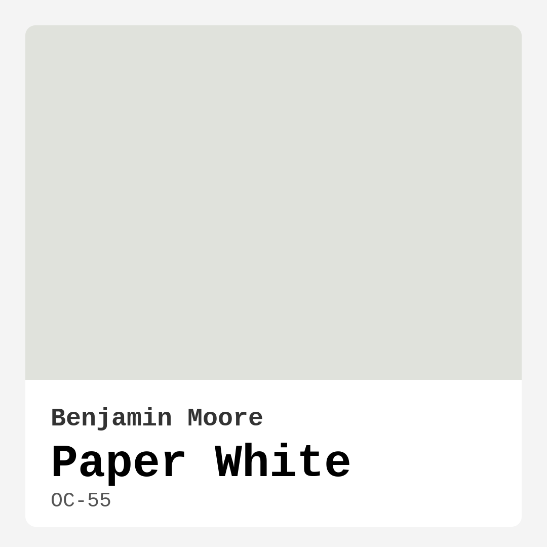
Color Preview & Key Details
| HEX Code | #E0E2DC |
| RGB | 224, 226, 220 |
| LRV | 74.41% |
| Undertone | Green |
| Finish Options | Eggshell, Matte |
Ever walked into a room and immediately felt a sense of calm wash over you? That’s the magic of the right paint color—it doesn’t just cover walls; it sets the tone for your entire space. Today, let’s talk about Benjamin Moore’s Paper White (OC-55), a shade that’s been quietly winning over designers and homeowners alike. It’s not just another off-white; it’s a soft, muted hue with a whisper of green undertone that brings serenity to any room. If you’re on the fence about whether this color is right for your home, let’s break it down together.
Paper White is one of those colors that feels fresh yet timeless. With an LRV of 74.41%, it reflects plenty of light, making it perfect for spaces that need a little brightness boost. Think of it as a gentle hug for your walls—subtle enough to blend seamlessly with your decor but distinctive enough to add depth. It’s especially great for rooms where you want a neutral backdrop that doesn’t feel sterile or cold. The green undertone gives it a touch of warmth, so it never feels stark like a pure white might.
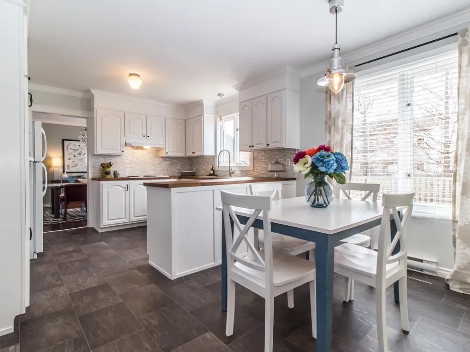
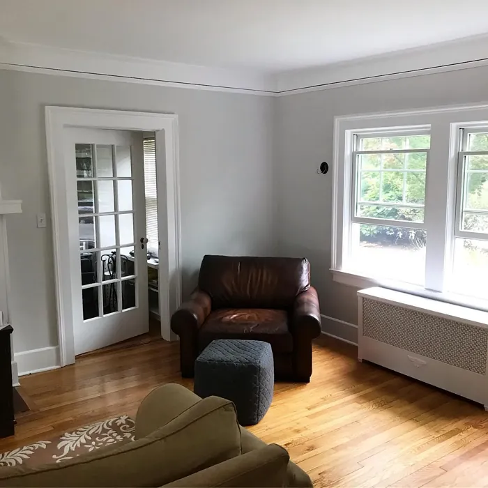
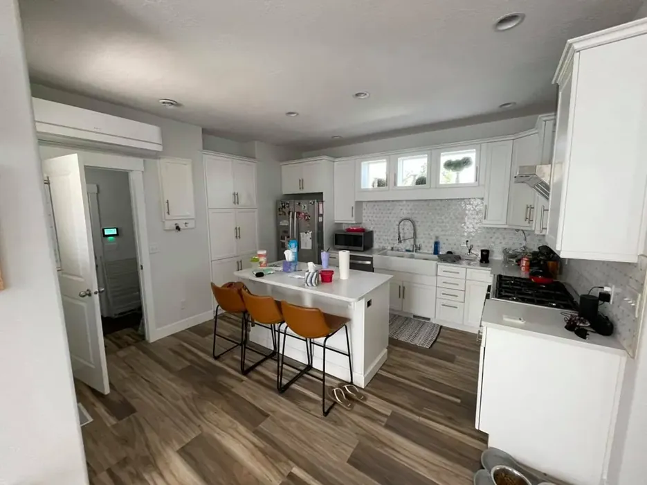
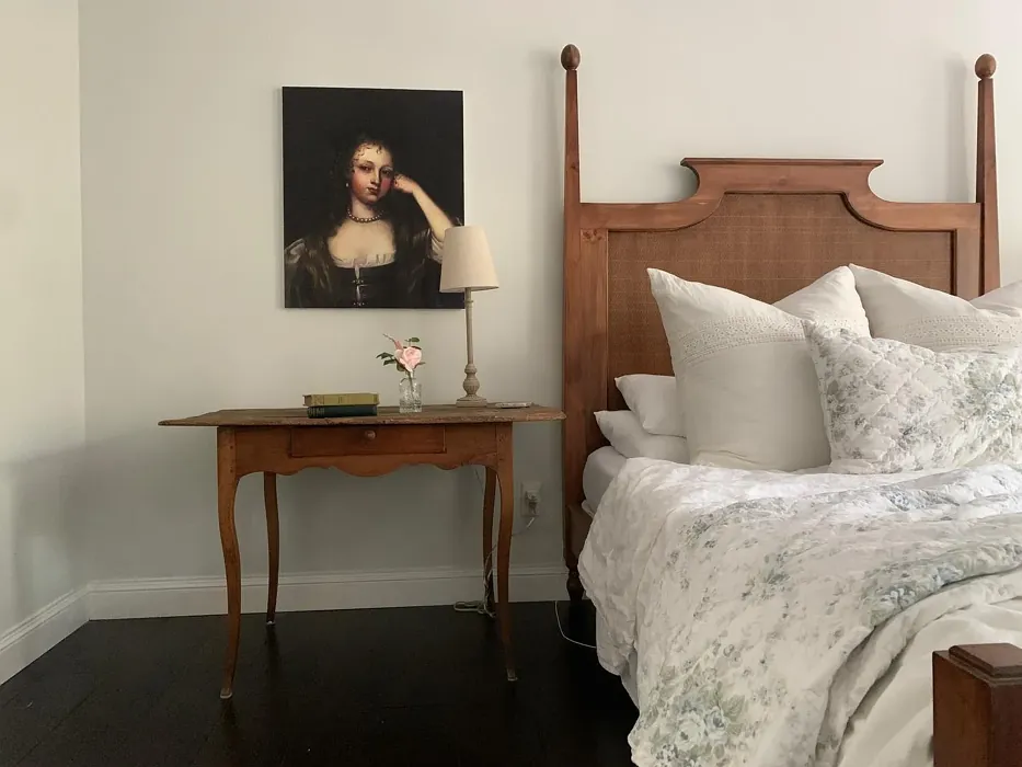
Now, let’s talk about where this color shines. Paper White is incredibly versatile, but it truly excels in living rooms, bedrooms, and home offices. In a living room, it creates an inviting atmosphere that pairs beautifully with both modern and traditional furniture. Picture a cozy sectional in charcoal gray or a warm wooden coffee table against walls painted in Paper White—it’s a match made in design heaven. For bedrooms, this color promotes relaxation, making it easier to unwind after a long day. And in a home office? It’s the perfect balance of calm and focus, helping you stay productive without feeling like you’re working in a clinical space.
One of the biggest questions I get about off-whites is how they handle different lighting situations. Here’s the thing: Paper White adapts. In bright, natural light, it leans into its crisp, airy side, making small rooms feel more spacious. In softer, evening light, it takes on a warmer, almost creamy appearance. This chameleon-like quality is why it works so well in so many spaces. But—and this is important—always test it in your home before committing. Paint a large swatch and observe it at different times of day to see how it plays with your unique lighting.
If you’re worried about application, don’t be. Paper White is beginner-friendly, with good coverage in one to two coats. It’s roller-ready and brushes on smoothly, drying quickly so you can finish your project without waiting around. The finish options—matte or eggshell—give you flexibility. Matte is ideal for low-traffic areas where you want a sophisticated, velvety look, while eggshell adds a subtle sheen and extra durability for spaces like hallways or kids’ rooms. And since it’s low-VOC, you won’t have to deal with harsh fumes during or after painting.
Maintenance is a breeze, too. Paper White is wipeable and washable, so it holds up well in kitchens and bathrooms where splashes happen. Just avoid harsh scrubbing, as it’s not a scrubbable finish. For touch-ups, it’s forgiving, blending seamlessly with the existing coat. That’s a huge plus if you’ve got active kids or pets leaving their mark on your walls.
Now, let’s address the elephant in the room: the green undertone. Some people love it; others are wary. Here’s my take—it’s what gives Paper White its character. Unlike cooler grays that can feel sterile, this hint of green adds a touch of organic warmth. It pairs beautifully with natural materials like wood and stone, as well as with blues and soft pastels. If you’re pairing it with trim, White Dove or a pure white will keep things crisp without clashing.
Wondering if it’s too cool for your space? Paper White does lean slightly cool, but it’s not icy. It’s more of a fresh, clean coolness that balances warmer elements in your decor. If your room gets a lot of warm sunlight, this color will soften that glow beautifully. In north-facing rooms with cooler light, it might feel a bit more muted, so consider adding warm textiles or wood tones to cozy it up.
For those who love to play with color, Paper White is a dream backdrop. It complements deeper shades like navy (CSP-535) or sage green (1411) for accent walls or furniture. If you’re into a monochromatic look, layer it with its lighter and darker cousins—OC-151 for a barely-there contrast or CSP-575 for a moodier vibe. And if you’re a fan of the modern farmhouse or Scandinavian aesthetic, this color is practically made for you. It’s clean, understated, and lets your decor take center stage.
So, is Paper White right for you? If you’re after a color that’s soft, versatile, and effortlessly elegant, the answer is probably yes. It’s a designer favorite for a reason—it works hard without demanding attention. Whether you’re refreshing a rental or designing your forever home, this shade delivers. Just remember: paint is personal. Grab a sample, live with it for a few days, and see how it makes you feel. After all, the best color for your home is the one that makes you happy every time you walk in the door.
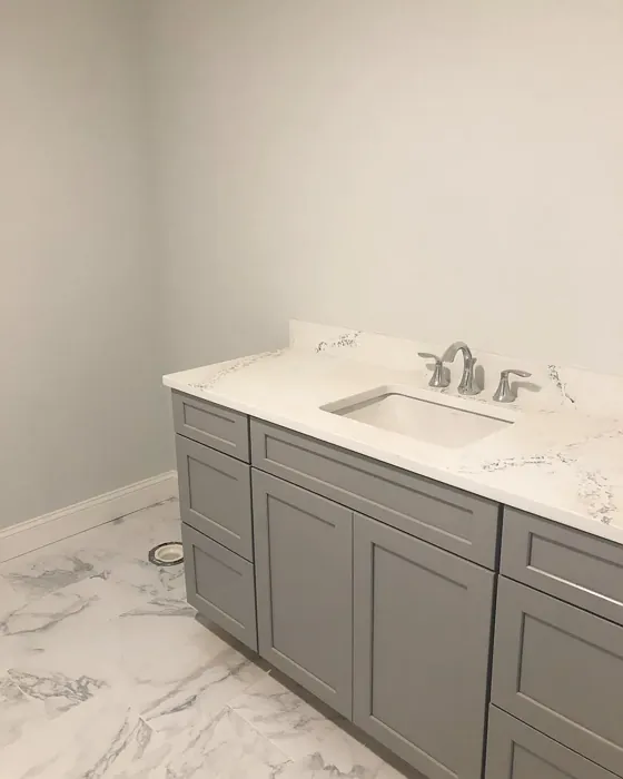
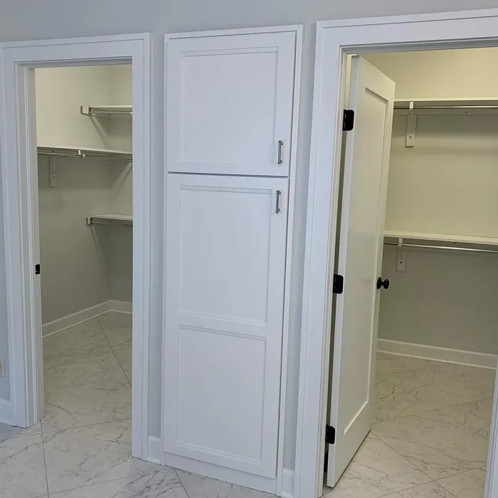
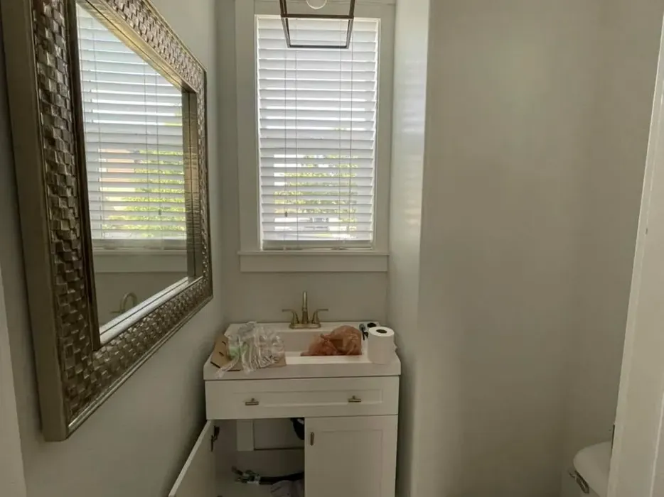
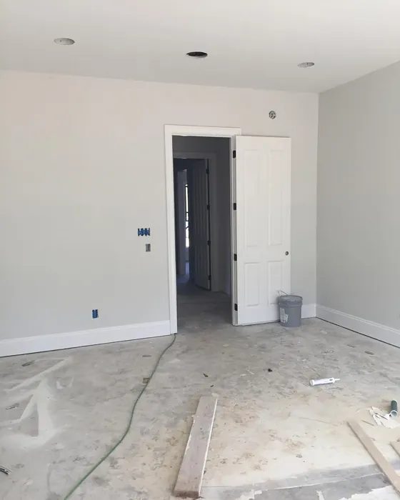
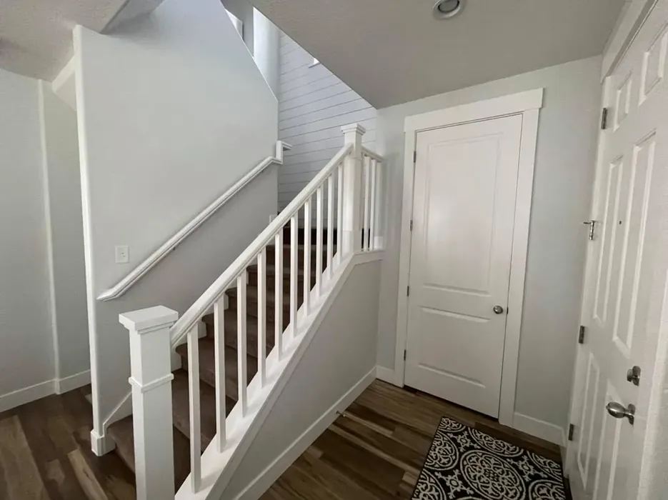
Real Room Photo of Paper White OC-55


Undertones of Paper White ?
The undertones of Paper White are a key aspect of its character, leaning towards Green. These subtle underlying hues are what give the color its depth and complexity. For example, a gray with a blue undertone will feel cooler and more modern, while one with a brown undertone will feel warmer and more traditional. It’s essential to test this paint in your home and observe it next to your existing furniture, flooring, and decor to see how these undertones interact and reveal themselves throughout the day.
HEX value: #E0E2DC
RGB code: 224, 226, 220
Is Paper White Cool or Warm?
This color leans towards the cool side, making it ideal for spaces that benefit from a fresh, airy feel. It can balance warmer tones in your decor, creating a harmonious and inviting atmosphere.
Understanding Color Properties and Interior Design Tips
Hue refers to a specific position on the color wheel, measured in degrees from 0 to 360. Each degree represents a different pure color:
- 0° represents red
- 120° represents green
- 240° represents blue
Saturation describes the intensity or purity of a color and is expressed as a percentage:
- At 0%, the color appears completely desaturated—essentially a shade of gray
- At 100%, the color is at its most vivid and vibrant
Lightness indicates how light or dark a color is, also expressed as a percentage:
- 0% lightness results in black
- 100% lightness results in white
Using Warm Colors in Interior Design
Warm hues—such as reds, oranges, yellows, warm beiges, and greiges—are excellent choices for creating inviting and energetic spaces. These colors are particularly well-suited for:
- Kitchens, living rooms, and bathrooms, where warmth enhances comfort and sociability
- Large rooms, where warm tones can help reduce the sense of emptiness and make the space feel more intimate
For example:
- Warm beige shades provide a cozy, inviting atmosphere, ideal for living rooms, bedrooms, and hallways.
- Warm greige (a mix of beige and gray) offers the warmth of beige with the modern appeal of gray, making it a versatile backdrop for dining areas, bedrooms, and living spaces.
However, be mindful when using warm light tones in rooms with limited natural light. These shades may appear muted or even take on an unpleasant yellowish tint. To avoid a dull or flat appearance:
- Add depth by incorporating richer tones like deep greens, charcoal, or chocolate brown
- Use textured elements such as curtains, rugs, or cushions to bring dimension to the space
Pro Tip: Achieving Harmony with Warm and Cool Color Balance
To create a well-balanced and visually interesting interior, mix warm and cool tones strategically. This contrast adds depth and harmony to your design.
- If your walls feature warm hues, introduce cool-colored accents such as blue or green furniture, artwork, or accessories to create contrast.
- For a polished look, consider using a complementary color scheme, which pairs colors opposite each other on the color wheel (e.g., red with green, orange with blue).
This thoughtful mix not only enhances visual appeal but also creates a space that feels both dynamic and cohesive.
Light Temperature Affects on Paper White
Natural Light
Natural daylight changes in color temperature as the sun moves across the sky. At sunrise and sunset, the light tends to have a warm, golden tone with a color temperature around 2000 Kelvin (K). As the day progresses and the sun rises higher, the light becomes cooler and more neutral. Around midday, especially when the sky is clear, natural light typically reaches its peak brightness and shifts to a cooler tone, ranging from 5500 to 6500 Kelvin. This midday light is close to what we perceive as pure white or daylight-balanced light.
These shifts in natural light can significantly influence how colors appear in a space, which is why designers often consider both the time of day and the orientation of windows when planning interior color schemes.
Artificial Light
When choosing artificial lighting, pay close attention to the color temperature, measured in Kelvin (K). This determines how warm or cool the light will appear. Lower temperatures, around 2700K, give off a warm, yellow glow often used in living rooms or bedrooms. Higher temperatures, above 5000K, create a cool, bluish light similar to daylight, commonly used in kitchens, offices, or task areas.
Use the slider to see how lighting temperature can affect the appearance of a surface or color throughout a space.


4800K
LRV of Paper White
The Light Reflectance Value (LRV) of Paper White is 74.41%, which places it in the Off‑White colors category. This means it reflect a lot of light. Understanding a paint’s LRV is crucial for predicting how it will look in your space. A higher LRV indicates a lighter color that reflects more light, making rooms feel larger and brighter. A lower LRV signifies a darker color that absorbs more light, creating a cozier, more intimate atmosphere. Always consider the natural and artificial lighting in your room when selecting a paint color based on its LRV.
Detailed Review of Paper White
Additional Paint Characteristics
Ideal Rooms
Bathroom, Bedroom, Hallway, Home Office, Living Room
Decor Styles
Minimalist, Modern, Scandi, Transitional
Coverage
Good (1–2 Coats), Touch-Up Friendly
Ease of Application
Beginner Friendly, Brush Smooth, Fast-Drying, Roller-Ready
Washability
Washable, Wipeable
VOC Level
Low VOC
Best Use
Accent Wall, Interior Walls, Large Spaces, Small Spaces
Room Suitability
Bathroom, Bedroom, Home Office, Living Room
Tone Tag
Airy, Cool, Neutral
Finish Type
Eggshell, Matte
Paint Performance
High Coverage, Low Odor, Quick Drying
Use Cases
Best for Modern Farmhouse, Best for Rentals, Classic Favorite, Designer Favorite
Mood
Calm, Inviting, Restful
Trim Pairing
Complements Cool Trim, Matches Pure White, Pairs with White Dove
When choosing a paint color, Paper White stands out for its versatility and subtle elegance. The shade is perfect for those looking to brighten a space without overwhelming it with brightness. It works beautifully in both natural and artificial light, adjusting its tone to suit the time of day. The finish can be selected according to your preference; matte offers a more sophisticated look while eggshell adds a touch of sheen and durability. This makes it suitable for high-traffic areas where a bit more washability is needed. Overall, Paper White is a fantastic choice for anyone wanting to create a serene and inviting environment in their home.
Pros & Cons of OC-55 Paper White
Pros
Cons
Colors that go with Benjamin Moore Paper White
FAQ on OC-55 Paper White
Is Paper White suitable for small spaces?
Absolutely! Paper White is an excellent choice for small spaces. Its light and airy quality helps to make rooms feel larger and more open. By reflecting light well, it can brighten even the coziest corners, creating an inviting atmosphere that doesn’t feel cramped. Just be mindful of your lighting; it’s best to test the color in different light conditions to see how it interacts with your space.
How does Paper White perform in terms of washability?
Paper White is quite user-friendly when it comes to maintenance. It’s categorized as wipeable and washable, making it suitable for areas like kitchens and bathrooms where you might encounter stains or splashes. While it’s not scrubbable, a gentle sponge or cloth can help maintain its clean look. Just remember to test cleaning methods on a small area first to ensure you’re happy with the results.
Comparisons Paper White with other colors
Paper White OC-55 vs Agreeable Gray SW 7029
| Attribute | Paper White OC-55 | Agreeable Gray SW 7029 |
|---|---|---|
| Color Name | Paper White OC-55 | Agreeable Gray SW 7029 |
| Color | ||
| Hue | Grey | Grey |
| Brightness | Light | Light |
| RGB | 224, 226, 220 | 209, 203, 193 |
| LRV | 74.41% | 60% |
| Finish Type | Eggshell, Matte | Eggshell, Matte, Satin |
| Finish Options | Eggshell, Matte | Eggshell, Flat, Matte, Satin |
| Ideal Rooms | Bathroom, Bedroom, Hallway, Home Office, Living Room | Bathroom, Bedroom, Dining Room, Home Office, Kitchen, Living Room |
| Decor Styles | Minimalist, Modern, Scandi, Transitional | Contemporary, Farmhouse, Minimalist, Modern, Transitional |
| Coverage | Good (1–2 Coats), Touch-Up Friendly | Good (1–2 Coats), Touch-Up Friendly |
| Ease of Application | Beginner Friendly, Brush Smooth, Fast-Drying, Roller-Ready | Beginner Friendly, Brush Smooth, Roller-Ready |
| Washability | Washable, Wipeable | Washable, Wipeable |
| Room Suitability | Bathroom, Bedroom, Home Office, Living Room | Bathroom, Bedroom, Dining Room, Kitchen, Living Room |
| Tone | Airy, Cool, Neutral | Muted, Neutral, Warm |
| Paint Performance | High Coverage, Low Odor, Quick Drying | Easy Touch-Up, Fade Resistant, Low Odor |
Paper White OC-55 vs Eider White SW 7014
| Attribute | Paper White OC-55 | Eider White SW 7014 |
|---|---|---|
| Color Name | Paper White OC-55 | Eider White SW 7014 |
| Color | ||
| Hue | Grey | Grey |
| Brightness | Light | Light |
| RGB | 224, 226, 220 | 226, 222, 216 |
| LRV | 74.41% | 73% |
| Finish Type | Eggshell, Matte | Eggshell, Matte, Satin |
| Finish Options | Eggshell, Matte | Eggshell, Matte, Satin |
| Ideal Rooms | Bathroom, Bedroom, Hallway, Home Office, Living Room | Bathroom, Bedroom, Dining Room, Home Office, Kitchen, Living Room |
| Decor Styles | Minimalist, Modern, Scandi, Transitional | Farmhouse, Minimalist, Modern, Scandinavian, Transitional |
| Coverage | Good (1–2 Coats), Touch-Up Friendly | Good (1–2 Coats), Touch-Up Friendly |
| Ease of Application | Beginner Friendly, Brush Smooth, Fast-Drying, Roller-Ready | Beginner Friendly, Brush Smooth, Roller-Ready |
| Washability | Washable, Wipeable | Highly Washable, Washable |
| Room Suitability | Bathroom, Bedroom, Home Office, Living Room | Bathroom, Bedroom, Dining Room, Kitchen, Living Room |
| Tone | Airy, Cool, Neutral | Creamy, Muted, Neutral, Warm |
| Paint Performance | High Coverage, Low Odor, Quick Drying | Easy Touch-Up, High Coverage, Low Odor, Scuff Resistant |
Paper White OC-55 vs Drift of Mist SW 9166
| Attribute | Paper White OC-55 | Drift of Mist SW 9166 |
|---|---|---|
| Color Name | Paper White OC-55 | Drift of Mist SW 9166 |
| Color | ||
| Hue | Grey | Grey |
| Brightness | Light | Light |
| RGB | 224, 226, 220 | 220, 216, 208 |
| LRV | 74.41% | 65% |
| Finish Type | Eggshell, Matte | Eggshell, Matte, Satin |
| Finish Options | Eggshell, Matte | Eggshell, Matte, Satin |
| Ideal Rooms | Bathroom, Bedroom, Hallway, Home Office, Living Room | Bathroom, Bedroom, Home Office, Kitchen, Living Room |
| Decor Styles | Minimalist, Modern, Scandi, Transitional | Coastal, Minimalist, Modern, Scandinavian |
| Coverage | Good (1–2 Coats), Touch-Up Friendly | Good (1–2 Coats), Touch-Up Friendly |
| Ease of Application | Beginner Friendly, Brush Smooth, Fast-Drying, Roller-Ready | Beginner Friendly, Brush Smooth, Fast-Drying, Roller-Ready |
| Washability | Washable, Wipeable | Washable, Wipeable |
| Room Suitability | Bathroom, Bedroom, Home Office, Living Room | Bathroom, Bedroom, Home Office, Living Room |
| Tone | Airy, Cool, Neutral | Airy, Cool, Neutral |
| Paint Performance | High Coverage, Low Odor, Quick Drying | Easy Touch-Up, Low Odor, Quick Drying, Scuff Resistant |
Paper White OC-55 vs Sanctuary SW 9583
| Attribute | Paper White OC-55 | Sanctuary SW 9583 |
|---|---|---|
| Color Name | Paper White OC-55 | Sanctuary SW 9583 |
| Color | ||
| Hue | Grey | Grey |
| Brightness | Light | Light |
| RGB | 224, 226, 220 | 230, 226, 217 |
| LRV | 74.41% | 24% |
| Finish Type | Eggshell, Matte | Eggshell, Matte, Satin |
| Finish Options | Eggshell, Matte | Eggshell, Matte, Satin |
| Ideal Rooms | Bathroom, Bedroom, Hallway, Home Office, Living Room | Bedroom, Dining Room, Home Office, Living Room, Nursery |
| Decor Styles | Minimalist, Modern, Scandi, Transitional | Bohemian, Coastal, Modern Farmhouse, Scandinavian |
| Coverage | Good (1–2 Coats), Touch-Up Friendly | Good (1–2 Coats), Touch-Up Friendly |
| Ease of Application | Beginner Friendly, Brush Smooth, Fast-Drying, Roller-Ready | Beginner Friendly, Brush Smooth, Fast-Drying, Roller-Ready |
| Washability | Washable, Wipeable | Highly Washable, Washable, Wipeable |
| Room Suitability | Bathroom, Bedroom, Home Office, Living Room | Bedroom, Home Office, Living Room, Nursery |
| Tone | Airy, Cool, Neutral | Earthy, Neutral, Soft, Warm |
| Paint Performance | High Coverage, Low Odor, Quick Drying | Easy Touch-Up, Low Odor, Quick Drying, Scuff Resistant |
Paper White OC-55 vs Snowbound SW 7004
| Attribute | Paper White OC-55 | Snowbound SW 7004 |
|---|---|---|
| Color Name | Paper White OC-55 | Snowbound SW 7004 |
| Color | ||
| Hue | Grey | Grey |
| Brightness | Light | Light |
| RGB | 224, 226, 220 | 237, 234, 229 |
| LRV | 74.41% | 83% |
| Finish Type | Eggshell, Matte | Eggshell, Matte, Satin |
| Finish Options | Eggshell, Matte | Eggshell, Matte, Satin |
| Ideal Rooms | Bathroom, Bedroom, Hallway, Home Office, Living Room | Bathroom, Bedroom, Dining Room, Hallway, Home Office, Kitchen, Living Room, Nursery |
| Decor Styles | Minimalist, Modern, Scandi, Transitional | Farmhouse, Minimalist, Modern, Scandinavian, Transitional |
| Coverage | Good (1–2 Coats), Touch-Up Friendly | Good (1–2 Coats), Touch-Up Friendly |
| Ease of Application | Beginner Friendly, Brush Smooth, Fast-Drying, Roller-Ready | Beginner Friendly, Brush Smooth, Fast-Drying, Roller-Ready |
| Washability | Washable, Wipeable | Washable, Wipeable |
| Room Suitability | Bathroom, Bedroom, Home Office, Living Room | Bathroom, Bedroom, Dining Room, Hallway, Home Office, Kitchen, Living Room |
| Tone | Airy, Cool, Neutral | Airy, Crisp, Neutral, Warm |
| Paint Performance | High Coverage, Low Odor, Quick Drying | High Coverage, Low Odor, Quick Drying |
Paper White OC-55 vs Pure White SW 7005
| Attribute | Paper White OC-55 | Pure White SW 7005 |
|---|---|---|
| Color Name | Paper White OC-55 | Pure White SW 7005 |
| Color | ||
| Hue | Grey | Grey |
| Brightness | Light | Light |
| RGB | 224, 226, 220 | 237, 236, 230 |
| LRV | 74.41% | 84% |
| Finish Type | Eggshell, Matte | Eggshell, Satin, Semi-Gloss |
| Finish Options | Eggshell, Matte | Eggshell, Flat, Matte, Satin, Semi-Gloss |
| Ideal Rooms | Bathroom, Bedroom, Hallway, Home Office, Living Room | Bathroom, Bedroom, Dining Room, Entryway, Hallway, Home Office, Kitchen, Living Room, Nursery |
| Decor Styles | Minimalist, Modern, Scandi, Transitional | Bohemian, Eclectic, Farmhouse, Minimalist, Modern, Traditional |
| Coverage | Good (1–2 Coats), Touch-Up Friendly | Good (1–2 Coats), Touch-Up Friendly |
| Ease of Application | Beginner Friendly, Brush Smooth, Fast-Drying, Roller-Ready | Beginner Friendly, Brush Smooth, Fast-Drying, Roller-Ready |
| Washability | Washable, Wipeable | Highly Washable, Washable |
| Room Suitability | Bathroom, Bedroom, Home Office, Living Room | Bathroom, Bedroom, Dining Room, Entryway, Hallway, Home Office, Kitchen, Living Room, Nursery |
| Tone | Airy, Cool, Neutral | Crisp, Neutral, Warm |
| Paint Performance | High Coverage, Low Odor, Quick Drying | Easy Touch-Up, High Coverage, Low Odor, Quick Drying |
Paper White OC-55 vs Crushed Ice SW 7647
| Attribute | Paper White OC-55 | Crushed Ice SW 7647 |
|---|---|---|
| Color Name | Paper White OC-55 | Crushed Ice SW 7647 |
| Color | ||
| Hue | Grey | Grey |
| Brightness | Light | Light |
| RGB | 224, 226, 220 | 214, 211, 204 |
| LRV | 74.41% | 66% |
| Finish Type | Eggshell, Matte | Eggshell, Matte, Satin |
| Finish Options | Eggshell, Matte | Eggshell, Matte, Satin |
| Ideal Rooms | Bathroom, Bedroom, Hallway, Home Office, Living Room | Bathroom, Bedroom, Dining Room, Home Office, Living Room |
| Decor Styles | Minimalist, Modern, Scandi, Transitional | Farmhouse, Minimalist, Modern, Scandinavian, Transitional |
| Coverage | Good (1–2 Coats), Touch-Up Friendly | Good (1–2 Coats), Touch-Up Friendly |
| Ease of Application | Beginner Friendly, Brush Smooth, Fast-Drying, Roller-Ready | Beginner Friendly, Brush Smooth, Roller-Ready |
| Washability | Washable, Wipeable | Stain Resistant, Washable |
| Room Suitability | Bathroom, Bedroom, Home Office, Living Room | Bathroom, Bedroom, Dining Room, Hallway, Home Office, Living Room |
| Tone | Airy, Cool, Neutral | Muted, Neutral, Warm |
| Paint Performance | High Coverage, Low Odor, Quick Drying | High Coverage, Low Odor, Quick Drying |
Paper White OC-55 vs Origami White SW 7636
| Attribute | Paper White OC-55 | Origami White SW 7636 |
|---|---|---|
| Color Name | Paper White OC-55 | Origami White SW 7636 |
| Color | ||
| Hue | Grey | Grey |
| Brightness | Light | Light |
| RGB | 224, 226, 220 | 229, 226, 218 |
| LRV | 74.41% | 83% |
| Finish Type | Eggshell, Matte | Eggshell, Matte |
| Finish Options | Eggshell, Matte | Eggshell, Matte, Satin |
| Ideal Rooms | Bathroom, Bedroom, Hallway, Home Office, Living Room | Bedroom, Dining Room, Entryway, Hallway, Home Office, Kitchen, Living Room |
| Decor Styles | Minimalist, Modern, Scandi, Transitional | Minimalist, Modern, Scandinavian, Traditional, Transitional |
| Coverage | Good (1–2 Coats), Touch-Up Friendly | Good (1–2 Coats), Touch-Up Friendly |
| Ease of Application | Beginner Friendly, Brush Smooth, Fast-Drying, Roller-Ready | Beginner Friendly, Brush Smooth, Roller-Ready |
| Washability | Washable, Wipeable | Washable, Wipeable |
| Room Suitability | Bathroom, Bedroom, Home Office, Living Room | Bedroom, Dining Room, Home Office, Kitchen, Living Room |
| Tone | Airy, Cool, Neutral | Airy, Neutral, Warm |
| Paint Performance | High Coverage, Low Odor, Quick Drying | Easy Touch-Up, Low Odor, Quick Drying |
Paper White OC-55 vs Spare White SW 6203
| Attribute | Paper White OC-55 | Spare White SW 6203 |
|---|---|---|
| Color Name | Paper White OC-55 | Spare White SW 6203 |
| Color | ||
| Hue | Grey | Grey |
| Brightness | Light | Light |
| RGB | 224, 226, 220 | 228, 228, 221 |
| LRV | 74.41% | 75% |
| Finish Type | Eggshell, Matte | Eggshell, Matte |
| Finish Options | Eggshell, Matte | Eggshell, Matte, Satin |
| Ideal Rooms | Bathroom, Bedroom, Hallway, Home Office, Living Room | Bedroom, Dining Room, Home Office, Kitchen, Living Room, Nursery |
| Decor Styles | Minimalist, Modern, Scandi, Transitional | Farmhouse, Minimalist, Modern, Scandinavian, Transitional |
| Coverage | Good (1–2 Coats), Touch-Up Friendly | Good (1–2 Coats), Primer Recommended, Touch-Up Friendly |
| Ease of Application | Beginner Friendly, Brush Smooth, Fast-Drying, Roller-Ready | Beginner Friendly, Brush Smooth, Fast-Drying, Roller-Ready |
| Washability | Washable, Wipeable | Washable, Wipeable |
| Room Suitability | Bathroom, Bedroom, Home Office, Living Room | Bedroom, Dining Room, Home Office, Kitchen, Living Room |
| Tone | Airy, Cool, Neutral | Creamy, Neutral, Warm |
| Paint Performance | High Coverage, Low Odor, Quick Drying | Easy Touch-Up, Low Odor, Quick Drying |
Paper White OC-55 vs Mountain Air SW 6224
| Attribute | Paper White OC-55 | Mountain Air SW 6224 |
|---|---|---|
| Color Name | Paper White OC-55 | Mountain Air SW 6224 |
| Color | ||
| Hue | Grey | Grey |
| Brightness | Light | Light |
| RGB | 224, 226, 220 | 216, 224, 223 |
| LRV | 74.41% | 66% |
| Finish Type | Eggshell, Matte | Eggshell, Satin |
| Finish Options | Eggshell, Matte | Eggshell, Matte, Satin |
| Ideal Rooms | Bathroom, Bedroom, Hallway, Home Office, Living Room | Bedroom, Hallway, Home Office, Living Room, Nursery |
| Decor Styles | Minimalist, Modern, Scandi, Transitional | Coastal, Minimalist, Modern, Scandinavian |
| Coverage | Good (1–2 Coats), Touch-Up Friendly | Good (1–2 Coats), Touch-Up Friendly |
| Ease of Application | Beginner Friendly, Brush Smooth, Fast-Drying, Roller-Ready | Beginner Friendly, Brush Smooth, Fast-Drying, Roller-Ready |
| Washability | Washable, Wipeable | Highly Washable, Washable |
| Room Suitability | Bathroom, Bedroom, Home Office, Living Room | Bedroom, Home Office, Living Room, Nursery |
| Tone | Airy, Cool, Neutral | Airy, Cool, Muted |
| Paint Performance | High Coverage, Low Odor, Quick Drying | Easy Touch-Up, Low Odor, Quick Drying, Scuff Resistant |
Official Page of Benjamin Moore Paper White OC-55