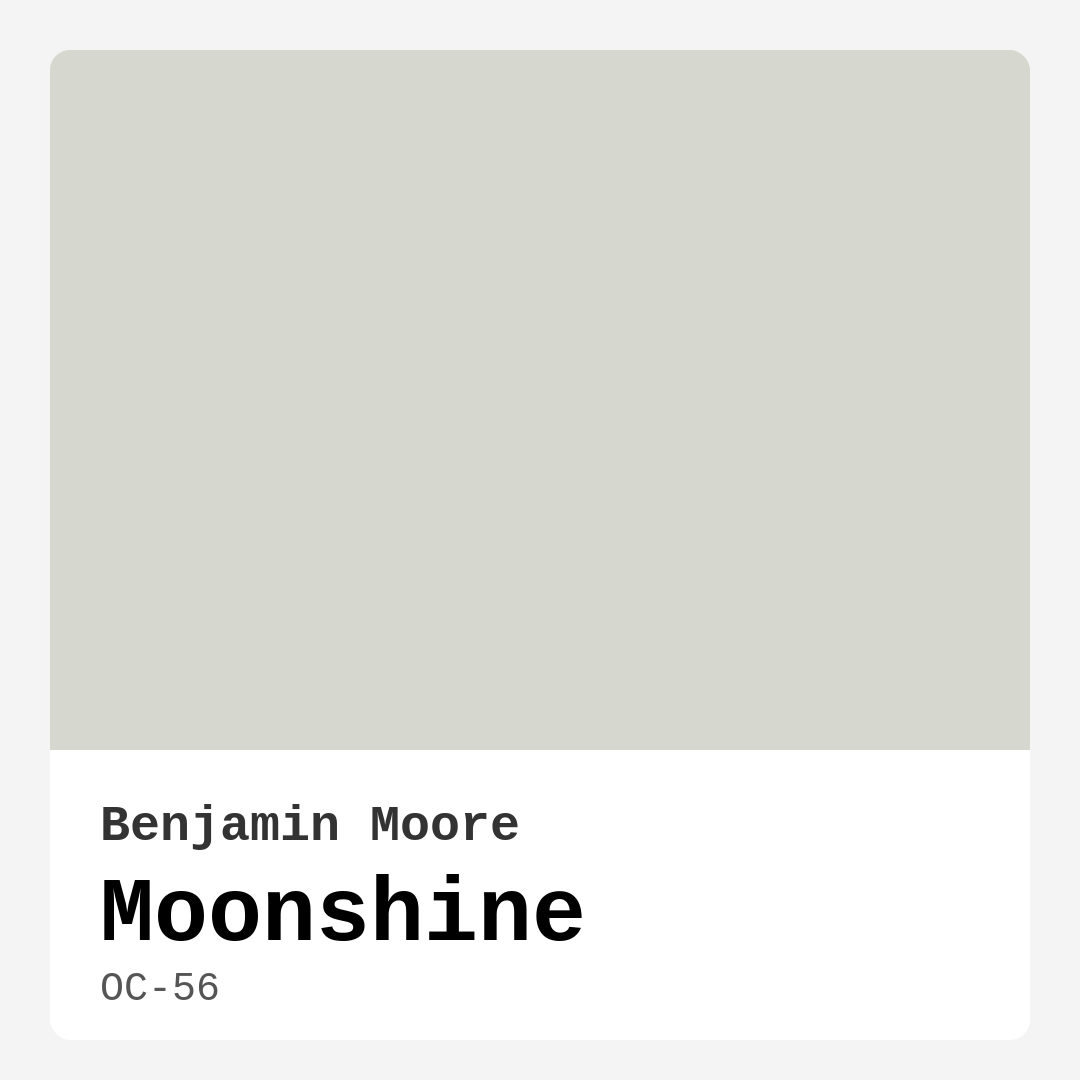
Color Preview & Key Details
| HEX Code | #D6D8CF |
| RGB | 214, 216, 207 |
| LRV | 66.53% |
| Undertone | Green and Yellow |
| Finish Options | Eggshell, Matte, Satin |
You know that feeling when you walk into a room and instantly feel at ease? The walls seem to whisper calm, the light feels soft, and the space wraps around you like a cozy blanket. That’s the magic of the right paint color—and if you’re searching for that effortless serenity, let’s talk about Benjamin Moore’s Moonshine.
Moonshine (OC-56) is one of those rare grays that doesn’t leave a room feeling cold or sterile. It’s a light, ethereal shade with just enough warmth to keep things inviting, thanks to its subtle green and yellow undertones. Imagine the soft glow of early morning light filtering through sheer curtains—that’s the vibe this color brings. It’s not stark, not muddy, just perfectly balanced.
If you’re worried about gray feeling too modern or impersonal, Moonshine is your antidote. It plays well with both contemporary and classic decor, making it a dream for transitional spaces. Picture it in a Scandinavian-inspired living room with clean lines and warm wood tones, or in a traditional bedroom paired with crisp white trim and vintage brass fixtures. It’s versatile enough to adapt without losing its quiet charm.
One of the best things about Moonshine is how it handles light. With an LRV of 66.53%, it reflects plenty of light, making rooms feel airy and bright without veering into harshness. In north-facing rooms, those warm undertones keep it from feeling chilly, while in sun-drenched spaces, it softens the glare into something dreamy. Just be aware that in very bright rooms, its subtlety might make it appear closer to an off-white—so if you’re after a more pronounced gray, you might want to test a darker shade from the same family.
Application is a breeze, even if you’re a DIY beginner. It covers well in one to two coats, and its touch-up-friendly formula means small fixes won’t leave awkward streaks. For finishes, eggshell is my go-to for living rooms and bedrooms—it’s durable enough for daily life but still has a velvety look. Satin works great in higher-traffic areas like hallways or kids’ rooms, where washability matters. And if you love a matte finish for its modern, velvety look, Moonshine wears it beautifully, though you’ll want to reserve that for lower-traffic spots.
Now, let’s talk pairings. Moonshine is a team player. It looks stunning with crisp whites like Benjamin Moore’s White Dove for trim—clean but never clinical. Warm wood tones, whether in flooring or furniture, bring out its cozier side, while black or deep charcoal accents add just the right contrast. If you’re feeling bold, try it with muted blues or soft greens for a serene, nature-inspired palette. And don’t overlook metals—brass and gold fixtures elevate its warmth, while polished nickel keeps things fresh.
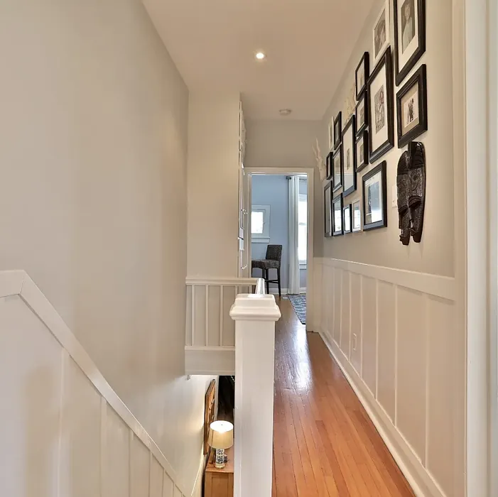
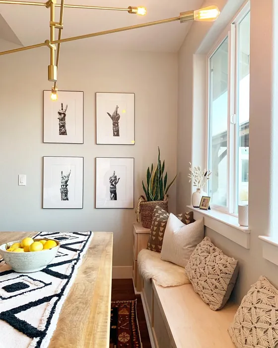
Wondering where to use it? Almost anywhere. It’s a star in bedrooms, where its restful quality helps create a retreat-like feel. Home offices benefit from its calming presence, and nurseries love its gentle neutrality. Even hallways, often overlooked, feel intentional and inviting in Moonshine. The only place I’d hesitate is in a room with very little natural light—without enough illumination, it might lean a bit flat.
A few pro tips: Always, always test before committing. Paint a large swatch and observe it at different times of day. Notice how it interacts with your furniture, flooring, and even artwork. And if you’re pairing it with other colors, pull in fabrics or decor items first to see how they play together.
Moonshine isn’t just a paint color—it’s a mood. It’s that feeling of quiet luxury, of a space that welcomes you without shouting for attention. Whether you’re refreshing a single room or reimagining your entire home, it’s a shade that’s as easy to live with as it is to love. So grab a sample, brush a little on your wall, and see how it transforms your space. You might just find it’s exactly what you’ve been looking for.
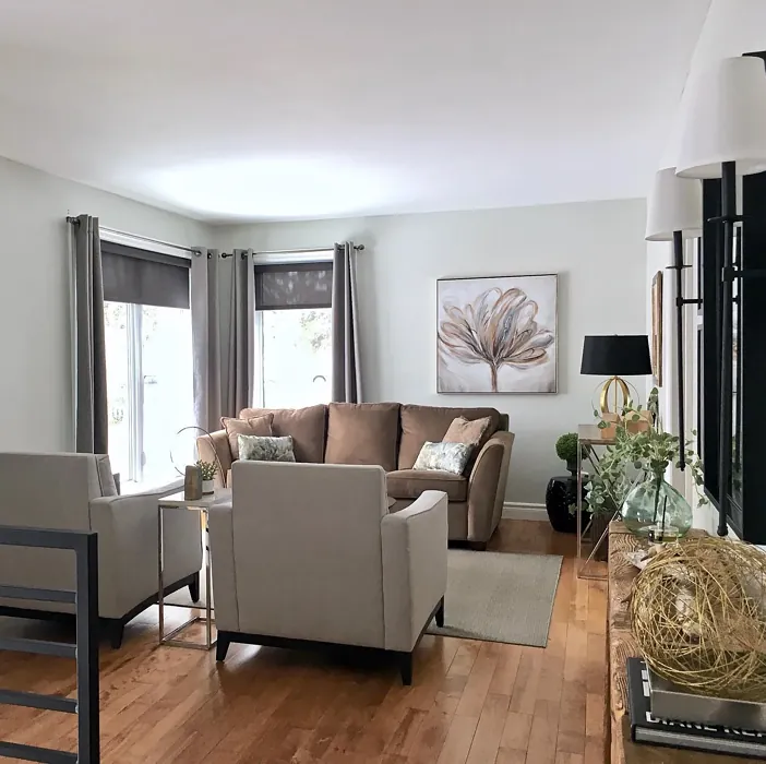
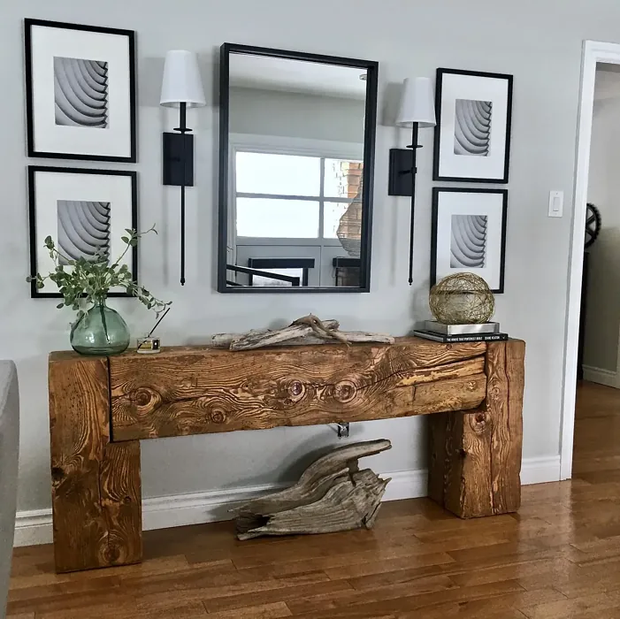
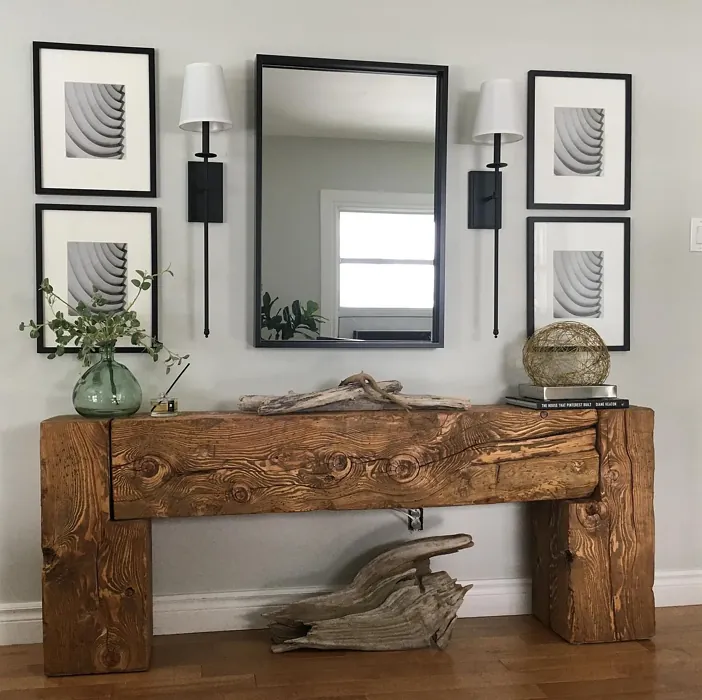
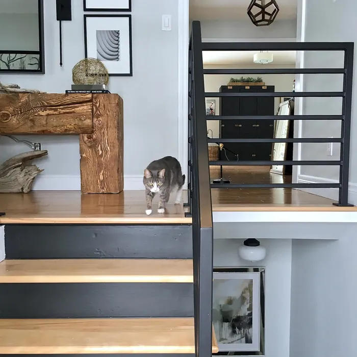
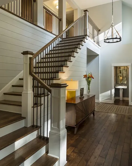
Real Room Photo of Moonshine OC-56
Undertones of Moonshine ?
The undertones of Moonshine are a key aspect of its character, leaning towards Green and Yellow. These subtle underlying hues are what give the color its depth and complexity. For example, a gray with a blue undertone will feel cooler and more modern, while one with a brown undertone will feel warmer and more traditional. It’s essential to test this paint in your home and observe it next to your existing furniture, flooring, and decor to see how these undertones interact and reveal themselves throughout the day.
HEX value: #D6D8CF
RGB code: 214, 216, 207
Is Moonshine Cool or Warm?
With its warm undertones, Moonshine leans more towards a cozy feel, making it ideal for creating inviting spaces that feel comfortable and welcoming.
Understanding Color Properties and Interior Design Tips
Hue refers to a specific position on the color wheel, measured in degrees from 0 to 360. Each degree represents a different pure color:
- 0° represents red
- 120° represents green
- 240° represents blue
Saturation describes the intensity or purity of a color and is expressed as a percentage:
- At 0%, the color appears completely desaturated—essentially a shade of gray
- At 100%, the color is at its most vivid and vibrant
Lightness indicates how light or dark a color is, also expressed as a percentage:
- 0% lightness results in black
- 100% lightness results in white
Using Warm Colors in Interior Design
Warm hues—such as reds, oranges, yellows, warm beiges, and greiges—are excellent choices for creating inviting and energetic spaces. These colors are particularly well-suited for:
- Kitchens, living rooms, and bathrooms, where warmth enhances comfort and sociability
- Large rooms, where warm tones can help reduce the sense of emptiness and make the space feel more intimate
For example:
- Warm beige shades provide a cozy, inviting atmosphere, ideal for living rooms, bedrooms, and hallways.
- Warm greige (a mix of beige and gray) offers the warmth of beige with the modern appeal of gray, making it a versatile backdrop for dining areas, bedrooms, and living spaces.
However, be mindful when using warm light tones in rooms with limited natural light. These shades may appear muted or even take on an unpleasant yellowish tint. To avoid a dull or flat appearance:
- Add depth by incorporating richer tones like deep greens, charcoal, or chocolate brown
- Use textured elements such as curtains, rugs, or cushions to bring dimension to the space
Pro Tip: Achieving Harmony with Warm and Cool Color Balance
To create a well-balanced and visually interesting interior, mix warm and cool tones strategically. This contrast adds depth and harmony to your design.
- If your walls feature warm hues, introduce cool-colored accents such as blue or green furniture, artwork, or accessories to create contrast.
- For a polished look, consider using a complementary color scheme, which pairs colors opposite each other on the color wheel (e.g., red with green, orange with blue).
This thoughtful mix not only enhances visual appeal but also creates a space that feels both dynamic and cohesive.
Light Temperature Affects on Moonshine
Natural Light
Natural daylight changes in color temperature as the sun moves across the sky. At sunrise and sunset, the light tends to have a warm, golden tone with a color temperature around 2000 Kelvin (K). As the day progresses and the sun rises higher, the light becomes cooler and more neutral. Around midday, especially when the sky is clear, natural light typically reaches its peak brightness and shifts to a cooler tone, ranging from 5500 to 6500 Kelvin. This midday light is close to what we perceive as pure white or daylight-balanced light.
These shifts in natural light can significantly influence how colors appear in a space, which is why designers often consider both the time of day and the orientation of windows when planning interior color schemes.
Artificial Light
When choosing artificial lighting, pay close attention to the color temperature, measured in Kelvin (K). This determines how warm or cool the light will appear. Lower temperatures, around 2700K, give off a warm, yellow glow often used in living rooms or bedrooms. Higher temperatures, above 5000K, create a cool, bluish light similar to daylight, commonly used in kitchens, offices, or task areas.
Use the slider to see how lighting temperature can affect the appearance of a surface or color throughout a space.


4800K
LRV of Moonshine
The Light Reflectance Value (LRV) of Moonshine is 66.53%, which places it in the Light colors category. This means it reflect most of the incident light. Understanding a paint’s LRV is crucial for predicting how it will look in your space. A higher LRV indicates a lighter color that reflects more light, making rooms feel larger and brighter. A lower LRV signifies a darker color that absorbs more light, creating a cozier, more intimate atmosphere. Always consider the natural and artificial lighting in your room when selecting a paint color based on its LRV.
Detailed Review of Moonshine
Additional Paint Characteristics
Ideal Rooms
Bedroom, Hallway, Home Office, Living Room, Nursery
Decor Styles
Classic, Modern, Scandinavian, Transitional
Coverage
Good (1–2 Coats), Touch-Up Friendly
Ease of Application
Beginner Friendly, Brush Smooth, Roller-Ready
Washability
Highly Washable, Washable
VOC Level
Eco-Certified, Low VOC
Best Use
Accent Wall, Bedroom, Interior Walls, Living Room
Room Suitability
Bedroom, Home Office, Living Room, Nursery
Tone Tag
Neutral, Soft, Warm
Finish Type
Eggshell, Matte, Satin
Paint Performance
Easy Touch-Up, Low Odor, Quick Drying
Use Cases
Best for Rentals, Best for Small Spaces, Designer Favorite
Mood
Calm, Inviting, Restful
Trim Pairing
Complements Brass Fixtures, Good with Wood Trim, Pairs with White Dove
Moonshine is a versatile paint that seamlessly blends into a variety of decor styles, from contemporary to traditional. Its soft gray hue is not just visually appealing but also highly adaptable, allowing it to complement various furnishings and decor elements. When applied, Moonshine offers a smooth finish that enhances the overall beauty of walls. The paint’s coverage is commendable, requiring just one to two coats for optimal results, which is a plus for DIY enthusiasts looking to save time. Its slight warmth makes it an inviting choice, perfect for creating cozy environments. Overall, Moonshine is a fantastic option for anyone looking to refresh their space without overwhelming it.
Pros & Cons of OC-56 Moonshine
Pros
Cons
Colors that go with Benjamin Moore Moonshine
FAQ on OC-56 Moonshine
Can Moonshine be used in high-traffic areas?
Absolutely! Moonshine is a durable paint with high washability, making it suitable for high-traffic areas like hallways and living rooms. Just ensure proper preparation and application for the best results.
What type of finish should I choose for my room?
For living rooms or bedrooms, an eggshell or satin finish is ideal as it offers a nice balance between durability and aesthetic appeal. For areas like kitchens or bathrooms, consider a satin finish for added washability.
Comparisons Moonshine with other colors
Moonshine OC-56 vs Agreeable Gray SW 7029
| Attribute | Moonshine OC-56 | Agreeable Gray SW 7029 |
|---|---|---|
| Color Name | Moonshine OC-56 | Agreeable Gray SW 7029 |
| Color | ||
| Hue | Grey | Grey |
| Brightness | Light | Light |
| RGB | 214, 216, 207 | 209, 203, 193 |
| LRV | 66.53% | 60% |
| Finish Type | Eggshell, Matte, Satin | Eggshell, Matte, Satin |
| Finish Options | Eggshell, Matte, Satin | Eggshell, Flat, Matte, Satin |
| Ideal Rooms | Bedroom, Hallway, Home Office, Living Room, Nursery | Bathroom, Bedroom, Dining Room, Home Office, Kitchen, Living Room |
| Decor Styles | Classic, Modern, Scandinavian, Transitional | Contemporary, Farmhouse, Minimalist, Modern, Transitional |
| Coverage | Good (1–2 Coats), Touch-Up Friendly | Good (1–2 Coats), Touch-Up Friendly |
| Ease of Application | Beginner Friendly, Brush Smooth, Roller-Ready | Beginner Friendly, Brush Smooth, Roller-Ready |
| Washability | Highly Washable, Washable | Washable, Wipeable |
| Room Suitability | Bedroom, Home Office, Living Room, Nursery | Bathroom, Bedroom, Dining Room, Kitchen, Living Room |
| Tone | Neutral, Soft, Warm | Muted, Neutral, Warm |
| Paint Performance | Easy Touch-Up, Low Odor, Quick Drying | Easy Touch-Up, Fade Resistant, Low Odor |
Moonshine OC-56 vs Eider White SW 7014
| Attribute | Moonshine OC-56 | Eider White SW 7014 |
|---|---|---|
| Color Name | Moonshine OC-56 | Eider White SW 7014 |
| Color | ||
| Hue | Grey | Grey |
| Brightness | Light | Light |
| RGB | 214, 216, 207 | 226, 222, 216 |
| LRV | 66.53% | 73% |
| Finish Type | Eggshell, Matte, Satin | Eggshell, Matte, Satin |
| Finish Options | Eggshell, Matte, Satin | Eggshell, Matte, Satin |
| Ideal Rooms | Bedroom, Hallway, Home Office, Living Room, Nursery | Bathroom, Bedroom, Dining Room, Home Office, Kitchen, Living Room |
| Decor Styles | Classic, Modern, Scandinavian, Transitional | Farmhouse, Minimalist, Modern, Scandinavian, Transitional |
| Coverage | Good (1–2 Coats), Touch-Up Friendly | Good (1–2 Coats), Touch-Up Friendly |
| Ease of Application | Beginner Friendly, Brush Smooth, Roller-Ready | Beginner Friendly, Brush Smooth, Roller-Ready |
| Washability | Highly Washable, Washable | Highly Washable, Washable |
| Room Suitability | Bedroom, Home Office, Living Room, Nursery | Bathroom, Bedroom, Dining Room, Kitchen, Living Room |
| Tone | Neutral, Soft, Warm | Creamy, Muted, Neutral, Warm |
| Paint Performance | Easy Touch-Up, Low Odor, Quick Drying | Easy Touch-Up, High Coverage, Low Odor, Scuff Resistant |
Moonshine OC-56 vs Drift of Mist SW 9166
| Attribute | Moonshine OC-56 | Drift of Mist SW 9166 |
|---|---|---|
| Color Name | Moonshine OC-56 | Drift of Mist SW 9166 |
| Color | ||
| Hue | Grey | Grey |
| Brightness | Light | Light |
| RGB | 214, 216, 207 | 220, 216, 208 |
| LRV | 66.53% | 65% |
| Finish Type | Eggshell, Matte, Satin | Eggshell, Matte, Satin |
| Finish Options | Eggshell, Matte, Satin | Eggshell, Matte, Satin |
| Ideal Rooms | Bedroom, Hallway, Home Office, Living Room, Nursery | Bathroom, Bedroom, Home Office, Kitchen, Living Room |
| Decor Styles | Classic, Modern, Scandinavian, Transitional | Coastal, Minimalist, Modern, Scandinavian |
| Coverage | Good (1–2 Coats), Touch-Up Friendly | Good (1–2 Coats), Touch-Up Friendly |
| Ease of Application | Beginner Friendly, Brush Smooth, Roller-Ready | Beginner Friendly, Brush Smooth, Fast-Drying, Roller-Ready |
| Washability | Highly Washable, Washable | Washable, Wipeable |
| Room Suitability | Bedroom, Home Office, Living Room, Nursery | Bathroom, Bedroom, Home Office, Living Room |
| Tone | Neutral, Soft, Warm | Airy, Cool, Neutral |
| Paint Performance | Easy Touch-Up, Low Odor, Quick Drying | Easy Touch-Up, Low Odor, Quick Drying, Scuff Resistant |
Moonshine OC-56 vs Sanctuary SW 9583
| Attribute | Moonshine OC-56 | Sanctuary SW 9583 |
|---|---|---|
| Color Name | Moonshine OC-56 | Sanctuary SW 9583 |
| Color | ||
| Hue | Grey | Grey |
| Brightness | Light | Light |
| RGB | 214, 216, 207 | 230, 226, 217 |
| LRV | 66.53% | 24% |
| Finish Type | Eggshell, Matte, Satin | Eggshell, Matte, Satin |
| Finish Options | Eggshell, Matte, Satin | Eggshell, Matte, Satin |
| Ideal Rooms | Bedroom, Hallway, Home Office, Living Room, Nursery | Bedroom, Dining Room, Home Office, Living Room, Nursery |
| Decor Styles | Classic, Modern, Scandinavian, Transitional | Bohemian, Coastal, Modern Farmhouse, Scandinavian |
| Coverage | Good (1–2 Coats), Touch-Up Friendly | Good (1–2 Coats), Touch-Up Friendly |
| Ease of Application | Beginner Friendly, Brush Smooth, Roller-Ready | Beginner Friendly, Brush Smooth, Fast-Drying, Roller-Ready |
| Washability | Highly Washable, Washable | Highly Washable, Washable, Wipeable |
| Room Suitability | Bedroom, Home Office, Living Room, Nursery | Bedroom, Home Office, Living Room, Nursery |
| Tone | Neutral, Soft, Warm | Earthy, Neutral, Soft, Warm |
| Paint Performance | Easy Touch-Up, Low Odor, Quick Drying | Easy Touch-Up, Low Odor, Quick Drying, Scuff Resistant |
Moonshine OC-56 vs Snowbound SW 7004
| Attribute | Moonshine OC-56 | Snowbound SW 7004 |
|---|---|---|
| Color Name | Moonshine OC-56 | Snowbound SW 7004 |
| Color | ||
| Hue | Grey | Grey |
| Brightness | Light | Light |
| RGB | 214, 216, 207 | 237, 234, 229 |
| LRV | 66.53% | 83% |
| Finish Type | Eggshell, Matte, Satin | Eggshell, Matte, Satin |
| Finish Options | Eggshell, Matte, Satin | Eggshell, Matte, Satin |
| Ideal Rooms | Bedroom, Hallway, Home Office, Living Room, Nursery | Bathroom, Bedroom, Dining Room, Hallway, Home Office, Kitchen, Living Room, Nursery |
| Decor Styles | Classic, Modern, Scandinavian, Transitional | Farmhouse, Minimalist, Modern, Scandinavian, Transitional |
| Coverage | Good (1–2 Coats), Touch-Up Friendly | Good (1–2 Coats), Touch-Up Friendly |
| Ease of Application | Beginner Friendly, Brush Smooth, Roller-Ready | Beginner Friendly, Brush Smooth, Fast-Drying, Roller-Ready |
| Washability | Highly Washable, Washable | Washable, Wipeable |
| Room Suitability | Bedroom, Home Office, Living Room, Nursery | Bathroom, Bedroom, Dining Room, Hallway, Home Office, Kitchen, Living Room |
| Tone | Neutral, Soft, Warm | Airy, Crisp, Neutral, Warm |
| Paint Performance | Easy Touch-Up, Low Odor, Quick Drying | High Coverage, Low Odor, Quick Drying |
Moonshine OC-56 vs Pure White SW 7005
| Attribute | Moonshine OC-56 | Pure White SW 7005 |
|---|---|---|
| Color Name | Moonshine OC-56 | Pure White SW 7005 |
| Color | ||
| Hue | Grey | Grey |
| Brightness | Light | Light |
| RGB | 214, 216, 207 | 237, 236, 230 |
| LRV | 66.53% | 84% |
| Finish Type | Eggshell, Matte, Satin | Eggshell, Satin, Semi-Gloss |
| Finish Options | Eggshell, Matte, Satin | Eggshell, Flat, Matte, Satin, Semi-Gloss |
| Ideal Rooms | Bedroom, Hallway, Home Office, Living Room, Nursery | Bathroom, Bedroom, Dining Room, Entryway, Hallway, Home Office, Kitchen, Living Room, Nursery |
| Decor Styles | Classic, Modern, Scandinavian, Transitional | Bohemian, Eclectic, Farmhouse, Minimalist, Modern, Traditional |
| Coverage | Good (1–2 Coats), Touch-Up Friendly | Good (1–2 Coats), Touch-Up Friendly |
| Ease of Application | Beginner Friendly, Brush Smooth, Roller-Ready | Beginner Friendly, Brush Smooth, Fast-Drying, Roller-Ready |
| Washability | Highly Washable, Washable | Highly Washable, Washable |
| Room Suitability | Bedroom, Home Office, Living Room, Nursery | Bathroom, Bedroom, Dining Room, Entryway, Hallway, Home Office, Kitchen, Living Room, Nursery |
| Tone | Neutral, Soft, Warm | Crisp, Neutral, Warm |
| Paint Performance | Easy Touch-Up, Low Odor, Quick Drying | Easy Touch-Up, High Coverage, Low Odor, Quick Drying |
Moonshine OC-56 vs Crushed Ice SW 7647
| Attribute | Moonshine OC-56 | Crushed Ice SW 7647 |
|---|---|---|
| Color Name | Moonshine OC-56 | Crushed Ice SW 7647 |
| Color | ||
| Hue | Grey | Grey |
| Brightness | Light | Light |
| RGB | 214, 216, 207 | 214, 211, 204 |
| LRV | 66.53% | 66% |
| Finish Type | Eggshell, Matte, Satin | Eggshell, Matte, Satin |
| Finish Options | Eggshell, Matte, Satin | Eggshell, Matte, Satin |
| Ideal Rooms | Bedroom, Hallway, Home Office, Living Room, Nursery | Bathroom, Bedroom, Dining Room, Home Office, Living Room |
| Decor Styles | Classic, Modern, Scandinavian, Transitional | Farmhouse, Minimalist, Modern, Scandinavian, Transitional |
| Coverage | Good (1–2 Coats), Touch-Up Friendly | Good (1–2 Coats), Touch-Up Friendly |
| Ease of Application | Beginner Friendly, Brush Smooth, Roller-Ready | Beginner Friendly, Brush Smooth, Roller-Ready |
| Washability | Highly Washable, Washable | Stain Resistant, Washable |
| Room Suitability | Bedroom, Home Office, Living Room, Nursery | Bathroom, Bedroom, Dining Room, Hallway, Home Office, Living Room |
| Tone | Neutral, Soft, Warm | Muted, Neutral, Warm |
| Paint Performance | Easy Touch-Up, Low Odor, Quick Drying | High Coverage, Low Odor, Quick Drying |
Moonshine OC-56 vs Origami White SW 7636
| Attribute | Moonshine OC-56 | Origami White SW 7636 |
|---|---|---|
| Color Name | Moonshine OC-56 | Origami White SW 7636 |
| Color | ||
| Hue | Grey | Grey |
| Brightness | Light | Light |
| RGB | 214, 216, 207 | 229, 226, 218 |
| LRV | 66.53% | 83% |
| Finish Type | Eggshell, Matte, Satin | Eggshell, Matte |
| Finish Options | Eggshell, Matte, Satin | Eggshell, Matte, Satin |
| Ideal Rooms | Bedroom, Hallway, Home Office, Living Room, Nursery | Bedroom, Dining Room, Entryway, Hallway, Home Office, Kitchen, Living Room |
| Decor Styles | Classic, Modern, Scandinavian, Transitional | Minimalist, Modern, Scandinavian, Traditional, Transitional |
| Coverage | Good (1–2 Coats), Touch-Up Friendly | Good (1–2 Coats), Touch-Up Friendly |
| Ease of Application | Beginner Friendly, Brush Smooth, Roller-Ready | Beginner Friendly, Brush Smooth, Roller-Ready |
| Washability | Highly Washable, Washable | Washable, Wipeable |
| Room Suitability | Bedroom, Home Office, Living Room, Nursery | Bedroom, Dining Room, Home Office, Kitchen, Living Room |
| Tone | Neutral, Soft, Warm | Airy, Neutral, Warm |
| Paint Performance | Easy Touch-Up, Low Odor, Quick Drying | Easy Touch-Up, Low Odor, Quick Drying |
Moonshine OC-56 vs Spare White SW 6203
| Attribute | Moonshine OC-56 | Spare White SW 6203 |
|---|---|---|
| Color Name | Moonshine OC-56 | Spare White SW 6203 |
| Color | ||
| Hue | Grey | Grey |
| Brightness | Light | Light |
| RGB | 214, 216, 207 | 228, 228, 221 |
| LRV | 66.53% | 75% |
| Finish Type | Eggshell, Matte, Satin | Eggshell, Matte |
| Finish Options | Eggshell, Matte, Satin | Eggshell, Matte, Satin |
| Ideal Rooms | Bedroom, Hallway, Home Office, Living Room, Nursery | Bedroom, Dining Room, Home Office, Kitchen, Living Room, Nursery |
| Decor Styles | Classic, Modern, Scandinavian, Transitional | Farmhouse, Minimalist, Modern, Scandinavian, Transitional |
| Coverage | Good (1–2 Coats), Touch-Up Friendly | Good (1–2 Coats), Primer Recommended, Touch-Up Friendly |
| Ease of Application | Beginner Friendly, Brush Smooth, Roller-Ready | Beginner Friendly, Brush Smooth, Fast-Drying, Roller-Ready |
| Washability | Highly Washable, Washable | Washable, Wipeable |
| Room Suitability | Bedroom, Home Office, Living Room, Nursery | Bedroom, Dining Room, Home Office, Kitchen, Living Room |
| Tone | Neutral, Soft, Warm | Creamy, Neutral, Warm |
| Paint Performance | Easy Touch-Up, Low Odor, Quick Drying | Easy Touch-Up, Low Odor, Quick Drying |
Moonshine OC-56 vs Mountain Air SW 6224
| Attribute | Moonshine OC-56 | Mountain Air SW 6224 |
|---|---|---|
| Color Name | Moonshine OC-56 | Mountain Air SW 6224 |
| Color | ||
| Hue | Grey | Grey |
| Brightness | Light | Light |
| RGB | 214, 216, 207 | 216, 224, 223 |
| LRV | 66.53% | 66% |
| Finish Type | Eggshell, Matte, Satin | Eggshell, Satin |
| Finish Options | Eggshell, Matte, Satin | Eggshell, Matte, Satin |
| Ideal Rooms | Bedroom, Hallway, Home Office, Living Room, Nursery | Bedroom, Hallway, Home Office, Living Room, Nursery |
| Decor Styles | Classic, Modern, Scandinavian, Transitional | Coastal, Minimalist, Modern, Scandinavian |
| Coverage | Good (1–2 Coats), Touch-Up Friendly | Good (1–2 Coats), Touch-Up Friendly |
| Ease of Application | Beginner Friendly, Brush Smooth, Roller-Ready | Beginner Friendly, Brush Smooth, Fast-Drying, Roller-Ready |
| Washability | Highly Washable, Washable | Highly Washable, Washable |
| Room Suitability | Bedroom, Home Office, Living Room, Nursery | Bedroom, Home Office, Living Room, Nursery |
| Tone | Neutral, Soft, Warm | Airy, Cool, Muted |
| Paint Performance | Easy Touch-Up, Low Odor, Quick Drying | Easy Touch-Up, Low Odor, Quick Drying, Scuff Resistant |
Official Page of Benjamin Moore Moonshine OC-56