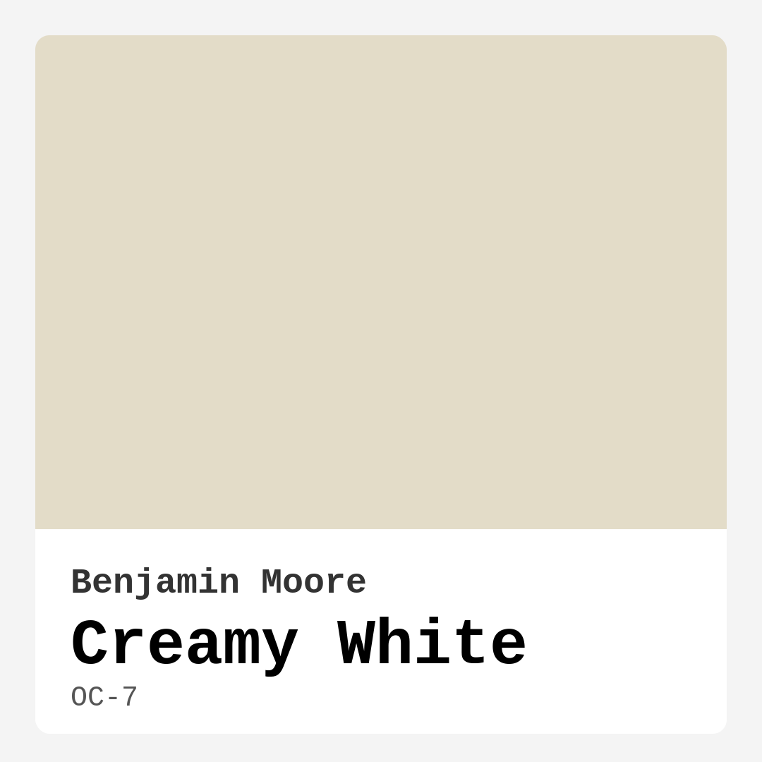
Color Preview & Key Details
| HEX Code | #E3DCC8 |
| RGB | 227, 220, 200 |
| LRV | 70.95% |
| Undertone | Yellow and Red |
| Finish Options | Eggshell, Satin |
Imagine walking into a room bathed in soft, warm light—walls that feel like a gentle embrace, a space that instantly puts you at ease. That’s the magic of Benjamin Moore’s Creamy White (OC-7). It’s not just another off-white; it’s a carefully balanced hue that brings serenity and sophistication to any home. Whether you’re refreshing a tired living room or designing a cozy bedroom retreat, this color might just be the perfect fit. Let’s dive into why Creamy White could be your next go-to paint choice.
Creamy White sits beautifully between a classic white and a subtle cream, with undertones of yellow and red that give it depth and warmth. Unlike stark whites that can feel clinical, this shade has a softness that makes spaces feel inviting. Its Light Reflectance Value (LRV) of 70.95% means it reflects plenty of light, making rooms feel airy and open—ideal for smaller spaces or rooms with limited natural light. But don’t let the name fool you; this isn’t a flat, boring white. It’s a chameleon that adapts to its surroundings, shifting slightly depending on the time of day and the lighting in your space.
One of the standout qualities of Creamy White is its versatility. It plays well with a range of decor styles, from modern farmhouse to coastal chic. Pair it with rustic wood accents for a cozy, lived-in feel, or combine it with sleek, minimalist furniture for a more contemporary vibe. It’s also a fantastic backdrop for bold artwork or vibrant textiles, allowing your decor to take center stage without competing for attention. If you love the idea of a neutral palette but want something with a bit more character than plain white, this is the color for you.
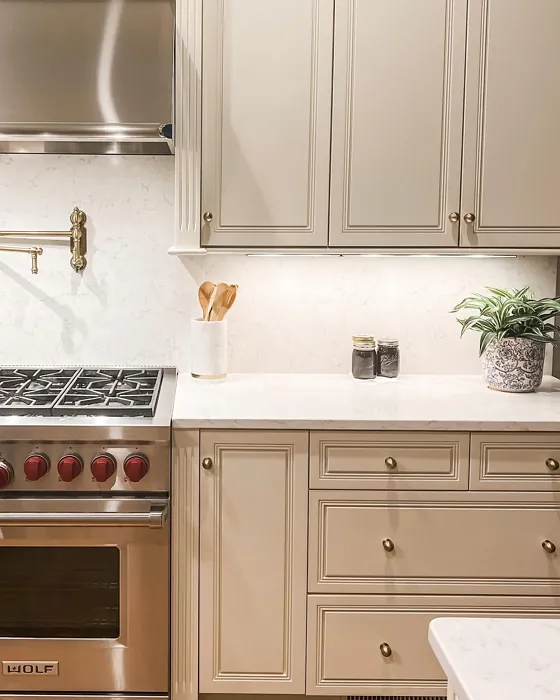
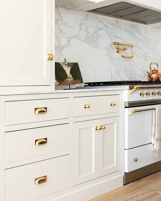
When it comes to application, Creamy White is a dream to work with. It offers excellent coverage—often needing just one or two coats—and dries quickly, which is a lifesaver if you’re tackling a DIY project over a weekend. The finish options, eggshell and satin, are both great choices. Eggshell gives walls a soft, velvety look with just a hint of sheen, while satin adds a bit more durability, making it perfect for high-traffic areas like kitchens or hallways. And because it’s low-VOC and eco-certified, you can feel good about using it in your home, especially if you’re sensitive to strong paint odors.
Lighting plays a huge role in how Creamy White performs. In natural light, it glows with a warm, buttery quality that feels uplifting. Under artificial light, it retains its creamy warmth, creating a cozy ambiance in the evenings. That said, if your room has very little natural light, you might notice it leaning slightly darker than expected. To avoid surprises, always test a sample on your walls and observe it at different times of day. This is especially important if your space has cool-toned flooring or furniture, as the warm undertones in Creamy White could clash if not balanced properly.
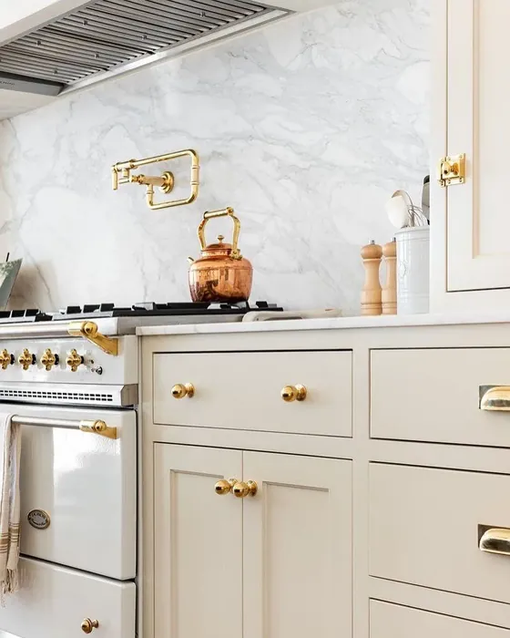
Now, let’s talk pairings. Creamy White loves company, and there are plenty of colors that complement it beautifully. For trim, White Dove (OC-17) is a classic choice—it’s crisp without being jarring, creating a seamless flow between walls and moldings. If you’re feeling adventurous, try pairing it with deep blues or muted greens for a striking contrast. Brass or gold fixtures add a touch of elegance, enhancing the warmth of the color. And if you’re using it in a kitchen, consider creamy white cabinets with a darker countertop for a timeless look that never goes out of style.
Of course, no color is perfect for every situation. Creamy White might not be the best pick for high-traffic areas like mudrooms or kids’ playrooms unless you opt for a more durable finish or add extra protection. And while it’s incredibly versatile, it does require some thought when selecting complementary colors—its warm undertones mean it won’t always play nicely with cooler shades like grays or blues unless you’re intentional about balancing them.
So, is Creamy White right for your project? If you’re after a color that’s warm, welcoming, and endlessly adaptable, the answer is probably yes. It’s a shade that feels both fresh and timeless, making it a smart choice whether you’re staging a home to sell or creating a forever space for your family. The best part? It’s hard to go wrong with it. Creamy White has a way of making rooms feel finished and polished without demanding too much attention. It’s the quiet hero of neutral paints—subtle, sophisticated, and effortlessly beautiful.
Before you commit, grab a sample and live with it for a few days. Paint a small section of your wall, move a lamp around, and see how it changes throughout the day. You’ll quickly get a sense of whether it’s the right fit for your home. And if it is, you’re in for a treat—Creamy White has a way of turning ordinary spaces into something extraordinary. Happy painting!

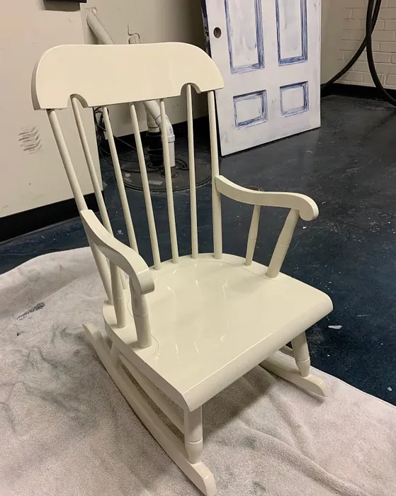
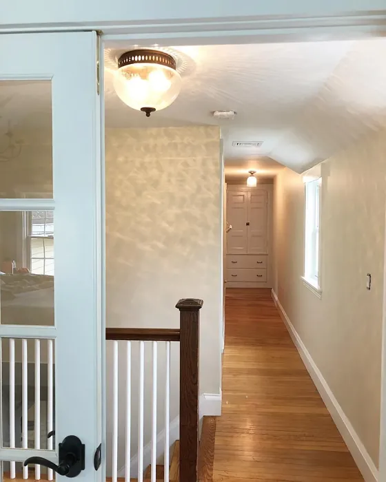
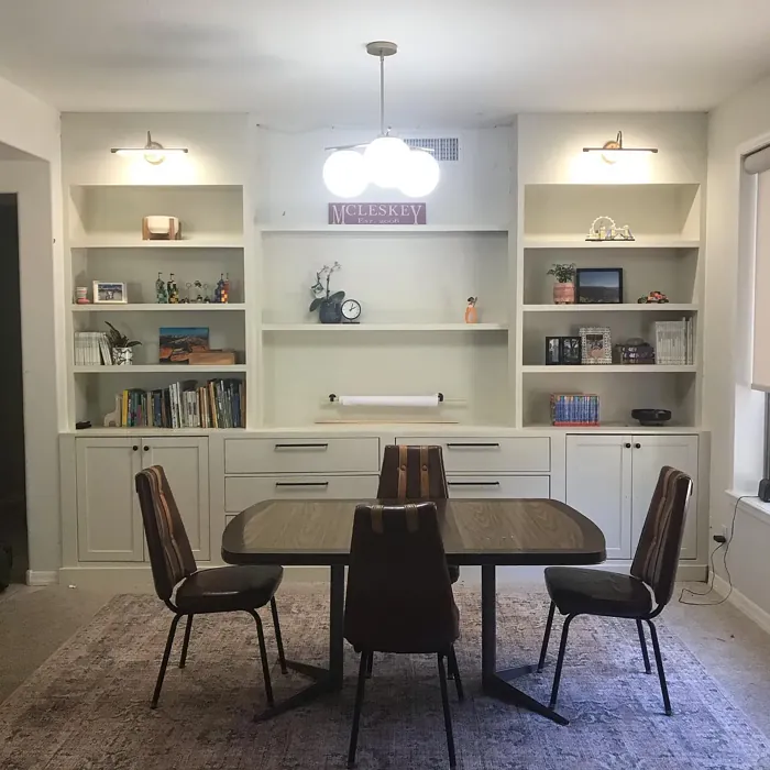
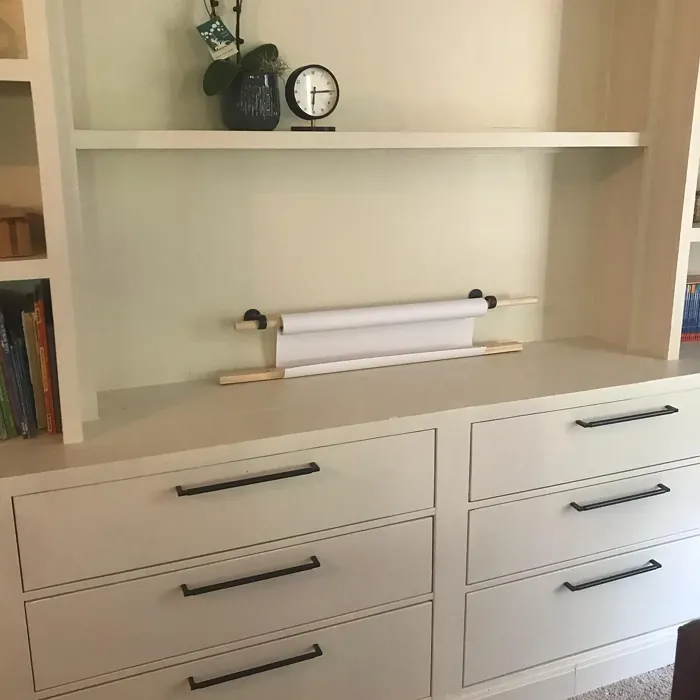
Real Room Photo of Creamy White OC-7
Undertones of Creamy White ?
The undertones of Creamy White are a key aspect of its character, leaning towards Yellow and Red. These subtle underlying hues are what give the color its depth and complexity. For example, a gray with a blue undertone will feel cooler and more modern, while one with a brown undertone will feel warmer and more traditional. It’s essential to test this paint in your home and observe it next to your existing furniture, flooring, and decor to see how these undertones interact and reveal themselves throughout the day.
HEX value: #E3DCC8
RGB code: 227, 220, 200
Is Creamy White Cool or Warm?
Creamy White is distinctly warm, making it a great option for spaces that seek to evoke comfort and tranquility. The warmth in this shade creates a welcoming environment, perfect for gathering spaces like living rooms and dining areas.
Understanding Color Properties and Interior Design Tips
Hue refers to a specific position on the color wheel, measured in degrees from 0 to 360. Each degree represents a different pure color:
- 0° represents red
- 120° represents green
- 240° represents blue
Saturation describes the intensity or purity of a color and is expressed as a percentage:
- At 0%, the color appears completely desaturated—essentially a shade of gray
- At 100%, the color is at its most vivid and vibrant
Lightness indicates how light or dark a color is, also expressed as a percentage:
- 0% lightness results in black
- 100% lightness results in white
Using Warm Colors in Interior Design
Warm hues—such as reds, oranges, yellows, warm beiges, and greiges—are excellent choices for creating inviting and energetic spaces. These colors are particularly well-suited for:
- Kitchens, living rooms, and bathrooms, where warmth enhances comfort and sociability
- Large rooms, where warm tones can help reduce the sense of emptiness and make the space feel more intimate
For example:
- Warm beige shades provide a cozy, inviting atmosphere, ideal for living rooms, bedrooms, and hallways.
- Warm greige (a mix of beige and gray) offers the warmth of beige with the modern appeal of gray, making it a versatile backdrop for dining areas, bedrooms, and living spaces.
However, be mindful when using warm light tones in rooms with limited natural light. These shades may appear muted or even take on an unpleasant yellowish tint. To avoid a dull or flat appearance:
- Add depth by incorporating richer tones like deep greens, charcoal, or chocolate brown
- Use textured elements such as curtains, rugs, or cushions to bring dimension to the space
Pro Tip: Achieving Harmony with Warm and Cool Color Balance
To create a well-balanced and visually interesting interior, mix warm and cool tones strategically. This contrast adds depth and harmony to your design.
- If your walls feature warm hues, introduce cool-colored accents such as blue or green furniture, artwork, or accessories to create contrast.
- For a polished look, consider using a complementary color scheme, which pairs colors opposite each other on the color wheel (e.g., red with green, orange with blue).
This thoughtful mix not only enhances visual appeal but also creates a space that feels both dynamic and cohesive.
Light Temperature Affects on Creamy White
Natural Light
Natural daylight changes in color temperature as the sun moves across the sky. At sunrise and sunset, the light tends to have a warm, golden tone with a color temperature around 2000 Kelvin (K). As the day progresses and the sun rises higher, the light becomes cooler and more neutral. Around midday, especially when the sky is clear, natural light typically reaches its peak brightness and shifts to a cooler tone, ranging from 5500 to 6500 Kelvin. This midday light is close to what we perceive as pure white or daylight-balanced light.
These shifts in natural light can significantly influence how colors appear in a space, which is why designers often consider both the time of day and the orientation of windows when planning interior color schemes.
Artificial Light
When choosing artificial lighting, pay close attention to the color temperature, measured in Kelvin (K). This determines how warm or cool the light will appear. Lower temperatures, around 2700K, give off a warm, yellow glow often used in living rooms or bedrooms. Higher temperatures, above 5000K, create a cool, bluish light similar to daylight, commonly used in kitchens, offices, or task areas.
Use the slider to see how lighting temperature can affect the appearance of a surface or color throughout a space.


4800K
LRV of Creamy White
The Light Reflectance Value (LRV) of Creamy White is 70.95%, which places it in the Light colors category. This means it reflect most of the incident light. Understanding a paint’s LRV is crucial for predicting how it will look in your space. A higher LRV indicates a lighter color that reflects more light, making rooms feel larger and brighter. A lower LRV signifies a darker color that absorbs more light, creating a cozier, more intimate atmosphere. Always consider the natural and artificial lighting in your room when selecting a paint color based on its LRV.
Detailed Review of Creamy White
Additional Paint Characteristics
Ideal Rooms
Bedroom, Dining Room, Entryway, Home Office, Kitchen, Living Room
Decor Styles
Coastal, Cottage, Modern Farmhouse, Scandinavian, Traditional
Coverage
Good (1–2 Coats), Touch-Up Friendly
Ease of Application
Beginner Friendly, Brush Smooth, Fast-Drying, Roller-Ready
Washability
Washable, Wipeable
VOC Level
Eco-Certified, Low VOC
Best Use
Accent Wall, Cabinets, Interior Walls, Trim
Room Suitability
Bedroom, Dining Room, Entryway, Kitchen, Living Room
Tone Tag
Balanced, Creamy, Warm
Finish Type
Eggshell, Satin
Paint Performance
Easy Touch-Up, Low Odor, Quick Drying, Scuff Resistant
Use Cases
Best for Open Concept, Best for Rentals, Best for Selling Your Home, Classic Favorite
Mood
Cozy, Inviting, Warm
Trim Pairing
Complements Brass Fixtures, Pairs with White Dove, Works with Warm Trim
Creamy White is an excellent choice for those looking to create a warm and inviting environment. Its soft tone beautifully reflects light, making spaces feel airy and open. When applied, it maintains its creamy essence without overwhelming the senses. Whether you’re painting an accent wall or an entire room, this color adapts seamlessly to different lighting conditions, enhancing the overall ambiance. It’s versatile enough to pair with a variety of decor styles, be it rustic or contemporary, ensuring it remains a timeless option in any home. The finish options of eggshell and satin offer a slight sheen that adds dimension without being too shiny, allowing it to fit perfectly in both casual and formal settings.
Pros & Cons of OC-7 Creamy White
Pros
Cons
Colors that go with Benjamin Moore Creamy White
FAQ on OC-7 Creamy White
What types of finishes work best with Creamy White?
Creamy White pairs beautifully with both eggshell and satin finishes. The eggshell finish provides a soft sheen that reflects light without being too glossy, making it great for walls. Satin adds a bit more durability, which is ideal for areas like kitchens and bathrooms where moisture might be a concern. Both finishes enhance the creamy tone, making spaces feel warm and inviting.
Can Creamy White be used in small spaces?
Absolutely! Creamy White is an excellent choice for small spaces. Its high Light Reflectance Value (LRV) allows it to reflect light effectively, making rooms feel larger and more open. Plus, its warm undertones create a cozy atmosphere without overwhelming the senses. Just be sure to complement it with lighting and decor that enhances its inviting nature.
Comparisons Creamy White with other colors
Creamy White OC-7 vs Agreeable Gray SW 7029
| Attribute | Creamy White OC-7 | Agreeable Gray SW 7029 |
|---|---|---|
| Color Name | Creamy White OC-7 | Agreeable Gray SW 7029 |
| Color | ||
| Hue | Grey | Grey |
| Brightness | Light | Light |
| RGB | 227, 220, 200 | 209, 203, 193 |
| LRV | 70.95% | 60% |
| Finish Type | Eggshell, Satin | Eggshell, Matte, Satin |
| Finish Options | Eggshell, Satin | Eggshell, Flat, Matte, Satin |
| Ideal Rooms | Bedroom, Dining Room, Entryway, Home Office, Kitchen, Living Room | Bathroom, Bedroom, Dining Room, Home Office, Kitchen, Living Room |
| Decor Styles | Coastal, Cottage, Modern Farmhouse, Scandinavian, Traditional | Contemporary, Farmhouse, Minimalist, Modern, Transitional |
| Coverage | Good (1–2 Coats), Touch-Up Friendly | Good (1–2 Coats), Touch-Up Friendly |
| Ease of Application | Beginner Friendly, Brush Smooth, Fast-Drying, Roller-Ready | Beginner Friendly, Brush Smooth, Roller-Ready |
| Washability | Washable, Wipeable | Washable, Wipeable |
| Room Suitability | Bedroom, Dining Room, Entryway, Kitchen, Living Room | Bathroom, Bedroom, Dining Room, Kitchen, Living Room |
| Tone | Balanced, Creamy, Warm | Muted, Neutral, Warm |
| Paint Performance | Easy Touch-Up, Low Odor, Quick Drying, Scuff Resistant | Easy Touch-Up, Fade Resistant, Low Odor |
Creamy White OC-7 vs Eider White SW 7014
| Attribute | Creamy White OC-7 | Eider White SW 7014 |
|---|---|---|
| Color Name | Creamy White OC-7 | Eider White SW 7014 |
| Color | ||
| Hue | Grey | Grey |
| Brightness | Light | Light |
| RGB | 227, 220, 200 | 226, 222, 216 |
| LRV | 70.95% | 73% |
| Finish Type | Eggshell, Satin | Eggshell, Matte, Satin |
| Finish Options | Eggshell, Satin | Eggshell, Matte, Satin |
| Ideal Rooms | Bedroom, Dining Room, Entryway, Home Office, Kitchen, Living Room | Bathroom, Bedroom, Dining Room, Home Office, Kitchen, Living Room |
| Decor Styles | Coastal, Cottage, Modern Farmhouse, Scandinavian, Traditional | Farmhouse, Minimalist, Modern, Scandinavian, Transitional |
| Coverage | Good (1–2 Coats), Touch-Up Friendly | Good (1–2 Coats), Touch-Up Friendly |
| Ease of Application | Beginner Friendly, Brush Smooth, Fast-Drying, Roller-Ready | Beginner Friendly, Brush Smooth, Roller-Ready |
| Washability | Washable, Wipeable | Highly Washable, Washable |
| Room Suitability | Bedroom, Dining Room, Entryway, Kitchen, Living Room | Bathroom, Bedroom, Dining Room, Kitchen, Living Room |
| Tone | Balanced, Creamy, Warm | Creamy, Muted, Neutral, Warm |
| Paint Performance | Easy Touch-Up, Low Odor, Quick Drying, Scuff Resistant | Easy Touch-Up, High Coverage, Low Odor, Scuff Resistant |
Creamy White OC-7 vs Drift of Mist SW 9166
| Attribute | Creamy White OC-7 | Drift of Mist SW 9166 |
|---|---|---|
| Color Name | Creamy White OC-7 | Drift of Mist SW 9166 |
| Color | ||
| Hue | Grey | Grey |
| Brightness | Light | Light |
| RGB | 227, 220, 200 | 220, 216, 208 |
| LRV | 70.95% | 65% |
| Finish Type | Eggshell, Satin | Eggshell, Matte, Satin |
| Finish Options | Eggshell, Satin | Eggshell, Matte, Satin |
| Ideal Rooms | Bedroom, Dining Room, Entryway, Home Office, Kitchen, Living Room | Bathroom, Bedroom, Home Office, Kitchen, Living Room |
| Decor Styles | Coastal, Cottage, Modern Farmhouse, Scandinavian, Traditional | Coastal, Minimalist, Modern, Scandinavian |
| Coverage | Good (1–2 Coats), Touch-Up Friendly | Good (1–2 Coats), Touch-Up Friendly |
| Ease of Application | Beginner Friendly, Brush Smooth, Fast-Drying, Roller-Ready | Beginner Friendly, Brush Smooth, Fast-Drying, Roller-Ready |
| Washability | Washable, Wipeable | Washable, Wipeable |
| Room Suitability | Bedroom, Dining Room, Entryway, Kitchen, Living Room | Bathroom, Bedroom, Home Office, Living Room |
| Tone | Balanced, Creamy, Warm | Airy, Cool, Neutral |
| Paint Performance | Easy Touch-Up, Low Odor, Quick Drying, Scuff Resistant | Easy Touch-Up, Low Odor, Quick Drying, Scuff Resistant |
Creamy White OC-7 vs Sanctuary SW 9583
| Attribute | Creamy White OC-7 | Sanctuary SW 9583 |
|---|---|---|
| Color Name | Creamy White OC-7 | Sanctuary SW 9583 |
| Color | ||
| Hue | Grey | Grey |
| Brightness | Light | Light |
| RGB | 227, 220, 200 | 230, 226, 217 |
| LRV | 70.95% | 24% |
| Finish Type | Eggshell, Satin | Eggshell, Matte, Satin |
| Finish Options | Eggshell, Satin | Eggshell, Matte, Satin |
| Ideal Rooms | Bedroom, Dining Room, Entryway, Home Office, Kitchen, Living Room | Bedroom, Dining Room, Home Office, Living Room, Nursery |
| Decor Styles | Coastal, Cottage, Modern Farmhouse, Scandinavian, Traditional | Bohemian, Coastal, Modern Farmhouse, Scandinavian |
| Coverage | Good (1–2 Coats), Touch-Up Friendly | Good (1–2 Coats), Touch-Up Friendly |
| Ease of Application | Beginner Friendly, Brush Smooth, Fast-Drying, Roller-Ready | Beginner Friendly, Brush Smooth, Fast-Drying, Roller-Ready |
| Washability | Washable, Wipeable | Highly Washable, Washable, Wipeable |
| Room Suitability | Bedroom, Dining Room, Entryway, Kitchen, Living Room | Bedroom, Home Office, Living Room, Nursery |
| Tone | Balanced, Creamy, Warm | Earthy, Neutral, Soft, Warm |
| Paint Performance | Easy Touch-Up, Low Odor, Quick Drying, Scuff Resistant | Easy Touch-Up, Low Odor, Quick Drying, Scuff Resistant |
Creamy White OC-7 vs Snowbound SW 7004
| Attribute | Creamy White OC-7 | Snowbound SW 7004 |
|---|---|---|
| Color Name | Creamy White OC-7 | Snowbound SW 7004 |
| Color | ||
| Hue | Grey | Grey |
| Brightness | Light | Light |
| RGB | 227, 220, 200 | 237, 234, 229 |
| LRV | 70.95% | 83% |
| Finish Type | Eggshell, Satin | Eggshell, Matte, Satin |
| Finish Options | Eggshell, Satin | Eggshell, Matte, Satin |
| Ideal Rooms | Bedroom, Dining Room, Entryway, Home Office, Kitchen, Living Room | Bathroom, Bedroom, Dining Room, Hallway, Home Office, Kitchen, Living Room, Nursery |
| Decor Styles | Coastal, Cottage, Modern Farmhouse, Scandinavian, Traditional | Farmhouse, Minimalist, Modern, Scandinavian, Transitional |
| Coverage | Good (1–2 Coats), Touch-Up Friendly | Good (1–2 Coats), Touch-Up Friendly |
| Ease of Application | Beginner Friendly, Brush Smooth, Fast-Drying, Roller-Ready | Beginner Friendly, Brush Smooth, Fast-Drying, Roller-Ready |
| Washability | Washable, Wipeable | Washable, Wipeable |
| Room Suitability | Bedroom, Dining Room, Entryway, Kitchen, Living Room | Bathroom, Bedroom, Dining Room, Hallway, Home Office, Kitchen, Living Room |
| Tone | Balanced, Creamy, Warm | Airy, Crisp, Neutral, Warm |
| Paint Performance | Easy Touch-Up, Low Odor, Quick Drying, Scuff Resistant | High Coverage, Low Odor, Quick Drying |
Creamy White OC-7 vs Pure White SW 7005
| Attribute | Creamy White OC-7 | Pure White SW 7005 |
|---|---|---|
| Color Name | Creamy White OC-7 | Pure White SW 7005 |
| Color | ||
| Hue | Grey | Grey |
| Brightness | Light | Light |
| RGB | 227, 220, 200 | 237, 236, 230 |
| LRV | 70.95% | 84% |
| Finish Type | Eggshell, Satin | Eggshell, Satin, Semi-Gloss |
| Finish Options | Eggshell, Satin | Eggshell, Flat, Matte, Satin, Semi-Gloss |
| Ideal Rooms | Bedroom, Dining Room, Entryway, Home Office, Kitchen, Living Room | Bathroom, Bedroom, Dining Room, Entryway, Hallway, Home Office, Kitchen, Living Room, Nursery |
| Decor Styles | Coastal, Cottage, Modern Farmhouse, Scandinavian, Traditional | Bohemian, Eclectic, Farmhouse, Minimalist, Modern, Traditional |
| Coverage | Good (1–2 Coats), Touch-Up Friendly | Good (1–2 Coats), Touch-Up Friendly |
| Ease of Application | Beginner Friendly, Brush Smooth, Fast-Drying, Roller-Ready | Beginner Friendly, Brush Smooth, Fast-Drying, Roller-Ready |
| Washability | Washable, Wipeable | Highly Washable, Washable |
| Room Suitability | Bedroom, Dining Room, Entryway, Kitchen, Living Room | Bathroom, Bedroom, Dining Room, Entryway, Hallway, Home Office, Kitchen, Living Room, Nursery |
| Tone | Balanced, Creamy, Warm | Crisp, Neutral, Warm |
| Paint Performance | Easy Touch-Up, Low Odor, Quick Drying, Scuff Resistant | Easy Touch-Up, High Coverage, Low Odor, Quick Drying |
Creamy White OC-7 vs Crushed Ice SW 7647
| Attribute | Creamy White OC-7 | Crushed Ice SW 7647 |
|---|---|---|
| Color Name | Creamy White OC-7 | Crushed Ice SW 7647 |
| Color | ||
| Hue | Grey | Grey |
| Brightness | Light | Light |
| RGB | 227, 220, 200 | 214, 211, 204 |
| LRV | 70.95% | 66% |
| Finish Type | Eggshell, Satin | Eggshell, Matte, Satin |
| Finish Options | Eggshell, Satin | Eggshell, Matte, Satin |
| Ideal Rooms | Bedroom, Dining Room, Entryway, Home Office, Kitchen, Living Room | Bathroom, Bedroom, Dining Room, Home Office, Living Room |
| Decor Styles | Coastal, Cottage, Modern Farmhouse, Scandinavian, Traditional | Farmhouse, Minimalist, Modern, Scandinavian, Transitional |
| Coverage | Good (1–2 Coats), Touch-Up Friendly | Good (1–2 Coats), Touch-Up Friendly |
| Ease of Application | Beginner Friendly, Brush Smooth, Fast-Drying, Roller-Ready | Beginner Friendly, Brush Smooth, Roller-Ready |
| Washability | Washable, Wipeable | Stain Resistant, Washable |
| Room Suitability | Bedroom, Dining Room, Entryway, Kitchen, Living Room | Bathroom, Bedroom, Dining Room, Hallway, Home Office, Living Room |
| Tone | Balanced, Creamy, Warm | Muted, Neutral, Warm |
| Paint Performance | Easy Touch-Up, Low Odor, Quick Drying, Scuff Resistant | High Coverage, Low Odor, Quick Drying |
Creamy White OC-7 vs Origami White SW 7636
| Attribute | Creamy White OC-7 | Origami White SW 7636 |
|---|---|---|
| Color Name | Creamy White OC-7 | Origami White SW 7636 |
| Color | ||
| Hue | Grey | Grey |
| Brightness | Light | Light |
| RGB | 227, 220, 200 | 229, 226, 218 |
| LRV | 70.95% | 83% |
| Finish Type | Eggshell, Satin | Eggshell, Matte |
| Finish Options | Eggshell, Satin | Eggshell, Matte, Satin |
| Ideal Rooms | Bedroom, Dining Room, Entryway, Home Office, Kitchen, Living Room | Bedroom, Dining Room, Entryway, Hallway, Home Office, Kitchen, Living Room |
| Decor Styles | Coastal, Cottage, Modern Farmhouse, Scandinavian, Traditional | Minimalist, Modern, Scandinavian, Traditional, Transitional |
| Coverage | Good (1–2 Coats), Touch-Up Friendly | Good (1–2 Coats), Touch-Up Friendly |
| Ease of Application | Beginner Friendly, Brush Smooth, Fast-Drying, Roller-Ready | Beginner Friendly, Brush Smooth, Roller-Ready |
| Washability | Washable, Wipeable | Washable, Wipeable |
| Room Suitability | Bedroom, Dining Room, Entryway, Kitchen, Living Room | Bedroom, Dining Room, Home Office, Kitchen, Living Room |
| Tone | Balanced, Creamy, Warm | Airy, Neutral, Warm |
| Paint Performance | Easy Touch-Up, Low Odor, Quick Drying, Scuff Resistant | Easy Touch-Up, Low Odor, Quick Drying |
Creamy White OC-7 vs Spare White SW 6203
| Attribute | Creamy White OC-7 | Spare White SW 6203 |
|---|---|---|
| Color Name | Creamy White OC-7 | Spare White SW 6203 |
| Color | ||
| Hue | Grey | Grey |
| Brightness | Light | Light |
| RGB | 227, 220, 200 | 228, 228, 221 |
| LRV | 70.95% | 75% |
| Finish Type | Eggshell, Satin | Eggshell, Matte |
| Finish Options | Eggshell, Satin | Eggshell, Matte, Satin |
| Ideal Rooms | Bedroom, Dining Room, Entryway, Home Office, Kitchen, Living Room | Bedroom, Dining Room, Home Office, Kitchen, Living Room, Nursery |
| Decor Styles | Coastal, Cottage, Modern Farmhouse, Scandinavian, Traditional | Farmhouse, Minimalist, Modern, Scandinavian, Transitional |
| Coverage | Good (1–2 Coats), Touch-Up Friendly | Good (1–2 Coats), Primer Recommended, Touch-Up Friendly |
| Ease of Application | Beginner Friendly, Brush Smooth, Fast-Drying, Roller-Ready | Beginner Friendly, Brush Smooth, Fast-Drying, Roller-Ready |
| Washability | Washable, Wipeable | Washable, Wipeable |
| Room Suitability | Bedroom, Dining Room, Entryway, Kitchen, Living Room | Bedroom, Dining Room, Home Office, Kitchen, Living Room |
| Tone | Balanced, Creamy, Warm | Creamy, Neutral, Warm |
| Paint Performance | Easy Touch-Up, Low Odor, Quick Drying, Scuff Resistant | Easy Touch-Up, Low Odor, Quick Drying |
Creamy White OC-7 vs Mountain Air SW 6224
| Attribute | Creamy White OC-7 | Mountain Air SW 6224 |
|---|---|---|
| Color Name | Creamy White OC-7 | Mountain Air SW 6224 |
| Color | ||
| Hue | Grey | Grey |
| Brightness | Light | Light |
| RGB | 227, 220, 200 | 216, 224, 223 |
| LRV | 70.95% | 66% |
| Finish Type | Eggshell, Satin | Eggshell, Satin |
| Finish Options | Eggshell, Satin | Eggshell, Matte, Satin |
| Ideal Rooms | Bedroom, Dining Room, Entryway, Home Office, Kitchen, Living Room | Bedroom, Hallway, Home Office, Living Room, Nursery |
| Decor Styles | Coastal, Cottage, Modern Farmhouse, Scandinavian, Traditional | Coastal, Minimalist, Modern, Scandinavian |
| Coverage | Good (1–2 Coats), Touch-Up Friendly | Good (1–2 Coats), Touch-Up Friendly |
| Ease of Application | Beginner Friendly, Brush Smooth, Fast-Drying, Roller-Ready | Beginner Friendly, Brush Smooth, Fast-Drying, Roller-Ready |
| Washability | Washable, Wipeable | Highly Washable, Washable |
| Room Suitability | Bedroom, Dining Room, Entryway, Kitchen, Living Room | Bedroom, Home Office, Living Room, Nursery |
| Tone | Balanced, Creamy, Warm | Airy, Cool, Muted |
| Paint Performance | Easy Touch-Up, Low Odor, Quick Drying, Scuff Resistant | Easy Touch-Up, Low Odor, Quick Drying, Scuff Resistant |
Official Page of Benjamin Moore Creamy White OC-7