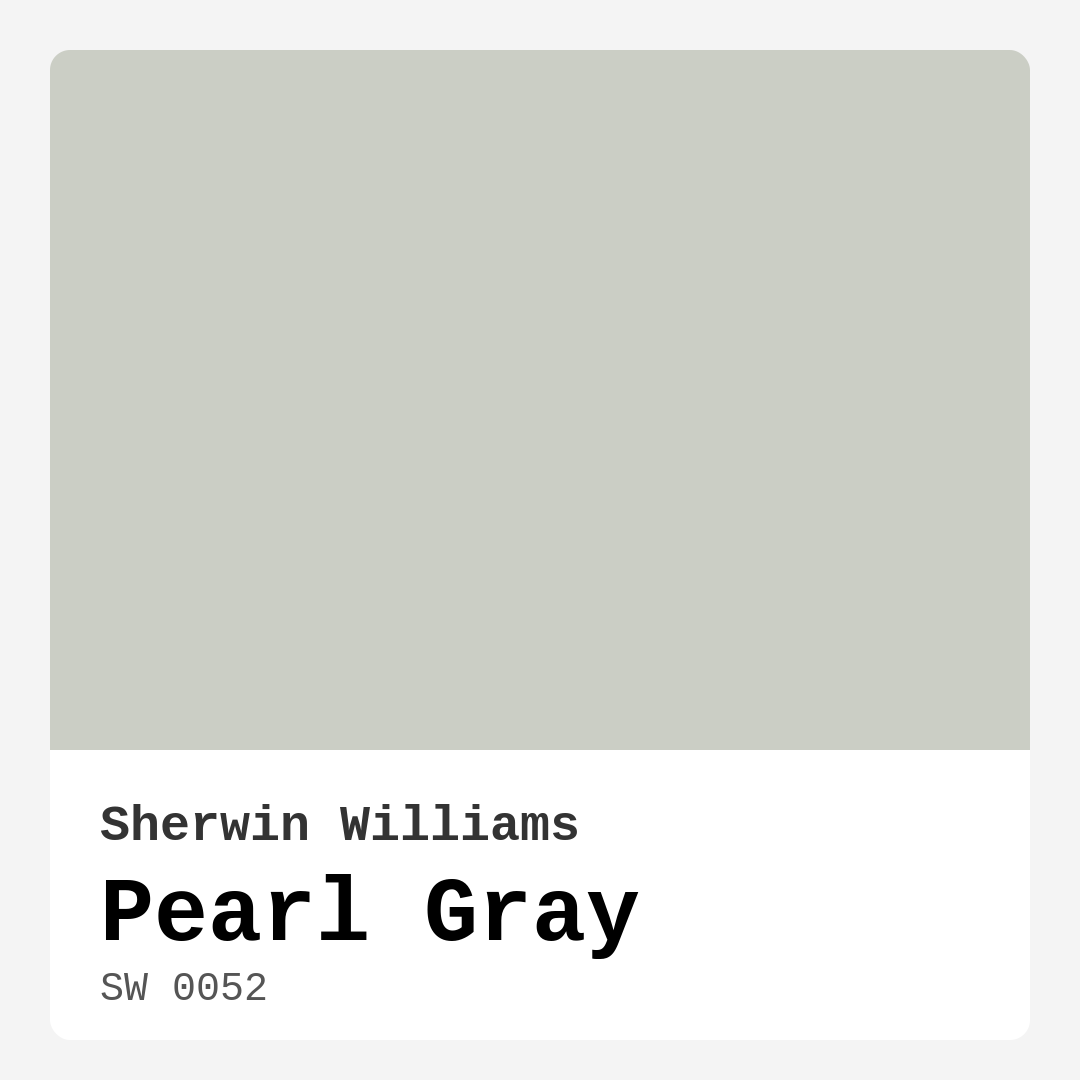
Color Preview & Key Details
| HEX Code | #CBCEC5 |
| RGB | 203, 206, 197 |
| LRV | 40% |
| Undertone | Green |
| Finish Options | Eggshell, Satin |
Imagine stepping into a room that immediately wraps you in a sense of calm, where the walls exude a serene elegance that invites you to relax. You’re greeted by the soft, sophisticated hue of Pearl Gray, a versatile color from Sherwin Williams that brings a modern twist to any space. This gentle gray, with its hint of warmth, is more than just a color; it’s a mood, a feeling, and an essential element of your home’s design.
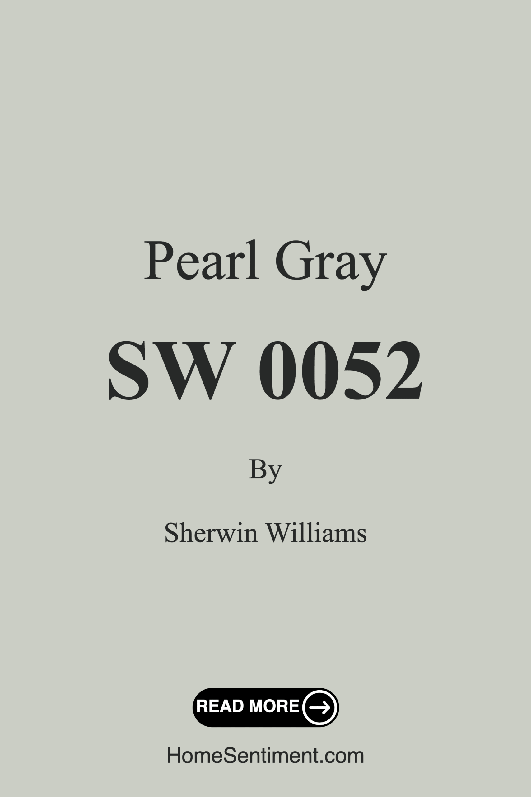
Pearl Gray, with the color code SW 0052, is a light grey that strikes a beautiful balance between warmth and coolness. Its muted tone, accompanied by a subtle green undertone, makes it an adaptable choice for various styles and environments. Whether your home leans toward modern, contemporary, industrial, or even farmhouse aesthetics, Pearl Gray can blend seamlessly, enhancing the overall appeal without overwhelming the senses.
One of the standout features of Pearl Gray is its light reflectance value (LRV) of 40%. This means it reflects a moderate amount of light, making it an excellent choice for both bright and dimly lit spaces. In natural light, it reveals its softer side, casting a warm glow that enriches the atmosphere. Conversely, in lower light, it maintains its character, providing depth without feeling heavy or dark. This adaptability makes it perfect for all kinds of rooms—living rooms, bedrooms, kitchens, dining areas, and home offices.
When it comes to application, you’ll find Pearl Gray to be beginner-friendly. Its smooth consistency allows for easy rolling and brushing, giving you a flawless finish with just one or two coats. Plus, it’s touch-up friendly, so if you happen to nick a corner, restoring it to perfection is a breeze. You’ll also appreciate its washability and scrubbability, making it a practical option for spaces that see a lot of activity, like kitchens and family rooms. Low VOC levels mean it’s not just good for your home aesthetic; it’s also better for your indoor air quality.
Now, let’s talk about how to make the most of Pearl Gray in your home. It pairs beautifully with a wide range of accent colors. For a fresh, crisp look, consider pairing it with whites like Simply White or even soft yellows. If you’re feeling bolder, deep blues or rich greens can create a striking contrast that brings depth and interest to your space. The versatility of Pearl Gray allows it to work harmoniously with almost any color palette, so you can let your creativity shine.
For those of you with smaller rooms, you might wonder if Pearl Gray can help make the space feel more open. Absolutely! Its light-reflective quality helps create an illusion of spaciousness, while the warm undertones add a sense of coziness. Just make sure to complement it with suitable decor to maintain a well-balanced look.
The undertones of Pearl Gray are crucial in defining its character. With a subtle green undertone, it enhances the complexity of the color, allowing it to shift slightly depending on the lighting and surrounding colors. Testing the paint in your home is essential. Observe how it interacts with your furniture, flooring, and decor throughout the day, as the undertones will reveal themselves differently in various lighting conditions. This attention to detail will ensure that your chosen hue feels just right in your specific environment.
If you’re thinking of using Pearl Gray, consider how it can impact the mood of the room. It creates a calm and inviting atmosphere, perfect for relaxation or focused work. Its sophisticated tone can serve as a wonderful backdrop for art, decorative pieces, and furniture, allowing your decor to take center stage without competing with the walls.
When it comes to trim and accents, Pearl Gray pairs excellently with colors like White Dove and Pure White, which can enhance its elegance and make it pop. If you have brass fixtures or details in your home, you’ll find that they complement this color beautifully, adding a touch of warmth and sophistication.
While Pearl Gray is predominantly a light tone, you might want to consider some darker shades for accent walls or trim. Colors like SW 0066, SW 6191, or SW 7057 can provide depth and visual interest when paired with Pearl Gray, creating a layered look that feels considered and intentional.
For lighter shades that stay within the same family, SW 9630 offers a softer alternative, while still maintaining that serene aesthetic. The options are plentiful, ensuring you can create a cohesive look that resonates with your personal style.
As an expert in home design, I can’t emphasize enough how vital it is to nurture a space that reflects who you are. Pearl Gray is a designer favorite not just for its aesthetic appeal, but for its ability to adapt and grow with you. It’s perfect for open concept areas where you want to maintain a sense of flow and connection between rooms without losing the individuality of the spaces.
Whether you’re drawing inspiration from modern trends or sticking to a more traditional design scheme, Pearl Gray can help bridge the gap between styles. It’s a color that invites exploration while providing a peaceful retreat from the chaos of daily life.
In conclusion, if you’re on the hunt for a paint color that embodies sophistication, versatility, and a sense of calm, Pearl Gray from Sherwin Williams is a choice you won’t regret. Its soft elegance can transform your space into a haven, allowing you to express your personal style while maintaining a timeless aesthetic. So grab your paintbrush and let Pearl Gray set the tone for your beautifully personalized interior!
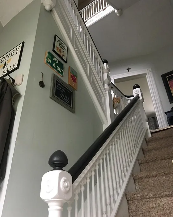
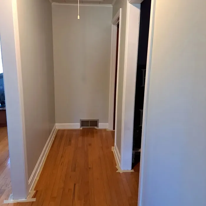
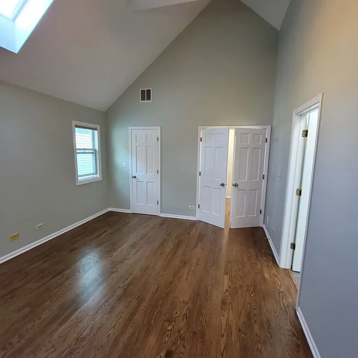
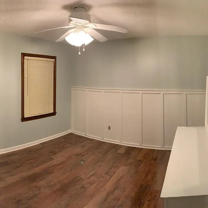
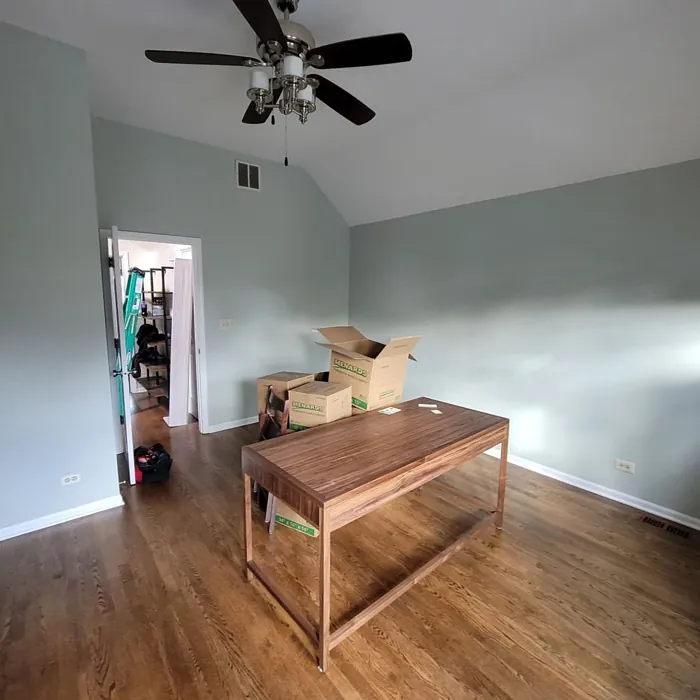
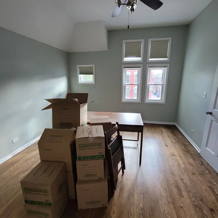
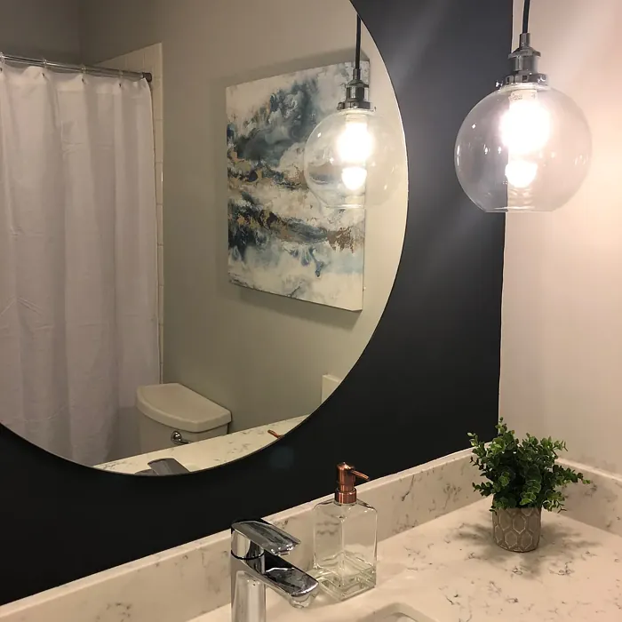
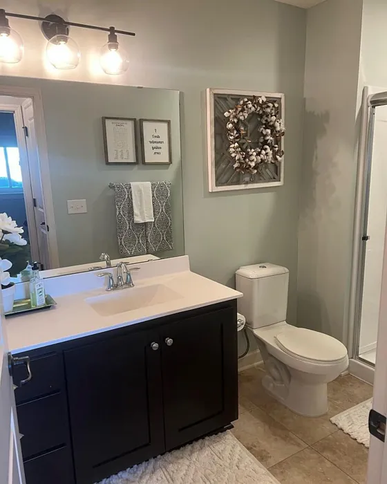
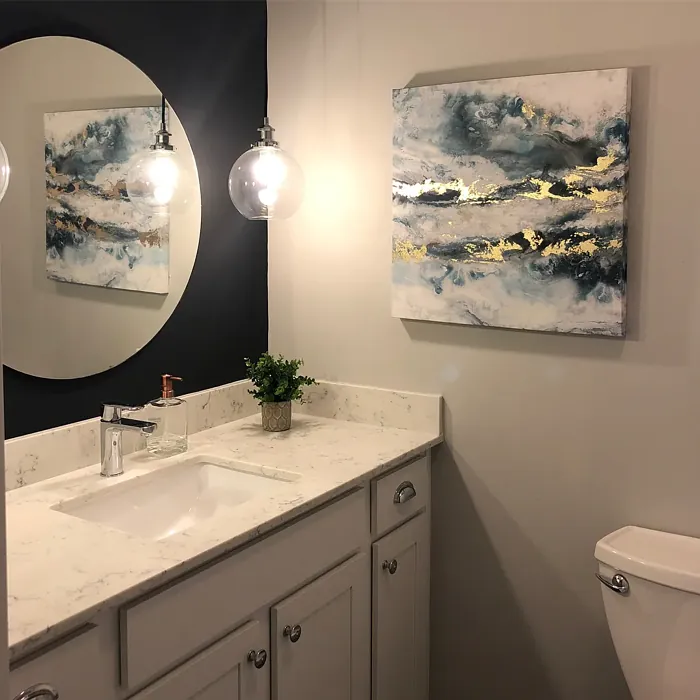
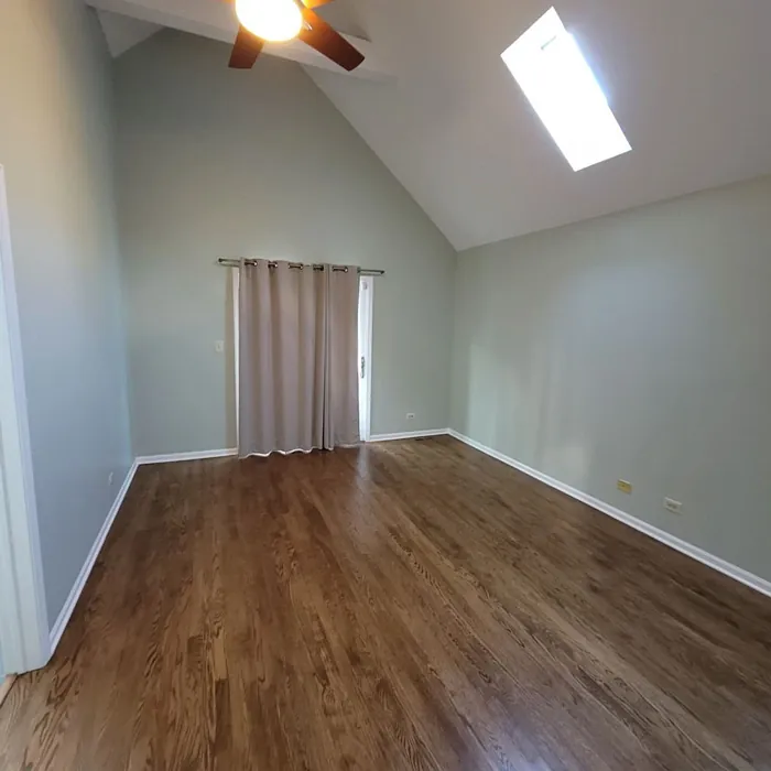
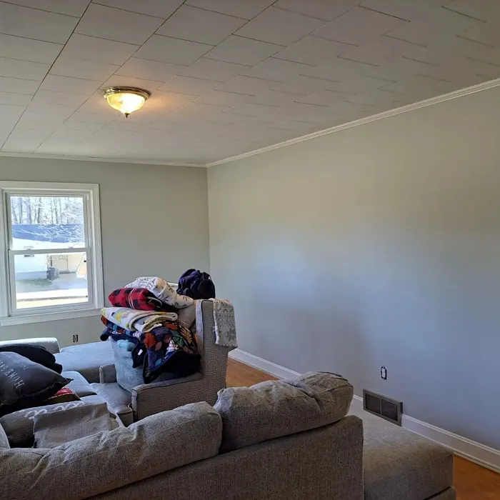
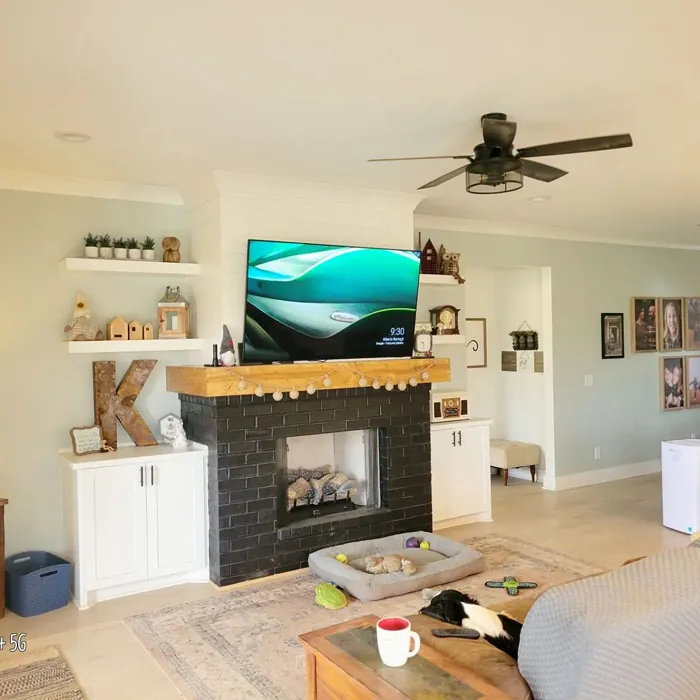
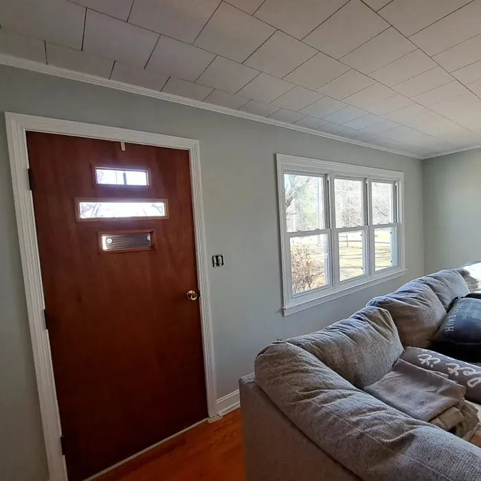
Real Room Photo of Pearl Gray SW 0052
Undertones of Pearl Gray ?
The undertones of Pearl Gray are a key aspect of its character, leaning towards Green. These subtle underlying hues are what give the color its depth and complexity. For example, a gray with a blue undertone will feel cooler and more modern, while one with a brown undertone will feel warmer and more traditional. It’s essential to test this paint in your home and observe it next to your existing furniture, flooring, and decor to see how these undertones interact and reveal themselves throughout the day.
HEX value: #CBCEC5
RGB code: 203, 206, 197
Is Pearl Gray Cool or Warm?
This color strikes a balance between warm and cool tones, making it adaptable in various lighting conditions. Depending on the surrounding colors and light, it can feel more inviting or slightly subdued, offering flexibility for different applications.
Understanding Color Properties and Interior Design Tips
Hue refers to a specific position on the color wheel, measured in degrees from 0 to 360. Each degree represents a different pure color:
- 0° represents red
- 120° represents green
- 240° represents blue
Saturation describes the intensity or purity of a color and is expressed as a percentage:
- At 0%, the color appears completely desaturated—essentially a shade of gray
- At 100%, the color is at its most vivid and vibrant
Lightness indicates how light or dark a color is, also expressed as a percentage:
- 0% lightness results in black
- 100% lightness results in white
Using Warm Colors in Interior Design
Warm hues—such as reds, oranges, yellows, warm beiges, and greiges—are excellent choices for creating inviting and energetic spaces. These colors are particularly well-suited for:
- Kitchens, living rooms, and bathrooms, where warmth enhances comfort and sociability
- Large rooms, where warm tones can help reduce the sense of emptiness and make the space feel more intimate
For example:
- Warm beige shades provide a cozy, inviting atmosphere, ideal for living rooms, bedrooms, and hallways.
- Warm greige (a mix of beige and gray) offers the warmth of beige with the modern appeal of gray, making it a versatile backdrop for dining areas, bedrooms, and living spaces.
However, be mindful when using warm light tones in rooms with limited natural light. These shades may appear muted or even take on an unpleasant yellowish tint. To avoid a dull or flat appearance:
- Add depth by incorporating richer tones like deep greens, charcoal, or chocolate brown
- Use textured elements such as curtains, rugs, or cushions to bring dimension to the space
Pro Tip: Achieving Harmony with Warm and Cool Color Balance
To create a well-balanced and visually interesting interior, mix warm and cool tones strategically. This contrast adds depth and harmony to your design.
- If your walls feature warm hues, introduce cool-colored accents such as blue or green furniture, artwork, or accessories to create contrast.
- For a polished look, consider using a complementary color scheme, which pairs colors opposite each other on the color wheel (e.g., red with green, orange with blue).
This thoughtful mix not only enhances visual appeal but also creates a space that feels both dynamic and cohesive.

Light Temperature Affects on Pearl Gray
Natural Light
Natural daylight changes in color temperature as the sun moves across the sky. At sunrise and sunset, the light tends to have a warm, golden tone with a color temperature around 2000 Kelvin (K). As the day progresses and the sun rises higher, the light becomes cooler and more neutral. Around midday, especially when the sky is clear, natural light typically reaches its peak brightness and shifts to a cooler tone, ranging from 5500 to 6500 Kelvin. This midday light is close to what we perceive as pure white or daylight-balanced light.
These shifts in natural light can significantly influence how colors appear in a space, which is why designers often consider both the time of day and the orientation of windows when planning interior color schemes.
Artificial Light
When choosing artificial lighting, pay close attention to the color temperature, measured in Kelvin (K). This determines how warm or cool the light will appear. Lower temperatures, around 2700K, give off a warm, yellow glow often used in living rooms or bedrooms. Higher temperatures, above 5000K, create a cool, bluish light similar to daylight, commonly used in kitchens, offices, or task areas.
Use the slider to see how lighting temperature can affect the appearance of a surface or color throughout a space.


4800K
LRV of Pearl Gray
The Light Reflectance Value (LRV) of Pearl Gray is 40%, which places it in the Medium category. This means it Reflects a moderate amount of light. Understanding a paint’s LRV is crucial for predicting how it will look in your space. A higher LRV indicates a lighter color that reflects more light, making rooms feel larger and brighter. A lower LRV signifies a darker color that absorbs more light, creating a cozier, more intimate atmosphere. Always consider the natural and artificial lighting in your room when selecting a paint color based on its LRV.
Detailed Review of Pearl Gray
Additional Paint Characteristics
Ideal Rooms
Bedroom, Dining Room, Home Office, Kitchen, Living Room
Decor Styles
Contemporary, Farmhouse, Industrial, Modern, Transitional
Coverage
Good (1–2 Coats), Touch-Up Friendly
Ease of Application
Beginner Friendly, Brush Smooth, Roller-Ready
Washability
Scrubbable, Washable
VOC Level
Low VOC
Best Use
Accent Wall, Furniture, Interior Walls, Trim
Room Suitability
Bedroom, Dining Room, Home Office, Kitchen, Living Room
Tone Tag
Balanced, Muted, Warm
Finish Type
Eggshell, Satin
Paint Performance
Easy Touch-Up, High Coverage, Low Odor, Quick Drying
Use Cases
Best for Modern Farmhouse, Best for Open Concept, Best for Rentals, Designer Favorite
Mood
Calm, Inviting, Sophisticated
Trim Pairing
Complements Brass Fixtures, Matches Pure White, Pairs with White Dove
Pearl Gray is a fantastic choice for anyone looking to achieve a tranquil aesthetic in their home. The color’s subtlety allows it to work well in both bright and dim lighting conditions, adapting to the mood of the space. When applied, it provides excellent coverage, typically requiring only one to two coats for a flawless finish. The soft undertones create a cozy atmosphere, making it a perfect backdrop for furniture and decor. Whether you’re painting a large open area or a small nook, Pearl Gray can bring balance and sophistication without overwhelming the senses. It’s also worth noting that this color pairs beautifully with various accent colors, allowing for creativity in styling.
Pros & Cons of SW 0052 Pearl Gray
Pros
Cons
Colors that go with Sherwin Williams Pearl Gray
FAQ on SW 0052 Pearl Gray
Can I use Pearl Gray in a small room?
Absolutely! Pearl Gray is an excellent choice for small rooms as its light-reflective quality helps to make the space feel larger and more open. The warm undertones also add a sense of coziness without making the room feel cramped. Just ensure you complement it with suitable decor to maintain a balanced look.
What colors work well with Pearl Gray?
Pearl Gray pairs beautifully with a range of colors. For a fresh look, consider using crisp whites like Simply White or warm tones like soft yellows. For a bolder contrast, deep blues or rich greens can add depth and interest. The versatility of Pearl Gray allows it to work harmoniously with almost any color palette.
Comparisons Pearl Gray with other colors
Pearl Gray SW 0052 vs Agreeable Gray SW 7029
| Attribute | Pearl Gray SW 0052 | Agreeable Gray SW 7029 |
|---|---|---|
| Color Name | Pearl Gray SW 0052 | Agreeable Gray SW 7029 |
| Color | ||
| Hue | Grey | Grey |
| Brightness | Light | Light |
| RGB | 203, 206, 197 | 209, 203, 193 |
| LRV | 40% | 60% |
| Finish Type | Eggshell, Satin | Eggshell, Matte, Satin |
| Finish Options | Eggshell, Satin | Eggshell, Flat, Matte, Satin |
| Ideal Rooms | Bedroom, Dining Room, Home Office, Kitchen, Living Room | Bathroom, Bedroom, Dining Room, Home Office, Kitchen, Living Room |
| Decor Styles | Contemporary, Farmhouse, Industrial, Modern, Transitional | Contemporary, Farmhouse, Minimalist, Modern, Transitional |
| Coverage | Good (1–2 Coats), Touch-Up Friendly | Good (1–2 Coats), Touch-Up Friendly |
| Ease of Application | Beginner Friendly, Brush Smooth, Roller-Ready | Beginner Friendly, Brush Smooth, Roller-Ready |
| Washability | Scrubbable, Washable | Washable, Wipeable |
| Room Suitability | Bedroom, Dining Room, Home Office, Kitchen, Living Room | Bathroom, Bedroom, Dining Room, Kitchen, Living Room |
| Tone | Balanced, Muted, Warm | Muted, Neutral, Warm |
| Paint Performance | Easy Touch-Up, High Coverage, Low Odor, Quick Drying | Easy Touch-Up, Fade Resistant, Low Odor |
Pearl Gray SW 0052 vs Eider White SW 7014
| Attribute | Pearl Gray SW 0052 | Eider White SW 7014 |
|---|---|---|
| Color Name | Pearl Gray SW 0052 | Eider White SW 7014 |
| Color | ||
| Hue | Grey | Grey |
| Brightness | Light | Light |
| RGB | 203, 206, 197 | 226, 222, 216 |
| LRV | 40% | 73% |
| Finish Type | Eggshell, Satin | Eggshell, Matte, Satin |
| Finish Options | Eggshell, Satin | Eggshell, Matte, Satin |
| Ideal Rooms | Bedroom, Dining Room, Home Office, Kitchen, Living Room | Bathroom, Bedroom, Dining Room, Home Office, Kitchen, Living Room |
| Decor Styles | Contemporary, Farmhouse, Industrial, Modern, Transitional | Farmhouse, Minimalist, Modern, Scandinavian, Transitional |
| Coverage | Good (1–2 Coats), Touch-Up Friendly | Good (1–2 Coats), Touch-Up Friendly |
| Ease of Application | Beginner Friendly, Brush Smooth, Roller-Ready | Beginner Friendly, Brush Smooth, Roller-Ready |
| Washability | Scrubbable, Washable | Highly Washable, Washable |
| Room Suitability | Bedroom, Dining Room, Home Office, Kitchen, Living Room | Bathroom, Bedroom, Dining Room, Kitchen, Living Room |
| Tone | Balanced, Muted, Warm | Creamy, Muted, Neutral, Warm |
| Paint Performance | Easy Touch-Up, High Coverage, Low Odor, Quick Drying | Easy Touch-Up, High Coverage, Low Odor, Scuff Resistant |
Pearl Gray SW 0052 vs Drift of Mist SW 9166
| Attribute | Pearl Gray SW 0052 | Drift of Mist SW 9166 |
|---|---|---|
| Color Name | Pearl Gray SW 0052 | Drift of Mist SW 9166 |
| Color | ||
| Hue | Grey | Grey |
| Brightness | Light | Light |
| RGB | 203, 206, 197 | 220, 216, 208 |
| LRV | 40% | 65% |
| Finish Type | Eggshell, Satin | Eggshell, Matte, Satin |
| Finish Options | Eggshell, Satin | Eggshell, Matte, Satin |
| Ideal Rooms | Bedroom, Dining Room, Home Office, Kitchen, Living Room | Bathroom, Bedroom, Home Office, Kitchen, Living Room |
| Decor Styles | Contemporary, Farmhouse, Industrial, Modern, Transitional | Coastal, Minimalist, Modern, Scandinavian |
| Coverage | Good (1–2 Coats), Touch-Up Friendly | Good (1–2 Coats), Touch-Up Friendly |
| Ease of Application | Beginner Friendly, Brush Smooth, Roller-Ready | Beginner Friendly, Brush Smooth, Fast-Drying, Roller-Ready |
| Washability | Scrubbable, Washable | Washable, Wipeable |
| Room Suitability | Bedroom, Dining Room, Home Office, Kitchen, Living Room | Bathroom, Bedroom, Home Office, Living Room |
| Tone | Balanced, Muted, Warm | Airy, Cool, Neutral |
| Paint Performance | Easy Touch-Up, High Coverage, Low Odor, Quick Drying | Easy Touch-Up, Low Odor, Quick Drying, Scuff Resistant |
Pearl Gray SW 0052 vs Sanctuary SW 9583
| Attribute | Pearl Gray SW 0052 | Sanctuary SW 9583 |
|---|---|---|
| Color Name | Pearl Gray SW 0052 | Sanctuary SW 9583 |
| Color | ||
| Hue | Grey | Grey |
| Brightness | Light | Light |
| RGB | 203, 206, 197 | 230, 226, 217 |
| LRV | 40% | 24% |
| Finish Type | Eggshell, Satin | Eggshell, Matte, Satin |
| Finish Options | Eggshell, Satin | Eggshell, Matte, Satin |
| Ideal Rooms | Bedroom, Dining Room, Home Office, Kitchen, Living Room | Bedroom, Dining Room, Home Office, Living Room, Nursery |
| Decor Styles | Contemporary, Farmhouse, Industrial, Modern, Transitional | Bohemian, Coastal, Modern Farmhouse, Scandinavian |
| Coverage | Good (1–2 Coats), Touch-Up Friendly | Good (1–2 Coats), Touch-Up Friendly |
| Ease of Application | Beginner Friendly, Brush Smooth, Roller-Ready | Beginner Friendly, Brush Smooth, Fast-Drying, Roller-Ready |
| Washability | Scrubbable, Washable | Highly Washable, Washable, Wipeable |
| Room Suitability | Bedroom, Dining Room, Home Office, Kitchen, Living Room | Bedroom, Home Office, Living Room, Nursery |
| Tone | Balanced, Muted, Warm | Earthy, Neutral, Soft, Warm |
| Paint Performance | Easy Touch-Up, High Coverage, Low Odor, Quick Drying | Easy Touch-Up, Low Odor, Quick Drying, Scuff Resistant |
Pearl Gray SW 0052 vs Snowbound SW 7004
| Attribute | Pearl Gray SW 0052 | Snowbound SW 7004 |
|---|---|---|
| Color Name | Pearl Gray SW 0052 | Snowbound SW 7004 |
| Color | ||
| Hue | Grey | Grey |
| Brightness | Light | Light |
| RGB | 203, 206, 197 | 237, 234, 229 |
| LRV | 40% | 83% |
| Finish Type | Eggshell, Satin | Eggshell, Matte, Satin |
| Finish Options | Eggshell, Satin | Eggshell, Matte, Satin |
| Ideal Rooms | Bedroom, Dining Room, Home Office, Kitchen, Living Room | Bathroom, Bedroom, Dining Room, Hallway, Home Office, Kitchen, Living Room, Nursery |
| Decor Styles | Contemporary, Farmhouse, Industrial, Modern, Transitional | Farmhouse, Minimalist, Modern, Scandinavian, Transitional |
| Coverage | Good (1–2 Coats), Touch-Up Friendly | Good (1–2 Coats), Touch-Up Friendly |
| Ease of Application | Beginner Friendly, Brush Smooth, Roller-Ready | Beginner Friendly, Brush Smooth, Fast-Drying, Roller-Ready |
| Washability | Scrubbable, Washable | Washable, Wipeable |
| Room Suitability | Bedroom, Dining Room, Home Office, Kitchen, Living Room | Bathroom, Bedroom, Dining Room, Hallway, Home Office, Kitchen, Living Room |
| Tone | Balanced, Muted, Warm | Airy, Crisp, Neutral, Warm |
| Paint Performance | Easy Touch-Up, High Coverage, Low Odor, Quick Drying | High Coverage, Low Odor, Quick Drying |
Pearl Gray SW 0052 vs Pure White SW 7005
| Attribute | Pearl Gray SW 0052 | Pure White SW 7005 |
|---|---|---|
| Color Name | Pearl Gray SW 0052 | Pure White SW 7005 |
| Color | ||
| Hue | Grey | Grey |
| Brightness | Light | Light |
| RGB | 203, 206, 197 | 237, 236, 230 |
| LRV | 40% | 84% |
| Finish Type | Eggshell, Satin | Eggshell, Satin, Semi-Gloss |
| Finish Options | Eggshell, Satin | Eggshell, Flat, Matte, Satin, Semi-Gloss |
| Ideal Rooms | Bedroom, Dining Room, Home Office, Kitchen, Living Room | Bathroom, Bedroom, Dining Room, Entryway, Hallway, Home Office, Kitchen, Living Room, Nursery |
| Decor Styles | Contemporary, Farmhouse, Industrial, Modern, Transitional | Bohemian, Eclectic, Farmhouse, Minimalist, Modern, Traditional |
| Coverage | Good (1–2 Coats), Touch-Up Friendly | Good (1–2 Coats), Touch-Up Friendly |
| Ease of Application | Beginner Friendly, Brush Smooth, Roller-Ready | Beginner Friendly, Brush Smooth, Fast-Drying, Roller-Ready |
| Washability | Scrubbable, Washable | Highly Washable, Washable |
| Room Suitability | Bedroom, Dining Room, Home Office, Kitchen, Living Room | Bathroom, Bedroom, Dining Room, Entryway, Hallway, Home Office, Kitchen, Living Room, Nursery |
| Tone | Balanced, Muted, Warm | Crisp, Neutral, Warm |
| Paint Performance | Easy Touch-Up, High Coverage, Low Odor, Quick Drying | Easy Touch-Up, High Coverage, Low Odor, Quick Drying |
Pearl Gray SW 0052 vs Crushed Ice SW 7647
| Attribute | Pearl Gray SW 0052 | Crushed Ice SW 7647 |
|---|---|---|
| Color Name | Pearl Gray SW 0052 | Crushed Ice SW 7647 |
| Color | ||
| Hue | Grey | Grey |
| Brightness | Light | Light |
| RGB | 203, 206, 197 | 214, 211, 204 |
| LRV | 40% | 66% |
| Finish Type | Eggshell, Satin | Eggshell, Matte, Satin |
| Finish Options | Eggshell, Satin | Eggshell, Matte, Satin |
| Ideal Rooms | Bedroom, Dining Room, Home Office, Kitchen, Living Room | Bathroom, Bedroom, Dining Room, Home Office, Living Room |
| Decor Styles | Contemporary, Farmhouse, Industrial, Modern, Transitional | Farmhouse, Minimalist, Modern, Scandinavian, Transitional |
| Coverage | Good (1–2 Coats), Touch-Up Friendly | Good (1–2 Coats), Touch-Up Friendly |
| Ease of Application | Beginner Friendly, Brush Smooth, Roller-Ready | Beginner Friendly, Brush Smooth, Roller-Ready |
| Washability | Scrubbable, Washable | Stain Resistant, Washable |
| Room Suitability | Bedroom, Dining Room, Home Office, Kitchen, Living Room | Bathroom, Bedroom, Dining Room, Hallway, Home Office, Living Room |
| Tone | Balanced, Muted, Warm | Muted, Neutral, Warm |
| Paint Performance | Easy Touch-Up, High Coverage, Low Odor, Quick Drying | High Coverage, Low Odor, Quick Drying |
Pearl Gray SW 0052 vs Origami White SW 7636
| Attribute | Pearl Gray SW 0052 | Origami White SW 7636 |
|---|---|---|
| Color Name | Pearl Gray SW 0052 | Origami White SW 7636 |
| Color | ||
| Hue | Grey | Grey |
| Brightness | Light | Light |
| RGB | 203, 206, 197 | 229, 226, 218 |
| LRV | 40% | 83% |
| Finish Type | Eggshell, Satin | Eggshell, Matte |
| Finish Options | Eggshell, Satin | Eggshell, Matte, Satin |
| Ideal Rooms | Bedroom, Dining Room, Home Office, Kitchen, Living Room | Bedroom, Dining Room, Entryway, Hallway, Home Office, Kitchen, Living Room |
| Decor Styles | Contemporary, Farmhouse, Industrial, Modern, Transitional | Minimalist, Modern, Scandinavian, Traditional, Transitional |
| Coverage | Good (1–2 Coats), Touch-Up Friendly | Good (1–2 Coats), Touch-Up Friendly |
| Ease of Application | Beginner Friendly, Brush Smooth, Roller-Ready | Beginner Friendly, Brush Smooth, Roller-Ready |
| Washability | Scrubbable, Washable | Washable, Wipeable |
| Room Suitability | Bedroom, Dining Room, Home Office, Kitchen, Living Room | Bedroom, Dining Room, Home Office, Kitchen, Living Room |
| Tone | Balanced, Muted, Warm | Airy, Neutral, Warm |
| Paint Performance | Easy Touch-Up, High Coverage, Low Odor, Quick Drying | Easy Touch-Up, Low Odor, Quick Drying |
Pearl Gray SW 0052 vs Spare White SW 6203
| Attribute | Pearl Gray SW 0052 | Spare White SW 6203 |
|---|---|---|
| Color Name | Pearl Gray SW 0052 | Spare White SW 6203 |
| Color | ||
| Hue | Grey | Grey |
| Brightness | Light | Light |
| RGB | 203, 206, 197 | 228, 228, 221 |
| LRV | 40% | 75% |
| Finish Type | Eggshell, Satin | Eggshell, Matte |
| Finish Options | Eggshell, Satin | Eggshell, Matte, Satin |
| Ideal Rooms | Bedroom, Dining Room, Home Office, Kitchen, Living Room | Bedroom, Dining Room, Home Office, Kitchen, Living Room, Nursery |
| Decor Styles | Contemporary, Farmhouse, Industrial, Modern, Transitional | Farmhouse, Minimalist, Modern, Scandinavian, Transitional |
| Coverage | Good (1–2 Coats), Touch-Up Friendly | Good (1–2 Coats), Primer Recommended, Touch-Up Friendly |
| Ease of Application | Beginner Friendly, Brush Smooth, Roller-Ready | Beginner Friendly, Brush Smooth, Fast-Drying, Roller-Ready |
| Washability | Scrubbable, Washable | Washable, Wipeable |
| Room Suitability | Bedroom, Dining Room, Home Office, Kitchen, Living Room | Bedroom, Dining Room, Home Office, Kitchen, Living Room |
| Tone | Balanced, Muted, Warm | Creamy, Neutral, Warm |
| Paint Performance | Easy Touch-Up, High Coverage, Low Odor, Quick Drying | Easy Touch-Up, Low Odor, Quick Drying |
Pearl Gray SW 0052 vs Mountain Air SW 6224
| Attribute | Pearl Gray SW 0052 | Mountain Air SW 6224 |
|---|---|---|
| Color Name | Pearl Gray SW 0052 | Mountain Air SW 6224 |
| Color | ||
| Hue | Grey | Grey |
| Brightness | Light | Light |
| RGB | 203, 206, 197 | 216, 224, 223 |
| LRV | 40% | 66% |
| Finish Type | Eggshell, Satin | Eggshell, Satin |
| Finish Options | Eggshell, Satin | Eggshell, Matte, Satin |
| Ideal Rooms | Bedroom, Dining Room, Home Office, Kitchen, Living Room | Bedroom, Hallway, Home Office, Living Room, Nursery |
| Decor Styles | Contemporary, Farmhouse, Industrial, Modern, Transitional | Coastal, Minimalist, Modern, Scandinavian |
| Coverage | Good (1–2 Coats), Touch-Up Friendly | Good (1–2 Coats), Touch-Up Friendly |
| Ease of Application | Beginner Friendly, Brush Smooth, Roller-Ready | Beginner Friendly, Brush Smooth, Fast-Drying, Roller-Ready |
| Washability | Scrubbable, Washable | Highly Washable, Washable |
| Room Suitability | Bedroom, Dining Room, Home Office, Kitchen, Living Room | Bedroom, Home Office, Living Room, Nursery |
| Tone | Balanced, Muted, Warm | Airy, Cool, Muted |
| Paint Performance | Easy Touch-Up, High Coverage, Low Odor, Quick Drying | Easy Touch-Up, Low Odor, Quick Drying, Scuff Resistant |
Official Page of Sherwin Williams Pearl Gray SW 0052