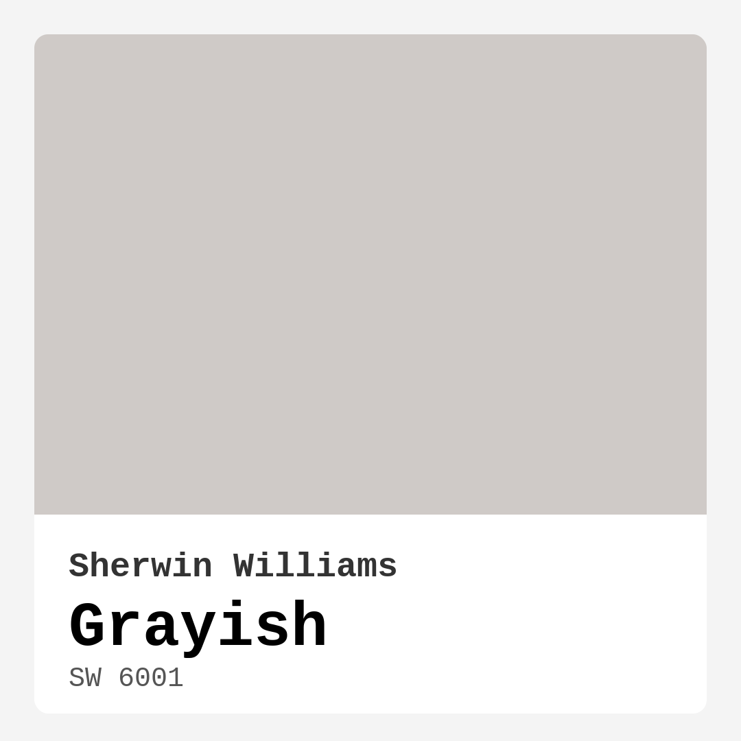
Color Preview & Key Details
| HEX Code | #CFCAC7 |
| RGB | 207, 202, 199 |
| LRV | 30% |
| Undertone | Red |
| Finish Options | Eggshell, Matte, Satin |
Imagine stepping into your living room, where the walls are painted a color that feels like a warm embrace. The light dances off the surfaces, creating a serene atmosphere that invites you to relax and unwind. That’s the magic of Grayish by Sherwin Williams. This sophisticated blend of gray with subtle beige undertones is more than just a shade; it’s a versatile backdrop that can transform any space into a calming sanctuary.
Choosing the right paint color for your home can feel overwhelming, but let me assure you, Grayish is a fantastic choice. Its unique balance between warm and cool tones makes it adaptable for various decor styles, from contemporary to traditional. Whether you’re revamping your living room, bedroom, or a cozy home office, this color has the ability to breathe life into your interiors.
One of the standout features of Grayish is its understated elegance. It’s not too bold, yet it offers a distinct personality that can elevate your space. With an LRV (Light Reflectance Value) of 30%, it sits comfortably in the medium dark category. This means it won’t flood your room with brightness, but rather, it absorbs just enough light to create a cozy, intimate environment. When combined with appropriate lighting, you’ll find that Grayish reflects a soft, luminous quality, especially in natural light, making your spaces feel airy and open.
Now, let’s talk about the important aspect of undertones. Grayish leans towards a red hue, which adds depth and warmth to the color. This subtle undertone is crucial when considering how Grayish will interact with the rest of your decor. It’s always a good idea to test the paint in your home before committing. Observe how it looks next to your furniture or flooring throughout the day, as these undertones can shift slightly with different lighting conditions.
When it comes to application, you’ll find Grayish to be a beginner-friendly option. It’s roller-ready and brush smooth, making it easy to apply, whether you’re a seasoned DIYer or a first-timer. Plus, it dries quickly and boasts a washable, scrubbable finish, meaning it can withstand the rigors of daily life without losing its charm. With good coverage in just one to two coats, touch-ups are a breeze, ensuring your walls maintain their pristine appearance.
Grayish’s versatility shines through its compatibility with a variety of decor styles. If you’re leaning towards a modern look, consider pairing it with sleek metal accents and crisp whites like Simply White. For a cozier, more traditional ambiance, warm wood tones can enhance the inviting feel of this color. It’s equally at home in Scandinavian and minimalist designs, where its muted tone complements clean lines and simplicity.
If you’re feeling adventurous, don’t hesitate to create contrast by teaming Grayish with deep blues or rich greens. These colors can create a stunning dynamic, allowing Grayish to shine as a sophisticated backdrop while adding depth to your space. And if you’re considering Grayish for a smaller room, you’re making a smart choice. Its soft tones can make a space feel larger and more open, especially when paired with good lighting.
In terms of room suitability, Grayish works wonders in various settings. Picture it in your living room, providing a soothing backdrop for family gatherings. Or imagine it in your bedroom, creating a tranquil retreat where you can escape the hustle of everyday life. It’s also ideal for home offices, where focus and calmness are essential for productivity. The dining room and hallways are equally suited for Grayish, providing a warm welcome to guests.
Let’s not overlook the performance of this paint. With low VOC content, Grayish is an eco-friendly option that doesn’t sacrifice quality for sustainability. It’s low odor, quick-drying, and scuff-resistant, making it perfect for family homes or busy spaces. No one wants to wait ages for their freshly painted room to dry, and with Grayish, you can dive back into your life sooner rather than later.
When considering trim and complementary shades, Grayish pairs beautifully with White Dove, creating a classic and clean look. If you’re integrating brass fixtures, Grayish enhances their warmth, creating an appealing contrast that feels curated and thoughtful. For a layered approach, consider complementing Grayish with deeper shades like SW 9137 or SW 9633. These can add richness and dimension to your decor, allowing for creative expression.
In review, Grayish is more than just a paint color; it’s an opportunity to create a personalized and beautiful interior. Its calming atmosphere, adaptability, and ease of application make it a favorite among designers and homeowners alike. Whether you’re looking to refresh a single accent wall or transform an entire room, Grayish offers a timeless and sophisticated solution.
So, as you embark on your next home project, remember the power of color. Grayish stands ready to enhance your space, inviting you to create an environment that feels both comforting and stylish. With its unique combination of warmth, versatility, and ease of use, it just might be the perfect choice for your home. Don’t forget to test it out, observe how it interacts with your unique lighting and furnishings, and watch as your space transforms into the serene retreat you’ve always desired.
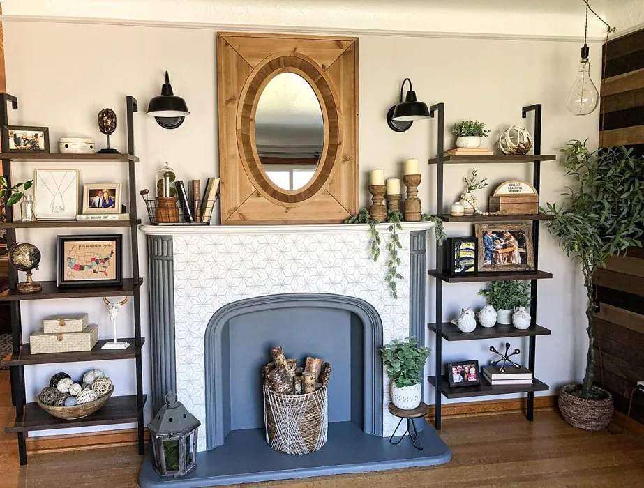
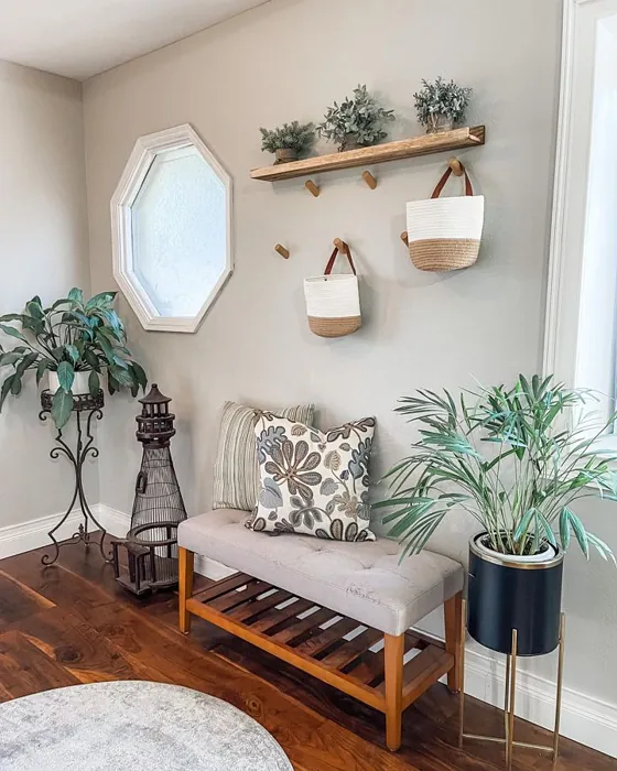
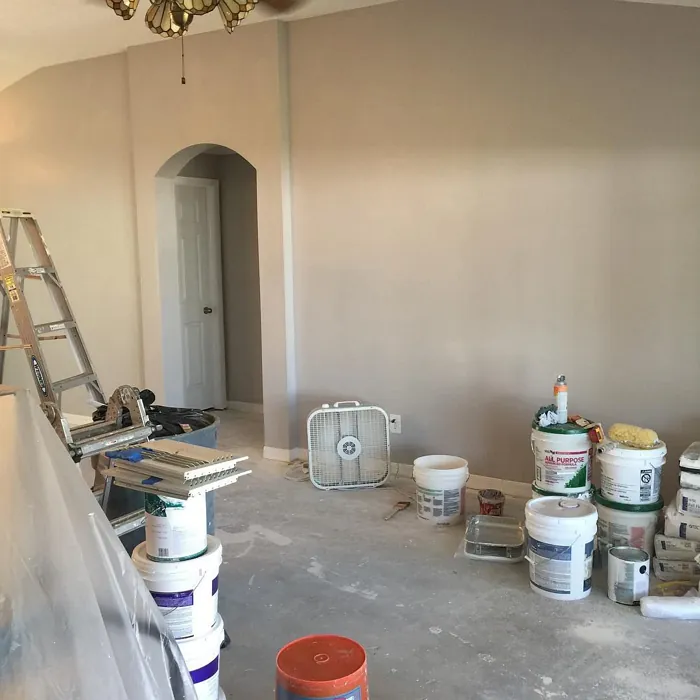
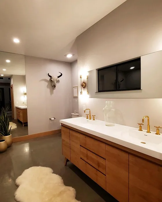
Real Room Photo of Grayish SW 6001
Undertones of Grayish ?
The undertones of Grayish are a key aspect of its character, leaning towards Red. These subtle underlying hues are what give the color its depth and complexity. For example, a gray with a blue undertone will feel cooler and more modern, while one with a brown undertone will feel warmer and more traditional. It’s essential to test this paint in your home and observe it next to your existing furniture, flooring, and decor to see how these undertones interact and reveal themselves throughout the day.
HEX value: #CFCAC7
RGB code: 207, 202, 199
Is Grayish Cool or Warm?
Grayish leans towards a balanced tone, but with its warm undertones, it can often feel more inviting than starkly cool. This makes it suitable for creating a cozy atmosphere in both modern and traditional settings.
Understanding Color Properties and Interior Design Tips
Hue refers to a specific position on the color wheel, measured in degrees from 0 to 360. Each degree represents a different pure color:
- 0° represents red
- 120° represents green
- 240° represents blue
Saturation describes the intensity or purity of a color and is expressed as a percentage:
- At 0%, the color appears completely desaturated—essentially a shade of gray
- At 100%, the color is at its most vivid and vibrant
Lightness indicates how light or dark a color is, also expressed as a percentage:
- 0% lightness results in black
- 100% lightness results in white
Using Warm Colors in Interior Design
Warm hues—such as reds, oranges, yellows, warm beiges, and greiges—are excellent choices for creating inviting and energetic spaces. These colors are particularly well-suited for:
- Kitchens, living rooms, and bathrooms, where warmth enhances comfort and sociability
- Large rooms, where warm tones can help reduce the sense of emptiness and make the space feel more intimate
For example:
- Warm beige shades provide a cozy, inviting atmosphere, ideal for living rooms, bedrooms, and hallways.
- Warm greige (a mix of beige and gray) offers the warmth of beige with the modern appeal of gray, making it a versatile backdrop for dining areas, bedrooms, and living spaces.
However, be mindful when using warm light tones in rooms with limited natural light. These shades may appear muted or even take on an unpleasant yellowish tint. To avoid a dull or flat appearance:
- Add depth by incorporating richer tones like deep greens, charcoal, or chocolate brown
- Use textured elements such as curtains, rugs, or cushions to bring dimension to the space
Pro Tip: Achieving Harmony with Warm and Cool Color Balance
To create a well-balanced and visually interesting interior, mix warm and cool tones strategically. This contrast adds depth and harmony to your design.
- If your walls feature warm hues, introduce cool-colored accents such as blue or green furniture, artwork, or accessories to create contrast.
- For a polished look, consider using a complementary color scheme, which pairs colors opposite each other on the color wheel (e.g., red with green, orange with blue).
This thoughtful mix not only enhances visual appeal but also creates a space that feels both dynamic and cohesive.
Light Temperature Affects on Grayish
Natural Light
Natural daylight changes in color temperature as the sun moves across the sky. At sunrise and sunset, the light tends to have a warm, golden tone with a color temperature around 2000 Kelvin (K). As the day progresses and the sun rises higher, the light becomes cooler and more neutral. Around midday, especially when the sky is clear, natural light typically reaches its peak brightness and shifts to a cooler tone, ranging from 5500 to 6500 Kelvin. This midday light is close to what we perceive as pure white or daylight-balanced light.
These shifts in natural light can significantly influence how colors appear in a space, which is why designers often consider both the time of day and the orientation of windows when planning interior color schemes.
Artificial Light
When choosing artificial lighting, pay close attention to the color temperature, measured in Kelvin (K). This determines how warm or cool the light will appear. Lower temperatures, around 2700K, give off a warm, yellow glow often used in living rooms or bedrooms. Higher temperatures, above 5000K, create a cool, bluish light similar to daylight, commonly used in kitchens, offices, or task areas.
Use the slider to see how lighting temperature can affect the appearance of a surface or color throughout a space.


4800K
LRV of Grayish
The Light Reflectance Value (LRV) of Grayish is 30%, which places it in the Medium Dark category. This means it reflects very little light. Understanding a paint’s LRV is crucial for predicting how it will look in your space. A higher LRV indicates a lighter color that reflects more light, making rooms feel larger and brighter. A lower LRV signifies a darker color that absorbs more light, creating a cozier, more intimate atmosphere. Always consider the natural and artificial lighting in your room when selecting a paint color based on its LRV.
Detailed Review of Grayish
Additional Paint Characteristics
Ideal Rooms
Bedroom, Dining Room, Hallway, Home Office, Living Room
Decor Styles
Industrial, Minimalist, Modern, Scandinavian, Transitional
Coverage
Good (1–2 Coats), Touch-Up Friendly
Ease of Application
Beginner Friendly, Brush Smooth, Fast-Drying, Roller-Ready
Washability
Scrubbable, Washable
VOC Level
Eco-Certified, Low VOC
Best Use
Accent Wall, Ceiling, Interior Walls, Trim
Room Suitability
Bedroom, Dining Room, Hallway, Home Office, Living Room
Tone Tag
Muted, Neutral, Warm
Finish Type
Eggshell, Satin
Paint Performance
Fade Resistant, Low Odor, Quick Drying, Scuff Resistant
Use Cases
Best for Low Light Rooms, Best for Open Concept, Best for Rentals, Designer Favorite
Mood
Calm, Grounding, Inviting
Trim Pairing
Complements Brass Fixtures, Good with Wood Trim, Pairs with White Dove
Grayish offers a unique, tranquil atmosphere that feels both fresh and timeless. Its understated elegance makes it a great choice for various applications, from accent walls to entire rooms. The color’s adaptability means it pairs well with warm wood tones or cool metal accents, allowing for creative design flexibility. When applied, Grayish reflects light beautifully, enhancing the overall brightness of your space. It’s particularly effective in areas where you want to create a serene environment, such as bedrooms or home offices. The application process is smooth, providing a consistently beautiful finish that homeowners will appreciate. Whether used in a small nook or an expansive room, Grayish is sure to impress.
Pros & Cons of SW 6001 Grayish
Pros
Cons
Colors that go with Sherwin Williams Grayish
FAQ on SW 6001 Grayish
Can Grayish be used in small spaces?
Absolutely! Grayish is a great choice for small spaces as its soft tones can make a room feel larger and more open. Its light reflectance helps bounce light around, creating an airy feel. Just be sure to complement it with adequate lighting to enhance its beautiful undertones.
What colors pair well with Grayish?
Grayish pairs beautifully with a variety of colors. For a fresh look, consider whites like Simply White or warm woods for a cozy feel. For a bolder contrast, deep blues or greens can create a stunning dynamic. The versatility of Grayish allows it to harmonize with both neutral and vibrant palettes.
Comparisons Grayish with other colors
Grayish SW 6001 vs Agreeable Gray SW 7029
| Attribute | Grayish SW 6001 | Agreeable Gray SW 7029 |
|---|---|---|
| Color Name | Grayish SW 6001 | Agreeable Gray SW 7029 |
| Color | ||
| Hue | Grey | Grey |
| Brightness | Light | Light |
| RGB | 207, 202, 199 | 209, 203, 193 |
| LRV | 30% | 60% |
| Finish Type | Eggshell, Satin | Eggshell, Matte, Satin |
| Finish Options | Eggshell, Matte, Satin | Eggshell, Flat, Matte, Satin |
| Ideal Rooms | Bedroom, Dining Room, Hallway, Home Office, Living Room | Bathroom, Bedroom, Dining Room, Home Office, Kitchen, Living Room |
| Decor Styles | Industrial, Minimalist, Modern, Scandinavian, Transitional | Contemporary, Farmhouse, Minimalist, Modern, Transitional |
| Coverage | Good (1–2 Coats), Touch-Up Friendly | Good (1–2 Coats), Touch-Up Friendly |
| Ease of Application | Beginner Friendly, Brush Smooth, Fast-Drying, Roller-Ready | Beginner Friendly, Brush Smooth, Roller-Ready |
| Washability | Scrubbable, Washable | Washable, Wipeable |
| Room Suitability | Bedroom, Dining Room, Hallway, Home Office, Living Room | Bathroom, Bedroom, Dining Room, Kitchen, Living Room |
| Tone | Muted, Neutral, Warm | Muted, Neutral, Warm |
| Paint Performance | Fade Resistant, Low Odor, Quick Drying, Scuff Resistant | Easy Touch-Up, Fade Resistant, Low Odor |
Grayish SW 6001 vs Eider White SW 7014
| Attribute | Grayish SW 6001 | Eider White SW 7014 |
|---|---|---|
| Color Name | Grayish SW 6001 | Eider White SW 7014 |
| Color | ||
| Hue | Grey | Grey |
| Brightness | Light | Light |
| RGB | 207, 202, 199 | 226, 222, 216 |
| LRV | 30% | 73% |
| Finish Type | Eggshell, Satin | Eggshell, Matte, Satin |
| Finish Options | Eggshell, Matte, Satin | Eggshell, Matte, Satin |
| Ideal Rooms | Bedroom, Dining Room, Hallway, Home Office, Living Room | Bathroom, Bedroom, Dining Room, Home Office, Kitchen, Living Room |
| Decor Styles | Industrial, Minimalist, Modern, Scandinavian, Transitional | Farmhouse, Minimalist, Modern, Scandinavian, Transitional |
| Coverage | Good (1–2 Coats), Touch-Up Friendly | Good (1–2 Coats), Touch-Up Friendly |
| Ease of Application | Beginner Friendly, Brush Smooth, Fast-Drying, Roller-Ready | Beginner Friendly, Brush Smooth, Roller-Ready |
| Washability | Scrubbable, Washable | Highly Washable, Washable |
| Room Suitability | Bedroom, Dining Room, Hallway, Home Office, Living Room | Bathroom, Bedroom, Dining Room, Kitchen, Living Room |
| Tone | Muted, Neutral, Warm | Creamy, Muted, Neutral, Warm |
| Paint Performance | Fade Resistant, Low Odor, Quick Drying, Scuff Resistant | Easy Touch-Up, High Coverage, Low Odor, Scuff Resistant |
Grayish SW 6001 vs Drift of Mist SW 9166
| Attribute | Grayish SW 6001 | Drift of Mist SW 9166 |
|---|---|---|
| Color Name | Grayish SW 6001 | Drift of Mist SW 9166 |
| Color | ||
| Hue | Grey | Grey |
| Brightness | Light | Light |
| RGB | 207, 202, 199 | 220, 216, 208 |
| LRV | 30% | 65% |
| Finish Type | Eggshell, Satin | Eggshell, Matte, Satin |
| Finish Options | Eggshell, Matte, Satin | Eggshell, Matte, Satin |
| Ideal Rooms | Bedroom, Dining Room, Hallway, Home Office, Living Room | Bathroom, Bedroom, Home Office, Kitchen, Living Room |
| Decor Styles | Industrial, Minimalist, Modern, Scandinavian, Transitional | Coastal, Minimalist, Modern, Scandinavian |
| Coverage | Good (1–2 Coats), Touch-Up Friendly | Good (1–2 Coats), Touch-Up Friendly |
| Ease of Application | Beginner Friendly, Brush Smooth, Fast-Drying, Roller-Ready | Beginner Friendly, Brush Smooth, Fast-Drying, Roller-Ready |
| Washability | Scrubbable, Washable | Washable, Wipeable |
| Room Suitability | Bedroom, Dining Room, Hallway, Home Office, Living Room | Bathroom, Bedroom, Home Office, Living Room |
| Tone | Muted, Neutral, Warm | Airy, Cool, Neutral |
| Paint Performance | Fade Resistant, Low Odor, Quick Drying, Scuff Resistant | Easy Touch-Up, Low Odor, Quick Drying, Scuff Resistant |
Grayish SW 6001 vs Sanctuary SW 9583
| Attribute | Grayish SW 6001 | Sanctuary SW 9583 |
|---|---|---|
| Color Name | Grayish SW 6001 | Sanctuary SW 9583 |
| Color | ||
| Hue | Grey | Grey |
| Brightness | Light | Light |
| RGB | 207, 202, 199 | 230, 226, 217 |
| LRV | 30% | 24% |
| Finish Type | Eggshell, Satin | Eggshell, Matte, Satin |
| Finish Options | Eggshell, Matte, Satin | Eggshell, Matte, Satin |
| Ideal Rooms | Bedroom, Dining Room, Hallway, Home Office, Living Room | Bedroom, Dining Room, Home Office, Living Room, Nursery |
| Decor Styles | Industrial, Minimalist, Modern, Scandinavian, Transitional | Bohemian, Coastal, Modern Farmhouse, Scandinavian |
| Coverage | Good (1–2 Coats), Touch-Up Friendly | Good (1–2 Coats), Touch-Up Friendly |
| Ease of Application | Beginner Friendly, Brush Smooth, Fast-Drying, Roller-Ready | Beginner Friendly, Brush Smooth, Fast-Drying, Roller-Ready |
| Washability | Scrubbable, Washable | Highly Washable, Washable, Wipeable |
| Room Suitability | Bedroom, Dining Room, Hallway, Home Office, Living Room | Bedroom, Home Office, Living Room, Nursery |
| Tone | Muted, Neutral, Warm | Earthy, Neutral, Soft, Warm |
| Paint Performance | Fade Resistant, Low Odor, Quick Drying, Scuff Resistant | Easy Touch-Up, Low Odor, Quick Drying, Scuff Resistant |
Grayish SW 6001 vs Snowbound SW 7004
| Attribute | Grayish SW 6001 | Snowbound SW 7004 |
|---|---|---|
| Color Name | Grayish SW 6001 | Snowbound SW 7004 |
| Color | ||
| Hue | Grey | Grey |
| Brightness | Light | Light |
| RGB | 207, 202, 199 | 237, 234, 229 |
| LRV | 30% | 83% |
| Finish Type | Eggshell, Satin | Eggshell, Matte, Satin |
| Finish Options | Eggshell, Matte, Satin | Eggshell, Matte, Satin |
| Ideal Rooms | Bedroom, Dining Room, Hallway, Home Office, Living Room | Bathroom, Bedroom, Dining Room, Hallway, Home Office, Kitchen, Living Room, Nursery |
| Decor Styles | Industrial, Minimalist, Modern, Scandinavian, Transitional | Farmhouse, Minimalist, Modern, Scandinavian, Transitional |
| Coverage | Good (1–2 Coats), Touch-Up Friendly | Good (1–2 Coats), Touch-Up Friendly |
| Ease of Application | Beginner Friendly, Brush Smooth, Fast-Drying, Roller-Ready | Beginner Friendly, Brush Smooth, Fast-Drying, Roller-Ready |
| Washability | Scrubbable, Washable | Washable, Wipeable |
| Room Suitability | Bedroom, Dining Room, Hallway, Home Office, Living Room | Bathroom, Bedroom, Dining Room, Hallway, Home Office, Kitchen, Living Room |
| Tone | Muted, Neutral, Warm | Airy, Crisp, Neutral, Warm |
| Paint Performance | Fade Resistant, Low Odor, Quick Drying, Scuff Resistant | High Coverage, Low Odor, Quick Drying |
Grayish SW 6001 vs Pure White SW 7005
| Attribute | Grayish SW 6001 | Pure White SW 7005 |
|---|---|---|
| Color Name | Grayish SW 6001 | Pure White SW 7005 |
| Color | ||
| Hue | Grey | Grey |
| Brightness | Light | Light |
| RGB | 207, 202, 199 | 237, 236, 230 |
| LRV | 30% | 84% |
| Finish Type | Eggshell, Satin | Eggshell, Satin, Semi-Gloss |
| Finish Options | Eggshell, Matte, Satin | Eggshell, Flat, Matte, Satin, Semi-Gloss |
| Ideal Rooms | Bedroom, Dining Room, Hallway, Home Office, Living Room | Bathroom, Bedroom, Dining Room, Entryway, Hallway, Home Office, Kitchen, Living Room, Nursery |
| Decor Styles | Industrial, Minimalist, Modern, Scandinavian, Transitional | Bohemian, Eclectic, Farmhouse, Minimalist, Modern, Traditional |
| Coverage | Good (1–2 Coats), Touch-Up Friendly | Good (1–2 Coats), Touch-Up Friendly |
| Ease of Application | Beginner Friendly, Brush Smooth, Fast-Drying, Roller-Ready | Beginner Friendly, Brush Smooth, Fast-Drying, Roller-Ready |
| Washability | Scrubbable, Washable | Highly Washable, Washable |
| Room Suitability | Bedroom, Dining Room, Hallway, Home Office, Living Room | Bathroom, Bedroom, Dining Room, Entryway, Hallway, Home Office, Kitchen, Living Room, Nursery |
| Tone | Muted, Neutral, Warm | Crisp, Neutral, Warm |
| Paint Performance | Fade Resistant, Low Odor, Quick Drying, Scuff Resistant | Easy Touch-Up, High Coverage, Low Odor, Quick Drying |
Grayish SW 6001 vs Crushed Ice SW 7647
| Attribute | Grayish SW 6001 | Crushed Ice SW 7647 |
|---|---|---|
| Color Name | Grayish SW 6001 | Crushed Ice SW 7647 |
| Color | ||
| Hue | Grey | Grey |
| Brightness | Light | Light |
| RGB | 207, 202, 199 | 214, 211, 204 |
| LRV | 30% | 66% |
| Finish Type | Eggshell, Satin | Eggshell, Matte, Satin |
| Finish Options | Eggshell, Matte, Satin | Eggshell, Matte, Satin |
| Ideal Rooms | Bedroom, Dining Room, Hallway, Home Office, Living Room | Bathroom, Bedroom, Dining Room, Home Office, Living Room |
| Decor Styles | Industrial, Minimalist, Modern, Scandinavian, Transitional | Farmhouse, Minimalist, Modern, Scandinavian, Transitional |
| Coverage | Good (1–2 Coats), Touch-Up Friendly | Good (1–2 Coats), Touch-Up Friendly |
| Ease of Application | Beginner Friendly, Brush Smooth, Fast-Drying, Roller-Ready | Beginner Friendly, Brush Smooth, Roller-Ready |
| Washability | Scrubbable, Washable | Stain Resistant, Washable |
| Room Suitability | Bedroom, Dining Room, Hallway, Home Office, Living Room | Bathroom, Bedroom, Dining Room, Hallway, Home Office, Living Room |
| Tone | Muted, Neutral, Warm | Muted, Neutral, Warm |
| Paint Performance | Fade Resistant, Low Odor, Quick Drying, Scuff Resistant | High Coverage, Low Odor, Quick Drying |
Grayish SW 6001 vs Origami White SW 7636
| Attribute | Grayish SW 6001 | Origami White SW 7636 |
|---|---|---|
| Color Name | Grayish SW 6001 | Origami White SW 7636 |
| Color | ||
| Hue | Grey | Grey |
| Brightness | Light | Light |
| RGB | 207, 202, 199 | 229, 226, 218 |
| LRV | 30% | 83% |
| Finish Type | Eggshell, Satin | Eggshell, Matte |
| Finish Options | Eggshell, Matte, Satin | Eggshell, Matte, Satin |
| Ideal Rooms | Bedroom, Dining Room, Hallway, Home Office, Living Room | Bedroom, Dining Room, Entryway, Hallway, Home Office, Kitchen, Living Room |
| Decor Styles | Industrial, Minimalist, Modern, Scandinavian, Transitional | Minimalist, Modern, Scandinavian, Traditional, Transitional |
| Coverage | Good (1–2 Coats), Touch-Up Friendly | Good (1–2 Coats), Touch-Up Friendly |
| Ease of Application | Beginner Friendly, Brush Smooth, Fast-Drying, Roller-Ready | Beginner Friendly, Brush Smooth, Roller-Ready |
| Washability | Scrubbable, Washable | Washable, Wipeable |
| Room Suitability | Bedroom, Dining Room, Hallway, Home Office, Living Room | Bedroom, Dining Room, Home Office, Kitchen, Living Room |
| Tone | Muted, Neutral, Warm | Airy, Neutral, Warm |
| Paint Performance | Fade Resistant, Low Odor, Quick Drying, Scuff Resistant | Easy Touch-Up, Low Odor, Quick Drying |
Grayish SW 6001 vs Spare White SW 6203
| Attribute | Grayish SW 6001 | Spare White SW 6203 |
|---|---|---|
| Color Name | Grayish SW 6001 | Spare White SW 6203 |
| Color | ||
| Hue | Grey | Grey |
| Brightness | Light | Light |
| RGB | 207, 202, 199 | 228, 228, 221 |
| LRV | 30% | 75% |
| Finish Type | Eggshell, Satin | Eggshell, Matte |
| Finish Options | Eggshell, Matte, Satin | Eggshell, Matte, Satin |
| Ideal Rooms | Bedroom, Dining Room, Hallway, Home Office, Living Room | Bedroom, Dining Room, Home Office, Kitchen, Living Room, Nursery |
| Decor Styles | Industrial, Minimalist, Modern, Scandinavian, Transitional | Farmhouse, Minimalist, Modern, Scandinavian, Transitional |
| Coverage | Good (1–2 Coats), Touch-Up Friendly | Good (1–2 Coats), Primer Recommended, Touch-Up Friendly |
| Ease of Application | Beginner Friendly, Brush Smooth, Fast-Drying, Roller-Ready | Beginner Friendly, Brush Smooth, Fast-Drying, Roller-Ready |
| Washability | Scrubbable, Washable | Washable, Wipeable |
| Room Suitability | Bedroom, Dining Room, Hallway, Home Office, Living Room | Bedroom, Dining Room, Home Office, Kitchen, Living Room |
| Tone | Muted, Neutral, Warm | Creamy, Neutral, Warm |
| Paint Performance | Fade Resistant, Low Odor, Quick Drying, Scuff Resistant | Easy Touch-Up, Low Odor, Quick Drying |
Grayish SW 6001 vs Mountain Air SW 6224
| Attribute | Grayish SW 6001 | Mountain Air SW 6224 |
|---|---|---|
| Color Name | Grayish SW 6001 | Mountain Air SW 6224 |
| Color | ||
| Hue | Grey | Grey |
| Brightness | Light | Light |
| RGB | 207, 202, 199 | 216, 224, 223 |
| LRV | 30% | 66% |
| Finish Type | Eggshell, Satin | Eggshell, Satin |
| Finish Options | Eggshell, Matte, Satin | Eggshell, Matte, Satin |
| Ideal Rooms | Bedroom, Dining Room, Hallway, Home Office, Living Room | Bedroom, Hallway, Home Office, Living Room, Nursery |
| Decor Styles | Industrial, Minimalist, Modern, Scandinavian, Transitional | Coastal, Minimalist, Modern, Scandinavian |
| Coverage | Good (1–2 Coats), Touch-Up Friendly | Good (1–2 Coats), Touch-Up Friendly |
| Ease of Application | Beginner Friendly, Brush Smooth, Fast-Drying, Roller-Ready | Beginner Friendly, Brush Smooth, Fast-Drying, Roller-Ready |
| Washability | Scrubbable, Washable | Highly Washable, Washable |
| Room Suitability | Bedroom, Dining Room, Hallway, Home Office, Living Room | Bedroom, Home Office, Living Room, Nursery |
| Tone | Muted, Neutral, Warm | Airy, Cool, Muted |
| Paint Performance | Fade Resistant, Low Odor, Quick Drying, Scuff Resistant | Easy Touch-Up, Low Odor, Quick Drying, Scuff Resistant |
Official Page of Sherwin Williams Grayish SW 6001