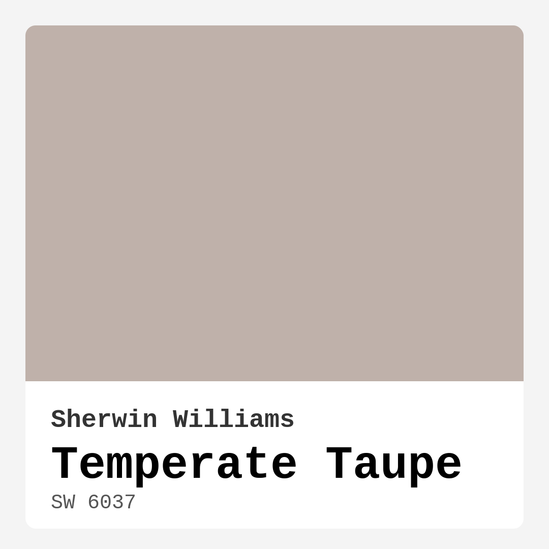
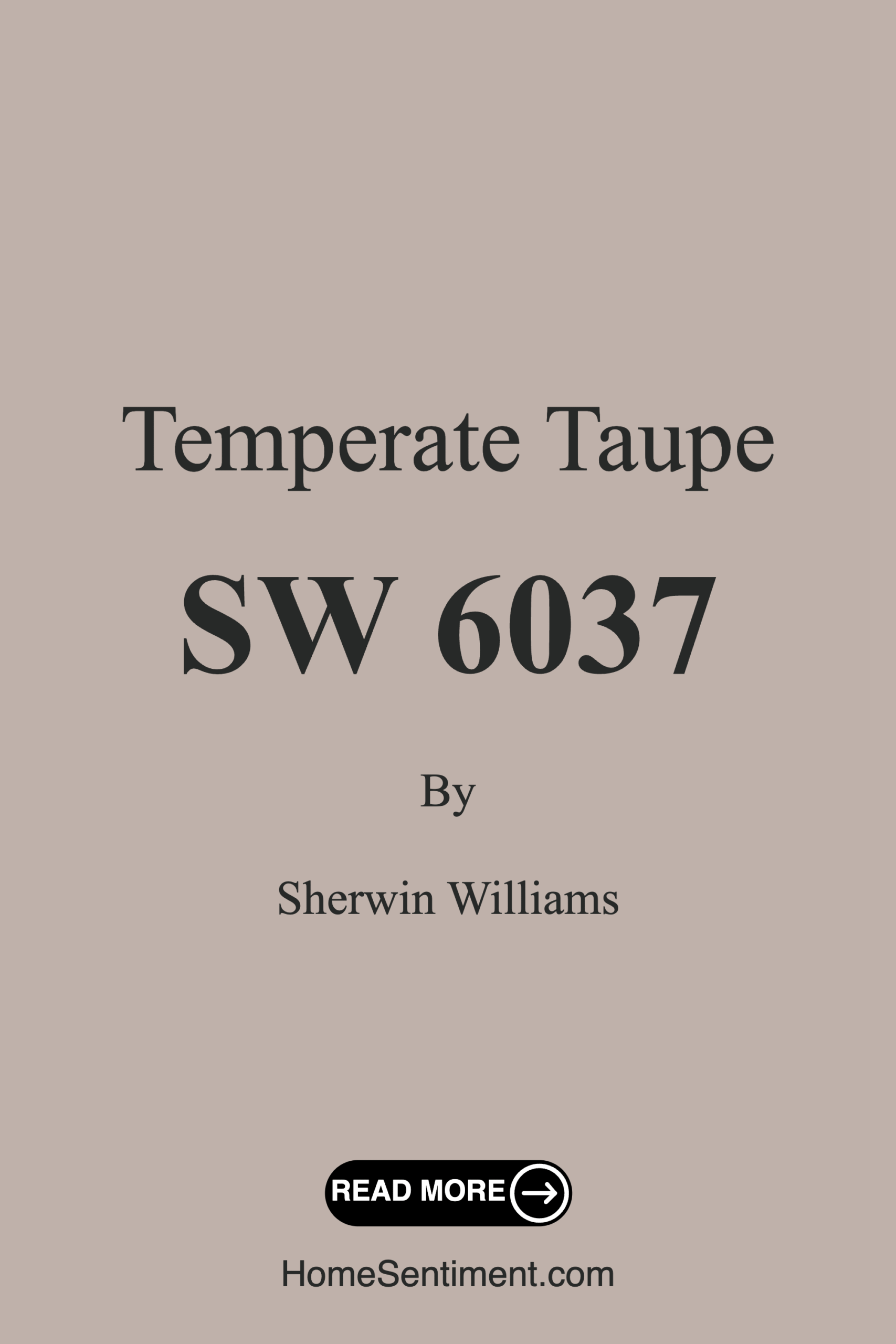
Color Preview & Key Details
| HEX Code | #BFB1AA |
| RGB | 191, 177, 170 |
| LRV | 34% |
| Undertone | Red |
| Finish Options | Eggshell, Matte, Satin |
Have you ever walked into a room and instantly felt at home? That’s the kind of warmth and comfort you can achieve with the right paint color. Let’s chat about a color that’s been making waves in the world of home decor—Sherwin Williams’ Temperate Taupe. This beautifully balanced hue is more than just a paint color; it’s a transformative element that can redefine your space.
Temperate Taupe (SW 6037) is a soft, warm taupe with a subtle red undertone that gives it depth and character. It’s not just another beige; it carries an earthy elegance that can make your interiors feel both cozy and sophisticated. With an LRV of 34%, it reflects very little light, creating an intimate atmosphere that invites relaxation. Whether you’re redoing an entire room or just an accent wall, this color can effortlessly adapt to your vision.
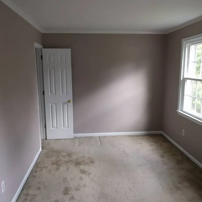
Imagine walking into your living room painted in Temperate Taupe. The warm tones wrap around you, creating a feeling of serenity. It’s a color that pairs beautifully with a variety of decor styles, whether you’re going for a modern farmhouse vibe, a bohemian touch, or rustic chic. Its versatility is one of its best features, allowing you to showcase a wide range of textures and accents without clashing.
One of the great aspects of Temperate Taupe is its ease of application. It’s beginner-friendly, meaning even if you’re not a seasoned painter, you can achieve a flawless finish. With just one to two coats needed for good coverage, it’s both time-efficient and economical. The finish options of matte, eggshell, and satin allow you to choose the sheen that best fits your style. Plus, it’s quick-drying and exceptionally washable, making maintenance a breeze.
When considering a color for your home, lighting is crucial. Temperate Taupe shines in spaces with ample natural light, revealing its inviting softness and airy feel. In dimly lit areas, though, it may appear darker. If you’re working with a small room, don’t shy away from this color but instead see it as an opportunity to create a warm, cozy nook. Pair it with lighter accents to brighten the space and maintain that inviting atmosphere.
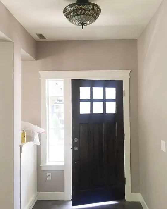
Now, let’s talk about trim colors. A classic white trim, such as White Dove or Simply White, can offer a timeless contrast to Temperate Taupe, highlighting its warmth. If you’re feeling a bit bolder, consider a dark wood trim or even black windows. This can create a striking visual appeal that enhances the overall aesthetic of your space.
When you think about the rooms best suited for Temperate Taupe, imagine your living room, bedroom, dining room, or even a home office enveloped in its warmth. It’s a color that promotes a grounding mood, making it ideal for spaces where you want to unwind or focus. The soothing backdrop allows you to play with a variety of accent colors; think rich greens or deep blues for a harmonious balance.
Speaking of accents, let’s explore how Temperate Taupe interacts with other colors. It pairs beautifully with both warm and cool shades, making it incredibly versatile. For a layered look, consider using complementary shades like SW 9137 or warm wood tones that enhance its inviting qualities. The subtle pink undertones in Temperate Taupe add a touch of romance, making it an excellent backdrop for floral patterns or textured fabrics.
Don’t forget about the mood you want to create. Temperate Taupe evokes feelings of coziness and comfort. It’s an earthy tone that can ground your space while still offering a sense of elegance. This makes it perfect for creating serene environments, whether you’re curling up with a good book in the living room or enjoying a quiet dinner in the dining area.
If you’re still on the fence, think about how Temperate Taupe compares to other popular colors like Revere Pewter or Agreeable Gray. While those colors have their charm, they often lack the warmth and depth that Temperate Taupe brings to the table. The subtle red undertones give this taupe a unique personality, setting it apart from the crowd.
When testing out Temperate Taupe, always paint a sample on your wall and observe it at different times of the day. It’s crucial to see how the color changes under various lighting conditions. Natural light will showcase its lovely warmth, while artificial light can give it a richer, cozier feel. This test run can make a significant difference in how you perceive the color in your space.
In terms of performance, Temperate Taupe is a low-VOC paint, which means it’s eco-certified and safer for indoor environments. You won’t have to worry about strong odors or harmful fumes, making it a smart choice for families or those sensitive to chemicals. Plus, with its scuff-resistant properties, it’s designed to last, maintaining its beauty over time.
So, is Temperate Taupe the right choice for your project? If you’re looking for a color that’s warm, inviting, and versatile, then it certainly could be. It doesn’t just paint walls; it creates environments where you can feel at peace, recharge, and enjoy life’s moments.
As you consider your options, remember that the best color is one that resonates with you and complements your lifestyle. So, take the plunge, grab a sample, and see how Temperate Taupe can transform your space into a haven of comfort and elegance. You’ll be amazed at how a fresh coat of paint can breathe new life into your home, creating a sanctuary that reflects your unique style.
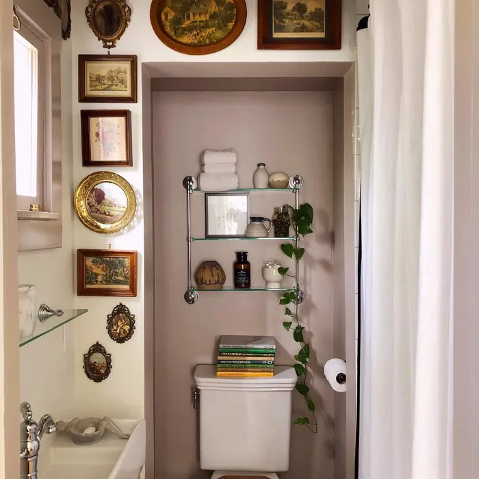
Real Room Photo of Temperate Taupe SW 6037


Undertones of Temperate Taupe ?
The undertones of Temperate Taupe are a key aspect of its character, leaning towards Red. These subtle underlying hues are what give the color its depth and complexity. For example, a gray with a blue undertone will feel cooler and more modern, while one with a brown undertone will feel warmer and more traditional. It’s essential to test this paint in your home and observe it next to your existing furniture, flooring, and decor to see how these undertones interact and reveal themselves throughout the day.
HEX value: #BFB1AA
RGB code: 191, 177, 170
Is Temperate Taupe Cool or Warm?
This color is predominantly warm, providing a welcoming vibe that can brighten up any room. However, its balanced undertones ensure it doesn’t skew too far into the warmer spectrum, making it suitable for diverse design aesthetics.
Understanding Color Properties and Interior Design Tips
Hue refers to a specific position on the color wheel, measured in degrees from 0 to 360. Each degree represents a different pure color:
- 0° represents red
- 120° represents green
- 240° represents blue
Saturation describes the intensity or purity of a color and is expressed as a percentage:
- At 0%, the color appears completely desaturated—essentially a shade of gray
- At 100%, the color is at its most vivid and vibrant
Lightness indicates how light or dark a color is, also expressed as a percentage:
- 0% lightness results in black
- 100% lightness results in white
Using Warm Colors in Interior Design
Warm hues—such as reds, oranges, yellows, warm beiges, and greiges—are excellent choices for creating inviting and energetic spaces. These colors are particularly well-suited for:
- Kitchens, living rooms, and bathrooms, where warmth enhances comfort and sociability
- Large rooms, where warm tones can help reduce the sense of emptiness and make the space feel more intimate
For example:
- Warm beige shades provide a cozy, inviting atmosphere, ideal for living rooms, bedrooms, and hallways.
- Warm greige (a mix of beige and gray) offers the warmth of beige with the modern appeal of gray, making it a versatile backdrop for dining areas, bedrooms, and living spaces.
However, be mindful when using warm light tones in rooms with limited natural light. These shades may appear muted or even take on an unpleasant yellowish tint. To avoid a dull or flat appearance:
- Add depth by incorporating richer tones like deep greens, charcoal, or chocolate brown
- Use textured elements such as curtains, rugs, or cushions to bring dimension to the space
Pro Tip: Achieving Harmony with Warm and Cool Color Balance
To create a well-balanced and visually interesting interior, mix warm and cool tones strategically. This contrast adds depth and harmony to your design.
- If your walls feature warm hues, introduce cool-colored accents such as blue or green furniture, artwork, or accessories to create contrast.
- For a polished look, consider using a complementary color scheme, which pairs colors opposite each other on the color wheel (e.g., red with green, orange with blue).
This thoughtful mix not only enhances visual appeal but also creates a space that feels both dynamic and cohesive.

Light Temperature Affects on Temperate Taupe
Natural Light
Natural daylight changes in color temperature as the sun moves across the sky. At sunrise and sunset, the light tends to have a warm, golden tone with a color temperature around 2000 Kelvin (K). As the day progresses and the sun rises higher, the light becomes cooler and more neutral. Around midday, especially when the sky is clear, natural light typically reaches its peak brightness and shifts to a cooler tone, ranging from 5500 to 6500 Kelvin. This midday light is close to what we perceive as pure white or daylight-balanced light.
These shifts in natural light can significantly influence how colors appear in a space, which is why designers often consider both the time of day and the orientation of windows when planning interior color schemes.
Artificial Light
When choosing artificial lighting, pay close attention to the color temperature, measured in Kelvin (K). This determines how warm or cool the light will appear. Lower temperatures, around 2700K, give off a warm, yellow glow often used in living rooms or bedrooms. Higher temperatures, above 5000K, create a cool, bluish light similar to daylight, commonly used in kitchens, offices, or task areas.
Use the slider to see how lighting temperature can affect the appearance of a surface or color throughout a space.


4800K
LRV of Temperate Taupe
The Light Reflectance Value (LRV) of Temperate Taupe is 34%, which places it in the Medium Dark category. This means it reflects very little light. Understanding a paint’s LRV is crucial for predicting how it will look in your space. A higher LRV indicates a lighter color that reflects more light, making rooms feel larger and brighter. A lower LRV signifies a darker color that absorbs more light, creating a cozier, more intimate atmosphere. Always consider the natural and artificial lighting in your room when selecting a paint color based on its LRV.
Detailed Review of Temperate Taupe
Additional Paint Characteristics
Ideal Rooms
Bedroom, Dining Room, Home Office, Kitchen, Living Room
Decor Styles
Bohemian, Modern Farmhouse, Rustic, Transitional
Coverage
Good (1–2 Coats), Touch-Up Friendly
Ease of Application
Beginner Friendly, Brush Smooth, Fast-Drying, Roller-Ready
Washability
Highly Washable, Washable
VOC Level
Eco-Certified, Low VOC
Best Use
Accent Wall, Interior Walls, Trim
Room Suitability
Bedroom, Dining Room, Home Office, Living Room
Tone Tag
Earthy, Neutral, Warm
Finish Type
Eggshell, Matte, Satin
Paint Performance
Long Lasting, Low Odor, Quick Drying, Scuff Resistant
Use Cases
Best for Small Spaces, Classic Favorite, Designer Favorite
Mood
Cozy, Grounding, Inviting
Trim Pairing
Complements Warm Trim, Good with Wood Trim, Pairs with White Dove
Temperate Taupe is a go-to choice for anyone looking to create a serene yet stylish atmosphere in their home. Its soft taupe tone strikes a perfect balance between warm and cool, making it adaptable to various decor styles, from modern farmhouse to rustic chic. When applied, it offers a soothing backdrop that complements both bright and muted accents, allowing you to play with textures and colors effortlessly. Plus, whether you’re painting a single accent wall or an entire room, it provides good coverage, typically requiring only one to two coats for a flawless finish. This paint not only beautifies your space but also enhances the overall ambiance, making it an excellent choice for living areas, bedrooms, and home offices.
Pros & Cons of SW 6037 Temperate Taupe
Pros
Cons
Colors that go with Sherwin Williams Temperate Taupe
FAQ on SW 6037 Temperate Taupe
Is Temperate Taupe suitable for small spaces?
Yes, Temperate Taupe can work well in small spaces, but it’s essential to consider lighting. In areas with ample natural light, this color can create a cozy yet spacious feel. However, in dimly lit rooms, it may appear darker, so pairing it with lighter accents can help brighten up the space.
What trim colors work best with Temperate Taupe?
Temperate Taupe pairs beautifully with a variety of trim colors. For a classic look, consider using white trim, such as White Dove or Simply White. If you’re looking for a bolder contrast, black windows or warm wood trim can create a striking visual appeal that complements the warmth of the taupe.
Comparisons Temperate Taupe with other colors
Temperate Taupe SW 6037 vs Realist Beige SW 6078
| Attribute | Temperate Taupe SW 6037 | Realist Beige SW 6078 |
|---|---|---|
| Color Name | Temperate Taupe SW 6037 | Realist Beige SW 6078 |
| Color | ||
| Hue | Pink | Pink |
| Brightness | Medium | Medium |
| RGB | 191, 177, 170 | 211, 200, 189 |
| LRV | 34% | 34% |
| Finish Type | Eggshell, Matte, Satin | Eggshell, Matte, Satin |
| Finish Options | Eggshell, Matte, Satin | Eggshell, Matte, Satin |
| Ideal Rooms | Bedroom, Dining Room, Home Office, Kitchen, Living Room | Bedroom, Dining Room, Entryway, Home Office, Kitchen, Living Room |
| Decor Styles | Bohemian, Modern Farmhouse, Rustic, Transitional | Contemporary, Minimalist, Modern Farmhouse, Rustic, Traditional |
| Coverage | Good (1–2 Coats), Touch-Up Friendly | Good (1–2 Coats), Touch-Up Friendly |
| Ease of Application | Beginner Friendly, Brush Smooth, Fast-Drying, Roller-Ready | Beginner Friendly, Brush Smooth, Fast-Drying, Roller-Ready |
| Washability | Highly Washable, Washable | Washable, Wipeable |
| Room Suitability | Bedroom, Dining Room, Home Office, Living Room | Bedroom, Dining Room, Home Office, Kitchen, Living Room |
| Tone | Earthy, Neutral, Warm | Earthy, Neutral, Warm |
| Paint Performance | Long Lasting, Low Odor, Quick Drying, Scuff Resistant | High Coverage, Low Odor, Quick Drying |
Temperate Taupe SW 6037 vs Rosaline Pearl SW 9077
| Attribute | Temperate Taupe SW 6037 | Rosaline Pearl SW 9077 |
|---|---|---|
| Color Name | Temperate Taupe SW 6037 | Rosaline Pearl SW 9077 |
| Color | ||
| Hue | Pink | Pink |
| Brightness | Medium | Medium |
| RGB | 191, 177, 170 | 163, 136, 135 |
| LRV | 34% | 69% |
| Finish Type | Eggshell, Matte, Satin | Eggshell, Matte |
| Finish Options | Eggshell, Matte, Satin | Eggshell, Matte, Satin |
| Ideal Rooms | Bedroom, Dining Room, Home Office, Kitchen, Living Room | Bedroom, Dining Room, Home Office, Living Room |
| Decor Styles | Bohemian, Modern Farmhouse, Rustic, Transitional | Bohemian, Contemporary, Modern, Transitional |
| Coverage | Good (1–2 Coats), Touch-Up Friendly | Good (1–2 Coats) |
| Ease of Application | Beginner Friendly, Brush Smooth, Fast-Drying, Roller-Ready | Beginner Friendly, Brush Smooth, Fast-Drying, Roller-Ready |
| Washability | Highly Washable, Washable | Washable, Wipeable |
| Room Suitability | Bedroom, Dining Room, Home Office, Living Room | Bedroom, Dining Room, Home Office, Living Room |
| Tone | Earthy, Neutral, Warm | Dusty, Muted, Warm |
| Paint Performance | Long Lasting, Low Odor, Quick Drying, Scuff Resistant | Easy Touch-Up, Fade Resistant, Low Odor |
Temperate Taupe SW 6037 vs Cabbage Rose SW 0003
| Attribute | Temperate Taupe SW 6037 | Cabbage Rose SW 0003 |
|---|---|---|
| Color Name | Temperate Taupe SW 6037 | Cabbage Rose SW 0003 |
| Color | ||
| Hue | Pink | Pink |
| Brightness | Medium | Medium |
| RGB | 191, 177, 170 | 197, 159, 145 |
| LRV | 34% | 15% |
| Finish Type | Eggshell, Matte, Satin | Eggshell, Matte, Satin |
| Finish Options | Eggshell, Matte, Satin | Eggshell, Matte, Satin |
| Ideal Rooms | Bedroom, Dining Room, Home Office, Kitchen, Living Room | Bedroom, Dining Room, Hallway, Living Room, Nursery |
| Decor Styles | Bohemian, Modern Farmhouse, Rustic, Transitional | Cottage, Modern Farmhouse, Romantic, Shabby Chic, Vintage |
| Coverage | Good (1–2 Coats), Touch-Up Friendly | Good (1–2 Coats), Touch-Up Friendly |
| Ease of Application | Beginner Friendly, Brush Smooth, Fast-Drying, Roller-Ready | Beginner Friendly, Brush Smooth, Roller-Ready |
| Washability | Highly Washable, Washable | Washable, Wipeable |
| Room Suitability | Bedroom, Dining Room, Home Office, Living Room | Bedroom, Dining Room, Hallway, Living Room, Nursery |
| Tone | Earthy, Neutral, Warm | Earthy, Muted, Warm |
| Paint Performance | Long Lasting, Low Odor, Quick Drying, Scuff Resistant | Easy Touch-Up, Low Odor |
Temperate Taupe SW 6037 vs Sashay Sand SW 6051
| Attribute | Temperate Taupe SW 6037 | Sashay Sand SW 6051 |
|---|---|---|
| Color Name | Temperate Taupe SW 6037 | Sashay Sand SW 6051 |
| Color | ||
| Hue | Pink | Pink |
| Brightness | Medium | Medium |
| RGB | 191, 177, 170 | 207, 180, 168 |
| LRV | 34% | 64% |
| Finish Type | Eggshell, Matte, Satin | Eggshell, Matte, Satin |
| Finish Options | Eggshell, Matte, Satin | Eggshell, Matte, Satin |
| Ideal Rooms | Bedroom, Dining Room, Home Office, Kitchen, Living Room | Bedroom, Dining Room, Home Office, Kitchen, Living Room |
| Decor Styles | Bohemian, Modern Farmhouse, Rustic, Transitional | Bohemian, Contemporary, Modern Farmhouse, Scandinavian, Transitional |
| Coverage | Good (1–2 Coats), Touch-Up Friendly | Good (1–2 Coats), Touch-Up Friendly |
| Ease of Application | Beginner Friendly, Brush Smooth, Fast-Drying, Roller-Ready | Beginner Friendly, Fast-Drying, Roller-Ready |
| Washability | Highly Washable, Washable | Highly Washable, Washable |
| Room Suitability | Bedroom, Dining Room, Home Office, Living Room | Bedroom, Dining Room, Home Office, Kitchen, Living Room |
| Tone | Earthy, Neutral, Warm | Earthy, Muted, Warm |
| Paint Performance | Long Lasting, Low Odor, Quick Drying, Scuff Resistant | Easy Touch-Up, Low Odor, Quick Drying, Scuff Resistant |
Temperate Taupe SW 6037 vs Touch of Sand SW 9085
| Attribute | Temperate Taupe SW 6037 | Touch of Sand SW 9085 |
|---|---|---|
| Color Name | Temperate Taupe SW 6037 | Touch of Sand SW 9085 |
| Color | ||
| Hue | Pink | Pink |
| Brightness | Medium | Medium |
| RGB | 191, 177, 170 | 213, 199, 186 |
| LRV | 34% | 66% |
| Finish Type | Eggshell, Matte, Satin | Eggshell, Matte, Satin |
| Finish Options | Eggshell, Matte, Satin | Eggshell, Matte, Satin |
| Ideal Rooms | Bedroom, Dining Room, Home Office, Kitchen, Living Room | Bathroom, Bedroom, Dining Room, Home Office, Kitchen, Living Room |
| Decor Styles | Bohemian, Modern Farmhouse, Rustic, Transitional | Bohemian, Coastal, Contemporary, Modern Farmhouse, Rustic |
| Coverage | Good (1–2 Coats), Touch-Up Friendly | Good (1–2 Coats), Touch-Up Friendly |
| Ease of Application | Beginner Friendly, Brush Smooth, Fast-Drying, Roller-Ready | Beginner Friendly, Brush Smooth, Fast-Drying, Roller-Ready |
| Washability | Highly Washable, Washable | Washable, Wipeable |
| Room Suitability | Bedroom, Dining Room, Home Office, Living Room | Bathroom, Bedroom, Dining Room, Home Office, Kitchen, Living Room |
| Tone | Earthy, Neutral, Warm | Earthy, Muted, Neutral, Warm |
| Paint Performance | Long Lasting, Low Odor, Quick Drying, Scuff Resistant | Easy Touch-Up, Low Odor, Quick Drying, Scuff Resistant |
Temperate Taupe SW 6037 vs Pink Shadow SW 0070
| Attribute | Temperate Taupe SW 6037 | Pink Shadow SW 0070 |
|---|---|---|
| Color Name | Temperate Taupe SW 6037 | Pink Shadow SW 0070 |
| Color | ||
| Hue | Pink | Pink |
| Brightness | Medium | Medium |
| RGB | 191, 177, 170 | 222, 195, 185 |
| LRV | 34% | 45% |
| Finish Type | Eggshell, Matte, Satin | Eggshell, Matte, Satin |
| Finish Options | Eggshell, Matte, Satin | Eggshell, Matte, Satin |
| Ideal Rooms | Bedroom, Dining Room, Home Office, Kitchen, Living Room | Bedroom, Dining Room, Home Office, Living Room, Nursery |
| Decor Styles | Bohemian, Modern Farmhouse, Rustic, Transitional | Bohemian, Minimalist, Modern Farmhouse, Scandinavian, Traditional |
| Coverage | Good (1–2 Coats), Touch-Up Friendly | Good (1–2 Coats) |
| Ease of Application | Beginner Friendly, Brush Smooth, Fast-Drying, Roller-Ready | Beginner Friendly, Brush Smooth, Fast-Drying, Roller-Ready |
| Washability | Highly Washable, Washable | Washable, Wipeable |
| Room Suitability | Bedroom, Dining Room, Home Office, Living Room | Bedroom, Dining Room, Living Room, Nursery |
| Tone | Earthy, Neutral, Warm | Muted, Pastel, Warm |
| Paint Performance | Long Lasting, Low Odor, Quick Drying, Scuff Resistant | Easy Touch-Up, High Coverage, Low Odor |
Temperate Taupe SW 6037 vs Hushed Auburn SW 9080
| Attribute | Temperate Taupe SW 6037 | Hushed Auburn SW 9080 |
|---|---|---|
| Color Name | Temperate Taupe SW 6037 | Hushed Auburn SW 9080 |
| Color | ||
| Hue | Pink | Pink |
| Brightness | Medium | Medium |
| RGB | 191, 177, 170 | 168, 133, 122 |
| LRV | 34% | 12% |
| Finish Type | Eggshell, Matte, Satin | Eggshell, Matte, Satin |
| Finish Options | Eggshell, Matte, Satin | Eggshell, Matte, Satin |
| Ideal Rooms | Bedroom, Dining Room, Home Office, Kitchen, Living Room | Bedroom, Dining Room, Home Office, Living Room |
| Decor Styles | Bohemian, Modern Farmhouse, Rustic, Transitional | Contemporary, Modern Farmhouse, Rustic, Transitional |
| Coverage | Good (1–2 Coats), Touch-Up Friendly | Good (1–2 Coats), Touch-Up Friendly |
| Ease of Application | Beginner Friendly, Brush Smooth, Fast-Drying, Roller-Ready | Beginner Friendly, Brush Smooth, Fast-Drying, Roller-Ready |
| Washability | Highly Washable, Washable | Washable, Wipeable |
| Room Suitability | Bedroom, Dining Room, Home Office, Living Room | Bedroom, Dining Room, Home Office, Living Room |
| Tone | Earthy, Neutral, Warm | Earthy, Muted, Warm |
| Paint Performance | Long Lasting, Low Odor, Quick Drying, Scuff Resistant | Easy Touch-Up, High Coverage, Low Odor |
Temperate Taupe SW 6037 vs Likeable Sand SW 6058
| Attribute | Temperate Taupe SW 6037 | Likeable Sand SW 6058 |
|---|---|---|
| Color Name | Temperate Taupe SW 6037 | Likeable Sand SW 6058 |
| Color | ||
| Hue | Pink | Pink |
| Brightness | Medium | Medium |
| RGB | 191, 177, 170 | 209, 183, 168 |
| LRV | 34% | 61% |
| Finish Type | Eggshell, Matte, Satin | Eggshell, Matte, Satin |
| Finish Options | Eggshell, Matte, Satin | Eggshell, Matte, Satin |
| Ideal Rooms | Bedroom, Dining Room, Home Office, Kitchen, Living Room | Bedroom, Dining Room, Home Office, Kitchen, Living Room |
| Decor Styles | Bohemian, Modern Farmhouse, Rustic, Transitional | Bohemian, Coastal, Contemporary, Modern Farmhouse, Rustic |
| Coverage | Good (1–2 Coats), Touch-Up Friendly | Good (1–2 Coats), Touch-Up Friendly |
| Ease of Application | Beginner Friendly, Brush Smooth, Fast-Drying, Roller-Ready | Beginner Friendly, Brush Smooth, Fast-Drying, Roller-Ready |
| Washability | Highly Washable, Washable | Washable, Wipeable |
| Room Suitability | Bedroom, Dining Room, Home Office, Living Room | Bedroom, Dining Room, Home Office, Kitchen, Living Room |
| Tone | Earthy, Neutral, Warm | Earthy, Muted, Warm |
| Paint Performance | Long Lasting, Low Odor, Quick Drying, Scuff Resistant | Easy Touch-Up, Low Odor, Quick Drying |
Temperate Taupe SW 6037 vs Glamour SW 6031
| Attribute | Temperate Taupe SW 6037 | Glamour SW 6031 |
|---|---|---|
| Color Name | Temperate Taupe SW 6037 | Glamour SW 6031 |
| Color | ||
| Hue | Pink | Pink |
| Brightness | Medium | Medium |
| RGB | 191, 177, 170 | 182, 160, 154 |
| LRV | 34% | 30% |
| Finish Type | Eggshell, Matte, Satin | Eggshell, Matte, Satin |
| Finish Options | Eggshell, Matte, Satin | Eggshell, Matte, Satin |
| Ideal Rooms | Bedroom, Dining Room, Home Office, Kitchen, Living Room | Bedroom, Dining Room, Home Office, Living Room |
| Decor Styles | Bohemian, Modern Farmhouse, Rustic, Transitional | Bohemian, Classic, Modern, Transitional |
| Coverage | Good (1–2 Coats), Touch-Up Friendly | Good (1–2 Coats) |
| Ease of Application | Beginner Friendly, Brush Smooth, Fast-Drying, Roller-Ready | Beginner Friendly, Brush Smooth, Fast-Drying, Roller-Ready |
| Washability | Highly Washable, Washable | Scrubbable, Washable |
| Room Suitability | Bedroom, Dining Room, Home Office, Living Room | Bedroom, Dining Room, Home Office, Living Room |
| Tone | Earthy, Neutral, Warm | Balanced, Neutral, Warm |
| Paint Performance | Long Lasting, Low Odor, Quick Drying, Scuff Resistant | Easy Touch-Up, Low Odor, Quick Drying |
Temperate Taupe SW 6037 vs Redend Point SW 9081
| Attribute | Temperate Taupe SW 6037 | Redend Point SW 9081 |
|---|---|---|
| Color Name | Temperate Taupe SW 6037 | Redend Point SW 9081 |
| Color | ||
| Hue | Pink | Pink |
| Brightness | Medium | Medium |
| RGB | 191, 177, 170 | 174, 142, 126 |
| LRV | 34% | 22% |
| Finish Type | Eggshell, Matte, Satin | Eggshell, Matte, Satin |
| Finish Options | Eggshell, Matte, Satin | Eggshell, Matte, Satin |
| Ideal Rooms | Bedroom, Dining Room, Home Office, Kitchen, Living Room | Bedroom, Dining Room, Home Office, Living Room, Nursery |
| Decor Styles | Bohemian, Modern Farmhouse, Rustic, Transitional | Bohemian, Contemporary, Modern Farmhouse, Rustic, Transitional |
| Coverage | Good (1–2 Coats), Touch-Up Friendly | Good (1–2 Coats), Touch-Up Friendly |
| Ease of Application | Beginner Friendly, Brush Smooth, Fast-Drying, Roller-Ready | Beginner Friendly, Brush Smooth, Roller-Ready |
| Washability | Highly Washable, Washable | Washable, Wipeable |
| Room Suitability | Bedroom, Dining Room, Home Office, Living Room | Bedroom, Dining Room, Home Office, Living Room, Nursery |
| Tone | Earthy, Neutral, Warm | Earthy, Muted, Warm |
| Paint Performance | Long Lasting, Low Odor, Quick Drying, Scuff Resistant | High Coverage, Low Odor, Quick Drying |
Official Page of Sherwin Williams Temperate Taupe SW 6037