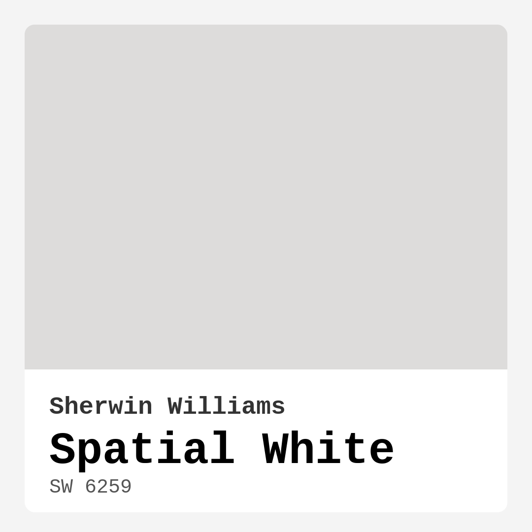
Color Preview & Key Details
| HEX Code | #DDDCDB |
| RGB | 221, 220, 219 |
| LRV | 83% |
| Undertone | Red |
| Finish Options | Eggshell, Matte, Satin |
Have you ever felt overwhelmed by the endless choices of paint colors? You stand there, staring at swatches, feeling like you might just lose your mind. But let me offer you a breath of fresh air: Spatial White by Sherwin Williams is here to simplify your decision-making process.
This isn’t just any white. It’s a soft, delicate hue that beautifully balances warmth and coolness, creating an inviting atmosphere that feels both modern and timeless. With a color code of SW 6259 and a hex code of #DDDCDB, Spatial White is more than just a shade; it’s a versatile backdrop that can transform any space into a serene sanctuary.
One of the standout features of Spatial White is its remarkable light reflectance value (LRV) of 83%. This means it reflects a significant amount of light, making rooms feel larger and brighter. Imagine your living room or kitchen bathed in a soft glow, enhancing the natural light that pours in through your windows. If you live in a home with limited natural light, this color can work wonders, creating an airy and expansive feel that combats any sense of confinement.
Speaking of airiness, let’s talk about the undertones. Spatial White leans slightly towards red, which adds a subtle depth and warmth to the color. It strikes just the right balance, so it doesn’t overwhelm a room. Picture this: your bedroom walls in Spatial White, offering a warm embrace at the end of a long day, or your dining room walls creating a calm backdrop for family dinners and gatherings. Its versatile nature means it can adapt perfectly to a range of decor styles, from modern and Scandinavian to transitional and farmhouse.
Now, you might be wondering where this lovely hue works best. The list is extensive! Spatial White is perfect for living rooms, bedrooms, kitchens, bathrooms, and dining rooms. Its ability to complement various styles means it can easily transition from one room to another, allowing you to create a cohesive look throughout your home. Whether you’re going for a minimalist approach or a more traditional feel, you can’t go wrong with this timeless choice.
When it comes to finishes, you’ve got options! Spatial White is available in eggshell, satin, and matte finishes. If you’re looking for a more reflective surface that’s easy to wipe down, satin might be your go-to. For those who prefer a softer, more subdued look, matte could be just what you need. No matter your preference, each finish enhances the color’s inherent beauty.
Applying Spatial White is a breeze. It’s beginner-friendly, meaning you don’t need to be a pro to achieve a flawless finish. With good coverage typically needing just 1-2 coats, you can quickly refresh your space without the hassle of endless touch-ups. Plus, it’s wash and scrubbable, making it an excellent choice for high-traffic areas where marks and scuffs are more likely to show up.
Let’s not overlook the practical side either. Spatial White boasts low VOC levels, making it an eco-certified option that contributes to better indoor air quality. This is especially important if you have kids or pets at home. You can breathe easy knowing that you’re creating a safe environment while still achieving a stunning aesthetic.
Pairing Spatial White with the right trim colors can elevate your design game even further. For a classic look, consider using Pure White or Simply White as your trim color. If you’re leaning towards adding warmth, natural wood trim will complement the hue beautifully. And for a modern twist, don’t hesitate to introduce black windows or cool-toned trims for a striking contrast that enhances the overall aesthetic.
Now, let me address a common concern: can Spatial White be used in small spaces? Absolutely! Its light reflectance helps create an illusion of more space. You’ll find that it enhances natural light in smaller rooms, making them feel brighter and more inviting.
One potential downside to consider is that, in high-traffic areas, it may show marks or scuffs more readily. However, its easy touch-up capabilities mean you can quickly restore its pristine appearance. Just keep a little of the paint handy for those inevitable nicks.
Spatial White can also be paired with darker shades to create contrast and visual interest. Think about incorporating deeper tones like SW 7625 or SW 9139. These darker colors can serve as accent walls or furnishings, allowing Spatial White to shine as an elegant backdrop.
If you’re someone who loves experimenting with color, Spatial White opens the door to endless possibilities. It pairs beautifully with a wide range of complementary shades, including SW 9660 and SW 6543. You can create a harmonious palette that reflects your personality while keeping things grounded with this soft neutral.
Light plays a significant role in how this color is perceived throughout the day. In bright, natural light, Spatial White appears bright and airy, creating a refreshing environment. In the softer light of the evening, it takes on a calming quality, making it an ideal choice for bedrooms and relaxation spaces.
This color also works well in rooms with varied artificial lighting. Whether you’re using warm bulbs or cooler fluorescent lights, Spatial White remains adaptable, ensuring your walls are always a sight to behold.
In summary, Spatial White isn’t just a color; it’s a pathway to creating a serene and inviting environment in your home. It’s perfect for anyone looking to elevate their space without overwhelming it, offering a timeless quality that adapts to both modern and traditional aesthetics.
When you choose Spatial White, you’re choosing a color that promises versatility, beauty, and practicality. So, grab a sample, paint a small section of your wall, and watch how it transforms your space. You might just find that this soft, inviting hue is exactly what your home has been waiting for.
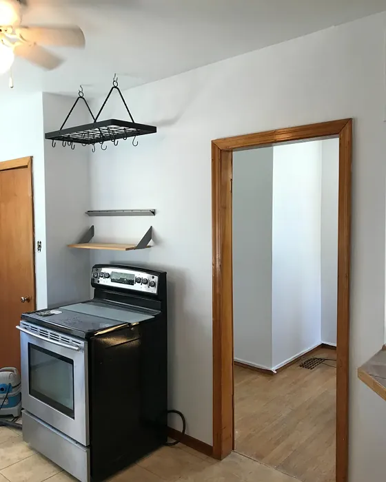
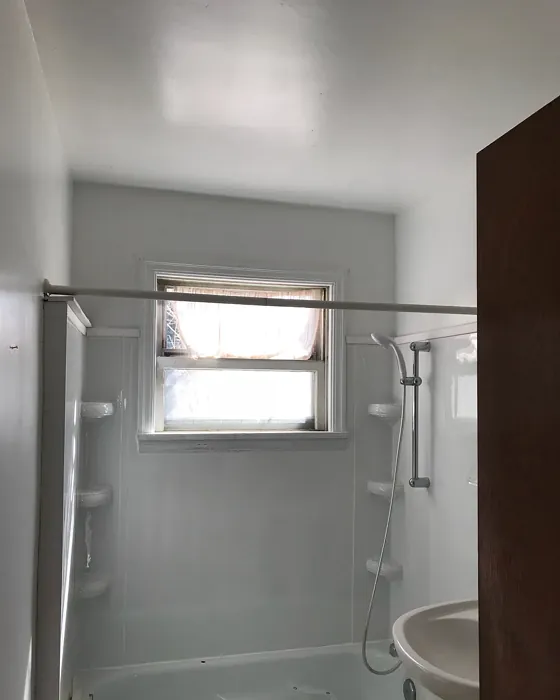
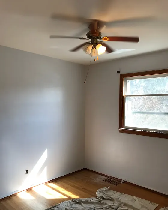
Real Room Photo of Spatial White SW 6259
Undertones of Spatial White ?
The undertones of Spatial White are a key aspect of its character, leaning towards Red. These subtle underlying hues are what give the color its depth and complexity. For example, a gray with a blue undertone will feel cooler and more modern, while one with a brown undertone will feel warmer and more traditional. It’s essential to test this paint in your home and observe it next to your existing furniture, flooring, and decor to see how these undertones interact and reveal themselves throughout the day.
HEX value: #DDDCDB
RGB code: 221, 220, 219
Is Spatial White Cool or Warm?
This color strikes a beautiful balance between warm and cool tones. While it leans slightly warm, it maintains enough coolness to ensure it doesn’t overwhelm a room, making it a versatile choice for various environments.
Understanding Color Properties and Interior Design Tips
Hue refers to a specific position on the color wheel, measured in degrees from 0 to 360. Each degree represents a different pure color:
- 0° represents red
- 120° represents green
- 240° represents blue
Saturation describes the intensity or purity of a color and is expressed as a percentage:
- At 0%, the color appears completely desaturated—essentially a shade of gray
- At 100%, the color is at its most vivid and vibrant
Lightness indicates how light or dark a color is, also expressed as a percentage:
- 0% lightness results in black
- 100% lightness results in white
Using Warm Colors in Interior Design
Warm hues—such as reds, oranges, yellows, warm beiges, and greiges—are excellent choices for creating inviting and energetic spaces. These colors are particularly well-suited for:
- Kitchens, living rooms, and bathrooms, where warmth enhances comfort and sociability
- Large rooms, where warm tones can help reduce the sense of emptiness and make the space feel more intimate
For example:
- Warm beige shades provide a cozy, inviting atmosphere, ideal for living rooms, bedrooms, and hallways.
- Warm greige (a mix of beige and gray) offers the warmth of beige with the modern appeal of gray, making it a versatile backdrop for dining areas, bedrooms, and living spaces.
However, be mindful when using warm light tones in rooms with limited natural light. These shades may appear muted or even take on an unpleasant yellowish tint. To avoid a dull or flat appearance:
- Add depth by incorporating richer tones like deep greens, charcoal, or chocolate brown
- Use textured elements such as curtains, rugs, or cushions to bring dimension to the space
Pro Tip: Achieving Harmony with Warm and Cool Color Balance
To create a well-balanced and visually interesting interior, mix warm and cool tones strategically. This contrast adds depth and harmony to your design.
- If your walls feature warm hues, introduce cool-colored accents such as blue or green furniture, artwork, or accessories to create contrast.
- For a polished look, consider using a complementary color scheme, which pairs colors opposite each other on the color wheel (e.g., red with green, orange with blue).
This thoughtful mix not only enhances visual appeal but also creates a space that feels both dynamic and cohesive.
Light Temperature Affects on Spatial White
Natural Light
Natural daylight changes in color temperature as the sun moves across the sky. At sunrise and sunset, the light tends to have a warm, golden tone with a color temperature around 2000 Kelvin (K). As the day progresses and the sun rises higher, the light becomes cooler and more neutral. Around midday, especially when the sky is clear, natural light typically reaches its peak brightness and shifts to a cooler tone, ranging from 5500 to 6500 Kelvin. This midday light is close to what we perceive as pure white or daylight-balanced light.
These shifts in natural light can significantly influence how colors appear in a space, which is why designers often consider both the time of day and the orientation of windows when planning interior color schemes.
Artificial Light
When choosing artificial lighting, pay close attention to the color temperature, measured in Kelvin (K). This determines how warm or cool the light will appear. Lower temperatures, around 2700K, give off a warm, yellow glow often used in living rooms or bedrooms. Higher temperatures, above 5000K, create a cool, bluish light similar to daylight, commonly used in kitchens, offices, or task areas.
Use the slider to see how lighting temperature can affect the appearance of a surface or color throughout a space.


4800K
LRV of Spatial White
The Light Reflectance Value (LRV) of Spatial White is 83%, which places it in the Light category. This means it Reflects a high amount of light. Understanding a paint’s LRV is crucial for predicting how it will look in your space. A higher LRV indicates a lighter color that reflects more light, making rooms feel larger and brighter. A lower LRV signifies a darker color that absorbs more light, creating a cozier, more intimate atmosphere. Always consider the natural and artificial lighting in your room when selecting a paint color based on its LRV.
Detailed Review of Spatial White
Additional Paint Characteristics
Ideal Rooms
Bathroom, Bedroom, Dining Room, Hallway, Home Office, Kitchen, Living Room
Decor Styles
Farmhouse, Minimalist, Modern, Scandinavian, Transitional
Coverage
Good (1–2 Coats), Touch-Up Friendly
Ease of Application
Beginner Friendly, Brush Smooth, Fast-Drying, Roller-Ready
Washability
Scrubbable, Washable
VOC Level
Eco-Certified, Low VOC
Best Use
Accent Wall, Ceiling, Interior Walls, Trim
Room Suitability
Bathroom, Bedroom, Dining Room, Kitchen, Living Room
Tone Tag
Airy, Cool, Neutral, Warm
Finish Type
Eggshell, Matte, Satin
Paint Performance
Easy Touch-Up, High Coverage, Low Odor, Quick Drying
Use Cases
Best for Low Light Rooms, Best for Rentals, Best for Selling Your Home, Classic Favorite
Mood
Airy, Calm, Inviting, Restful
Trim Pairing
Complements Cool Trim, Matches Pure White, Pairs with White Dove
Spatial White is a standout choice for those seeking a neutral that feels fresh and airy. It reflects light beautifully, enhancing the sense of space in smaller rooms while maintaining a cozy vibe in larger areas. This paint offers excellent coverage, typically requiring just 1-2 coats for a flawless finish. Whether you’re repainting your living room or sprucing up a kitchen, Spatial White provides an elegant backdrop that allows other colors and decor elements to shine. The ease of touch-ups makes it practical for high-traffic areas, ensuring your walls always look their best. Overall, this color not only elevates your home’s aesthetic but also creates a serene environment that’s perfect for relaxation.
Pros & Cons of SW 6259 Spatial White
Pros
Cons
Colors that go with Sherwin Williams Spatial White
FAQ on SW 6259 Spatial White
Can Spatial White be used in small spaces?
Absolutely! Spatial White is perfect for small spaces as its light reflectance helps create an illusion of more space. Its warm undertones also add a cozy feel without making the area feel cramped. Using this color can enhance the natural light in smaller rooms, allowing them to feel brighter and more inviting.
What trim colors work best with Spatial White?
Spatial White pairs beautifully with a variety of trim colors. For a classic look, consider using it with Pure White or Simply White. If you want to add a touch of warmth, it also complements natural wood trim effectively. For a modern twist, black windows or cool-toned trims can create a striking contrast that enhances the overall aesthetic.
Comparisons Spatial White with other colors
Spatial White SW 6259 vs Agreeable Gray SW 7029
| Attribute | Spatial White SW 6259 | Agreeable Gray SW 7029 |
|---|---|---|
| Color Name | Spatial White SW 6259 | Agreeable Gray SW 7029 |
| Color | ||
| Hue | Grey | Grey |
| Brightness | Light | Light |
| RGB | 221, 220, 219 | 209, 203, 193 |
| LRV | 83% | 60% |
| Finish Type | Eggshell, Matte, Satin | Eggshell, Matte, Satin |
| Finish Options | Eggshell, Matte, Satin | Eggshell, Flat, Matte, Satin |
| Ideal Rooms | Bathroom, Bedroom, Dining Room, Hallway, Home Office, Kitchen, Living Room | Bathroom, Bedroom, Dining Room, Home Office, Kitchen, Living Room |
| Decor Styles | Farmhouse, Minimalist, Modern, Scandinavian, Transitional | Contemporary, Farmhouse, Minimalist, Modern, Transitional |
| Coverage | Good (1–2 Coats), Touch-Up Friendly | Good (1–2 Coats), Touch-Up Friendly |
| Ease of Application | Beginner Friendly, Brush Smooth, Fast-Drying, Roller-Ready | Beginner Friendly, Brush Smooth, Roller-Ready |
| Washability | Scrubbable, Washable | Washable, Wipeable |
| Room Suitability | Bathroom, Bedroom, Dining Room, Kitchen, Living Room | Bathroom, Bedroom, Dining Room, Kitchen, Living Room |
| Tone | Airy, Cool, Neutral, Warm | Muted, Neutral, Warm |
| Paint Performance | Easy Touch-Up, High Coverage, Low Odor, Quick Drying | Easy Touch-Up, Fade Resistant, Low Odor |
Spatial White SW 6259 vs Eider White SW 7014
| Attribute | Spatial White SW 6259 | Eider White SW 7014 |
|---|---|---|
| Color Name | Spatial White SW 6259 | Eider White SW 7014 |
| Color | ||
| Hue | Grey | Grey |
| Brightness | Light | Light |
| RGB | 221, 220, 219 | 226, 222, 216 |
| LRV | 83% | 73% |
| Finish Type | Eggshell, Matte, Satin | Eggshell, Matte, Satin |
| Finish Options | Eggshell, Matte, Satin | Eggshell, Matte, Satin |
| Ideal Rooms | Bathroom, Bedroom, Dining Room, Hallway, Home Office, Kitchen, Living Room | Bathroom, Bedroom, Dining Room, Home Office, Kitchen, Living Room |
| Decor Styles | Farmhouse, Minimalist, Modern, Scandinavian, Transitional | Farmhouse, Minimalist, Modern, Scandinavian, Transitional |
| Coverage | Good (1–2 Coats), Touch-Up Friendly | Good (1–2 Coats), Touch-Up Friendly |
| Ease of Application | Beginner Friendly, Brush Smooth, Fast-Drying, Roller-Ready | Beginner Friendly, Brush Smooth, Roller-Ready |
| Washability | Scrubbable, Washable | Highly Washable, Washable |
| Room Suitability | Bathroom, Bedroom, Dining Room, Kitchen, Living Room | Bathroom, Bedroom, Dining Room, Kitchen, Living Room |
| Tone | Airy, Cool, Neutral, Warm | Creamy, Muted, Neutral, Warm |
| Paint Performance | Easy Touch-Up, High Coverage, Low Odor, Quick Drying | Easy Touch-Up, High Coverage, Low Odor, Scuff Resistant |
Spatial White SW 6259 vs Drift of Mist SW 9166
| Attribute | Spatial White SW 6259 | Drift of Mist SW 9166 |
|---|---|---|
| Color Name | Spatial White SW 6259 | Drift of Mist SW 9166 |
| Color | ||
| Hue | Grey | Grey |
| Brightness | Light | Light |
| RGB | 221, 220, 219 | 220, 216, 208 |
| LRV | 83% | 65% |
| Finish Type | Eggshell, Matte, Satin | Eggshell, Matte, Satin |
| Finish Options | Eggshell, Matte, Satin | Eggshell, Matte, Satin |
| Ideal Rooms | Bathroom, Bedroom, Dining Room, Hallway, Home Office, Kitchen, Living Room | Bathroom, Bedroom, Home Office, Kitchen, Living Room |
| Decor Styles | Farmhouse, Minimalist, Modern, Scandinavian, Transitional | Coastal, Minimalist, Modern, Scandinavian |
| Coverage | Good (1–2 Coats), Touch-Up Friendly | Good (1–2 Coats), Touch-Up Friendly |
| Ease of Application | Beginner Friendly, Brush Smooth, Fast-Drying, Roller-Ready | Beginner Friendly, Brush Smooth, Fast-Drying, Roller-Ready |
| Washability | Scrubbable, Washable | Washable, Wipeable |
| Room Suitability | Bathroom, Bedroom, Dining Room, Kitchen, Living Room | Bathroom, Bedroom, Home Office, Living Room |
| Tone | Airy, Cool, Neutral, Warm | Airy, Cool, Neutral |
| Paint Performance | Easy Touch-Up, High Coverage, Low Odor, Quick Drying | Easy Touch-Up, Low Odor, Quick Drying, Scuff Resistant |
Spatial White SW 6259 vs Sanctuary SW 9583
| Attribute | Spatial White SW 6259 | Sanctuary SW 9583 |
|---|---|---|
| Color Name | Spatial White SW 6259 | Sanctuary SW 9583 |
| Color | ||
| Hue | Grey | Grey |
| Brightness | Light | Light |
| RGB | 221, 220, 219 | 230, 226, 217 |
| LRV | 83% | 24% |
| Finish Type | Eggshell, Matte, Satin | Eggshell, Matte, Satin |
| Finish Options | Eggshell, Matte, Satin | Eggshell, Matte, Satin |
| Ideal Rooms | Bathroom, Bedroom, Dining Room, Hallway, Home Office, Kitchen, Living Room | Bedroom, Dining Room, Home Office, Living Room, Nursery |
| Decor Styles | Farmhouse, Minimalist, Modern, Scandinavian, Transitional | Bohemian, Coastal, Modern Farmhouse, Scandinavian |
| Coverage | Good (1–2 Coats), Touch-Up Friendly | Good (1–2 Coats), Touch-Up Friendly |
| Ease of Application | Beginner Friendly, Brush Smooth, Fast-Drying, Roller-Ready | Beginner Friendly, Brush Smooth, Fast-Drying, Roller-Ready |
| Washability | Scrubbable, Washable | Highly Washable, Washable, Wipeable |
| Room Suitability | Bathroom, Bedroom, Dining Room, Kitchen, Living Room | Bedroom, Home Office, Living Room, Nursery |
| Tone | Airy, Cool, Neutral, Warm | Earthy, Neutral, Soft, Warm |
| Paint Performance | Easy Touch-Up, High Coverage, Low Odor, Quick Drying | Easy Touch-Up, Low Odor, Quick Drying, Scuff Resistant |
Spatial White SW 6259 vs Snowbound SW 7004
| Attribute | Spatial White SW 6259 | Snowbound SW 7004 |
|---|---|---|
| Color Name | Spatial White SW 6259 | Snowbound SW 7004 |
| Color | ||
| Hue | Grey | Grey |
| Brightness | Light | Light |
| RGB | 221, 220, 219 | 237, 234, 229 |
| LRV | 83% | 83% |
| Finish Type | Eggshell, Matte, Satin | Eggshell, Matte, Satin |
| Finish Options | Eggshell, Matte, Satin | Eggshell, Matte, Satin |
| Ideal Rooms | Bathroom, Bedroom, Dining Room, Hallway, Home Office, Kitchen, Living Room | Bathroom, Bedroom, Dining Room, Hallway, Home Office, Kitchen, Living Room, Nursery |
| Decor Styles | Farmhouse, Minimalist, Modern, Scandinavian, Transitional | Farmhouse, Minimalist, Modern, Scandinavian, Transitional |
| Coverage | Good (1–2 Coats), Touch-Up Friendly | Good (1–2 Coats), Touch-Up Friendly |
| Ease of Application | Beginner Friendly, Brush Smooth, Fast-Drying, Roller-Ready | Beginner Friendly, Brush Smooth, Fast-Drying, Roller-Ready |
| Washability | Scrubbable, Washable | Washable, Wipeable |
| Room Suitability | Bathroom, Bedroom, Dining Room, Kitchen, Living Room | Bathroom, Bedroom, Dining Room, Hallway, Home Office, Kitchen, Living Room |
| Tone | Airy, Cool, Neutral, Warm | Airy, Crisp, Neutral, Warm |
| Paint Performance | Easy Touch-Up, High Coverage, Low Odor, Quick Drying | High Coverage, Low Odor, Quick Drying |
Spatial White SW 6259 vs Pure White SW 7005
| Attribute | Spatial White SW 6259 | Pure White SW 7005 |
|---|---|---|
| Color Name | Spatial White SW 6259 | Pure White SW 7005 |
| Color | ||
| Hue | Grey | Grey |
| Brightness | Light | Light |
| RGB | 221, 220, 219 | 237, 236, 230 |
| LRV | 83% | 84% |
| Finish Type | Eggshell, Matte, Satin | Eggshell, Satin, Semi-Gloss |
| Finish Options | Eggshell, Matte, Satin | Eggshell, Flat, Matte, Satin, Semi-Gloss |
| Ideal Rooms | Bathroom, Bedroom, Dining Room, Hallway, Home Office, Kitchen, Living Room | Bathroom, Bedroom, Dining Room, Entryway, Hallway, Home Office, Kitchen, Living Room, Nursery |
| Decor Styles | Farmhouse, Minimalist, Modern, Scandinavian, Transitional | Bohemian, Eclectic, Farmhouse, Minimalist, Modern, Traditional |
| Coverage | Good (1–2 Coats), Touch-Up Friendly | Good (1–2 Coats), Touch-Up Friendly |
| Ease of Application | Beginner Friendly, Brush Smooth, Fast-Drying, Roller-Ready | Beginner Friendly, Brush Smooth, Fast-Drying, Roller-Ready |
| Washability | Scrubbable, Washable | Highly Washable, Washable |
| Room Suitability | Bathroom, Bedroom, Dining Room, Kitchen, Living Room | Bathroom, Bedroom, Dining Room, Entryway, Hallway, Home Office, Kitchen, Living Room, Nursery |
| Tone | Airy, Cool, Neutral, Warm | Crisp, Neutral, Warm |
| Paint Performance | Easy Touch-Up, High Coverage, Low Odor, Quick Drying | Easy Touch-Up, High Coverage, Low Odor, Quick Drying |
Spatial White SW 6259 vs Crushed Ice SW 7647
| Attribute | Spatial White SW 6259 | Crushed Ice SW 7647 |
|---|---|---|
| Color Name | Spatial White SW 6259 | Crushed Ice SW 7647 |
| Color | ||
| Hue | Grey | Grey |
| Brightness | Light | Light |
| RGB | 221, 220, 219 | 214, 211, 204 |
| LRV | 83% | 66% |
| Finish Type | Eggshell, Matte, Satin | Eggshell, Matte, Satin |
| Finish Options | Eggshell, Matte, Satin | Eggshell, Matte, Satin |
| Ideal Rooms | Bathroom, Bedroom, Dining Room, Hallway, Home Office, Kitchen, Living Room | Bathroom, Bedroom, Dining Room, Home Office, Living Room |
| Decor Styles | Farmhouse, Minimalist, Modern, Scandinavian, Transitional | Farmhouse, Minimalist, Modern, Scandinavian, Transitional |
| Coverage | Good (1–2 Coats), Touch-Up Friendly | Good (1–2 Coats), Touch-Up Friendly |
| Ease of Application | Beginner Friendly, Brush Smooth, Fast-Drying, Roller-Ready | Beginner Friendly, Brush Smooth, Roller-Ready |
| Washability | Scrubbable, Washable | Stain Resistant, Washable |
| Room Suitability | Bathroom, Bedroom, Dining Room, Kitchen, Living Room | Bathroom, Bedroom, Dining Room, Hallway, Home Office, Living Room |
| Tone | Airy, Cool, Neutral, Warm | Muted, Neutral, Warm |
| Paint Performance | Easy Touch-Up, High Coverage, Low Odor, Quick Drying | High Coverage, Low Odor, Quick Drying |
Spatial White SW 6259 vs Origami White SW 7636
| Attribute | Spatial White SW 6259 | Origami White SW 7636 |
|---|---|---|
| Color Name | Spatial White SW 6259 | Origami White SW 7636 |
| Color | ||
| Hue | Grey | Grey |
| Brightness | Light | Light |
| RGB | 221, 220, 219 | 229, 226, 218 |
| LRV | 83% | 83% |
| Finish Type | Eggshell, Matte, Satin | Eggshell, Matte |
| Finish Options | Eggshell, Matte, Satin | Eggshell, Matte, Satin |
| Ideal Rooms | Bathroom, Bedroom, Dining Room, Hallway, Home Office, Kitchen, Living Room | Bedroom, Dining Room, Entryway, Hallway, Home Office, Kitchen, Living Room |
| Decor Styles | Farmhouse, Minimalist, Modern, Scandinavian, Transitional | Minimalist, Modern, Scandinavian, Traditional, Transitional |
| Coverage | Good (1–2 Coats), Touch-Up Friendly | Good (1–2 Coats), Touch-Up Friendly |
| Ease of Application | Beginner Friendly, Brush Smooth, Fast-Drying, Roller-Ready | Beginner Friendly, Brush Smooth, Roller-Ready |
| Washability | Scrubbable, Washable | Washable, Wipeable |
| Room Suitability | Bathroom, Bedroom, Dining Room, Kitchen, Living Room | Bedroom, Dining Room, Home Office, Kitchen, Living Room |
| Tone | Airy, Cool, Neutral, Warm | Airy, Neutral, Warm |
| Paint Performance | Easy Touch-Up, High Coverage, Low Odor, Quick Drying | Easy Touch-Up, Low Odor, Quick Drying |
Spatial White SW 6259 vs Spare White SW 6203
| Attribute | Spatial White SW 6259 | Spare White SW 6203 |
|---|---|---|
| Color Name | Spatial White SW 6259 | Spare White SW 6203 |
| Color | ||
| Hue | Grey | Grey |
| Brightness | Light | Light |
| RGB | 221, 220, 219 | 228, 228, 221 |
| LRV | 83% | 75% |
| Finish Type | Eggshell, Matte, Satin | Eggshell, Matte |
| Finish Options | Eggshell, Matte, Satin | Eggshell, Matte, Satin |
| Ideal Rooms | Bathroom, Bedroom, Dining Room, Hallway, Home Office, Kitchen, Living Room | Bedroom, Dining Room, Home Office, Kitchen, Living Room, Nursery |
| Decor Styles | Farmhouse, Minimalist, Modern, Scandinavian, Transitional | Farmhouse, Minimalist, Modern, Scandinavian, Transitional |
| Coverage | Good (1–2 Coats), Touch-Up Friendly | Good (1–2 Coats), Primer Recommended, Touch-Up Friendly |
| Ease of Application | Beginner Friendly, Brush Smooth, Fast-Drying, Roller-Ready | Beginner Friendly, Brush Smooth, Fast-Drying, Roller-Ready |
| Washability | Scrubbable, Washable | Washable, Wipeable |
| Room Suitability | Bathroom, Bedroom, Dining Room, Kitchen, Living Room | Bedroom, Dining Room, Home Office, Kitchen, Living Room |
| Tone | Airy, Cool, Neutral, Warm | Creamy, Neutral, Warm |
| Paint Performance | Easy Touch-Up, High Coverage, Low Odor, Quick Drying | Easy Touch-Up, Low Odor, Quick Drying |
Spatial White SW 6259 vs Mountain Air SW 6224
| Attribute | Spatial White SW 6259 | Mountain Air SW 6224 |
|---|---|---|
| Color Name | Spatial White SW 6259 | Mountain Air SW 6224 |
| Color | ||
| Hue | Grey | Grey |
| Brightness | Light | Light |
| RGB | 221, 220, 219 | 216, 224, 223 |
| LRV | 83% | 66% |
| Finish Type | Eggshell, Matte, Satin | Eggshell, Satin |
| Finish Options | Eggshell, Matte, Satin | Eggshell, Matte, Satin |
| Ideal Rooms | Bathroom, Bedroom, Dining Room, Hallway, Home Office, Kitchen, Living Room | Bedroom, Hallway, Home Office, Living Room, Nursery |
| Decor Styles | Farmhouse, Minimalist, Modern, Scandinavian, Transitional | Coastal, Minimalist, Modern, Scandinavian |
| Coverage | Good (1–2 Coats), Touch-Up Friendly | Good (1–2 Coats), Touch-Up Friendly |
| Ease of Application | Beginner Friendly, Brush Smooth, Fast-Drying, Roller-Ready | Beginner Friendly, Brush Smooth, Fast-Drying, Roller-Ready |
| Washability | Scrubbable, Washable | Highly Washable, Washable |
| Room Suitability | Bathroom, Bedroom, Dining Room, Kitchen, Living Room | Bedroom, Home Office, Living Room, Nursery |
| Tone | Airy, Cool, Neutral, Warm | Airy, Cool, Muted |
| Paint Performance | Easy Touch-Up, High Coverage, Low Odor, Quick Drying | Easy Touch-Up, Low Odor, Quick Drying, Scuff Resistant |
Official Page of Sherwin Williams Spatial White SW 6259