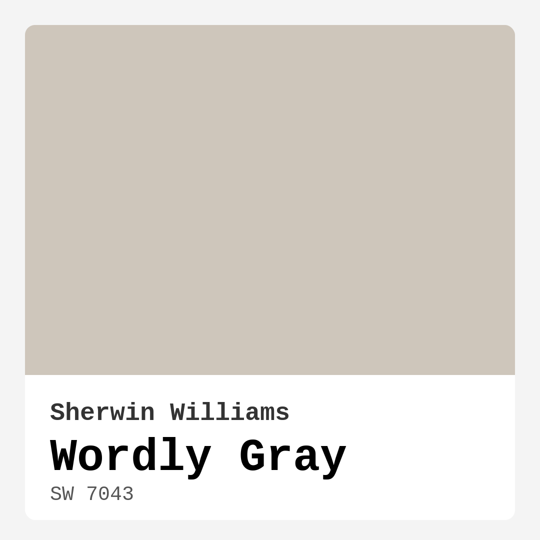
Color Preview & Key Details
| HEX Code | #CEC6BB |
| RGB | 206, 198, 187 |
| LRV | 58% |
| Undertone | Red |
| Finish Options | Eggshell, Flat, Satin |
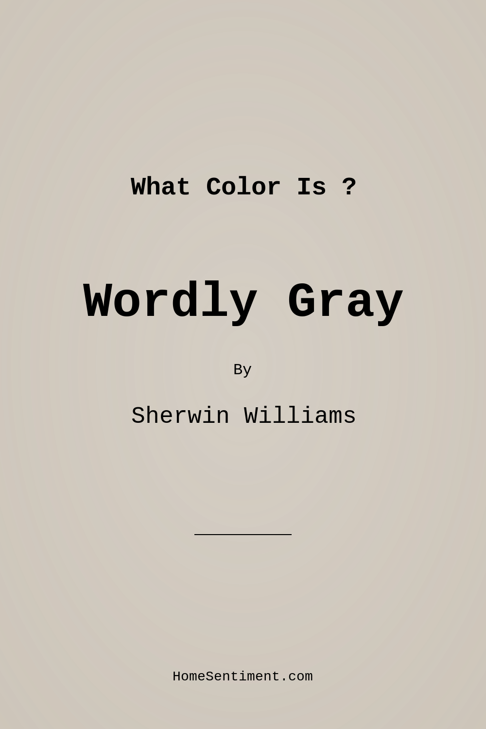
Imagine walking into a room that feels instantly welcoming, where the walls wrap you in a warm embrace and the decor sings in perfect harmony. This is the magic of Wordly Gray by Sherwin Williams. This beautiful paint color, with the code SW 7043, isn’t just a neutral; it’s a canvas that brings life to your home.
Wordly Gray is a soft, muted gray that effortlessly exudes sophistication. It has a balanced undertone of red, which gives it that inviting warmth. You’ll find that it fits seamlessly into various design aesthetics, from modern and transitional to Scandinavian and minimalist styles. The color acts as a calm backdrop that allows your furnishings and decor to truly shine, making it a beloved choice for many homeowners and designers alike.
Now, let’s get into the nitty-gritty of why Wordly Gray might just be the perfect fit for your next project. With a Light Reflectance Value (LRV) of 58%, Wordly Gray reflects a moderate amount of light, making spaces feel open yet cozy. It’s just the right shade to brighten your home without feeling overly stark. If you’ve ever walked into a room with dull walls, you know the difference a fresh coat of paint can make. Wordly Gray strikes that perfect balance, ensuring your rooms feel airy yet grounded.
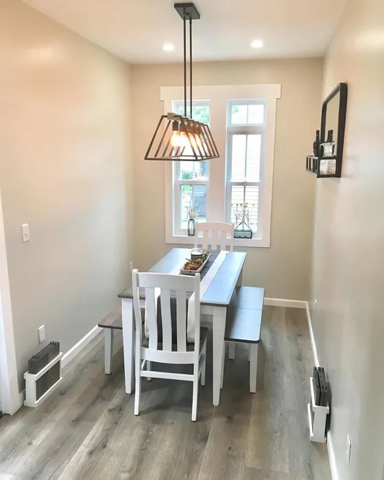
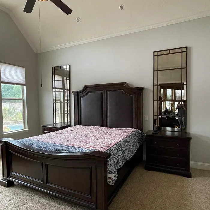
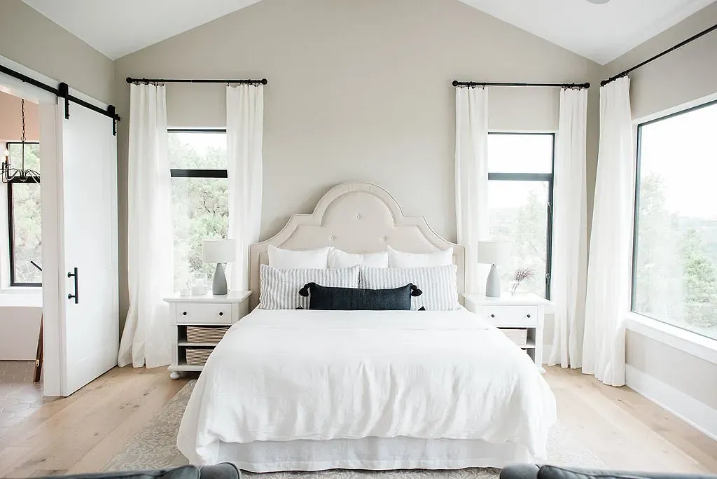
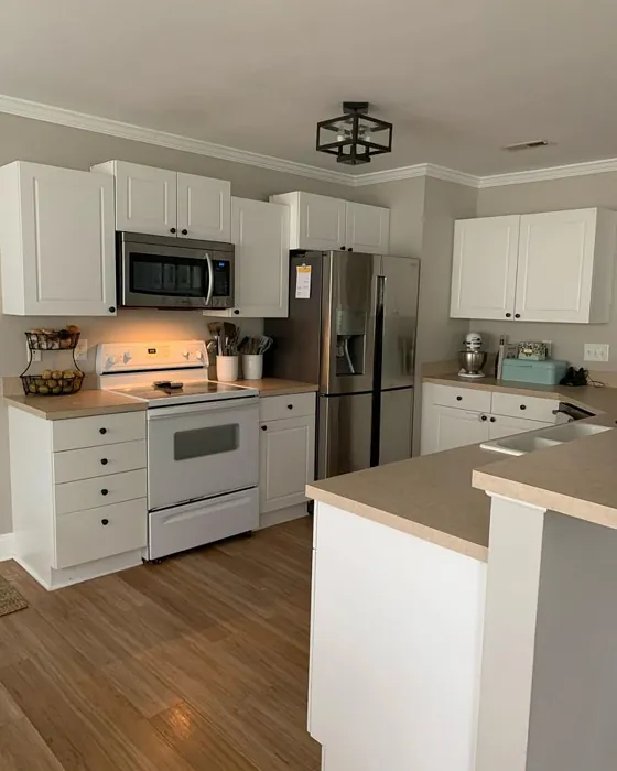
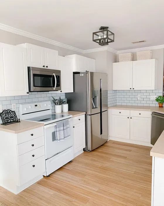
One of the beauties of Wordly Gray is its versatility. This soft gray can transform a living room into a serene retreat or a bedroom into a cozy sanctuary. It works beautifully in dining areas, creating an elegant backdrop for gatherings, and can even enhance the productivity of your home office. Just imagine sitting at your desk, surrounded by the calming hues of Wordly Gray, as you tackle your daily tasks.
When it comes to application, you’ll be pleased to know that Wordly Gray is beginner-friendly. Its smooth formula applies easily with a roller or brush, dries quickly, and provides excellent coverage, typically needing just one or two coats. This means less time spent painting and more time enjoying your freshly updated space. Plus, its washable finish makes maintenance a breeze, perfect for busy households that need a paint color that stands up to the test of time.
While Wordly Gray has so many advantages, it’s important to consider a few things before you dive in. In smaller rooms, this color may appear darker, especially if natural light is limited. If you’re working with a snug space, be mindful of your lighting. To counterbalance this, consider pairing it with lighter furnishings or decor elements that can help create a balanced look, making the room feel open and inviting.
Lighting plays a critical role in how Wordly Gray will look in your space. In bright, natural light, it can feel fresh and airy, creating an uplifting atmosphere. However, in dimmer conditions, the color may take on a cozier, more subdued vibe, which can be perfect for creating intimate settings. Always test this paint in your specific lighting conditions to see how it transforms throughout the day.
The undertones of Wordly Gray are a key element of its character. With that subtle red undertone, it offers depth and complexity that many grays lack. This is why it’s essential to sample the paint in your home and observe how it interacts with your existing furniture and decor. You’ll notice how it can lean warmer or cooler depending on its surroundings, adapting beautifully to your unique style.
When you’re considering trim colors, Wordly Gray pairs wonderfully with whites like White Dove or Simply White. This creates a crisp contrast that enhances the warmth of the gray. If you have wood trims, they’ll bring a natural feel to your space, while brass fixtures can add an elegant touch. It’s all about finding that perfect complement that makes your space feel cohesive and well thought out.
If you’re looking to create an accent wall, Wordly Gray is a fantastic choice. It can anchor a space without overwhelming it, providing just the right amount of contrast against lighter or bolder colors. Imagine a chic modern farmhouse aesthetic where Wordly Gray sets the stage for rustic decor or a contemporary minimalist design, where it enhances the clean lines and simplicity of the furnishings.
For those who are exploring color combinations, Wordly Gray’s versatility shines through. Pair it with bolder colors for a striking contrast, or keep it soft and layered with other muted tones to create a tranquil retreat. Colors like warm cream, soft taupe, or even lush greens can beautifully enhance Wordly Gray’s appeal. This adaptability makes it a favorite among designers who appreciate a color that can evolve with their vision.
When it comes to performance, Wordly Gray stands out. It’s low in VOC, meaning it won’t release harsh chemicals into your home environment, making it a healthier choice for your family. Whether you’re touching up scuffs or refreshing your walls, this paint’s durability makes it easy to maintain, keeping your home looking pristine with minimal effort.
Wordly Gray isn’t just a paint color; it’s a tool for setting the mood in your home. Its cozy, calm, and inviting essence creates a space where you can truly relax and recharge. Whether you’re hosting friends and family or enjoying a quiet evening alone, the atmosphere Wordly Gray creates is one of warmth and comfort.
In summary, if you’re in the market for a sophisticated and versatile paint color that works beautifully across various rooms and styles, look no further than Wordly Gray. From its soft, muted tone to its warm undertones, this Sherwin Williams color is designed to elevate your space. Remember to consider your lighting and decor when making your choice, and you may just find that Wordly Gray is the perfect finishing touch for your home. So go ahead, grab that paintbrush, and let your walls tell a story of elegance and warmth. Your beautifully transformed space awaits!
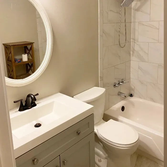
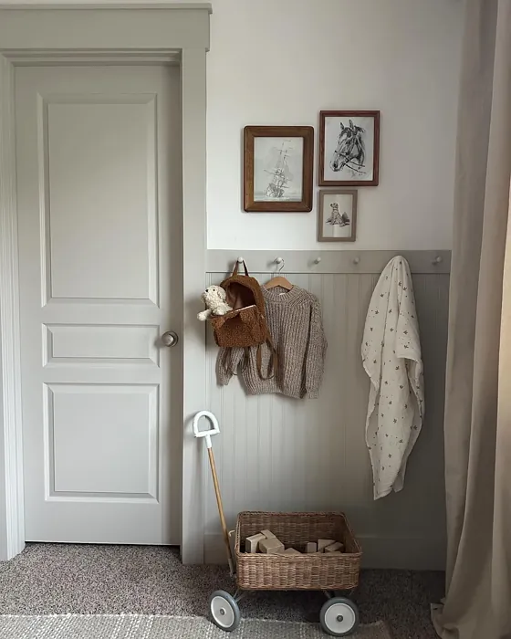
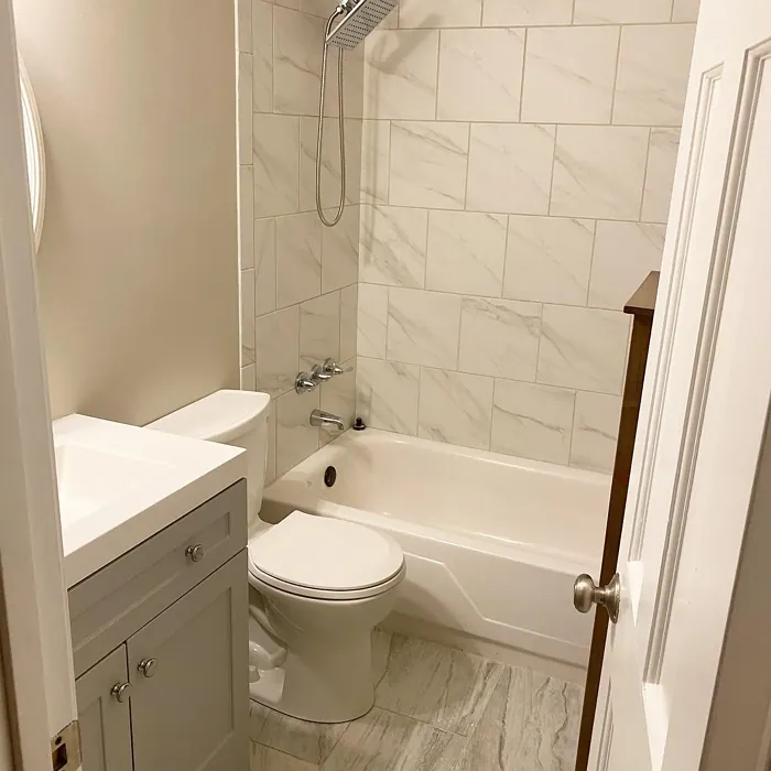
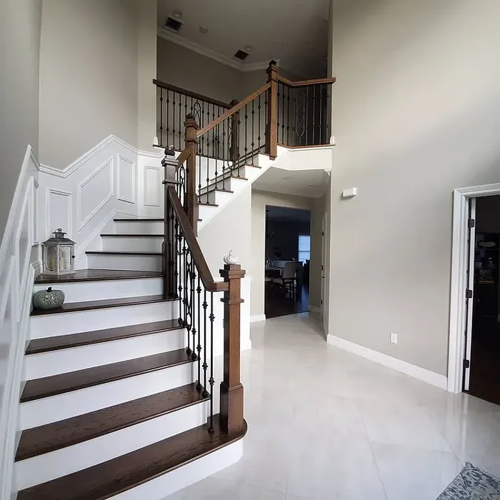
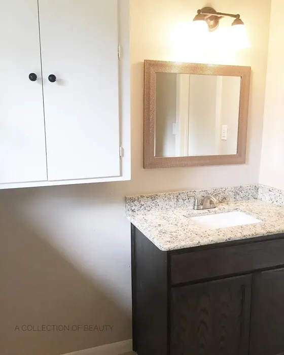
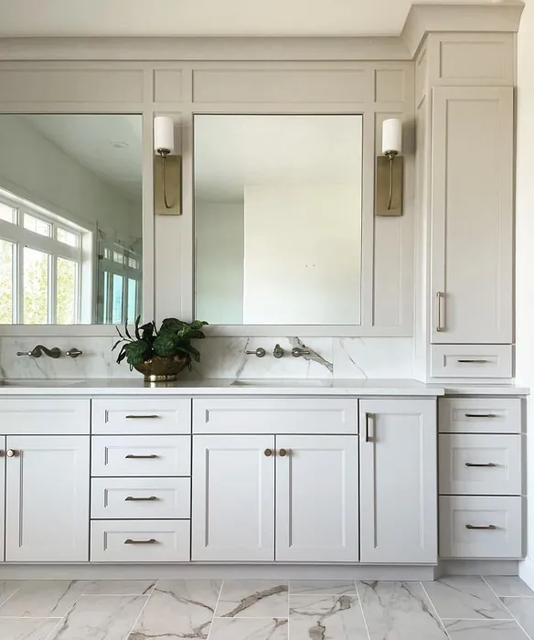
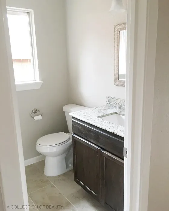
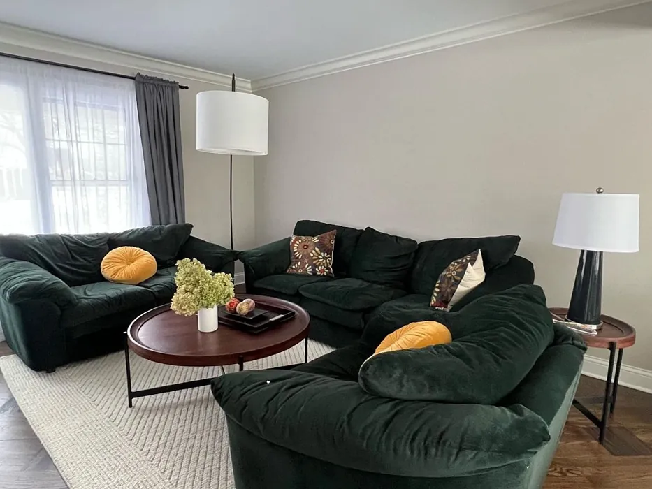
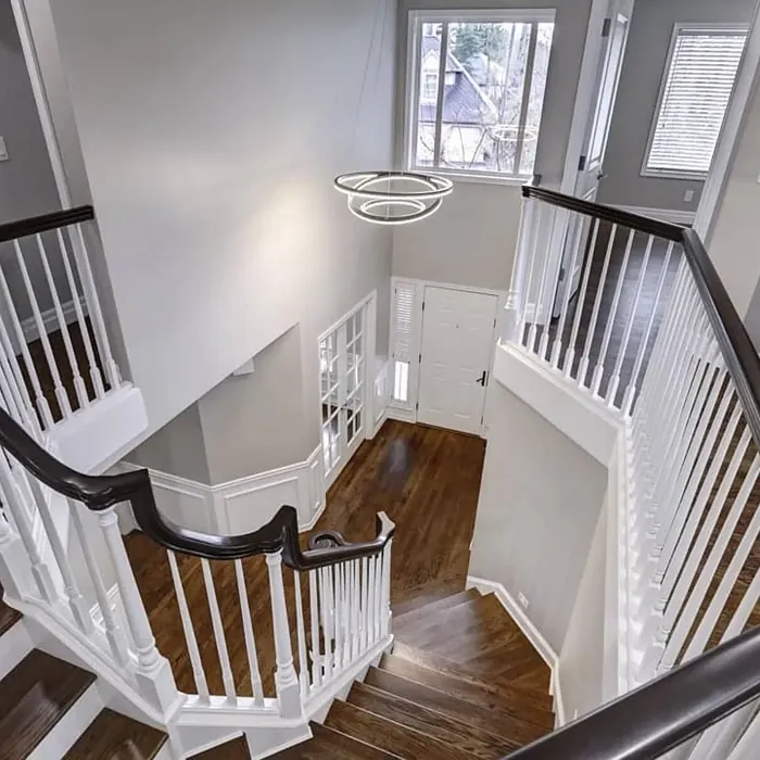
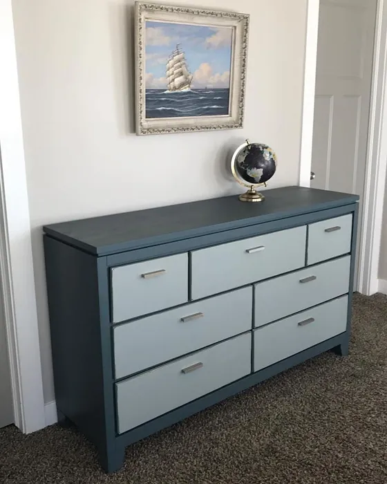
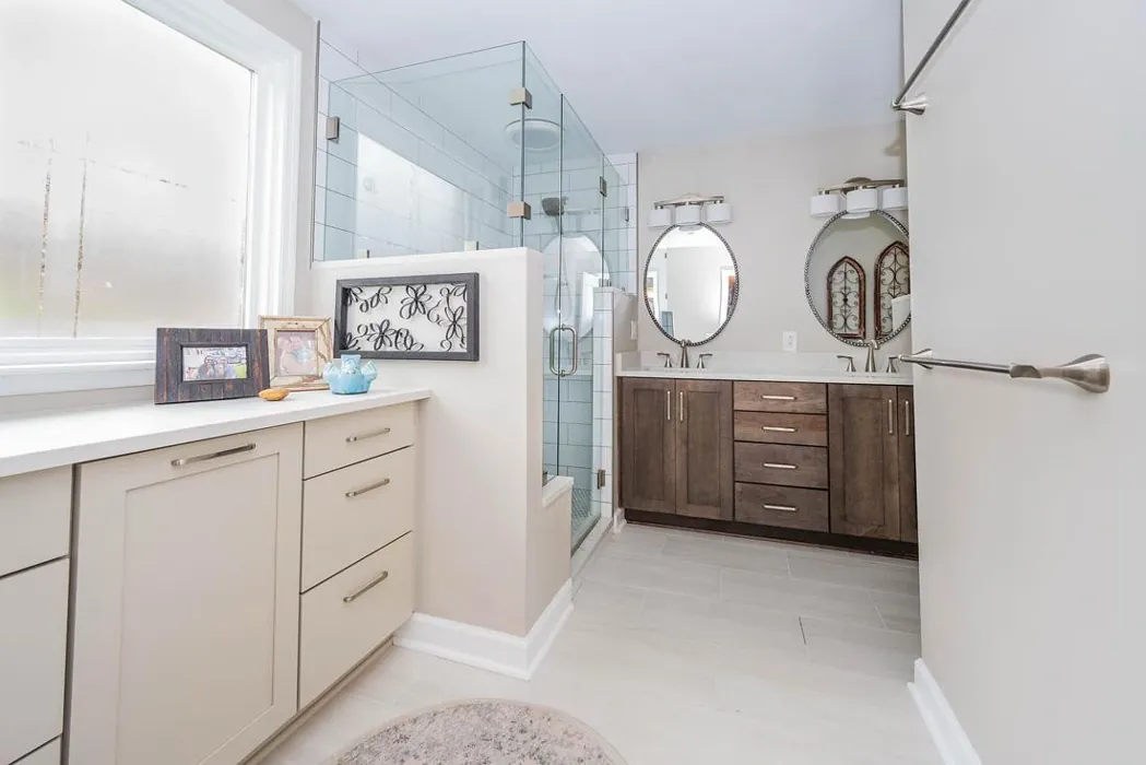
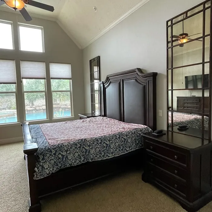
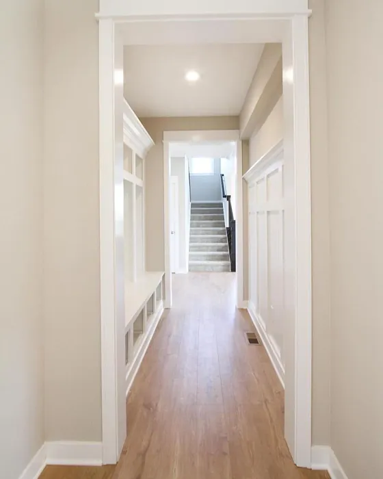
Real Room Photo of Wordly Gray SW 7043


Undertones of Wordly Gray ?
The undertones of Wordly Gray are a key aspect of its character, leaning towards Red. These subtle underlying hues are what give the color its depth and complexity. For example, a gray with a blue undertone will feel cooler and more modern, while one with a brown undertone will feel warmer and more traditional. It’s essential to test this paint in your home and observe it next to your existing furniture, flooring, and decor to see how these undertones interact and reveal themselves throughout the day.
HEX value: #CEC6BB
RGB code: 206, 198, 187
Is Wordly Gray Cool or Warm?
While Wordly Gray leans towards the warm side due to its undertones, it maintains a balanced feel that can work in both warm and cool settings. This makes it an adaptable choice for homeowners who enjoy flexibility in their color palettes.
Understanding Color Properties and Interior Design Tips
Hue refers to a specific position on the color wheel, measured in degrees from 0 to 360. Each degree represents a different pure color:
- 0° represents red
- 120° represents green
- 240° represents blue
Saturation describes the intensity or purity of a color and is expressed as a percentage:
- At 0%, the color appears completely desaturated—essentially a shade of gray
- At 100%, the color is at its most vivid and vibrant
Lightness indicates how light or dark a color is, also expressed as a percentage:
- 0% lightness results in black
- 100% lightness results in white
Using Warm Colors in Interior Design
Warm hues—such as reds, oranges, yellows, warm beiges, and greiges—are excellent choices for creating inviting and energetic spaces. These colors are particularly well-suited for:
- Kitchens, living rooms, and bathrooms, where warmth enhances comfort and sociability
- Large rooms, where warm tones can help reduce the sense of emptiness and make the space feel more intimate
For example:
- Warm beige shades provide a cozy, inviting atmosphere, ideal for living rooms, bedrooms, and hallways.
- Warm greige (a mix of beige and gray) offers the warmth of beige with the modern appeal of gray, making it a versatile backdrop for dining areas, bedrooms, and living spaces.
However, be mindful when using warm light tones in rooms with limited natural light. These shades may appear muted or even take on an unpleasant yellowish tint. To avoid a dull or flat appearance:
- Add depth by incorporating richer tones like deep greens, charcoal, or chocolate brown
- Use textured elements such as curtains, rugs, or cushions to bring dimension to the space
Pro Tip: Achieving Harmony with Warm and Cool Color Balance
To create a well-balanced and visually interesting interior, mix warm and cool tones strategically. This contrast adds depth and harmony to your design.
- If your walls feature warm hues, introduce cool-colored accents such as blue or green furniture, artwork, or accessories to create contrast.
- For a polished look, consider using a complementary color scheme, which pairs colors opposite each other on the color wheel (e.g., red with green, orange with blue).
This thoughtful mix not only enhances visual appeal but also creates a space that feels both dynamic and cohesive.
Light Temperature Affects on Wordly Gray
Natural Light
Natural daylight changes in color temperature as the sun moves across the sky. At sunrise and sunset, the light tends to have a warm, golden tone with a color temperature around 2000 Kelvin (K). As the day progresses and the sun rises higher, the light becomes cooler and more neutral. Around midday, especially when the sky is clear, natural light typically reaches its peak brightness and shifts to a cooler tone, ranging from 5500 to 6500 Kelvin. This midday light is close to what we perceive as pure white or daylight-balanced light.
These shifts in natural light can significantly influence how colors appear in a space, which is why designers often consider both the time of day and the orientation of windows when planning interior color schemes.
Artificial Light
When choosing artificial lighting, pay close attention to the color temperature, measured in Kelvin (K). This determines how warm or cool the light will appear. Lower temperatures, around 2700K, give off a warm, yellow glow often used in living rooms or bedrooms. Higher temperatures, above 5000K, create a cool, bluish light similar to daylight, commonly used in kitchens, offices, or task areas.
Use the slider to see how lighting temperature can affect the appearance of a surface or color throughout a space.


4800K
LRV of Wordly Gray
The Light Reflectance Value (LRV) of Wordly Gray is 58%, which places it in the Medium category. This means it Reflects a moderate amount of light. Understanding a paint’s LRV is crucial for predicting how it will look in your space. A higher LRV indicates a lighter color that reflects more light, making rooms feel larger and brighter. A lower LRV signifies a darker color that absorbs more light, creating a cozier, more intimate atmosphere. Always consider the natural and artificial lighting in your room when selecting a paint color based on its LRV.
Detailed Review of Wordly Gray
Additional Paint Characteristics
Ideal Rooms
Bedroom, Home Office, Kitchen, Living Room
Decor Styles
Minimalist, Modern, Scandi, Transitional
Coverage
Good (1–2 Coats)
Ease of Application
Beginner Friendly, Brush Smooth, Fast-Drying, Roller-Ready
Washability
Highly Washable, Washable
VOC Level
Low VOC
Best Use
Accent Wall, Furniture, Interior Walls
Room Suitability
Bedroom, Dining Room, Home Office, Living Room
Tone Tag
Muted, Neutral, Warm
Finish Type
Eggshell, Satin
Paint Performance
Easy Touch-Up, Low Odor, Scuff Resistant
Use Cases
Best for Modern Farmhouse, Best for Open Concept, Best for Small Spaces
Mood
Calm, Cozy, Inviting
Trim Pairing
Complements Brass Fixtures, Good with Wood Trim, Pairs with White Dove
When it comes to versatility, Wordly Gray stands out as a top contender. Its soft, neutral tone makes it an excellent choice for any room in your home. Whether you’re looking to create a calm bedroom retreat or a cozy living room, this paint color provides a perfect backdrop. The gray hue is not too dark, allowing it to brighten spaces while still feeling grounded. Additionally, it complements a wide range of furnishings and decor styles, making it a favorite among homeowners and designers alike. The coverage is commendable, typically requiring just one to two coats for a flawless finish. If you’re on the hunt for a calming yet elegant color, Wordly Gray is definitely worth considering.
Pros & Cons of SW 7043 Wordly Gray
Pros
Cons
Colors that go with Sherwin Williams Wordly Gray
FAQ on SW 7043 Wordly Gray
Can Wordly Gray be used in a small room?
Absolutely! While Wordly Gray is a soft hue, it can make smaller spaces feel cozy and inviting. However, be mindful of the lighting; in poorly lit areas, it may appear darker. To maximize its potential, consider pairing it with lighter furnishings or decor to create a balanced look that feels open.
What trim colors pair well with Wordly Gray?
Wordly Gray pairs beautifully with white trims like White Dove or Simply White, creating a crisp contrast that enhances the warmth of the gray. Additionally, it works well with wood trims for a natural feel, and complements brass fixtures, adding an elegant touch to your space.
Comparisons Wordly Gray with other colors
Wordly Gray SW 7043 vs Repose Gray SW 7015
| Attribute | Wordly Gray SW 7043 | Repose Gray SW 7015 |
|---|---|---|
| Color Name | Wordly Gray SW 7043 | Repose Gray SW 7015 |
| Color | ||
| Hue | Grey | Grey |
| Brightness | Medium | Medium |
| RGB | 206, 198, 187 | 204, 201, 192 |
| LRV | 58% | 58% |
| Finish Type | Eggshell, Satin | Eggshell, Matte, Satin |
| Finish Options | Eggshell, Flat, Satin | Eggshell, Matte, Satin |
| Ideal Rooms | Bedroom, Home Office, Kitchen, Living Room | Bedroom, Dining Room, Hallway, Home Office, Living Room |
| Decor Styles | Minimalist, Modern, Scandi, Transitional | Contemporary, Farmhouse, Minimalist, Modern, Transitional |
| Coverage | Good (1–2 Coats) | Good (1–2 Coats), Touch-Up Friendly |
| Ease of Application | Beginner Friendly, Brush Smooth, Fast-Drying, Roller-Ready | Beginner Friendly, Brush Smooth, Fast-Drying, Roller-Ready |
| Washability | Highly Washable, Washable | Highly Washable, Washable |
| Room Suitability | Bedroom, Dining Room, Home Office, Living Room | Bedroom, Dining Room, Hallway, Home Office, Living Room |
| Tone | Muted, Neutral, Warm | Muted, Neutral, Warm |
| Paint Performance | Easy Touch-Up, Low Odor, Scuff Resistant | Low Odor, Quick Drying, Scuff Resistant |
Wordly Gray SW 7043 vs Light French Gray SW 0055
| Attribute | Wordly Gray SW 7043 | Light French Gray SW 0055 |
|---|---|---|
| Color Name | Wordly Gray SW 7043 | Light French Gray SW 0055 |
| Color | ||
| Hue | Grey | Grey |
| Brightness | Medium | Medium |
| RGB | 206, 198, 187 | 194, 192, 187 |
| LRV | 58% | 53% |
| Finish Type | Eggshell, Satin | Eggshell, Matte, Satin |
| Finish Options | Eggshell, Flat, Satin | Eggshell, Matte, Satin |
| Ideal Rooms | Bedroom, Home Office, Kitchen, Living Room | Bedroom, Dining Room, Home Office, Kitchen, Living Room |
| Decor Styles | Minimalist, Modern, Scandi, Transitional | Contemporary, Farmhouse, Modern, Scandinavian, Transitional |
| Coverage | Good (1–2 Coats) | Good (1–2 Coats), Touch-Up Friendly |
| Ease of Application | Beginner Friendly, Brush Smooth, Fast-Drying, Roller-Ready | Beginner Friendly, Brush Smooth, Roller-Ready |
| Washability | Highly Washable, Washable | Highly Washable, Washable |
| Room Suitability | Bedroom, Dining Room, Home Office, Living Room | Bedroom, Dining Room, Home Office, Kitchen, Living Room |
| Tone | Muted, Neutral, Warm | Balanced, Muted, Neutral, Warm |
| Paint Performance | Easy Touch-Up, Low Odor, Scuff Resistant | Easy Touch-Up, High Coverage, Low Odor |
Wordly Gray SW 7043 vs Illusive Green SW 9164
| Attribute | Wordly Gray SW 7043 | Illusive Green SW 9164 |
|---|---|---|
| Color Name | Wordly Gray SW 7043 | Illusive Green SW 9164 |
| Color | ||
| Hue | Grey | Grey |
| Brightness | Medium | Medium |
| RGB | 206, 198, 187 | 146, 148, 141 |
| LRV | 58% | 24% |
| Finish Type | Eggshell, Satin | Eggshell, Matte, Satin |
| Finish Options | Eggshell, Flat, Satin | Eggshell, Matte, Satin |
| Ideal Rooms | Bedroom, Home Office, Kitchen, Living Room | Bedroom, Dining Room, Home Office, Living Room, Nursery |
| Decor Styles | Minimalist, Modern, Scandi, Transitional | Coastal, Minimalist, Modern, Rustic, Scandinavian |
| Coverage | Good (1–2 Coats) | Good (1–2 Coats), Touch-Up Friendly |
| Ease of Application | Beginner Friendly, Brush Smooth, Fast-Drying, Roller-Ready | Beginner Friendly, Brush Smooth, Fast-Drying, Roller-Ready |
| Washability | Highly Washable, Washable | Highly Washable, Washable, Wipeable |
| Room Suitability | Bedroom, Dining Room, Home Office, Living Room | Bedroom, Dining Room, Home Office, Living Room, Nursery |
| Tone | Muted, Neutral, Warm | Balanced, Earthy, Muted |
| Paint Performance | Easy Touch-Up, Low Odor, Scuff Resistant | Easy Touch-Up, Low Odor, Quick Drying, Scuff Resistant |
Wordly Gray SW 7043 vs Fawn Brindle SW 7640
| Attribute | Wordly Gray SW 7043 | Fawn Brindle SW 7640 |
|---|---|---|
| Color Name | Wordly Gray SW 7043 | Fawn Brindle SW 7640 |
| Color | ||
| Hue | Grey | Grey |
| Brightness | Medium | Medium |
| RGB | 206, 198, 187 | 167, 160, 148 |
| LRV | 58% | 24% |
| Finish Type | Eggshell, Satin | Eggshell, Matte |
| Finish Options | Eggshell, Flat, Satin | Eggshell, Matte, Satin |
| Ideal Rooms | Bedroom, Home Office, Kitchen, Living Room | Bedroom, Dining Room, Hallway, Home Office, Living Room |
| Decor Styles | Minimalist, Modern, Scandi, Transitional | Bohemian, Minimalist, Modern Farmhouse, Transitional |
| Coverage | Good (1–2 Coats) | Good (1–2 Coats) |
| Ease of Application | Beginner Friendly, Brush Smooth, Fast-Drying, Roller-Ready | Brush Smooth, Fast-Drying, Roller-Ready |
| Washability | Highly Washable, Washable | Stain Resistant, Washable |
| Room Suitability | Bedroom, Dining Room, Home Office, Living Room | Bedroom, Dining Room, Home Office, Living Room |
| Tone | Muted, Neutral, Warm | Earthy, Neutral, Warm |
| Paint Performance | Easy Touch-Up, Low Odor, Scuff Resistant | Easy Touch-Up, Fade Resistant, Low Odor |
Wordly Gray SW 7043 vs Balanced Beige SW 7037
| Attribute | Wordly Gray SW 7043 | Balanced Beige SW 7037 |
|---|---|---|
| Color Name | Wordly Gray SW 7043 | Balanced Beige SW 7037 |
| Color | ||
| Hue | Grey | Grey |
| Brightness | Medium | Medium |
| RGB | 206, 198, 187 | 192, 178, 162 |
| LRV | 58% | 44% |
| Finish Type | Eggshell, Satin | Eggshell, Matte, Satin |
| Finish Options | Eggshell, Flat, Satin | Eggshell, Matte, Satin |
| Ideal Rooms | Bedroom, Home Office, Kitchen, Living Room | Bedroom, Dining Room, Home Office, Kitchen, Living Room |
| Decor Styles | Minimalist, Modern, Scandi, Transitional | Contemporary, Minimalist, Modern Farmhouse, Rustic, Transitional |
| Coverage | Good (1–2 Coats) | Good (1–2 Coats), Touch-Up Friendly |
| Ease of Application | Beginner Friendly, Brush Smooth, Fast-Drying, Roller-Ready | Beginner Friendly, Brush Smooth, Roller-Ready |
| Washability | Highly Washable, Washable | Washable, Wipeable |
| Room Suitability | Bedroom, Dining Room, Home Office, Living Room | Bedroom, Dining Room, Hallway, Kitchen, Living Room |
| Tone | Muted, Neutral, Warm | Balanced, Earthy, Warm |
| Paint Performance | Easy Touch-Up, Low Odor, Scuff Resistant | Easy Touch-Up, High Coverage, Low Odor |
Wordly Gray SW 7043 vs Mushroom SW 9587
| Attribute | Wordly Gray SW 7043 | Mushroom SW 9587 |
|---|---|---|
| Color Name | Wordly Gray SW 7043 | Mushroom SW 9587 |
| Color | ||
| Hue | Grey | Grey |
| Brightness | Medium | Medium |
| RGB | 206, 198, 187 | 208, 199, 183 |
| LRV | 58% | 24% |
| Finish Type | Eggshell, Satin | Eggshell, Satin |
| Finish Options | Eggshell, Flat, Satin | Eggshell, Flat, Matte, Satin |
| Ideal Rooms | Bedroom, Home Office, Kitchen, Living Room | Bedroom, Dining Room, Hallway, Home Office, Living Room |
| Decor Styles | Minimalist, Modern, Scandi, Transitional | Bohemian, Contemporary, Modern Farmhouse, Traditional |
| Coverage | Good (1–2 Coats) | Good (1–2 Coats) |
| Ease of Application | Beginner Friendly, Brush Smooth, Fast-Drying, Roller-Ready | Beginner Friendly, Brush Smooth, Roller-Ready |
| Washability | Highly Washable, Washable | Highly Washable, Washable |
| Room Suitability | Bedroom, Dining Room, Home Office, Living Room | Bedroom, Dining Room, Home Office, Living Room |
| Tone | Muted, Neutral, Warm | Earthy, Neutral, Warm |
| Paint Performance | Easy Touch-Up, Low Odor, Scuff Resistant | Easy Touch-Up, Long Lasting, Low Odor, Scuff Resistant |
Wordly Gray SW 7043 vs Silver Strand SW 7057
| Attribute | Wordly Gray SW 7043 | Silver Strand SW 7057 |
|---|---|---|
| Color Name | Wordly Gray SW 7043 | Silver Strand SW 7057 |
| Color | ||
| Hue | Grey | Grey |
| Brightness | Medium | Medium |
| RGB | 206, 198, 187 | 200, 203, 196 |
| LRV | 58% | 66% |
| Finish Type | Eggshell, Satin | Eggshell, Satin |
| Finish Options | Eggshell, Flat, Satin | Eggshell, Matte, Satin |
| Ideal Rooms | Bedroom, Home Office, Kitchen, Living Room | Bedroom, Dining Room, Hallway, Home Office, Living Room |
| Decor Styles | Minimalist, Modern, Scandi, Transitional | Coastal, Minimalist, Modern, Traditional, Transitional |
| Coverage | Good (1–2 Coats) | Good (1–2 Coats), Touch-Up Friendly |
| Ease of Application | Beginner Friendly, Brush Smooth, Fast-Drying, Roller-Ready | Beginner Friendly, Brush Smooth, Roller-Ready |
| Washability | Highly Washable, Washable | Highly Washable, Washable |
| Room Suitability | Bedroom, Dining Room, Home Office, Living Room | Bathroom, Bedroom, Home Office, Kitchen, Living Room |
| Tone | Muted, Neutral, Warm | Balanced, Neutral, Warm |
| Paint Performance | Easy Touch-Up, Low Odor, Scuff Resistant | Easy Touch-Up, High Coverage, Low Odor |
Wordly Gray SW 7043 vs Cadet SW 9143
| Attribute | Wordly Gray SW 7043 | Cadet SW 9143 |
|---|---|---|
| Color Name | Wordly Gray SW 7043 | Cadet SW 9143 |
| Color | ||
| Hue | Grey | Grey |
| Brightness | Medium | Medium |
| RGB | 206, 198, 187 | 145, 153, 156 |
| LRV | 58% | 12% |
| Finish Type | Eggshell, Satin | Eggshell, Matte, Satin |
| Finish Options | Eggshell, Flat, Satin | Eggshell, Matte, Satin |
| Ideal Rooms | Bedroom, Home Office, Kitchen, Living Room | Bathroom, Bedroom, Hallway, Home Office, Kitchen, Living Room |
| Decor Styles | Minimalist, Modern, Scandi, Transitional | Coastal, Industrial, Minimalist, Modern, Scandinavian |
| Coverage | Good (1–2 Coats) | Good (1–2 Coats), Touch-Up Friendly |
| Ease of Application | Beginner Friendly, Brush Smooth, Fast-Drying, Roller-Ready | Beginner Friendly, Brush Smooth, Roller-Ready |
| Washability | Highly Washable, Washable | Washable, Wipeable |
| Room Suitability | Bedroom, Dining Room, Home Office, Living Room | Bathroom, Bedroom, Hallway, Home Office, Living Room |
| Tone | Muted, Neutral, Warm | Balanced, Cool, Muted |
| Paint Performance | Easy Touch-Up, Low Odor, Scuff Resistant | Easy Touch-Up, High Coverage, Low Odor |
Wordly Gray SW 7043 vs Dovetail SW 7018
| Attribute | Wordly Gray SW 7043 | Dovetail SW 7018 |
|---|---|---|
| Color Name | Wordly Gray SW 7043 | Dovetail SW 7018 |
| Color | ||
| Hue | Grey | Grey |
| Brightness | Medium | Medium |
| RGB | 206, 198, 187 | 144, 138, 131 |
| LRV | 58% | 24% |
| Finish Type | Eggshell, Satin | Eggshell, Matte, Satin |
| Finish Options | Eggshell, Flat, Satin | Eggshell, Matte, Satin |
| Ideal Rooms | Bedroom, Home Office, Kitchen, Living Room | Bedroom, Dining Room, Hallway, Home Office, Living Room |
| Decor Styles | Minimalist, Modern, Scandi, Transitional | Minimalist, Modern Farmhouse, Rustic, Transitional |
| Coverage | Good (1–2 Coats) | Good (1–2 Coats), Touch-Up Friendly |
| Ease of Application | Beginner Friendly, Brush Smooth, Fast-Drying, Roller-Ready | Beginner Friendly, Brush Smooth, Roller-Ready |
| Washability | Highly Washable, Washable | Washable, Wipeable |
| Room Suitability | Bedroom, Dining Room, Home Office, Living Room | Bedroom, Dining Room, Home Office, Living Room |
| Tone | Muted, Neutral, Warm | Earthy, Neutral, Warm |
| Paint Performance | Easy Touch-Up, Low Odor, Scuff Resistant | Easy Touch-Up, Fade Resistant, Low Odor |
Wordly Gray SW 7043 vs Morning Fog SW 6255
| Attribute | Wordly Gray SW 7043 | Morning Fog SW 6255 |
|---|---|---|
| Color Name | Wordly Gray SW 7043 | Morning Fog SW 6255 |
| Color | ||
| Hue | Grey | Grey |
| Brightness | Medium | Medium |
| RGB | 206, 198, 187 | 168, 174, 177 |
| LRV | 58% | 40% |
| Finish Type | Eggshell, Satin | Eggshell, Matte |
| Finish Options | Eggshell, Flat, Satin | Eggshell, Matte, Satin |
| Ideal Rooms | Bedroom, Home Office, Kitchen, Living Room | Bathroom, Bedroom, Home Office, Kitchen, Living Room |
| Decor Styles | Minimalist, Modern, Scandi, Transitional | Coastal, Minimalist, Modern, Scandinavian |
| Coverage | Good (1–2 Coats) | Good (1–2 Coats), Touch-Up Friendly |
| Ease of Application | Beginner Friendly, Brush Smooth, Fast-Drying, Roller-Ready | Beginner Friendly, Fast-Drying, Roller-Ready |
| Washability | Highly Washable, Washable | Highly Washable, Washable |
| Room Suitability | Bedroom, Dining Room, Home Office, Living Room | Bedroom, Home Office, Living Room, Nursery |
| Tone | Muted, Neutral, Warm | Cool, Muted, Neutral |
| Paint Performance | Easy Touch-Up, Low Odor, Scuff Resistant | Easy Touch-Up, Low Odor, Quick Drying |
Official Page of Sherwin Williams Wordly Gray SW 7043