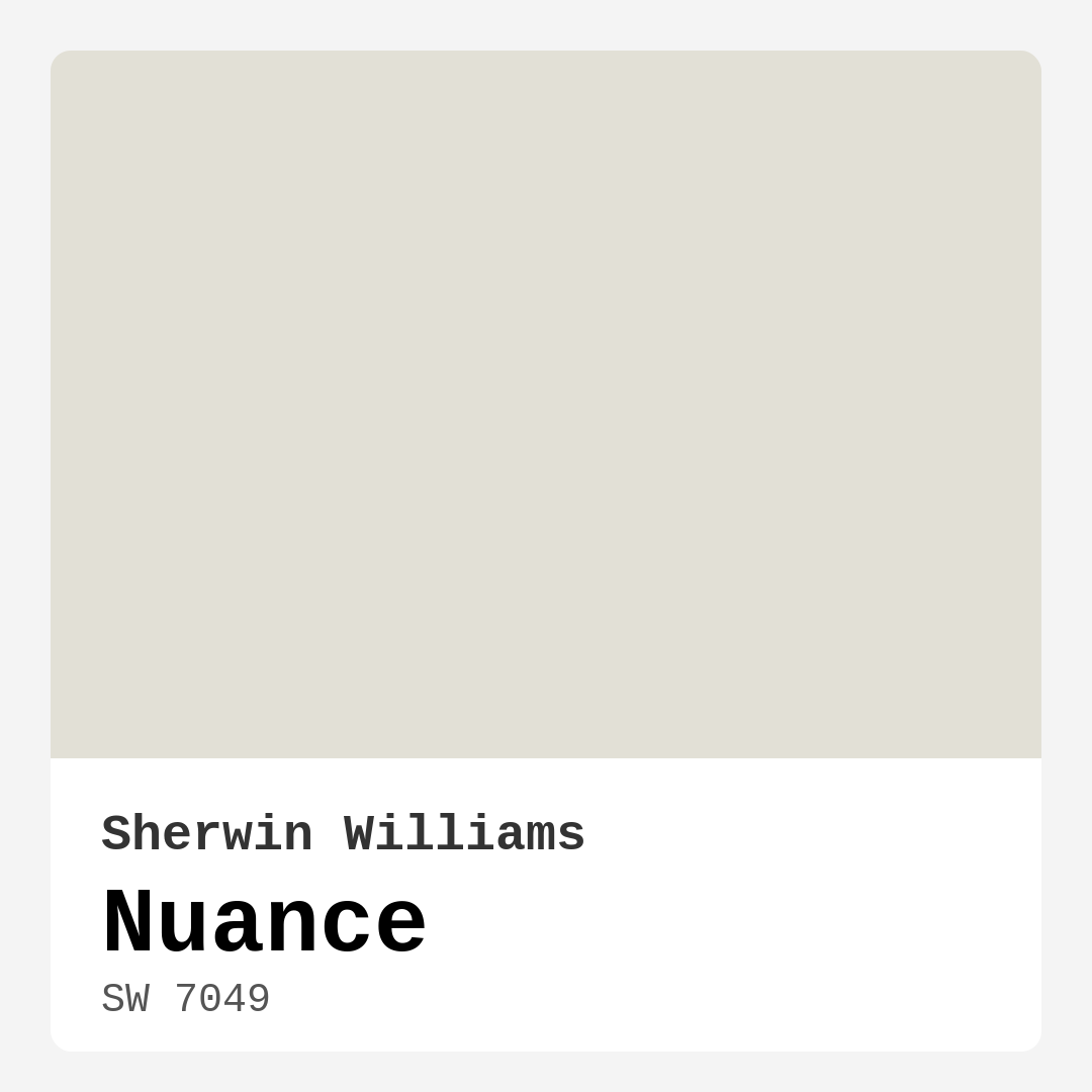
Color Preview & Key Details
| HEX Code | #E2E0D6 |
| RGB | 226, 224, 214 |
| LRV | 22% |
| Undertone | Yellow |
| Finish Options | Eggshell, Matte, Satin |
Imagine walking into a room that instantly wraps you in a gentle embrace. You breathe in, and a sense of calm washes over you. That’s the magic of a well-chosen paint color, and today, I want to share one that can do just that: Sherwin Williams’ Nuance (SW 7049). This soft, muted gray isn’t just a paint; it’s a transformative element for your home.
Nuance has a delicate quality that reflects a gentle fog, creating an atmosphere of tranquility. Its light brightness tag makes it ideal for those looking to achieve a serene backdrop. But don’t let the softness fool you—this color packs a punch in versatility. It suits various decor styles, from modern and Scandinavian to rustic and minimalist.
When you think about where to apply Nuance, consider spaces like the living room, bedroom, home office, or even a nursery. Each of these rooms can benefit from the calming influence of this shade. Imagine a bedroom painted in Nuance, where the soft hue invites relaxation after a long day. Or picture a home office that inspires creativity and focus, free of distractions.
One of the best aspects of Nuance is its compatibility with a broad range of colors and decor styles. The undertone is a gentle yellow, which adds warmth to the otherwise cool gray. This subtle warmth allows it to pair beautifully with both warm and cool colors, making it a versatile choice. Whether you want to complement warm wood tones or cool metallic accents, Nuance does it all with grace.
Now, let’s talk application. Nuance is beginner-friendly, which means even if you’re new to painting, you can achieve a beautiful finish. It’s roller-ready and brush smooth, ensuring a hassle-free experience. Generally, it provides good coverage, typically needing only one or two coats for that flawless look.
But what about maintenance? Nuance is washable and wipeable, a practical feature for any home. So, if you’re considering it for high-traffic areas, keep in mind that it’s suitable for moderate use. While it may require touch-ups in busy zones, its easy-to-clean nature makes it a solid choice for spaces that see a lot of action.
Wondering if Nuance will work in a smaller room? The answer is a resounding yes! Its light and airy quality can make a space feel larger and more open. In a nursery, for example, it fosters an inviting atmosphere, perfect for both playtime and nap time.
When choosing a paint color, understanding the Light Reflectance Value (LRV) is crucial. Nuance boasts an LRV of 22%, which means it reflects very little light. This characteristic creates a cozy, intimate atmosphere, ideal for spaces meant for relaxation. Just keep in mind that in rooms with limited natural light, you might want to consider an additional coat to ensure the hue shines through as intended.
As with any paint, it’s essential to test Nuance in your specific environment. Observe how it interacts with your existing furniture and decor throughout the day. The way it shifts under different lighting conditions can be quite telling. In natural light, the color appears even more ethereal, enhancing its calming qualities. Under artificial lighting, it maintains its gentle character, ensuring your space feels welcoming, regardless of the time of day.
So, how do you style Nuance? Think of it as a canvas that invites other colors to play. Pairing it with complementary shades like SW 9640 or SW 6540 creates a beautiful harmony. For a more classic look, consider white trim like White Dove, which elevates the overall aesthetic. Brass fixtures can add a touch of elegance, enhancing the warmth of the color while providing a modern twist.
If you’re leaning towards a monochromatic look, lighter shades like SW 6182 or SW 7005 can provide a soft gradient effect. On the flip side, if you’re drawn to deeper hues, you might explore shades like SW 6169 or SW 6162 for a more dramatic contrast.
Ultimately, Nuance stands out as more than just a color; it’s a mood enhancer. Whether you’re creating a serene retreat in your bedroom, a productive workspace in your home office, or a welcoming atmosphere in your living room, this versatile shade adapts to your needs. Its understated elegance resonates with those seeking a sophisticated yet cozy vibe.
When it comes to personalizing your space, the right color can make all the difference. Nuance offers a calming yet stylish solution for any room, blending warmth and tranquility in a way that few colors can. So, as you embark on your home decor journey, consider how this soft gray might transform your space into a sanctuary.
Remember, painting is one of the most accessible ways to make a significant change in your home. With Nuance, you’re not just adding a color to your walls—you’re creating an experience, a feeling, and a reflection of your personal style. So grab that paintbrush and let your walls tell a story that is uniquely yours.

Save this color to your Pinterest board to revisit when planning your room.
Real Room Photo of Nuance SW 7049


Real rooms painted with Nuance SW 7049 by Sherwin Williams. Lighting and photography can affect how colors appear — always test a sample swatch in your own space.
Undertones of Nuance ?
The undertones of Nuance are a key aspect of its character, leaning towards Yellow. These subtle underlying hues are what give the color its depth and complexity. For example, a gray with a blue undertone will feel cooler and more modern, while one with a brown undertone will feel warmer and more traditional. It’s essential to test this paint in your home and observe it next to your existing furniture, flooring, and decor to see how these undertones interact and reveal themselves throughout the day.
HEX value: #E2E0D6
RGB code: 226, 224, 214
Is Nuance Cool or Warm?
While Nuance is predominantly neutral, its faint warmth brings a cozy element that can soften a room’s overall feel. This quality makes it versatile, as it can be paired with both warm and cool accent colors, providing balance in your decor.
Understanding Color Properties and Interior Design Tips
Hue refers to a specific position on the color wheel, measured in degrees from 0 to 360. Each degree represents a different pure color:
- 0° represents red
- 120° represents green
- 240° represents blue
Saturation describes the intensity or purity of a color and is expressed as a percentage:
- At 0%, the color appears completely desaturated—essentially a shade of gray
- At 100%, the color is at its most vivid and vibrant
Lightness indicates how light or dark a color is, also expressed as a percentage:
- 0% lightness results in black
- 100% lightness results in white
Using Warm Colors in Interior Design
Warm hues—such as reds, oranges, yellows, warm beiges, and greiges—are excellent choices for creating inviting and energetic spaces. These colors are particularly well-suited for:
- Kitchens, living rooms, and bathrooms, where warmth enhances comfort and sociability
- Large rooms, where warm tones can help reduce the sense of emptiness and make the space feel more intimate
For example:
- Warm beige shades provide a cozy, inviting atmosphere, ideal for living rooms, bedrooms, and hallways.
- Warm greige (a mix of beige and gray) offers the warmth of beige with the modern appeal of gray, making it a versatile backdrop for dining areas, bedrooms, and living spaces.
However, be mindful when using warm light tones in rooms with limited natural light. These shades may appear muted or even take on an unpleasant yellowish tint. To avoid a dull or flat appearance:
- Add depth by incorporating richer tones like deep greens, charcoal, or chocolate brown
- Use textured elements such as curtains, rugs, or cushions to bring dimension to the space
Pro Tip: Achieving Harmony with Warm and Cool Color Balance
To create a well-balanced and visually interesting interior, mix warm and cool tones strategically. This contrast adds depth and harmony to your design.
- If your walls feature warm hues, introduce cool-colored accents such as blue or green furniture, artwork, or accessories to create contrast.
- For a polished look, consider using a complementary color scheme, which pairs colors opposite each other on the color wheel (e.g., red with green, orange with blue).
This thoughtful mix not only enhances visual appeal but also creates a space that feels both dynamic and cohesive.

Save this color to your Pinterest board to revisit when planning your room.
Light Temperature Affects on Nuance
Natural Light
Natural daylight changes in color temperature as the sun moves across the sky. At sunrise and sunset, the light tends to have a warm, golden tone with a color temperature around 2000 Kelvin (K). As the day progresses and the sun rises higher, the light becomes cooler and more neutral. Around midday, especially when the sky is clear, natural light typically reaches its peak brightness and shifts to a cooler tone, ranging from 5500 to 6500 Kelvin. This midday light is close to what we perceive as pure white or daylight-balanced light.
These shifts in natural light can significantly influence how colors appear in a space, which is why designers often consider both the time of day and the orientation of windows when planning interior color schemes.
Explore how this color transforms from sunrise through sunset as natural light changes throughout the day. Use the slider to simulate morning light, midday brightness, and warm afternoon tones.
North-facing rooms stay cooler throughout the day and benefit from warmer paint tones to compensate. South-facing rooms receive more direct sunlight, making even deeper shades more workable. East-facing rooms get bright morning light that fades by afternoon, while west-facing rooms glow warmly in the evening.
Artificial Light
When choosing artificial lighting, pay close attention to the color temperature, measured in Kelvin (K). This determines how warm or cool the light will appear. Lower temperatures, around 2700K, give off a warm, yellow glow often used in living rooms or bedrooms. Higher temperatures, above 5000K, create a cool, bluish light similar to daylight, commonly used in kitchens, offices, or task areas.
Use the slider to see how lighting temperature can affect the appearance of a surface or color throughout a space.
See how this color looks under different artificial light temperatures — from warm candlelight (2000K) to cool daylight (7000K). Move the slider to simulate your room's lighting conditions.


4800K
Keep in mind that natural light from windows, the warmth of lamps, and overhead lighting all affect how this color reads on your walls at different times of day. Always observe a sample swatch in your actual space before purchasing.
LRV of Nuance
The Light Reflectance Value (LRV) of Nuance is 22%, which places it in the Medium Dark category. This means it reflects very little light. Understanding a paint’s LRV is crucial for predicting how it will look in your space. A higher LRV indicates a lighter color that reflects more light, making rooms feel larger and brighter. A lower LRV signifies a darker color that absorbs more light, creating a cozier, more intimate atmosphere. Always consider the natural and artificial lighting in your room when selecting a paint color based on its LRV.
Detailed Review of Nuance
Additional Paint Characteristics
Ideal Rooms
Bedroom, Hallway, Home Office, Living Room, Nursery
Decor Styles
Minimalist, Modern, Rustic, Scandinavian
Coverage
Good (1–2 Coats)
Ease of Application
Beginner Friendly, Brush Smooth, Roller-Ready
Washability
Washable, Wipeable
VOC Level
Low VOC
Best Use
Accent Wall, Interior Walls, Trim
Room Suitability
Bedroom, Home Office, Living Room, Nursery
Tone Tag
Muted, Neutral, Warm
Finish Type
Eggshell, Matte
Paint Performance
Easy Touch-Up, High Coverage, Low Odor
Use Cases
Best for Rentals, Best for Small Spaces, Classic Favorite
Mood
Calm, Cozy, Inviting
Trim Pairing
Complements Brass Fixtures, Pairs with White Dove, Works with Warm Trim
Nuance is more than just a paint color; it’s a mood enhancer. This soft, muted shade blends effortlessly into various settings, providing a calming atmosphere that’s perfect for relaxation. Its understated elegance makes it a go-to choice for those looking to create a sophisticated yet cozy vibe. When applied, Nuance demonstrates excellent coverage, typically needing only one or two coats for a flawless finish. It works wonders in spaces that require a touch of serenity, like bedrooms and home offices. Plus, it pairs beautifully with both warm and cool tones, allowing for a wide range of design flexibility. Whether you’re aiming for a minimalist aesthetic or a more rustic feel, Nuance adapts seamlessly.
Pros & Cons of SW 7049 Nuance
Pros
Cons
Colors that go with Sherwin Williams Nuance
FAQ on SW 7049 Nuance
Is Nuance suitable for high-traffic areas?
Nuance is a great choice for moderate traffic areas. While it’s not specifically designed for high-traffic zones, its washable nature allows for easy maintenance. If you’re applying it in a hallway or entryway, just be prepared for the possibility of needing touch-ups periodically. For heavy-duty use, consider pairing it with a more durable finish.
Can I use Nuance in a small room?
Absolutely! In fact, Nuance works wonderfully in small rooms. Its light and airy quality can make a space feel larger and more open. When applied, it reflects light beautifully, helping to create an inviting atmosphere, which is perfect for cozy spaces like nurseries or small bedrooms.
Comparisons Nuance with other colors
Nuance SW 7049 vs Agreeable Gray SW 7029
| Attribute | Nuance SW 7049 | Agreeable Gray SW 7029 |
|---|---|---|
| Color Name | Nuance SW 7049 | Agreeable Gray SW 7029 |
| Color | ||
| Hue | Grey | Grey |
| Brightness | Light | Light |
| RGB | 226, 224, 214 | 209, 203, 193 |
| LRV | 22% | 60% |
| Finish Type | Eggshell, Matte | Eggshell, Matte, Satin |
| Finish Options | Eggshell, Matte, Satin | Eggshell, Flat, Matte, Satin |
| Ideal Rooms | Bedroom, Hallway, Home Office, Living Room, Nursery | Bathroom, Bedroom, Dining Room, Home Office, Kitchen, Living Room |
| Decor Styles | Minimalist, Modern, Rustic, Scandinavian | Contemporary, Farmhouse, Minimalist, Modern, Transitional |
| Coverage | Good (1–2 Coats) | Good (1–2 Coats), Touch-Up Friendly |
| Ease of Application | Beginner Friendly, Brush Smooth, Roller-Ready | Beginner Friendly, Brush Smooth, Roller-Ready |
| Washability | Washable, Wipeable | Washable, Wipeable |
| Room Suitability | Bedroom, Home Office, Living Room, Nursery | Bathroom, Bedroom, Dining Room, Kitchen, Living Room |
| Tone | Muted, Neutral, Warm | Muted, Neutral, Warm |
| Paint Performance | Easy Touch-Up, High Coverage, Low Odor | Easy Touch-Up, Fade Resistant, Low Odor |
Lighting conditions, wall orientation, and surrounding decor can significantly affect how these colors appear in your space. Always test a sample swatch before committing to a full application.
Nuance SW 7049 vs Eider White SW 7014
| Attribute | Nuance SW 7049 | Eider White SW 7014 |
|---|---|---|
| Color Name | Nuance SW 7049 | Eider White SW 7014 |
| Color | ||
| Hue | Grey | Grey |
| Brightness | Light | Light |
| RGB | 226, 224, 214 | 226, 222, 216 |
| LRV | 22% | 73% |
| Finish Type | Eggshell, Matte | Eggshell, Matte, Satin |
| Finish Options | Eggshell, Matte, Satin | Eggshell, Matte, Satin |
| Ideal Rooms | Bedroom, Hallway, Home Office, Living Room, Nursery | Bathroom, Bedroom, Dining Room, Home Office, Kitchen, Living Room |
| Decor Styles | Minimalist, Modern, Rustic, Scandinavian | Farmhouse, Minimalist, Modern, Scandinavian, Transitional |
| Coverage | Good (1–2 Coats) | Good (1–2 Coats), Touch-Up Friendly |
| Ease of Application | Beginner Friendly, Brush Smooth, Roller-Ready | Beginner Friendly, Brush Smooth, Roller-Ready |
| Washability | Washable, Wipeable | Highly Washable, Washable |
| Room Suitability | Bedroom, Home Office, Living Room, Nursery | Bathroom, Bedroom, Dining Room, Kitchen, Living Room |
| Tone | Muted, Neutral, Warm | Creamy, Muted, Neutral, Warm |
| Paint Performance | Easy Touch-Up, High Coverage, Low Odor | Easy Touch-Up, High Coverage, Low Odor, Scuff Resistant |
Lighting conditions, wall orientation, and surrounding decor can significantly affect how these colors appear in your space. Always test a sample swatch before committing to a full application.
Nuance SW 7049 vs Drift of Mist SW 9166
| Attribute | Nuance SW 7049 | Drift of Mist SW 9166 |
|---|---|---|
| Color Name | Nuance SW 7049 | Drift of Mist SW 9166 |
| Color | ||
| Hue | Grey | Grey |
| Brightness | Light | Light |
| RGB | 226, 224, 214 | 220, 216, 208 |
| LRV | 22% | 65% |
| Finish Type | Eggshell, Matte | Eggshell, Matte, Satin |
| Finish Options | Eggshell, Matte, Satin | Eggshell, Matte, Satin |
| Ideal Rooms | Bedroom, Hallway, Home Office, Living Room, Nursery | Bathroom, Bedroom, Home Office, Kitchen, Living Room |
| Decor Styles | Minimalist, Modern, Rustic, Scandinavian | Coastal, Minimalist, Modern, Scandinavian |
| Coverage | Good (1–2 Coats) | Good (1–2 Coats), Touch-Up Friendly |
| Ease of Application | Beginner Friendly, Brush Smooth, Roller-Ready | Beginner Friendly, Brush Smooth, Fast-Drying, Roller-Ready |
| Washability | Washable, Wipeable | Washable, Wipeable |
| Room Suitability | Bedroom, Home Office, Living Room, Nursery | Bathroom, Bedroom, Home Office, Living Room |
| Tone | Muted, Neutral, Warm | Airy, Cool, Neutral |
| Paint Performance | Easy Touch-Up, High Coverage, Low Odor | Easy Touch-Up, Low Odor, Quick Drying, Scuff Resistant |
Lighting conditions, wall orientation, and surrounding decor can significantly affect how these colors appear in your space. Always test a sample swatch before committing to a full application.
Nuance SW 7049 vs Sanctuary SW 9583
| Attribute | Nuance SW 7049 | Sanctuary SW 9583 |
|---|---|---|
| Color Name | Nuance SW 7049 | Sanctuary SW 9583 |
| Color | ||
| Hue | Grey | Grey |
| Brightness | Light | Light |
| RGB | 226, 224, 214 | 230, 226, 217 |
| LRV | 22% | 24% |
| Finish Type | Eggshell, Matte | Eggshell, Matte, Satin |
| Finish Options | Eggshell, Matte, Satin | Eggshell, Matte, Satin |
| Ideal Rooms | Bedroom, Hallway, Home Office, Living Room, Nursery | Bedroom, Dining Room, Home Office, Living Room, Nursery |
| Decor Styles | Minimalist, Modern, Rustic, Scandinavian | Bohemian, Coastal, Modern Farmhouse, Scandinavian |
| Coverage | Good (1–2 Coats) | Good (1–2 Coats), Touch-Up Friendly |
| Ease of Application | Beginner Friendly, Brush Smooth, Roller-Ready | Beginner Friendly, Brush Smooth, Fast-Drying, Roller-Ready |
| Washability | Washable, Wipeable | Highly Washable, Washable, Wipeable |
| Room Suitability | Bedroom, Home Office, Living Room, Nursery | Bedroom, Home Office, Living Room, Nursery |
| Tone | Muted, Neutral, Warm | Earthy, Neutral, Soft, Warm |
| Paint Performance | Easy Touch-Up, High Coverage, Low Odor | Easy Touch-Up, Low Odor, Quick Drying, Scuff Resistant |
Lighting conditions, wall orientation, and surrounding decor can significantly affect how these colors appear in your space. Always test a sample swatch before committing to a full application.
Nuance SW 7049 vs Snowbound SW 7004
| Attribute | Nuance SW 7049 | Snowbound SW 7004 |
|---|---|---|
| Color Name | Nuance SW 7049 | Snowbound SW 7004 |
| Color | ||
| Hue | Grey | Grey |
| Brightness | Light | Light |
| RGB | 226, 224, 214 | 237, 234, 229 |
| LRV | 22% | 83% |
| Finish Type | Eggshell, Matte | Eggshell, Matte, Satin |
| Finish Options | Eggshell, Matte, Satin | Eggshell, Matte, Satin |
| Ideal Rooms | Bedroom, Hallway, Home Office, Living Room, Nursery | Bathroom, Bedroom, Dining Room, Hallway, Home Office, Kitchen, Living Room, Nursery |
| Decor Styles | Minimalist, Modern, Rustic, Scandinavian | Farmhouse, Minimalist, Modern, Scandinavian, Transitional |
| Coverage | Good (1–2 Coats) | Good (1–2 Coats), Touch-Up Friendly |
| Ease of Application | Beginner Friendly, Brush Smooth, Roller-Ready | Beginner Friendly, Brush Smooth, Fast-Drying, Roller-Ready |
| Washability | Washable, Wipeable | Washable, Wipeable |
| Room Suitability | Bedroom, Home Office, Living Room, Nursery | Bathroom, Bedroom, Dining Room, Hallway, Home Office, Kitchen, Living Room |
| Tone | Muted, Neutral, Warm | Airy, Crisp, Neutral, Warm |
| Paint Performance | Easy Touch-Up, High Coverage, Low Odor | High Coverage, Low Odor, Quick Drying |
Lighting conditions, wall orientation, and surrounding decor can significantly affect how these colors appear in your space. Always test a sample swatch before committing to a full application.
Nuance SW 7049 vs Pure White SW 7005
| Attribute | Nuance SW 7049 | Pure White SW 7005 |
|---|---|---|
| Color Name | Nuance SW 7049 | Pure White SW 7005 |
| Color | ||
| Hue | Grey | Grey |
| Brightness | Light | Light |
| RGB | 226, 224, 214 | 237, 236, 230 |
| LRV | 22% | 84% |
| Finish Type | Eggshell, Matte | Eggshell, Satin, Semi-Gloss |
| Finish Options | Eggshell, Matte, Satin | Eggshell, Flat, Matte, Satin, Semi-Gloss |
| Ideal Rooms | Bedroom, Hallway, Home Office, Living Room, Nursery | Bathroom, Bedroom, Dining Room, Entryway, Hallway, Home Office, Kitchen, Living Room, Nursery |
| Decor Styles | Minimalist, Modern, Rustic, Scandinavian | Bohemian, Eclectic, Farmhouse, Minimalist, Modern, Traditional |
| Coverage | Good (1–2 Coats) | Good (1–2 Coats), Touch-Up Friendly |
| Ease of Application | Beginner Friendly, Brush Smooth, Roller-Ready | Beginner Friendly, Brush Smooth, Fast-Drying, Roller-Ready |
| Washability | Washable, Wipeable | Highly Washable, Washable |
| Room Suitability | Bedroom, Home Office, Living Room, Nursery | Bathroom, Bedroom, Dining Room, Entryway, Hallway, Home Office, Kitchen, Living Room, Nursery |
| Tone | Muted, Neutral, Warm | Crisp, Neutral, Warm |
| Paint Performance | Easy Touch-Up, High Coverage, Low Odor | Easy Touch-Up, High Coverage, Low Odor, Quick Drying |
Lighting conditions, wall orientation, and surrounding decor can significantly affect how these colors appear in your space. Always test a sample swatch before committing to a full application.
Nuance SW 7049 vs Crushed Ice SW 7647
| Attribute | Nuance SW 7049 | Crushed Ice SW 7647 |
|---|---|---|
| Color Name | Nuance SW 7049 | Crushed Ice SW 7647 |
| Color | ||
| Hue | Grey | Grey |
| Brightness | Light | Light |
| RGB | 226, 224, 214 | 214, 211, 204 |
| LRV | 22% | 66% |
| Finish Type | Eggshell, Matte | Eggshell, Matte, Satin |
| Finish Options | Eggshell, Matte, Satin | Eggshell, Matte, Satin |
| Ideal Rooms | Bedroom, Hallway, Home Office, Living Room, Nursery | Bathroom, Bedroom, Dining Room, Home Office, Living Room |
| Decor Styles | Minimalist, Modern, Rustic, Scandinavian | Farmhouse, Minimalist, Modern, Scandinavian, Transitional |
| Coverage | Good (1–2 Coats) | Good (1–2 Coats), Touch-Up Friendly |
| Ease of Application | Beginner Friendly, Brush Smooth, Roller-Ready | Beginner Friendly, Brush Smooth, Roller-Ready |
| Washability | Washable, Wipeable | Stain Resistant, Washable |
| Room Suitability | Bedroom, Home Office, Living Room, Nursery | Bathroom, Bedroom, Dining Room, Hallway, Home Office, Living Room |
| Tone | Muted, Neutral, Warm | Muted, Neutral, Warm |
| Paint Performance | Easy Touch-Up, High Coverage, Low Odor | High Coverage, Low Odor, Quick Drying |
Lighting conditions, wall orientation, and surrounding decor can significantly affect how these colors appear in your space. Always test a sample swatch before committing to a full application.
Nuance SW 7049 vs Origami White SW 7636
| Attribute | Nuance SW 7049 | Origami White SW 7636 |
|---|---|---|
| Color Name | Nuance SW 7049 | Origami White SW 7636 |
| Color | ||
| Hue | Grey | Grey |
| Brightness | Light | Light |
| RGB | 226, 224, 214 | 229, 226, 218 |
| LRV | 22% | 83% |
| Finish Type | Eggshell, Matte | Eggshell, Matte |
| Finish Options | Eggshell, Matte, Satin | Eggshell, Matte, Satin |
| Ideal Rooms | Bedroom, Hallway, Home Office, Living Room, Nursery | Bedroom, Dining Room, Entryway, Hallway, Home Office, Kitchen, Living Room |
| Decor Styles | Minimalist, Modern, Rustic, Scandinavian | Minimalist, Modern, Scandinavian, Traditional, Transitional |
| Coverage | Good (1–2 Coats) | Good (1–2 Coats), Touch-Up Friendly |
| Ease of Application | Beginner Friendly, Brush Smooth, Roller-Ready | Beginner Friendly, Brush Smooth, Roller-Ready |
| Washability | Washable, Wipeable | Washable, Wipeable |
| Room Suitability | Bedroom, Home Office, Living Room, Nursery | Bedroom, Dining Room, Home Office, Kitchen, Living Room |
| Tone | Muted, Neutral, Warm | Airy, Neutral, Warm |
| Paint Performance | Easy Touch-Up, High Coverage, Low Odor | Easy Touch-Up, Low Odor, Quick Drying |
Lighting conditions, wall orientation, and surrounding decor can significantly affect how these colors appear in your space. Always test a sample swatch before committing to a full application.
Nuance SW 7049 vs Spare White SW 6203
| Attribute | Nuance SW 7049 | Spare White SW 6203 |
|---|---|---|
| Color Name | Nuance SW 7049 | Spare White SW 6203 |
| Color | ||
| Hue | Grey | Grey |
| Brightness | Light | Light |
| RGB | 226, 224, 214 | 228, 228, 221 |
| LRV | 22% | 75% |
| Finish Type | Eggshell, Matte | Eggshell, Matte |
| Finish Options | Eggshell, Matte, Satin | Eggshell, Matte, Satin |
| Ideal Rooms | Bedroom, Hallway, Home Office, Living Room, Nursery | Bedroom, Dining Room, Home Office, Kitchen, Living Room, Nursery |
| Decor Styles | Minimalist, Modern, Rustic, Scandinavian | Farmhouse, Minimalist, Modern, Scandinavian, Transitional |
| Coverage | Good (1–2 Coats) | Good (1–2 Coats), Primer Recommended, Touch-Up Friendly |
| Ease of Application | Beginner Friendly, Brush Smooth, Roller-Ready | Beginner Friendly, Brush Smooth, Fast-Drying, Roller-Ready |
| Washability | Washable, Wipeable | Washable, Wipeable |
| Room Suitability | Bedroom, Home Office, Living Room, Nursery | Bedroom, Dining Room, Home Office, Kitchen, Living Room |
| Tone | Muted, Neutral, Warm | Creamy, Neutral, Warm |
| Paint Performance | Easy Touch-Up, High Coverage, Low Odor | Easy Touch-Up, Low Odor, Quick Drying |
Lighting conditions, wall orientation, and surrounding decor can significantly affect how these colors appear in your space. Always test a sample swatch before committing to a full application.
Nuance SW 7049 vs Mountain Air SW 6224
| Attribute | Nuance SW 7049 | Mountain Air SW 6224 |
|---|---|---|
| Color Name | Nuance SW 7049 | Mountain Air SW 6224 |
| Color | ||
| Hue | Grey | Grey |
| Brightness | Light | Light |
| RGB | 226, 224, 214 | 216, 224, 223 |
| LRV | 22% | 66% |
| Finish Type | Eggshell, Matte | Eggshell, Satin |
| Finish Options | Eggshell, Matte, Satin | Eggshell, Matte, Satin |
| Ideal Rooms | Bedroom, Hallway, Home Office, Living Room, Nursery | Bedroom, Hallway, Home Office, Living Room, Nursery |
| Decor Styles | Minimalist, Modern, Rustic, Scandinavian | Coastal, Minimalist, Modern, Scandinavian |
| Coverage | Good (1–2 Coats) | Good (1–2 Coats), Touch-Up Friendly |
| Ease of Application | Beginner Friendly, Brush Smooth, Roller-Ready | Beginner Friendly, Brush Smooth, Fast-Drying, Roller-Ready |
| Washability | Washable, Wipeable | Highly Washable, Washable |
| Room Suitability | Bedroom, Home Office, Living Room, Nursery | Bedroom, Home Office, Living Room, Nursery |
| Tone | Muted, Neutral, Warm | Airy, Cool, Muted |
| Paint Performance | Easy Touch-Up, High Coverage, Low Odor | Easy Touch-Up, Low Odor, Quick Drying, Scuff Resistant |
Lighting conditions, wall orientation, and surrounding decor can significantly affect how these colors appear in your space. Always test a sample swatch before committing to a full application.
Official Page of Sherwin Williams Nuance SW 7049