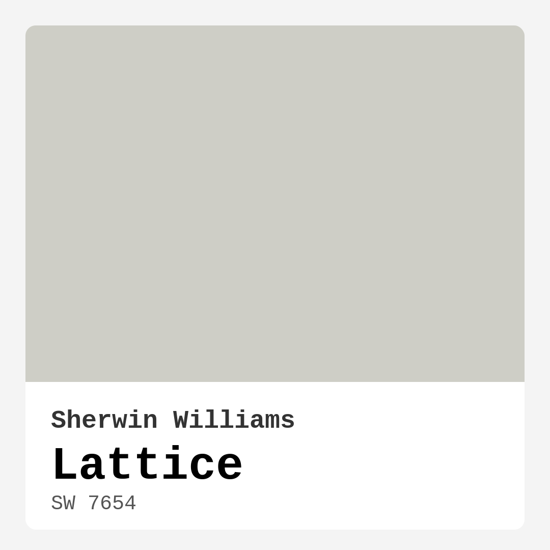
Color Preview & Key Details
| HEX Code | #CECEC6 |
| RGB | 206, 206, 198 |
| LRV | 48% |
| Undertone | Yellow |
| Finish Options | Eggshell, Matte, Satin |
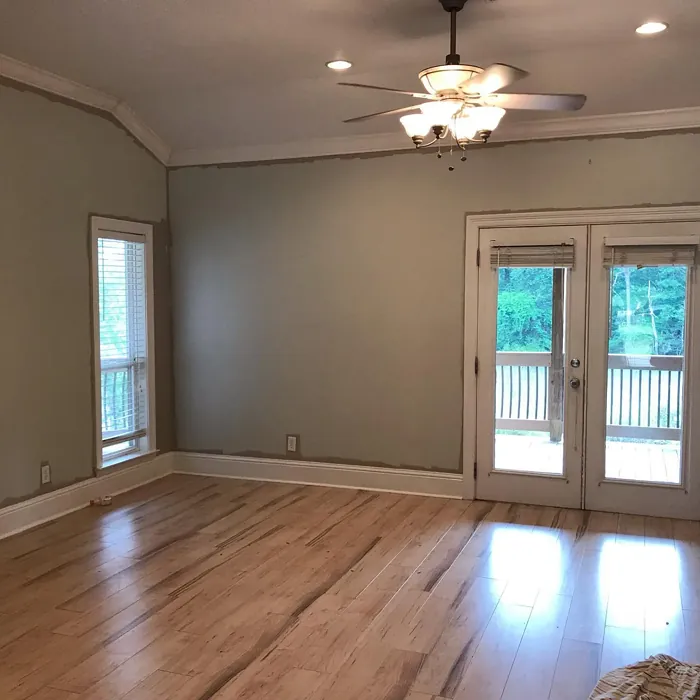
Imagine walking into a room that feels both calm and inviting, where the atmosphere is perfectly balanced between warmth and sophistication. That’s the kind of magic you can create with Sherwin Williams’ Lattice, a gorgeous light grey that’s quickly becoming a go-to choice for homeowners and designers alike.
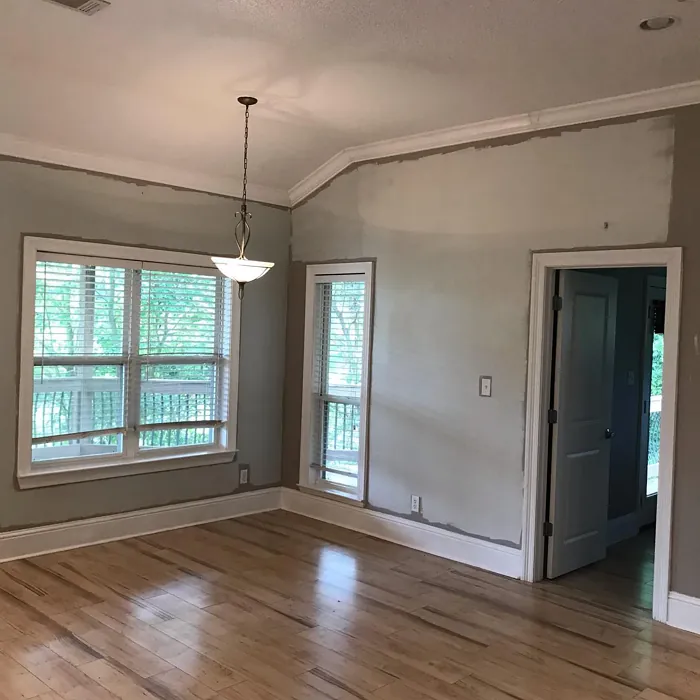
Picture this: you’re standing in your living room, noticing how the natural light filters through the windows, casting a soft glow on your walls. Lattice, with its subtle yellow undertones, brings an elegant touch to the space without overwhelming it. This color is all about creating a serene backdrop, allowing your decor to take center stage while still feeling cohesive and inviting.
Let’s delve deeper into why Lattice could be just the color you need for your next home project. First off, its versatility is unmatched. Whether you’re leaning towards a modern aesthetic, a cozy Scandinavian vibe, or even a classic feel, Lattice fits right in. It effortlessly complements various decor styles, making it a smart choice for anyone looking to refresh their interiors without committing to a specific theme.
One of the standout features of Lattice is its light reflectance value (LRV) of 48%. This means it reflects a moderate amount of light, brightening up your space without making it feel stark or sterile. In well-lit rooms, Lattice can enhance the airy feel, while in dimmer settings, it retains its soft charm. It’s a color that adapts beautifully to the changing light throughout the day, giving your walls a dynamic quality that keeps the room feeling fresh.
When it comes to application, Lattice is beginner-friendly. Its smooth finish means you can use a roller or brush without worrying about inconsistent texture. You’ll find that it provides excellent coverage with just one or two coats, making it a practical choice for those DIY projects. Plus, if you need to do touch-ups later on, you’ll appreciate how easy it is to blend in any new paintwork.
Let’s talk about finishes. Lattice comes in several options—matte, eggshell, and satin. The finish you choose can significantly impact the overall look and feel of your space. A matte finish offers a soft, low-sheen appearance, which works beautifully in bedrooms or quiet spaces. On the other hand, if you’re painting a high-traffic area like a kitchen or living room, an eggshell or satin finish could be more suitable due to their washability and durability.
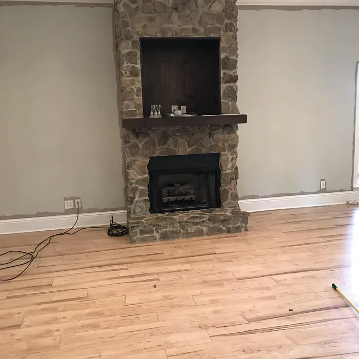
Now, consider how Lattice interacts with other colors. Its warm undertones make it a fantastic backdrop for a variety of complementary shades. Pair it with crisp whites like White Dove for a classic look, or introduce deeper hues like navy blue for a bolder contrast. Brass fixtures or wood trim can further enhance the warmth of Lattice, creating a cozy yet sophisticated atmosphere.
For homeowners who might worry about how it compares to other light grays, Lattice holds its own remarkably well. Unlike some grays that may lean too heavily towards blue or beige, Lattice strikes a perfect balance. It maintains a neutral tone that feels inviting, making it an adaptable choice in any space.
While Lattice is indeed a stunning option, it’s worth noting a couple of considerations. On very porous surfaces, you might find that it requires multiple coats to achieve the desired finish. Additionally, in overly bright spaces, the subtlety of this color might make it blend in more than stand out. However, with the right accent pieces, it can shine brilliantly.
Think about using Lattice in various spaces around your home. It’s perfect for living rooms, bedrooms, kitchens, and even bathrooms. The color promotes a sense of calm, making it ideal for spaces where you want to unwind. If you’re working with a home office, it can help create an environment that’s both productive and restful.
One of the best aspects of Lattice is its eco-friendliness. With low VOC levels and eco-certification, you can feel good about your choice. Whether you’re sensitive to odors or simply want to promote a healthier home environment, Lattice is an excellent choice that marries aesthetics with practicality.
To get the most out of Lattice, consider how you want to use it. For a more intimate feel, try it as an accent wall in a larger room. Or, if you’re working on a rental, this neutral shade can elevate your space without making a permanent commitment. It’s a designer favorite for a reason—its ability to blend seamlessly while still making a statement is unparalleled.
When testing Lattice, it’s essential to observe how it interacts with your existing decor. Colors can shift based on lighting and surrounding hues, so sample it next to your furniture, flooring, and art. You might find that its yellow undertones come to life in certain settings, adding a layer of depth that enhances your overall design.
In conclusion, Lattice by Sherwin Williams is an impeccable choice for anyone looking to create a tranquil yet stylish environment. Its versatility, ease of application, and eco-friendly nature make it an excellent option for homeowners at any stage of their design journey. So, if you’re on the hunt for that perfect shade to breathe new life into your space, take a closer look at Lattice. It’s not just a paint color; it’s an invitation to create a home that feels just right.
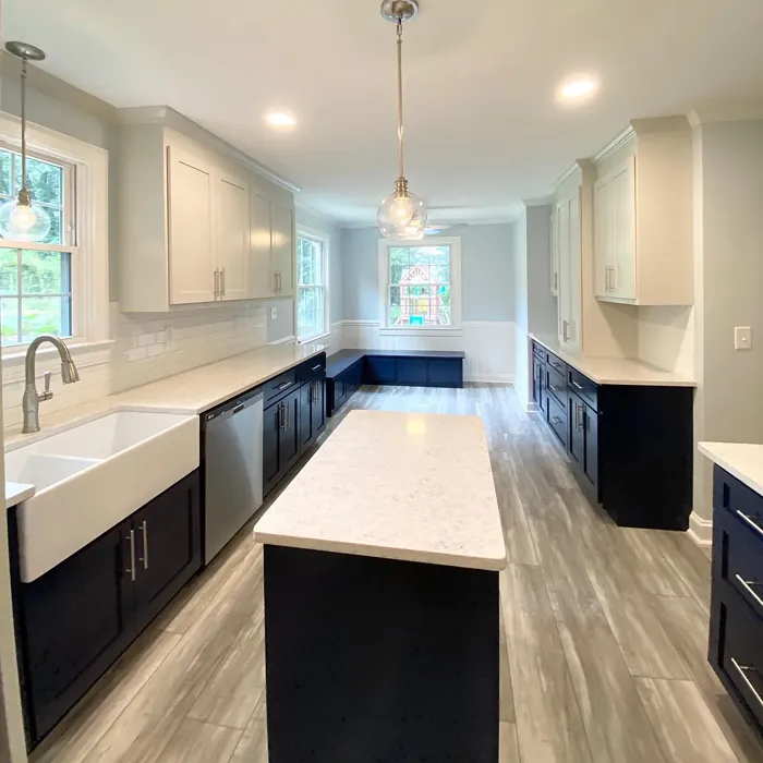
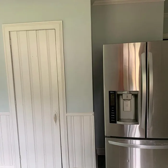
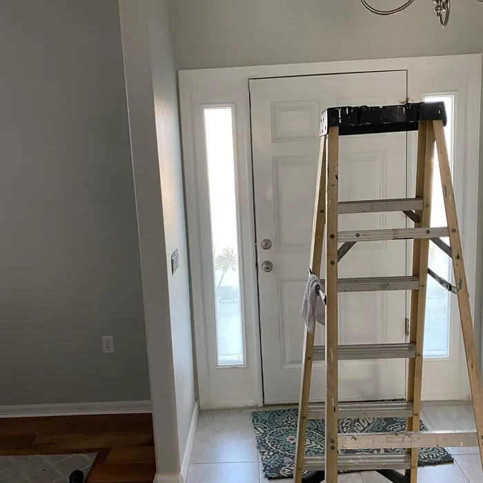
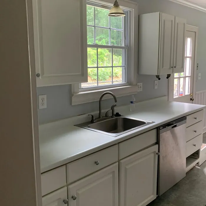
Real Room Photo of Lattice SW 7654
Undertones of Lattice ?
The undertones of Lattice are a key aspect of its character, leaning towards Yellow. These subtle underlying hues are what give the color its depth and complexity. For example, a gray with a blue undertone will feel cooler and more modern, while one with a brown undertone will feel warmer and more traditional. It’s essential to test this paint in your home and observe it next to your existing furniture, flooring, and decor to see how these undertones interact and reveal themselves throughout the day.
HEX value: #CECEC6
RGB code: 206, 206, 198
Is Lattice Cool or Warm?
This color leans towards the cool side, making it an ideal choice for spaces where you want to promote calmness and tranquility. Its understated elegance pairs well with both warm and cool accents.
Understanding Color Properties and Interior Design Tips
Hue refers to a specific position on the color wheel, measured in degrees from 0 to 360. Each degree represents a different pure color:
- 0° represents red
- 120° represents green
- 240° represents blue
Saturation describes the intensity or purity of a color and is expressed as a percentage:
- At 0%, the color appears completely desaturated—essentially a shade of gray
- At 100%, the color is at its most vivid and vibrant
Lightness indicates how light or dark a color is, also expressed as a percentage:
- 0% lightness results in black
- 100% lightness results in white
Using Warm Colors in Interior Design
Warm hues—such as reds, oranges, yellows, warm beiges, and greiges—are excellent choices for creating inviting and energetic spaces. These colors are particularly well-suited for:
- Kitchens, living rooms, and bathrooms, where warmth enhances comfort and sociability
- Large rooms, where warm tones can help reduce the sense of emptiness and make the space feel more intimate
For example:
- Warm beige shades provide a cozy, inviting atmosphere, ideal for living rooms, bedrooms, and hallways.
- Warm greige (a mix of beige and gray) offers the warmth of beige with the modern appeal of gray, making it a versatile backdrop for dining areas, bedrooms, and living spaces.
However, be mindful when using warm light tones in rooms with limited natural light. These shades may appear muted or even take on an unpleasant yellowish tint. To avoid a dull or flat appearance:
- Add depth by incorporating richer tones like deep greens, charcoal, or chocolate brown
- Use textured elements such as curtains, rugs, or cushions to bring dimension to the space
Pro Tip: Achieving Harmony with Warm and Cool Color Balance
To create a well-balanced and visually interesting interior, mix warm and cool tones strategically. This contrast adds depth and harmony to your design.
- If your walls feature warm hues, introduce cool-colored accents such as blue or green furniture, artwork, or accessories to create contrast.
- For a polished look, consider using a complementary color scheme, which pairs colors opposite each other on the color wheel (e.g., red with green, orange with blue).
This thoughtful mix not only enhances visual appeal but also creates a space that feels both dynamic and cohesive.
Light Temperature Affects on Lattice
Natural Light
Natural daylight changes in color temperature as the sun moves across the sky. At sunrise and sunset, the light tends to have a warm, golden tone with a color temperature around 2000 Kelvin (K). As the day progresses and the sun rises higher, the light becomes cooler and more neutral. Around midday, especially when the sky is clear, natural light typically reaches its peak brightness and shifts to a cooler tone, ranging from 5500 to 6500 Kelvin. This midday light is close to what we perceive as pure white or daylight-balanced light.
These shifts in natural light can significantly influence how colors appear in a space, which is why designers often consider both the time of day and the orientation of windows when planning interior color schemes.
Artificial Light
When choosing artificial lighting, pay close attention to the color temperature, measured in Kelvin (K). This determines how warm or cool the light will appear. Lower temperatures, around 2700K, give off a warm, yellow glow often used in living rooms or bedrooms. Higher temperatures, above 5000K, create a cool, bluish light similar to daylight, commonly used in kitchens, offices, or task areas.
Use the slider to see how lighting temperature can affect the appearance of a surface or color throughout a space.


4800K
LRV of Lattice
The Light Reflectance Value (LRV) of Lattice is 48%, which places it in the Medium category. This means it Reflects a moderate amount of light. Understanding a paint’s LRV is crucial for predicting how it will look in your space. A higher LRV indicates a lighter color that reflects more light, making rooms feel larger and brighter. A lower LRV signifies a darker color that absorbs more light, creating a cozier, more intimate atmosphere. Always consider the natural and artificial lighting in your room when selecting a paint color based on its LRV.
Detailed Review of Lattice
Additional Paint Characteristics
Ideal Rooms
Bathroom, Bedroom, Dining Room, Home Office, Kitchen, Living Room
Decor Styles
Contemporary, Minimalist, Modern, Scandinavian, Transitional
Coverage
Good (1–2 Coats), Touch-Up Friendly
Ease of Application
Beginner Friendly, Brush Smooth, Roller-Ready
Washability
Washable, Wipeable
VOC Level
Eco-Certified, Low VOC
Best Use
Accent Wall, Interior Walls, Trim
Room Suitability
Bathroom, Bedroom, Dining Room, Home Office, Kitchen, Living Room
Tone Tag
Balanced, Cool, Neutral
Finish Type
Eggshell, Matte, Satin
Paint Performance
High Coverage, Low Odor, Quick Drying
Use Cases
Best for Rentals, Best for Small Spaces, Designer Favorite
Mood
Calm, Inviting, Restful
Trim Pairing
Complements Brass Fixtures, Good with Wood Trim, Pairs with White Dove
Lattice is a delightful choice for anyone looking to refresh their living space with a light and airy feel. The color’s subtlety makes it a wonderful backdrop for artwork and furniture, allowing your decor to shine. Application is straightforward, with a smooth finish that enhances its elegant nature. It works beautifully in both natural and artificial light, adjusting its tone slightly throughout the day. If you’re considering this color, think about pairing it with warmer accents to create a cozy atmosphere or contrasting it with darker shades for a more dramatic effect. Overall, Lattice is a timeless option that won’t go out of style anytime soon.
Pros & Cons of SW 7654 Lattice
Pros
Cons
Colors that go with Sherwin Williams Lattice
FAQ on SW 7654 Lattice
What type of finish should I choose for Lattice?
The finish you choose for Lattice depends on the look and function you desire. A matte finish can give a soft, low-sheen appearance, perfect for ceilings or low-traffic areas. If you’re painting a living space that sees more activity, consider an eggshell or satin finish for better washability and durability. Each finish enhances the color’s elegance while providing a slightly different aesthetic, so choose based on your room’s needs.
How does Lattice compare to other light grays?
Lattice stands out among light grays due to its unique blend of warmth and coolness. Unlike some grays that may lean too blue or beige, Lattice strikes a balance that can complement a variety of decor styles. It works well in both traditional and modern settings, making it a versatile choice. Additionally, its ability to reflect light without appearing stark gives it an edge, ensuring it maintains a soft, inviting ambiance in any room.
Comparisons Lattice with other colors
Lattice SW 7654 vs Agreeable Gray SW 7029
| Attribute | Lattice SW 7654 | Agreeable Gray SW 7029 |
|---|---|---|
| Color Name | Lattice SW 7654 | Agreeable Gray SW 7029 |
| Color | ||
| Hue | Grey | Grey |
| Brightness | Light | Light |
| RGB | 206, 206, 198 | 209, 203, 193 |
| LRV | 48% | 60% |
| Finish Type | Eggshell, Matte, Satin | Eggshell, Matte, Satin |
| Finish Options | Eggshell, Matte, Satin | Eggshell, Flat, Matte, Satin |
| Ideal Rooms | Bathroom, Bedroom, Dining Room, Home Office, Kitchen, Living Room | Bathroom, Bedroom, Dining Room, Home Office, Kitchen, Living Room |
| Decor Styles | Contemporary, Minimalist, Modern, Scandinavian, Transitional | Contemporary, Farmhouse, Minimalist, Modern, Transitional |
| Coverage | Good (1–2 Coats), Touch-Up Friendly | Good (1–2 Coats), Touch-Up Friendly |
| Ease of Application | Beginner Friendly, Brush Smooth, Roller-Ready | Beginner Friendly, Brush Smooth, Roller-Ready |
| Washability | Washable, Wipeable | Washable, Wipeable |
| Room Suitability | Bathroom, Bedroom, Dining Room, Home Office, Kitchen, Living Room | Bathroom, Bedroom, Dining Room, Kitchen, Living Room |
| Tone | Balanced, Cool, Neutral | Muted, Neutral, Warm |
| Paint Performance | High Coverage, Low Odor, Quick Drying | Easy Touch-Up, Fade Resistant, Low Odor |
Lattice SW 7654 vs Eider White SW 7014
| Attribute | Lattice SW 7654 | Eider White SW 7014 |
|---|---|---|
| Color Name | Lattice SW 7654 | Eider White SW 7014 |
| Color | ||
| Hue | Grey | Grey |
| Brightness | Light | Light |
| RGB | 206, 206, 198 | 226, 222, 216 |
| LRV | 48% | 73% |
| Finish Type | Eggshell, Matte, Satin | Eggshell, Matte, Satin |
| Finish Options | Eggshell, Matte, Satin | Eggshell, Matte, Satin |
| Ideal Rooms | Bathroom, Bedroom, Dining Room, Home Office, Kitchen, Living Room | Bathroom, Bedroom, Dining Room, Home Office, Kitchen, Living Room |
| Decor Styles | Contemporary, Minimalist, Modern, Scandinavian, Transitional | Farmhouse, Minimalist, Modern, Scandinavian, Transitional |
| Coverage | Good (1–2 Coats), Touch-Up Friendly | Good (1–2 Coats), Touch-Up Friendly |
| Ease of Application | Beginner Friendly, Brush Smooth, Roller-Ready | Beginner Friendly, Brush Smooth, Roller-Ready |
| Washability | Washable, Wipeable | Highly Washable, Washable |
| Room Suitability | Bathroom, Bedroom, Dining Room, Home Office, Kitchen, Living Room | Bathroom, Bedroom, Dining Room, Kitchen, Living Room |
| Tone | Balanced, Cool, Neutral | Creamy, Muted, Neutral, Warm |
| Paint Performance | High Coverage, Low Odor, Quick Drying | Easy Touch-Up, High Coverage, Low Odor, Scuff Resistant |
Lattice SW 7654 vs Drift of Mist SW 9166
| Attribute | Lattice SW 7654 | Drift of Mist SW 9166 |
|---|---|---|
| Color Name | Lattice SW 7654 | Drift of Mist SW 9166 |
| Color | ||
| Hue | Grey | Grey |
| Brightness | Light | Light |
| RGB | 206, 206, 198 | 220, 216, 208 |
| LRV | 48% | 65% |
| Finish Type | Eggshell, Matte, Satin | Eggshell, Matte, Satin |
| Finish Options | Eggshell, Matte, Satin | Eggshell, Matte, Satin |
| Ideal Rooms | Bathroom, Bedroom, Dining Room, Home Office, Kitchen, Living Room | Bathroom, Bedroom, Home Office, Kitchen, Living Room |
| Decor Styles | Contemporary, Minimalist, Modern, Scandinavian, Transitional | Coastal, Minimalist, Modern, Scandinavian |
| Coverage | Good (1–2 Coats), Touch-Up Friendly | Good (1–2 Coats), Touch-Up Friendly |
| Ease of Application | Beginner Friendly, Brush Smooth, Roller-Ready | Beginner Friendly, Brush Smooth, Fast-Drying, Roller-Ready |
| Washability | Washable, Wipeable | Washable, Wipeable |
| Room Suitability | Bathroom, Bedroom, Dining Room, Home Office, Kitchen, Living Room | Bathroom, Bedroom, Home Office, Living Room |
| Tone | Balanced, Cool, Neutral | Airy, Cool, Neutral |
| Paint Performance | High Coverage, Low Odor, Quick Drying | Easy Touch-Up, Low Odor, Quick Drying, Scuff Resistant |
Lattice SW 7654 vs Sanctuary SW 9583
| Attribute | Lattice SW 7654 | Sanctuary SW 9583 |
|---|---|---|
| Color Name | Lattice SW 7654 | Sanctuary SW 9583 |
| Color | ||
| Hue | Grey | Grey |
| Brightness | Light | Light |
| RGB | 206, 206, 198 | 230, 226, 217 |
| LRV | 48% | 24% |
| Finish Type | Eggshell, Matte, Satin | Eggshell, Matte, Satin |
| Finish Options | Eggshell, Matte, Satin | Eggshell, Matte, Satin |
| Ideal Rooms | Bathroom, Bedroom, Dining Room, Home Office, Kitchen, Living Room | Bedroom, Dining Room, Home Office, Living Room, Nursery |
| Decor Styles | Contemporary, Minimalist, Modern, Scandinavian, Transitional | Bohemian, Coastal, Modern Farmhouse, Scandinavian |
| Coverage | Good (1–2 Coats), Touch-Up Friendly | Good (1–2 Coats), Touch-Up Friendly |
| Ease of Application | Beginner Friendly, Brush Smooth, Roller-Ready | Beginner Friendly, Brush Smooth, Fast-Drying, Roller-Ready |
| Washability | Washable, Wipeable | Highly Washable, Washable, Wipeable |
| Room Suitability | Bathroom, Bedroom, Dining Room, Home Office, Kitchen, Living Room | Bedroom, Home Office, Living Room, Nursery |
| Tone | Balanced, Cool, Neutral | Earthy, Neutral, Soft, Warm |
| Paint Performance | High Coverage, Low Odor, Quick Drying | Easy Touch-Up, Low Odor, Quick Drying, Scuff Resistant |
Lattice SW 7654 vs Snowbound SW 7004
| Attribute | Lattice SW 7654 | Snowbound SW 7004 |
|---|---|---|
| Color Name | Lattice SW 7654 | Snowbound SW 7004 |
| Color | ||
| Hue | Grey | Grey |
| Brightness | Light | Light |
| RGB | 206, 206, 198 | 237, 234, 229 |
| LRV | 48% | 83% |
| Finish Type | Eggshell, Matte, Satin | Eggshell, Matte, Satin |
| Finish Options | Eggshell, Matte, Satin | Eggshell, Matte, Satin |
| Ideal Rooms | Bathroom, Bedroom, Dining Room, Home Office, Kitchen, Living Room | Bathroom, Bedroom, Dining Room, Hallway, Home Office, Kitchen, Living Room, Nursery |
| Decor Styles | Contemporary, Minimalist, Modern, Scandinavian, Transitional | Farmhouse, Minimalist, Modern, Scandinavian, Transitional |
| Coverage | Good (1–2 Coats), Touch-Up Friendly | Good (1–2 Coats), Touch-Up Friendly |
| Ease of Application | Beginner Friendly, Brush Smooth, Roller-Ready | Beginner Friendly, Brush Smooth, Fast-Drying, Roller-Ready |
| Washability | Washable, Wipeable | Washable, Wipeable |
| Room Suitability | Bathroom, Bedroom, Dining Room, Home Office, Kitchen, Living Room | Bathroom, Bedroom, Dining Room, Hallway, Home Office, Kitchen, Living Room |
| Tone | Balanced, Cool, Neutral | Airy, Crisp, Neutral, Warm |
| Paint Performance | High Coverage, Low Odor, Quick Drying | High Coverage, Low Odor, Quick Drying |
Lattice SW 7654 vs Pure White SW 7005
| Attribute | Lattice SW 7654 | Pure White SW 7005 |
|---|---|---|
| Color Name | Lattice SW 7654 | Pure White SW 7005 |
| Color | ||
| Hue | Grey | Grey |
| Brightness | Light | Light |
| RGB | 206, 206, 198 | 237, 236, 230 |
| LRV | 48% | 84% |
| Finish Type | Eggshell, Matte, Satin | Eggshell, Satin, Semi-Gloss |
| Finish Options | Eggshell, Matte, Satin | Eggshell, Flat, Matte, Satin, Semi-Gloss |
| Ideal Rooms | Bathroom, Bedroom, Dining Room, Home Office, Kitchen, Living Room | Bathroom, Bedroom, Dining Room, Entryway, Hallway, Home Office, Kitchen, Living Room, Nursery |
| Decor Styles | Contemporary, Minimalist, Modern, Scandinavian, Transitional | Bohemian, Eclectic, Farmhouse, Minimalist, Modern, Traditional |
| Coverage | Good (1–2 Coats), Touch-Up Friendly | Good (1–2 Coats), Touch-Up Friendly |
| Ease of Application | Beginner Friendly, Brush Smooth, Roller-Ready | Beginner Friendly, Brush Smooth, Fast-Drying, Roller-Ready |
| Washability | Washable, Wipeable | Highly Washable, Washable |
| Room Suitability | Bathroom, Bedroom, Dining Room, Home Office, Kitchen, Living Room | Bathroom, Bedroom, Dining Room, Entryway, Hallway, Home Office, Kitchen, Living Room, Nursery |
| Tone | Balanced, Cool, Neutral | Crisp, Neutral, Warm |
| Paint Performance | High Coverage, Low Odor, Quick Drying | Easy Touch-Up, High Coverage, Low Odor, Quick Drying |
Lattice SW 7654 vs Crushed Ice SW 7647
| Attribute | Lattice SW 7654 | Crushed Ice SW 7647 |
|---|---|---|
| Color Name | Lattice SW 7654 | Crushed Ice SW 7647 |
| Color | ||
| Hue | Grey | Grey |
| Brightness | Light | Light |
| RGB | 206, 206, 198 | 214, 211, 204 |
| LRV | 48% | 66% |
| Finish Type | Eggshell, Matte, Satin | Eggshell, Matte, Satin |
| Finish Options | Eggshell, Matte, Satin | Eggshell, Matte, Satin |
| Ideal Rooms | Bathroom, Bedroom, Dining Room, Home Office, Kitchen, Living Room | Bathroom, Bedroom, Dining Room, Home Office, Living Room |
| Decor Styles | Contemporary, Minimalist, Modern, Scandinavian, Transitional | Farmhouse, Minimalist, Modern, Scandinavian, Transitional |
| Coverage | Good (1–2 Coats), Touch-Up Friendly | Good (1–2 Coats), Touch-Up Friendly |
| Ease of Application | Beginner Friendly, Brush Smooth, Roller-Ready | Beginner Friendly, Brush Smooth, Roller-Ready |
| Washability | Washable, Wipeable | Stain Resistant, Washable |
| Room Suitability | Bathroom, Bedroom, Dining Room, Home Office, Kitchen, Living Room | Bathroom, Bedroom, Dining Room, Hallway, Home Office, Living Room |
| Tone | Balanced, Cool, Neutral | Muted, Neutral, Warm |
| Paint Performance | High Coverage, Low Odor, Quick Drying | High Coverage, Low Odor, Quick Drying |
Lattice SW 7654 vs Origami White SW 7636
| Attribute | Lattice SW 7654 | Origami White SW 7636 |
|---|---|---|
| Color Name | Lattice SW 7654 | Origami White SW 7636 |
| Color | ||
| Hue | Grey | Grey |
| Brightness | Light | Light |
| RGB | 206, 206, 198 | 229, 226, 218 |
| LRV | 48% | 83% |
| Finish Type | Eggshell, Matte, Satin | Eggshell, Matte |
| Finish Options | Eggshell, Matte, Satin | Eggshell, Matte, Satin |
| Ideal Rooms | Bathroom, Bedroom, Dining Room, Home Office, Kitchen, Living Room | Bedroom, Dining Room, Entryway, Hallway, Home Office, Kitchen, Living Room |
| Decor Styles | Contemporary, Minimalist, Modern, Scandinavian, Transitional | Minimalist, Modern, Scandinavian, Traditional, Transitional |
| Coverage | Good (1–2 Coats), Touch-Up Friendly | Good (1–2 Coats), Touch-Up Friendly |
| Ease of Application | Beginner Friendly, Brush Smooth, Roller-Ready | Beginner Friendly, Brush Smooth, Roller-Ready |
| Washability | Washable, Wipeable | Washable, Wipeable |
| Room Suitability | Bathroom, Bedroom, Dining Room, Home Office, Kitchen, Living Room | Bedroom, Dining Room, Home Office, Kitchen, Living Room |
| Tone | Balanced, Cool, Neutral | Airy, Neutral, Warm |
| Paint Performance | High Coverage, Low Odor, Quick Drying | Easy Touch-Up, Low Odor, Quick Drying |
Lattice SW 7654 vs Spare White SW 6203
| Attribute | Lattice SW 7654 | Spare White SW 6203 |
|---|---|---|
| Color Name | Lattice SW 7654 | Spare White SW 6203 |
| Color | ||
| Hue | Grey | Grey |
| Brightness | Light | Light |
| RGB | 206, 206, 198 | 228, 228, 221 |
| LRV | 48% | 75% |
| Finish Type | Eggshell, Matte, Satin | Eggshell, Matte |
| Finish Options | Eggshell, Matte, Satin | Eggshell, Matte, Satin |
| Ideal Rooms | Bathroom, Bedroom, Dining Room, Home Office, Kitchen, Living Room | Bedroom, Dining Room, Home Office, Kitchen, Living Room, Nursery |
| Decor Styles | Contemporary, Minimalist, Modern, Scandinavian, Transitional | Farmhouse, Minimalist, Modern, Scandinavian, Transitional |
| Coverage | Good (1–2 Coats), Touch-Up Friendly | Good (1–2 Coats), Primer Recommended, Touch-Up Friendly |
| Ease of Application | Beginner Friendly, Brush Smooth, Roller-Ready | Beginner Friendly, Brush Smooth, Fast-Drying, Roller-Ready |
| Washability | Washable, Wipeable | Washable, Wipeable |
| Room Suitability | Bathroom, Bedroom, Dining Room, Home Office, Kitchen, Living Room | Bedroom, Dining Room, Home Office, Kitchen, Living Room |
| Tone | Balanced, Cool, Neutral | Creamy, Neutral, Warm |
| Paint Performance | High Coverage, Low Odor, Quick Drying | Easy Touch-Up, Low Odor, Quick Drying |
Lattice SW 7654 vs Mountain Air SW 6224
| Attribute | Lattice SW 7654 | Mountain Air SW 6224 |
|---|---|---|
| Color Name | Lattice SW 7654 | Mountain Air SW 6224 |
| Color | ||
| Hue | Grey | Grey |
| Brightness | Light | Light |
| RGB | 206, 206, 198 | 216, 224, 223 |
| LRV | 48% | 66% |
| Finish Type | Eggshell, Matte, Satin | Eggshell, Satin |
| Finish Options | Eggshell, Matte, Satin | Eggshell, Matte, Satin |
| Ideal Rooms | Bathroom, Bedroom, Dining Room, Home Office, Kitchen, Living Room | Bedroom, Hallway, Home Office, Living Room, Nursery |
| Decor Styles | Contemporary, Minimalist, Modern, Scandinavian, Transitional | Coastal, Minimalist, Modern, Scandinavian |
| Coverage | Good (1–2 Coats), Touch-Up Friendly | Good (1–2 Coats), Touch-Up Friendly |
| Ease of Application | Beginner Friendly, Brush Smooth, Roller-Ready | Beginner Friendly, Brush Smooth, Fast-Drying, Roller-Ready |
| Washability | Washable, Wipeable | Highly Washable, Washable |
| Room Suitability | Bathroom, Bedroom, Dining Room, Home Office, Kitchen, Living Room | Bedroom, Home Office, Living Room, Nursery |
| Tone | Balanced, Cool, Neutral | Airy, Cool, Muted |
| Paint Performance | High Coverage, Low Odor, Quick Drying | Easy Touch-Up, Low Odor, Quick Drying, Scuff Resistant |
Official Page of Sherwin Williams Lattice SW 7654