
Color Preview & Key Details
| HEX Code | #D3D5D3 |
| RGB | 211, 213, 211 |
| LRV | 50% |
| Undertone | Green |
| Finish Options | Eggshell, Matte, Satin |
Imagine stepping into a room that feels like a breath of fresh air. The walls are painted in a soft, soothing gray that instantly calms your senses. This isn’t just any gray; it’s Reflection by Sherwin-Williams (SW 7661), a color that perfectly balances tranquility and sophistication. If you’re considering a paint project, Reflection might just be the secret ingredient to achieving the serene atmosphere you’ve been dreaming of.
Reflection is a beautiful, light gray hue with subtle green undertones. With its Light Reflectance Value (LRV) of 50%, it reflects a moderate amount of light, making it ideal for creating an airy and inviting space. This is a color that works wonders in various settings — from cozy bedrooms to vibrant living rooms and even professional home offices.
One of the most appealing aspects of Reflection is its versatility. Whether you’re a fan of modern, Scandinavian, or minimalist designs, this color complements them all. It brings a soft elegance that enhances any decor without overwhelming the senses. Its muted tone makes it a perfect backdrop for artwork, vibrant furniture, or even a calming setup of natural elements like plants and wood accents.
You may wonder how this color performs under different lighting conditions. That’s a great question! Reflection has this amazing ability to adapt. In natural light, it can take on a warmer tone, giving your space a more welcoming feel. On the flip side, in artificial light, it can appear cooler, introducing a refreshing vibe that’s perfect for late-night reading or relaxation. It’s essential to test samples in your home first to see how it behaves at different times of the day.
Now, let’s talk about practicalities. Reflection is incredibly beginner-friendly when it comes to application. Its smooth formula glides easily, whether you’re using a roller or a brush. Cleanup is a breeze, too; it’s wipeable and washable, which means you don’t have to stress about those inevitable marks from daily life. With low VOC levels, it’s eco-certified, making it a healthier option for your home.
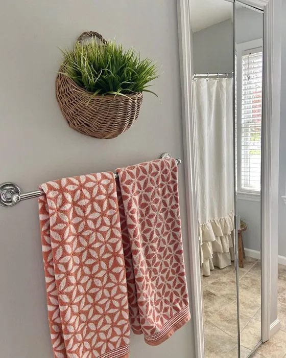
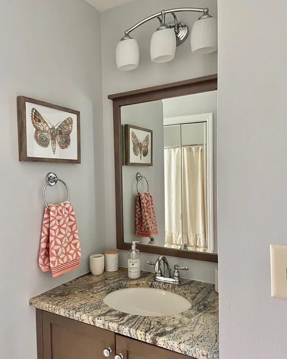
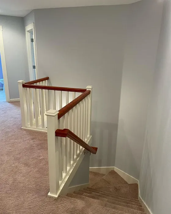
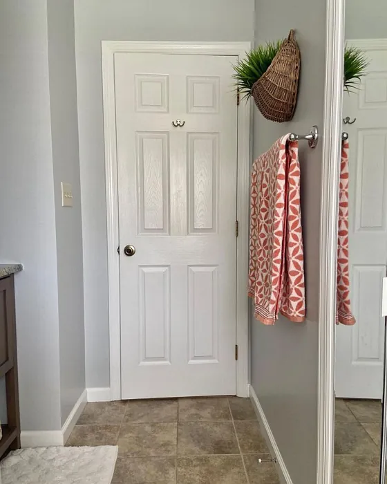
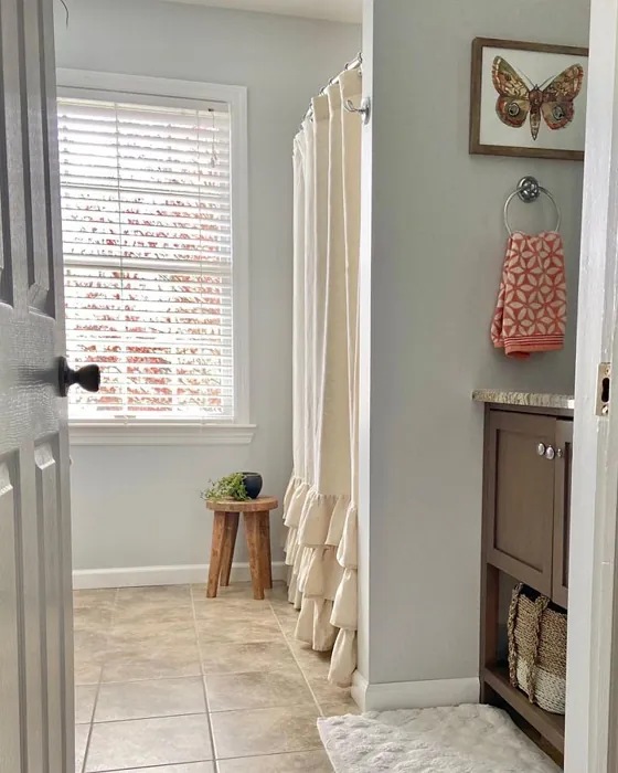
When planning your project, consider the types of rooms where Reflection would shine. It works beautifully in spaces that require a calm atmosphere, such as the bedroom or bathroom. Picture stepping into a bedroom painted in this soothing shade; it creates a restful sanctuary that invites you to unwind after a long day. In a bathroom, it can evoke a spa-like feel, especially when combined with white fixtures and natural textures.
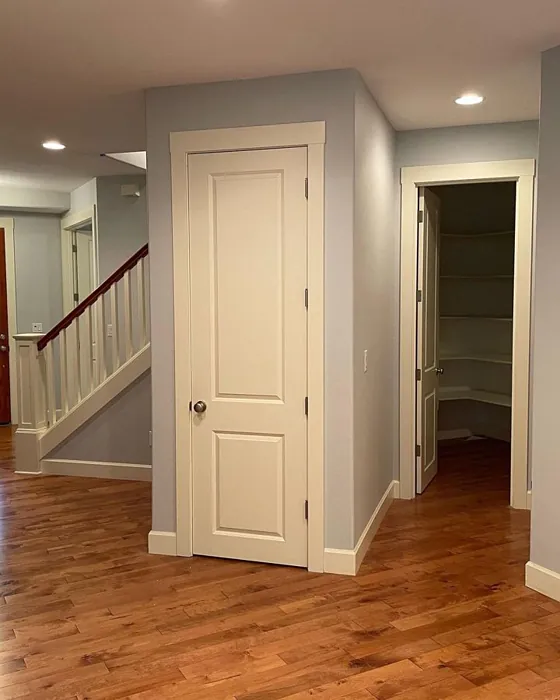
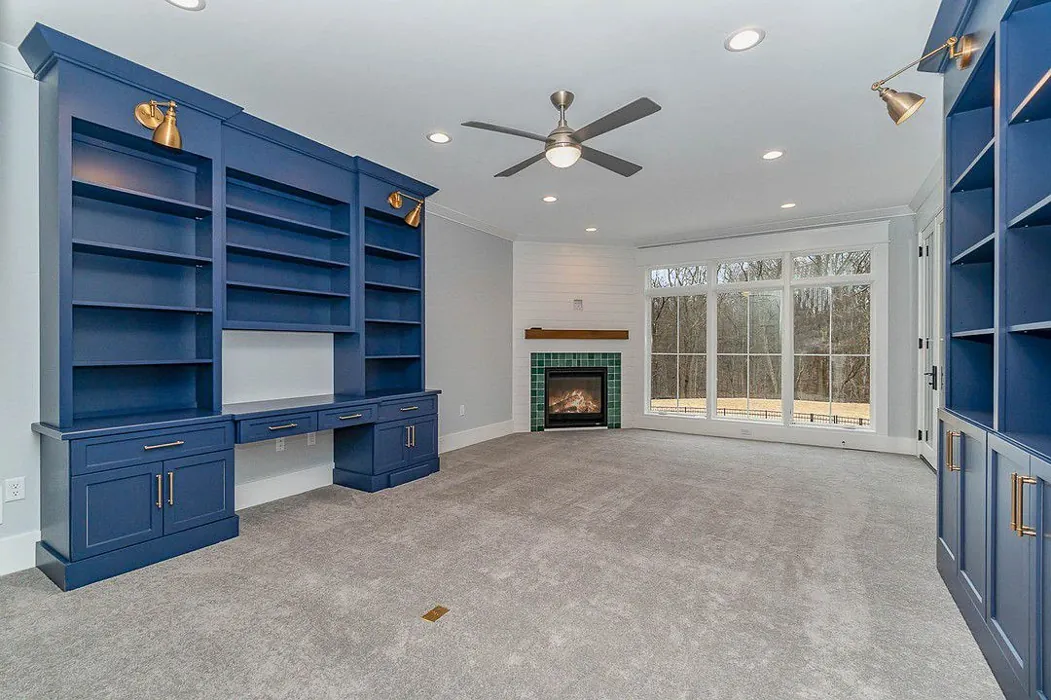
In living areas, Reflection can help create a sense of openness. If you have an open concept space, this color can unify different areas while allowing each space to maintain its identity. You might pair it with bolder accents like rich woods or vibrant textiles to create a dynamic interplay of colors that keeps the space interesting yet cohesive.
Speaking of pairing, let’s explore some complementary shades. Reflection goes hand-in-hand with crisp whites like White Dove or Pure White, which can really make the color pop. If you want to inject a bit of warmth into your space, consider accents in brass or gold, which contrast beautifully against the cool tones of Reflection.
If you’re wondering about the coverage, you’ll find that Reflection generally requires 1-2 coats for full impact. It’s worth noting, however, that in dimly lit rooms, this shade might lean towards a cooler appearance, which may not be ideal for spaces with minimal natural light. Therefore, ensuring your room has ample light will maximize the color’s potential.
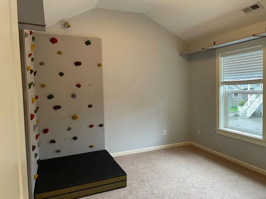
For those of you working in small spaces, don’t shy away from using Reflection. Its light gray tone can transform tight areas, making them feel more open and inviting. Just remember to balance it out with good lighting and perhaps some lively decor to keep the space from feeling too cold or stark.
As you embark on your painting journey, keep in mind that Reflection is a designer favorite for a reason. It’s not only aesthetically pleasing; it also creates a calm and inviting mood, making it a perfect choice for homes aiming for a restful sanctuary.
The performance of this paint is worth noting. With its quick-drying properties, you won’t have to wait long before you can start enjoying your newly painted space. Its fade-resistant quality ensures that the color remains vibrant over time, while its low odor means you can get back to your routine without feeling overwhelmed by paint fumes.
To create a truly harmonious look, consider using Reflection not just on the walls, but also as an accent color for smaller features such as trim or cabinetry. This can enhance the color’s depth and make the overall design feel more cohesive.
Feeling inspired yet? You should be! Reflection offers a world of possibilities for transforming your home into a serene oasis. Whether you’re updating your living space, refreshing a bedroom, or creating a tranquil bathroom retreat, this color wraps your walls in a soft embrace that feels both modern and timeless.
Before making your final decision, gather samples and test them in your space, observing how they interact with your existing furnishings and decor. This will ensure that you fully embrace the beauty of Reflection and how it enhances your home environment.
With the right approach, Reflection can be the perfect choice to elevate your home’s aesthetic, bringing a sense of calm and sophistication that’s truly unforgettable. So grab that paintbrush and embark on your journey to a beautifully refreshed space! You won’t regret it.
Real Room Photo of Reflection SW 7661
Undertones of Reflection ?
The undertones of Reflection are a key aspect of its character, leaning towards Green. These subtle underlying hues are what give the color its depth and complexity. For example, a gray with a blue undertone will feel cooler and more modern, while one with a brown undertone will feel warmer and more traditional. It’s essential to test this paint in your home and observe it next to your existing furniture, flooring, and decor to see how these undertones interact and reveal themselves throughout the day.
HEX value: #D3D5D3
RGB code: 211, 213, 211
Is Reflection Cool or Warm?
This shade is predominantly cool, making it a great choice for creating a refreshing atmosphere. It pairs beautifully with warmer colors for a balanced look, but stands strong on its own in cooler palettes.
Understanding Color Properties and Interior Design Tips
Hue refers to a specific position on the color wheel, measured in degrees from 0 to 360. Each degree represents a different pure color:
- 0° represents red
- 120° represents green
- 240° represents blue
Saturation describes the intensity or purity of a color and is expressed as a percentage:
- At 0%, the color appears completely desaturated—essentially a shade of gray
- At 100%, the color is at its most vivid and vibrant
Lightness indicates how light or dark a color is, also expressed as a percentage:
- 0% lightness results in black
- 100% lightness results in white
Using Warm Colors in Interior Design
Warm hues—such as reds, oranges, yellows, warm beiges, and greiges—are excellent choices for creating inviting and energetic spaces. These colors are particularly well-suited for:
- Kitchens, living rooms, and bathrooms, where warmth enhances comfort and sociability
- Large rooms, where warm tones can help reduce the sense of emptiness and make the space feel more intimate
For example:
- Warm beige shades provide a cozy, inviting atmosphere, ideal for living rooms, bedrooms, and hallways.
- Warm greige (a mix of beige and gray) offers the warmth of beige with the modern appeal of gray, making it a versatile backdrop for dining areas, bedrooms, and living spaces.
However, be mindful when using warm light tones in rooms with limited natural light. These shades may appear muted or even take on an unpleasant yellowish tint. To avoid a dull or flat appearance:
- Add depth by incorporating richer tones like deep greens, charcoal, or chocolate brown
- Use textured elements such as curtains, rugs, or cushions to bring dimension to the space
Pro Tip: Achieving Harmony with Warm and Cool Color Balance
To create a well-balanced and visually interesting interior, mix warm and cool tones strategically. This contrast adds depth and harmony to your design.
- If your walls feature warm hues, introduce cool-colored accents such as blue or green furniture, artwork, or accessories to create contrast.
- For a polished look, consider using a complementary color scheme, which pairs colors opposite each other on the color wheel (e.g., red with green, orange with blue).
This thoughtful mix not only enhances visual appeal but also creates a space that feels both dynamic and cohesive.
Light Temperature Affects on Reflection
Natural Light
Natural daylight changes in color temperature as the sun moves across the sky. At sunrise and sunset, the light tends to have a warm, golden tone with a color temperature around 2000 Kelvin (K). As the day progresses and the sun rises higher, the light becomes cooler and more neutral. Around midday, especially when the sky is clear, natural light typically reaches its peak brightness and shifts to a cooler tone, ranging from 5500 to 6500 Kelvin. This midday light is close to what we perceive as pure white or daylight-balanced light.
These shifts in natural light can significantly influence how colors appear in a space, which is why designers often consider both the time of day and the orientation of windows when planning interior color schemes.
Artificial Light
When choosing artificial lighting, pay close attention to the color temperature, measured in Kelvin (K). This determines how warm or cool the light will appear. Lower temperatures, around 2700K, give off a warm, yellow glow often used in living rooms or bedrooms. Higher temperatures, above 5000K, create a cool, bluish light similar to daylight, commonly used in kitchens, offices, or task areas.
Use the slider to see how lighting temperature can affect the appearance of a surface or color throughout a space.


4800K
LRV of Reflection
The Light Reflectance Value (LRV) of Reflection is 50%, which places it in the Medium category. This means it Reflects a moderate amount of light. Understanding a paint’s LRV is crucial for predicting how it will look in your space. A higher LRV indicates a lighter color that reflects more light, making rooms feel larger and brighter. A lower LRV signifies a darker color that absorbs more light, creating a cozier, more intimate atmosphere. Always consider the natural and artificial lighting in your room when selecting a paint color based on its LRV.
Detailed Review of Reflection
Additional Paint Characteristics
Ideal Rooms
Bathroom, Bedroom, Home Office, Kitchen, Living Room, Nursery
Decor Styles
Minimalist, Modern, Scandinavian, Transitional
Coverage
Good (1–2 Coats), Touch-Up Friendly
Ease of Application
Beginner Friendly, Brush Smooth, Fast-Drying, Roller-Ready
Washability
Washable, Wipeable
VOC Level
Eco-Certified, Low VOC
Best Use
Accent Wall, Interior Walls, Open Concept Spaces
Room Suitability
Bathroom, Bedroom, Home Office, Living Room
Tone Tag
Balanced, Cool, Neutral
Finish Type
Eggshell, Matte
Paint Performance
Easy Touch-Up, Fade Resistant, Low Odor, Quick Drying
Use Cases
Best for Low Light Rooms, Best for Rentals, Classic Favorite, Designer Favorite
Mood
Calm, Inviting, Restful
Trim Pairing
Complements Brass Fixtures, Matches Pure White, Pairs with White Dove
Reflection is a versatile paint that truly embodies sophistication. Its soft gray undertone makes it an excellent choice for various design aesthetics, from modern minimalism to cozy Scandinavian styles. When applied, it offers a subtle elegance that brightens up spaces without being too stark. One of the standout features is its ability to adapt to different lighting conditions; it can appear warmer in natural light and cooler in artificial light, allowing homeowners to enjoy a dynamic look throughout the day. Additionally, its smooth finish makes application a breeze, and cleanup is straightforward, making it an ideal choice for DIY enthusiasts and professionals alike.
Pros & Cons of SW 7661 Reflection
Pros
Cons
Colors that go with Sherwin Williams Reflection
FAQ on SW 7661 Reflection
Can I use Reflection in a small space?
Absolutely! Reflection works wonders in small spaces due to its reflective qualities. The light gray tone brightens up tight areas, making them feel more open and inviting. Just ensure you have enough natural light to maximize its effect.
How does Reflection perform in terms of durability?
Reflection is quite durable and stands up well to everyday wear. It’s wipeable and washable, which means you can easily clean off marks or smudges without damaging the finish. Just keep in mind that it’s always best to use a gentle cleaner to maintain its appearance.
Comparisons Reflection with other colors
Reflection SW 7661 vs Agreeable Gray SW 7029
| Attribute | Reflection SW 7661 | Agreeable Gray SW 7029 |
|---|---|---|
| Color Name | Reflection SW 7661 | Agreeable Gray SW 7029 |
| Color | ||
| Hue | Grey | Grey |
| Brightness | Light | Light |
| RGB | 211, 213, 211 | 209, 203, 193 |
| LRV | 50% | 60% |
| Finish Type | Eggshell, Matte | Eggshell, Matte, Satin |
| Finish Options | Eggshell, Matte, Satin | Eggshell, Flat, Matte, Satin |
| Ideal Rooms | Bathroom, Bedroom, Home Office, Kitchen, Living Room, Nursery | Bathroom, Bedroom, Dining Room, Home Office, Kitchen, Living Room |
| Decor Styles | Minimalist, Modern, Scandinavian, Transitional | Contemporary, Farmhouse, Minimalist, Modern, Transitional |
| Coverage | Good (1–2 Coats), Touch-Up Friendly | Good (1–2 Coats), Touch-Up Friendly |
| Ease of Application | Beginner Friendly, Brush Smooth, Fast-Drying, Roller-Ready | Beginner Friendly, Brush Smooth, Roller-Ready |
| Washability | Washable, Wipeable | Washable, Wipeable |
| Room Suitability | Bathroom, Bedroom, Home Office, Living Room | Bathroom, Bedroom, Dining Room, Kitchen, Living Room |
| Tone | Balanced, Cool, Neutral | Muted, Neutral, Warm |
| Paint Performance | Easy Touch-Up, Fade Resistant, Low Odor, Quick Drying | Easy Touch-Up, Fade Resistant, Low Odor |
Reflection SW 7661 vs Eider White SW 7014
| Attribute | Reflection SW 7661 | Eider White SW 7014 |
|---|---|---|
| Color Name | Reflection SW 7661 | Eider White SW 7014 |
| Color | ||
| Hue | Grey | Grey |
| Brightness | Light | Light |
| RGB | 211, 213, 211 | 226, 222, 216 |
| LRV | 50% | 73% |
| Finish Type | Eggshell, Matte | Eggshell, Matte, Satin |
| Finish Options | Eggshell, Matte, Satin | Eggshell, Matte, Satin |
| Ideal Rooms | Bathroom, Bedroom, Home Office, Kitchen, Living Room, Nursery | Bathroom, Bedroom, Dining Room, Home Office, Kitchen, Living Room |
| Decor Styles | Minimalist, Modern, Scandinavian, Transitional | Farmhouse, Minimalist, Modern, Scandinavian, Transitional |
| Coverage | Good (1–2 Coats), Touch-Up Friendly | Good (1–2 Coats), Touch-Up Friendly |
| Ease of Application | Beginner Friendly, Brush Smooth, Fast-Drying, Roller-Ready | Beginner Friendly, Brush Smooth, Roller-Ready |
| Washability | Washable, Wipeable | Highly Washable, Washable |
| Room Suitability | Bathroom, Bedroom, Home Office, Living Room | Bathroom, Bedroom, Dining Room, Kitchen, Living Room |
| Tone | Balanced, Cool, Neutral | Creamy, Muted, Neutral, Warm |
| Paint Performance | Easy Touch-Up, Fade Resistant, Low Odor, Quick Drying | Easy Touch-Up, High Coverage, Low Odor, Scuff Resistant |
Reflection SW 7661 vs Drift of Mist SW 9166
| Attribute | Reflection SW 7661 | Drift of Mist SW 9166 |
|---|---|---|
| Color Name | Reflection SW 7661 | Drift of Mist SW 9166 |
| Color | ||
| Hue | Grey | Grey |
| Brightness | Light | Light |
| RGB | 211, 213, 211 | 220, 216, 208 |
| LRV | 50% | 65% |
| Finish Type | Eggshell, Matte | Eggshell, Matte, Satin |
| Finish Options | Eggshell, Matte, Satin | Eggshell, Matte, Satin |
| Ideal Rooms | Bathroom, Bedroom, Home Office, Kitchen, Living Room, Nursery | Bathroom, Bedroom, Home Office, Kitchen, Living Room |
| Decor Styles | Minimalist, Modern, Scandinavian, Transitional | Coastal, Minimalist, Modern, Scandinavian |
| Coverage | Good (1–2 Coats), Touch-Up Friendly | Good (1–2 Coats), Touch-Up Friendly |
| Ease of Application | Beginner Friendly, Brush Smooth, Fast-Drying, Roller-Ready | Beginner Friendly, Brush Smooth, Fast-Drying, Roller-Ready |
| Washability | Washable, Wipeable | Washable, Wipeable |
| Room Suitability | Bathroom, Bedroom, Home Office, Living Room | Bathroom, Bedroom, Home Office, Living Room |
| Tone | Balanced, Cool, Neutral | Airy, Cool, Neutral |
| Paint Performance | Easy Touch-Up, Fade Resistant, Low Odor, Quick Drying | Easy Touch-Up, Low Odor, Quick Drying, Scuff Resistant |
Reflection SW 7661 vs Sanctuary SW 9583
| Attribute | Reflection SW 7661 | Sanctuary SW 9583 |
|---|---|---|
| Color Name | Reflection SW 7661 | Sanctuary SW 9583 |
| Color | ||
| Hue | Grey | Grey |
| Brightness | Light | Light |
| RGB | 211, 213, 211 | 230, 226, 217 |
| LRV | 50% | 24% |
| Finish Type | Eggshell, Matte | Eggshell, Matte, Satin |
| Finish Options | Eggshell, Matte, Satin | Eggshell, Matte, Satin |
| Ideal Rooms | Bathroom, Bedroom, Home Office, Kitchen, Living Room, Nursery | Bedroom, Dining Room, Home Office, Living Room, Nursery |
| Decor Styles | Minimalist, Modern, Scandinavian, Transitional | Bohemian, Coastal, Modern Farmhouse, Scandinavian |
| Coverage | Good (1–2 Coats), Touch-Up Friendly | Good (1–2 Coats), Touch-Up Friendly |
| Ease of Application | Beginner Friendly, Brush Smooth, Fast-Drying, Roller-Ready | Beginner Friendly, Brush Smooth, Fast-Drying, Roller-Ready |
| Washability | Washable, Wipeable | Highly Washable, Washable, Wipeable |
| Room Suitability | Bathroom, Bedroom, Home Office, Living Room | Bedroom, Home Office, Living Room, Nursery |
| Tone | Balanced, Cool, Neutral | Earthy, Neutral, Soft, Warm |
| Paint Performance | Easy Touch-Up, Fade Resistant, Low Odor, Quick Drying | Easy Touch-Up, Low Odor, Quick Drying, Scuff Resistant |
Reflection SW 7661 vs Snowbound SW 7004
| Attribute | Reflection SW 7661 | Snowbound SW 7004 |
|---|---|---|
| Color Name | Reflection SW 7661 | Snowbound SW 7004 |
| Color | ||
| Hue | Grey | Grey |
| Brightness | Light | Light |
| RGB | 211, 213, 211 | 237, 234, 229 |
| LRV | 50% | 83% |
| Finish Type | Eggshell, Matte | Eggshell, Matte, Satin |
| Finish Options | Eggshell, Matte, Satin | Eggshell, Matte, Satin |
| Ideal Rooms | Bathroom, Bedroom, Home Office, Kitchen, Living Room, Nursery | Bathroom, Bedroom, Dining Room, Hallway, Home Office, Kitchen, Living Room, Nursery |
| Decor Styles | Minimalist, Modern, Scandinavian, Transitional | Farmhouse, Minimalist, Modern, Scandinavian, Transitional |
| Coverage | Good (1–2 Coats), Touch-Up Friendly | Good (1–2 Coats), Touch-Up Friendly |
| Ease of Application | Beginner Friendly, Brush Smooth, Fast-Drying, Roller-Ready | Beginner Friendly, Brush Smooth, Fast-Drying, Roller-Ready |
| Washability | Washable, Wipeable | Washable, Wipeable |
| Room Suitability | Bathroom, Bedroom, Home Office, Living Room | Bathroom, Bedroom, Dining Room, Hallway, Home Office, Kitchen, Living Room |
| Tone | Balanced, Cool, Neutral | Airy, Crisp, Neutral, Warm |
| Paint Performance | Easy Touch-Up, Fade Resistant, Low Odor, Quick Drying | High Coverage, Low Odor, Quick Drying |
Reflection SW 7661 vs Pure White SW 7005
| Attribute | Reflection SW 7661 | Pure White SW 7005 |
|---|---|---|
| Color Name | Reflection SW 7661 | Pure White SW 7005 |
| Color | ||
| Hue | Grey | Grey |
| Brightness | Light | Light |
| RGB | 211, 213, 211 | 237, 236, 230 |
| LRV | 50% | 84% |
| Finish Type | Eggshell, Matte | Eggshell, Satin, Semi-Gloss |
| Finish Options | Eggshell, Matte, Satin | Eggshell, Flat, Matte, Satin, Semi-Gloss |
| Ideal Rooms | Bathroom, Bedroom, Home Office, Kitchen, Living Room, Nursery | Bathroom, Bedroom, Dining Room, Entryway, Hallway, Home Office, Kitchen, Living Room, Nursery |
| Decor Styles | Minimalist, Modern, Scandinavian, Transitional | Bohemian, Eclectic, Farmhouse, Minimalist, Modern, Traditional |
| Coverage | Good (1–2 Coats), Touch-Up Friendly | Good (1–2 Coats), Touch-Up Friendly |
| Ease of Application | Beginner Friendly, Brush Smooth, Fast-Drying, Roller-Ready | Beginner Friendly, Brush Smooth, Fast-Drying, Roller-Ready |
| Washability | Washable, Wipeable | Highly Washable, Washable |
| Room Suitability | Bathroom, Bedroom, Home Office, Living Room | Bathroom, Bedroom, Dining Room, Entryway, Hallway, Home Office, Kitchen, Living Room, Nursery |
| Tone | Balanced, Cool, Neutral | Crisp, Neutral, Warm |
| Paint Performance | Easy Touch-Up, Fade Resistant, Low Odor, Quick Drying | Easy Touch-Up, High Coverage, Low Odor, Quick Drying |
Reflection SW 7661 vs Crushed Ice SW 7647
| Attribute | Reflection SW 7661 | Crushed Ice SW 7647 |
|---|---|---|
| Color Name | Reflection SW 7661 | Crushed Ice SW 7647 |
| Color | ||
| Hue | Grey | Grey |
| Brightness | Light | Light |
| RGB | 211, 213, 211 | 214, 211, 204 |
| LRV | 50% | 66% |
| Finish Type | Eggshell, Matte | Eggshell, Matte, Satin |
| Finish Options | Eggshell, Matte, Satin | Eggshell, Matte, Satin |
| Ideal Rooms | Bathroom, Bedroom, Home Office, Kitchen, Living Room, Nursery | Bathroom, Bedroom, Dining Room, Home Office, Living Room |
| Decor Styles | Minimalist, Modern, Scandinavian, Transitional | Farmhouse, Minimalist, Modern, Scandinavian, Transitional |
| Coverage | Good (1–2 Coats), Touch-Up Friendly | Good (1–2 Coats), Touch-Up Friendly |
| Ease of Application | Beginner Friendly, Brush Smooth, Fast-Drying, Roller-Ready | Beginner Friendly, Brush Smooth, Roller-Ready |
| Washability | Washable, Wipeable | Stain Resistant, Washable |
| Room Suitability | Bathroom, Bedroom, Home Office, Living Room | Bathroom, Bedroom, Dining Room, Hallway, Home Office, Living Room |
| Tone | Balanced, Cool, Neutral | Muted, Neutral, Warm |
| Paint Performance | Easy Touch-Up, Fade Resistant, Low Odor, Quick Drying | High Coverage, Low Odor, Quick Drying |
Reflection SW 7661 vs Origami White SW 7636
| Attribute | Reflection SW 7661 | Origami White SW 7636 |
|---|---|---|
| Color Name | Reflection SW 7661 | Origami White SW 7636 |
| Color | ||
| Hue | Grey | Grey |
| Brightness | Light | Light |
| RGB | 211, 213, 211 | 229, 226, 218 |
| LRV | 50% | 83% |
| Finish Type | Eggshell, Matte | Eggshell, Matte |
| Finish Options | Eggshell, Matte, Satin | Eggshell, Matte, Satin |
| Ideal Rooms | Bathroom, Bedroom, Home Office, Kitchen, Living Room, Nursery | Bedroom, Dining Room, Entryway, Hallway, Home Office, Kitchen, Living Room |
| Decor Styles | Minimalist, Modern, Scandinavian, Transitional | Minimalist, Modern, Scandinavian, Traditional, Transitional |
| Coverage | Good (1–2 Coats), Touch-Up Friendly | Good (1–2 Coats), Touch-Up Friendly |
| Ease of Application | Beginner Friendly, Brush Smooth, Fast-Drying, Roller-Ready | Beginner Friendly, Brush Smooth, Roller-Ready |
| Washability | Washable, Wipeable | Washable, Wipeable |
| Room Suitability | Bathroom, Bedroom, Home Office, Living Room | Bedroom, Dining Room, Home Office, Kitchen, Living Room |
| Tone | Balanced, Cool, Neutral | Airy, Neutral, Warm |
| Paint Performance | Easy Touch-Up, Fade Resistant, Low Odor, Quick Drying | Easy Touch-Up, Low Odor, Quick Drying |
Reflection SW 7661 vs Spare White SW 6203
| Attribute | Reflection SW 7661 | Spare White SW 6203 |
|---|---|---|
| Color Name | Reflection SW 7661 | Spare White SW 6203 |
| Color | ||
| Hue | Grey | Grey |
| Brightness | Light | Light |
| RGB | 211, 213, 211 | 228, 228, 221 |
| LRV | 50% | 75% |
| Finish Type | Eggshell, Matte | Eggshell, Matte |
| Finish Options | Eggshell, Matte, Satin | Eggshell, Matte, Satin |
| Ideal Rooms | Bathroom, Bedroom, Home Office, Kitchen, Living Room, Nursery | Bedroom, Dining Room, Home Office, Kitchen, Living Room, Nursery |
| Decor Styles | Minimalist, Modern, Scandinavian, Transitional | Farmhouse, Minimalist, Modern, Scandinavian, Transitional |
| Coverage | Good (1–2 Coats), Touch-Up Friendly | Good (1–2 Coats), Primer Recommended, Touch-Up Friendly |
| Ease of Application | Beginner Friendly, Brush Smooth, Fast-Drying, Roller-Ready | Beginner Friendly, Brush Smooth, Fast-Drying, Roller-Ready |
| Washability | Washable, Wipeable | Washable, Wipeable |
| Room Suitability | Bathroom, Bedroom, Home Office, Living Room | Bedroom, Dining Room, Home Office, Kitchen, Living Room |
| Tone | Balanced, Cool, Neutral | Creamy, Neutral, Warm |
| Paint Performance | Easy Touch-Up, Fade Resistant, Low Odor, Quick Drying | Easy Touch-Up, Low Odor, Quick Drying |
Reflection SW 7661 vs Mountain Air SW 6224
| Attribute | Reflection SW 7661 | Mountain Air SW 6224 |
|---|---|---|
| Color Name | Reflection SW 7661 | Mountain Air SW 6224 |
| Color | ||
| Hue | Grey | Grey |
| Brightness | Light | Light |
| RGB | 211, 213, 211 | 216, 224, 223 |
| LRV | 50% | 66% |
| Finish Type | Eggshell, Matte | Eggshell, Satin |
| Finish Options | Eggshell, Matte, Satin | Eggshell, Matte, Satin |
| Ideal Rooms | Bathroom, Bedroom, Home Office, Kitchen, Living Room, Nursery | Bedroom, Hallway, Home Office, Living Room, Nursery |
| Decor Styles | Minimalist, Modern, Scandinavian, Transitional | Coastal, Minimalist, Modern, Scandinavian |
| Coverage | Good (1–2 Coats), Touch-Up Friendly | Good (1–2 Coats), Touch-Up Friendly |
| Ease of Application | Beginner Friendly, Brush Smooth, Fast-Drying, Roller-Ready | Beginner Friendly, Brush Smooth, Fast-Drying, Roller-Ready |
| Washability | Washable, Wipeable | Highly Washable, Washable |
| Room Suitability | Bathroom, Bedroom, Home Office, Living Room | Bedroom, Home Office, Living Room, Nursery |
| Tone | Balanced, Cool, Neutral | Airy, Cool, Muted |
| Paint Performance | Easy Touch-Up, Fade Resistant, Low Odor, Quick Drying | Easy Touch-Up, Low Odor, Quick Drying, Scuff Resistant |
Official Page of Sherwin Williams Reflection SW 7661