
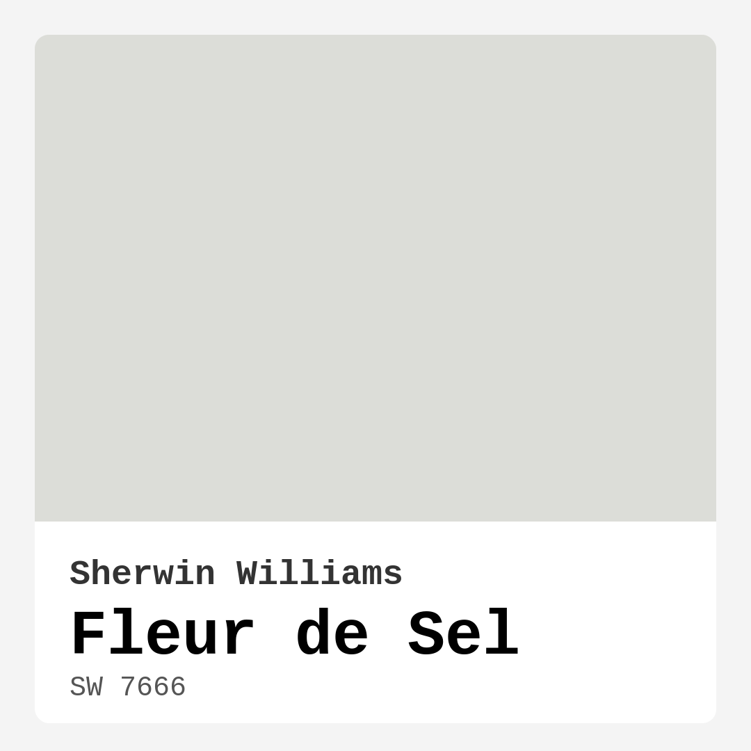
Color Preview & Key Details
| HEX Code | #DCDDD8 |
| RGB | 220, 221, 216 |
| LRV | 70% |
| Undertone | Yellow |
| Finish Options | Eggshell, Matte, Satin |
Imagine stepping into a space that instantly calms your spirit, a serene oasis that feels like a gentle breeze on a warm day. That’s the magic of Fleur de Sel, a beautifully soft shade from Sherwin Williams that captures the essence of tranquility. With its delicate gray hue and warm undertones, Fleur de Sel can transform any room into a peaceful retreat.
Let’s dive deeper into this enchanting color and explore why it might be the perfect choice for your next home project.
Fleur de Sel, with its color code SW 7666, is a light gray that leans towards a soft yellow undertone. This subtle warmth is what sets it apart from other grays, allowing it to create an inviting atmosphere without feeling overly bright or stark. It reflects a significant amount of light, boasting a Light Reflectance Value (LRV) of 70%. This means it not only brightens your space but also contributes to an airy ambiance, making it ideal for smaller rooms or areas that may feel a bit cramped.
Using Fleur de Sel is like wrapping your walls in a comforting hug. It adapts beautifully to various decor styles, from coastal to modern farmhouse, Scandinavian, and minimalist. Whether you’re looking to refresh a living room, bedroom, bathroom, dining room, or hallway, this color can seamlessly integrate into your design vision. Picture it as the backdrop for your favorite artwork, or as a soothing palette for your cozy reading nook.
One of the remarkable aspects of Fleur de Sel is its versatility. It pairs wonderfully with whites and muted pastels, creating a harmonious flow throughout your home. Think about using it alongside a crisp white trim, like White Dove, to enhance that light, airy feel. The combination not only feels refreshing but also adds a touch of elegance that can elevate your space.
Now, let’s talk about how Fleur de Sel behaves under different lighting conditions. In natural light, it appears almost ethereal, reflecting the surrounding colors and creating a soft glow. However, in artificial lighting, it takes on a more muted quality, which can make it feel cozy and intimate. This characteristic allows it to adapt beautifully to any setting, whether you’re enjoying a sunlit breakfast or a quiet evening at home.
When considering this color, it’s essential to keep in mind its undertones. The subtle yellow hints lend a warmth that can help a room feel inviting rather than chilly. However, be mindful of how these undertones interact with your existing decor. Testing Fleur de Sel against your furniture and flooring is a smart move to ensure you’re happy with the overall effect.
For those of you wondering about practicality, Fleur de Sel checks all the boxes. It’s beginner-friendly to apply, forgiving during touch-ups, and boasts a washable, wipeable finish. This means that if little hands or paws leave their mark, you can easily clean it up without worry. With options like matte, eggshell, or satin finishes available, you can choose the level of sheen that best fits your style and the room’s needs.
While there’s so much to love about Fleur de Sel, it’s important to be aware of some of its limitations. In low light, it may appear darker than expected, which could slightly shift the mood of a room. And while it’s a stunning choice on its own, it may require careful pairing with other colors to avoid feeling bland. This isn’t a color that demands attention, but rather one that provides a calming backdrop for your cherished decor.
If you’re thinking about using Fleur de Sel in a small space, you’re making a fantastic choice. Its light-reflecting qualities can create an illusion of a larger area, making compact rooms feel open and airy. It’s excellent for tight entryways or small bathrooms, giving those spaces the charm and comfort they deserve.
Now, let’s consider its performance in high-traffic areas. You’ll be pleased to know that Fleur de Sel holds up well in these environments. Its durability, combined with its washable nature, makes it suitable for busy homes. Opt for a satin or eggshell finish in these zones for added resilience against scuffs and marks.
As you orchestrate your vision for incorporating Fleur de Sel into your home, think of complementary shades that can enhance its beauty. Colors like SW 6551, SW 6558, and SW 6827 work wonderfully alongside it, creating a cohesive palette that feels both curated and comfortable.
For those seeking an even softer touch, consider pairing Fleur de Sel with lighter shades like SW 9543. On the other hand, if you want to add some depth, darker shades like SW 7653 or SW 6191 can provide contrast without clashing. Remember, it’s all about balance and creating a space that feels uniquely yours.
Fleur de Sel isn’t just a paint color; it’s a mood enhancer. It promotes calmness and restfulness, making it ideal for spaces where relaxation is a priority. Imagine unwinding in a bedroom painted in this lovely hue, or enjoying dinner in a dining room that radiates such peaceful energy.
In short, Fleur de Sel is more than just a color option; it’s an opportunity to create a serene, inviting environment in your home. Its versatility, light-reflecting qualities, and warm undertones make it an excellent choice for various applications. So, whether you’re just updating a room or embarking on a larger project, consider this soft, beautiful gray. It’s a color that promises to elevate your space while providing a perfect backdrop for your personal style.
Embrace the tranquility of Fleur de Sel, and let your home be a reflection of comfort, elegance, and warmth. Your walls will thank you for it.
Save this color to your Pinterest board to revisit when planning your room.
Real Room Photo of Fleur de Sel SW 7666
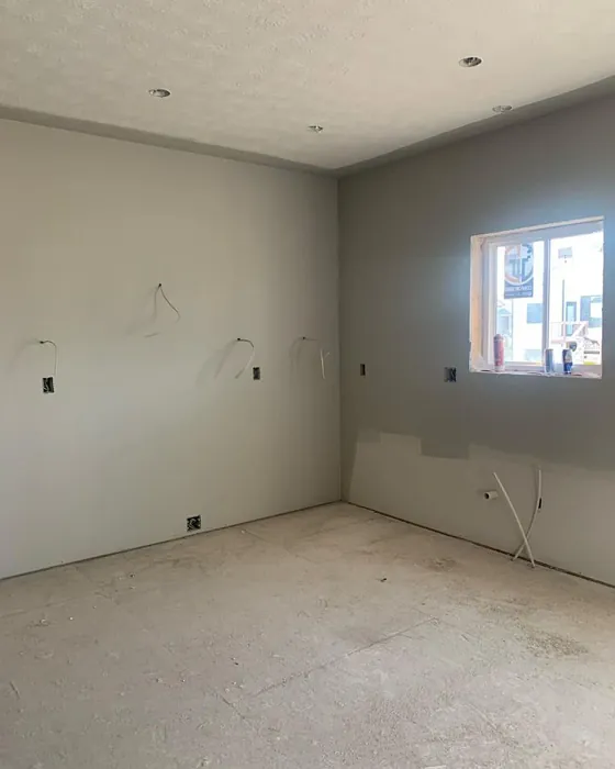
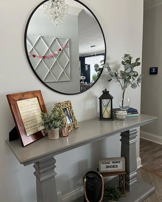
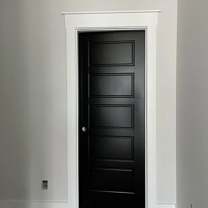
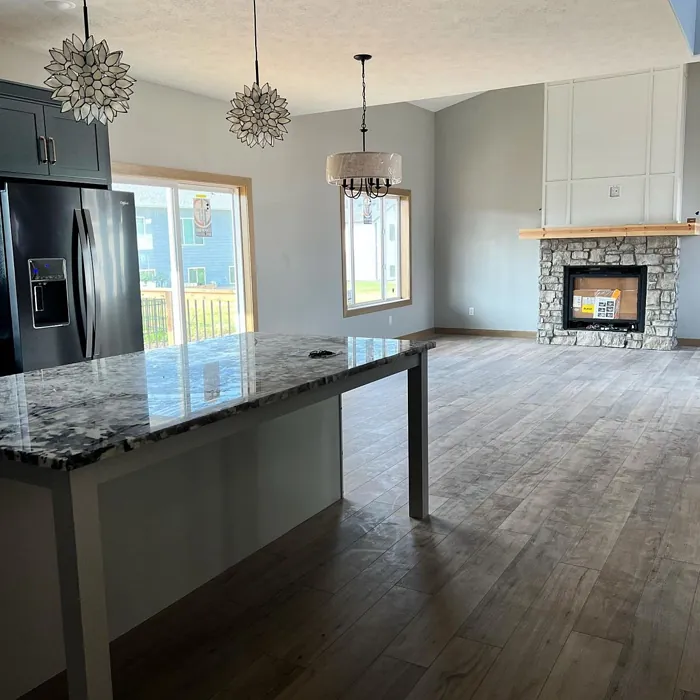
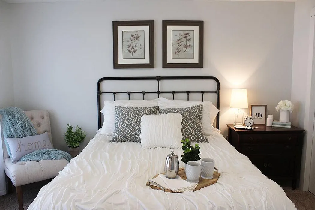
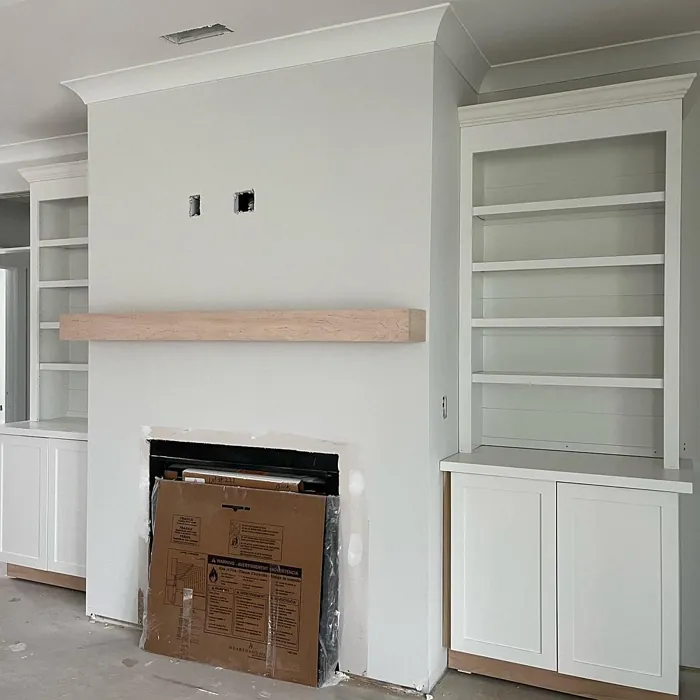
Real rooms painted with Fleur de Sel SW 7666 by Sherwin Williams. Lighting and photography can affect how colors appear — always test a sample swatch in your own space.
Undertones of Fleur de Sel ?
The undertones of Fleur de Sel are a key aspect of its character, leaning towards Yellow. These subtle underlying hues are what give the color its depth and complexity. For example, a gray with a blue undertone will feel cooler and more modern, while one with a brown undertone will feel warmer and more traditional. It’s essential to test this paint in your home and observe it next to your existing furniture, flooring, and decor to see how these undertones interact and reveal themselves throughout the day.
HEX value: #DCDDD8
RGB code: 220, 221, 216
Is Fleur de Sel Cool or Warm?
This color leans slightly warm, giving it a soft and inviting feel. It’s ideal for those who prefer a touch of warmth in their interiors without the vibrancy that some warmer shades can bring.
Understanding Color Properties and Interior Design Tips
Hue refers to a specific position on the color wheel, measured in degrees from 0 to 360. Each degree represents a different pure color:
- 0° represents red
- 120° represents green
- 240° represents blue
Saturation describes the intensity or purity of a color and is expressed as a percentage:
- At 0%, the color appears completely desaturated—essentially a shade of gray
- At 100%, the color is at its most vivid and vibrant
Lightness indicates how light or dark a color is, also expressed as a percentage:
- 0% lightness results in black
- 100% lightness results in white
Using Warm Colors in Interior Design
Warm hues—such as reds, oranges, yellows, warm beiges, and greiges—are excellent choices for creating inviting and energetic spaces. These colors are particularly well-suited for:
- Kitchens, living rooms, and bathrooms, where warmth enhances comfort and sociability
- Large rooms, where warm tones can help reduce the sense of emptiness and make the space feel more intimate
For example:
- Warm beige shades provide a cozy, inviting atmosphere, ideal for living rooms, bedrooms, and hallways.
- Warm greige (a mix of beige and gray) offers the warmth of beige with the modern appeal of gray, making it a versatile backdrop for dining areas, bedrooms, and living spaces.
However, be mindful when using warm light tones in rooms with limited natural light. These shades may appear muted or even take on an unpleasant yellowish tint. To avoid a dull or flat appearance:
- Add depth by incorporating richer tones like deep greens, charcoal, or chocolate brown
- Use textured elements such as curtains, rugs, or cushions to bring dimension to the space
Pro Tip: Achieving Harmony with Warm and Cool Color Balance
To create a well-balanced and visually interesting interior, mix warm and cool tones strategically. This contrast adds depth and harmony to your design.
- If your walls feature warm hues, introduce cool-colored accents such as blue or green furniture, artwork, or accessories to create contrast.
- For a polished look, consider using a complementary color scheme, which pairs colors opposite each other on the color wheel (e.g., red with green, orange with blue).
This thoughtful mix not only enhances visual appeal but also creates a space that feels both dynamic and cohesive.
Save this color to your Pinterest board to revisit when planning your room.
Light Temperature Affects on Fleur de Sel
Natural Light
Natural daylight changes in color temperature as the sun moves across the sky. At sunrise and sunset, the light tends to have a warm, golden tone with a color temperature around 2000 Kelvin (K). As the day progresses and the sun rises higher, the light becomes cooler and more neutral. Around midday, especially when the sky is clear, natural light typically reaches its peak brightness and shifts to a cooler tone, ranging from 5500 to 6500 Kelvin. This midday light is close to what we perceive as pure white or daylight-balanced light.
These shifts in natural light can significantly influence how colors appear in a space, which is why designers often consider both the time of day and the orientation of windows when planning interior color schemes.
Explore how this color transforms from sunrise through sunset as natural light changes throughout the day. Use the slider to simulate morning light, midday brightness, and warm afternoon tones.
North-facing rooms stay cooler throughout the day and benefit from warmer paint tones to compensate. South-facing rooms receive more direct sunlight, making even deeper shades more workable. East-facing rooms get bright morning light that fades by afternoon, while west-facing rooms glow warmly in the evening.
Artificial Light
When choosing artificial lighting, pay close attention to the color temperature, measured in Kelvin (K). This determines how warm or cool the light will appear. Lower temperatures, around 2700K, give off a warm, yellow glow often used in living rooms or bedrooms. Higher temperatures, above 5000K, create a cool, bluish light similar to daylight, commonly used in kitchens, offices, or task areas.
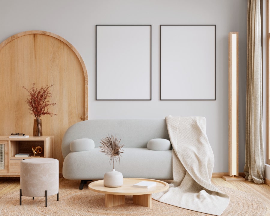
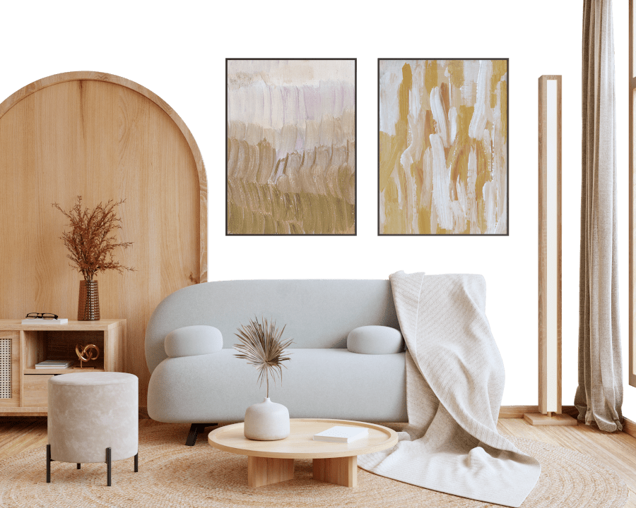
Use the slider to see how lighting temperature can affect the appearance of a surface or color throughout a space.
See how this color looks under different artificial light temperatures — from warm candlelight (2000K) to cool daylight (7000K). Move the slider to simulate your room's lighting conditions.
4800K
Keep in mind that natural light from windows, the warmth of lamps, and overhead lighting all affect how this color reads on your walls at different times of day. Always observe a sample swatch in your actual space before purchasing.
LRV of Fleur de Sel
The Light Reflectance Value (LRV) of Fleur de Sel is 70%, which places it in the Light category. This means it Reflects a high amount of light. Understanding a paint’s LRV is crucial for predicting how it will look in your space. A higher LRV indicates a lighter color that reflects more light, making rooms feel larger and brighter. A lower LRV signifies a darker color that absorbs more light, creating a cozier, more intimate atmosphere. Always consider the natural and artificial lighting in your room when selecting a paint color based on its LRV.
Detailed Review of Fleur de Sel
Additional Paint Characteristics
Ideal Rooms
Bathroom, Bedroom, Dining Room, Hallway, Kitchen, Living Room
Decor Styles
Coastal, Minimalist, Modern Farmhouse, Scandinavian
Coverage
Good (1–2 Coats), Touch-Up Friendly
Ease of Application
Beginner Friendly, Brush Smooth, Roller-Ready
Washability
Washable, Wipeable
VOC Level
Low VOC, Ultra Low VOC
Best Use
Accent Wall, Ceilings, Interior Walls
Room Suitability
Bathroom, Bedroom, Dining Room, Hallway, Living Room
Tone Tag
Airy, Muted, Neutral
Finish Type
Eggshell, Matte
Paint Performance
Easy Touch-Up, Low Odor, Scuff Resistant
Use Cases
Best for Low Light Rooms, Best for Rentals, Classic Favorite
Mood
Calm, Inviting, Restful
Trim Pairing
Complements Cool Trim, Pairs with White Dove
Fleur de Sel stands out as a beautifully understated color that works wonders in both bright and dimly lit spaces. Its soft gray tone carries subtle hints of warmth, making it feel inviting and comfortable. When applied, it creates a smooth, even finish that enhances the natural light in a room. It’s particularly effective in creating a serene backdrop for artwork or furniture, allowing those elements to shine without overwhelming the space. Homeowners will appreciate how this color can effortlessly blend with both modern and traditional decor. You’ll find that it pairs beautifully with whites and muted pastels, creating a cohesive palette throughout your home. Whether you’re looking to refresh a single room or your entire living space, Fleur de Sel is a choice that promotes relaxation and peace.
Pros & Cons of SW 7666 Fleur de Sel
Pros
Cons
Colors that go with Sherwin Williams Fleur de Sel
FAQ on SW 7666 Fleur de Sel
Is Fleur de Sel suitable for small spaces?
Absolutely! Fleur de Sel is a fantastic choice for small spaces due to its light-reflecting qualities. It helps to create an illusion of a larger area while maintaining a cozy feel. Whether you use it in a small bathroom or a compact entryway, this color can make the space feel airy and inviting.
Can I use Fleur de Sel in a high-traffic area?
Yes, Fleur de Sel is a durable option for high-traffic areas. Its washable nature means it’s easy to clean, and using a finish like eggshell or satin can add extra durability against scuffs and marks. Just make sure to apply the recommended number of coats for optimal performance.
Comparisons Fleur de Sel with other colors
Fleur de Sel SW 7666 vs Agreeable Gray SW 7029
| Attribute | Fleur de Sel SW 7666 | Agreeable Gray SW 7029 |
|---|---|---|
| Color Name | Fleur de Sel SW 7666 | Agreeable Gray SW 7029 |
| Color | ||
| Hue | Grey | Grey |
| Brightness | Light | Light |
| RGB | 220, 221, 216 | 209, 203, 193 |
| LRV | 70% | 60% |
| Finish Type | Eggshell, Matte | Eggshell, Matte, Satin |
| Finish Options | Eggshell, Matte, Satin | Eggshell, Flat, Matte, Satin |
| Ideal Rooms | Bathroom, Bedroom, Dining Room, Hallway, Kitchen, Living Room | Bathroom, Bedroom, Dining Room, Home Office, Kitchen, Living Room |
| Decor Styles | Coastal, Minimalist, Modern Farmhouse, Scandinavian | Contemporary, Farmhouse, Minimalist, Modern, Transitional |
| Coverage | Good (1–2 Coats), Touch-Up Friendly | Good (1–2 Coats), Touch-Up Friendly |
| Ease of Application | Beginner Friendly, Brush Smooth, Roller-Ready | Beginner Friendly, Brush Smooth, Roller-Ready |
| Washability | Washable, Wipeable | Washable, Wipeable |
| Room Suitability | Bathroom, Bedroom, Dining Room, Hallway, Living Room | Bathroom, Bedroom, Dining Room, Kitchen, Living Room |
| Tone | Airy, Muted, Neutral | Muted, Neutral, Warm |
| Paint Performance | Easy Touch-Up, Low Odor, Scuff Resistant | Easy Touch-Up, Fade Resistant, Low Odor |
Lighting conditions, wall orientation, and surrounding decor can significantly affect how these colors appear in your space. Always test a sample swatch before committing to a full application.
Fleur de Sel SW 7666 vs Eider White SW 7014
| Attribute | Fleur de Sel SW 7666 | Eider White SW 7014 |
|---|---|---|
| Color Name | Fleur de Sel SW 7666 | Eider White SW 7014 |
| Color | ||
| Hue | Grey | Grey |
| Brightness | Light | Light |
| RGB | 220, 221, 216 | 226, 222, 216 |
| LRV | 70% | 73% |
| Finish Type | Eggshell, Matte | Eggshell, Matte, Satin |
| Finish Options | Eggshell, Matte, Satin | Eggshell, Matte, Satin |
| Ideal Rooms | Bathroom, Bedroom, Dining Room, Hallway, Kitchen, Living Room | Bathroom, Bedroom, Dining Room, Home Office, Kitchen, Living Room |
| Decor Styles | Coastal, Minimalist, Modern Farmhouse, Scandinavian | Farmhouse, Minimalist, Modern, Scandinavian, Transitional |
| Coverage | Good (1–2 Coats), Touch-Up Friendly | Good (1–2 Coats), Touch-Up Friendly |
| Ease of Application | Beginner Friendly, Brush Smooth, Roller-Ready | Beginner Friendly, Brush Smooth, Roller-Ready |
| Washability | Washable, Wipeable | Highly Washable, Washable |
| Room Suitability | Bathroom, Bedroom, Dining Room, Hallway, Living Room | Bathroom, Bedroom, Dining Room, Kitchen, Living Room |
| Tone | Airy, Muted, Neutral | Creamy, Muted, Neutral, Warm |
| Paint Performance | Easy Touch-Up, Low Odor, Scuff Resistant | Easy Touch-Up, High Coverage, Low Odor, Scuff Resistant |
Lighting conditions, wall orientation, and surrounding decor can significantly affect how these colors appear in your space. Always test a sample swatch before committing to a full application.
Fleur de Sel SW 7666 vs Drift of Mist SW 9166
| Attribute | Fleur de Sel SW 7666 | Drift of Mist SW 9166 |
|---|---|---|
| Color Name | Fleur de Sel SW 7666 | Drift of Mist SW 9166 |
| Color | ||
| Hue | Grey | Grey |
| Brightness | Light | Light |
| RGB | 220, 221, 216 | 220, 216, 208 |
| LRV | 70% | 65% |
| Finish Type | Eggshell, Matte | Eggshell, Matte, Satin |
| Finish Options | Eggshell, Matte, Satin | Eggshell, Matte, Satin |
| Ideal Rooms | Bathroom, Bedroom, Dining Room, Hallway, Kitchen, Living Room | Bathroom, Bedroom, Home Office, Kitchen, Living Room |
| Decor Styles | Coastal, Minimalist, Modern Farmhouse, Scandinavian | Coastal, Minimalist, Modern, Scandinavian |
| Coverage | Good (1–2 Coats), Touch-Up Friendly | Good (1–2 Coats), Touch-Up Friendly |
| Ease of Application | Beginner Friendly, Brush Smooth, Roller-Ready | Beginner Friendly, Brush Smooth, Fast-Drying, Roller-Ready |
| Washability | Washable, Wipeable | Washable, Wipeable |
| Room Suitability | Bathroom, Bedroom, Dining Room, Hallway, Living Room | Bathroom, Bedroom, Home Office, Living Room |
| Tone | Airy, Muted, Neutral | Airy, Cool, Neutral |
| Paint Performance | Easy Touch-Up, Low Odor, Scuff Resistant | Easy Touch-Up, Low Odor, Quick Drying, Scuff Resistant |
Lighting conditions, wall orientation, and surrounding decor can significantly affect how these colors appear in your space. Always test a sample swatch before committing to a full application.
Fleur de Sel SW 7666 vs Sanctuary SW 9583
| Attribute | Fleur de Sel SW 7666 | Sanctuary SW 9583 |
|---|---|---|
| Color Name | Fleur de Sel SW 7666 | Sanctuary SW 9583 |
| Color | ||
| Hue | Grey | Grey |
| Brightness | Light | Light |
| RGB | 220, 221, 216 | 230, 226, 217 |
| LRV | 70% | 24% |
| Finish Type | Eggshell, Matte | Eggshell, Matte, Satin |
| Finish Options | Eggshell, Matte, Satin | Eggshell, Matte, Satin |
| Ideal Rooms | Bathroom, Bedroom, Dining Room, Hallway, Kitchen, Living Room | Bedroom, Dining Room, Home Office, Living Room, Nursery |
| Decor Styles | Coastal, Minimalist, Modern Farmhouse, Scandinavian | Bohemian, Coastal, Modern Farmhouse, Scandinavian |
| Coverage | Good (1–2 Coats), Touch-Up Friendly | Good (1–2 Coats), Touch-Up Friendly |
| Ease of Application | Beginner Friendly, Brush Smooth, Roller-Ready | Beginner Friendly, Brush Smooth, Fast-Drying, Roller-Ready |
| Washability | Washable, Wipeable | Highly Washable, Washable, Wipeable |
| Room Suitability | Bathroom, Bedroom, Dining Room, Hallway, Living Room | Bedroom, Home Office, Living Room, Nursery |
| Tone | Airy, Muted, Neutral | Earthy, Neutral, Soft, Warm |
| Paint Performance | Easy Touch-Up, Low Odor, Scuff Resistant | Easy Touch-Up, Low Odor, Quick Drying, Scuff Resistant |
Lighting conditions, wall orientation, and surrounding decor can significantly affect how these colors appear in your space. Always test a sample swatch before committing to a full application.
Fleur de Sel SW 7666 vs Snowbound SW 7004
| Attribute | Fleur de Sel SW 7666 | Snowbound SW 7004 |
|---|---|---|
| Color Name | Fleur de Sel SW 7666 | Snowbound SW 7004 |
| Color | ||
| Hue | Grey | Grey |
| Brightness | Light | Light |
| RGB | 220, 221, 216 | 237, 234, 229 |
| LRV | 70% | 83% |
| Finish Type | Eggshell, Matte | Eggshell, Matte, Satin |
| Finish Options | Eggshell, Matte, Satin | Eggshell, Matte, Satin |
| Ideal Rooms | Bathroom, Bedroom, Dining Room, Hallway, Kitchen, Living Room | Bathroom, Bedroom, Dining Room, Hallway, Home Office, Kitchen, Living Room, Nursery |
| Decor Styles | Coastal, Minimalist, Modern Farmhouse, Scandinavian | Farmhouse, Minimalist, Modern, Scandinavian, Transitional |
| Coverage | Good (1–2 Coats), Touch-Up Friendly | Good (1–2 Coats), Touch-Up Friendly |
| Ease of Application | Beginner Friendly, Brush Smooth, Roller-Ready | Beginner Friendly, Brush Smooth, Fast-Drying, Roller-Ready |
| Washability | Washable, Wipeable | Washable, Wipeable |
| Room Suitability | Bathroom, Bedroom, Dining Room, Hallway, Living Room | Bathroom, Bedroom, Dining Room, Hallway, Home Office, Kitchen, Living Room |
| Tone | Airy, Muted, Neutral | Airy, Crisp, Neutral, Warm |
| Paint Performance | Easy Touch-Up, Low Odor, Scuff Resistant | High Coverage, Low Odor, Quick Drying |
Lighting conditions, wall orientation, and surrounding decor can significantly affect how these colors appear in your space. Always test a sample swatch before committing to a full application.
Fleur de Sel SW 7666 vs Pure White SW 7005
| Attribute | Fleur de Sel SW 7666 | Pure White SW 7005 |
|---|---|---|
| Color Name | Fleur de Sel SW 7666 | Pure White SW 7005 |
| Color | ||
| Hue | Grey | Grey |
| Brightness | Light | Light |
| RGB | 220, 221, 216 | 237, 236, 230 |
| LRV | 70% | 84% |
| Finish Type | Eggshell, Matte | Eggshell, Satin, Semi-Gloss |
| Finish Options | Eggshell, Matte, Satin | Eggshell, Flat, Matte, Satin, Semi-Gloss |
| Ideal Rooms | Bathroom, Bedroom, Dining Room, Hallway, Kitchen, Living Room | Bathroom, Bedroom, Dining Room, Entryway, Hallway, Home Office, Kitchen, Living Room, Nursery |
| Decor Styles | Coastal, Minimalist, Modern Farmhouse, Scandinavian | Bohemian, Eclectic, Farmhouse, Minimalist, Modern, Traditional |
| Coverage | Good (1–2 Coats), Touch-Up Friendly | Good (1–2 Coats), Touch-Up Friendly |
| Ease of Application | Beginner Friendly, Brush Smooth, Roller-Ready | Beginner Friendly, Brush Smooth, Fast-Drying, Roller-Ready |
| Washability | Washable, Wipeable | Highly Washable, Washable |
| Room Suitability | Bathroom, Bedroom, Dining Room, Hallway, Living Room | Bathroom, Bedroom, Dining Room, Entryway, Hallway, Home Office, Kitchen, Living Room, Nursery |
| Tone | Airy, Muted, Neutral | Crisp, Neutral, Warm |
| Paint Performance | Easy Touch-Up, Low Odor, Scuff Resistant | Easy Touch-Up, High Coverage, Low Odor, Quick Drying |
Lighting conditions, wall orientation, and surrounding decor can significantly affect how these colors appear in your space. Always test a sample swatch before committing to a full application.
Fleur de Sel SW 7666 vs Crushed Ice SW 7647
| Attribute | Fleur de Sel SW 7666 | Crushed Ice SW 7647 |
|---|---|---|
| Color Name | Fleur de Sel SW 7666 | Crushed Ice SW 7647 |
| Color | ||
| Hue | Grey | Grey |
| Brightness | Light | Light |
| RGB | 220, 221, 216 | 214, 211, 204 |
| LRV | 70% | 66% |
| Finish Type | Eggshell, Matte | Eggshell, Matte, Satin |
| Finish Options | Eggshell, Matte, Satin | Eggshell, Matte, Satin |
| Ideal Rooms | Bathroom, Bedroom, Dining Room, Hallway, Kitchen, Living Room | Bathroom, Bedroom, Dining Room, Home Office, Living Room |
| Decor Styles | Coastal, Minimalist, Modern Farmhouse, Scandinavian | Farmhouse, Minimalist, Modern, Scandinavian, Transitional |
| Coverage | Good (1–2 Coats), Touch-Up Friendly | Good (1–2 Coats), Touch-Up Friendly |
| Ease of Application | Beginner Friendly, Brush Smooth, Roller-Ready | Beginner Friendly, Brush Smooth, Roller-Ready |
| Washability | Washable, Wipeable | Stain Resistant, Washable |
| Room Suitability | Bathroom, Bedroom, Dining Room, Hallway, Living Room | Bathroom, Bedroom, Dining Room, Hallway, Home Office, Living Room |
| Tone | Airy, Muted, Neutral | Muted, Neutral, Warm |
| Paint Performance | Easy Touch-Up, Low Odor, Scuff Resistant | High Coverage, Low Odor, Quick Drying |
Lighting conditions, wall orientation, and surrounding decor can significantly affect how these colors appear in your space. Always test a sample swatch before committing to a full application.
Fleur de Sel SW 7666 vs Origami White SW 7636
| Attribute | Fleur de Sel SW 7666 | Origami White SW 7636 |
|---|---|---|
| Color Name | Fleur de Sel SW 7666 | Origami White SW 7636 |
| Color | ||
| Hue | Grey | Grey |
| Brightness | Light | Light |
| RGB | 220, 221, 216 | 229, 226, 218 |
| LRV | 70% | 83% |
| Finish Type | Eggshell, Matte | Eggshell, Matte |
| Finish Options | Eggshell, Matte, Satin | Eggshell, Matte, Satin |
| Ideal Rooms | Bathroom, Bedroom, Dining Room, Hallway, Kitchen, Living Room | Bedroom, Dining Room, Entryway, Hallway, Home Office, Kitchen, Living Room |
| Decor Styles | Coastal, Minimalist, Modern Farmhouse, Scandinavian | Minimalist, Modern, Scandinavian, Traditional, Transitional |
| Coverage | Good (1–2 Coats), Touch-Up Friendly | Good (1–2 Coats), Touch-Up Friendly |
| Ease of Application | Beginner Friendly, Brush Smooth, Roller-Ready | Beginner Friendly, Brush Smooth, Roller-Ready |
| Washability | Washable, Wipeable | Washable, Wipeable |
| Room Suitability | Bathroom, Bedroom, Dining Room, Hallway, Living Room | Bedroom, Dining Room, Home Office, Kitchen, Living Room |
| Tone | Airy, Muted, Neutral | Airy, Neutral, Warm |
| Paint Performance | Easy Touch-Up, Low Odor, Scuff Resistant | Easy Touch-Up, Low Odor, Quick Drying |
Lighting conditions, wall orientation, and surrounding decor can significantly affect how these colors appear in your space. Always test a sample swatch before committing to a full application.
Fleur de Sel SW 7666 vs Spare White SW 6203
| Attribute | Fleur de Sel SW 7666 | Spare White SW 6203 |
|---|---|---|
| Color Name | Fleur de Sel SW 7666 | Spare White SW 6203 |
| Color | ||
| Hue | Grey | Grey |
| Brightness | Light | Light |
| RGB | 220, 221, 216 | 228, 228, 221 |
| LRV | 70% | 75% |
| Finish Type | Eggshell, Matte | Eggshell, Matte |
| Finish Options | Eggshell, Matte, Satin | Eggshell, Matte, Satin |
| Ideal Rooms | Bathroom, Bedroom, Dining Room, Hallway, Kitchen, Living Room | Bedroom, Dining Room, Home Office, Kitchen, Living Room, Nursery |
| Decor Styles | Coastal, Minimalist, Modern Farmhouse, Scandinavian | Farmhouse, Minimalist, Modern, Scandinavian, Transitional |
| Coverage | Good (1–2 Coats), Touch-Up Friendly | Good (1–2 Coats), Primer Recommended, Touch-Up Friendly |
| Ease of Application | Beginner Friendly, Brush Smooth, Roller-Ready | Beginner Friendly, Brush Smooth, Fast-Drying, Roller-Ready |
| Washability | Washable, Wipeable | Washable, Wipeable |
| Room Suitability | Bathroom, Bedroom, Dining Room, Hallway, Living Room | Bedroom, Dining Room, Home Office, Kitchen, Living Room |
| Tone | Airy, Muted, Neutral | Creamy, Neutral, Warm |
| Paint Performance | Easy Touch-Up, Low Odor, Scuff Resistant | Easy Touch-Up, Low Odor, Quick Drying |
Lighting conditions, wall orientation, and surrounding decor can significantly affect how these colors appear in your space. Always test a sample swatch before committing to a full application.
Fleur de Sel SW 7666 vs Mountain Air SW 6224
| Attribute | Fleur de Sel SW 7666 | Mountain Air SW 6224 |
|---|---|---|
| Color Name | Fleur de Sel SW 7666 | Mountain Air SW 6224 |
| Color | ||
| Hue | Grey | Grey |
| Brightness | Light | Light |
| RGB | 220, 221, 216 | 216, 224, 223 |
| LRV | 70% | 66% |
| Finish Type | Eggshell, Matte | Eggshell, Satin |
| Finish Options | Eggshell, Matte, Satin | Eggshell, Matte, Satin |
| Ideal Rooms | Bathroom, Bedroom, Dining Room, Hallway, Kitchen, Living Room | Bedroom, Hallway, Home Office, Living Room, Nursery |
| Decor Styles | Coastal, Minimalist, Modern Farmhouse, Scandinavian | Coastal, Minimalist, Modern, Scandinavian |
| Coverage | Good (1–2 Coats), Touch-Up Friendly | Good (1–2 Coats), Touch-Up Friendly |
| Ease of Application | Beginner Friendly, Brush Smooth, Roller-Ready | Beginner Friendly, Brush Smooth, Fast-Drying, Roller-Ready |
| Washability | Washable, Wipeable | Highly Washable, Washable |
| Room Suitability | Bathroom, Bedroom, Dining Room, Hallway, Living Room | Bedroom, Home Office, Living Room, Nursery |
| Tone | Airy, Muted, Neutral | Airy, Cool, Muted |
| Paint Performance | Easy Touch-Up, Low Odor, Scuff Resistant | Easy Touch-Up, Low Odor, Quick Drying, Scuff Resistant |
Lighting conditions, wall orientation, and surrounding decor can significantly affect how these colors appear in your space. Always test a sample swatch before committing to a full application.
Official Page of Sherwin Williams Fleur de Sel SW 7666