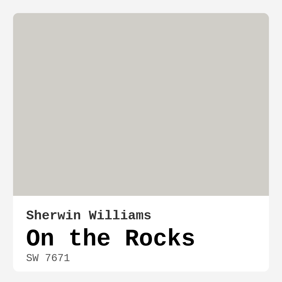
Color Preview & Key Details
| HEX Code | #D0CEC8 |
| RGB | 208, 206, 200 |
| LRV | 53% |
| Undertone | Yellow |
| Finish Options | Eggshell, Matte, Satin |
Imagine stepping into a room that feels effortlessly serene, a space where calmness washes over you as soon as you walk in. This is the magic that a well-chosen paint color can create, and one such color that embodies this tranquility is Sherwin Williams’ On the Rocks (SW 7671). This soft, muted gray isn’t just a color; it’s an experience waiting to unfold in your home.
On the Rocks is one of those shades that feels like a gentle hug. With its light brightness and a Light Reflectance Value (LRV) of 53%, it strikes a perfect balance that reflects a moderate amount of light. This makes it a versatile choice for many rooms in your home, from the living room to the bedroom, home office, dining room, and even entryways. The color feels inviting and warm, yet it possesses a certain sophistication that can elevate any space.
What sets On the Rocks apart is its subtle yellow undertone. While many grays lean towards cooler hues, On the Rocks introduces a hint of warmth that prevents it from feeling stark or cold. This quality makes it incredibly adaptable, allowing it to harmonize beautifully with a variety of decor styles, whether you’re aiming for a modern, contemporary vibe or something more minimalist and Scandinavian.
When you’re considering a paint color, it’s vital to think about how it will behave in different lighting conditions. On the Rocks adapts wonderfully, appearing more luminous and airy under natural light, while taking on a cozier feel in artificial light. This dynamic quality ensures that your space remains fresh and inviting, regardless of the time of day.
One of the best features of On the Rocks is its application process. If you’re a homeowner looking to tackle a DIY project, you’ll appreciate that this paint is beginner-friendly. It glides on smoothly, providing good coverage, often requiring only one to two coats for full opacity. Plus, its fast-drying formula means you won’t be stuck waiting around for hours before you can finish your project. After you paint, clean-up is a breeze too, thanks to its washable and highly washability qualities.
Now, let’s talk about pairing this beautiful gray with other colors. On the Rocks works exceptionally well with white trims, such as Sherwin Williams’ White Dove or Simply White. This contrast enhances the softness of the gray, creating a crisp, elegant look that feels polished without being overly formal. If you’re leaning into a more rustic theme, consider wood trims that can add warmth and character to the overall design.
When it comes to choosing complementary shades, you have plenty of options. Colors like SW 9640, SW 6540, and SW 9073 can create a lovely palette when combined with On the Rocks, ensuring your space feels cohesive and thoughtfully designed. But remember, while On the Rocks is versatile, careful color pairing is essential to avoid a washed-out look; the right accessories and accents can help it shine.
For those who love experimenting with different decor styles, you’ll find that On the Rocks is a designer favorite. Its calm, inviting mood makes it perfect for open-concept spaces where flow and cohesion are key. Whether you’re updating a single room or refreshing an entire home, this color can adapt to various settings, making it a practical choice for homeowners looking to enhance their living spaces.
Of course, every paint color comes with its own set of considerations. While On the Rocks is generally easy to work with, it may appear cooler in certain lighting scenarios. This is where testing comes into play. Always sample the paint in your home’s lighting conditions and against your existing furnishings to see how it interacts throughout the day.
If you’re in a high-traffic area, don’t worry! On the Rocks is suitable for these spaces, especially when you opt for a durable finish like satin or eggshell. Its practical nature makes it an excellent choice for family homes, where walls often bear the brunt of daily life.
In terms of mood, On the Rocks creates a calm and restful environment. It’s perfect for bedrooms or home offices where you want to foster concentration and relaxation. You’ll find that the gentle hue provides a soothing backdrop that allows for pops of color in accessories, artwork, or furniture.
For those who appreciate the aesthetics of lighter and darker shades, On the Rocks beautifully complements both. If you’re looking to lighten up your space, consider lighter shades like SW 7648 or SW 6000. Conversely, if you want a bolder contrast, darker shades such as SW 7015 or SW 7649 can add depth and dimension to your design.
Ultimately, On the Rocks is more than just a paint color; it’s a versatile canvas for your creative expression. With its soothing gray tone, easy application, and dynamic appearance in varying light, it truly can transform your home into a personalized sanctuary.
So, as you consider your next home project, think about how On the Rocks might serve as the ideal backdrop for your life. Whether you’re looking to create a peaceful retreat, a stylish living area, or a functional workspace, this color can help you achieve that vision. Paint is one of the easiest ways to elevate your home, and with On the Rocks, you can rest assured you’re choosing a hue that’s both beautiful and practical.
In the realm of home decor, the right color can make all the difference, and On the Rocks might just be the perfect choice to bring your design dreams to life. So, grab a sample, test it out, and watch as your space transforms into the haven you’ve always envisioned.
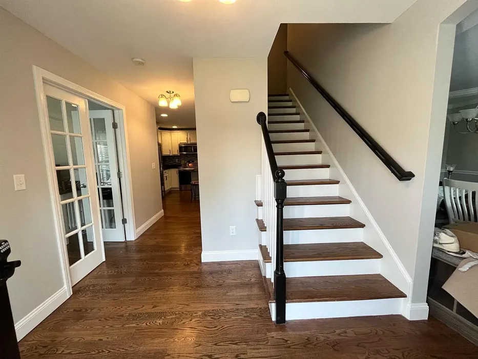
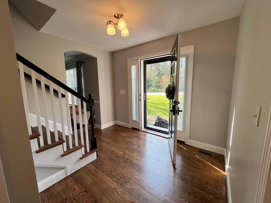
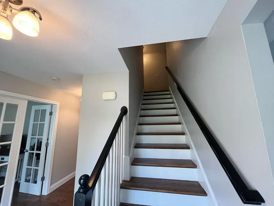
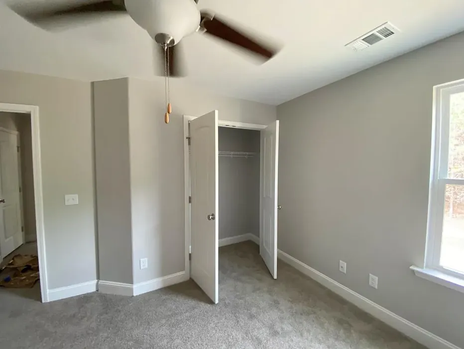
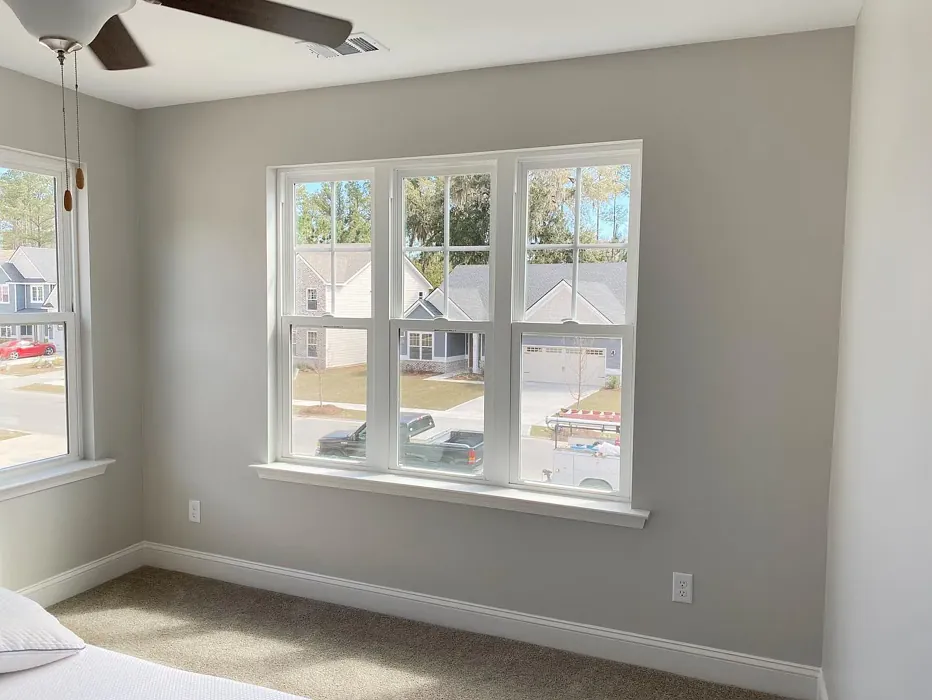
Real Room Photo of On the Rocks SW 7671
Undertones of On the Rocks ?
The undertones of On the Rocks are a key aspect of its character, leaning towards Yellow. These subtle underlying hues are what give the color its depth and complexity. For example, a gray with a blue undertone will feel cooler and more modern, while one with a brown undertone will feel warmer and more traditional. It’s essential to test this paint in your home and observe it next to your existing furniture, flooring, and decor to see how these undertones interact and reveal themselves throughout the day.
HEX value: #D0CEC8
RGB code: 208, 206, 200
Is On the Rocks Cool or Warm?
This color is primarily cool, with hints of warmth that prevent it from feeling stark. It’s perfect for creating a balanced and inviting atmosphere in any room.
Understanding Color Properties and Interior Design Tips
Hue refers to a specific position on the color wheel, measured in degrees from 0 to 360. Each degree represents a different pure color:
- 0° represents red
- 120° represents green
- 240° represents blue
Saturation describes the intensity or purity of a color and is expressed as a percentage:
- At 0%, the color appears completely desaturated—essentially a shade of gray
- At 100%, the color is at its most vivid and vibrant
Lightness indicates how light or dark a color is, also expressed as a percentage:
- 0% lightness results in black
- 100% lightness results in white
Using Warm Colors in Interior Design
Warm hues—such as reds, oranges, yellows, warm beiges, and greiges—are excellent choices for creating inviting and energetic spaces. These colors are particularly well-suited for:
- Kitchens, living rooms, and bathrooms, where warmth enhances comfort and sociability
- Large rooms, where warm tones can help reduce the sense of emptiness and make the space feel more intimate
For example:
- Warm beige shades provide a cozy, inviting atmosphere, ideal for living rooms, bedrooms, and hallways.
- Warm greige (a mix of beige and gray) offers the warmth of beige with the modern appeal of gray, making it a versatile backdrop for dining areas, bedrooms, and living spaces.
However, be mindful when using warm light tones in rooms with limited natural light. These shades may appear muted or even take on an unpleasant yellowish tint. To avoid a dull or flat appearance:
- Add depth by incorporating richer tones like deep greens, charcoal, or chocolate brown
- Use textured elements such as curtains, rugs, or cushions to bring dimension to the space
Pro Tip: Achieving Harmony with Warm and Cool Color Balance
To create a well-balanced and visually interesting interior, mix warm and cool tones strategically. This contrast adds depth and harmony to your design.
- If your walls feature warm hues, introduce cool-colored accents such as blue or green furniture, artwork, or accessories to create contrast.
- For a polished look, consider using a complementary color scheme, which pairs colors opposite each other on the color wheel (e.g., red with green, orange with blue).
This thoughtful mix not only enhances visual appeal but also creates a space that feels both dynamic and cohesive.
Light Temperature Affects on On the Rocks
Natural Light
Natural daylight changes in color temperature as the sun moves across the sky. At sunrise and sunset, the light tends to have a warm, golden tone with a color temperature around 2000 Kelvin (K). As the day progresses and the sun rises higher, the light becomes cooler and more neutral. Around midday, especially when the sky is clear, natural light typically reaches its peak brightness and shifts to a cooler tone, ranging from 5500 to 6500 Kelvin. This midday light is close to what we perceive as pure white or daylight-balanced light.
These shifts in natural light can significantly influence how colors appear in a space, which is why designers often consider both the time of day and the orientation of windows when planning interior color schemes.
Artificial Light
When choosing artificial lighting, pay close attention to the color temperature, measured in Kelvin (K). This determines how warm or cool the light will appear. Lower temperatures, around 2700K, give off a warm, yellow glow often used in living rooms or bedrooms. Higher temperatures, above 5000K, create a cool, bluish light similar to daylight, commonly used in kitchens, offices, or task areas.
Use the slider to see how lighting temperature can affect the appearance of a surface or color throughout a space.


4800K
LRV of On the Rocks
The Light Reflectance Value (LRV) of On the Rocks is 53%, which places it in the Medium category. This means it Reflects a moderate amount of light. Understanding a paint’s LRV is crucial for predicting how it will look in your space. A higher LRV indicates a lighter color that reflects more light, making rooms feel larger and brighter. A lower LRV signifies a darker color that absorbs more light, creating a cozier, more intimate atmosphere. Always consider the natural and artificial lighting in your room when selecting a paint color based on its LRV.
Detailed Review of On the Rocks
Additional Paint Characteristics
Ideal Rooms
Bedroom, Dining Room, Entryway, Home Office, Living Room
Decor Styles
Contemporary, Minimalist, Modern, Scandinavian, Transitional
Coverage
Good (1–2 Coats), Touch-Up Friendly
Ease of Application
Beginner Friendly, Brush Smooth, Fast-Drying, Roller-Ready
Washability
Highly Washable, Washable
VOC Level
Low VOC
Best Use
Accent Wall, Furniture, Interior Walls, Trim
Room Suitability
Bedroom, Dining Room, Entryway, Home Office, Living Room
Tone Tag
Balanced, Cool, Muted
Finish Type
Eggshell, Matte, Satin
Paint Performance
Easy Touch-Up, Low Odor, Quick Drying, Scuff Resistant
Use Cases
Best for Open Concept, Best for Rentals, Designer Favorite
Mood
Calm, Inviting, Restful
Trim Pairing
Good with Wood Trim, Matches Pure White, Pairs with White Dove
On the Rocks is a truly versatile paint choice that can transform any room into a peaceful retreat. Its soft gray tone is neither too cool nor too warm, making it a perfect backdrop for a variety of decor styles, from modern minimalist to cozy farmhouse. The application process is a breeze, and the paint glides on smoothly, providing excellent coverage without much effort. Many users have reported that it only took one to two coats for full opacity, making it a practical choice for quick home updates. Additionally, its subtle undertones can shift throughout the day, allowing for a dynamic look that keeps your space feeling fresh and inviting. Overall, On the Rocks is an excellent option for anyone seeking a calming yet stylish shade for their home.
Pros & Cons of SW 7671 On the Rocks
Pros
Cons
Colors that go with Sherwin Williams On the Rocks
FAQ on SW 7671 On the Rocks
Can On the Rocks be used in high-traffic areas?
Yes, On the Rocks is suitable for high-traffic areas, especially when paired with a durable finish like satin or eggshell. Its washable properties make it easy to maintain, ensuring that your walls stay looking fresh even with frequent use.
What type of trim works best with On the Rocks?
On the Rocks pairs beautifully with white trim options, such as White Dove or Simply White. These crisp contrasts highlight the softness of the gray and create an elegant look throughout your space.
Comparisons On the Rocks with other colors
On the Rocks SW 7671 vs Agreeable Gray SW 7029
| Attribute | On the Rocks SW 7671 | Agreeable Gray SW 7029 |
|---|---|---|
| Color Name | On the Rocks SW 7671 | Agreeable Gray SW 7029 |
| Color | ||
| Hue | Grey | Grey |
| Brightness | Light | Light |
| RGB | 208, 206, 200 | 209, 203, 193 |
| LRV | 53% | 60% |
| Finish Type | Eggshell, Matte, Satin | Eggshell, Matte, Satin |
| Finish Options | Eggshell, Matte, Satin | Eggshell, Flat, Matte, Satin |
| Ideal Rooms | Bedroom, Dining Room, Entryway, Home Office, Living Room | Bathroom, Bedroom, Dining Room, Home Office, Kitchen, Living Room |
| Decor Styles | Contemporary, Minimalist, Modern, Scandinavian, Transitional | Contemporary, Farmhouse, Minimalist, Modern, Transitional |
| Coverage | Good (1–2 Coats), Touch-Up Friendly | Good (1–2 Coats), Touch-Up Friendly |
| Ease of Application | Beginner Friendly, Brush Smooth, Fast-Drying, Roller-Ready | Beginner Friendly, Brush Smooth, Roller-Ready |
| Washability | Highly Washable, Washable | Washable, Wipeable |
| Room Suitability | Bedroom, Dining Room, Entryway, Home Office, Living Room | Bathroom, Bedroom, Dining Room, Kitchen, Living Room |
| Tone | Balanced, Cool, Muted | Muted, Neutral, Warm |
| Paint Performance | Easy Touch-Up, Low Odor, Quick Drying, Scuff Resistant | Easy Touch-Up, Fade Resistant, Low Odor |
On the Rocks SW 7671 vs Eider White SW 7014
| Attribute | On the Rocks SW 7671 | Eider White SW 7014 |
|---|---|---|
| Color Name | On the Rocks SW 7671 | Eider White SW 7014 |
| Color | ||
| Hue | Grey | Grey |
| Brightness | Light | Light |
| RGB | 208, 206, 200 | 226, 222, 216 |
| LRV | 53% | 73% |
| Finish Type | Eggshell, Matte, Satin | Eggshell, Matte, Satin |
| Finish Options | Eggshell, Matte, Satin | Eggshell, Matte, Satin |
| Ideal Rooms | Bedroom, Dining Room, Entryway, Home Office, Living Room | Bathroom, Bedroom, Dining Room, Home Office, Kitchen, Living Room |
| Decor Styles | Contemporary, Minimalist, Modern, Scandinavian, Transitional | Farmhouse, Minimalist, Modern, Scandinavian, Transitional |
| Coverage | Good (1–2 Coats), Touch-Up Friendly | Good (1–2 Coats), Touch-Up Friendly |
| Ease of Application | Beginner Friendly, Brush Smooth, Fast-Drying, Roller-Ready | Beginner Friendly, Brush Smooth, Roller-Ready |
| Washability | Highly Washable, Washable | Highly Washable, Washable |
| Room Suitability | Bedroom, Dining Room, Entryway, Home Office, Living Room | Bathroom, Bedroom, Dining Room, Kitchen, Living Room |
| Tone | Balanced, Cool, Muted | Creamy, Muted, Neutral, Warm |
| Paint Performance | Easy Touch-Up, Low Odor, Quick Drying, Scuff Resistant | Easy Touch-Up, High Coverage, Low Odor, Scuff Resistant |
On the Rocks SW 7671 vs Drift of Mist SW 9166
| Attribute | On the Rocks SW 7671 | Drift of Mist SW 9166 |
|---|---|---|
| Color Name | On the Rocks SW 7671 | Drift of Mist SW 9166 |
| Color | ||
| Hue | Grey | Grey |
| Brightness | Light | Light |
| RGB | 208, 206, 200 | 220, 216, 208 |
| LRV | 53% | 65% |
| Finish Type | Eggshell, Matte, Satin | Eggshell, Matte, Satin |
| Finish Options | Eggshell, Matte, Satin | Eggshell, Matte, Satin |
| Ideal Rooms | Bedroom, Dining Room, Entryway, Home Office, Living Room | Bathroom, Bedroom, Home Office, Kitchen, Living Room |
| Decor Styles | Contemporary, Minimalist, Modern, Scandinavian, Transitional | Coastal, Minimalist, Modern, Scandinavian |
| Coverage | Good (1–2 Coats), Touch-Up Friendly | Good (1–2 Coats), Touch-Up Friendly |
| Ease of Application | Beginner Friendly, Brush Smooth, Fast-Drying, Roller-Ready | Beginner Friendly, Brush Smooth, Fast-Drying, Roller-Ready |
| Washability | Highly Washable, Washable | Washable, Wipeable |
| Room Suitability | Bedroom, Dining Room, Entryway, Home Office, Living Room | Bathroom, Bedroom, Home Office, Living Room |
| Tone | Balanced, Cool, Muted | Airy, Cool, Neutral |
| Paint Performance | Easy Touch-Up, Low Odor, Quick Drying, Scuff Resistant | Easy Touch-Up, Low Odor, Quick Drying, Scuff Resistant |
On the Rocks SW 7671 vs Sanctuary SW 9583
| Attribute | On the Rocks SW 7671 | Sanctuary SW 9583 |
|---|---|---|
| Color Name | On the Rocks SW 7671 | Sanctuary SW 9583 |
| Color | ||
| Hue | Grey | Grey |
| Brightness | Light | Light |
| RGB | 208, 206, 200 | 230, 226, 217 |
| LRV | 53% | 24% |
| Finish Type | Eggshell, Matte, Satin | Eggshell, Matte, Satin |
| Finish Options | Eggshell, Matte, Satin | Eggshell, Matte, Satin |
| Ideal Rooms | Bedroom, Dining Room, Entryway, Home Office, Living Room | Bedroom, Dining Room, Home Office, Living Room, Nursery |
| Decor Styles | Contemporary, Minimalist, Modern, Scandinavian, Transitional | Bohemian, Coastal, Modern Farmhouse, Scandinavian |
| Coverage | Good (1–2 Coats), Touch-Up Friendly | Good (1–2 Coats), Touch-Up Friendly |
| Ease of Application | Beginner Friendly, Brush Smooth, Fast-Drying, Roller-Ready | Beginner Friendly, Brush Smooth, Fast-Drying, Roller-Ready |
| Washability | Highly Washable, Washable | Highly Washable, Washable, Wipeable |
| Room Suitability | Bedroom, Dining Room, Entryway, Home Office, Living Room | Bedroom, Home Office, Living Room, Nursery |
| Tone | Balanced, Cool, Muted | Earthy, Neutral, Soft, Warm |
| Paint Performance | Easy Touch-Up, Low Odor, Quick Drying, Scuff Resistant | Easy Touch-Up, Low Odor, Quick Drying, Scuff Resistant |
On the Rocks SW 7671 vs Snowbound SW 7004
| Attribute | On the Rocks SW 7671 | Snowbound SW 7004 |
|---|---|---|
| Color Name | On the Rocks SW 7671 | Snowbound SW 7004 |
| Color | ||
| Hue | Grey | Grey |
| Brightness | Light | Light |
| RGB | 208, 206, 200 | 237, 234, 229 |
| LRV | 53% | 83% |
| Finish Type | Eggshell, Matte, Satin | Eggshell, Matte, Satin |
| Finish Options | Eggshell, Matte, Satin | Eggshell, Matte, Satin |
| Ideal Rooms | Bedroom, Dining Room, Entryway, Home Office, Living Room | Bathroom, Bedroom, Dining Room, Hallway, Home Office, Kitchen, Living Room, Nursery |
| Decor Styles | Contemporary, Minimalist, Modern, Scandinavian, Transitional | Farmhouse, Minimalist, Modern, Scandinavian, Transitional |
| Coverage | Good (1–2 Coats), Touch-Up Friendly | Good (1–2 Coats), Touch-Up Friendly |
| Ease of Application | Beginner Friendly, Brush Smooth, Fast-Drying, Roller-Ready | Beginner Friendly, Brush Smooth, Fast-Drying, Roller-Ready |
| Washability | Highly Washable, Washable | Washable, Wipeable |
| Room Suitability | Bedroom, Dining Room, Entryway, Home Office, Living Room | Bathroom, Bedroom, Dining Room, Hallway, Home Office, Kitchen, Living Room |
| Tone | Balanced, Cool, Muted | Airy, Crisp, Neutral, Warm |
| Paint Performance | Easy Touch-Up, Low Odor, Quick Drying, Scuff Resistant | High Coverage, Low Odor, Quick Drying |
On the Rocks SW 7671 vs Pure White SW 7005
| Attribute | On the Rocks SW 7671 | Pure White SW 7005 |
|---|---|---|
| Color Name | On the Rocks SW 7671 | Pure White SW 7005 |
| Color | ||
| Hue | Grey | Grey |
| Brightness | Light | Light |
| RGB | 208, 206, 200 | 237, 236, 230 |
| LRV | 53% | 84% |
| Finish Type | Eggshell, Matte, Satin | Eggshell, Satin, Semi-Gloss |
| Finish Options | Eggshell, Matte, Satin | Eggshell, Flat, Matte, Satin, Semi-Gloss |
| Ideal Rooms | Bedroom, Dining Room, Entryway, Home Office, Living Room | Bathroom, Bedroom, Dining Room, Entryway, Hallway, Home Office, Kitchen, Living Room, Nursery |
| Decor Styles | Contemporary, Minimalist, Modern, Scandinavian, Transitional | Bohemian, Eclectic, Farmhouse, Minimalist, Modern, Traditional |
| Coverage | Good (1–2 Coats), Touch-Up Friendly | Good (1–2 Coats), Touch-Up Friendly |
| Ease of Application | Beginner Friendly, Brush Smooth, Fast-Drying, Roller-Ready | Beginner Friendly, Brush Smooth, Fast-Drying, Roller-Ready |
| Washability | Highly Washable, Washable | Highly Washable, Washable |
| Room Suitability | Bedroom, Dining Room, Entryway, Home Office, Living Room | Bathroom, Bedroom, Dining Room, Entryway, Hallway, Home Office, Kitchen, Living Room, Nursery |
| Tone | Balanced, Cool, Muted | Crisp, Neutral, Warm |
| Paint Performance | Easy Touch-Up, Low Odor, Quick Drying, Scuff Resistant | Easy Touch-Up, High Coverage, Low Odor, Quick Drying |
On the Rocks SW 7671 vs Crushed Ice SW 7647
| Attribute | On the Rocks SW 7671 | Crushed Ice SW 7647 |
|---|---|---|
| Color Name | On the Rocks SW 7671 | Crushed Ice SW 7647 |
| Color | ||
| Hue | Grey | Grey |
| Brightness | Light | Light |
| RGB | 208, 206, 200 | 214, 211, 204 |
| LRV | 53% | 66% |
| Finish Type | Eggshell, Matte, Satin | Eggshell, Matte, Satin |
| Finish Options | Eggshell, Matte, Satin | Eggshell, Matte, Satin |
| Ideal Rooms | Bedroom, Dining Room, Entryway, Home Office, Living Room | Bathroom, Bedroom, Dining Room, Home Office, Living Room |
| Decor Styles | Contemporary, Minimalist, Modern, Scandinavian, Transitional | Farmhouse, Minimalist, Modern, Scandinavian, Transitional |
| Coverage | Good (1–2 Coats), Touch-Up Friendly | Good (1–2 Coats), Touch-Up Friendly |
| Ease of Application | Beginner Friendly, Brush Smooth, Fast-Drying, Roller-Ready | Beginner Friendly, Brush Smooth, Roller-Ready |
| Washability | Highly Washable, Washable | Stain Resistant, Washable |
| Room Suitability | Bedroom, Dining Room, Entryway, Home Office, Living Room | Bathroom, Bedroom, Dining Room, Hallway, Home Office, Living Room |
| Tone | Balanced, Cool, Muted | Muted, Neutral, Warm |
| Paint Performance | Easy Touch-Up, Low Odor, Quick Drying, Scuff Resistant | High Coverage, Low Odor, Quick Drying |
On the Rocks SW 7671 vs Origami White SW 7636
| Attribute | On the Rocks SW 7671 | Origami White SW 7636 |
|---|---|---|
| Color Name | On the Rocks SW 7671 | Origami White SW 7636 |
| Color | ||
| Hue | Grey | Grey |
| Brightness | Light | Light |
| RGB | 208, 206, 200 | 229, 226, 218 |
| LRV | 53% | 83% |
| Finish Type | Eggshell, Matte, Satin | Eggshell, Matte |
| Finish Options | Eggshell, Matte, Satin | Eggshell, Matte, Satin |
| Ideal Rooms | Bedroom, Dining Room, Entryway, Home Office, Living Room | Bedroom, Dining Room, Entryway, Hallway, Home Office, Kitchen, Living Room |
| Decor Styles | Contemporary, Minimalist, Modern, Scandinavian, Transitional | Minimalist, Modern, Scandinavian, Traditional, Transitional |
| Coverage | Good (1–2 Coats), Touch-Up Friendly | Good (1–2 Coats), Touch-Up Friendly |
| Ease of Application | Beginner Friendly, Brush Smooth, Fast-Drying, Roller-Ready | Beginner Friendly, Brush Smooth, Roller-Ready |
| Washability | Highly Washable, Washable | Washable, Wipeable |
| Room Suitability | Bedroom, Dining Room, Entryway, Home Office, Living Room | Bedroom, Dining Room, Home Office, Kitchen, Living Room |
| Tone | Balanced, Cool, Muted | Airy, Neutral, Warm |
| Paint Performance | Easy Touch-Up, Low Odor, Quick Drying, Scuff Resistant | Easy Touch-Up, Low Odor, Quick Drying |
On the Rocks SW 7671 vs Spare White SW 6203
| Attribute | On the Rocks SW 7671 | Spare White SW 6203 |
|---|---|---|
| Color Name | On the Rocks SW 7671 | Spare White SW 6203 |
| Color | ||
| Hue | Grey | Grey |
| Brightness | Light | Light |
| RGB | 208, 206, 200 | 228, 228, 221 |
| LRV | 53% | 75% |
| Finish Type | Eggshell, Matte, Satin | Eggshell, Matte |
| Finish Options | Eggshell, Matte, Satin | Eggshell, Matte, Satin |
| Ideal Rooms | Bedroom, Dining Room, Entryway, Home Office, Living Room | Bedroom, Dining Room, Home Office, Kitchen, Living Room, Nursery |
| Decor Styles | Contemporary, Minimalist, Modern, Scandinavian, Transitional | Farmhouse, Minimalist, Modern, Scandinavian, Transitional |
| Coverage | Good (1–2 Coats), Touch-Up Friendly | Good (1–2 Coats), Primer Recommended, Touch-Up Friendly |
| Ease of Application | Beginner Friendly, Brush Smooth, Fast-Drying, Roller-Ready | Beginner Friendly, Brush Smooth, Fast-Drying, Roller-Ready |
| Washability | Highly Washable, Washable | Washable, Wipeable |
| Room Suitability | Bedroom, Dining Room, Entryway, Home Office, Living Room | Bedroom, Dining Room, Home Office, Kitchen, Living Room |
| Tone | Balanced, Cool, Muted | Creamy, Neutral, Warm |
| Paint Performance | Easy Touch-Up, Low Odor, Quick Drying, Scuff Resistant | Easy Touch-Up, Low Odor, Quick Drying |
On the Rocks SW 7671 vs Mountain Air SW 6224
| Attribute | On the Rocks SW 7671 | Mountain Air SW 6224 |
|---|---|---|
| Color Name | On the Rocks SW 7671 | Mountain Air SW 6224 |
| Color | ||
| Hue | Grey | Grey |
| Brightness | Light | Light |
| RGB | 208, 206, 200 | 216, 224, 223 |
| LRV | 53% | 66% |
| Finish Type | Eggshell, Matte, Satin | Eggshell, Satin |
| Finish Options | Eggshell, Matte, Satin | Eggshell, Matte, Satin |
| Ideal Rooms | Bedroom, Dining Room, Entryway, Home Office, Living Room | Bedroom, Hallway, Home Office, Living Room, Nursery |
| Decor Styles | Contemporary, Minimalist, Modern, Scandinavian, Transitional | Coastal, Minimalist, Modern, Scandinavian |
| Coverage | Good (1–2 Coats), Touch-Up Friendly | Good (1–2 Coats), Touch-Up Friendly |
| Ease of Application | Beginner Friendly, Brush Smooth, Fast-Drying, Roller-Ready | Beginner Friendly, Brush Smooth, Fast-Drying, Roller-Ready |
| Washability | Highly Washable, Washable | Highly Washable, Washable |
| Room Suitability | Bedroom, Dining Room, Entryway, Home Office, Living Room | Bedroom, Home Office, Living Room, Nursery |
| Tone | Balanced, Cool, Muted | Airy, Cool, Muted |
| Paint Performance | Easy Touch-Up, Low Odor, Quick Drying, Scuff Resistant | Easy Touch-Up, Low Odor, Quick Drying, Scuff Resistant |
Official Page of Sherwin Williams On the Rocks SW 7671