Imagine stepping into a room that feels like a gentle hug. That’s the kind of warmth and comfort Pink Shadow SW 0070 brings to a space. It’s a color that truly makes you feel instantly at ease.
This isn’t a loud or flashy pink. Instead, it offers a subtle beauty that leaves a lasting impression without being overwhelming. It’s incredibly versatile, giving you plenty of options when it comes to decorating.
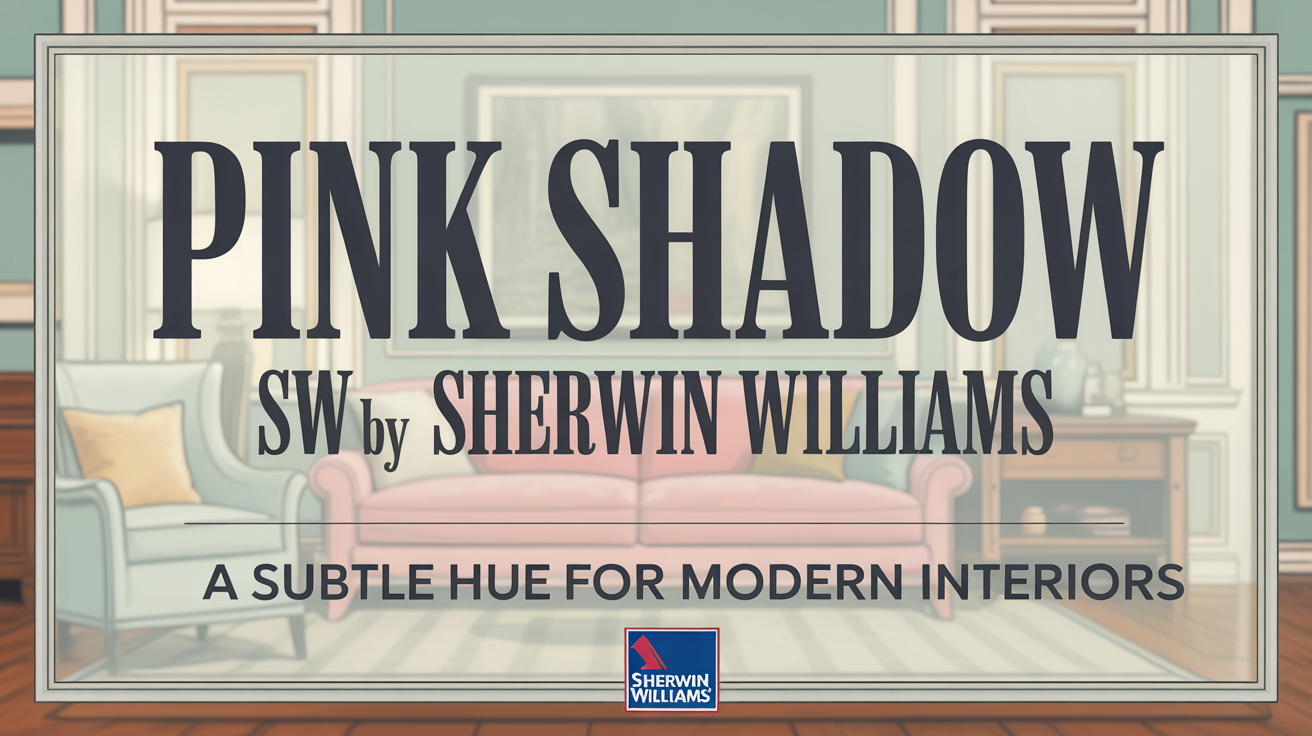
What Color Is Pink Shadow SW 0070 by Sherwin Williams?
Pink Shadow SW 0070 is a soft, muted pink from Sherwin Williams. Think of it as a delicate blush that brings a gentle warmth into any space.
It’s right in that sweet spot – not too bold, but definitely not too faint either. This makes it a fantastic choice for many different rooms and styles. It truly evokes a sense of calm and comfort.
Is Pink Shadow SW 0070 by Sherwin Williams Warm or Cool color?
This lovely shade offers a soft, delicate hue that definitely adds warmth. It brings a sense of gentleness to any room.
The pale pink tone creates a welcoming and airy atmosphere. It can even make spaces feel larger and more inviting. It’s a versatile color that works beautifully in living rooms, bedrooms, and nurseries.
It reflects light wonderfully, helping to enhance brightness in rooms with natural sunlight. Pink Shadow brings a subtle touch of color without overwhelming your senses.
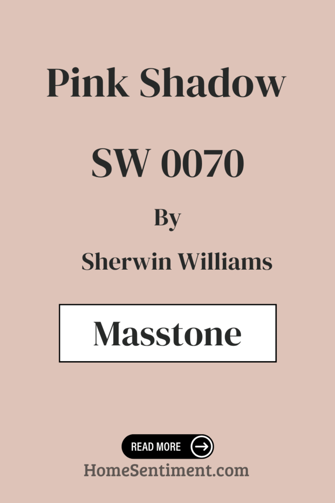
What is the Masstone of the Pink Shadow SW 0070 by Sherwin Williams?
Every color has a masstone, which is the underlying shade that influences its appearance. For Pink Shadow SW 0070, the masstone is light gray.
This gray base is really important. It gives the pink its softer, more muted tone, making it feel gentle and relaxing. It helps create that calm and peaceful atmosphere you love.
The light gray masstone also makes it easy to pair with other colors. It blends nicely with whites and other neutrals for a harmonious look. You can even pair it with darker grays or earthy tones for a balanced design.
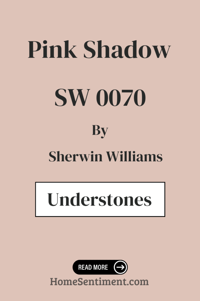
Undertones of Pink Shadow SW 0070 by Sherwin Williams
Pink Shadow is more complex than just pink! It has a delightful blend of undertones that subtly influence how it looks. These undertones add complexity and depth.
You’ll find pale yellow undertones, which bring warmth and make spaces feel inviting and comfortable. This warmth balances some of the cooler undertones.
Yes, it has cooler undertones too, like light blue and light purple. These help give the color a sense of balance and neutrality.
The pale pink undertone simply enhances its natural gentle quality. Plus, hints of mint and lilac tones introduce a fresh, airy feeling, perfect for adding lightness.
Finally, grey undertones add that muted quality, bringing sophistication and a calming influence. These undertones ensure the color is never overwhelming. Based on lighting and surrounding decor, Pink Shadow can appear warmer or cooler. This makes it super adaptable for different styles.
Coordinating Colors of Pink Shadow SW 0070 by Sherwin Williams
Picking colors that work well together is key to a harmonious look. For Pink Shadow SW 0070, some fantastic coordinating colors really enhance its beauty.
Consider using SW 6147 – Panda White and SW 6151 – Quiver Tan.
- Panda White is a warm neutral with subtle beige hints. It’s a versatile backdrop that pairs perfectly with Pink Shadow’s delicate tones, making rooms feel incredibly inviting.
- Quiver Tan is a rich, earthy hue. It helps ground the airy feel of Pink Shadow, adding depth and character.
Together, these colors create a pleasing, cohesive look that enhances the pink shade.
How Does Lighting Affect Pink Shadow SW 0070 by Sherwin Williams?
Lighting is a total game-changer for how paint colors appear. Pink Shadow SW 0070 is a great example of how light can shift a color.
In natural light, it tends to look soft and muted. But the direction of the room makes a difference.
- In a north-facing room, where light is cooler, Pink Shadow might show a slightly bluer, more subdued tint.
- South-facing rooms get lots of warm light, making Pink Shadow seem more vibrant and warmer. This really brings out the softer pink hues.
- East-facing rooms have bright, warm morning light, so Pink Shadow will look warm initially, but cooler later in the day.
- West-facing rooms get strong afternoon and evening light, which can make Pink Shadow appear richer and more intense as dusk approaches.
Artificial lighting also matters.
- With incandescent or warm LED bulbs, Pink Shadow will look warmer and cozier.
- Cool LED or fluorescent lights might make it appear cooler, possibly even duller.
So, the room’s orientation and your light bulbs significantly influence how you perceive this color.
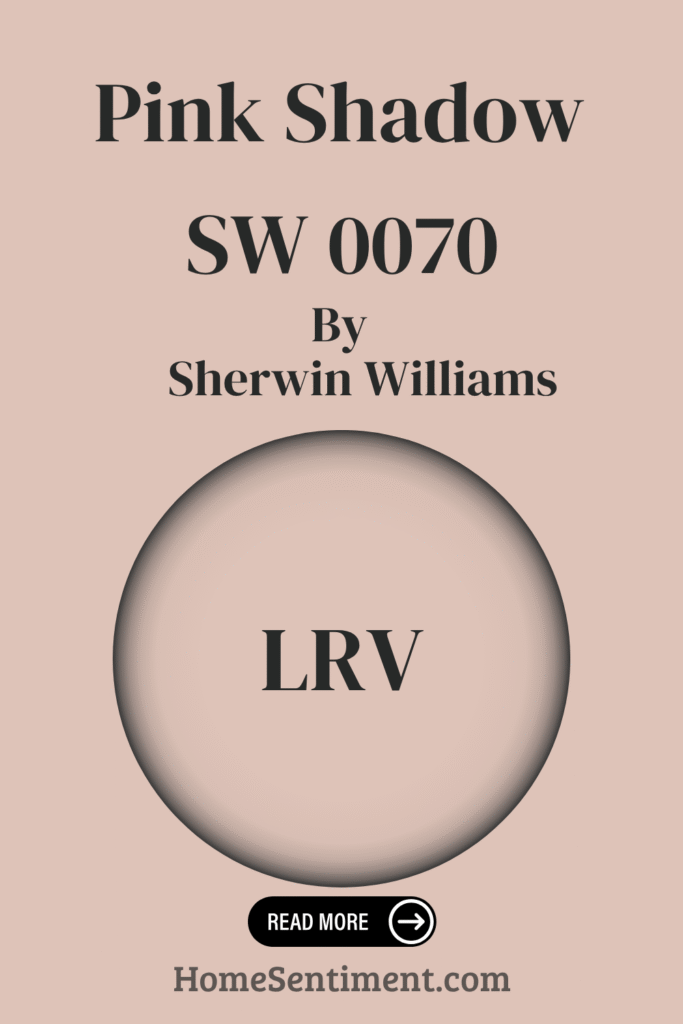
What is the LRV of Pink Shadow SW 0070 by Sherwin Williams?
LRV stands for Light Reflectance Value. It’s a number (from 0 to 100) that tells you how much light a color reflects. Higher numbers mean more light reflected, making a space feel brighter. Lower numbers mean more light absorbed, making a room feel warmer.
Pink Shadow SW 0070 has an LRV of 58.27. This is a moderate value, meaning it reflects a decent amount of light.
This moderate LRV makes it really versatile. In bright rooms, it keeps the space airy. In smaller or darker areas, it adds brightness without overpowering. Its balanced LRV helps it maintain that soft, subtle pink hue without feeling too intense.
What are the Trim colors of Pink Shadow SW 0070 by Sherwin Williams?
Trim colors are those shades on your moldings, door frames, and window sills. Choosing the right ones makes a big difference in the room’s look. They add contrast, depth, and a finished feel.
For Pink Shadow’s subtle pink, a few trim colors are excellent choices. They really highlight the interiors’ charm.
Consider these options:
- SW 6385 Dover White: This is a warm, creamy white. It creates a soft contrast with Pink Shadow, adding warmth and brightness for a cozy feel.
- SW 7014 Eider White: This is a cooler, more neutral white. Its gray undertones subtly frame the pink, offering a modern and balanced look.
Both enhance the walls beautifully but create different atmospheres.
Colors Similar to Pink Shadow SW 0070 by Sherwin Williams
Sometimes you want colors that share a similar vibe or undertones to create a cohesive look. These colors can add layers and depth.
Here are some colors that are similar to Pink Shadow:
- SW 6050 Abalone Shell – A soft, warm neutral.
- SW 0056 Classic Sand – A timeless beige.
- SW 6051 Sashay Sand – Light, earthy with warm undertones.
- SW 6057 Malted Milk – A creamy beige with a cozy feel.
- SW 6330 Quaint Peche – A delicate peach with subtlety.
- SW 6323 Romance – A soft pink hue.
- SW 6617 Blushing – A rosy warmth that’s inviting.
- SW 6610 Koral Kicks – A coral undertone adding lively color.
- SW 6022 Breathless – A pale pink creating lightness.
- SW 6058 Likeable Sand – Beige with a whisper of pink.
These colors work effortlessly together, creating a soothing and unified palette. They belong to the same gentle family, each with its own character.
How to Use Pink Shadow SW 0070 by Sherwin Williams In Your Home?
Pink Shadow SW 0070 is a beautifully versatile shade. It truly works well in many spaces.
- Bedrooms: It’s ideal for creating a gentle, calm atmosphere perfect for relaxing.
- Accent Wall: Use it here to add warmth and coziness without overpowering the room. It harmonizes well with neutral tones.
- Living Rooms: It provides a unique backdrop that lets your art and decor shine. It keeps the look cohesive and elegant. Try pairing it with light gray or beige furniture for a balanced, inviting feel.
- Bathrooms: It adds a hint of softness and can make mornings feel brighter.
- Kid’s Rooms: This hue is playful yet not too intense, complementing modern or classic styles.
Pink Shadow brings subtle charm and enhances comfort in any room, remaining versatile and stylish.
Pink Shadow SW 0070 by Sherwin Williams vs Koral Kicks SW 6610 by Sherwin Williams
These two colors have distinct vibes.
- Pink Shadow is soft and muted, feeling gentle and subtle. It makes spaces feel cozy and warm with understated elegance. It’s perfect for a calming atmosphere.
- Koral Kicks SW 6610 is bold and lively. It has vibrant energy that adds enthusiasm and cheer. It works well where you want energy, like playrooms or kitchens.
Think of Pink Shadow as a whisper of comfort, while Koral Kicks is a shout of fun.
Pink Shadow SW 0070 by Sherwin Williams vs Likeable Sand SW 6058 by Sherwin Williams
Here we have two comforting colors with different approaches.
- Pink Shadow is a delicate blend of pink with a subtle undertone. It feels soft, airy, and makes rooms feel open and inviting. It adds a gentle warmth without overwhelming.
- Likeable Sand SW 6058 is a warm, earthy beige. It feels cozy and stable. It has hints of rosy undertones, offering depth. It’s great for larger spaces like kitchens and family rooms.
Pink Shadow brings light and freshness, while Likeable Sand offers grounded warmth.
Pink Shadow SW 0070 by Sherwin Williams vs Classic Sand SW 0056 by Sherwin Williams
Let’s compare Pink Shadow to a true neutral.
- Pink Shadow is a soft, muted pink that radiates warmth and comfort. It’s subtle and inviting, perfect for areas where relaxation is key.
- Classic Sand SW 0056 is a light, sandy beige. It’s a neutral that pairs easily with many colors and materials. It brightens a room without feeling cold.
Pink Shadow adds warmth, while Classic Sand provides neutrality and balance.
Pink Shadow SW 0070 by Sherwin Williams vs Sashay Sand SW 6051 by Sherwin Williams
Both offer warmth, but in different ways.
- Pink Shadow is a gentle shade with hints of purplish undertones. This makes it feel romantic and soothing. It’s ideal for creating a calming oasis.
- Sashay Sand SW 6051 leans more towards a beige tone with just a touch of pink. It’s versatile and works well as a neutral, warm backdrop in many rooms.
Pink Shadow has a more noticeable pink hue, while Sashay Sand is subtler with its sand-like quality.
Pink Shadow SW 0070 by Sherwin Williams vs Malted Milk SW 6057 by Sherwin Williams
These two bring different personalities.
- Pink Shadow is a soft, muted pink with a delicate, serene presence. It evokes warmth and subtle elegance, great for a cozy, inviting atmosphere.
- Malted Milk SW 6057 is a warm beige with creamy undertones. It’s gentle and versatile, providing a neutral backdrop. It offers a sense of comfort in various settings.
Pink Shadow is a gentle touch of color, while Malted Milk is more neutral and understated.
Pink Shadow SW 0070 by Sherwin Williams vs Quaint Peche SW 6330 by Sherwin Williams
Both are charming, but distinct.
- Pink Shadow is a soft, muted shade with a gentle, calm vibe. It’s a subtle, dusty pink, perfect for cozy, warm spaces without being overpowering.
- Quaint Peche SW 6330 has a warm, peachy undertone. It imparts a cheerful, fresh feeling and can brighten a room. It’s ideal for a lively, inviting atmosphere.
Pink Shadow is serene and soft, while Quaint Peche brings warmth with a hint of playfulness.
Pink Shadow SW 0070 by Sherwin Williams vs Breathless SW 6022 by Sherwin Williams
Here are two shades in the pink family with different moods.
- Pink Shadow is soft and elegant with a subtle warm undertone. It creates a comforting and gentle atmosphere. It’s great for adding a touch of romance and calm.
- Breathless SW 6022 is another light pink, but it leans cooler with a hint of gray. It feels more muted and sophisticated, offering a modern twist. It makes spaces feel airy and refined.
Pink Shadow offers warmth and charm, while Breathless provides cooler, subdued elegance.
Pink Shadow SW 0070 by Sherwin Williams vs Romance SW 6323 by Sherwin Williams
Comparing Pink Shadow to a more vibrant pink shows the range.
- Pink Shadow is muted and soft with a subtle gray undertone. It feels calm and understated, ideal for gentle spaces like a bedroom or nursery.
- Romance SW 6323 is a more vibrant and richer pink. This color exudes warmth and energy. It’s suitable for living spaces where you want a lively and inviting atmosphere.
Pink Shadow suits a serene environment, while Romance invigorates a space with its bolder presence.
Pink Shadow SW 0070 by Sherwin Williams vs Abalone Shell SW 6050 by Sherwin Williams
Let’s look at Pink Shadow against a more neutral hue.
- Pink Shadow is a light, soft pink that feels gentle and cheerful. It has a warm tone that adds subtle elegance without being bold. It creates a cozy, inviting atmosphere.
- Abalone Shell SW 6050 is more neutral and understated. It leans towards a beige or taupe with slight warmth. It’s versatile and a great subtle backdrop.
Pink Shadow is more playful and inviting, while Abalone Shell offers a versatile neutral base.
Pink Shadow SW 0070 by Sherwin Williams vs Blushing SW 6617 by Sherwin Williams
These two pinks offer different levels of intensity.
- Pink Shadow is a softer, muted pink with a touch of gray. It provides a gentle and subtle feel, perfect for creating a calming, quiet atmosphere.
- Blushing SW 6617 is a lively, bright pink with a hint of warmth. It brings energy and cheerfulness, ideal for playful spaces or accent walls.
Pink Shadow is like a whisper, while Blushing is more like a cheerful conversation.
Conclusion
Pink Shadow SW 0070 by Sherwin Williams is truly a remarkably versatile shade. It consistently brings warmth and charm into any space you use it in.
It perfectly balances being soft and sophisticated. The muted rose tones blend beautifully, fitting well in both modern and traditional designs.
It excels in living rooms and bedrooms, fostering a cozy atmosphere for relaxation. It pairs wonderfully with neutrals like grays and beiges, but don’t shy away from deeper colors like navy or emerald either.
Whether you prefer minimalist decor or like vibrant accents, Pink Shadow serves as an excellent backdrop. When painted on walls, you’ll notice how well it captures light, elegantly changing throughout the day. This adaptability creates a truly inviting and personal environment.
Choosing a color can feel like a big step, but Pink Shadow is one that consistently delivers. It not only stands strong on its own but also brings out the best in other colors you pair with it. It’s a timeless choice for refreshing your space.
The Only Samples You Need
Ready to see Pink Shadow in your own home? Testing colors used to be messy, right? Well, there’s a much easier way now.
Look for peel-and-stick paint samples. You simply stick them on your wall, see how the color looks throughout the day, and easily move or remove them. It’s a game-changer!