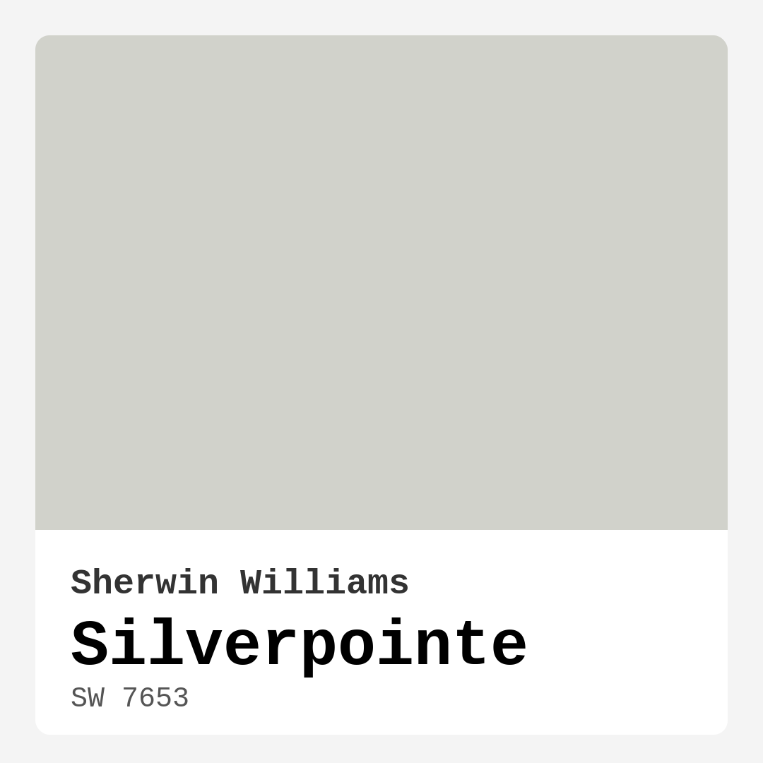
Color Preview & Key Details
| HEX Code | #D1D2CB |
| RGB | 209, 210, 203 |
| LRV | 66% |
| Undertone | Yellow |
| Finish Options | Eggshell, Matte, Satin |
Imagine stepping into a room that feels instantly serene, inviting, and sophisticated. You glance at the walls and can’t help but appreciate how the color softly envelops the space, enhancing the natural light while providing a warm backdrop for your decor. This is the magic of Silverpointe by Sherwin Williams, a paint color that has earned its place as a favorite among homeowners and designers alike.
Let’s dive into why Silverpointe, with its subtle yellow undertones and light gray hue, might just be the perfect choice for your next home project.
Silverpointe (SW 7653) stands out as a soft, sophisticated gray that dances beautifully between modern and classic styles. Its versatility is one of its biggest selling points. Whether you’re designing a tranquil bedroom, a chic dining room, or a cozy home office, this color adapts seamlessly to various aesthetics, from contemporary to Scandinavian to transitional designs. You’ll find that it harmonizes effortlessly with a range of complementary shades, making it a fantastic canvas for your personal style.
What’s particularly remarkable about Silverpointe is its ability to reflect light. With a Light Reflectance Value (LRV) of 66%, it does a wonderful job brightening up spaces by bouncing light around the room, creating an airy, open feel. This is especially valuable in smaller areas where you want to create the illusion of more space. Imagine how it will brighten that nook in your home, making it feel welcoming and expansive.
When considering the atmosphere you want to create, think about how Silverpointe interacts with light throughout the day. In the morning sunlight, it has a fresh, crisp appearance, and as the day progresses into evening, it takes on a warmer glow, allowing the room to transform into a cozy retreat. This dynamic quality means you won’t tire of the color—it evolves with the light, providing a continually refreshing backdrop.
But let’s talk about its undertones for a moment. Silverpointe leans slightly towards yellow, which gives it a warmth that sets it apart from cooler grays. This subtle undertone is what makes it a balanced choice; it can complement both warm and cool furnishings without feeling out of place. It’s essential to test this paint next to your existing decor to see how it interacts with your unique lighting and furnishings.
One of the most practical aspects of Silverpointe is its ease of application. Whether you’re a DIY enthusiast or a beginner, you’ll appreciate how smoothly it goes on. It’s designed to be touch-up-friendly and is available in various finishes—matte, eggshell, or satin—to suit your desired aesthetic and functionality. For a softer, more understated look, the matte finish is perfect, while satin offers durability for high-traffic areas. The choice depends on your needs, but you can’t go wrong with either.
Now, let’s address a common concern: how does Silverpointe perform in different lighting conditions? While it’s crucial to understand that the color may appear differently based on the light in your space, its high reflectance value means it typically maintains its elegance and warmth. Just be sure to swatch it on your walls and observe it at different times of the day before making a final decision.
Silverpointe’s versatility shines through in its pairing potential. It works beautifully with a variety of colors, from soft whites like White Dove to deeper shades that create a striking contrast. For a cohesive look, consider using complementary shades such as SW 6551 or SW 6827 to tie your space together. If you’re looking to make a statement, pairing it with darker tones can add depth and drama.
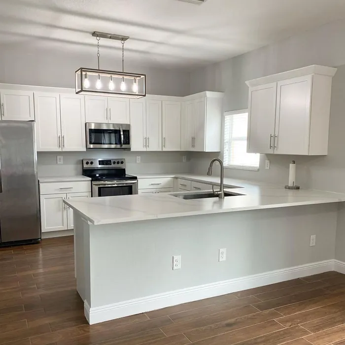
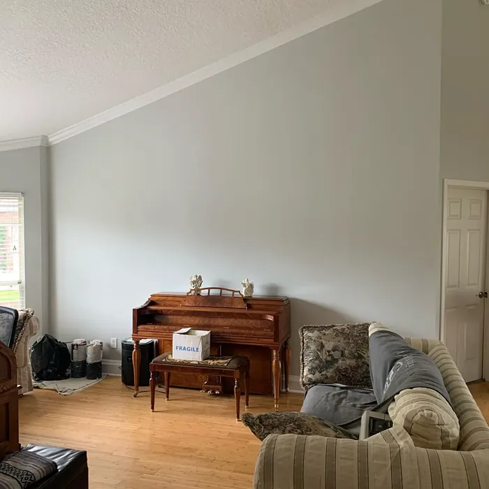
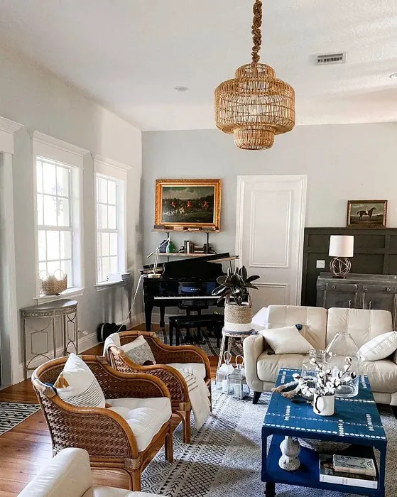
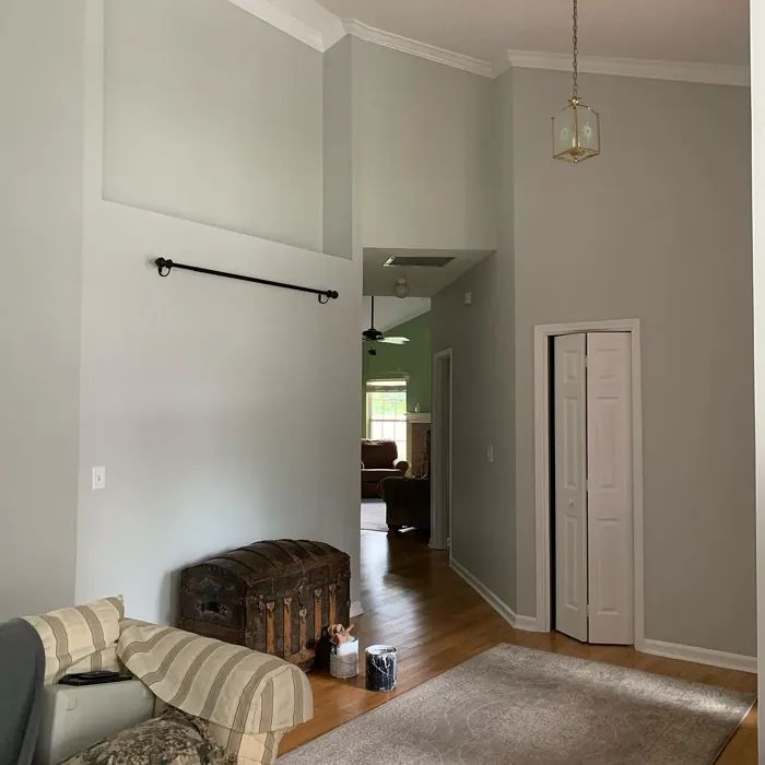
Think about the rooms where Silverpointe could work its magic. In the living room, it creates a calming atmosphere, perfect for relaxation after a long day. In a bedroom, it promotes tranquility and restful sleep, making it an ideal choice for those seeking a peaceful sanctuary. Even in a home office, it can help maintain focus while providing a stylish backdrop for your productivity.
Another fantastic use for Silverpointe is as an accent wall. This can create a focal point in a room, especially when paired with vibrant artwork or furniture pieces. The soft gray acts as a neutral anchor, allowing your decor to shine while maintaining a sophisticated ambiance.
Let’s not forget about the practical side of paint. Silverpointe is washable and highly resistant to scuffs, making it suitable for homes with kids or pets. Plus, with its low VOC content, you can feel good about using it in your home without compromising indoor air quality.
As you consider Silverpointe for your next project, remember that its appeal lies in its soft sophistication and versatility. It invites warmth without overwhelming a space, making it a fantastic choice for almost any room. Whether you’re aiming for a cozy feel or a modern edge, this paint color can help you achieve your vision.
In conclusion, Silverpointe is more than just a color; it’s a statement of elegance and calm. By choosing it for your walls, you’re not just painting a room—you’re creating an atmosphere, a mood, a home. So grab a sample, paint a swatch, and watch how this subtle yet powerful hue transforms your space. It might just be the perfect touch of sophistication your home has been waiting for.
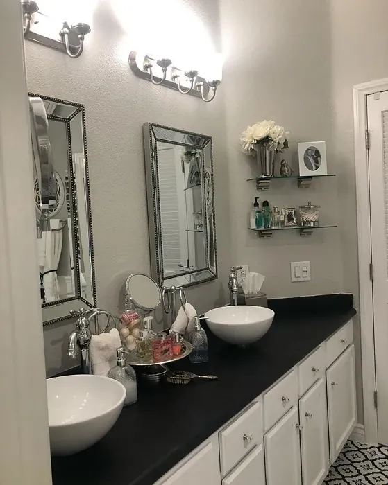
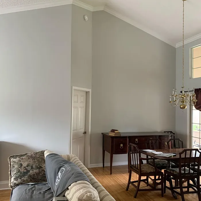
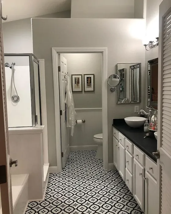
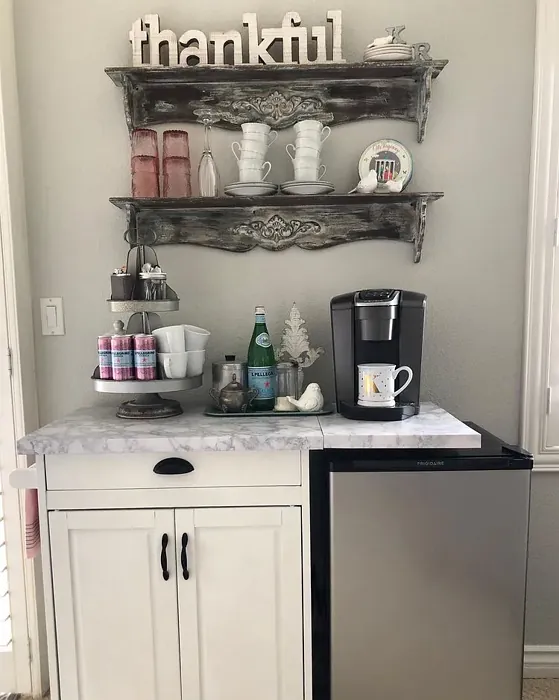
Real Room Photo of Silverpointe SW 7653
Undertones of Silverpointe ?
The undertones of Silverpointe are a key aspect of its character, leaning towards Yellow. These subtle underlying hues are what give the color its depth and complexity. For example, a gray with a blue undertone will feel cooler and more modern, while one with a brown undertone will feel warmer and more traditional. It’s essential to test this paint in your home and observe it next to your existing furniture, flooring, and decor to see how these undertones interact and reveal themselves throughout the day.
HEX value: #D1D2CB
RGB code: 209, 210, 203
Is Silverpointe Cool or Warm?
This color leans slightly towards the warm side of the spectrum while maintaining a balanced neutrality. It’s not overly warm, which means it can complement a variety of furnishings and accents without clashing. This balance makes it a fantastic choice for those who want a cozy yet sophisticated feel in their space.
Understanding Color Properties and Interior Design Tips
Hue refers to a specific position on the color wheel, measured in degrees from 0 to 360. Each degree represents a different pure color:
- 0° represents red
- 120° represents green
- 240° represents blue
Saturation describes the intensity or purity of a color and is expressed as a percentage:
- At 0%, the color appears completely desaturated—essentially a shade of gray
- At 100%, the color is at its most vivid and vibrant
Lightness indicates how light or dark a color is, also expressed as a percentage:
- 0% lightness results in black
- 100% lightness results in white
Using Warm Colors in Interior Design
Warm hues—such as reds, oranges, yellows, warm beiges, and greiges—are excellent choices for creating inviting and energetic spaces. These colors are particularly well-suited for:
- Kitchens, living rooms, and bathrooms, where warmth enhances comfort and sociability
- Large rooms, where warm tones can help reduce the sense of emptiness and make the space feel more intimate
For example:
- Warm beige shades provide a cozy, inviting atmosphere, ideal for living rooms, bedrooms, and hallways.
- Warm greige (a mix of beige and gray) offers the warmth of beige with the modern appeal of gray, making it a versatile backdrop for dining areas, bedrooms, and living spaces.
However, be mindful when using warm light tones in rooms with limited natural light. These shades may appear muted or even take on an unpleasant yellowish tint. To avoid a dull or flat appearance:
- Add depth by incorporating richer tones like deep greens, charcoal, or chocolate brown
- Use textured elements such as curtains, rugs, or cushions to bring dimension to the space
Pro Tip: Achieving Harmony with Warm and Cool Color Balance
To create a well-balanced and visually interesting interior, mix warm and cool tones strategically. This contrast adds depth and harmony to your design.
- If your walls feature warm hues, introduce cool-colored accents such as blue or green furniture, artwork, or accessories to create contrast.
- For a polished look, consider using a complementary color scheme, which pairs colors opposite each other on the color wheel (e.g., red with green, orange with blue).
This thoughtful mix not only enhances visual appeal but also creates a space that feels both dynamic and cohesive.
Light Temperature Affects on Silverpointe
Natural Light
Natural daylight changes in color temperature as the sun moves across the sky. At sunrise and sunset, the light tends to have a warm, golden tone with a color temperature around 2000 Kelvin (K). As the day progresses and the sun rises higher, the light becomes cooler and more neutral. Around midday, especially when the sky is clear, natural light typically reaches its peak brightness and shifts to a cooler tone, ranging from 5500 to 6500 Kelvin. This midday light is close to what we perceive as pure white or daylight-balanced light.
These shifts in natural light can significantly influence how colors appear in a space, which is why designers often consider both the time of day and the orientation of windows when planning interior color schemes.
Artificial Light
When choosing artificial lighting, pay close attention to the color temperature, measured in Kelvin (K). This determines how warm or cool the light will appear. Lower temperatures, around 2700K, give off a warm, yellow glow often used in living rooms or bedrooms. Higher temperatures, above 5000K, create a cool, bluish light similar to daylight, commonly used in kitchens, offices, or task areas.
Use the slider to see how lighting temperature can affect the appearance of a surface or color throughout a space.


4800K
LRV of Silverpointe
The Light Reflectance Value (LRV) of Silverpointe is 66%, which places it in the Light category. This means it Reflects a high amount of light. Understanding a paint’s LRV is crucial for predicting how it will look in your space. A higher LRV indicates a lighter color that reflects more light, making rooms feel larger and brighter. A lower LRV signifies a darker color that absorbs more light, creating a cozier, more intimate atmosphere. Always consider the natural and artificial lighting in your room when selecting a paint color based on its LRV.
Detailed Review of Silverpointe
Additional Paint Characteristics
Ideal Rooms
Bedroom, Dining Room, Hallway, Home Office, Living Room
Decor Styles
Contemporary, Minimalist, Modern, Scandinavian, Transitional
Coverage
Good (1–2 Coats), Touch-Up Friendly
Ease of Application
Beginner Friendly, Brush Smooth, Roller-Ready
Washability
Highly Washable, Washable
VOC Level
Low VOC
Best Use
Accent Wall, Interior Walls, Trim
Room Suitability
Bedroom, Dining Room, Home Office, Living Room
Tone Tag
Balanced, Neutral, Warm
Finish Type
Eggshell, Matte, Satin
Paint Performance
Easy Touch-Up, Low Odor, Scuff Resistant
Use Cases
Best for Modern Farmhouse, Best for Rentals, Best for Small Spaces, Designer Favorite
Mood
Calm, Inviting, Sophisticated
Trim Pairing
Complements Cool Trim, Pairs with White Dove, Works with Warm Trim
When it comes to choosing a paint that balances elegance and warmth, Silverpointe truly shines. This soft gray not only acts as a neutral backdrop but also adds depth and character to your walls. Whether you’re designing a cozy reading nook or a sophisticated dining area, this color offers the perfect canvas. Its ability to adapt to different lighting conditions means that it can take on various looks throughout the day, appearing cooler in the morning and warmer in the evening. Plus, its matte finish minimizes imperfections on the wall while providing a smooth application. Overall, Silverpointe is a stylish choice that won’t disappoint.
Pros & Cons of SW 7653 Silverpointe
Pros
Cons
Colors that go with Sherwin Williams Silverpointe
FAQ on SW 7653 Silverpointe
What type of finish should I choose for my walls with Silverpointe?
For walls painted in Silverpointe, both matte and eggshell finishes work beautifully. A matte finish will provide a more understated, sophisticated look, while eggshell offers a slight sheen that can enhance the color’s depth. If you’re looking for a more durable surface, especially in high-traffic areas, consider using satin. Ultimately, the choice depends on your desired aesthetic and the function of the space.
Can I use Silverpointe in a small room?
Absolutely! Silverpointe’s LRV of about 65 allows it to reflect light effectively, making it a great choice for smaller spaces. It creates an illusion of openness while maintaining a warm, inviting atmosphere. Just be mindful of the lighting in the room, as it can alter the color slightly. Pair it with vibrant accents or lighter trims for a stunning effect.
Comparisons Silverpointe with other colors
Silverpointe SW 7653 vs Agreeable Gray SW 7029
| Attribute | Silverpointe SW 7653 | Agreeable Gray SW 7029 |
|---|---|---|
| Color Name | Silverpointe SW 7653 | Agreeable Gray SW 7029 |
| Color | ||
| Hue | Grey | Grey |
| Brightness | Light | Light |
| RGB | 209, 210, 203 | 209, 203, 193 |
| LRV | 66% | 60% |
| Finish Type | Eggshell, Matte, Satin | Eggshell, Matte, Satin |
| Finish Options | Eggshell, Matte, Satin | Eggshell, Flat, Matte, Satin |
| Ideal Rooms | Bedroom, Dining Room, Hallway, Home Office, Living Room | Bathroom, Bedroom, Dining Room, Home Office, Kitchen, Living Room |
| Decor Styles | Contemporary, Minimalist, Modern, Scandinavian, Transitional | Contemporary, Farmhouse, Minimalist, Modern, Transitional |
| Coverage | Good (1–2 Coats), Touch-Up Friendly | Good (1–2 Coats), Touch-Up Friendly |
| Ease of Application | Beginner Friendly, Brush Smooth, Roller-Ready | Beginner Friendly, Brush Smooth, Roller-Ready |
| Washability | Highly Washable, Washable | Washable, Wipeable |
| Room Suitability | Bedroom, Dining Room, Home Office, Living Room | Bathroom, Bedroom, Dining Room, Kitchen, Living Room |
| Tone | Balanced, Neutral, Warm | Muted, Neutral, Warm |
| Paint Performance | Easy Touch-Up, Low Odor, Scuff Resistant | Easy Touch-Up, Fade Resistant, Low Odor |
Silverpointe SW 7653 vs Eider White SW 7014
| Attribute | Silverpointe SW 7653 | Eider White SW 7014 |
|---|---|---|
| Color Name | Silverpointe SW 7653 | Eider White SW 7014 |
| Color | ||
| Hue | Grey | Grey |
| Brightness | Light | Light |
| RGB | 209, 210, 203 | 226, 222, 216 |
| LRV | 66% | 73% |
| Finish Type | Eggshell, Matte, Satin | Eggshell, Matte, Satin |
| Finish Options | Eggshell, Matte, Satin | Eggshell, Matte, Satin |
| Ideal Rooms | Bedroom, Dining Room, Hallway, Home Office, Living Room | Bathroom, Bedroom, Dining Room, Home Office, Kitchen, Living Room |
| Decor Styles | Contemporary, Minimalist, Modern, Scandinavian, Transitional | Farmhouse, Minimalist, Modern, Scandinavian, Transitional |
| Coverage | Good (1–2 Coats), Touch-Up Friendly | Good (1–2 Coats), Touch-Up Friendly |
| Ease of Application | Beginner Friendly, Brush Smooth, Roller-Ready | Beginner Friendly, Brush Smooth, Roller-Ready |
| Washability | Highly Washable, Washable | Highly Washable, Washable |
| Room Suitability | Bedroom, Dining Room, Home Office, Living Room | Bathroom, Bedroom, Dining Room, Kitchen, Living Room |
| Tone | Balanced, Neutral, Warm | Creamy, Muted, Neutral, Warm |
| Paint Performance | Easy Touch-Up, Low Odor, Scuff Resistant | Easy Touch-Up, High Coverage, Low Odor, Scuff Resistant |
Silverpointe SW 7653 vs Drift of Mist SW 9166
| Attribute | Silverpointe SW 7653 | Drift of Mist SW 9166 |
|---|---|---|
| Color Name | Silverpointe SW 7653 | Drift of Mist SW 9166 |
| Color | ||
| Hue | Grey | Grey |
| Brightness | Light | Light |
| RGB | 209, 210, 203 | 220, 216, 208 |
| LRV | 66% | 65% |
| Finish Type | Eggshell, Matte, Satin | Eggshell, Matte, Satin |
| Finish Options | Eggshell, Matte, Satin | Eggshell, Matte, Satin |
| Ideal Rooms | Bedroom, Dining Room, Hallway, Home Office, Living Room | Bathroom, Bedroom, Home Office, Kitchen, Living Room |
| Decor Styles | Contemporary, Minimalist, Modern, Scandinavian, Transitional | Coastal, Minimalist, Modern, Scandinavian |
| Coverage | Good (1–2 Coats), Touch-Up Friendly | Good (1–2 Coats), Touch-Up Friendly |
| Ease of Application | Beginner Friendly, Brush Smooth, Roller-Ready | Beginner Friendly, Brush Smooth, Fast-Drying, Roller-Ready |
| Washability | Highly Washable, Washable | Washable, Wipeable |
| Room Suitability | Bedroom, Dining Room, Home Office, Living Room | Bathroom, Bedroom, Home Office, Living Room |
| Tone | Balanced, Neutral, Warm | Airy, Cool, Neutral |
| Paint Performance | Easy Touch-Up, Low Odor, Scuff Resistant | Easy Touch-Up, Low Odor, Quick Drying, Scuff Resistant |
Silverpointe SW 7653 vs Sanctuary SW 9583
| Attribute | Silverpointe SW 7653 | Sanctuary SW 9583 |
|---|---|---|
| Color Name | Silverpointe SW 7653 | Sanctuary SW 9583 |
| Color | ||
| Hue | Grey | Grey |
| Brightness | Light | Light |
| RGB | 209, 210, 203 | 230, 226, 217 |
| LRV | 66% | 24% |
| Finish Type | Eggshell, Matte, Satin | Eggshell, Matte, Satin |
| Finish Options | Eggshell, Matte, Satin | Eggshell, Matte, Satin |
| Ideal Rooms | Bedroom, Dining Room, Hallway, Home Office, Living Room | Bedroom, Dining Room, Home Office, Living Room, Nursery |
| Decor Styles | Contemporary, Minimalist, Modern, Scandinavian, Transitional | Bohemian, Coastal, Modern Farmhouse, Scandinavian |
| Coverage | Good (1–2 Coats), Touch-Up Friendly | Good (1–2 Coats), Touch-Up Friendly |
| Ease of Application | Beginner Friendly, Brush Smooth, Roller-Ready | Beginner Friendly, Brush Smooth, Fast-Drying, Roller-Ready |
| Washability | Highly Washable, Washable | Highly Washable, Washable, Wipeable |
| Room Suitability | Bedroom, Dining Room, Home Office, Living Room | Bedroom, Home Office, Living Room, Nursery |
| Tone | Balanced, Neutral, Warm | Earthy, Neutral, Soft, Warm |
| Paint Performance | Easy Touch-Up, Low Odor, Scuff Resistant | Easy Touch-Up, Low Odor, Quick Drying, Scuff Resistant |
Silverpointe SW 7653 vs Snowbound SW 7004
| Attribute | Silverpointe SW 7653 | Snowbound SW 7004 |
|---|---|---|
| Color Name | Silverpointe SW 7653 | Snowbound SW 7004 |
| Color | ||
| Hue | Grey | Grey |
| Brightness | Light | Light |
| RGB | 209, 210, 203 | 237, 234, 229 |
| LRV | 66% | 83% |
| Finish Type | Eggshell, Matte, Satin | Eggshell, Matte, Satin |
| Finish Options | Eggshell, Matte, Satin | Eggshell, Matte, Satin |
| Ideal Rooms | Bedroom, Dining Room, Hallway, Home Office, Living Room | Bathroom, Bedroom, Dining Room, Hallway, Home Office, Kitchen, Living Room, Nursery |
| Decor Styles | Contemporary, Minimalist, Modern, Scandinavian, Transitional | Farmhouse, Minimalist, Modern, Scandinavian, Transitional |
| Coverage | Good (1–2 Coats), Touch-Up Friendly | Good (1–2 Coats), Touch-Up Friendly |
| Ease of Application | Beginner Friendly, Brush Smooth, Roller-Ready | Beginner Friendly, Brush Smooth, Fast-Drying, Roller-Ready |
| Washability | Highly Washable, Washable | Washable, Wipeable |
| Room Suitability | Bedroom, Dining Room, Home Office, Living Room | Bathroom, Bedroom, Dining Room, Hallway, Home Office, Kitchen, Living Room |
| Tone | Balanced, Neutral, Warm | Airy, Crisp, Neutral, Warm |
| Paint Performance | Easy Touch-Up, Low Odor, Scuff Resistant | High Coverage, Low Odor, Quick Drying |
Silverpointe SW 7653 vs Pure White SW 7005
| Attribute | Silverpointe SW 7653 | Pure White SW 7005 |
|---|---|---|
| Color Name | Silverpointe SW 7653 | Pure White SW 7005 |
| Color | ||
| Hue | Grey | Grey |
| Brightness | Light | Light |
| RGB | 209, 210, 203 | 237, 236, 230 |
| LRV | 66% | 84% |
| Finish Type | Eggshell, Matte, Satin | Eggshell, Satin, Semi-Gloss |
| Finish Options | Eggshell, Matte, Satin | Eggshell, Flat, Matte, Satin, Semi-Gloss |
| Ideal Rooms | Bedroom, Dining Room, Hallway, Home Office, Living Room | Bathroom, Bedroom, Dining Room, Entryway, Hallway, Home Office, Kitchen, Living Room, Nursery |
| Decor Styles | Contemporary, Minimalist, Modern, Scandinavian, Transitional | Bohemian, Eclectic, Farmhouse, Minimalist, Modern, Traditional |
| Coverage | Good (1–2 Coats), Touch-Up Friendly | Good (1–2 Coats), Touch-Up Friendly |
| Ease of Application | Beginner Friendly, Brush Smooth, Roller-Ready | Beginner Friendly, Brush Smooth, Fast-Drying, Roller-Ready |
| Washability | Highly Washable, Washable | Highly Washable, Washable |
| Room Suitability | Bedroom, Dining Room, Home Office, Living Room | Bathroom, Bedroom, Dining Room, Entryway, Hallway, Home Office, Kitchen, Living Room, Nursery |
| Tone | Balanced, Neutral, Warm | Crisp, Neutral, Warm |
| Paint Performance | Easy Touch-Up, Low Odor, Scuff Resistant | Easy Touch-Up, High Coverage, Low Odor, Quick Drying |
Silverpointe SW 7653 vs Crushed Ice SW 7647
| Attribute | Silverpointe SW 7653 | Crushed Ice SW 7647 |
|---|---|---|
| Color Name | Silverpointe SW 7653 | Crushed Ice SW 7647 |
| Color | ||
| Hue | Grey | Grey |
| Brightness | Light | Light |
| RGB | 209, 210, 203 | 214, 211, 204 |
| LRV | 66% | 66% |
| Finish Type | Eggshell, Matte, Satin | Eggshell, Matte, Satin |
| Finish Options | Eggshell, Matte, Satin | Eggshell, Matte, Satin |
| Ideal Rooms | Bedroom, Dining Room, Hallway, Home Office, Living Room | Bathroom, Bedroom, Dining Room, Home Office, Living Room |
| Decor Styles | Contemporary, Minimalist, Modern, Scandinavian, Transitional | Farmhouse, Minimalist, Modern, Scandinavian, Transitional |
| Coverage | Good (1–2 Coats), Touch-Up Friendly | Good (1–2 Coats), Touch-Up Friendly |
| Ease of Application | Beginner Friendly, Brush Smooth, Roller-Ready | Beginner Friendly, Brush Smooth, Roller-Ready |
| Washability | Highly Washable, Washable | Stain Resistant, Washable |
| Room Suitability | Bedroom, Dining Room, Home Office, Living Room | Bathroom, Bedroom, Dining Room, Hallway, Home Office, Living Room |
| Tone | Balanced, Neutral, Warm | Muted, Neutral, Warm |
| Paint Performance | Easy Touch-Up, Low Odor, Scuff Resistant | High Coverage, Low Odor, Quick Drying |
Silverpointe SW 7653 vs Origami White SW 7636
| Attribute | Silverpointe SW 7653 | Origami White SW 7636 |
|---|---|---|
| Color Name | Silverpointe SW 7653 | Origami White SW 7636 |
| Color | ||
| Hue | Grey | Grey |
| Brightness | Light | Light |
| RGB | 209, 210, 203 | 229, 226, 218 |
| LRV | 66% | 83% |
| Finish Type | Eggshell, Matte, Satin | Eggshell, Matte |
| Finish Options | Eggshell, Matte, Satin | Eggshell, Matte, Satin |
| Ideal Rooms | Bedroom, Dining Room, Hallway, Home Office, Living Room | Bedroom, Dining Room, Entryway, Hallway, Home Office, Kitchen, Living Room |
| Decor Styles | Contemporary, Minimalist, Modern, Scandinavian, Transitional | Minimalist, Modern, Scandinavian, Traditional, Transitional |
| Coverage | Good (1–2 Coats), Touch-Up Friendly | Good (1–2 Coats), Touch-Up Friendly |
| Ease of Application | Beginner Friendly, Brush Smooth, Roller-Ready | Beginner Friendly, Brush Smooth, Roller-Ready |
| Washability | Highly Washable, Washable | Washable, Wipeable |
| Room Suitability | Bedroom, Dining Room, Home Office, Living Room | Bedroom, Dining Room, Home Office, Kitchen, Living Room |
| Tone | Balanced, Neutral, Warm | Airy, Neutral, Warm |
| Paint Performance | Easy Touch-Up, Low Odor, Scuff Resistant | Easy Touch-Up, Low Odor, Quick Drying |
Silverpointe SW 7653 vs Spare White SW 6203
| Attribute | Silverpointe SW 7653 | Spare White SW 6203 |
|---|---|---|
| Color Name | Silverpointe SW 7653 | Spare White SW 6203 |
| Color | ||
| Hue | Grey | Grey |
| Brightness | Light | Light |
| RGB | 209, 210, 203 | 228, 228, 221 |
| LRV | 66% | 75% |
| Finish Type | Eggshell, Matte, Satin | Eggshell, Matte |
| Finish Options | Eggshell, Matte, Satin | Eggshell, Matte, Satin |
| Ideal Rooms | Bedroom, Dining Room, Hallway, Home Office, Living Room | Bedroom, Dining Room, Home Office, Kitchen, Living Room, Nursery |
| Decor Styles | Contemporary, Minimalist, Modern, Scandinavian, Transitional | Farmhouse, Minimalist, Modern, Scandinavian, Transitional |
| Coverage | Good (1–2 Coats), Touch-Up Friendly | Good (1–2 Coats), Primer Recommended, Touch-Up Friendly |
| Ease of Application | Beginner Friendly, Brush Smooth, Roller-Ready | Beginner Friendly, Brush Smooth, Fast-Drying, Roller-Ready |
| Washability | Highly Washable, Washable | Washable, Wipeable |
| Room Suitability | Bedroom, Dining Room, Home Office, Living Room | Bedroom, Dining Room, Home Office, Kitchen, Living Room |
| Tone | Balanced, Neutral, Warm | Creamy, Neutral, Warm |
| Paint Performance | Easy Touch-Up, Low Odor, Scuff Resistant | Easy Touch-Up, Low Odor, Quick Drying |
Silverpointe SW 7653 vs Mountain Air SW 6224
| Attribute | Silverpointe SW 7653 | Mountain Air SW 6224 |
|---|---|---|
| Color Name | Silverpointe SW 7653 | Mountain Air SW 6224 |
| Color | ||
| Hue | Grey | Grey |
| Brightness | Light | Light |
| RGB | 209, 210, 203 | 216, 224, 223 |
| LRV | 66% | 66% |
| Finish Type | Eggshell, Matte, Satin | Eggshell, Satin |
| Finish Options | Eggshell, Matte, Satin | Eggshell, Matte, Satin |
| Ideal Rooms | Bedroom, Dining Room, Hallway, Home Office, Living Room | Bedroom, Hallway, Home Office, Living Room, Nursery |
| Decor Styles | Contemporary, Minimalist, Modern, Scandinavian, Transitional | Coastal, Minimalist, Modern, Scandinavian |
| Coverage | Good (1–2 Coats), Touch-Up Friendly | Good (1–2 Coats), Touch-Up Friendly |
| Ease of Application | Beginner Friendly, Brush Smooth, Roller-Ready | Beginner Friendly, Brush Smooth, Fast-Drying, Roller-Ready |
| Washability | Highly Washable, Washable | Highly Washable, Washable |
| Room Suitability | Bedroom, Dining Room, Home Office, Living Room | Bedroom, Home Office, Living Room, Nursery |
| Tone | Balanced, Neutral, Warm | Airy, Cool, Muted |
| Paint Performance | Easy Touch-Up, Low Odor, Scuff Resistant | Easy Touch-Up, Low Odor, Quick Drying, Scuff Resistant |
Official Page of Sherwin Williams Silverpointe SW 7653